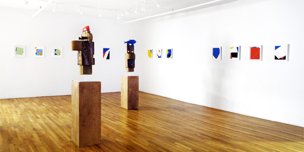

Ivan Chermayeff has designed some of the past century’s most memorable graphics. Now, his collages and assemblages of found materials are on view in a solo exhibition (top) at Pavel Zoubok Gallery in New York. All photos courtesy of the artist and Pavel Zoubok Gallery, unless otherwise noted
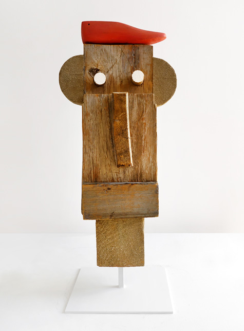
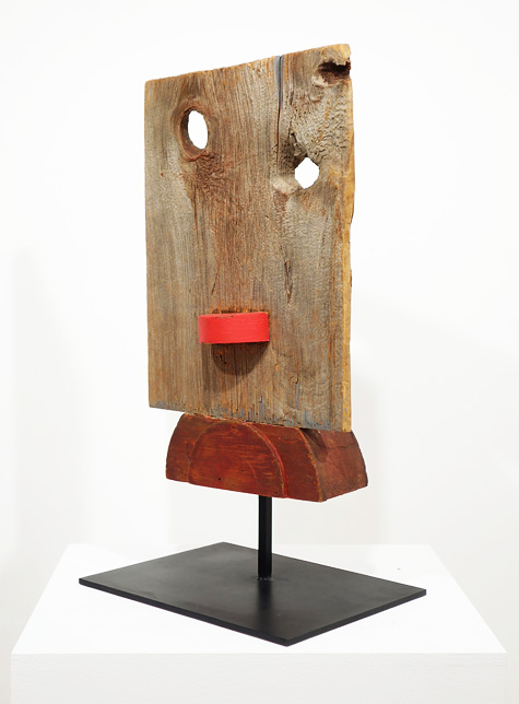
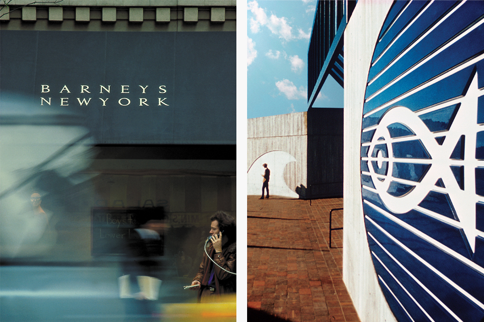
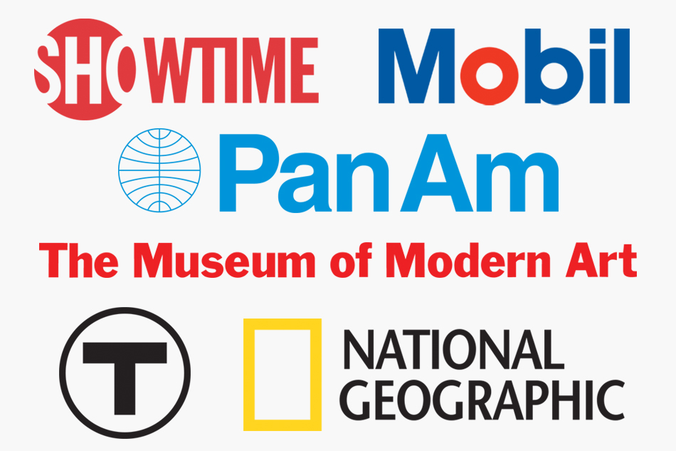
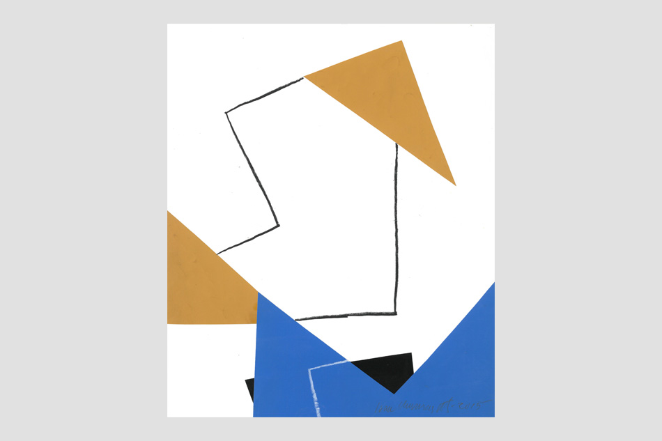
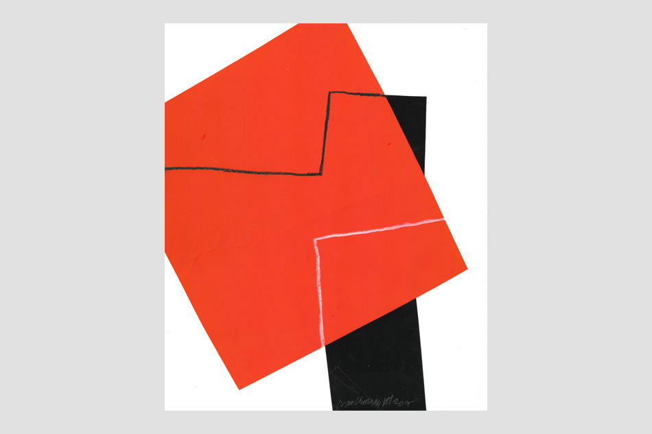
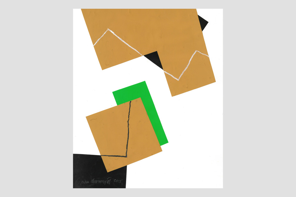
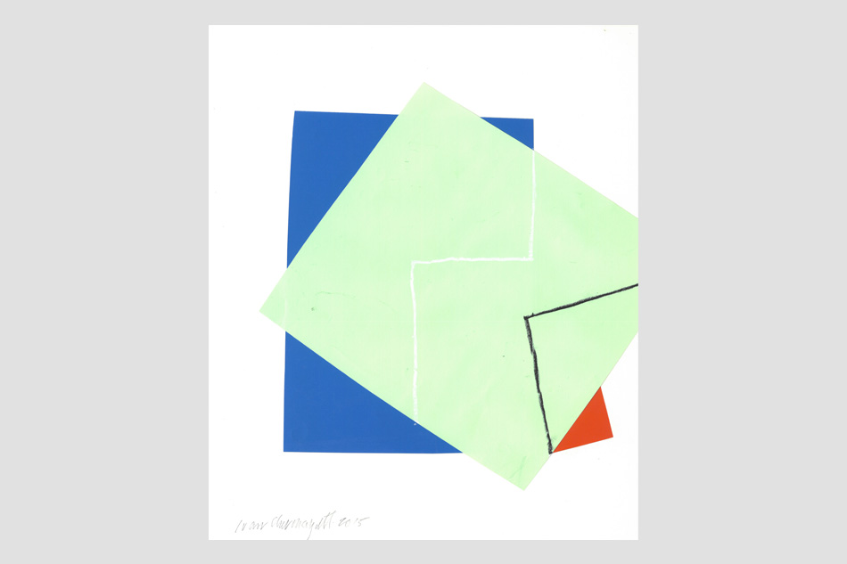
Ivan Chermayeff is a giant in the field of graphic design, the mind behind some of the past century’s most indelible graphics, from the Museum of Modern Art’s cool block typography to PanAm’s pared-down globe. (He even convinced the airline to shorten its name from the clunky Pan American World Airways.) Chermayeff is also an artist, whose droll collages and assemblages of found materials have the same modernist sensibility as his logos. His pieces transform the discarded — scrap paper, envelopes, wood, gloves, aluminum cans — into whimsical faces and abstractions with a minimalist bent. “I can’t not do something,” Chermayeff says, explaining why he uses his downtime to make art.
That art is currently on view in a solo exhibition at Pavel Zoubok Gallery in New York’s Chelsea neighborhood (through April 9). And a large survey show of his collages and posters, “Ivan Chermayeff: Cut and Paste,” has been touring Britain since 2014. Its next stop is the London College of Communication, where it will appear this spring, after which it heads to Madrid.
On a rainy winter morning, an old chocolate Lab named Neo lopes around the loft-like offices of Chermayeff & Geismar & Haviv, in Manhattan’s Flatiron District. Hanging over the reception desk is a typically smile-inducing Chermayeff collage: a highly abstracted face composed of brown paper for the skin, pebbles for the eyes, red paper for the mouth and black paper for the nose. A wide piece of yellow paper with an off-kilter pattern of black polka dots serves as the necktie.
Tall and elegant at 83, Chermayeff has been making collages since his student days. “I’m more comfortable with scissors than I am with drawing,” he says in the firm’s conference room, where a roll of Bubble Wrap used to safeguard pieces being transported to his latest show still sits on the table. “I like scissors. I have several pairs. That’s my idea of drawing: to cut.”
He also rips. “It’s the opposite of what one thinks — scissors are fast; tearing is slow.”
Overall, collages are relatively quick, as art forms go, an important plus for a man with a demanding day job. “I don’t stew about it,” he says. “I just do it. Some of them only take five minutes. But that doesn’t mean I don’t change them, add to them or tear them up and throw them away. I’ve got very good eyes, and I can see that I’ve made a mistake and either correct it or, if it’s uncorrectable, toss it.”
Chermayeff has a habit of prowling the city’s gutters for refuse. “I’m very fond of garbage,” he says. “I found, for instance, that workers on construction sites, when they lose one glove, they throw away the other. The gloves get run over by trucks, flattened. Women drop gloves in pairs, going in and out of cabs, and they’re driven over by trucks, too. It’s not as though they’re all over the place, but I used to have bags of gloves because I went out to search for them. They’re interesting because they’re never the same. They become hair or noses or hands.”
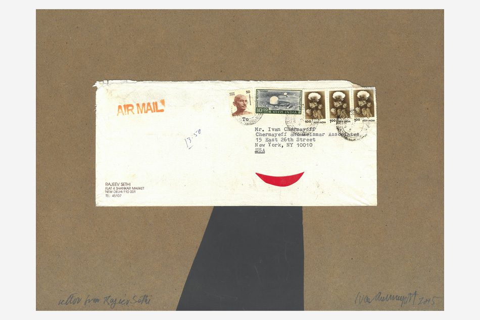
He might save stuff for years before he hits on a way to use it. In Untitled (2015), Chermayeff created a face from an elegantly calligraphed envelope, pairing it with a piece of black paper that he cut at a jaunty angle to mimic a top hat. In another recent work, Dog in the Window (2015), he conjured a canine’s head, ears and all, by ripping an envelope.
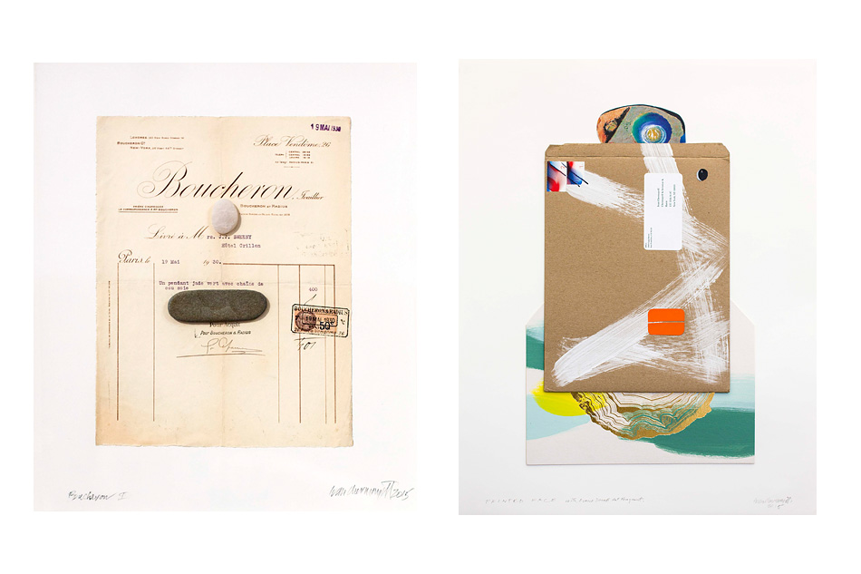
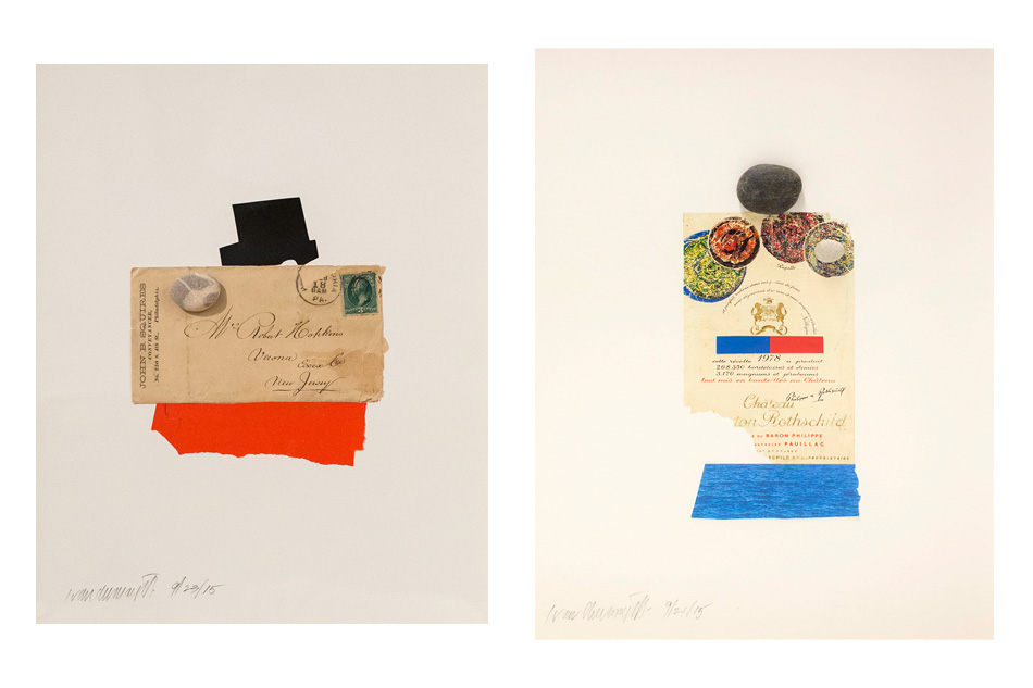
Chermayeff finds that pebbles are just the right scale for human eyes or noses. They also remind him of Joan Miró’s exuberant dots of color. “Oh, I love pebbles,” he says. “I was brought up at a place on Cape Cod, which my brother and I still have, so I go there and I walk on the beach. Pebbles come leaping out at me. I like ones that have a flat side to them. They may be tens of thousands of years old. To get to be a pebble from a bigger stone takes thousands and thousands of years, and they get smoother and smoother. Stones are big history.” The only drawback: “They’re heavy. It doesn’t take very long to get a basket of pebbles that you can barely carry.”
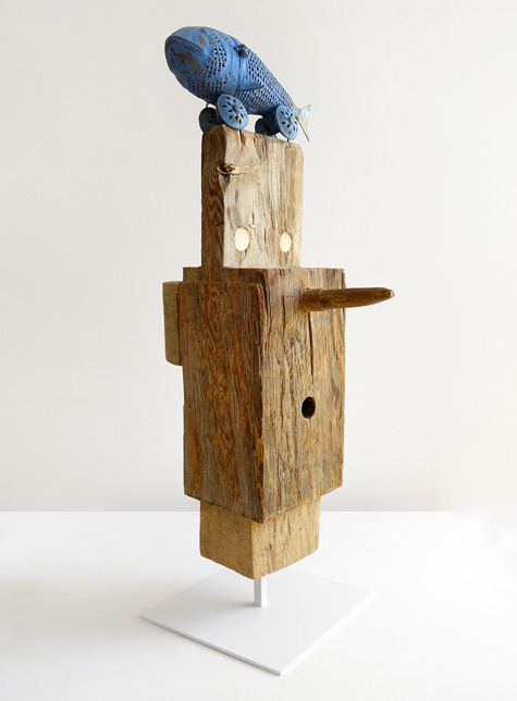
Littered, run-over soda or beer cans are good for assemblages. (A new can lacks the proper patina.) These sculptures take more time, Chermayeff finds, which is why he makes fewer of them. But the Zoubok show includes a few charming examples. Many years ago, Chermayeff and his late wife, Jane, bought a four-bay barn in Pennsylvania, disassembled it and moved it to Upstate New York, where they used it as a weekend house. His fondness for these structures led him to make Janus with Blue Fish (2000–5), which turns a salvaged hunk of wood from a barn into a face, with peg holes standing in for eyes and a blue model of a fish he found in a junk shop decades ago topping the piece like a woman’s zany hat.
Chermayeff hails from a family deeply embedded in the history of 20th-century design, beginning with his father, Serge, a leading modernist architect and designer. The elder Chermayeff was born in Russia in 1900 to wealthy Jewish parents who later sent him to an English boarding school. “It took him four days to get there, if I remember, in 1911, and he never went back,” Chermayeff says. At age 17, as the Russian Revolution ravaged his native land, Serge hopped a boat for South America. “He knew all about horses, so he went to the Pampas in Argentina and was a cowboy for a year, got bored with that, became a croupier in Chile, said the hell with that, and went back to England.”
There, despite no formal training, Serge became an architect. (The first stop for “Cut and Paste” was the De La Warr Pavilion, a landmark 1935 building he designed with architect Erich Mendelsohn in Bexhill-on-Sea, in England.) After Serge and his wife, Barbara, had Ivan and a second son, Peter, the family emigrated to the United States. There, Serge became an influential instructor to generations of architects, teaching at Harvard and Yale and serving as director of the Institute of Design in Chicago. “He was quite a character,” Chermayeff recalls. “He spoke five languages perfectly, and he was a good talker.”
Like many creative professionals, Serge had a reputation for being difficult, but his son remembers him as an extremely supportive father. “As far as I was concerned, no matter what piece of garbage I turned out, he said it was great,” Chermayeff says. “That’s always helpful.”
“I’m more comfortable with scissors than I am with drawing,” Chermayeff says.
Chermayeff’s childhood was peripatetic. As his parents hopscotched around the country, he attended 19 schools before landing at Phillips Academy, in Andover, Massachusetts. He went on to Harvard but even then undertook an unconventional approach to his education. “I told the freshman dean that I was not going to stay there, and would he mind if I skipped all the freshman courses?” Instead, he wanted to pick and choose classes from any and every department that interested him. To his surprise, the dean replied, “That’s a great idea. Do it,” Chermayeff recalls. “I left after two years.”
He continued his studies at the Institute of Design in Chicago, he says, “because Harvard hadn’t heard of design at the time. I had to wait until my father was gone [from the institute] because he was the head of it, and I wasn’t about to go to a school that my father was the head of.” He finished up at Yale with a bachelor’s in fine art.
In 1962, Chermayeff and his brother, Peter, founded the Cambridge Seven design collective with five like-minded friends. Among their groundbreaking projects was Boston’s New England Aquarium, completed in 1969, which set Peter on a path to become the architect of some of the world’s most beloved aquariums. Chermayeff, though, was drawn to the immediacy and reach of graphic design. One of the partners’ biggest contributions to the Boston landscape was the reconceptualization of the city’s transit system. Naming each subway and aboveground train line for a color, they devised a bold, user-friendly, color-coded map. In a stroke of genius, the team dubbed the system the “T” and used the capital letter surrounded by a circle as a simple, instantly recognizable logo to mark each station.
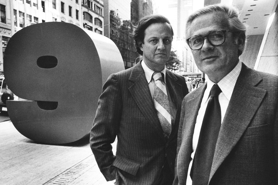
In 1957, Chermayeff, along with Robert Brownjohn and fellow Cambridge Seven member Tom Geismar, founded Brownjohn, Chermayeff and Geismar Associates. Brownjohn left for London in 1960, and the firm became known as Chermayeff & Geismar. The team’s influential output included the iconic Chase logo, introduced in 1961 and still heavily in use today. “Chase is an abstract symbol,” Chermayeff says. “It’s concentrated, simple, it has motion in it, and it’s memorable. You may not be able to draw it, but when you see it, you know you’ve seen it before.”
Chermayeff served on the board of the Museum of Modern Art with Chase chairman David Rockefeller, who helped convince his skeptical banking colleagues to go with the symbol. Chermayeff scoffs at the notion that there’s any sort of magic to this one particular design. “We probably presented them with twelve different alternatives, and any one of them would have done as well,” he says. “They all had the same qualities: strong, simple, reproducible and original.” A great deal of thought and refinement goes into such projects, he explains, but he doesn’t pretend there’s any deep psychological reason the logo has worked so well for a financial institution. “I don’t think it has anything to do with a bank. You could rationalize it” — arguing, for instance, that the shape resembles a coin — “but it would be bullshit.”

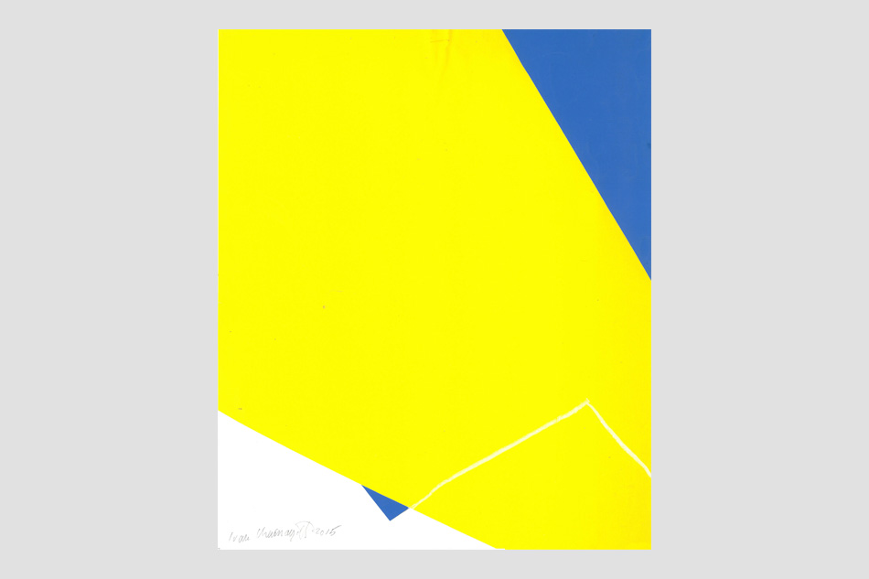
Twins, 1998, is featured at Zoubok.
Not to suggest that developing a winning brand identity is all aesthetics, instinct and luck. “Design is a long series of connections,” he says. The firm’s solution for Mobil — with the red “o” set off against the other letters in blue — has endured for more than 50 years in part because Chermayeff and Geismar were conscious that drivers on the new interstate highway system would need to see gas station signs while speeding by. “It has to be spotted at forty miles an hour or fifty miles an hour,” Chermayeff says. “In fact, we even tested it out and made an amateur film, and showed it to the board of directors that way.”
The firm has completed hundreds of projects, both domestically and globally. Chermayeff’s eye is so finely tuned that he cannot go about daily life without being assaulted by bad design. He usually lets it go — he can’t fix every poorly conceived sign or building — but occasionally he can’t help himself. The Metropolitan Museum of Art’s recently debuted, much-criticized new logo raised his hackles so much that he says he uncharacteristically shot off a letter to the museum’s director, Thomas P. Campbell, lambasting him for it. If Campbell doesn’t change the logo, Chermayeff declares, he should lose his job, “and you can quote me.”
The Chermayeff legacy continues into the third generation. All four of Chermayeff’s children work in visual fields: Catherine was director of special projects at Magnum, the photography agency; Sasha is an artist; Maro is a documentary filmmaker; Sam is an architect. None, however, is a graphic designer. Chermayeff and Geismar, cognizant that companies rarely survive without their visionary founders, added partner Sagi Haviv’s name in 2013. “Tom and I are in our eighties,” Chermayeff says. “Sagi Haviv is half our age. Tom and I felt very strongly that, if we wanted [the business] to continue and take advantage of what we accomplished, we have to have someone to replace us because we’re going to drop dead.”
That’s not to say Chermayeff has any plans to retire. “Oh, no, what for?” he responds to the suggestion. “That’s my idea of nothing to do. I would never think of retiring. Retire to what? There’s nothing more fun than what we do.”
Visit Pavel Zoubok Gallery on 1stdibs