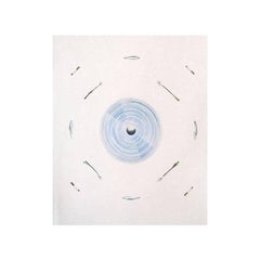
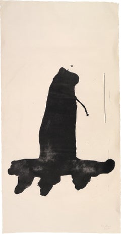
Ed RuschaThe World and Its Surroundings, from the Global Editions Series1982
1982
About the Item
- Creator:Ed Ruscha (1937, American)
- Creation Year:1982
- Dimensions:Height: 42 in (106.68 cm)Width: 31.5 in (80.01 cm)
- More Editions & Sizes:Edition of 55Price: $6,000
- Medium:
- Movement & Style:
- Period:
- Condition:
- Gallery Location:London, GB
- Reference Number:

Ed Ruscha
Indisputably one of the most iconic American artists of the 20th century, Ed Ruscha has built a formidable body of work by staking a claim on the deceptively simple intersection of text and image, superimposing elliptical phrases (or, often, single words) over West Coast landscapes to create prints and paintings that can be read instantaneously yet evade easy understanding.
Alongside artists like Robert Irwin and Billy Al Bengston, Ruscha was a pioneer of the 1960s Los Angeles art scene as part of the famed Ferus Gallery. His embrace of Hollywood vernacular and the open Western road have tied him as closely to the identity of L.A. art as Jackson Pollock is to that of New York.
Coming to California in 1956 at the age of 18, Ruscha intended to become a commercial painter but found himself drawn to fine art, over time being shaped by three galvanizing influences: Marcel Duchamp, Pop art and the movies.
Meeting Duchamp when the Pasadena Art Museum (now the Norton Simon Museum) hosted the French Conceptual artist's first U.S. show, Ruscha was especially affected by his use of "readymade" objects and imagery, rendered unfamiliar through unexpected titles or text. Andy Warhol's Campbell's Soup can paintings, meanwhile, were shown for the first time at the Ferus Gallery in 1962, opening up new vistas for Ruscha. Movies, then, provided another inspiration through their use of title cards, placing graphic text over filmic shots — The End, for instance — for maximum impact.
Ruscha began his famous series of word paintings in the 1960s, depicting various views of the Hollywood sign and the logos of studios like 20th Century Fox, but also roadside views like the Standard Oil stations dotting L.A.'s freeways. Over time these became more abstracted, pinning ambiguous, free-floating phrases (Wall Rockets is a famous example) to natural vistas, scenes of highways, or monochrome backgrounds. Beginning in about 1980, the artist began using a sharp font he designed himself, called Boy Scout Utility Modern.
A master printmaker who also works across the mediums of books, drawing, photography and even film — in 2009 he starred in a movie directed by the artist Doug Aitken — Ruscha has been an influence on a staggering array of artists, including Stephen Shore, Christopher Wool and Anselm Kiefer.
Ruscha's work has been featured in dozens of exhibitions around the world, including "Ed Ruscha: 50 Years of Painting" at London's Hayward Gallery (2009), "Ed Ruscha: Made in Los Angeles" at Madrid's Reina Sofia in 2002, a 2000 retrospective at the Hirshhorn Museum and Sculpture Garden, a survey of his works-on-paper at the J. Paul Getty Museum in 1998, and a 1982 retrospective that traveled to the Whitney Museum. In 2005 he represented the United States at the 51st Venice Biennale, and in 2009 he received a National Arts Award.
Find a collection of original Ed Ruscha lithographs and other art for sale on 1stDibs.
- ShippingRetrieving quote...Ships From: London, United Kingdom
- Return PolicyA return for this item may be initiated within 7 days of delivery.
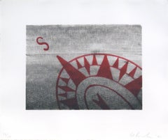
- The Fan and its Surroundings, from the Global Editions SeriesBy Ed RuschaLocated in London, GBLithograph on Rives BFK paper, torn and deckle edgesCategory
Late 20th Century Pop Art Abstract Prints
MaterialsLithograph
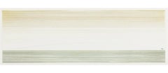
- SouthBy Ed RuschaLocated in London, GBLithograph on white Rives BFK paper Proofs: 10AP, 1BAT, 2CTP, 2PP, 4 publisher's proofs, 1 shop proof, 5TP Inscriptions: Signed and dated in pencil lower right, "Ed Ruscha 91", numbe...Category
Late 20th Century Pop Art Abstract Prints
MaterialsColor, Lithograph
- Chicago Art Fair (C.I.A.E)By Ed RuschaLocated in London, GBLithograph on Arches 88 paperCategory
Late 20th Century Pop Art Abstract Prints
MaterialsColor, Lithograph
- Jumping FishBy Ed RuschaLocated in London, GBEtching on R.K.Burt paper, cut, torn, and deckle edgesCategory
Late 20th Century Pop Art Abstract Prints
MaterialsColor, Etching
- SamuraiBy Robert MotherwellLocated in London, GBSignature: Signed "R. Motherwell" in pencil lower right Inscriptions: Numbered in pencil lower right; workshop chop mark lower right Edition: 16Category
1970s Abstract Expressionist Abstract Prints
MaterialsLithograph
- The Berggruen Series: UntitledBy Robert MotherwellLocated in London, GB40 x 42.2 cms (15 3/4 x 16 5/8 ins) Signature: Signed "Motherwell" in pencil lower right Inscriptions: Numbered in pencil lower right Edition: 100Category
1980s Abstract Expressionist Abstract Prints
MaterialsLithograph
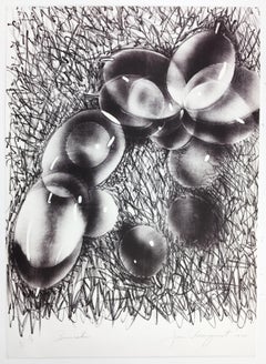
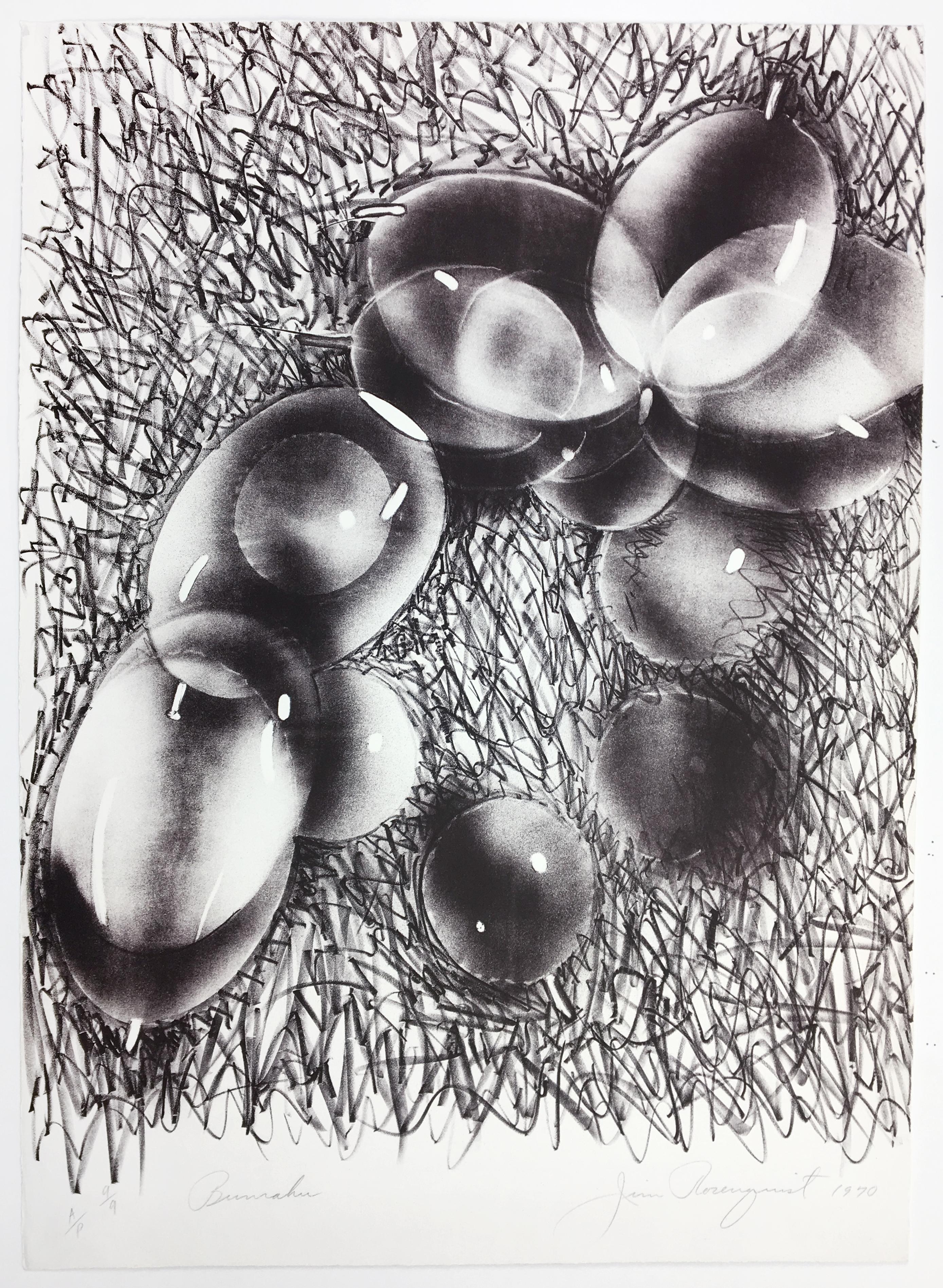
- Bunraku, James Rosenquist, abstract Japanese puppetry monochrome Pop ArtBy James RosenquistLocated in New York, NYThis abstract monochrome print portrays large, shiny dark purple bubbles that cascade over a scribbled, dense background. The sense of moveme...Category
Late 20th Century Pop Art Abstract Prints
MaterialsLithograph
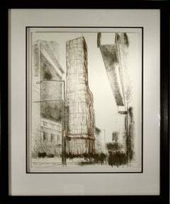
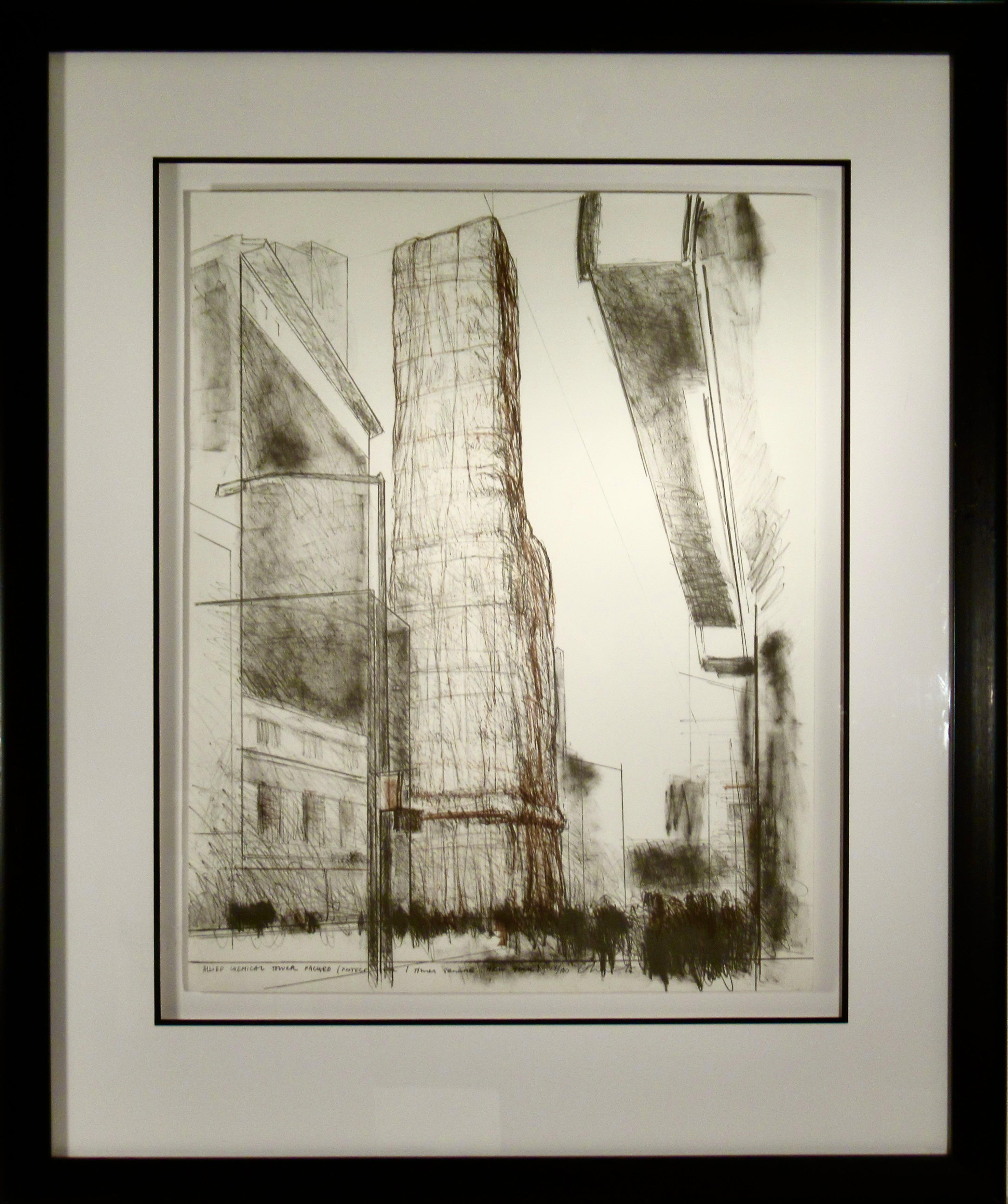
- Allied Chemical Tower, Packed, Project for Number 1 Time Square New YorkLocated in San Francisco, CAThis artwork titled ' Allied Chemical Tower, Packed, Project for Number 1 Time Square, New York" 1971, in an original color lithograph on Arjomari paper by renown Bulgarian/American ...Category
Late 20th Century Pop Art Abstract Prints
MaterialsLithograph
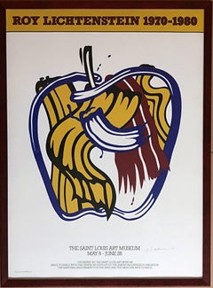
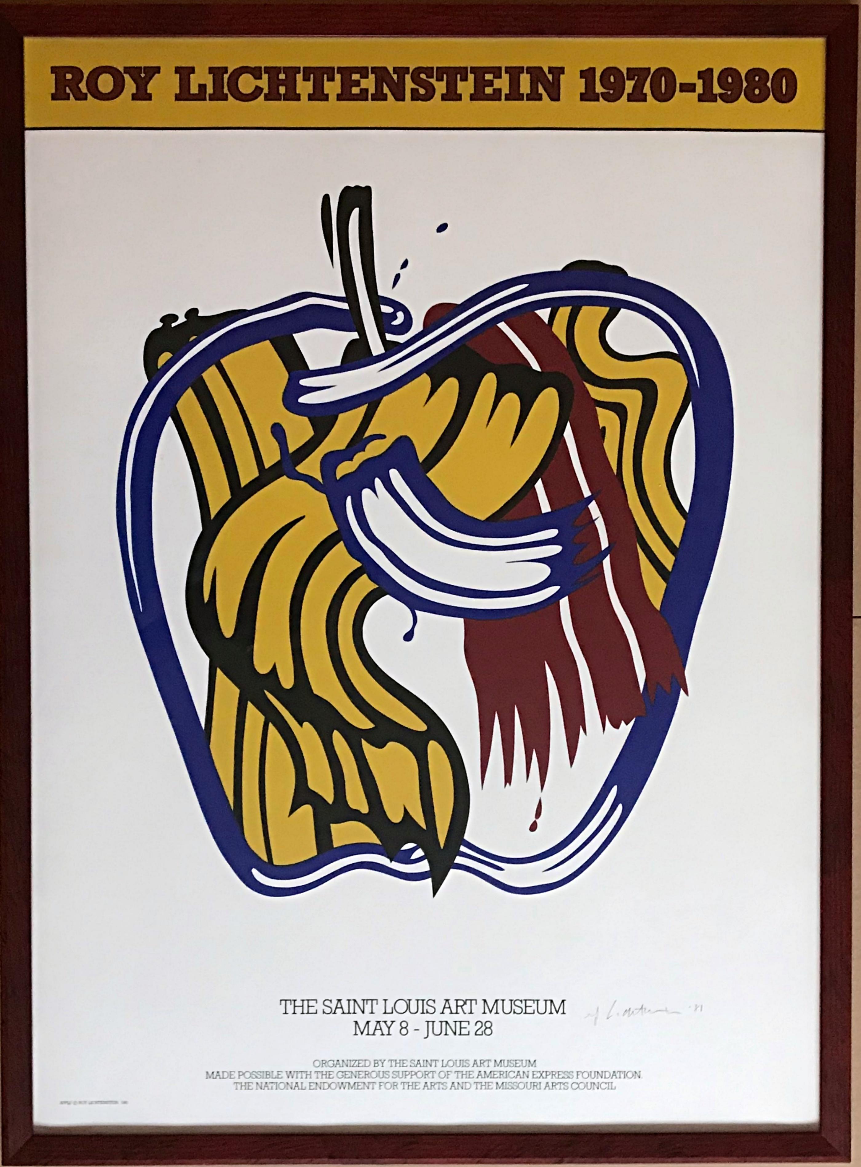
- Limited Ed. St. Louis Art museum poster Hand Signed & dated by Roy LichtensteinBy Roy LichtensteinLocated in New York, NYRoy Lichtenstein 1970-1980 (Hand Signed and dated by Roy Lichtenstein), 1981 Offset lithograph. Hand signed and dated in ink Hand-signed by artist, H...Category
1980s Pop Art Abstract Prints
MaterialsInk, Lithograph, Offset, Pencil, Graphite
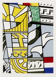
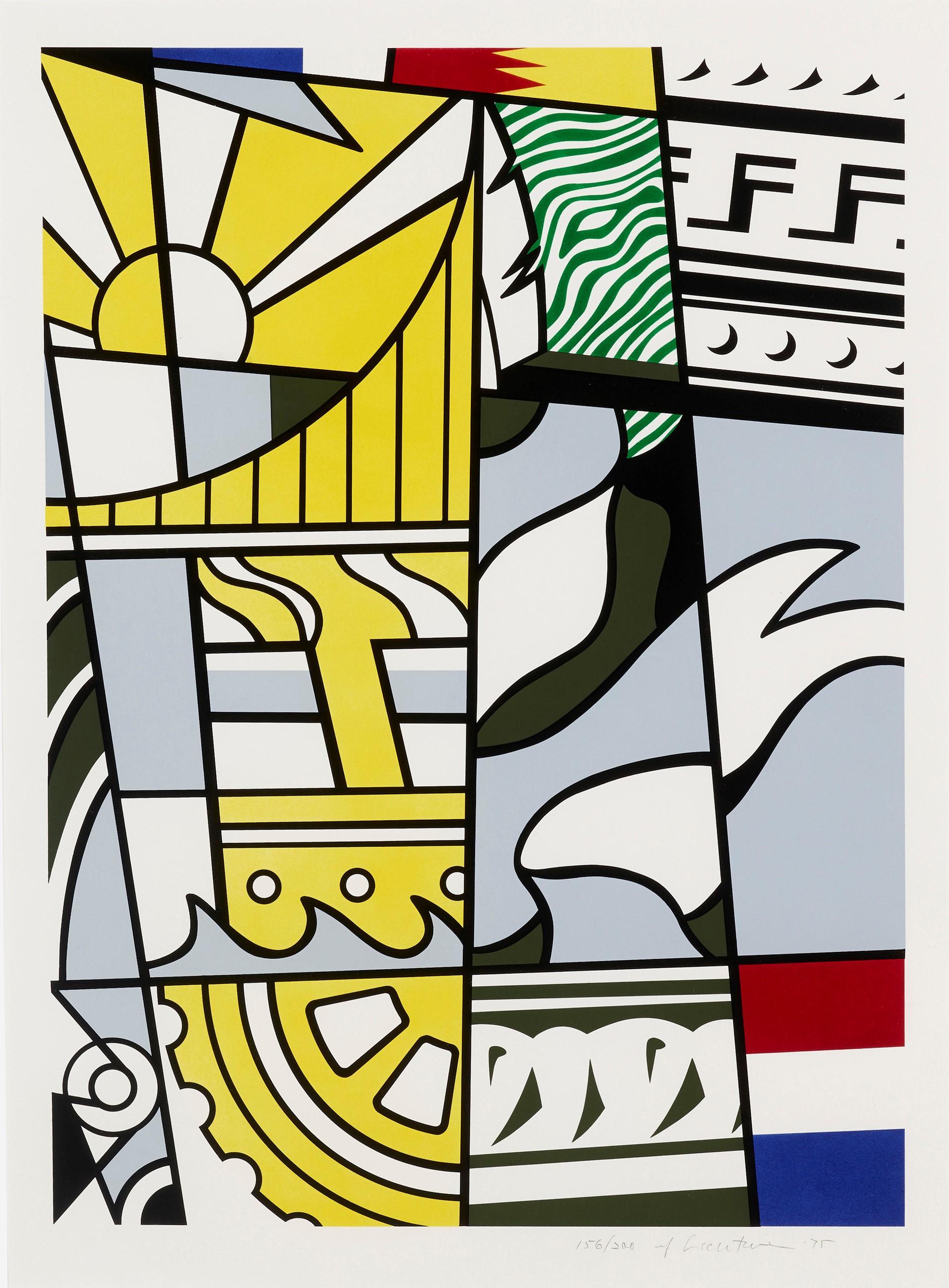
- Bicentennial, by Roy LichtensteinBy Roy LichtensteinLocated in New York, NYIncluded in America: The Third Century portfolio, Roy Lichtenstein created Bicentennial as an original color lithograph with screenprint in 1975, conceived to celebrate the 200th ann...Category
20th Century Pop Art More Prints
MaterialsLithograph, Screen
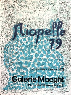
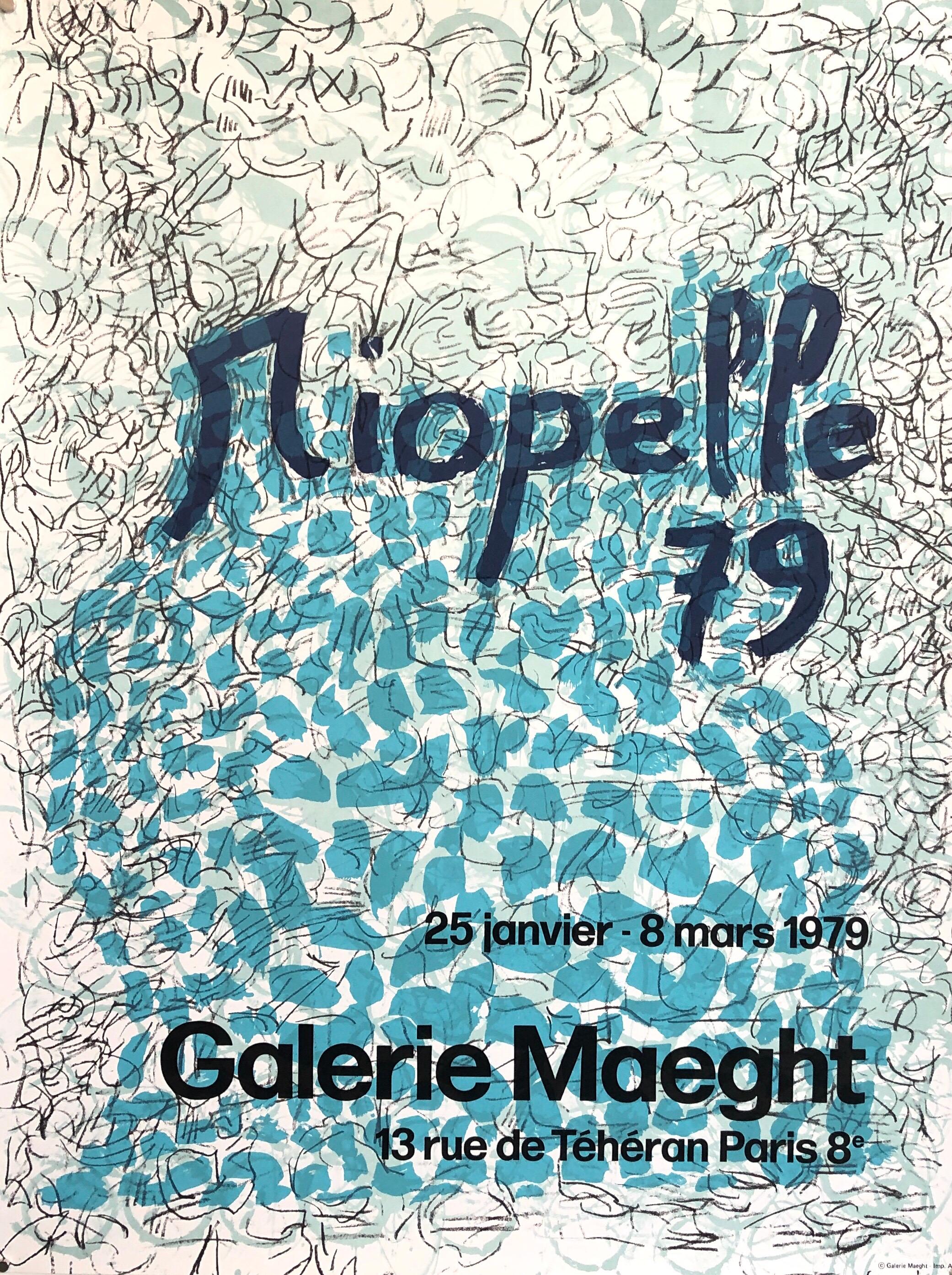
- Canadian Post Modern Pop Art Lithograph Vintage Poster Memphis Galerie MaeghtBy Jean-Paul RiopelleLocated in Surfside, FLVintage gallery exhibition poster. The Galerie Maeght is a gallery of modern art in Paris, France, and Barcelona, Catalonia, Spain. The gallery was founded in 1936 in Cannes. The Paris gallery was started in 1946 by Aimé Maeght. The artists exhibited are mainly from France and Spain. Since 1945, the gallery has presented the greatest modern artists such as Matisse, Bonnard, Braque, Miró, and Calder. In 1956, Adrien Maeght opened a new parisian venue. The second generation of “Maeght” artists was born: Bazaine, Andre Derain, Giacometti, Kelly, Raoul Ubac, then Riopelle, Antoni Tapies, Pol Bury and Adami, among others. Jean-Paul Riopelle, CC GOQ (7 October 1923 – 12 March 2002) was a painter and sculptor from Quebec, Canada. He became the first Canadian painter (since James Wilson Morrice) to attain widespread international recognition. Born in Montreal, Riopelle began drawing lessons in 1933 and continued through 1938. He studied engineering, architecture and photography at the école polytechnique in 1941. In 1942 he enrolled at the École des beaux-arts de Montréal but shifted his studies to the less academic école du Meuble, graduating in 1945. He studied under Paul-Émile Borduas in the 1940s and was a member of Les Automatistes movement. Breaking with traditional conventions in 1945 after reading André Breton's Le Surréalisme et la Peinture, he began experimenting with non-objective (or non-representational) painting. He was one of the signers of the Refus global manifesto. In 1947 Riopelle moved to Paris and continued his career as an artist, where, after a brief association with the surrealists (he was the only Canadian to exhibit with them) he capitalized on his image as a "wild Canadian". His first solo exhibition took place in 1949 at the Surrealist meeting place, Galerie La Dragonne in Paris. Riopelle married Françoise Lespérance in 1946; the couple had two daughters but separated in 1953. In 1959 he began a relationship with the American painter Joan Mitchell, Living together throughout the 1960s, they kept separate homes and studios near Giverny, where Monet had lived. They influenced one another greatly, as much intellectually as artistically, but their relationship was a stormy one, fueled by alcohol. The relationship ended in 1979. His 1992 painting Hommage à Rosa Luxemburg is Riopelle's tribute to Mitchell, who died that year, and is regarded as a high point of his later work. Riopelle's style in the 1940s changed quickly from Surrealism to Lyrical Abstraction (related to abstract expressionism), in which he used myriad tumultuous cubes and triangles of multicolored elements, facetted with a palette knife, spatula, or trowel, on often large canvases to create powerful atmospheres. The presence of long filaments of paint in his painting from 1948 through the early 1950s[8] has often been seen as resulting from a dripping technique like that of Jackson Pollock. Rather, the creation of such effects came from the act of throwing, with a palette knife or brush, large quantities of paint onto the stretched canvas. Riopelle's voluminous impasto became just as important as color. His oil painting technique allowed him to paint thick layers, producing peaks and troughs as copious amounts of paint were applied to the surface of the canvas. Riopelle, though, claimed that the heavy impasto was unintentional: "When I begin a painting," he said, "I always hope to complete it in a few strokes, starting with the first colours I daub down anywhere and anyhow. But it never works, so I add more, without realizing it. I have never wanted to paint thickly, paint tubes are much too expensive. But one way or another, the painting has to be done. When I learn how to paint better, I will paint less thickly." When Riopelle started painting, he would attempt to finish the work in one session, preparing all the color he needed before hand: "I would even go as far to say—obviously I don't use a palette, but the idea of a palette or a selection of colors that is not mine makes me uncomfortable, because when I work, I can't waste my time searching for them. It has to work right away." A third element, range of gloss, in addition to color and volume, plays a crucial role in Riopelle's oil paintings. Paints are juxtaposed so that light is reflected off the surface not just in different directions but with varying intensity, depending on the naturally occurring gloss finish (he did not varnish his paintings). These three elements; color, volume, and range of gloss, would form the basis of his oil painting technique throughout his long and prolific career. Riopelle received an Honorable Mention at the 1952 São Paulo Art Biennial. In 1953 he showed at the Younger European Painters exhibition at the Solomon R. Guggenheim Museum in New York City. The following year Riopelle began exhibiting at the Pierre Matisse Gallery in New York. In 1954, works by Riopelle, along with those of B. C. Binning and Paul-Émile Borduas represented Canada at the Venice Biennale. He was the sole artist representing Canada at the 1962 Venice Biennale in an exhibit curated by Charles Comfort...Category
1970s Pop Art Abstract Prints
MaterialsLithograph, Offset
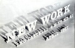
- Leo Castelli Gallery poster (Roy Lichtenstein, Frank Stella, John Chamberlain)Located in New York, NYRare collectors item: Roy Lichtenstein, Frank Stella, John Chamberlain New Work, Leo Castelli poster, 1967 Offset lithograph poster invitation with original folds, addressee and post...Category
1960s Pop Art Abstract Prints
MaterialsOffset, Lithograph