Items Similar to "Don't Wine, " Original Surreal Serigraph by Paula Schuette Kraemer & Bill Weege

Want more images or videos?
Request additional images or videos from the seller
1 of 10
Paula Schuette Kraemer"Don't Wine, " Original Surreal Serigraph by Paula Schuette Kraemer & Bill Weege1994
1994
About the Item
"Don't Wine" is a mixed media piece, predominately a serigraph, by Paula Schuette Kramer and Bill Weege. Both artists signed in pencil in the lower right, and the title is in the lower left. It is one of a an edition of 50. The print is an explosion of bright colors, but red, blue, and green dominated the composition as they fade through the background. A blue figure climbs up a ladder out of an apple, hefting a large wine bottle overhead, which they pour out into the sea of wine. A man, woman, and long-necked orange bird also look out from the apple, reading for the stem of a floating bunch of green grapes. A group surrounds the grapes with their heads and shoulders above the water, eating the fruit. Birds fly through the background, dodging wine glasses and a vase of flowers that seem to be tumbling from a flying carpet. The entire image feels very surreal.
Art size: 12" x 10"
Frame size: 19 1/4" x 17"
Paula Schuette Kraemer is an independent artist living in Madison, Wisconsin. Her etchings and drypoint monoprints and monotypes are colorful, symbolic narratives that over the years have involved themes of childhood and domesticity, security and shelter. The color in Paula's works will sometimes be a simple hue added to one form, but at other times consumes the entire background of a print.
Paula also does photogravures - a method by which a photographic image can be transferred to an etching plate - into her work. The photorealistic images combined with Paula's style of drawing add another dimension to her lively works.
Paula attended Vassar College and received her B.S. in Art and her M.A. in Ceramics and Printmaking (under the teaching of Warrington Colescott) from the University of Wisconsin.
Her work is also represented in many private, corporate, and museum collections throughout the midwest including Quad Graphics; Hallmark Corporation; and the Madison Museum of Contemporary Art, WI.
Kraemer has exhibited in many galleries including Elaine Erickson Gallery, Milwaukee, WI; Grace Chosy Gallery, Madison, WI; Groveland Gallery, Minneapolis, MN; Hibberd-McGrath Gallery, Breckenridge, CO; and Olson-Larsen Galleries, Des Moines, IA. She was in an exhibition at the International Print Center New York in 2004 and has been in several shows at Grace Chosy Gallery in Madison and Suzanne Kohn Gallery in Minneapolis. Paula has pieces included in the collections of 3M Corporation, Sprint, Hubbell Realty Company, The Equitable Company, and Pioneer Hi-Bred International. In addition, Kraemer participates in group and solo shows at least four times per year. She is also a patron and member of the advisory board of Tandem Press, Madison, WI, which affords her continued artistic influence and education.
PAULA SCHUETTE KRAEMER
EDUCATION
Vassar College 1966-68
University of Wisconsin – Madison 1968-70, B.S. in Art
University of Wisconsin – Madison 1970-71, M.A. in Printmaking & Ceramics
Extensive travel and study in the Mediterranean 1971-74
Crown Point Press Etching Workshop- San Francisco, California, 2007
EXHIBITIONS
Beloit and Vicinity Show, Beloit, Wisconsin - 1983, 1988, 1991, 1992, 1993, 1994
Paper: "Interpretations", Bergstrom Museum, Neenah, Wisconsin -1984
1984 Wisconsin Biennial, Madison Art Center, Madison, Wisconsin
One Man Show, Wisconsin Academy of Sciences Arts & Letters, Madison, Wisconsin - 1986
"The Intelligent Monoprint", Miriam Perlman Gallery, Chicago, Illinois -1986
"Gallery Printmakers", Olson-Larsen Galleries, Des Moines, Iowa -1987
1988 Commemorative Artist for WHA-TV, Madison, Wisconsin
Paula Schuette Anderson and Dagny Quisling Myrah, "New Work", Grace Chosy Gallery, Madison, Wisconsin - 1988
Recent Work from Dane County, Madison Art Center, Madison, Wisconsin -1988
Paula Schuette Anderson & Myrth Schuette, "Recent Work", Mimzi/Ross Gallery, Davenport, Iowa -1989
"Wisconsin Biennial 1989", Rahr-West Art Museum, Manitowoc, Wisconsin
"Wisconsin ‘89" and "Wisconsin '91", Edna Carlsten Gallery, University of Wisconsin, Stevens Point, WI
"Shelter Series", Olson-Larsen Galleries, Des Moines, Iowa -1990
"Women Printmakers", Waterloo Museum of Art, Waterloo, Iowa -1991
"1991 Wisconsin Artists' Biennial", Patrick & Beatrice Haggerty Museum, Marquette University, Milwaukee, Wisconsin
Paula Schuette Kraemer "Drypoint Monoprints", Grace Chosy Gallery, Madison, Wisconsin -1991
The Peltz Gallery, Milwaukee, Wisconsin - 1992, 1994, 1995, 1996
Paula Schuette Kraemer, "New Work", Olson-Larsen Galleries, Des Moines, Iowa - 1992
"Outstanding American Prints", Anderson Arts Center, Kenosha, Wisconsin - 1993
Paula Schuette Kraemer, "Home", Grace Chosy Gallery, Madison, Wisconsin - 1993
"A Personal Perspective", Jura Silverman Gallery, Spring Green, Wisconsin - 1995
"Summer Gardens", Suzanne Kohn Gallery, Minneapolis, Minnesota -1995
"Summer Invitational Show", Olson-Larsen Galleries, Des Moines, Iowa -1995
Paula Schuette Kraemer, "Changing Seasons", Suzanne Kohn Gallery, Minneapolis, Minnesota -1995
Holiday Exhibition, Olson-Larsen Galleries, Des Moines, Iowa - 1995, 1997-2001, 2003, 2005
"Trees or Tulips?”, One Person Show at the Wisconsin Academy of Sciences, Arts & Letters,
Madison, Wisconsin - 1996
Featured Artist, Edgewood Orchard Galleries, Fish Creek, Wisconsin - 1996
Paula Schuette Kraemer and Jane Marshall, "Recent Work", Grace Chosy Gallery, Madison, WI - 1996
“Red”, Grace Chosy Gallery, Madison, Wisconsin - 1997
“150 Years of Wisconsin Printmaking”, Elvehjem Museum of Art, University of Wisconsin, Madison - 1998
Paula Schuette Kraemer and Marylin Hart, “New Work”, Grace Chosy Gallery, Madison, Wisconsin - 1999
“Printmakers Show”, Olson-Larsen Galleries, Des Moines, Iowa - 1999
“McNeese National Works on Paper”, McNeese State University, Lake Charles, Louisiana - 1999
“1999 Wisconsin Triennial”, Madison Art Center, Madison, Wisconsin
“From a Matrix - Wisconsin Women Printmakers”, Quad/Graphics, Sussex, Wisconsin - 2000
“Printwork ‘2K”, Barrett Art Center, Poughkeepsie, New York – 2000
“Art /A Family Vocation”, Grace Chosy Gallery, Madison, Wisconsin - 2001
“Paula Schuette Kraemer, Drypoint Monopoints”, Hibberd-McGrath Gallery, Breckenridge, CO– 2001
“For the Love of Dogs”, Tercera Gallery, San Francisco, California - 2002
“The Trolly Car Show”, Group Show at Gallery 1911, Fort Wayne, Indiana – 2002
Paula Schuette Kraemer, “Where It’s Quiet”, Mixed Media Drawings and Monoprints,
Grace Chosy Gallery, Madison, Wisconsin – 2002
“From Open Gate Press”, Quad/Graphics, Inc. Corporate Headquarters, Sussex, Wisconsin – 2003
Paula Schuette Kraemer, “Where It’s Quiet”, Groveland Gallery, Minneapolis, Minnesota - 2003
“NEW PRINTS 2004/Winter”, International Print Center New York, New York City
“Birds and Animals”, Prints and Drawings, Elaine Erickson Gallery, Milwaukee, Wisconsin – 2004
“DOGS!” , Grace Chosy Gallery, Madison, Wisconsin – 2004
“A Decade of Art from the Wisconsin Academy Gallery”, Wisconsin Academy Gallery,
Madison, Wisconsin -September 2004
“Squirrels !!! ”,Grace Chosy Gallery ,Madison, Wisconsin-December 2004
“Squirrels II”, Hibberd-McGrath Gallery, Breckenridge, Colorado, July 2005
Groveland Galleries Holiday Show, Minneapolis, Minnesota, 2005, 2006, 2007
UW Printmaking Graduates”, University of Wisconsin Memorial Union, Madison, Wisconsin – 2006
“Birds by a Baker’s Dozen”, Grace Chosy Gallery, Madison, Wisconsin, 2006
“April Show”, Olson-Larsen Galleries, Des Moines, Iowa, 2007, 2008
“Butterflies”, Hibberd /McGrath Gallery, Breckenridge, Colorado, 2007
“Birds”, Olson-Larsen Galleries, Des Moines, Iowa, 2007
“2008 Prints”, Grace Chosy Gallery, Madison, Wisconsin, 2008
“Images of Winter”, Hibberd/McGrath Gallery, Breckenridge, Colorado, 2008
“Works on Paper”, Olson- Larsen Galleries, Des Moines, Iowa, 2009
“On a Walk”, Hibberd/McGrath Gallery, Breckenridge, Colorado, 2009
2009 Tandem Press Wine Auction Print Artist, Madison, Wisconsin
“The Toy Show”, Grace Chosy Gallery, Madison, Wisconsin 2010
“Paper in Particular”, Columbia College, Columbia, Missouri, 2011
“1 x 1” = $200”, Groveland Gallery, Minneapolis, Minnesota, 2011
“Red, White and Blue”, Groveland Gallery, Minneapolis, Minnesota, 2011
“Paula Schuette Kraemer: New Work”, Olson-Larsen Galleries, Des Moines, Iowa 2011
“Three Artists”, Grace Chosy Gallery, Madison, Wisconsin, 2011
PERMANENT COLLECTIONS
Cuna Mutual, Madison, Wisconsin
Farm Bureau Insurance, Des Moines, Iowa
Hallmark Corporation, Liberty, Missouri
Heritage Insurance Corporate Headquarters, Franklin Park, Illinois
Hospice Care, Inc., Madison, Wisconsin
The Kartridg-Pak Company, Davenport, Iowa
Madison Newspapers, Inc., Madison, Wisconsin
The Miller Brewing Company, Milwaukee, Wisconsin
Madison Museum of Contemporary Art, Madison, Wisconsin
Mendota Mental Health Institute, Madison, Wisconsin
Pioneer Hi-Bred International, Des Moines, Iowa
Pleasant Company, Middleton, Wisconsin
Prudential Life Insurance Company, Minneapolis, Minnesota
Quad Graphics, Sussex, Wisconsin
RTE Corporation, Brookfield, Wisconsin
Region’s Hospital, St. Paul, Minnesota
Sprint, Kansas City, Missouri
3M Corporation, St. Paul, Minnesota
University of Iowa Hospitals, Iowa City, Iowa
University of Wisconsin Hospitals, Madison, Wisconsin
University of Wisconsin - Marathon Center, Wausau, Wisconsin
University of Wisconsin School of Veterinary Medicine – Madison, Wisconsin
University of Wisconsin Student Union Collection, Madison, Wisconsin
Vail Resorts Inc., Vail, Colorado
Waterloo Museum of Art, Waterloo, Iowa
GALLERIES REPRESENTING WORK
Grace Chosy Gallery, Madison, Wisconsin
Groveland Gallery, Minneapolis, Minnesota
Hibberd-McGrath Gallery, Breckenridge, Colorado
Integrated Art Group, Evansville, Wisconsin
The Olson-Larsen Galleries, Des Moines, Iowa
Bill Weege
Born 1935
In 1987, Bill Weege founded Tandem Press, which is affiliated to the Art Department in the School of Education at the UW-Madison. Like an artistic Pied Piper, he convinced nationally known artists to come and print at Tandem Press. The first artist who created prints at Tandem was his lifelong friend, Sam Gilliam.
Bill Weege, one of the featured artists in the Center’s Since 1968 exhibition in Mitchell Hall, has quite the venerable past both as an artist and activist. At first, I must admit, he came off as a bit too much of an artist; he spoke of his art as if there were infinite ways to interpret his work.
However, his art was based much more in the process with less emphasis placed on the deliberateness of the content. “Big was the thing. I threw everything into it, including the kitchen sink.” That was the call of the times, of course–agitation, finding meaning where there was chaos and random, terrifying Technicolor.
Weege related that his MFA studies focused on the process of printmaking (screen printing, off-set lithography, wood cut printing), and the politics of the day. Others, Weege said, had rebuked his art’s political tenacity, asking, “Why do this? It will have no bearing later.” The haphazardness of the individual images would probably be hard to comprehend, and I think hard to defend in front of a tenure-track committee in the time it was created because too often we take the present for granted as the inevitable outcome of the narrative of history. Weege’s juxtaposed images do a good job of mixing it up so that one no longer has the luxury of viewing history in such narrow terms.
He used photographs (he couldn’t draw), book pages (never mind the copyright law), and a city planning grid as the main attractions. The use of grids and numbers were a nod back to his city planning occupation: “I would count things. There were grids everywhere.” Lyrics from pop culture also help to create the piece’s own space in time. And the saucy images of naughty ladies? There to attract your attention. On his mental process Weege commented that “[Long Live Life] was all laid out. I had to think ahead—which was so unlike me. It turned out the way it was meant to, too, which was so unlike me.”
Toward the end of his talk he noted that he had been accused of stealing from Vasarely, whom he had never heard of, but still he could not deny the possibility: “Maybe I had seen something. But you see something, interpret it, put it down, and you reinterpret it.” That’s exactly how his pieces work.
- Creator:Paula Schuette Kraemer (American)
- Creation Year:1994
- Dimensions:Height: 19.25 in (48.9 cm)Width: 17 in (43.18 cm)
- Medium:
- Movement & Style:
- Period:
- Condition:
- Gallery Location:Milwaukee, WI
- Reference Number:

Paula Schuette Kraemer
Wisconsin artist Paula Schuette Kraemer is known for her drypoint monoprints and monotypes, although she works in other traditional intaglio techniques such as etching and photogravure. Stylistically, her work is noted for its free and expressionistic line, depiction of movement, rich use of color and experimentation with layering of materials. Although her subject matter is drawn from personal experiences, it is the artist’s intent to portray universally what we are all feeling during the various stages of our lives, be it loosing a pet, letting go of one’s children or seeking calm in a hectic world. Often the reaction of nature to human intrusion is a subject that interests Schuette, hence the image of a deer turning away from the viewer. She tends to follow a theme for one or two years and then moves on as her life progresses and new images sift to the surface. It is not her intent to become known for any specific subject matter but rather to use her artistic ability to portray life’s experiences, often with a slight smile… or a tear.
The artist studied art history at Vassar College and then completed her undergraduate work in fine art at the University of Wisconsin-Madison. She then went on to receive her Master’s Degree in Fine Art from the University of Wisconsin where she studied with Warrington Colescott and Bruce Breckenridge. Close alliance with Tandem Press has also afforded Schuette the opportunity to learn from many of the Tandem artists who have worked there.
Paula Schuette Kraemer’s work is represented in many private, corporate and museum collections throughout the Midwest, including Quadgraphics, The Hallmark Corporation, Vail Resorts, The University of Wisconsin, The University of Iowa and The Madison Museum of Contemporary Art. All of her work is created and printed at her own Open Gate Press which is located in Madison, Wisconsin.
About the Seller
4.9
Platinum Seller
These expertly vetted sellers are 1stDibs' most experienced sellers and are rated highest by our customers.
Established in 1966
1stDibs seller since 2017
392 sales on 1stDibs
Typical response time: 1 hour
- ShippingRetrieving quote...Ships From: Milwaukee, WI
- Return PolicyA return for this item may be initiated within 14 days of delivery.
More From This SellerView All
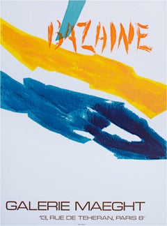
- "Galerie Maeght, " Graphic Color Lines Lithograph Poster by Jean Rene BazaineLocated in Milwaukee, WI"Galerie Maeght" lithograph poster by Jean Rene Bazaine. This poster holds Bazine's name in harsh orange lines near the top of the piece. Diagonally bisecting the b and a in Bazaine is a teal line. Bellow this horizontally against the white backgrounds are two lines, one painted yellow and the other blue. Image: 29 x 21 in Jean Bazaine was a French painter, designer of stained glass windows, and writer. He was the great great grandson of the English Court portraitist Sir George Hayter. In 1949/1950 he had his first major one man show at the Galerie Maeght, who remained his art dealer thenceforth. From then on it was a steady progress of major exhibitions: Bern, Hanover, Zürich, Oslo... 1987 a retrospective exhibition in Galerie Maeght, 1988 a retrospective of his drawings in the Musée Matisse and finally in 1990 the Exposition Bazaine in the Galeries Nationales du Grand Palais, Paris., which was accompanied by the reissue of his major texts on painting in art theory as Le temps de la peinture (Paris, Aubier 1990). "The motley crowds of international tourists and souvenir-shoppers who fill the ancient streets of the Latin Quarter in Paris spend most of their time admiring the open-air displays of seafood outside the Greek restaurants in the rue de la Huchette. They ignore the beautiful church of St Severin in the same street, for have they not already "done" Notre Dame? So they miss one of the most wonderful series of stained-glass windows in France: Jean Bazaine's vivid, dynamic works irradiating the sombre ambulatory and apsidal chapels. These windows represent the seven sacraments of the Church, portrayed as essential forms from nature in all its glory and symbolising Water, Fire and Light, sacred emblems of Divine Grace. An appropriate biblical verse is inscribed beneath each. Only Pierre Soulages with his "luminous black" windows at l'Abbaye de Conques (1998) can stand comparison with the majesty of these contemporary works by Bazaine, created between 1965 and 1970. Bazaine was fortunate in his friends. He received at an early stage in his student career support and advice from another master colourist, Pierre Bonnard. In his youth he knew Leger, Braque, James Joyce and Marcel Proust. One of his great personal friends was Jean Fautrier, with whom he shared his first exhibition in 1930. His work gradually developed as a form of bold tachisme - brilliantly composed but well-controlled "splashes" of sumptuous colour. He rejected the term "abstract" which he considered a denial of the essentially intimate relationships between art and reality. He quoted his friend Braque: "The canvas must efface the idea behind it." In 1941, during the Nazi occupation, at a time when Hitler was destroying many works of modern art, Bazaine had the courage to organise in Paris a first "avant-garde" exhibition of 20 French artists. In 1948, he wrote his first book, an unpedantic, unacademic view of contemporary painting, Notes sur la peinture d'aujourd'hui. He quotes Braque on Cezanne: "He's a painters' painter - other people think it's unfinished." Bazaine, too, reverenced Cezanne: Three lines drawn by Cezanne overturn our whole concept of the world, proclaim the liberty of man, his courage. The great painters have never had any other aims. The painter says: "I exist, therefore you exist. I am free, therefore you are free. Or at least he tries to. It's his one aim in life." After the Second World War, Bazaine produced vast compositions with virtuoso colour structures, mostly with references to nature, like the breathtaking Vent de mer (1949, now in the Museum of Modern Art, Paris) and Orage au jardin (1952, now in the Van Abbemuseum at Eindhoven). His Earth and Sky (1950) is in the Maeght Foundation at Saint Paul de Vence. One of his greatest works, L'Arbre tenebreux (1962), was sold to the Sonja Henie...Category
1970s Post-Modern Abstract Prints
MaterialsLithograph
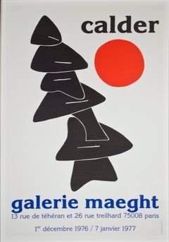
- "Stabile with Red Sun Galerie Maeght, " Original Lithograph Poster by A. CalderBy Alexander CalderLocated in Milwaukee, WI"Stabile with Red Sun Galerie Maught" is an original color lithograph by Alexander Calder. The Stabile is a black topsy-turvy statue taking up most of the piece. A red sun sits to th...Category
1970s Post-Modern Abstract Prints
MaterialsLithograph
- 'Venus & Shooting Stars Over the Mountain' giclée print canvas signed abstractBy David BarnettLocated in Milwaukee, WI‘Venus & Shooting Stars Over the Mountain’ is a reproduction giclée print on canvas, signed by the artist in the lower center. It is based after the original Mixed Media piece. Alte...Category
2010s Contemporary Mixed Media
MaterialsCanvas, Mixed Media, Watercolor, Foam Board, Giclée
- 'Human Geography' original signed mixed media artworkBy David BarnettLocated in Milwaukee, WIOriginally drawn in 1964 while Barnett was still in high school, ‘Human Geography’ depicts an anthropomorphic figure assembled from the continents. Featuring the simultaneous points ...Category
Early 2000s Contemporary Abstract Prints
MaterialsPaper, Giclée, Mixed Media
- "Pura Vida" original color woodcut print signed by Carol SummersBy Carol SummersLocated in Milwaukee, WI"Pura Vida" is an original color woodcut signed by Carol Summers. A multi-colored piece shows a waterfall with red flames behind it in the middle of the piece. On the left stands a tree with yellow leaves on a hill. To the right is a rainbow. This is an excellent example of Summer's printmaking, not just because of the technique and imagery, but because it numbered 1 of the edition of 125. In addition, it contains a personal inscription to the Milwaukee gallerist David Barnett, who has championed the work of Summers and produced catalogs of his work. Indeed, this print appears as no. 189 in the David Barnett Gallery's 1988 catalogue raisonné of Summer's woodcuts. Feel free to inquire if you would like to purchase a copy of the catalogue raisonné along with your Carol Summers print. Art: 24.25 x 24.75 in Frame: 36 x 35 in signed lower right titled and inscribed to David [Barnett] lower right edition (1/125) lower right Carol Summers (1925-2016) has worked as an artist throughout the second half of the 20th century and into the first years of the next, outliving most of his mid-century modernist peers. Initially trained as a painter, Summers was drawn to color woodcuts around 1950 and it became his specialty thereafter. Over the years he has developed a process and style that is both innovative and readily recognizable. His art is known for it’s large scale, saturated fields of bold color, semi-abstract treatment of landscapes from around the world and a luminescent quality achieved through a printmaking process he invented. In a career that has extended over half a century, Summers has hand-pulled approximately 245 woodcuts in editions that have typically run from 25 to 100 in number. His talent was both inherited and learned. Born in 1925 in Kingston, a small town in upstate New York, Summers was raised in nearby Woodstock with his older sister, Mary. His parents were both artists who had met in art school in St. Louis. During the Great Depression, when Carol was growing up, his father supported the family as a medical illustrator until he could return to painting. His mother was a watercolorist and also quite knowledgeable about the different kinds of papers used for various kinds of painting. Many years later, Summers would paint or print on thinly textured paper originally collected by his mother. From 1948 to 1951, Carol Summers trained in the classical fine and studio arts at Bard College and at the Art Students League of New York. He studied painting with Steven Hirsh and printmaking with Louis Schanker. He admired the shapes and colors favored by early modernists Paul Klee (Sw: 1879-1940) and Matt Phillips (Am: b.1927- ). After graduating, Summers quit working as a part-time carpenter and cabinetmaker (which had supported his schooling and living expenses) to focus fulltime on art. That same year, an early abstract, Bridge No. 1 was selected for a Purchase Prize in a competition sponsored by the Brooklyn Museum. In 1952, his work (Cathedral, Construction and Icarus) was shown the first time at the Museum of Modern Art in New York City in an exhibition of American woodcuts. In 1954, Summers received a grant from the Italian government to study for a year in Italy. Woodcuts completed soon after his arrival there were almost all editions of only 8 to 25 prints, small in size, architectural in content and black and white in color. The most well-known are Siennese Landscape and Little Landscape, which depicted the area near where he resided. Summers extended this trip three more years, a decision which would have significant impact on choices of subject matter and color in the coming decade. After returning from Europe, Summers’ images continued to feature historical landmarks and events from Italy as well as from France, Spain and Greece. However, as evidenced in Aetna’s Dream, Worldwind and Arch of Triumph, a new look prevailed. These woodcuts were larger in size and in color. Some incorporated metal leaf in the creation of a collage and Summers even experimented with silkscreening. Editions were now between 20 and 50 prints in number. Most importantly, Summers employed his rubbing technique for the first time in the creation of Fantastic Garden in late 1957. Dark Vision of Xerxes, a benchmark for Summers, was the first woodcut where Summers experimented using mineral spirits as part of his printmaking process. A Fulbright Grant as well as Fellowships from the Louis Comfort Tiffany Foundation and the Guggenheim Foundation followed soon thereafter, as did faculty positions at colleges and universities primarily in New York and Pennsylvania. During this period he married a dancer named Elaine Smithers with whom he had one son, Kyle. Around this same time, along with fellow artist Leonard Baskin, Summers pioneered what is now referred to as the “monumental” woodcut. This term was coined in the early 1960s to denote woodcuts that were dramatically bigger than those previously created in earlier years, ones that were limited in size mostly by the size of small hand-presses. While Baskin chose figurative subject matter, serious in nature and rendered with thick, striated lines, Summers rendered much less somber images preferring to emphasize shape and color; his subject matter approached abstraction but was always firmly rooted in the landscape. In addition to working in this new, larger scale, Summers simultaneously refined a printmaking process which would eventually be called the “Carol Summers Method” or the “ Carol Summers Technique”. Summers produces his woodcuts by hand, usually from one or more blocks of quarter-inch pine, using oil-based printing inks and porous mulberry papers. His woodcuts reveal a sensitivity to wood especially its absorptive qualities and the subtleties of the grain. In several of his woodcuts throughout his career he has used the undulating, grainy patterns of a large wood plank to portray a flowing river or tumbling waterfall. The best examples of this are Dream, done in 1965 and the later Flash Flood Escalante, in 2003. In the majority of his woodcuts, Summers makes the blocks slightly larger than the paper so the image and color will bleed off the edge. Before printing, he centers a dry sheet of paper over the top of the cut wood block or blocks, securing it with giant clips. Then he rolls the ink directly on the front of the sheet of paper and pressing down onto the dry wood block or reassembled group of blocks. Summers is technically very proficient; the inks are thoroughly saturated onto the surface of the paper but they do not run into each other. The precision of the color inking in Constantine’s Dream in 1969 and Rainbow Glacier in 1970 has been referred to in various studio handbooks. Summers refers to his own printing technique as “rubbing”. In traditional woodcut printing, including the Japanese method, the ink is applied directly onto the block. However, by following his own method, Summers has avoided the mirror-reversed image of a conventional print and it has given him the control over the precise amount of ink that he wants on the paper. After the ink is applied to the front of the paper, Summers sprays it with mineral spirits, which act as a thinning agent. The absorptive fibers of the paper draw the thinned ink away from the surface softening the shapes and diffusing and muting the colors. This produces a unique glow that is a hallmark of the Summers printmaking technique. Unlike the works of other color field artists or modernists of the time, this new technique made Summers’ extreme simplification and flat color areas anything but hard-edged or coldly impersonal. By the 1960s, Summers had developed a personal way of coloring and printing and was not afraid of hard work, doing the cutting, inking and pulling himself. In 1964, at the age of 38, Summers’ work was exhibited for a second time at the Museum of Modern Art. This time his work was featured in a one-man show and then as one of MOMA’s two-year traveling exhibitions which toured throughout the United States. In subsequent years, Summers’ works would be exhibited and acquired for the permanent collections of multiple museums throughout the United States, Europe and Asia. Summers’ familiarity with landscapes throughout the world is firsthand. As a navigator-bombardier in the Marines in World War II, he toured the South Pacific and Asia. Following college, travel in Europe and subsequent teaching positions, in 1972, after 47 years on the East Coast, Carol Summers moved permanently to Bonny Doon in the Santa Cruz Mountains in Northern California. There met his second wife, Joan Ward Toth, a textile artist who died in 1998; and it was here his second son, Ethan was born. During the years that followed this relocation, Summers’ choice of subject matter became more diverse although it retained the positive, mostly life-affirming quality that had existed from the beginning. Images now included moons, comets, both sunny and starry skies, hearts and flowers, all of which, in one way or another, remained tied to the landscape. In the 1980s, from his home and studio in the Santa Cruz mountains, Summers continued to work as an artist supplementing his income by conducting classes and workshops at universities in California and Oregon as well as throughout the Mid and Southwest. He also traveled extensively during this period hiking and camping, often for weeks at a time, throughout the western United States and Canada. Throughout the decade it was not unusual for Summers to backpack alone or with a fellow artist into mountains or back country for six weeks or more at a time. Not surprisingly, the artwork created during this period rarely departed from images of the land, sea and sky. Summers rendered these landscapes in a more representational style than before, however he always kept them somewhat abstract by mixing geometric shapes with organic shapes, irregular in outline. Some of his most critically acknowledged work was created during this period including First Rain, 1985 and The Rolling Sea, 1989. Summers received an honorary doctorate from his alma mater, Bard College in 1979 and was selected by the United States Information Agency to spend a year conducting painting and printmaking workshops at universities throughout India. Since that original sabbatical, he has returned every year, spending four to eight weeks traveling throughout that country. In the 1990s, interspersed with these journeys to India have been additional treks to the back roads and high country areas of Mexico, Central America, Nepal, China and Japan. Travel to these exotic and faraway places had a profound influence on Summers’ art. Subject matter became more worldly and nonwestern as with From Humla to Dolpo, 1991 or A Former Life of Budha, 1996, for example. Architectural images, such as The Pillars of Hercules, 1990 or The Raja’s Aviary, 1992 became more common. Still life images made a reappearance with Jungle Bouquet in 1997. This was also a period when Summers began using odd-sized paper to further the impact of an image. The 1996 Night, a view of the earth and horizon as it might be seen by an astronaut, is over six feet long and only slightly more than a foot-and-a-half high. From 1999, Revuelta A Vida (Spanish for “Return to Life”) is pie-shaped and covers nearly 18 cubic feet. It was also at this juncture that Summers began to experiment with a somewhat different palette although he retained his love of saturated colors. The 2003 Far Side of Time is a superb example of the new direction taken by this colorist. At the turn of the millennium in 1999, “Carol Summers Woodcuts...Category
1980s Contemporary Abstract Prints
MaterialsWoodcut
- "India, " Abstract Woodcut and Monotype signed by Carol SummersBy Carol SummersLocated in Milwaukee, WI"India" is a woodcut and monotype signed by Carol Summers. Here, Summer's abstract language for landscape imagery is taken to its most extreme: The image offers a view of a highly stylized waterfall, with red water falling down behind green foliage below. A hint of light blue at the lower left suggests a continuation of the water's flow. Above, purples and yellows mist upward from the power of the water. The playfulness of the image is enhanced by Summers' signature printmaking technique, which allows the ink from the woodblock to seep through the paper, blurring the edges of each form. Summers' signature can be found in pencil at the bottom of the rightmost blue form, with the title and edition at the bottom of the leftmost blue form. A copy of this print can be found in the collection of the Fine Arts Museums of San Francisco. 37.25 x 24.88 inches, artwork 48.5 x 35.5 inches, frame Numbered 44 from the edition of 75 Carol Summers (1925-2016) has worked as an artist throughout the second half of the 20th century and into the first years of the next, outliving most of his mid-century modernist peers. Initially trained as a painter, Summers was drawn to color woodcuts around 1950 and it became his specialty thereafter. Over the years he has developed a process and style that is both innovative and readily recognizable. His art is known for it’s large scale, saturated fields of bold color, semi-abstract treatment of landscapes from around the world and a luminescent quality achieved through a printmaking process he invented. In a career that has extended over half a century, Summers has hand-pulled approximately 245 woodcuts in editions that have typically run from 25 to 100 in number. His talent was both inherited and learned. Born in 1925 in Kingston, a small town in upstate New York, Summers was raised in nearby Woodstock with his older sister, Mary. His parents were both artists who had met in art school in St. Louis. During the Great Depression, when Carol was growing up, his father supported the family as a medical illustrator until he could return to painting. His mother was a watercolorist and also quite knowledgeable about the different kinds of papers used for various kinds of painting. Many years later, Summers would paint or print on thinly textured paper originally collected by his mother. From 1948 to 1951, Carol Summers trained in the classical fine and studio arts at Bard College and at the Art Students League of New York. He studied painting with Steven Hirsh and printmaking with Louis Schanker. He admired the shapes and colors favored by early modernists Paul Klee (Sw: 1879-1940) and Matt Phillips (Am: b.1927- ). After graduating, Summers quit working as a part-time carpenter and cabinetmaker (which had supported his schooling and living expenses) to focus fulltime on art. That same year, an early abstract, Bridge No. 1 was selected for a Purchase Prize in a competition sponsored by the Brooklyn Museum. In 1952, his work (Cathedral, Construction and Icarus) was shown the first time at the Museum of Modern Art in New York City in an exhibition of American woodcuts. In 1954, Summers received a grant from the Italian government to study for a year in Italy. Woodcuts completed soon after his arrival there were almost all editions of only 8 to 25 prints, small in size, architectural in content and black and white in color. The most well-known are Siennese Landscape and Little Landscape, which depicted the area near where he resided. Summers extended this trip three more years, a decision which would have significant impact on choices of subject matter and color in the coming decade. After returning from Europe, Summers’ images continued to feature historical landmarks and events from Italy as well as from France, Spain and Greece. However, as evidenced in Aetna’s Dream, Worldwind and Arch of Triumph, a new look prevailed. These woodcuts were larger in size and in color. Some incorporated metal leaf in the creation of a collage and Summers even experimented with silkscreening. Editions were now between 20 and 50 prints in number. Most importantly, Summers employed his rubbing technique for the first time in the creation of Fantastic Garden in late 1957. Dark Vision of Xerxes, a benchmark for Summers, was the first woodcut where Summers experimented using mineral spirits as part of his printmaking process. A Fulbright Grant as well as Fellowships from the Louis Comfort Tiffany Foundation and the Guggenheim Foundation followed soon thereafter, as did faculty positions at colleges and universities primarily in New York and Pennsylvania. During this period he married a dancer named Elaine Smithers with whom he had one son, Kyle. Around this same time, along with fellow artist Leonard Baskin, Summers pioneered what is now referred to as the “monumental” woodcut. This term was coined in the early 1960s to denote woodcuts that were dramatically bigger than those previously created in earlier years, ones that were limited in size mostly by the size of small hand-presses. While Baskin chose figurative subject matter, serious in nature and rendered with thick, striated lines, Summers rendered much less somber images preferring to emphasize shape and color; his subject matter approached abstraction but was always firmly rooted in the landscape. In addition to working in this new, larger scale, Summers simultaneously refined a printmaking process which would eventually be called the “Carol Summers Method” or the “ Carol Summers Technique”. Summers produces his woodcuts by hand, usually from one or more blocks of quarter-inch pine, using oil-based printing inks and porous mulberry papers. His woodcuts reveal a sensitivity to wood especially its absorptive qualities and the subtleties of the grain. In several of his woodcuts throughout his career he has used the undulating, grainy patterns of a large wood plank to portray a flowing river or tumbling waterfall. The best examples of this are Dream, done in 1965 and the later Flash Flood Escalante, in 2003. In the majority of his woodcuts, Summers makes the blocks slightly larger than the paper so the image and color will bleed off the edge. Before printing, he centers a dry sheet of paper over the top of the cut wood block or blocks, securing it with giant clips. Then he rolls the ink directly on the front of the sheet of paper and pressing down onto the dry wood block or reassembled group of blocks. Summers is technically very proficient; the inks are thoroughly saturated onto the surface of the paper but they do not run into each other. The precision of the color inking in Constantine’s Dream in 1969 and Rainbow Glacier in 1970 has been referred to in various studio handbooks. Summers refers to his own printing technique as “rubbing”. In traditional woodcut printing, including the Japanese method, the ink is applied directly onto the block. However, by following his own method, Summers has avoided the mirror-reversed image of a conventional print and it has given him the control over the precise amount of ink that he wants on the paper. After the ink is applied to the front of the paper, Summers sprays it with mineral spirits, which act as a thinning agent. The absorptive fibers of the paper draw the thinned ink away from the surface softening the shapes and diffusing and muting the colors. This produces a unique glow that is a hallmark of the Summers printmaking technique. Unlike the works of other color field artists or modernists of the time, this new technique made Summers’ extreme simplification and flat color areas anything but hard-edged or coldly impersonal. By the 1960s, Summers had developed a personal way of coloring and printing and was not afraid of hard work, doing the cutting, inking and pulling himself. In 1964, at the age of 38, Summers’ work was exhibited for a second time at the Museum of Modern Art. This time his work was featured in a one-man show and then as one of MoMA’s two-year traveling exhibitions which toured throughout the United States. In subsequent years, Summers’ works would be exhibited and acquired for the permanent collections of multiple museums throughout the United States, Europe and Asia. Summers’ familiarity with landscapes throughout the world is firsthand. As a navigator-bombardier in the Marines in World War II, he toured the South Pacific and Asia. Following college, travel in Europe and subsequent teaching positions, in 1972, after 47 years on the East Coast, Carol Summers moved permanently to Bonny Doon in the Santa Cruz Mountains in Northern California. There met his second wife, Joan Ward Toth, a textile artist who died in 1998; and it was here his second son, Ethan was born. During the years that followed this relocation, Summers’ choice of subject matter became more diverse although it retained the positive, mostly life-affirming quality that had existed from the beginning. Images now included moons, comets, both sunny and starry skies, hearts and flowers, all of which, in one way or another, remained tied to the landscape. In the 1980s, from his home and studio in the Santa Cruz mountains, Summers continued to work as an artist supplementing his income by conducting classes and workshops at universities in California and Oregon as well as throughout the Mid and Southwest. He also traveled extensively during this period hiking and camping, often for weeks at a time, throughout the western United States and Canada. Throughout the decade it was not unusual for Summers to backpack alone or with a fellow artist into mountains or back country for six weeks or more at a time. Not surprisingly, the artwork created during this period rarely departed from images of the land, sea and sky. Summers rendered these landscapes in a more representational style than before, however he always kept them somewhat abstract by mixing geometric shapes with organic shapes, irregular in outline. Some of his most critically acknowledged work was created during this period including First Rain, 1985 and The Rolling Sea, 1989. Summers received an honorary doctorate from his alma mater, Bard College in 1979 and was selected by the United States Information Agency to spend a year conducting painting and printmaking workshops at universities throughout India. Since that original sabbatical, he has returned every year, spending four to eight weeks traveling throughout that country. In the 1990s, interspersed with these journeys to India have been additional treks to the back roads and high country areas of Mexico, Central America, Nepal, China and Japan. Travel to these exotic and faraway places had a profound influence on Summers’ art. Subject matter became more worldly and nonwestern as with From Humla to Dolpo, 1991 or A Former Life of Budha, 1996, for example. Architectural images, such as The Pillars of Hercules, 1990 or The Raja’s Aviary, 1992 became more common. Still life images made a reappearance with Jungle Bouquet in 1997. This was also a period when Summers began using odd-sized paper to further the impact of an image. The 1996 Night, a view of the earth and horizon as it might be seen by an astronaut, is over six feet long and only slightly more than a foot-and-a-half high. From 1999, Revuelta A Vida (Spanish for “Return to Life”) is pie-shaped and covers nearly 18 cubic feet. It was also at this juncture that Summers began to experiment with a somewhat different palette although he retained his love of saturated colors. The 2003 Far Side of Time is a superb example of the new direction taken by this colorist. At the turn of the millennium in 1999, “Carol Summers Woodcuts...Category
1990s Contemporary Abstract Prints
MaterialsMonotype, Woodcut
You May Also Like
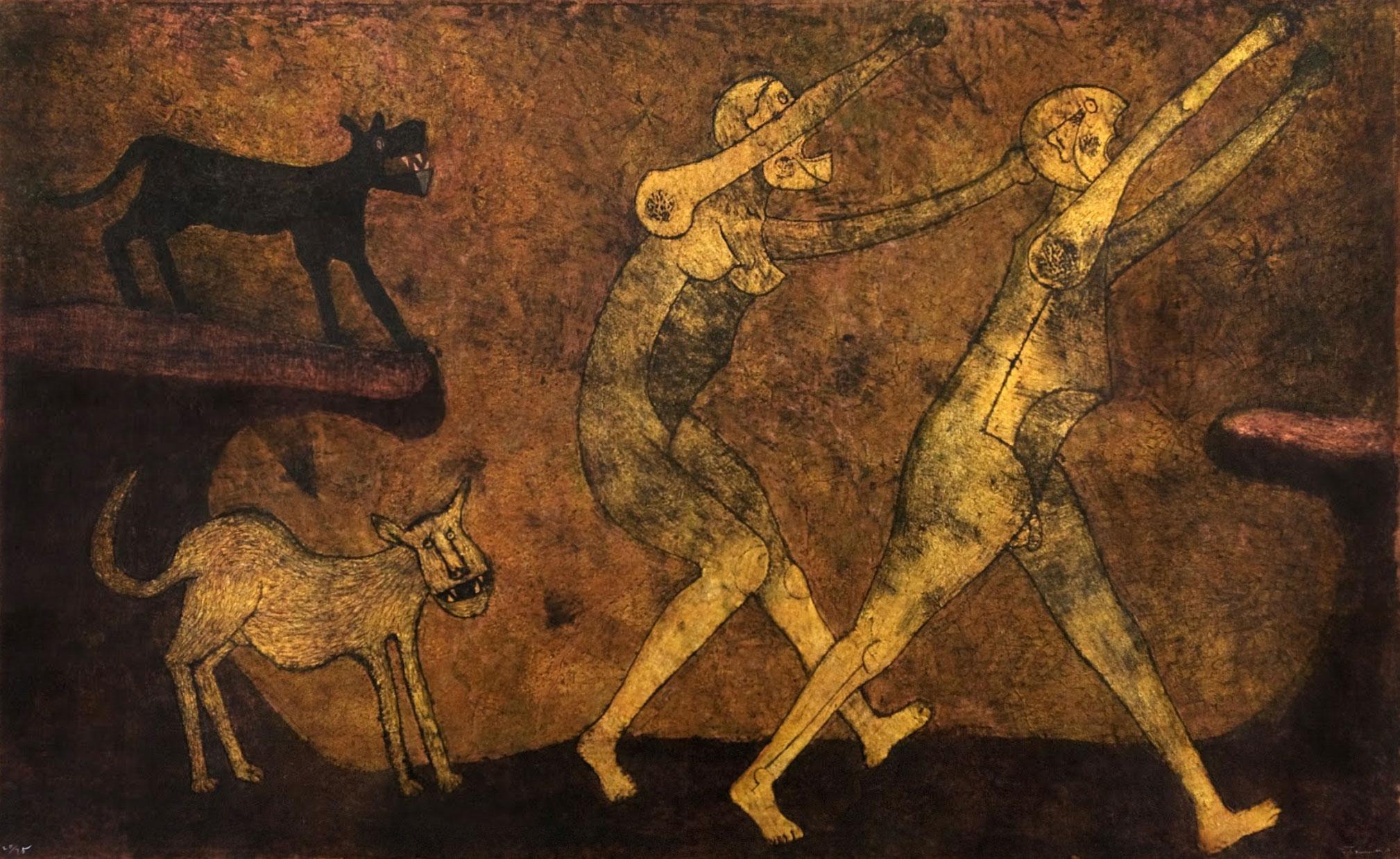
- "Dos Personajes Atacado Per Perros", Rufino Tamayo, Mixographia, 61x98, ModernBy Rufino TamayoLocated in Dallas, TX"Dos Personajes Atacado Per Perros" by Rufino Tamayo is a Figurative Abstraction Mixographia on amate paper measuring 61x98 in. The piece is sandwiched between two pieces of plexigla...Category
1980s Post-Modern Figurative Prints
MaterialsMixed Media
- The Songs of the Blacks and the BluesBy Louise BourgeoisLocated in Ljubljana, SIThe Songs of the Blacks and the Blues. Original color lithograph, woodcut, gouache and oil-stick editions, 1996. Edition of 40 signed and numbered impressions on Arches paper. Louise...Category
1990s Post-Modern Abstract Prints
MaterialsMixed Media, Gouache, Lithograph, Woodcut
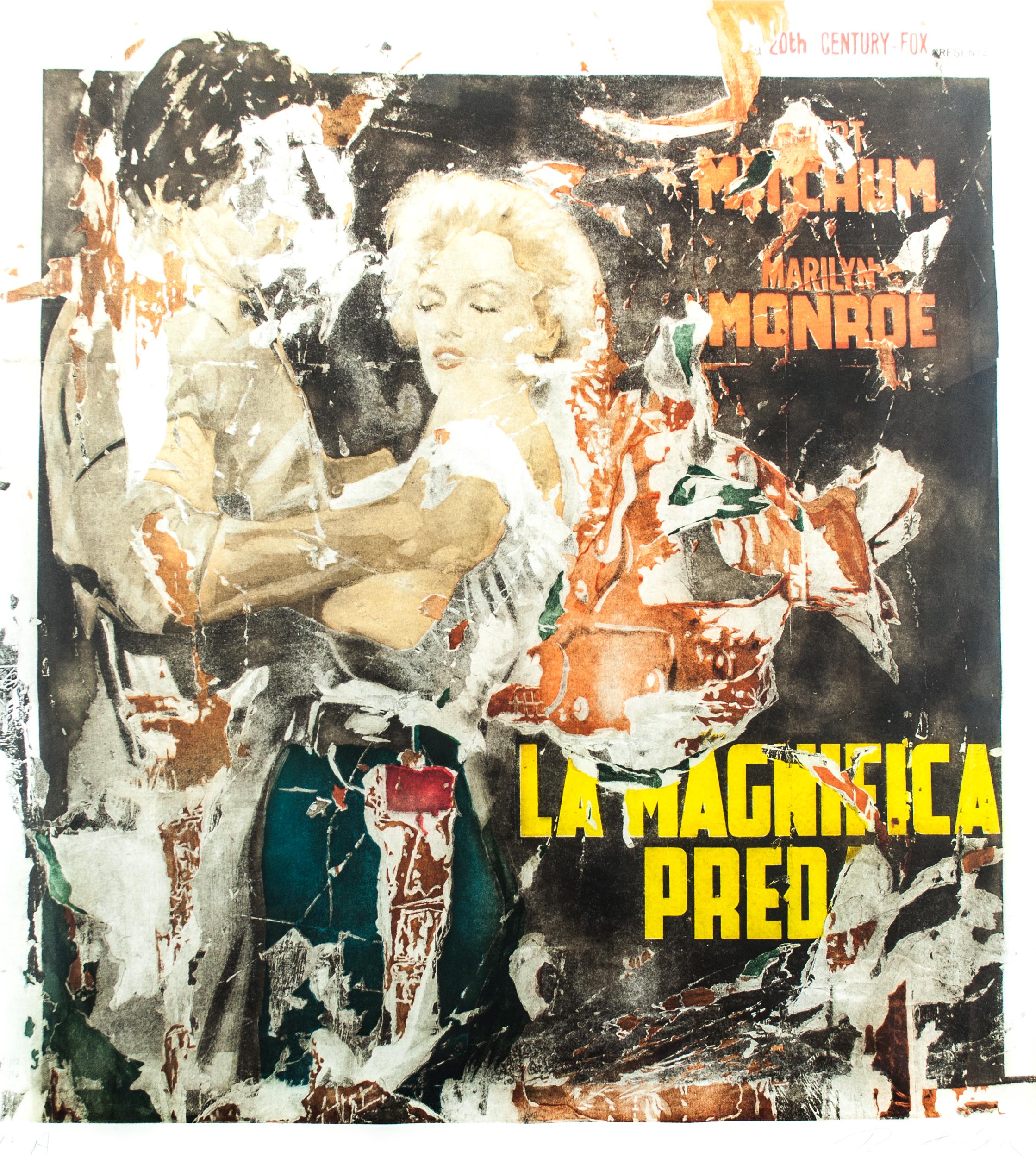
- La Magnifica PredaBy Mimmo RotellaLocated in Ljubljana, SILa Magnifica Preda. Original color silkscreen and collage, unknown year. Edition of E.A. (artist’s proof) signed and numbered impressions on Arches paper. Mimmo Rotella was an Italia...Category
Late 20th Century Post-Modern Figurative Prints
MaterialsMixed Media, Screen
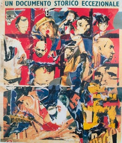
- Un Documento Storico EccezionaleBy Mimmo RotellaLocated in Ljubljana, SIUn Documento Storico Eccezionale (eng. An exceptional historical document). Original color silkscreen and collage, unknown year. Edition of 20 signed and numbered impressions on Arch...Category
Late 20th Century Post-Modern Abstract Prints
MaterialsMixed Media, Screen
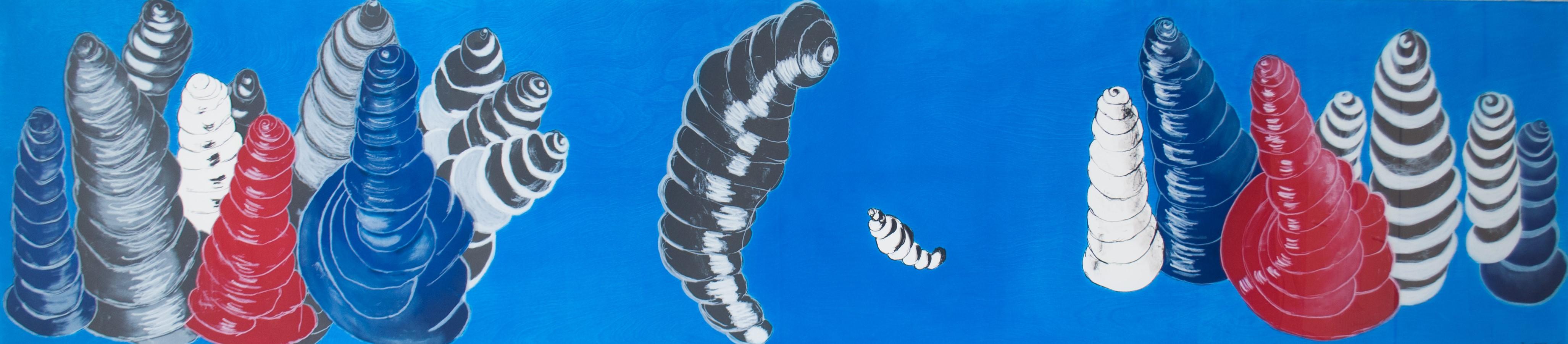
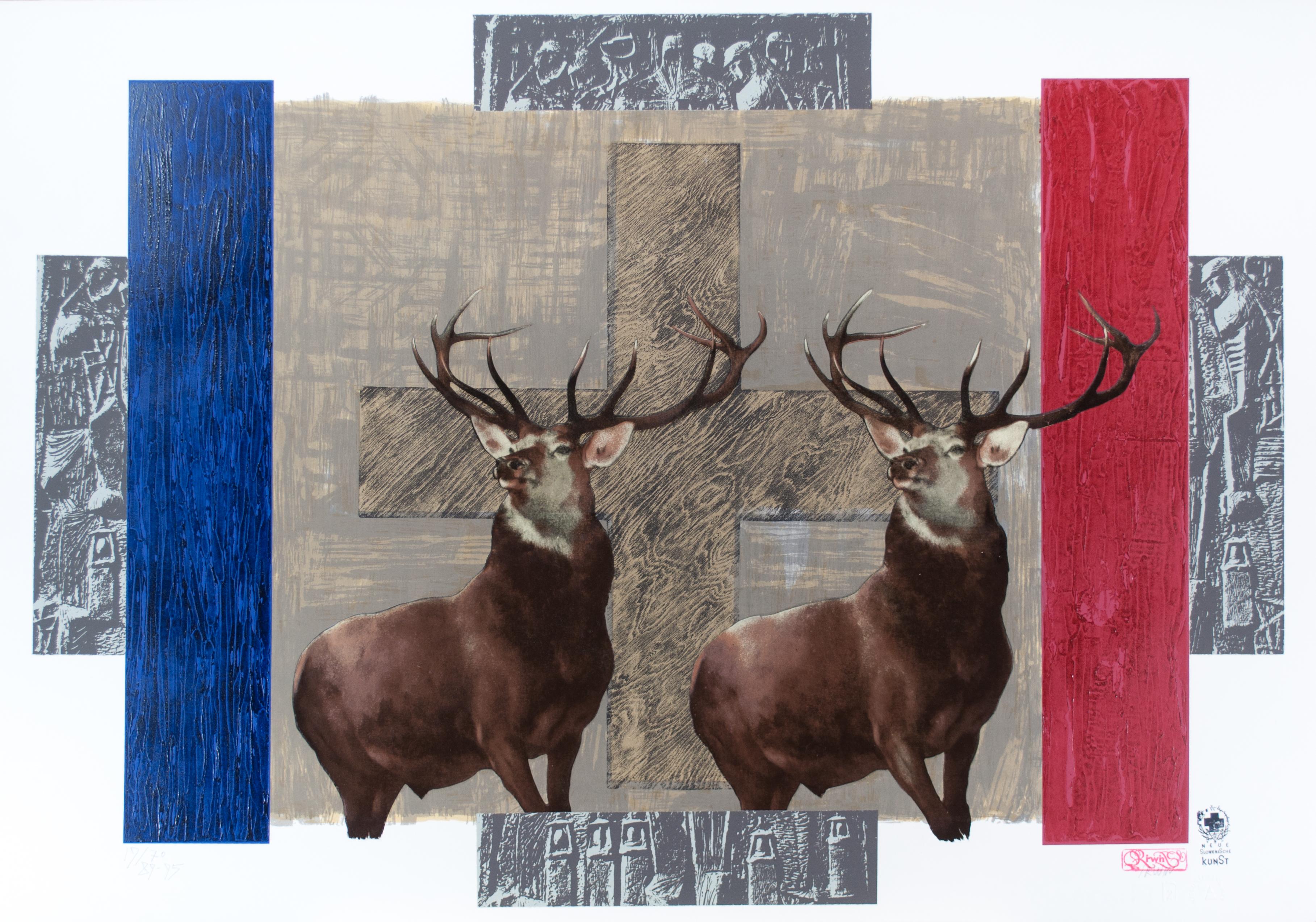
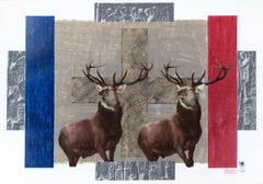
- Toronto Portfolio “Deers”Located in Ljubljana, SIToronto Portfolio “Deers”. Original mixed media and collage, 1989-95. Edition of 70 signed and numbered impressions on Arches paper. IRWIN is a political internationally acclaimed group of five Slovenian artists (Dusan Mandic, Miran Mohar, Andrej Savski, Roman Uranjek and Bort Vogelnik), primarily painters, and an original founding member of Neue Slowenische Kunst...Category
1990s Post-Modern Abstract Prints
MaterialsMixed Media
- NocturnsLocated in Barcelona, ESIncludes a Certificate of AuthenticityCategory
1960s Post-Modern Abstract Prints
MaterialsCanvas, Mixed Media


Recently Viewed
View AllMore Ways To Browse
Don Green
Donner Plates
Vintage Blue Wine
American Vintage Wine
Art With Wine Bottles
Vintage Kitchen Prints
Gate Posts
Vintage Wine Art Prints
Bill Hall
Framed Print Shoulder
Surreal Etching
Red Vintage Car
Farm Animal Prints
Bill Heads
Vintage Kitchen Art Prints
Large Wine Bottles
Contemporary Modern Serigraph
Red Glass Tree Art