Larry RiversThe Last Civil War Veteran1970
1970
About the Item
- Creator:Larry Rivers (1923 - 2002, American)
- Creation Year:1970
- Dimensions:Height: 31.25 in (79.38 cm)Width: 22 in (55.88 cm)Depth: 1.25 in (3.18 cm)
- Medium:
- Movement & Style:
- Period:
- Condition:Work itself is in fine condition; held in vintage 1970s frame (frames are as is).
- Gallery Location:New York, NY
- Reference Number:1stDibs: LU1745211125592
Larry Rivers
Figurative artist Larry Rivers was born in the Bronx in 1923 to Ukrainian Jewish parents, and was named Yitzak Loiza Grossberg. Rivers belonged to the second generation of the New York School of painters, although unlike most of his contemporaries he stayed away from abstraction instead preferring narrative paintings. He began his artistic career playing the jazz saxophone, and when one night his group was introduced as "Larry Rivers and the Mudcats," he decided to keep the name.
After a brief period in the army during World War II, Rivers attended Juilliard School of Music for one year before returning to the jazz saxophone. After he met the painter Jane Freilicher, he decided to devote himself to painting. Rivers attended Hans Hofmann's school for nearly two years. In 1949, he had his first solo show at the Jane Street Gallery, an artist's co-op in the Village. Rivers received favorable reviews and was invited to join the Tibor de Nagy Gallery uptown.
Rivers continued to show annually at the Tibor de Nagy Gallery from 1952 to 1962. In 1963, he joined the Marlborough Gallery, where he stayed until his death. In 1955, The New York Museum of Modern Art acquired his painting Washington Crossing the Delaware, and in 1956 the Whitney Museum purchased Double Portrait of Berdie, two of his more famous paintings. He had periodic museum shows in Europe and the United States throughout his career.
Rivers had two sons, Joseph and Steven, by his first wife, Augusta. In 1961 he married Clarice Price and had two more children, Gwynne and Emma. In the 1970s he had another son with the painter Daria Deshuk.
The subjects of River's figurative paintings were family, history, politics, religion and sex. His work done in oils often included the use of stencils, cutouts, blank canvas and image reversals. He often painted family members including his mother in law, his sons and his ex-wife. Rivers favored historical subjects such as History of Matzah: The Story of the Jews (1984-85), History of the Russian Revolution (1965) and often painted parodies including his Washington Crossing the Delaware. He enjoyed controversial subjects and shocking the public. Lapman Loves It (1966) is a nine-foot electrified assemblage complete with strategically located light bulbs. French Vocabulary Lesson (1961-62) is a nude with body parts labeled in French.
Rivers was also a writer. In 1979 he published Drawings and Digressions with Carol Brightman. In 1992 he published What Did I Do? The Unauthorized Autobiography with Arnold Weinstein.
Find original Larry Rivers prints and paintings on 1stDibs.
(Biography provided by Lincoln Glenn)
- ShippingRetrieving quote...Ships From: New York, NY
- Return PolicyA return for this item may be initiated within 1 day of delivery.
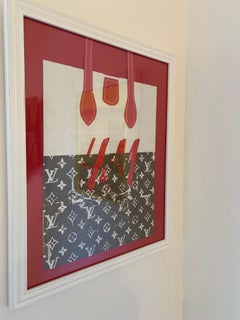
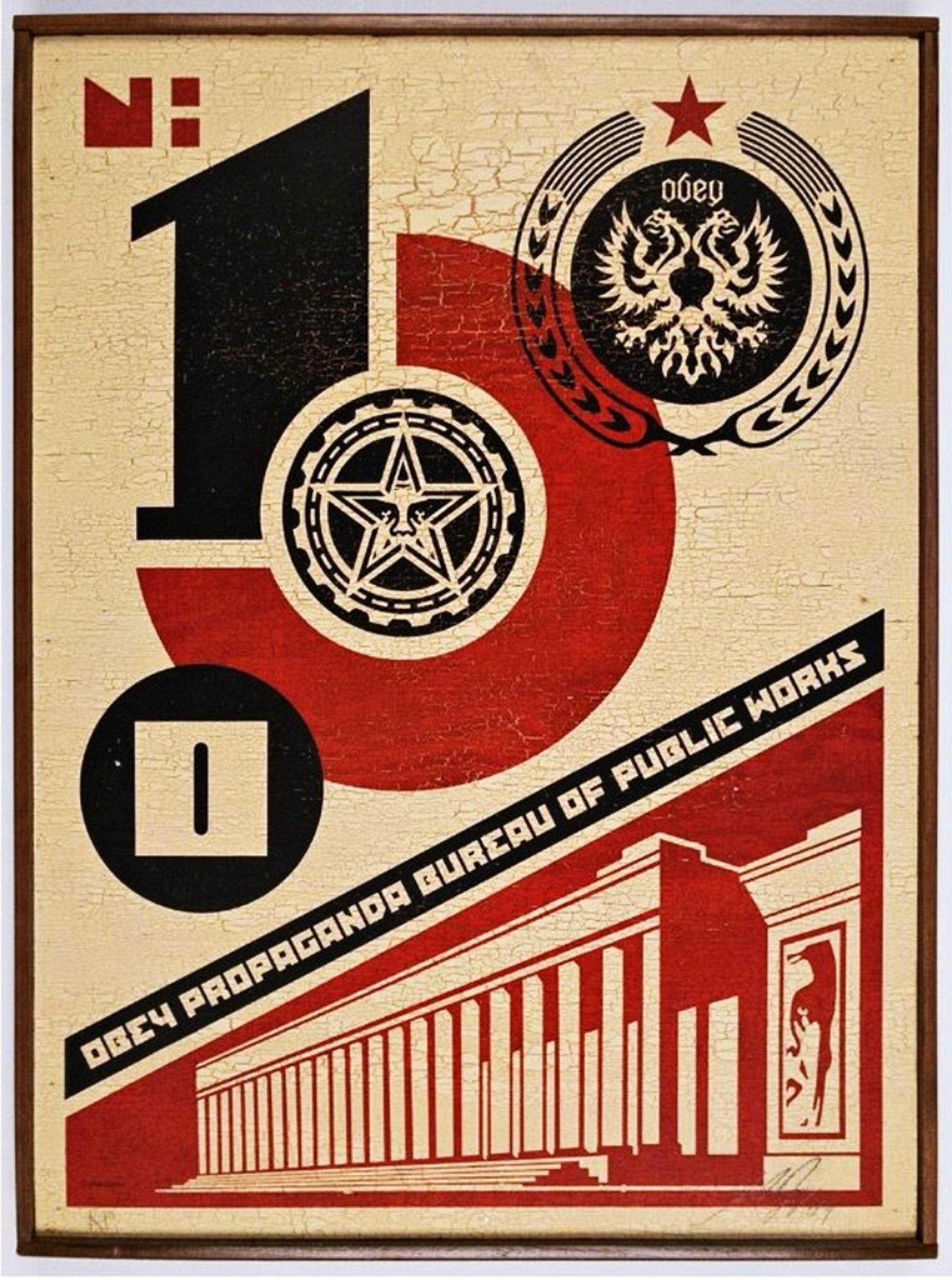
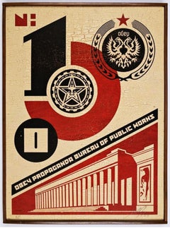
- Bureau of Public Works (Mixed Media on Wood)By Shepard FaireyLocated in New York, NYSHEPARD FAIREY Bureau of Public Works (on Wood), 2004 Mixed media silkscreen on wood panel. Hand signed and annotated on both the recto and verso. In original handmade artist's frame...Category
Early 2000s Pop Art Mixed Media
MaterialsPencil, Screen, Mixed Media, Wood
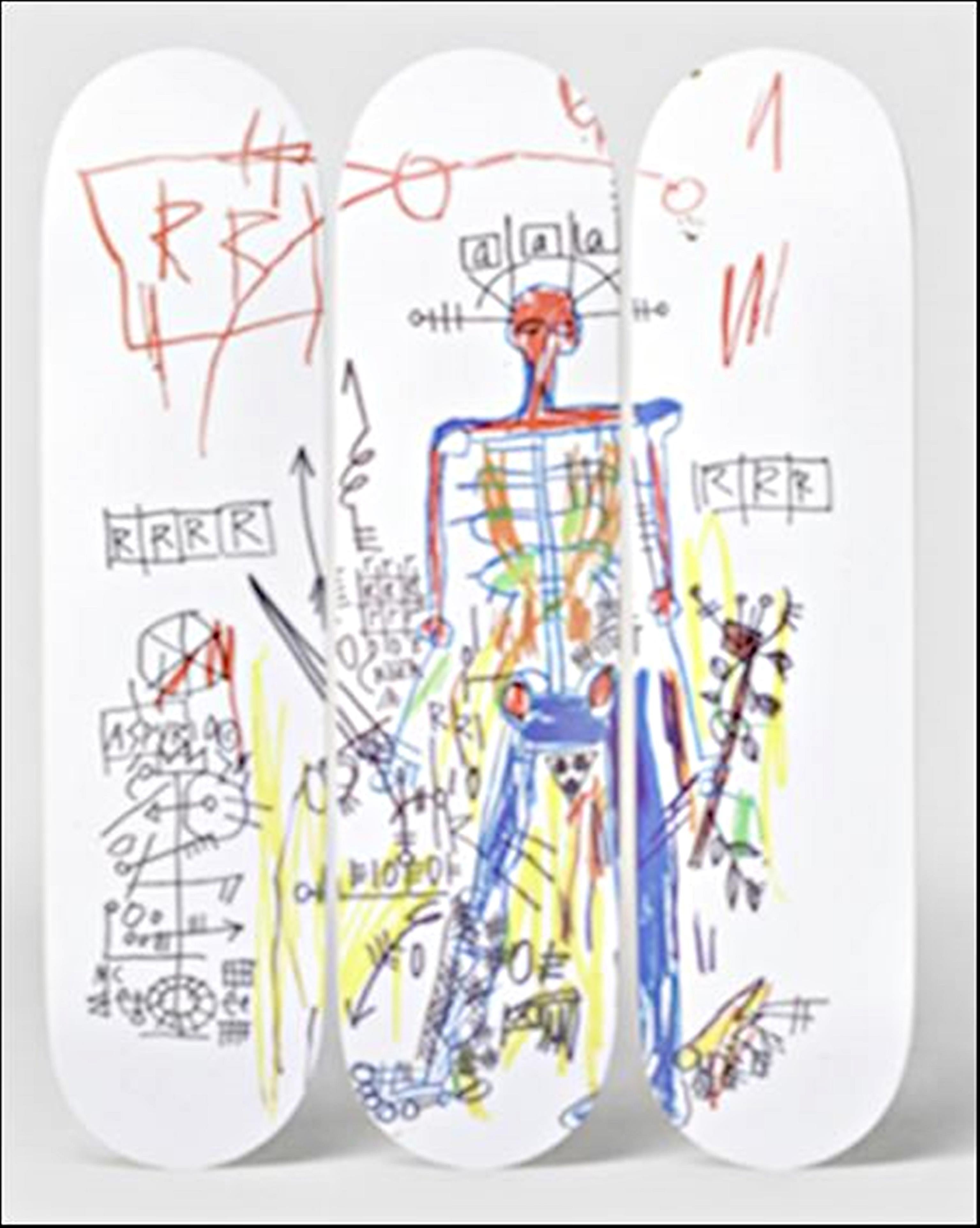
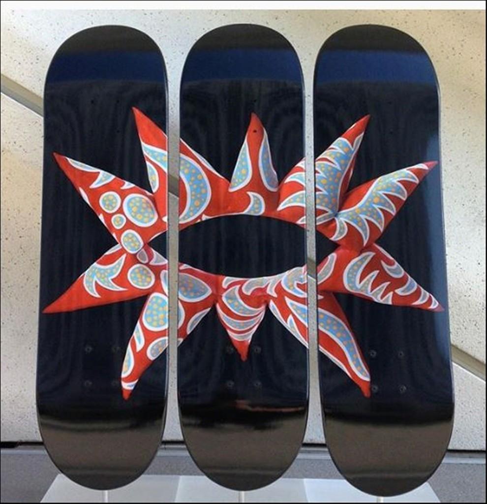
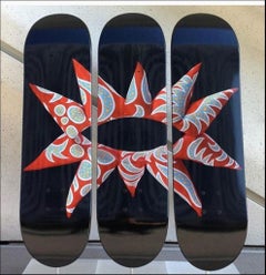
- ROBOT Triptych (Set of Three (3) Skateboards)By Jean-Michel BasquiatLocated in New York, NYJean-Michel Basquiat ROBOT Triptych (Set of Three (3) Skateboards), 2017 Set of 3 Silkscreens on 7-Ply Canadian Maplewood Skate Decks (Set of 3) Estate of Jean-Michel Basquiat copyri...Category
2010s Pop Art Abstract Prints
MaterialsWood, Maple, Mixed Media, Screen
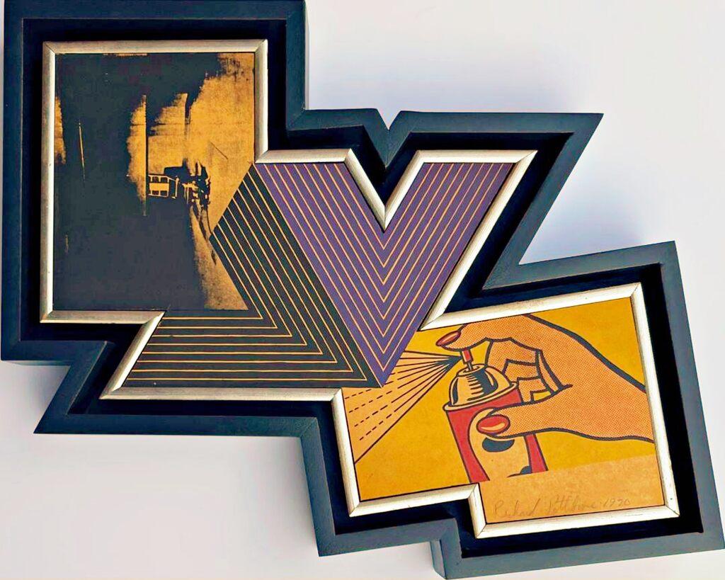
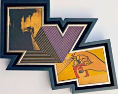
- The Appropriation piece: Andy Warhol, Frank Stella, Roy Lichtenstein Unique varBy Richard PettiboneLocated in New York, NYRichard Pettibone The Appropriation Print Andy Warhol, Frank Stella, Roy Lichtenstein, 1970 Silkscreen in colors on masonite board (unique variant on sculpted board) Hand-signed by artist, Signed and dated on the front (see close up image) Bespoke frame Included This is a rare example of Pettibone's iconic Appropriation Print, as it's silkscreened and sculpted on masonite board rather than paper, giving it a different background hue, and enabling it work to be framed so uniquely. The Appropriation print is one of the most coveted prints Pettibone ever created ; the regular edition is on a full sheet with white background; the present example was silkscreened on board, allowing it to be framed in 3-D. While we do not know how many examples of this graphic work Pettibone created, so far the present work is the only one example we have ever seen on the public market since 1970. (Other editions of The Appropriation Print have been printed on vellum, wove paper and pink and yellow paper.) This 1970 homage to Andy Warhol, Frank Stella and Roy Lichtenstein exemplifies the type of artistic appropriation he was engaging in early on during the height of the Pop Art movement - long before more contemporary artists like Deborah Kass, Louise Lawler, etc. followed suit. This silkscreen was in its original 1970 vintage period frame; a bespoke custom hand cut black wood outer frame was subsequently created especially to house the work, giving it a distinctive sculptural aesthetic. Measurements: Framed 14.5 inches vertical by 18 inches horizontal by 2 inches Work 13 inches vertical by 16.5 inches horizontal Richard Pettibone biography: Richard Pettibone (American, b.1938) is one of the pioneering artists to use appropriation techniques. Pettibone was born in Los Angeles, and first worked with shadow boxes and assemblages, illustrating his interest in craft, construction, and working in miniature scales. In 1964, he created the first of his appropriated pieces, two tiny painted “replicas” of the iconic Campbell’s soup cans by Andy Warhol (American, 1928–1987). By 1965, he had created several “replicas” of paintings by American artists, such as Warhol, Roy Lichtenstein (1923–1997), Ed Ruscha (b.1937), and others, among them some of the biggest names in Pop Art. Pettibone chose to recreate the work of leading avant-garde artists whose careers were often centered on themes of replication themselves, further lending irony to his work. Pettibone also created both miniature and life-sized sculptural works, including an exact copy of Bicycle Wheel by Marcel Duchamp (French, 1887–1968), and in the 1980s, an entire series of sculptures of varying sizes replicating the most famous works of Constantin Brancusi (Romanian, 1876–1957). In more recent years, Pettibone has created paintings based on the covers of poetry books by Ezra Pound, as well as sculptures drawn from the grid compositions of Piet Mondrian (Dutch, 1872–1944). Pettibone straddles the lines of appropriation, Pop, and Conceptual Art, and has received critical attention for decades for the important questions his work raises about authorship, craftsmanship, and the original in art. His work has been exhibited at the Institute for Contemporary Art in Philadelphia, the Museum of Modern Art in New York, the Museum of Contemporary Art in Miami, and the Laguna Art Museum in Laguna Beach, CA. Pettibone is currently based in New York. "I wished I had stuck with the idea of just painting the same painting like the soup can and never painting another painting. When someone wanted one, you would just do another one. Does anybody do that now?" Andy Warhol, 1981 Since the mid-1960s, Richard Pettibone has been making hand-painted, small-scale copies of works by other artists — a practice due to which he is best known as a precursor of appropriation art — and for a decade now, he has been revisiting subjects from across his career. In his latest exhibitions at Castelli Gallery, Pettibone has been showing more of the “same” paintings that had already been part of his 2005–6 museum retrospective,1 and also including “new” subject matter drawn from his usual roster of European modernists and American postwar artists. Art critic Kim Levin laid out some phases of the intricate spectrum from copies to repetitions in her review of the Warhol-de Chirico showdown, a joint exhibition at the heyday of appropriation art in the mid-1980s when Warhol’s appropriations of de Chirico’s work effectively revaluated “the grand old auto-appropriator”. Upon having counted well over a dozen Disquieting Muses by de Chirico, Levin speculated: “Maybe he kept doing them because no one got the point. Maybe he needed the money. Maybe he meant it when he said his technique had improved, and traditional skills were what mattered.” On the other side, Warhol, in her eyes, was the “latter-day exemplar of museless creativity”. To Pettibone, traditional skills certainly still matter, as he practices his contemporary version of museless creativity. He paints the same painting again and again, no matter whether anybody shows an interest in it or not. His work, of course, takes place well outside the historical framework of what Levin aptly referred to as the “modern/postmodern wrestling match”, but neither was this exactly his match to begin with. Pettibone is one of appropriation art’s trailblazers, but his diverse selection of sources removes from his work the critique of the modernist myth of originality most commonly associated with appropriation art in a narrow sense, as we see, for example, in Sherrie Levine’s practice of re-photographing the work of Walker Evans and Edward Weston. In particular, during his photorealist phase of the 1970s, Pettibone’s sources ranged widely across several art-historical periods. His appropriations of the 1980s and 1990s spanned from Picasso etchings and Brancusi sculptures to Shaker furniture and even included Ezra Pound’s poetry. Pettibone has professed outright admiration for his source artists, whose work he shrinks and tweaks to comic effect but, nevertheless, always treats with reverence and care. His response to these artists is primarily on an aesthetic level, owing much to the fact that his process relies on photographs. By the same token, the aesthetic that attracts him is a graphic one that lends itself to reproduction. Painstakingly copying other artists’ work by hand has been a way of making it his own, yet each source is acknowledged in his titles and, occasionally, in captions on white margins that he leaves around the image as an indication that the actual source is a photographic image. The enjoyment he receives in copying is part of the motivation behind doing it, as is the pleasure he receives from actually being with the finished painting — a considerable private dimension of his work. His copies are “handmade readymades” that he meticulously paints in great quantities in his studio upstate in New York; the commitment to manual labor and the time spent at material production has become an increasingly important dimension of his recent work. Pettibone operates at some remove from the contemporary art scene, not only by staying put geographically, but also by refusing to recoup the simulated lack of originality through the creation of a public persona. In so doing, Pettibone takes a real risk. He places himself in opposition to conceptualism, and he is apprehensive of an understanding of art as the mere illustration of an idea. His reading of Marcel Duchamp’s works as beautiful is revealing about Pettibone’s priorities in this respect. When Pettibone, for aesthetic pleasure, paints Duchamp’s Poster...Category
1970s Pop Art Mixed Media
MaterialsMasonite, Mixed Media, Screen, Pencil
- With all My Flowering Heart Skateboard Triptych, 3 Limited Edition Skate DecksBy Yayoi KusamaLocated in New York, NYYayoi Kusama With All My Flowering Heart (Triptych), 2014 Set of Three (3) Separate Limited Edition numbered skate decks on 7-ply Canadian maple wood 31 × 8 × 2/5 inches (each) Hand ...Category
2010s Pop Art Mixed Media
MaterialsScreen, Wood, Mixed Media, Permanent Marker
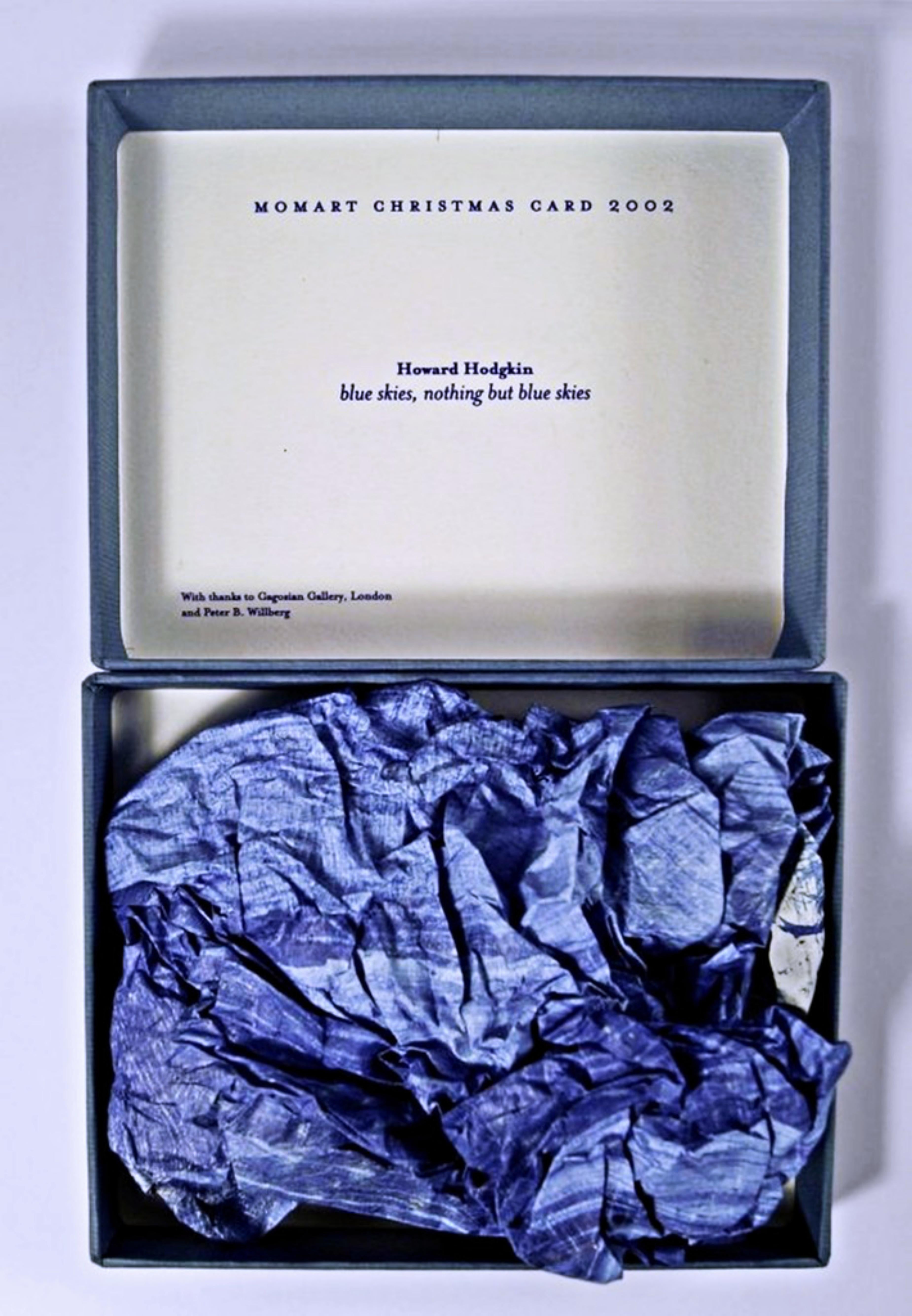
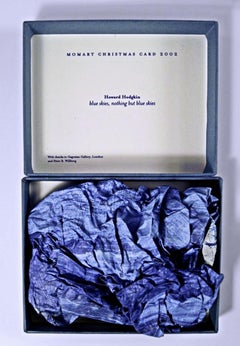
- Blue Skies, Nothing but Blue SkiesBy Howard HodgkinLocated in New York, NYHOWARD HODGKIN Blue Skies, Nothing but Blue Skies, 2002 Screenprint in Colors, Scrunched Up and Presented in a Box 5 3/25 × 6 3/10 x 2 inches Edition of 500 (unnumbered) Momart is a British company specialising in the storage, transportation, and installation of works of art. Today, the company is best known for two things: its annual artist Christmas Card, and a 2004 warehouse fire that destroyed irreplaceable art works including Tracey Emin's famous "Everyone I Have Ever Slept With. Momart's clients include the Royal Academy of Arts, Victoria & Albert Museum, National Gallery, Tate Modern, Tate Britain and Buckingham Palace. The tradition of the MOMART "Christmas card" (which would later morph into actual artist-designed work) goes back to 1984 when the first object – a festive card – was designed for the company by Bruce McLean. Since then Momart collaborated on this project with many of the top British and international artists. The complete series of Momart Christmas cards is now part of the permanent collections of the Victoria and Albert Museum and the Tate. The present item is the vintage 2002 MOMART Christmas card, designed by Howard Hodgkin. It is a rich blue screenprint, scrunched up in a box - with the printed text MOMART CHRISTMAS CARD 2002 inside the box, the artist's name and work title, "Blue Skies, Nothing But Blue Skies" and a credit at the bottom "With thanks to Gagosian Gallery London and Peter B. Willberg." And that's the MOMART "gift". Very cool and collectible! Unnumbered, but known to have been issued in an edition of 500 About Howard Hodgkin For an artist, time can always be regained . . . because by an act of imagination you can always go back. —Howard Hodgkin One of England’s most celebrated contemporary painters, Howard Hodgkin (1932–2017) was deeply attuned to the interplay of gesture, color, and ground. His brushstrokes, set against wooden supports, often continue beyond the picture plane and onto the frame, breaking from traditional confines. Embracing time as a compositional element, his work is testament to his immersion in the intangibility of thoughts, feelings, and fleeting private moments. Hodgkin was born in London and grew up in Hammersmith Terrace. During World War II he was evacuated to Long Island, New York, for three years. In the Museum of Modern Art, New York, he saw works by School of Paris artists such as Henri Matisse, Édouard Vuillard, and Pierre Bonnard, which he could not easily have seen then in London or Paris. Back in England in 1943, Hodgkin ran away from Eton College and Bryanston School, convinced that education would impede his progress as an artist, though he encountered inspiring teachers at both schools. He then attended Camberwell School of Arts and Crafts (1949–50) and Bath Academy of Art, Corsham (1950–54). Hodgkin never belonged to a school or group. While many of his contemporaries were drawn to Pop or the School of London, he remained independent, initially marking his outsider status with a series of portraits of contemporary artists and their families. His first solo exhibition was at Arthur Tooth and Sons in London in 1962. Two years later he first visited India, following his interest in Indian miniatures, which began during his time at Eton. Collecting Indian art would remain a lifelong passion, which he initially supported by dealing in picture frames. In 1984 Hodgkin represented Britain at the Biennale di Venezia. His exhibition Forty Paintings reopened the Whitechapel Gallery, London, in 1985, and he won the Turner Prize the same year. In 1998 Hodgkin joined Gagosian, and the gallery presented his first show in the United States since his critically acclaimed 1995–96 exhibition at the Metropolitan Museum of Art, New York, which had traveled to the Modern Art Museum of Fort Worth, Texas; Kunstverein für die Rheinlande und Westfalen, Düsseldorf; and Hayward Gallery, London. His first full retrospective opened at the Irish Museum of Modern Art, Dublin, in 2006 and traveled to Tate Britain, London, and Museo Nacional Centro de Arte Reina Sofía, Madrid. In the autumn of 2016 Hodgkin visited India for what was to be the last time, completing six new paintings before his return to London. These works were shown at England’s Hepworth Wakefield in 2017, in Painting India, a show that focused on the artist’s long-standing relationship with the Indian subcontinent. Starting in the 1950s, Hodgkin maintained a parallel printmaking practice, translating his visual language into works on paper. Exploring the interactions of color and space on a grander scale, he produced theatrical set designs for Ballet Rambert, the Royal Ballet, and the Mark Morris Dance Group...Category
Early 2000s Pop Art Mixed Media
MaterialsMixed Media, Screen
- Aufbruch Aus Moskau MockBa: Suite of 20 signed prints top Russian artists 64/100Located in New York, NYVARIOUS ARTISTS AUFBRUCH AUS MOSKAU MOCKBA - PORTFOLIO OF TWENTY (20) ORIGINAL LIMITED EDITION SIGNED GRAPHICS, 1990 20 Limited edition, hand signed and numbered Screenprints, unfram...Category
1990s Pop Art Abstract Prints
MaterialsMixed Media, Screen, Linen, Pencil


- BagsLocated in Santa Monica, CASilkscreen/Collage on Retail BagsCategory
21st Century and Contemporary Pop Art Mixed Media
MaterialsScreen
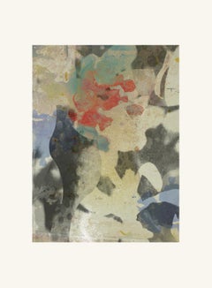
- ST1b99-Contemporary, Abstract prints, stil-life, figurative, nude, landscapeBy Francisco NicolásLocated in London, LondonFlowers 09, 2019 Edition of 25 Digital pigment print Ultrachrome ink on Fabriano Rosaspina paper. Hand signed by the artist, and certificate of authenticity, (Unframed) His work h...Category
2010s Pop Art Abstract Prints
MaterialsPaper, Mixed Media, C Print, Inkjet, Giclée, Pigment, Archival Pigment
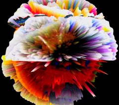
- Hematriptan mRNA (Black), Agent X, Futuristic Artwork, Limited EditionBy Agent XLocated in Deddington, GBHematriptan mRNA(Black) by Agent X [2021] limited edition Mixed Media Edition of 70 Image size: H:85 cm x W:96 cm Complete Size of Unframed Work: H:85 cm x W:96 cm x D:1cm Sold Unfr...Category
21st Century and Contemporary Pop Art Mixed Media
MaterialsMixed Media
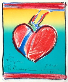
- HEART II Signed Hand Colored Lithograph, Love Symbol, Red, Yellow, TurquoiseBy Peter MaxLocated in Union City, NJHEART II - is a unique, hand colored lithograph by the pop culture icon - Peter Max. The image Heart II was printed in 1981 as a limited edition lithograph of 165, using traditional...Category
1980s Pop Art Mixed Media
MaterialsMixed Media, Lithograph
- ST107B-Contemporary, Abstract prints, stil-life, figurative, nude, landscapeBy Francisco NicolásLocated in London, LondonEdition of 25 Digital pigment print Ultrachrome ink on Fabriano Rosaspina paper. Hand signed by the artist, and certificate of authenticity, (Unframed) His work has been shown in...Category
2010s Pop Art Abstract Prints
MaterialsArchival Pigment, Paper, Mixed Media, C Print, Color, Digital Pigment
- ST1b99-Contemporary, Abstract prints, stil-life, figurative, nude, landscapeBy Francisco NicolásLocated in London, LondonFlowers 09, 2019 Edition of 25 Digital pigment print Ultrachrome ink on Fabriano Rosaspina paper. Hand signed by the artist, and certificate of authenticity, (Unframed) His work h...Category
2010s Pop Art Abstract Prints
MaterialsPaper, Mixed Media, C Print, Inkjet, Giclée, Pigment, Archival Pigment