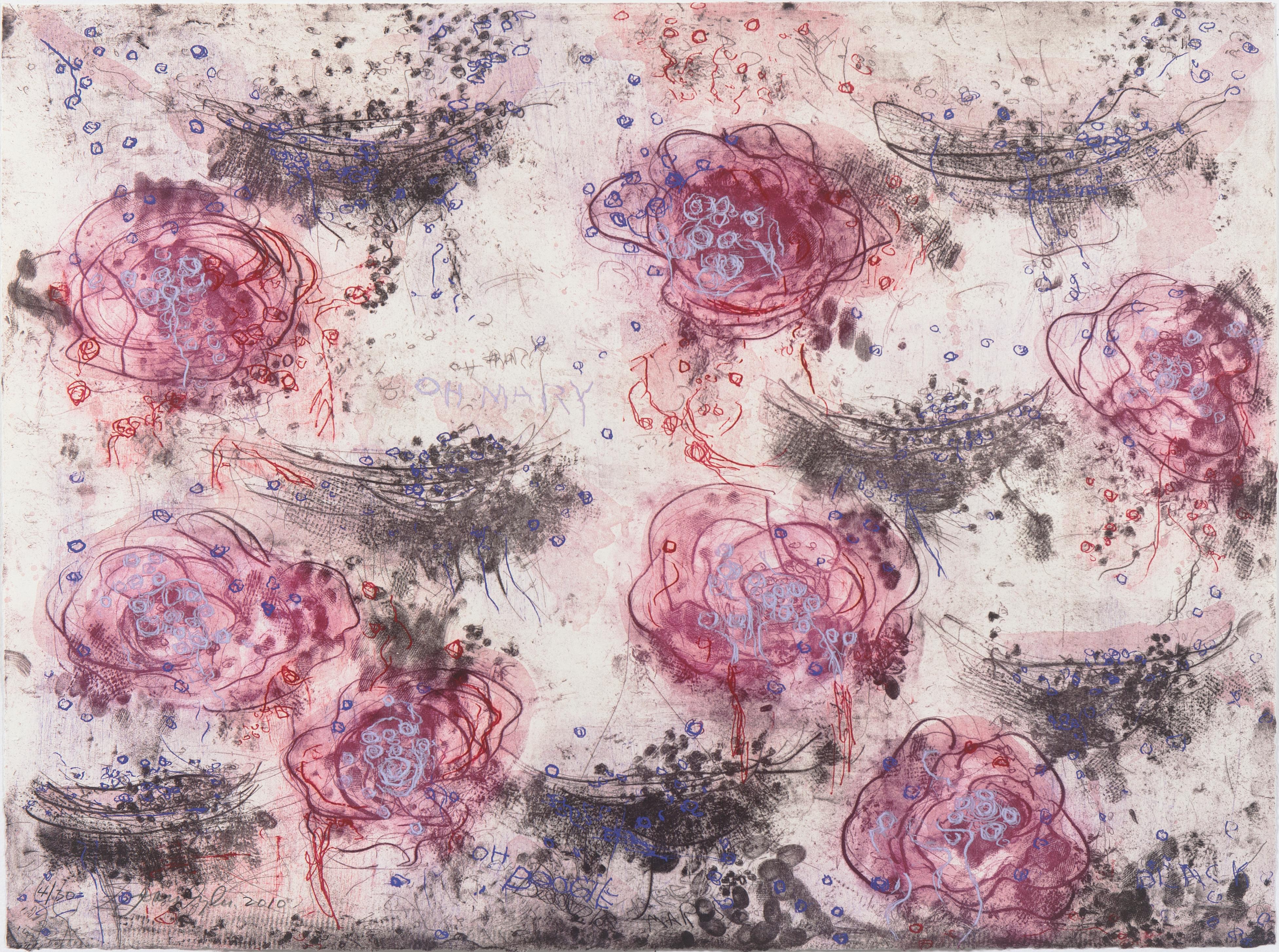
Items Similar to "Jungle, " Color Lithograph Landscape signed by Carol Summers

Want more images or videos?
Request additional images or videos from the seller
1 of 9
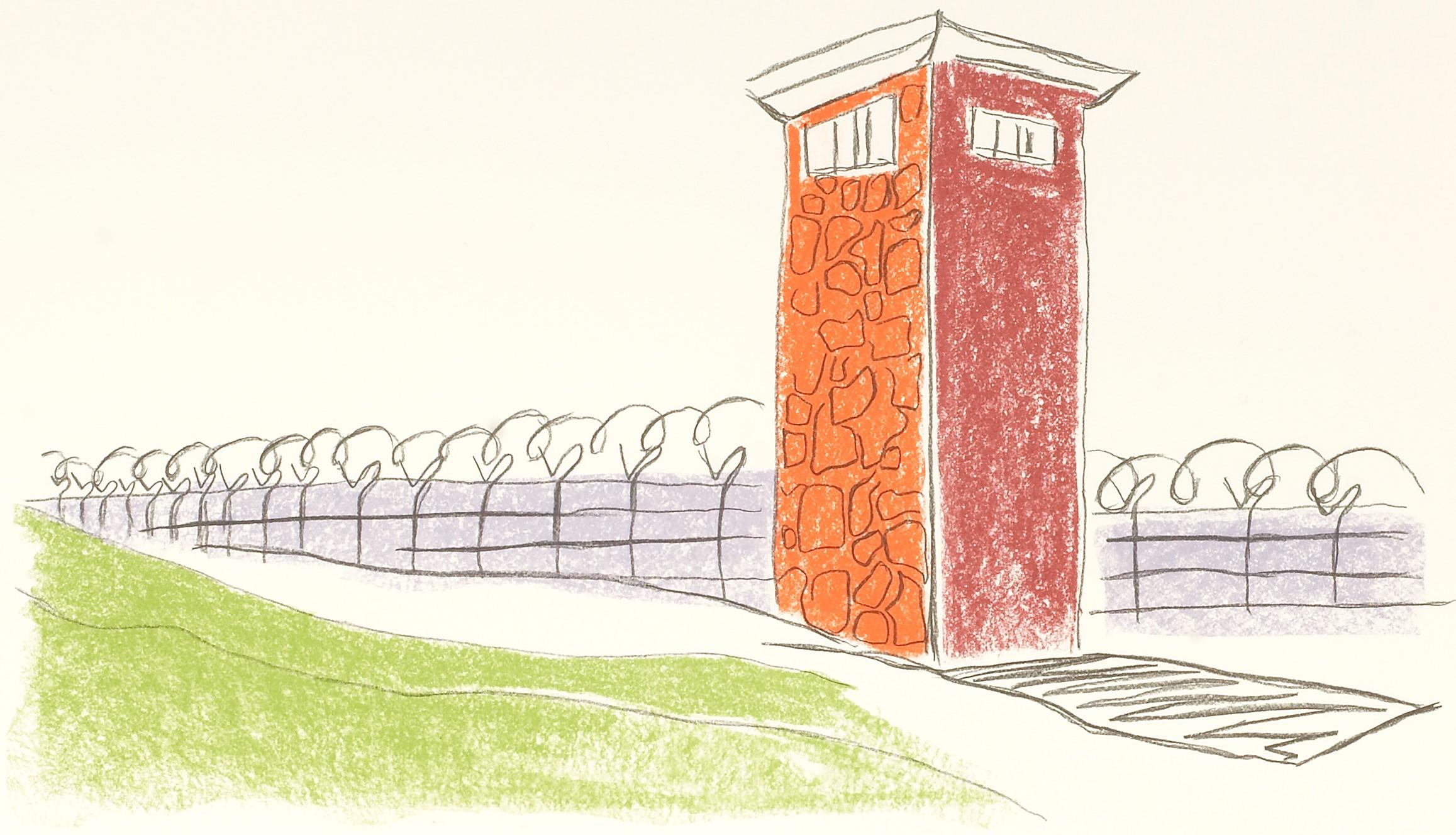
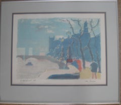
Carol Summers"Jungle, " Color Lithograph Landscape signed by Carol Summers1966
1966
About the Item
"Jungle" is an important, rare color lithograph signed by Carol Summers from the early years of his production. The image offers a landscape of a dark jungle, printed mostly in black ink. In the center, a blue pool of water is shaded by two trees. Summers' technique in this print renders a painterly quality to the image: the grasses and leaves of the scene are all created with playful, energetic swiping motions much like watercolor paint. This technique and the use of fields of color predict the style Summers would adopt in the coming decades, making this an important early work.
30 x 22 inches, artwork
Numbered 14 of the edition of 27
Carol Summers (1925-2016) has worked as an artist throughout the second half of the 20th century and into the first years of the next, outliving most of his mid-century modernist peers. Initially trained as a painter, Summers was drawn to color woodcuts around 1950 and it became his specialty thereafter. Over the years he has developed a process and style that is both innovative and readily recognizable. His art is known for it’s large scale, saturated fields of bold color, semi-abstract treatment of landscapes from around the world and a luminescent quality achieved through a printmaking process he invented.
In a career that has extended over half a century, Summers has hand-pulled approximately 245 woodcuts in editions that have typically run from 25 to 100 in number. His talent was both inherited and learned. Born in 1925 in Kingston, a small town in upstate New York, Summers was raised in nearby Woodstock with his older sister, Mary. His parents were both artists who had met in art school in St. Louis. During the Great Depression, when Carol was growing up, his father supported the family as a medical illustrator until he could return to painting. His mother was a watercolorist and also quite knowledgeable about the different kinds of papers used for various kinds of painting. Many years later, Summers would paint or print on thinly textured paper originally collected by his mother.
From 1948 to 1951, Carol Summers trained in the classical fine and studio arts at Bard College and at the Art Students League of New York. He studied painting with Steven Hirsh and printmaking with Louis Schanker. He admired the shapes and colors favored by early modernists Paul Klee (Sw: 1879-1940) and Matt Phillips (Am: b.1927- ). After graduating, Summers quit working as a part-time carpenter and cabinetmaker (which had supported his schooling and living expenses) to focus fulltime on art. That same year, an early abstract, Bridge No. 1 was selected for a Purchase Prize in a competition sponsored by the Brooklyn Museum.
In 1952, his work (Cathedral, Construction and Icarus) was shown the first time at the Museum of Modern Art in New York City in an exhibition of American woodcuts. In 1954, Summers received a grant from the Italian government to study for a year in Italy. Woodcuts completed soon after his arrival there were almost all editions of only 8 to 25 prints, small in size, architectural in content and black and white in color. The most well-known are Siennese Landscape and Little Landscape, which depicted the area near where he resided. Summers extended this trip three more years, a decision which would have significant impact on choices of subject matter and color in the coming decade.
After returning from Europe, Summers’ images continued to feature historical landmarks and events from Italy as well as from France, Spain and Greece. However, as evidenced in Aetna’s Dream, Worldwind and Arch of Triumph, a new look prevailed. These woodcuts were larger in size and in color. Some incorporated metal leaf in the creation of a collage and Summers even experimented with silkscreening. Editions were now between 20 and 50 prints in number. Most importantly, Summers employed his rubbing technique for the first time in the creation of Fantastic Garden in late 1957.
Dark Vision of Xerxes, a benchmark for Summers, was the first woodcut where Summers experimented using mineral spirits as part of his printmaking process. A Fulbright Grant as well as Fellowships from the Louis Comfort Tiffany Foundation and the Guggenheim Foundation followed soon thereafter, as did faculty positions at colleges and universities primarily in New York and Pennsylvania. During this period he married a dancer named Elaine Smithers with whom he had one son, Kyle. Around this same time, along with fellow artist Leonard Baskin, Summers pioneered what is now referred to as the “monumental” woodcut. This term was coined in the early 1960s to denote woodcuts that were dramatically bigger than those previously created in earlier years, ones that were limited in size mostly by the size of small hand-presses. While Baskin chose figurative subject matter, serious in nature and rendered with thick, striated lines, Summers rendered much less somber images preferring to emphasize shape and color; his subject matter approached abstraction but was always firmly rooted in the landscape.
In addition to working in this new, larger scale, Summers simultaneously refined a printmaking process which would eventually be called the “Carol Summers Method” or the “ Carol Summers Technique”. Summers produces his woodcuts by hand, usually from one or more blocks of quarter-inch pine, using oil-based printing inks and porous mulberry papers. His woodcuts reveal a sensitivity to wood especially its absorptive qualities and the subtleties of the grain. In several of his woodcuts throughout his career he has used the undulating, grainy patterns of a large wood plank to portray a flowing river or tumbling waterfall. The best examples of this are Dream, done in 1965 and the later Flash Flood Escalante, in 2003. In the majority of his woodcuts, Summers makes the blocks slightly larger than the paper so the image and color will bleed off the edge.
Before printing, he centers a dry sheet of paper over the top of the cut wood block or blocks, securing it with giant clips. Then he rolls the ink directly on the front of the sheet of paper and pressing down onto the dry wood block or reassembled group of blocks. Summers is technically very proficient; the inks are thoroughly saturated onto the surface of the paper but they do not run into each other. The precision of the color inking in Constantine’s Dream in 1969 and Rainbow Glacier in 1970 has been referred to in various studio handbooks. Summers refers to his own printing technique as “rubbing”. In traditional woodcut printing, including the Japanese method, the ink is applied directly onto the block. However, by following his own method, Summers has avoided the mirror-reversed image of a conventional print and it has given him the control over the precise amount of ink that he wants on the paper. After the ink is applied to the front of the paper, Summers sprays it with mineral spirits, which act as a thinning agent. The absorptive fibers of the paper draw the thinned ink away from the surface softening the shapes and diffusing and muting the colors. This produces a unique glow that is a hallmark of the Summers printmaking technique. Unlike the works of other color field artists or modernists of the time, this new technique made Summers’ extreme simplification and flat color areas anything but hard-edged or coldly impersonal.
By the 1960s, Summers had developed a personal way of coloring and printing and was not afraid of hard work, doing the cutting, inking and pulling himself. In 1964, at the age of 38, Summers’ work was exhibited for a second time at the Museum of Modern Art. This time his work was featured in a one-man show and then as one of MOMA’s two-year traveling exhibitions which toured throughout the United States. In subsequent years, Summers’ works would be exhibited and acquired for the permanent collections of multiple museums throughout the United States, Europe and Asia. Summers’ familiarity with landscapes throughout the world is firsthand. As a navigator-bombardier in the Marines in World War II, he toured the South Pacific and Asia.
Following college, travel in Europe and subsequent teaching positions, in 1972, after 47 years on the East Coast, Carol Summers moved permanently to Bonny Doon in the Santa Cruz Mountains in Northern California. There met his second wife, Joan Ward Toth, a textile artist who died in 1998; and it was here his second son, Ethan was born. During the years that followed this relocation, Summers’ choice of subject matter became more diverse although it retained the positive, mostly life-affirming quality that had existed from the beginning. Images now included moons, comets, both sunny and starry skies, hearts and flowers, all of which, in one way or another, remained tied to the landscape.
In the 1980s, from his home and studio in the Santa Cruz mountains, Summers continued to work as an artist supplementing his income by conducting classes and workshops at universities in California and Oregon as well as throughout the Mid and Southwest. He also traveled extensively during this period hiking and camping, often for weeks at a time, throughout the western United States and Canada. Throughout the decade it was not unusual for Summers to backpack alone or with a fellow artist into mountains or back country for six weeks or more at a time. Not surprisingly, the artwork created during this period rarely departed from images of the land, sea and sky. Summers rendered these landscapes in a more representational style than before, however he always kept them somewhat abstract by mixing geometric shapes with organic shapes, irregular in outline. Some of his most critically acknowledged work was created during this period including First Rain, 1985 and The Rolling Sea, 1989. Summers received an honorary doctorate from his alma mater, Bard College in 1979 and was selected by the United States Information Agency to spend a year conducting painting and printmaking workshops at universities throughout India. Since that original sabbatical, he has returned every year, spending four to eight weeks traveling throughout that country.
In the 1990s, interspersed with these journeys to India have been additional treks to the back roads and high country areas of Mexico, Central America, Nepal, China and Japan. Travel to these exotic and faraway places had a profound influence on Summers’ art. Subject matter became more worldly and nonwestern as with From Humla to Dolpo, 1991 or A Former Life of Budha, 1996, for example. Architectural images, such as The Pillars of Hercules, 1990 or The Raja’s Aviary, 1992 became more common. Still life images made a reappearance with Jungle Bouquet in 1997. This was also a period when Summers began using odd-sized paper to further the impact of an image.
The 1996 Night, a view of the earth and horizon as it might be seen by an astronaut, is over six feet long and only slightly more than a foot-and-a-half high. From 1999, Revuelta A Vida (Spanish for “Return to Life”) is pie-shaped and covers nearly 18 cubic feet. It was also at this juncture that Summers began to experiment with a somewhat different palette although he retained his love of saturated colors. The 2003 Far Side of Time is a superb example of the new direction taken by this colorist.
At the turn of the millennium in 1999, “Carol Summers Woodcuts, 50 Year Retrospective” exhibitions were held by the Woodstock Artists Association in New York and at the Museum of Art and History in Santa Cruz, California. Summers was chosen Printmaker of the Year in 2004 by the Mid-America Print Council (an outgrowth of the earlier Prairie Printmakers Association) which included a commemorative exhibition of his work at the University of Nebraska Art Center. Since the turn of the century, Summers’ woodcuts have generally been somewhat smaller in scale but more complex and more technically difficult to create. Chamba Bamba created in 2004 and Los Volcanes de Dia Y Noche completed in 2005, are more recent editions by Summers which required multiple blocks, plus more inks and roller work than many of those before. In 2005, Carol Summers published the first of two catalogs highlighting artifacts from his extensive collection of early 20th century East Indian folk textiles collected over the past 35 years. A Treasury of Indian Folk Textiles will be followed by a second catalog of textiles to be published in 2006. A look through these catalogs shows why Summers is so attracted to the fabrics, shawls, wall-hangings, blankets and articles of clothing from various villages throughout India. He says that he looks upon these objects as works of art that pay homage to the vitality and imagination of their creators. He also acknowledges that in them he sees his own preferences for fields of color, bright and deeply saturated in shapes and forms that tell a story.
- Creator:Carol Summers (1925 - 2016, American)
- Creation Year:1966
- Dimensions:Height: 30 in (76.2 cm)Width: 22 in (55.88 cm)
- Medium:
- Movement & Style:
- Period:
- Condition:
- Gallery Location:Milwaukee, WI
- Reference Number:
About the Seller
4.9
Platinum Seller
These expertly vetted sellers are 1stDibs' most experienced sellers and are rated highest by our customers.
Established in 1966
1stDibs seller since 2017
390 sales on 1stDibs
Typical response time: 1 hour
- ShippingRetrieving quote...Ships From: Milwaukee, WI
- Return PolicyA return for this item may be initiated within 14 days of delivery.
More From This SellerView All
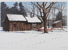
- "Wolf Tracks, " Snowy Winter Scene Color Lithograph signed by Helen RundellBy Helen RundellLocated in Milwaukee, WI"Wolf Tracks" is an original color lithograph by Helen Rundell. The artist signed the piece in the plate. This artwork features a winter homestead with wolf tracks going in and out o...Category
1980s Contemporary Landscape Prints
MaterialsLithograph
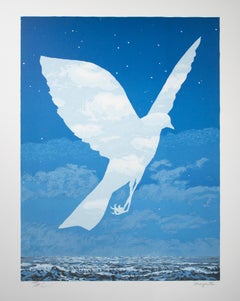
- "L'Entree en scene (The Emergence), " Color Lithograph after Rene MagritteBy René MagritteLocated in Milwaukee, WI"L'Entree en scene (The Emergence)" is a color lithograph after a 1961 original piece by Rene Magritte. A transparent bird flies over the ocean. The body of this bird shows through it a clean light sky with fluffy clouds. The view around the bird is instead the dark night, stars shine at the top of the scene. Clouds blow by and the waves are turbulent. Art: 20.25 x 14.25 in Frame: 31.38 x 25.38 in René-François-Ghislain Magritte was born November 21, 1898, in Lessines, Belgium and died on August 15, 1967 in Brussels. He is one of the most important surrealist artists. Through his art, Magritte creates humor and mystery with juxtapositions and shocking irregularities. Some of his hallmark motifs include the bourgeois “little man,” bowler hats, apples, hidden faces, and contradictory texts. René Magritte’s father was a tailor and his mother was a miller. Tragedy struck Magritte’s life when his mother committed suicide when he was only fourteen. Magritte and his two brothers were thereafter raised by their grandmother. Magritte studied at the Brussels Academy of Fine Arts from 1916 to 1918. After graduating he worked as a wallpaper designer and in advertisement. It was during this period that he married Georgette Berger, whom he had known since they were teenagers. In 1926, René Magritte signed a contract with the Brussels Art Gallery, which allowed him to quit his other jobs and focus completely on creating art. A year later he had his first solo show at the Galerie la Centaurie in Brussels. At this show Magritte exhibited what is today thought of as his first surrealist piece, The Lost Jockey, painted in 1926. In this work a jockey and his steed run across a theater stage, curtains parted on either side. Throughout the scene, there are trees with trunks shaped somewhat like chess pawns with musical scores running vertically up their sides and branches sticking out from all angles. Critics did not enjoy this style of art; it was new, different, and took critical thought to understand, but The Lost Jockey was only the first of many surrealist artworks Magritte would paint. Because of the bad press in Brussels, René and Georgette moved to Paris in 1927, with the hope that this center of avant-garde art would bring him success and recognition. In Paris, he was able to become friends with many other surrealists, including André Breton and Paul Éluard. They were able to learn from and inspire one another, pushing the Surrealist movement further forward. It was also in Paris that Magritte decided to add text to some of his pieces, which was one of the elements that made his artwork stand out. In 1929, he painted one of his most famous oil works: The Treachery of Images. This is the eye-catching piece centered on a pipe. Below the pipe is written “Ceci n’est pas un pipe,” which translates to “This is not a pipe.” This simple sentence upset many critics of the time, for of course it was a pipe. Magritte replied that it was not a pipe, but a representation of a pipe. One could not use this oil on canvas as a pipe, to fill it with tobacco and smoke it. Thus, it was not a pipe. In 1930, Magritte and Georgette moved back to Brussels. Though they would travel to his exhibitions elsewhere, their home going forward would always be in Brussels. Magritte had his first American exhibition at the Julien Levy Gallery in New York City in 1936 and his first show in England two years later in 1938 at The London Gallery...Category
2010s Surrealist Landscape Prints
MaterialsLithograph
- "Daphnis et Chloe - The Lovers, " an Original Lithograph by Pierre BonnardBy Pierre BonnardLocated in Milwaukee, WI"Daphnis et Chloe - The Lovers" is an original lithograph by Pierre Bonnard. This lithograph is a rare proof for the illustrated edition of Daphnis et Chloe. There were two proofs, o...Category
Early 1900s Figurative Prints
MaterialsLithograph
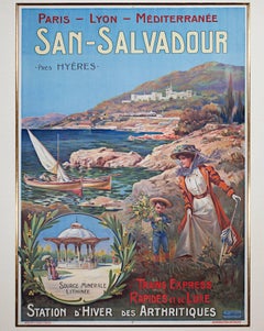
- "San Salvador: Station d'Hiver des Arthritiques" Original Color LithographBy Ernest-Louis LessieuxLocated in Milwaukee, WI"San Salvador (Mediterranean)" is an original color lithograph poster by Ernest Louis Lessieux. It depicts a woman and her son on the picturesque coast of...Category
Late 19th Century Landscape Prints
MaterialsColor, Lithograph
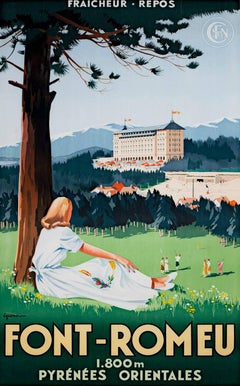
- "Font-Romeu, " Original Color Lithograph Poster by Vincent GuerraBy Vincent GuerraLocated in Milwaukee, WI"Font-Romeu (Tennis/Golfing Retreat)" is an original color lithograph poster by the designer Vincent Guerra. He signed the design in the lower left. This poster depicts a woman relaxing under a tree...Category
1920s Landscape Prints
MaterialsLithograph
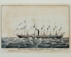
- "Iron Steam Ship Great Britain, " an Original Lithograph by Nathaniel CurrierBy Currier & IvesLocated in Milwaukee, WI"Iron Steam Ship Great Britain" is an original hand-colored lithographed published by Currier & Ives. It depicts a large British steam ship on the water. The caption below says "3500 Tons. Engine 1000 Horse power. Weight of Iron used in the Ship and Engine is 1500 Tons. THE LARGEST IN THE WORLD. Length from Figurehead to Tafrail 322 Fe3et. Main breadth 50' 6" ... Depth 32' 6" Lieut. Jaf. Hosken R.N. Commander." 8" x 12 3/4" art 17 1/8" x 21 1/2" frame Currier & Ives produced their prints in a building at 33 Spruce Street where they occupied the third, fourth and fifth floors. The third floor was devoted to the hand operated printing presses that were built by Nat's cousin, Cyrus Currier, at his shop Cyrus Currier & Sons in Newark, NJ. The fourth floor found the artists, lithographers and the stone...Category
1850s Landscape Prints
MaterialsLithograph
You May Also Like
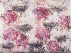
- Wild RosesBy Joan SnyderLocated in Brooklyn, NYWild Roses, 2010 Lithograph/etching/woodcut 28 3/8 × 38 3/8 in 72.1 × 97.5 cm This print combines etching, lithography, and woodcut to create a great variet...Category
2010s Contemporary Landscape Prints
MaterialsEtching, Lithograph, Woodcut
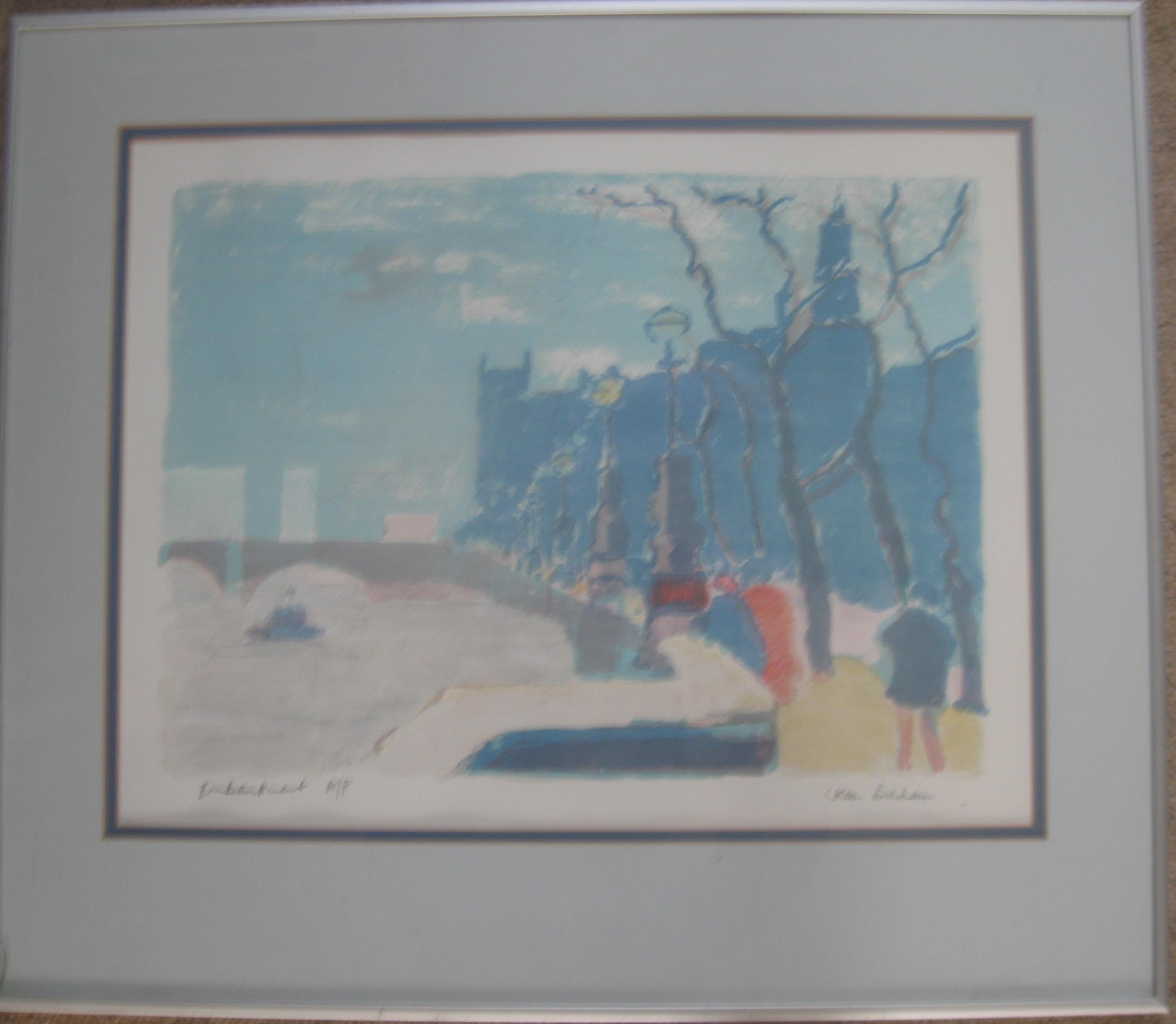
- Jean Banham. 'The Embankment, The Thames , London' Lithograph C1960'sLocated in Frome, SomersetFine print from the 1960's London. Embackment in London, by the Thames. City side with Houses of Parliamant looking west. Fine piece of history. Banham made many works of Central London...Category
1960s Contemporary Landscape Prints
MaterialsLithograph
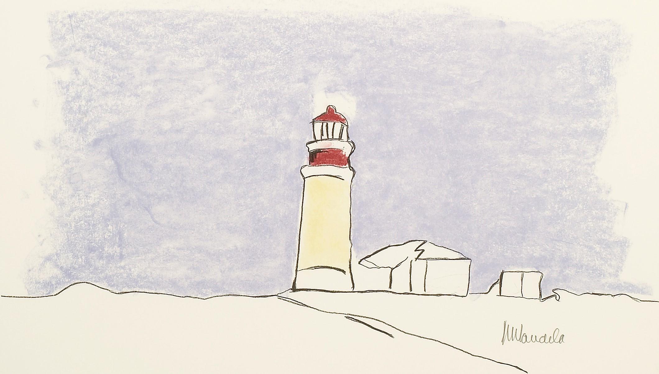
- The Lighthouse - Mandela, Former South African President, Signed, Robben IslandBy Nelson MandelaLocated in Knowle Lane, CranleighNelson Mandela, The Lighthouse, Signed Limited Edition Lithograph Many people are unaware that Nelson Mandela turned his hand to art in his 80's as a way of leaving a legacy for his family. He spent time with an art tutor and learnt to draw. In 2002, when creating the The Lighthouse print...Category
Early 2000s Contemporary Landscape Prints
MaterialsLithograph
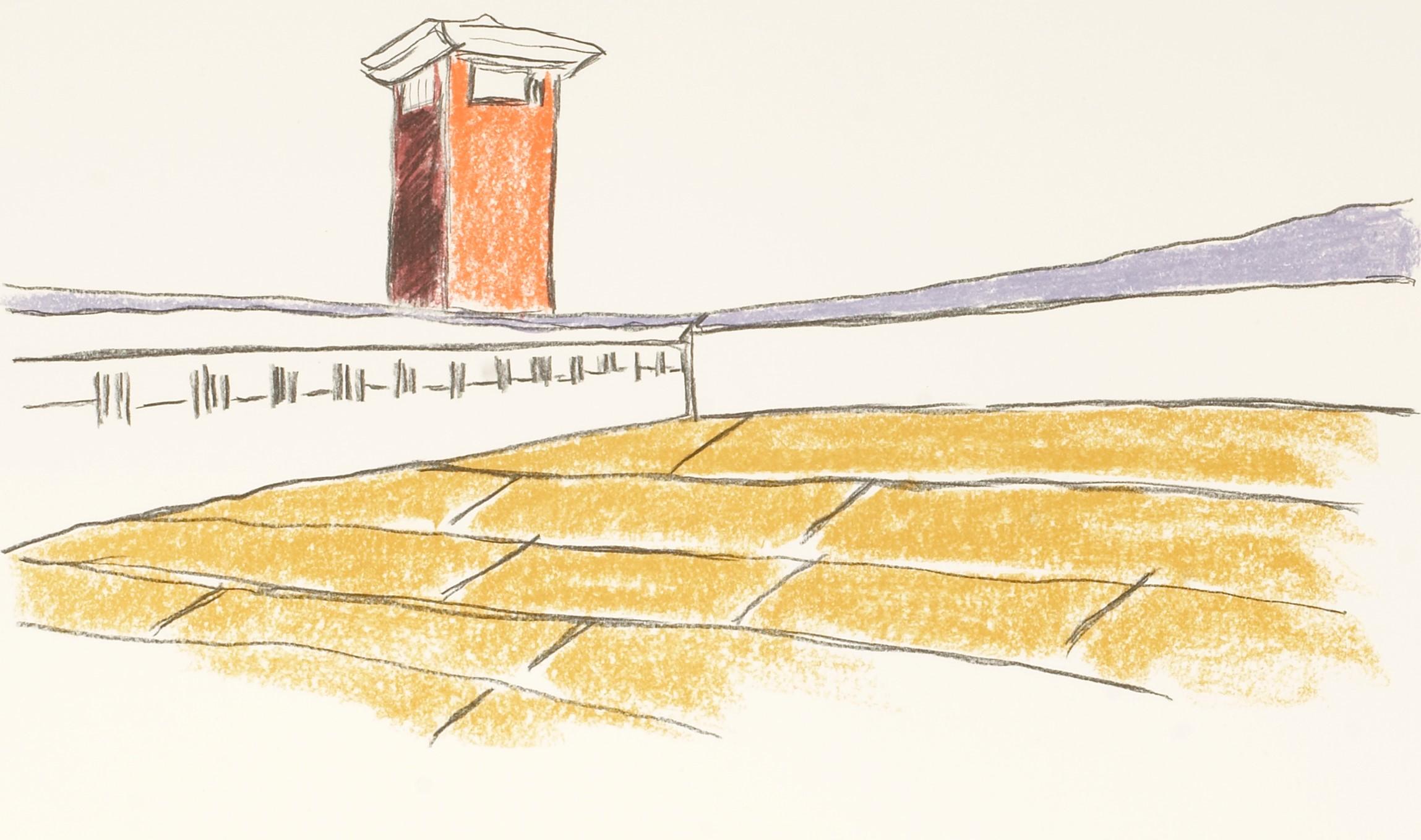
- The Tennis Court - Mandela, South African President, Signed, Robben Island, sportBy Nelson MandelaLocated in Knowle Lane, CranleighNelson Mandela, The Tennis Court, Signed Limited Edition Lithograph Many people are unaware that Nelson Mandela turned his hand to art in his 80's as a way of leaving a legacy for hi...Category
Early 2000s Contemporary Landscape Prints
MaterialsLithograph
- The Harbour - Mandela, Former South African President, Signed Art, Robben IslandBy Nelson MandelaLocated in Knowle Lane, CranleighNelson Mandela, The Harbour, Signed Limited Edition Lithograph Many people are unaware that Nelson Mandela turned his hand to art in his 80's as a way of leaving a legacy for his fam...Category
Early 2000s Contemporary Landscape Prints
MaterialsLithograph
- Mandela's Walk - Mandela, Former South African President, Signed, Robben IslandBy Nelson MandelaLocated in Knowle Lane, CranleighNelson Mandela, The Walk, Signed Limited Edition Lithograph Many people are unaware that Nelson Mandela turned his hand to art in his 80's as a way of leaving a legacy for his family...Category
Early 2000s Contemporary Landscape Prints
MaterialsLithograph
Recently Viewed
View AllMore Ways To Browse
Summer Italy
Vintage Construction Sign
Vintage Construction Signs
Vintage Summer Style
Vintage Italian Summer
Vintage Summer Of Love
Signed Modern Textile
Jungle Vintage
Large Vintage Metal Signs Original
Lithograph Canada
Canadian Lithograph
Vintage Wood Planks
Far Side Vintage
Geometric Print Fabric
Vintage Camp Signs
Vintage Camping Signs
Chinese Landscape Mountain
Greek Lithograph