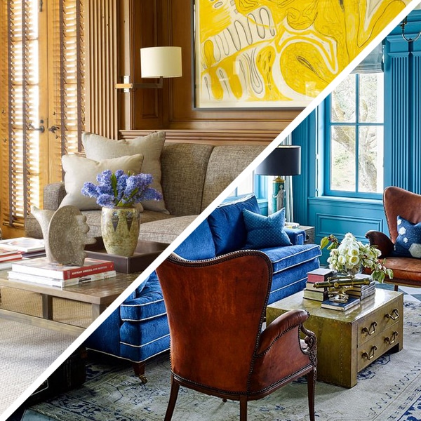
In a recently inaugurated column, we explore two diametrically opposed — but equally chic — decorating styles, looking at paired sets of living rooms created by some of the top names in interior design and architecture. Today, we take on color palette, first feasting our eyes on rooms brightly hued and then those that work wonders with neutrals. After perusing the looks, shop items all across the color (and lack thereof) spectrum on 1stdibs.
COLOR
How do you hue? It’s often one of the first questions we ask ourselves (or our decorators, or that our decorators ask us) when we embark on a new design project. And for the designers who created the rooms gathered here, the answer is an unequivocal Big, Bold and Bright — all the better for creating stimulating spaces that excite their occupants and set the stage for equally exciting furnishing schemes.
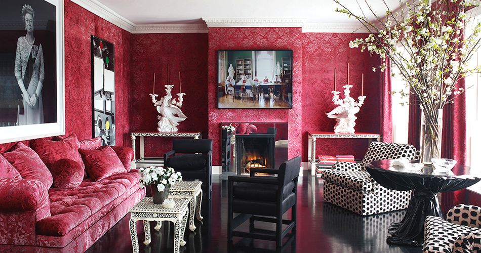
Thomas Britt, San Francisco, California In the San Francisco house of Alexis and Trevor Traina, New York-based interior designer Britt used a ravishing red damask — on both the walls and the couch — to serve as a backdrop for the couple’s contemporary art collection, which includes works by, from left, Hiroshi Sugimoto, John Baldessari and Jackie Nickerson. Photo by Simon Upton
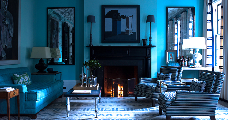
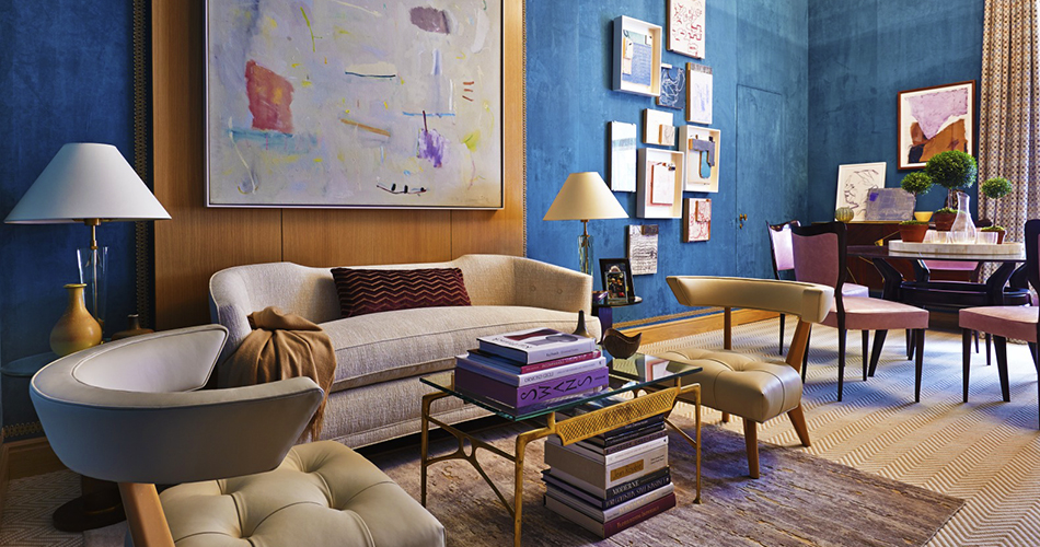
Stephen Gambrel, New York, New York In his own four-story 1827 townhouse in Manhattan’s West Village, architect and interior designer Gambrel took a deep dive into sea-worthy hues of blue, designing much of the turquoise-and-aqua-upholstered furniture himself and modeling the azure pattern of the hand-loomed carpet off a cable-knit sweater often worn by his partner. Photo by Eric Piasecki
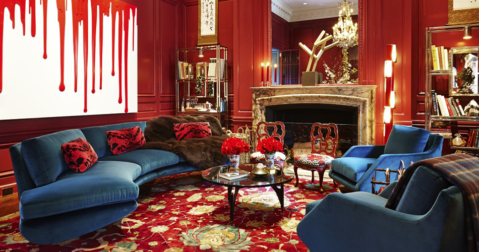
William Georgis, New York, New York For the 2014 Kips Bay Decorator Show House at McKim, Mead & White’s landmarked 1883 Villard Houses, Georgis, a New York decorator who often likes his playful spaces to have a bit of shock value, employed rich ruby hues from floor to ceiling, setting that color against blue-upholstered seating of his own design, available through 1stdibs gallery Maison Gerard. Added together, the look gave a contemporary jolt to a historic landmark. Photo by Timothy Bell for Kips Bay
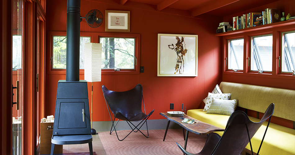
Alan Wanzenberg
Taghkanic, New York Red rules the roost at the Upstate New York country home of Manhattan-based architect Wazenberg, the color recalling the area’s countryside barns and dramatic autumn foliage. Wanzenberg designed the residence as a trio of small cabins, each made of pre-cut pieces from the company Shelter-Kit. The living area of the largest cabin, with its distinctive Butterfly chairs, is shown here. Photo by William Abranowicz
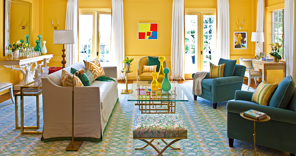
Scott Sanders, Locust, New Jersey The room he created for 2011’s Stately Homes by-the-Sea Designer Showhouse clearly evidences New York designer Sanders’s abundant love for bright, forthright color. “I'm not a fan of pastels,” he says. “I like strong, rich, deep colors — primaries and saturated shades.” Here, marigold-yellow walls play the foil to sea-foam accents and crisp white drapes. (Bernd Goeckler Antiques supplied the angular coffee table, while the graphic painting is by Andrew Masullo.) Photo by Marco Ricca
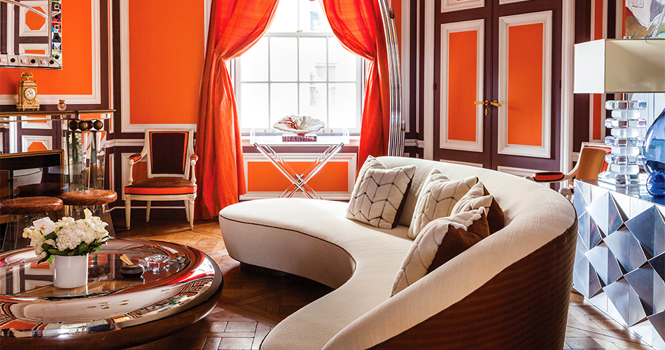
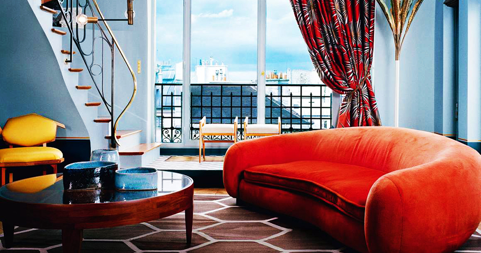
Robert Couturier, New York, New York In his new monograph, French-born, New York-based interior designer Couturier shows off a grand Manhattan apartment whose wood paneling he painted in two warmly complementary tones — a bright Hermès orange and a chocolate-brown — creating a space that reads as cozily family-friendly. A serpentine sofa by Vladimir Kagan and coffee table by Mattia Bonetti enhance the appeal. Photo by Zach DeSart, courtesy of Rizzoli
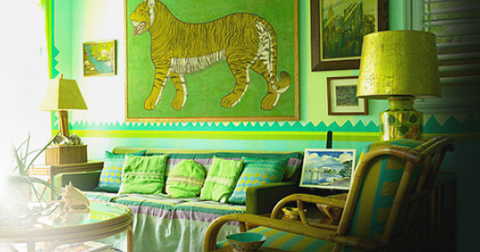
Doug & Gene Meyer, Miami, Florida Particularly known for their commanding sense of color and profound creativity, the New York-based Meyer brothers run a thriving design business that includes interiors, furniture, housewares and fashion. Here, in the Miami home Gene shares with his partner, interior designer Frank di Biasi, one of the brothers’ graphic, color-blocked rugs for Holland & Sherry enlivens a retro-feeling, Tiki-tinged room whose verdant hues might leave some green with envy. Photo by Mark Roskams
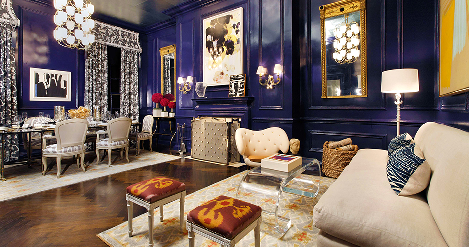
Eric Cohler, New York, New York Featured in his 2012 monograph, this high-gloss, deeply hued room at 2010’s New York Holiday House makes clear why the Manhattan-based Cohler has been dubbed the "Mix Master.” Beyond its daringly dark aubergine walls, the space also features a ceiling wallpapered in silver-leaf, a pair of Regency parcel-gilt mirrors and dining chairs, once owned by Jayne Wrightsman, upholstered in Cohler’s Dinesen fabric for Lee Jofa. Photo by Roy Wright
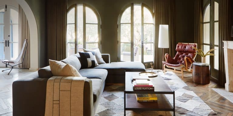
As subtle as they are sophisticated, spaces swathed in neutral tones can have a calming influence on all who enter them. To add visual interest to these gentle palettes — most often a mix of ivories and ecrus, taupes and grays — designers tend to play with texture in these living rooms, as well as light, shape and, sometimes, even a statement-making pop of color.
Stephen Gambrel, Bridgehampton, New York While the living room of his Manhattan home took to the sea in varying shades of cerulean, at this Long Island beach house, Gambrel let tones of sand and stone serve as his guide. The palette may evidence the audacity of taupe, but the final result — with its smartly combined prints, patterns and materials, and its scattering of organic objects and ephemera — is the furthest thing from beige.
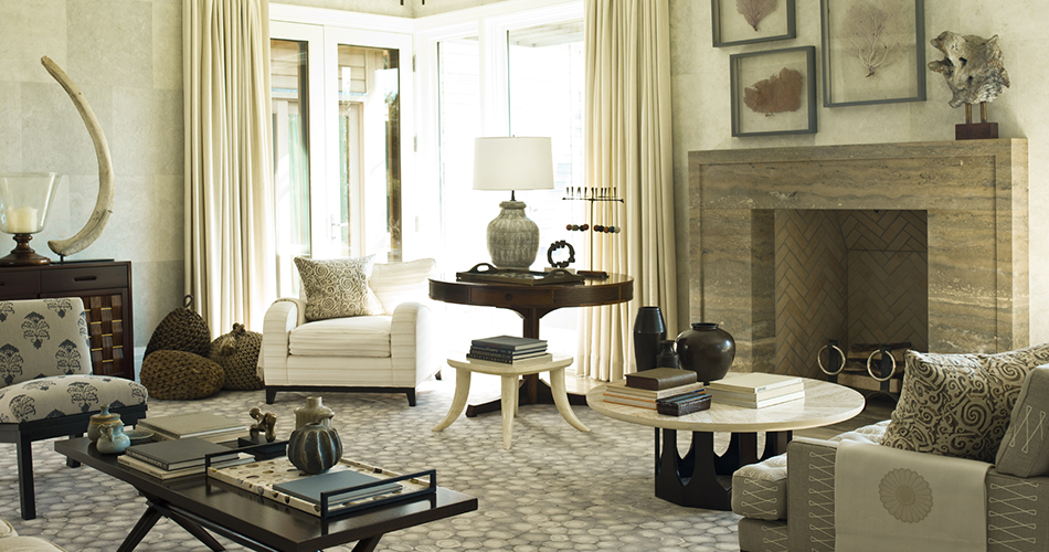
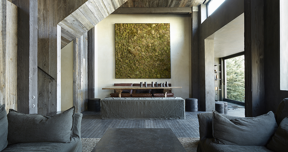
Chad Oppenheim, Aspen, Colorado At his own mountain home in the Rockies, architect Oppenheim — whose firm, with studios in Miami and Basel, Switzerland, creates muscular-but-playful modernist buildings all over the world — used the same reclaimed wood on both the building’s interior and exterior. His decorating color palette, in turn, picks up on the warm, rich grays of the salvaged material. Photo by Laziz Hamani
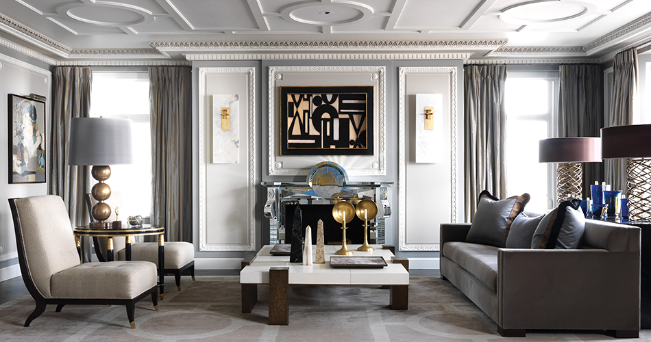
Jean-Louis Deniot,
Chicago, Illinois With custom plaster detailing on the walls and a fireplace of his own design adding visual interest to the otherwise gray-on-gray-on-gray décor, French designer Deniot — who recently published his first monograph — channeled Paris in the Windy City. The bronze-and-parchment coffee table and the Tornado lamps behind the sofa are by Hervé Van der Straeten. Photo by Xavier Bejot/courtesy of Rizzoli
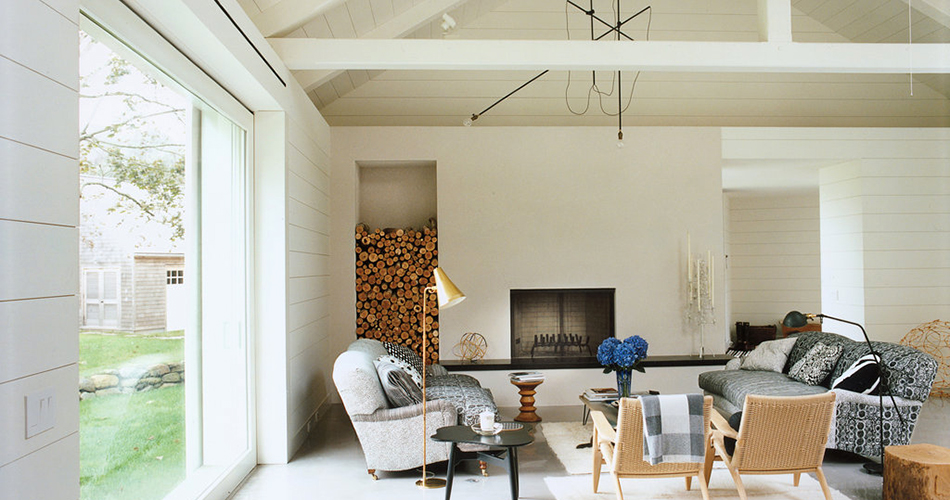
Workstead, Bridgehampton, New York At a home on the East End of Long Island, the three principles of this young Brooklyn design firm — husband and wife Robert Highsmith and Stefanie Brechbuehler, and their fellow RISD grad Ryan Mahoney — created a light, mid-century-accented beach feel with white-clapboard cladding on the walls and ceiling, natural fibers, soft hues and a spare lighting fixture of their own design. Photo by Matthew Williams
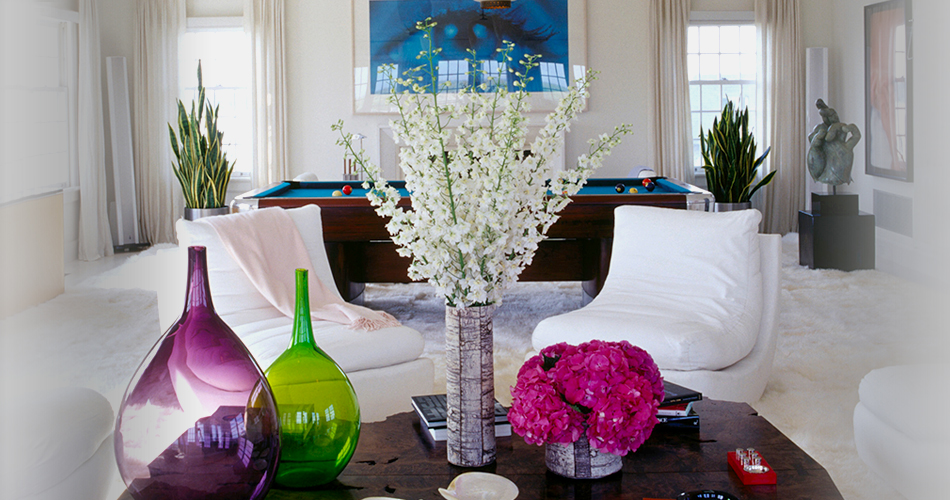
William Georgis, Southampton, New York While a regal-looking red reigned in his room at the 2014 Kips Bay Decorator Show House, Georgis elected to let color act as more of an accent in this Colonial Revival home in the Hamptons. Here, French 1940s glass lanterns hang above a burl-wood coffee table and slipper chairs, while a Sam Samore photo looks out over a mod billiard table. Photos by T. Whitney Cox, courtesy of Monacelli