Items Similar to Blue and Red Space

Want more images or videos?
Request additional images or videos from the seller
1 of 10
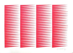
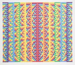
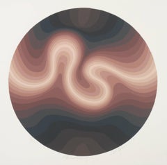
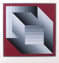
Clarence Holbrook CarterBlue and Red Space1971
1971
About the Item
Blue and Red Space
Ilk Screen, 1971
Signed and dated lower right (see photo)
editioned lower left (see photo)
Edition: 75 (75/75)
Sheet size: 22 1/8 x 29 7/8"
Image: 21-7/8 x 29-5/8"
Clarence Holbrook Carter
From Wikipedia, the free encyclopedia
Clarence Holbrook Carter (March 26, 1904 – June 4, 2000) born in Portsmouth, Ohio, was an American artist.
Education
Carter studied at the Cleveland School of Art from 1923 to 1927, and earned key patronage from William Millikin, the director of the Cleveland Museum of Art. Millikin arranged for Carter study in Italy with Hans Hofmann in Capri, Italy, for the summer of 1927.[1]
Career
Throughout the 1930s and 40s he was known for his paintings of rural America and the burden brought on by the Great Depression. By the end of World War II he had adopted a more surrealist approach to painting. In 1949, he was elected into the National Academy of Design as an Associate member, and became a full member in 1964.
Collected works
Carter's work is found in the collections of the Whitney Museum of American Art; the Museum of Fine Arts, Boston; the Hirshhorn Museum and Sculpture Garden, Washington D.C.; the James A. Michener Art Museum; the Cleveland Museum of Art; the Smithsonian American Art Museum, Washington D.C.; the Carnegie Museum of Art, Pittsburgh, PA; the Yager Museum of Art & Culture, Oneonta, New York; and many others.
References
1. ^ "CLARENCE HOLBROOK CARTER (1904-2000)". D.Wigmore Fine Art, Inc. Archived from the original on 2017-09-28. Retrieved 2017-12-05.
• Carter, Clarence Holbrook; James A. Michener; Gimpel & Weitzenhoffer (New York, N.Y.); Bodley Gallery (New York, N.Y.) Clarence Carter : a joint exhibition 30 April through 1 June, 1974 Gimpel & Weitzenhiffer Gallery ... and Bodley Gallery (New York : Gimpel & Weitzenhoffer) OCLC: 6540063
• Trapp, Frank; Douglas Dreishpoon; Ricardo Pau-Llosa. Clarence Holbrook Carter (New York : Rizzoli, ©1989) ISBN 0-8478-0975-7
- Creator:Clarence Holbrook Carter (1904-2000, American)
- Creation Year:1971
- Dimensions:Height: 22.13 in (56.22 cm)Width: 29.88 in (75.9 cm)
- Medium:
- Movement & Style:
- Period:
- Condition:
- Gallery Location:Fairlawn, OH
- Reference Number:

Clarence Holbrook Carter
Clarence Holbrook Carter achieved a level of national artistic success that was nearly unprecedented among Cleveland School artists of his day, with representation by major New York dealers, scores of awards and solo exhibits, and streams of praise flowing from pens of the top art critics. Over the course of his 60+ year career Carter evolved from an exceptionally fine American Scene painter capable of evoking deep reservoirs of mood, into an abstractionist with a strongly surrealist bent. While his two bodies of work seem at first to be worlds apart, owing to their different formal vocabularies, they, in fact, explore virtually the same subject: the nexus between life and death and the transition from earth to spirit. The early work finds its expressive power through specific people, events, and landscapes—most of which are drawn from his experiences growing up in the river town of Portsmouth, Ohio—while the later work from the 1960s on evokes potent states of being through pure flat shape, color and form that read as universals. As his primary form he adopted the ovoid or egg shape, endowing it with varying degrees of transparency. Alone or in multiples, the egg moves through Carter’s landscapes and architectural settings like a sentient spirit on a restless quest. Born and raised in southern Ohio along the banks of the mercurial Ohio River and its treacherous floods, Carter developed a love of drawing as a child, and was encouraged by both his parents. He was self-directed, found inspiration all around him, and was strongly encouraged by the fact that his teenage work consistently captured art prizes in county and state fairs. Carter studied at the Cleveland School of Art from 1923-27, where he trained under painters Henry Keller, Frank Wilcox and Paul Travis. Returning to Cleveland in 1929, Carter had his first solo show, and through Milliken taught studio classes at the Cleveland Museum of Art from 1930-37. In 1938, he moved to Pittsburgh to teach at the Carnegie Institute of Technology until 1944. Carter’s American Scene paintings of the ’30s and ’40s, which launched his artistic star, are the works for which the artist remains best known. During and immediately after World War II, Clarence Carter realized his attraction to bold pattern, dramatic perspective and eye-catching hard-edged design was a poor fit with the prevailing style of Abstract Expressionism. Fortunately, these same hallmarks of his style were prized within the realm of commercial art. Around 1964 Carter acknowledged a need to break from the confines of representational painting. Once Carter had found a potent symbol in the egg, he used it to create an astounding body of imagery for the rest of his life. Among the most ambitious of all his later paintings were his Transections, a theological term meaning to cross, specifically between life and death.
About the Seller
5.0
Recognized Seller
These prestigious sellers are industry leaders and represent the highest echelon for item quality and design.
Platinum Seller
These expertly vetted sellers are 1stDibs' most experienced sellers and are rated highest by our customers.
Established in 1978
1stDibs seller since 2013
713 sales on 1stDibs
Typical response time: 1 hour
Associations
International Fine Print Dealers Association
- ShippingRetrieving quote...Ships From: Fairlawn, OH
- Return PolicyA return for this item may be initiated within 10 days of delivery.
More From This SellerView All
- MarginalBy Julian StanczakLocated in Fairlawn, OHSigned and numbered in pencil From: Twelve Progressions, 1970-1971 Commissioned by Martha Jackson Graphics Printed: Domberger, Stuttgart, Germany Edition: 90 (51/90) Provenance:...Category
1970s Op Art Abstract Prints
MaterialsScreen
- SanctuaryBy Roy AhlgrenLocated in Fairlawn, OHSigned, dated, titled and numbered in pencil Edition: 150 (80/150) 15 color silk screen 12" round Provenance: Estate of the Artist By decentCategory
1980s Op Art Abstract Prints
MaterialsScreen
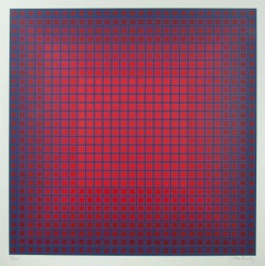
- Compounded RedBy Julian StanczakLocated in Fairlawn, OHSigned and numbered in pencil Publisher: Eugene Shuster, London Arts Printer: Vistec Graphics, Rochester, New York Stamp verso: London Arts Copyright 1980 Edition: 175 (85/175)Category
1980s Op Art Abstract Prints
MaterialsScreen
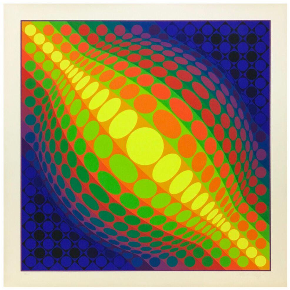
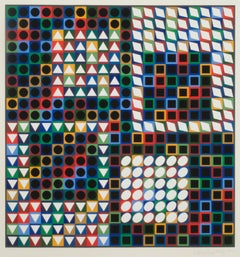
- Our M.C.-2By Victor VasarelyLocated in Fairlawn, OHOur M.C.-2 Screen print, 1970 Signed in pencil lower right Chop stamp: Denise Rene Editeur, on lower left margin From: Album Charities Edition: 300 (35/300) Catalog raisonne states e...Category
1970s Op Art Abstract Prints
MaterialsScreen
- DOOR-MCBy Victor VasarelyLocated in Fairlawn, OHDOOR-MC Screen print, 1982 Signed and numbered in pencil Printed on Arches wove paper Published by Atelier Arcay, Paris Edition: 325 (47/325) Reference Benavides & Vasarely No. 894 C...Category
1980s Op Art Abstract Prints
MaterialsScreen
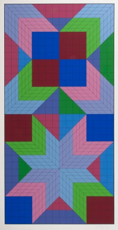
- TRIDIM GrisBy Victor VasarelyLocated in Fairlawn, OHTRIDIM Gris Screen print, 1986 Signed in pencil lower right (see photo) Edition: 200 (76/200) From: portfolio enetitled "35 ans apres" Printed at Atelier Arcay, Paris, France Publisher: Park West Gallery...Category
1980s Op Art Abstract Prints
MaterialsScreen
You May Also Like
- Fuchsine Composition - Original Screen Print by Victor Debach - 1970sBy Victor DebachLocated in Roma, ITHand signed and numbered. Edition of 100 prints. On headed paper.Category
1970s Op Art Abstract Prints
MaterialsScreen
- Composition VII - Original Screen Print by Franco Cannilla - 1971By Franco CannillaLocated in Roma, ITComposition VII is an original serigraph realized by Franco Cannilla in 1971. The artwork is hand-signed in pen by the artist. Edition of 40 prints. ...Category
1970s Op Art Abstract Prints
MaterialsScreen
- GlobeBy Victor VasarelyLocated in PARIS, FRScreen print of victor vasarely edited in 1974Category
1970s Op Art Abstract Prints
MaterialsScreen
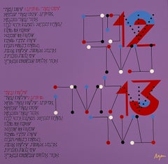
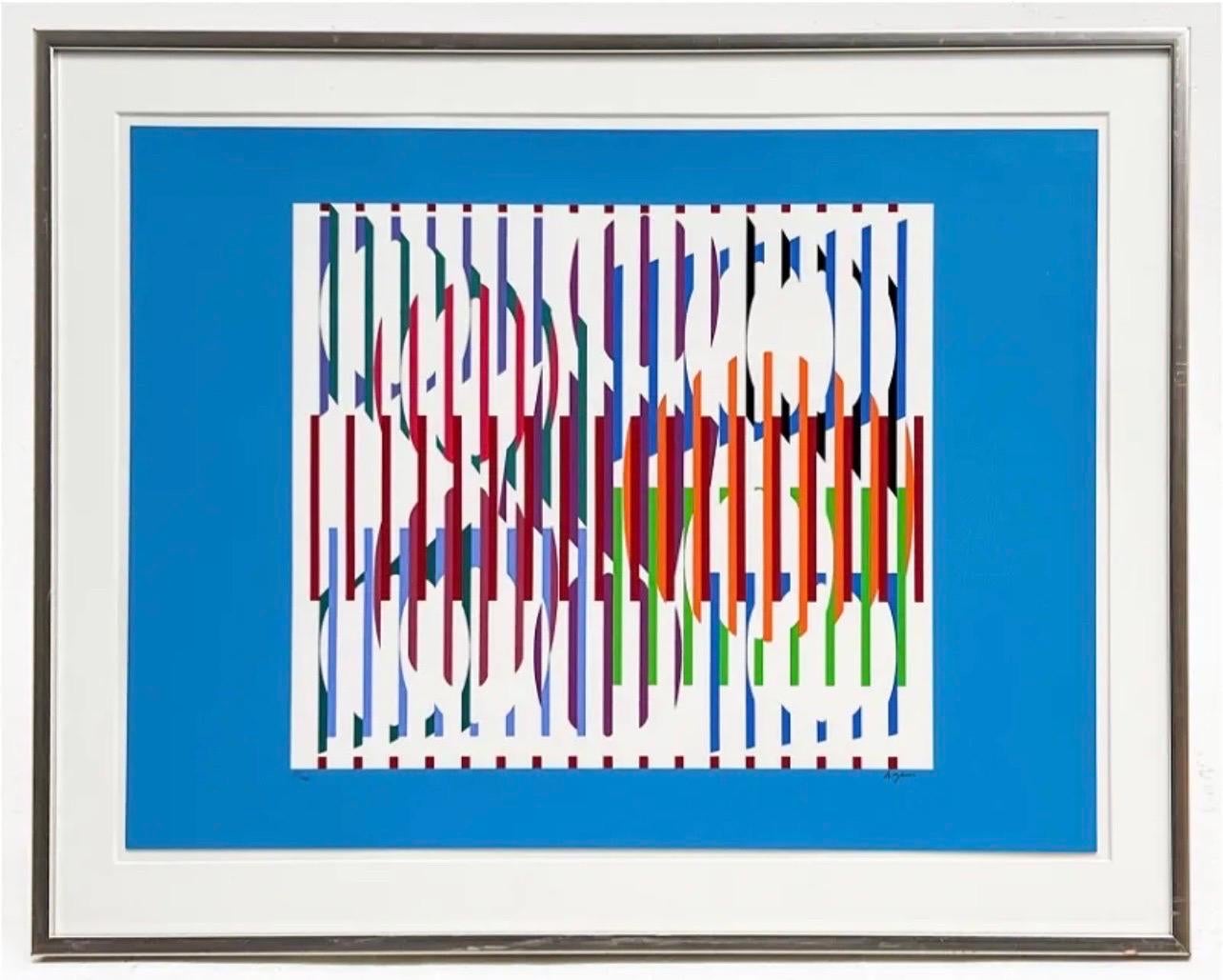
- Agam Silkscreen Mod Judaica Lithograph Hand Signed Israeli Kinetic Op Art PrintBy Yaacov AgamLocated in Surfside, FLYaacov Agam Israeli (b. 1928) Hommage aux Prix Nobel (1974) Serigraph signed lower right, numbered 85/100 sheet: 22 x 29 3/4 inches frame dimensions: 28 x 35 1/2 x 1 inches, wood fra...Category
1990s Op Art Abstract Prints
MaterialsLithograph, Screen
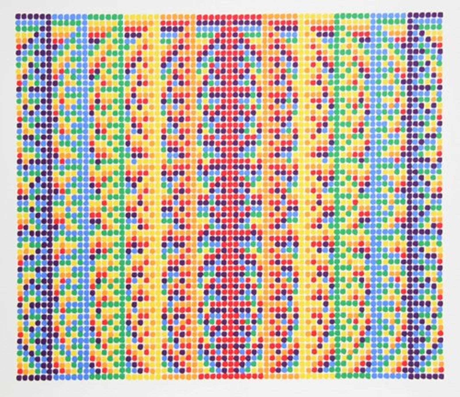
- Op Art, Kinetic 1970s Original Vintage Silkscreen Lithograph PrintBy David RothLocated in Surfside, FLHand signed and numbered limited edition print. David Roth studied at the Illinois Institute of Technology's Institute of Design and was twice the recipient of the Moholy-Nagy Scholarship in visual design. It was Roth's initial work as a designer at fine art for commercial use that brought him interesting positions as art director for Lanvin, Charles at the Ritz, and Germain Monteil. . The strings are tied in bunches and closely hung tram a wooden bar. The size and shape of the string is similar to that at a canvas painting. Each bundle is represented by a vertical row at squares on the graph and the groupings at string are lined up along the wall according to the horizontal rows at the program. The six primary and secondary colors are used in their full intensity along with black, grey, and white. As a painter Roth works to formulate with color. Some painters regard color as a concomitant of form, hence a subordinate, but Roth's color is the chief medium of his pictorial language. A programmed juxtaposition at primary color allows Roth and the viewer to play upon various combinations. The graphs Roth executes are proportioned according to a strict mathematical formula - the pictures are Composed according to horizontal and vertical divisions on the graph paper. The optical quality of color, deliberately sought, has its roots in the Bauhaus investigations of illusion, and thus has a direct relationship to the Op art produced in postwar Europe. Roth has arranged his hues so as to persuade the planes to separate from the ground on which they are planted, and float free in space. It is almost as if Roth is giving us a "readout" on his creative process. Although the graphs appear to vary in their use of color the same colors are used throughout, also the same amount of color. Roth's work illustrates the sophistication of the human eye-brain relationship that has developed and invites the viewer to participate in the evolution at visionary ideas. One Man Shows 1966 The Gallery Upstairs, Buffalo, New York 1967 The Gallery Upstairs, Buffalo, New York 1969 The House of Graphics, New York 1969 Illinois Institute of Technology, Chicago, Illinois 1972 Robert Elkon Gallery, New York 1973 Robert Elkon Gallery, New York 1974 Robert Elkon Gallery, New York 1975 Michael Wyman Gallery, Chicago 1975 Robert Elkon Gallery, New York 1976 G.W. Einstein, New York 1976 Robert Elkon Gallery, New York 1977 Robert Elkon Gallery, New York 1977 G.W. Einstein, New York 1978 Sunne Savage Gallery, Boston, Massachusetts 1978 Robert Elkon Gallery, New York 1979 Nancy Roth Gallery, Katonah, New York Group Exhibitions 1967 State University of New York, Buffalo 1970 Ronald Feldman Gallery 1970 The Everyman Gallery 1971 Robert Elkon Gallery, New York 1972 The Brooklyn Museum, New York 1972 The Newark Museum, New Jersey 1972 Art...Category
1970s Op Art Abstract Prints
MaterialsScreen
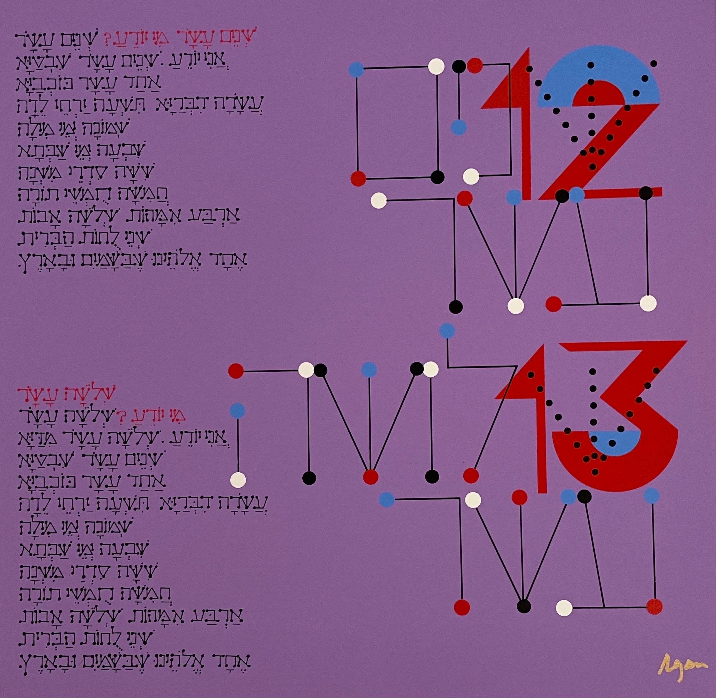
- Agam Silkscreen Jerusalem Lithograph Hand Signed Israeli Kinetic Op Art PrintBy Yaacov AgamLocated in Surfside, FLYaacov Agam, Israeli (b. 1928) Hand signed, not individually numbered but from edition of 180. I can include a copy of the title sheet with the edition size and his signature if you ...Category
1980s Op Art Abstract Prints
MaterialsLithograph, Screen