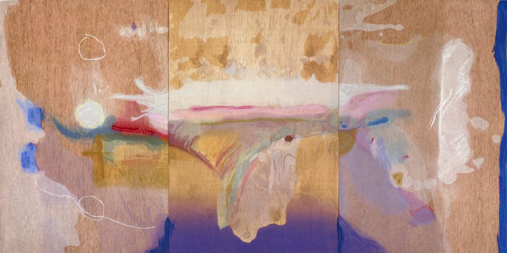

August 21, 2017Artworks by pioneering Abstract Expressionist Helen Frankenthaler are currently on view at the Clark Art Institute include Summer Harp, 1973 (from the Louis-Dreyfus Family Collection, courtesy of the William Louis-Dreyfus Foundation Inc.), and, top, Madame Butterfly, 2000 (© Tyler Graphics Ltd., Mount Kisco, New York). Both pictures © 2017 Helen Frankenthaler Foundation, Inc. / Artists Rights Society (ARS), New York
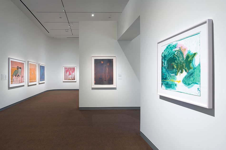
During a career that spanned six decades, Helen Frankenthaler (1928–2011) garnered accolades for abstract paintings featuring mesmerizing colors, inventive shapes and fluid space. All these qualities are in evidence in two radiant exhibitions of Frankenthaler’s work currently on view at the Clark Art Institute, in Williamstown, Massachusetts. “As in Nature” showcases 12 canvases created from 1951 to 1992, lent by two foundations: the artist’s eponymous one and one established by the late collector William Louis-Dreyfus. “No Rules” brings together 17 of the roughly 25 woodcuts the lifelong New Yorker executed between 1973 and 2009. (The shows run through October 9 and September 24 respectively.)
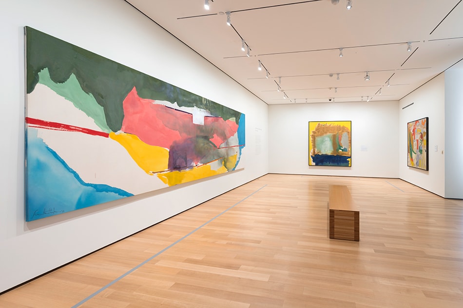
Off White Square, a highlight of “As in Nature,” is a dramatic picture from 1973 that’s more than 21 feet long. The smallest print in “No Rules” measures 20 by 24 inches. This pair of works reveal Frankenthaler’s innate gift for handling different scales, making paintings and works on paper that are compelling whether they are super-sized or intimate. In some ways, this was the magic ingredient in the work of this artist, who was one of the few women to garner the critical acclaim given to such male Ab-Ex counterparts as Willem de Kooning and Jackson Pollock.
Although not referential, Frankenthaler’s imagery often seems vaguely familiar. In many instances, the lyricism and ebullience of her paintings evoke landscapes, both real and imaginary. Her most famous work is perhaps the 1952 Mountains and Sea, which is on extended loan from her foundation to the National Gallery of Art in Washington, D.C. (It did not travel to Massachusetts for these shows.) About this canvas, executed soon after she returned to New York City from a trip to Nova Scotia, the artist said, “The landscapes were in my arms as I did it.”

The artist at the opening reception of “Helen Frankenthaler Prints: 1961–1979” at the Clark Art Institute, April 11, 1980. Photo courtesy of the Clark Art Institute

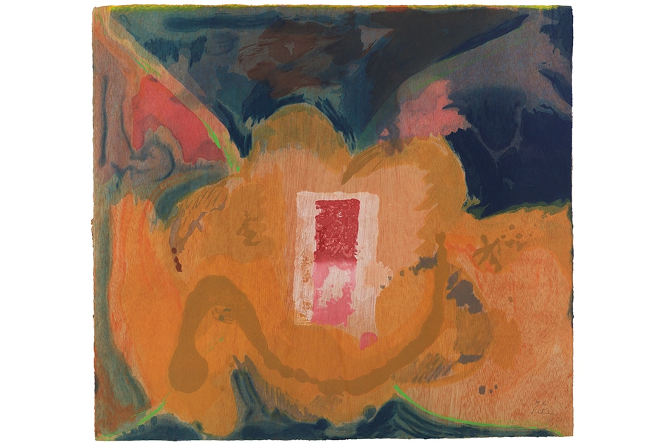
Tales of Genji III, 1998. © 2017 Helen Frankenthaler Foundation, Inc. / Artists Rights Society (ARS), New York / Tyler Graphics Ltd., Mount Kisco, New York
The paintings from different periods of Frankenthaler’s career that are on view in the elegant Tadao Ando–designed pavilion at the Clark were chosen because they illustrate her enduring engagement with landscape. Nevertheless, by titling one of the earlier pictures in the show Abstract Landscape, the artist had it both ways. Executed in 1951, two years after she graduated from Bennington College, in Vermont, this square-format canvas is also a compendium of the influences on the young artist. There are passages reminiscent of French Cubist Georges Braque, Russian abstractionist Wassily Kandinsky and Armenian-American proto-Abstract Expressionist Arshile Gorky. The largest, most assertive shapes are boldly colored.
By the time she executed Giralda, in 1956, Frankenthaler had pioneered a soak-stain technique and was pouring paint onto unprimed canvases lying directly on the floor of her studio. Her most fervent, animated works from this period have been compared to classic abstractions by Pollock, whom she knew well. However, she also was inspired by art she admired in museums and was just as enthralled by old masters like Titian.
When her pictures became sparer — during the 1960s and early ’70s (as exemplified by Summer Harp, 1973) — and then lush and spectacular (as in Red Shift, 1990), Frankenthaler earned praise as a colorist. But she herself rejected this appellation. Time and again, she pointed out that her hues were not to be admired in their own right and that what was important about her choice of pigments was that they allowed her to create compelling spatial relationships. When she succeeded, certain abstract elements seemed to project into the foreground while others hovered far back in the distance.
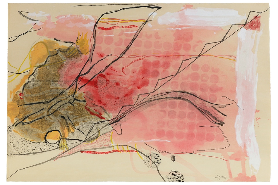

Snow Pines, 2004. © 2017 Helen Frankenthaler Foundation, Inc. / Artists Rights Society (ARS), New York / Pace Editions, Inc., New York
In the 1970s, Tatyana Grosman, of Universal Limited Art Editions, invited Frankenthaler, then in her mid-40s, to make her first woodcut. The artist approached the time-consuming process unconventionally. Her mantra became “Ignore the rules.” Rethinking the properties of wood, paper and even the inks, Frankenthaler made woodcuts that the show’s curator, Jay A. Clarke, praises for being “technically complex.” In this body of work, the painter/printmaker introduced qualities of transparency that were new to the medium. Her colors became diaphanous layers. The six prints that comprise “Tales of Genji” (1998) and “Madame Butterfly” (2000) are remarkable examples of this feat.
Early on, Frankenthaler did not carve into the wood. Instead, she applied ink to the ends of multiple blocks. Because she did not want negative spaces to appear between her colors, each individual element was printed separately rather than being joined to the others in a jigsaw-like configuration. The artist also incorporated the wood grain as a formal quality, enlivening its natural character by roughing it up a bit with all sorts of scrapers, including sand paper, dental tools and even a cheese scraper.
Acknowledging the important role that the paper was assuming, Frankenthaler left the lower portion of the fourth woodcut she created practically bare. Eventually, she began making her own unique paper pulp. As for her colors, when she was unhappy with the tones of a few in early test prints, she began laying down a layer of white ink to enliven the pigments that would be applied next.
Frankenthaler was not in any rush. She made four woodcuts during the 1970s and just two more during the ’80s. The resulting oeuvre was worth the wait. By the time she made her last woodcut, in 2009, she’d created off-kilter compositions, astonishing color arrangements and meandering lines evocative of her paintings. Referencing Japan, Frankenthaler called her first woodcut East and Beyond. As a group, all the prints at the Clark represent the best of the West and the East.