

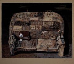
Carol Summers"Incredible String Band, " Original Color Woodcut, Serigraph, & Monotype 1972
1972
About the Item
- Creator:Carol Summers (1925 - 2016, American)
- Creation Year:1972
- Dimensions:Height: 42.75 in (108.59 cm)Width: 43.25 in (109.86 cm)
- Medium:
- Period:
- Condition:
- Gallery Location:Milwaukee, WI
- Reference Number:
Carol Summers
Carol Summers, one of America's foremost printmakers, was born in Kingston, New York, in 1925. After service in the Second World War in the Pacific, he attended Bard College, where he studied painting under Stefan Hirsch and printmaking with Louis Schanker. Soon after his graduation in 1951, Summers was awarded several prestigious fellowships, one from the Italian government to study in Italy in 1955, two from the Louis Comfort Tiffany Foundation in 1955 and 1960, and another from the John Simon Guggenheim Foundation in 1959. University posts and workshops took him all over the world, and his subject matter is mainly colorful, stylized landscapes of the places that were of special significance to him, such as in Italy, India and Nepal. In 1974, Summers was awarded an honorary doctorate from the Bard College. His work is in numerous prestigious museums internationally including the Museum of Modern Art, Metropolitan Museum of Art, Art Institute of Chicago, Los Angeles County Museum of Art and Accademia Degli Intronati in Siena, Italy.
- ShippingRetrieving quote...Ships From: Milwaukee, WI
- Return PolicyA return for this item may be initiated within 14 days of delivery.
- "Que Alivio, " Silkscreen on Board signed by Ignacio IturriaBy Ignacio IturriaLocated in Milwaukee, WI"Que Alivio" is an original silkscreen by Ignacio Iturria. The artist signed the piece in the lower right and wrote the edition number (25/59) in the lower left. This piece depicts a...Category
1990s Interior Prints
MaterialsScreen, Board
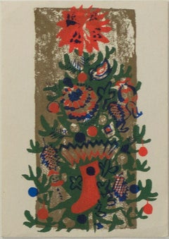
- 'O'Tannenbaum' original color silkscreen signed on verso, Christmas tree, winterBy Ruth GrotenrathLocated in Milwaukee, WI'O'Tannenbaum' (Artist's #30129) is an original color silkscreen print by Ruth Grotenrath, signed by the artist on verso. Influenced by the works of Expressionists like Henri Matisse and the woodblock prints of early modern Japanese artists like Katsushika Hokusai, Ruth Grotenrath's 'O'Tannenbaum' combines the expressive use of color of the former with the precision of the latter to create a Christmas card that is as vibrant as it is subtle. Depicting a pine tree decked with ornaments and stockings, Grotenrath has rendered the tree-topping star as a ball of flames to analogize the warmth and spirit of the holiday season. Original color silkscreen 6.625 x 4 inches, silkscreen 14.375 x 11.375 inches, frame Signed in screen on verso inside-letter Framed to conservation standards using archival materials including 100 percent rag matting and mounting materials, Museum Glass to inhibit UV damage and reduce glare, and housed in a gold finish wood frame. "The paintings of Ruth...Category
1940s Expressionist Interior Prints
MaterialsScreen
- "Westminster Abbey, " complete portfolio of 13 etchings by John SloanBy John SloanLocated in Milwaukee, WIJohn Sloan's Westminster Abbey portfolio is among the most rare of his printmaking output, and a complete set like this is even more unusual. Printed in dark brown ink in on a sturdy...Category
1890s Ashcan School Interior Prints
MaterialsEtching, Paper
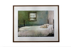
- Yellow Lab Sleeping in the Bed, 2009By (after) Andrew WyethLocated in Milwaukee, WI21 7/8" x 30" art 31 1/4" x 39" frame Gicleé print on watercolor paper after the original oil painting.Category
21st Century and Contemporary Interior Prints
MaterialsGiclée
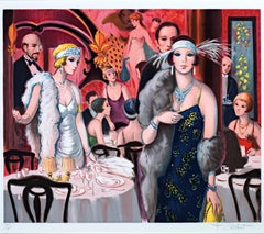
- "Soiree Chez Maxime, " Original color Lithograph signed by Francois BatetBy Francois BatetLocated in Milwaukee, WI"Soiree Chez Maxine" is an original color lithograph by Francois Batet. The artist signed the piece in the lower right and wrote the edition number (94/200) in the lower left. This piece depicts fashionable people in a party interior space. 19" x 24" image 22" x 30" paper 32" x 35 3/4" frame Francois Batet was born in 1921 in Barcelona, Spain. He studied painting at the School of San Jordi (Beaux Arts) and also at Tarrega Academy. When he lived in Madrid he studied the masters like Goya and Valasquez. He then moved to Paris and studied famous French impressionistic painters. He has lived and worked in France since 1950. Batet's classic School of Paris style recalls the spirit of Paris in the 1920's and 1930's. In addition to being a master print maker, he has illustrated over 100 books...Category
1980s Figurative Prints
MaterialsLithograph
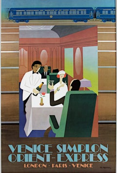
- "Orient-Express, " Colored Lithograph Poster signed by Pierre Fix-MasseauBy Pierre Fix-MasseauLocated in Milwaukee, WI"Orient-Express" is a lithograph poster by Pierre Fix-Masseau. It depicts two people dining and being served drinks on a luxury train. The artist signed the artwork in the image lower right. There was a small tear on the margin that has been repaired. 38 5/8" x 24 1/4" art 40 1/2" x 26" frame French Poster...Category
1980s Art Deco Figurative Prints
MaterialsLithograph
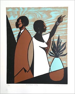
- Miss Prather's ClassBy Winfred RembertLocated in New York, NYColor Reduction woodcut from 4 blocks with 4 silk screen colors and embossing on white Rives BFK paper Edition 28/30, Unframed MassArt welcomed artist Winfred Rembert for the 2014 Master Print Series, an artist in residency project during which, an established artist transforms an idea into physical artwork, and invites students to collaborate in the art-making process. A self-taught artist, Winfred Rembert records a painful chapter of American history in autobiographical paintings, created on hand-tooled and dyed leather, which explore the lives of African Americans in Jim Crow-era Georgia. After taking part in civil rights demonstrations, he survived a lynching only to be sent to prison to do hard labor on a chain gang. Another inmate taught him leatherworking and Rembert began depicting his past in engaging compositions and vibrant color. In many scenes, Rembert offers a raw view of racism, inequality, and violence while celebrating his community’s resilience in the face of such overwhelming injustice. Winfred Rembert also participated in the Adderley Lecture series, which features distinguished artists, historians, and writers and was established in 1995 in memory of Tyrone Maurice Adderley. Past Adderley lecturers have included Chakaia Booker, Melvin Edwards...Category
2010s Folk Art Figurative Prints
MaterialsWoodcut, Screen

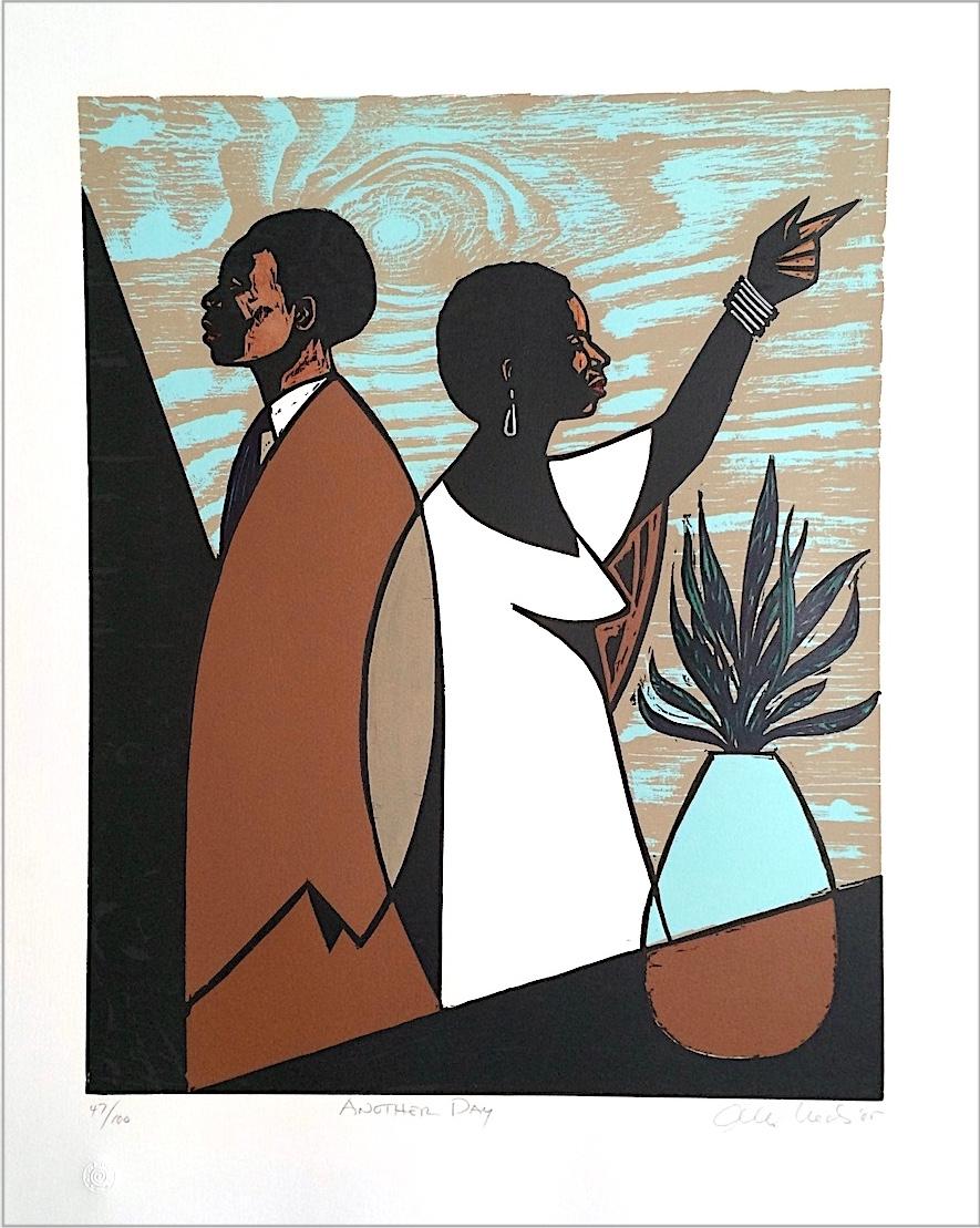
- ANOTHER DAY Signed Woodcut, Modern Portrait, Black Couple, Brown, Blue, BeigeBy Otto NealsLocated in Union City, NJANOTHER DAY is an original limited edition woodcut and screen print by the American painter and sculptor, Otto Neals. The woodblock used to print ANOTHER DAY was hand-carved by Otto ...Category
Early 2000s Contemporary Portrait Prints
MaterialsScreen, Woodcut
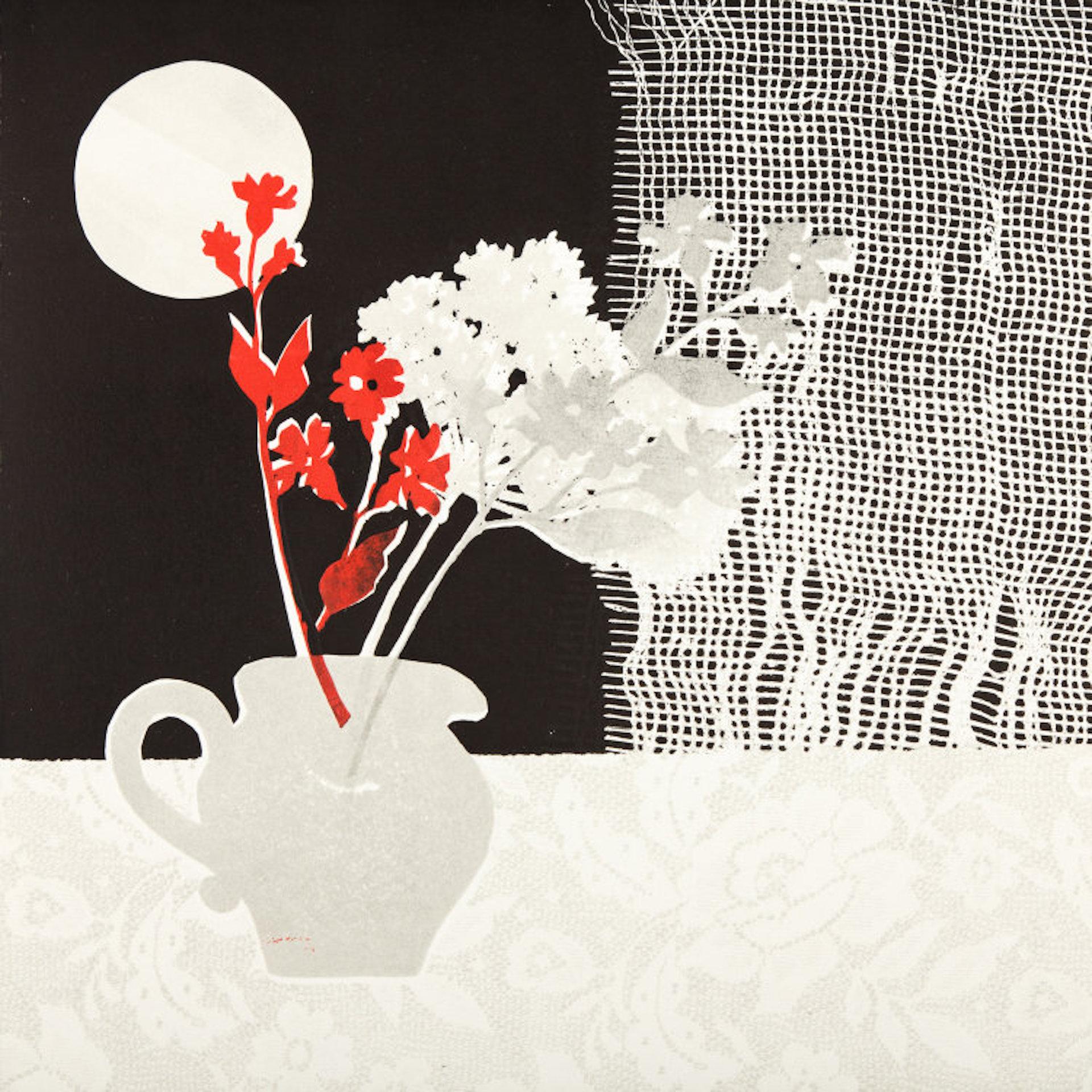
- Rosemary Farrer, Still Life with Net Curtain, Still Life Black and White ArtworkBy Rosemary FarrerLocated in Deddington, GBStill Life with Net Curtain is a unique monoprint by Rosemary Farrer. The simplistic shapes and contrasting colours give the work a layered effect. The prints are in no way copies of...Category
2010s Contemporary Still-life Prints
MaterialsPaper, Monoprint
- Rosehips BY ROSEMARY FARRER, Monoprint, Floral Art, Monotone Art, Minimalist ArtBy Rosemary FarrerLocated in Deddington, GBRosemary Farrer Rosehips Unique Monoprint Image size: H:36cm x W:30cm Mount size: H:44.5cm x W:38cm Sold Unframed Free Shipping Rosehips is a unique st...Category
21st Century and Contemporary Interior Prints
MaterialsPaper, Monoprint
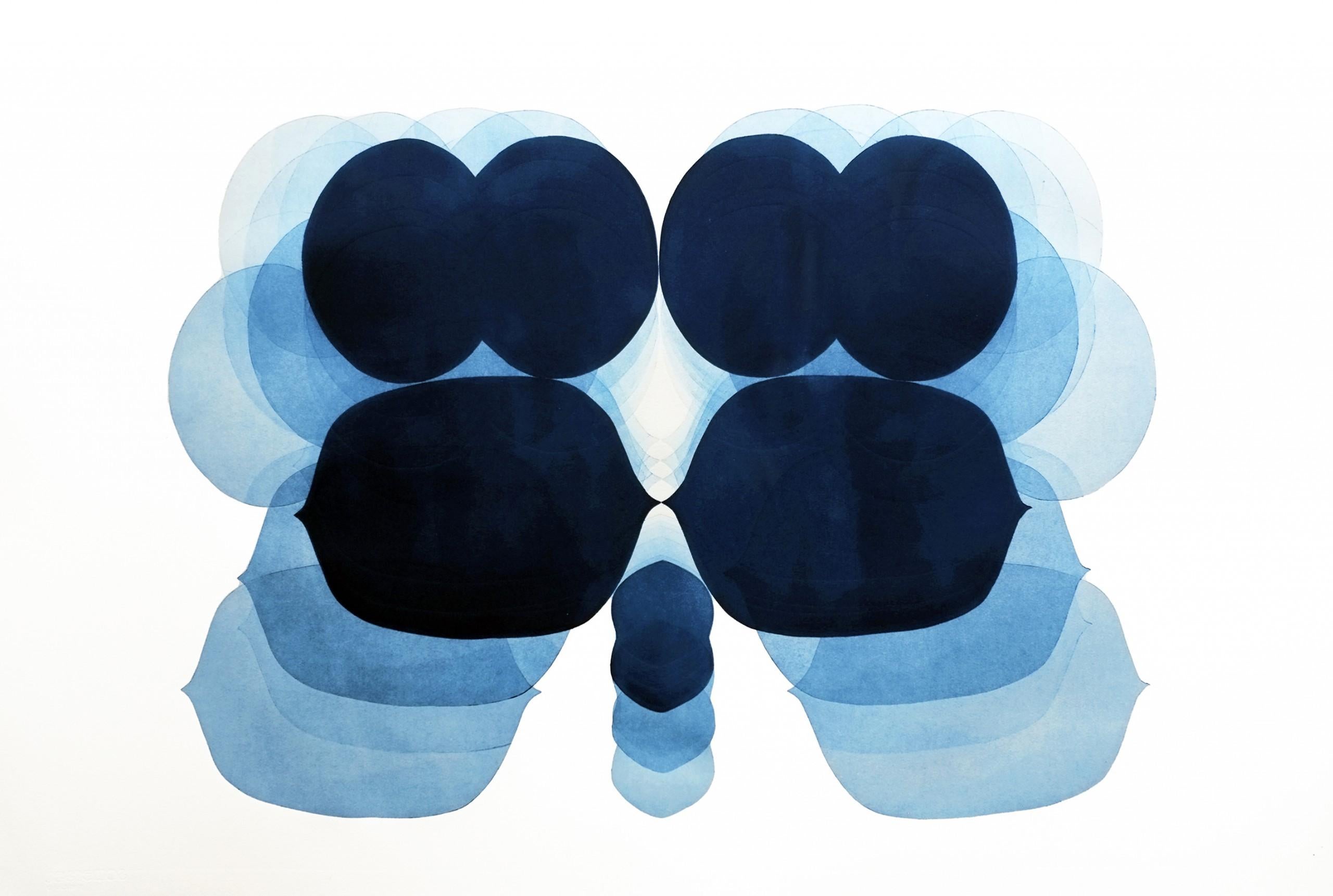
- Jonathan Moss, NV14, Original Contemporary Minimalist Print, Unique ArtBy Jonathan MossLocated in Deddington, GBJonathan Moss NV14 Bright Contemporary Art Unique Relief Print printed on Somerset, 300gsm, paper. Sheet Size: H 76cm x W 96cm x D 0.1cm Sold unframed Pl...Category
21st Century and Contemporary Contemporary Abstract Prints
MaterialsPaper, Monoprint
- NV10, Abstract Minimalist Painting, Blue and White Art, Large Contemporary ArtBy Jonathan MossLocated in Deddington, GBJonathan Moss NV10 Bright Contemporary Art Unique Relief Print printed on Somerset, 300gsm, paper. Sheet Size: H 76cm x W 111cm x D 0.1cm Sold unframed Please note that in-situ image...Category
2010s Abstract Abstract Prints
MaterialsPaper, Monoprint