Items Similar to "Destruction of the U.S. Battleship Maine in Havana Harbor, " by Kurz & Allison
Want more images or videos?
Request additional images or videos from the seller
1 of 11
Kurz and Allison"Destruction of the U.S. Battleship Maine in Havana Harbor, " by Kurz & Allison1898
1898
About the Item
"Destruction of the U.S. Battleship Maine in Havana Harbor" is an original color lithograph by Kurz & Allison. It depicts an explosion on a battleship from 1898, the same year the print was completed.
8 1/4" x 13 1/4" art
19 3/8" x 23 3/8" frame
Kurz & Allison were a major publisher of chromolithographs in the late 19th century. Based at 267-269 Wabash Avenue in Chicago, they built their reputation on large prints published in the mid-1880s depicting battles of the American Civil War. This was a period of recollection among veterans, and the company was trying to capitalize of this sentiment. In all, a set of thirty-six battle scenes were published from designs by Louis Kurz (1835–1921), himself a veteran of the war. Kurz, a native of Salzburg, Austria, had immigrated to the United States in 1848. While the prints were highly inaccurate and considered naive fantasies like Currier and Ives prints, they were still sought after. They did not pretend to mirror the actual events but rather attempted to tap people's patriotic emotions. When the Spanish-American War broke out in 1898, the company created several large prints of the major battles and of the subsequent campaign of the Philippine-American War. Later conflicts such as the Russo-Japanese War were also illustrated by the company.
- Creator:Kurz and Allison (1880, American)
- Creation Year:1898
- Dimensions:Height: 19.375 in (49.22 cm)Width: 23.375 in (59.38 cm)
- Medium:
- Period:
- Condition:
- Gallery Location:Milwaukee, WI
- Reference Number:
About the Seller
4.9
Platinum Seller
These expertly vetted sellers are 1stDibs' most experienced sellers and are rated highest by our customers.
Established in 1966
1stDibs seller since 2017
391 sales on 1stDibs
Typical response time: 1 hour
- ShippingRetrieving quote...Ships From: Milwaukee, WI
- Return PolicyA return for this item may be initiated within 14 days of delivery.
More From This SellerView All
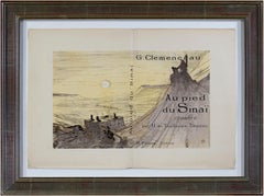
- Toulouse Lautrec Original Lithograph Famous Political 1800s Collection SignedBy Henri de Toulouse-LautrecLocated in Milwaukee, WI"Lautrec Book: From Au Pied du Sinai written by Georges Clemenceau" lithographs created by the legendary Henri de Toulouse-Lautrec. This book, Au Pied...Category
1890s Post-Impressionist Figurative Prints
MaterialsLithograph, Mulberry Paper
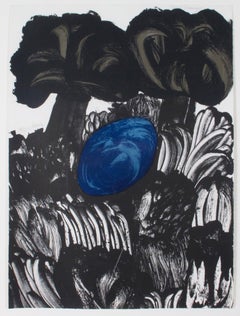
- "Jungle, " Color Lithograph Landscape signed by Carol SummersBy Carol SummersLocated in Milwaukee, WI"Jungle" is an important, rare color lithograph signed by Carol Summers from the early years of his production. The image offers a landscape of a dark jungle, printed mostly in black ink. In the center, a blue pool of water is shaded by two trees. Summers' technique in this print renders a painterly quality to the image: the grasses and leaves of the scene are all created with playful, energetic swiping motions much like watercolor paint. This technique and the use of fields of color predict the style Summers would adopt in the coming decades, making this an important early work. 30 x 22 inches, artwork Numbered 14 of the edition of 27 Carol Summers (1925-2016) has worked as an artist throughout the second half of the 20th century and into the first years of the next, outliving most of his mid-century modernist peers. Initially trained as a painter, Summers was drawn to color woodcuts around 1950 and it became his specialty thereafter. Over the years he has developed a process and style that is both innovative and readily recognizable. His art is known for it’s large scale, saturated fields of bold color, semi-abstract treatment of landscapes from around the world and a luminescent quality achieved through a printmaking process he invented. In a career that has extended over half a century, Summers has hand-pulled approximately 245 woodcuts in editions that have typically run from 25 to 100 in number. His talent was both inherited and learned. Born in 1925 in Kingston, a small town in upstate New York, Summers was raised in nearby Woodstock with his older sister, Mary. His parents were both artists who had met in art school in St. Louis. During the Great Depression, when Carol was growing up, his father supported the family as a medical illustrator until he could return to painting. His mother was a watercolorist and also quite knowledgeable about the different kinds of papers used for various kinds of painting. Many years later, Summers would paint or print on thinly textured paper originally collected by his mother. From 1948 to 1951, Carol Summers trained in the classical fine and studio arts at Bard College and at the Art Students League of New York. He studied painting with Steven Hirsh and printmaking with Louis Schanker. He admired the shapes and colors favored by early modernists Paul Klee (Sw: 1879-1940) and Matt Phillips (Am: b.1927- ). After graduating, Summers quit working as a part-time carpenter and cabinetmaker (which had supported his schooling and living expenses) to focus fulltime on art. That same year, an early abstract, Bridge No. 1 was selected for a Purchase Prize in a competition sponsored by the Brooklyn Museum. In 1952, his work (Cathedral, Construction and Icarus) was shown the first time at the Museum of Modern Art in New York City in an exhibition of American woodcuts. In 1954, Summers received a grant from the Italian government to study for a year in Italy. Woodcuts completed soon after his arrival there were almost all editions of only 8 to 25 prints, small in size, architectural in content and black and white in color. The most well-known are Siennese Landscape and Little Landscape, which depicted the area near where he resided. Summers extended this trip three more years, a decision which would have significant impact on choices of subject matter and color in the coming decade. After returning from Europe, Summers’ images continued to feature historical landmarks and events from Italy as well as from France, Spain and Greece. However, as evidenced in Aetna’s Dream, Worldwind and Arch of Triumph, a new look prevailed. These woodcuts were larger in size and in color. Some incorporated metal leaf in the creation of a collage and Summers even experimented with silkscreening. Editions were now between 20 and 50 prints in number. Most importantly, Summers employed his rubbing technique for the first time in the creation of Fantastic Garden in late 1957. Dark Vision of Xerxes, a benchmark for Summers, was the first woodcut where Summers experimented using mineral spirits as part of his printmaking process. A Fulbright Grant as well as Fellowships from the Louis Comfort Tiffany Foundation and the Guggenheim Foundation followed soon thereafter, as did faculty positions at colleges and universities primarily in New York and Pennsylvania. During this period he married a dancer named Elaine Smithers with whom he had one son, Kyle. Around this same time, along with fellow artist Leonard Baskin, Summers pioneered what is now referred to as the “monumental” woodcut. This term was coined in the early 1960s to denote woodcuts that were dramatically bigger than those previously created in earlier years, ones that were limited in size mostly by the size of small hand-presses. While Baskin chose figurative subject matter, serious in nature and rendered with thick, striated lines, Summers rendered much less somber images preferring to emphasize shape and color; his subject matter approached abstraction but was always firmly rooted in the landscape. In addition to working in this new, larger scale, Summers simultaneously refined a printmaking process which would eventually be called the “Carol Summers Method” or the “ Carol Summers Technique”. Summers produces his woodcuts by hand, usually from one or more blocks of quarter-inch pine, using oil-based printing inks and porous mulberry papers. His woodcuts reveal a sensitivity to wood especially its absorptive qualities and the subtleties of the grain. In several of his woodcuts throughout his career he has used the undulating, grainy patterns of a large wood plank to portray a flowing river or tumbling waterfall. The best examples of this are Dream, done in 1965 and the later Flash Flood Escalante, in 2003. In the majority of his woodcuts, Summers makes the blocks slightly larger than the paper so the image and color will bleed off the edge. Before printing, he centers a dry sheet of paper over the top of the cut wood block or blocks, securing it with giant clips. Then he rolls the ink directly on the front of the sheet of paper and pressing down onto the dry wood block or reassembled group of blocks. Summers is technically very proficient; the inks are thoroughly saturated onto the surface of the paper but they do not run into each other. The precision of the color inking in Constantine’s Dream in 1969 and Rainbow Glacier in 1970 has been referred to in various studio handbooks. Summers refers to his own printing technique as “rubbing”. In traditional woodcut printing, including the Japanese method, the ink is applied directly onto the block. However, by following his own method, Summers has avoided the mirror-reversed image of a conventional print and it has given him the control over the precise amount of ink that he wants on the paper. After the ink is applied to the front of the paper, Summers sprays it with mineral spirits, which act as a thinning agent. The absorptive fibers of the paper draw the thinned ink away from the surface softening the shapes and diffusing and muting the colors. This produces a unique glow that is a hallmark of the Summers printmaking technique. Unlike the works of other color field artists or modernists of the time, this new technique made Summers’ extreme simplification and flat color areas anything but hard-edged or coldly impersonal. By the 1960s, Summers had developed a personal way of coloring and printing and was not afraid of hard work, doing the cutting, inking and pulling himself. In 1964, at the age of 38, Summers’ work was exhibited for a second time at the Museum of Modern Art. This time his work was featured in a one-man show and then as one of MOMA’s two-year traveling exhibitions which toured throughout the United States. In subsequent years, Summers’ works would be exhibited and acquired for the permanent collections of multiple museums throughout the United States, Europe and Asia. Summers’ familiarity with landscapes throughout the world is firsthand. As a navigator-bombardier in the Marines in World War II, he toured the South Pacific and Asia. Following college, travel in Europe and subsequent teaching positions, in 1972, after 47 years on the East Coast, Carol Summers moved permanently to Bonny Doon in the Santa Cruz Mountains in Northern California. There met his second wife, Joan Ward Toth, a textile artist who died in 1998; and it was here his second son, Ethan was born. During the years that followed this relocation, Summers’ choice of subject matter became more diverse although it retained the positive, mostly life-affirming quality that had existed from the beginning. Images now included moons, comets, both sunny and starry skies, hearts and flowers, all of which, in one way or another, remained tied to the landscape. In the 1980s, from his home and studio in the Santa Cruz mountains, Summers continued to work as an artist supplementing his income by conducting classes and workshops at universities in California and Oregon as well as throughout the Mid and Southwest. He also traveled extensively during this period hiking and camping, often for weeks at a time, throughout the western United States and Canada. Throughout the decade it was not unusual for Summers to backpack alone or with a fellow artist into mountains or back country for six weeks or more at a time. Not surprisingly, the artwork created during this period rarely departed from images of the land, sea and sky. Summers rendered these landscapes in a more representational style than before, however he always kept them somewhat abstract by mixing geometric shapes with organic shapes, irregular in outline. Some of his most critically acknowledged work was created during this period including First Rain, 1985 and The Rolling Sea, 1989. Summers received an honorary doctorate from his alma mater, Bard College in 1979 and was selected by the United States Information Agency to spend a year conducting painting and printmaking workshops at universities throughout India. Since that original sabbatical, he has returned every year, spending four to eight weeks traveling throughout that country. In the 1990s, interspersed with these journeys to India have been additional treks to the back roads and high country areas of Mexico, Central America, Nepal, China and Japan. Travel to these exotic and faraway places had a profound influence on Summers’ art. Subject matter became more worldly and nonwestern as with From Humla to Dolpo, 1991 or A Former Life of Budha, 1996, for example. Architectural images, such as The Pillars of Hercules, 1990 or The Raja’s Aviary, 1992 became more common. Still life images made a reappearance with Jungle Bouquet in 1997. This was also a period when Summers began using odd-sized paper to further the impact of an image. The 1996 Night, a view of the earth and horizon as it might be seen by an astronaut, is over six feet long and only slightly more than a foot-and-a-half high. From 1999, Revuelta A Vida (Spanish for “Return to Life”) is pie-shaped and covers nearly 18 cubic feet. It was also at this juncture that Summers began to experiment with a somewhat different palette although he retained his love of saturated colors. The 2003 Far Side of Time is a superb example of the new direction taken by this colorist. At the turn of the millennium in 1999, “Carol Summers Woodcuts...Category
1960s Contemporary Landscape Prints
MaterialsLithograph
- "La Fleche de Zenon (Zeno's Arrow), " Lithograph after Painting by Rene MagritteBy René MagritteLocated in Milwaukee, WI"La Fleche de Zenon (Zeno's Arrow)" is a color lithograph after the original 1964 painting by Rene Magritte. A gigantic rock levitates over the sea. Waves crash bellow and a crescent moon hangs above. Art: 9.75 x 11.75 in Frame: 20.38 x 22.38 in René-François-Ghislain Magritte was born November 21, 1898, in Lessines, Belgium and died on August 15, 1967 in Brussels. He is one of the most important surrealist artists. Through his art, Magritte creates humor and mystery with juxtapositions and shocking irregularities. Some of his hallmark motifs include the bourgeois “little man,” bowler hats, apples, hidden faces, and contradictory texts. René Magritte’s father was a tailor and his mother was a miller. Tragedy struck Magritte’s life when his mother committed suicide when he was only fourteen. Magritte and his two brothers were thereafter raised by their grandmother. Magritte studied at the Brussels Academy of Fine Arts from 1916 to 1918. After graduating he worked as a wallpaper designer and in advertisement. It was during this period that he married Georgette Berger, whom he had known since they were teenagers. In 1926, René Magritte signed...Category
2010s Surrealist Landscape Prints
MaterialsLithograph
- "Sarah Bernhardt from Ilsee, Princesse de Tripoli, " Original Color LithographBy Alphonse MuchaLocated in Milwaukee, WIIn 1897, Alphonse Mucha created illustrations for "Ilsee, Princesse de Tripoli." This double-sided print is a rare proof of an original color lithograph before any text from the story was added. This is a special edition print from edition 252 and is 12/35 on Chinese paper. 4.25" x 5.0625" image 20.75" x 17.5" frame Alphonse Mucha was born in 1860 in what is now the Czech Republic. His career began in decorative painting for theater scenery...Category
1890s Art Nouveau Prints and Multiples
MaterialsLithograph
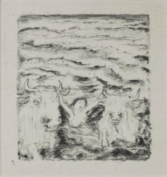
- "Daphnis et Chloe (Two Bulls & Person in Water), " Lithograph signed by BonnardBy Pierre BonnardLocated in Milwaukee, WI"Daphnis et Chloe (Two Bulls & Person in Water)" is an original lithograph by Pierre Bonnard, signed in lower left. It is a black and white work ...Category
Early 1900s Post-Impressionist Figurative Prints
MaterialsLithograph
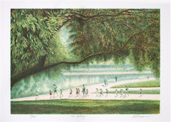
- "The Outing, " Original Color Lithograph signed by Harold AltmanBy Harold AltmanLocated in Milwaukee, WI"The Outing" is an original color lithograph by Harold Altman. It is numbered 37 out of an edition of 285, signed in the lower right hand corner. The viewers angle is high up, right ...Category
21st Century and Contemporary Post-Impressionist Figurative Prints
MaterialsLithograph

You May Also Like
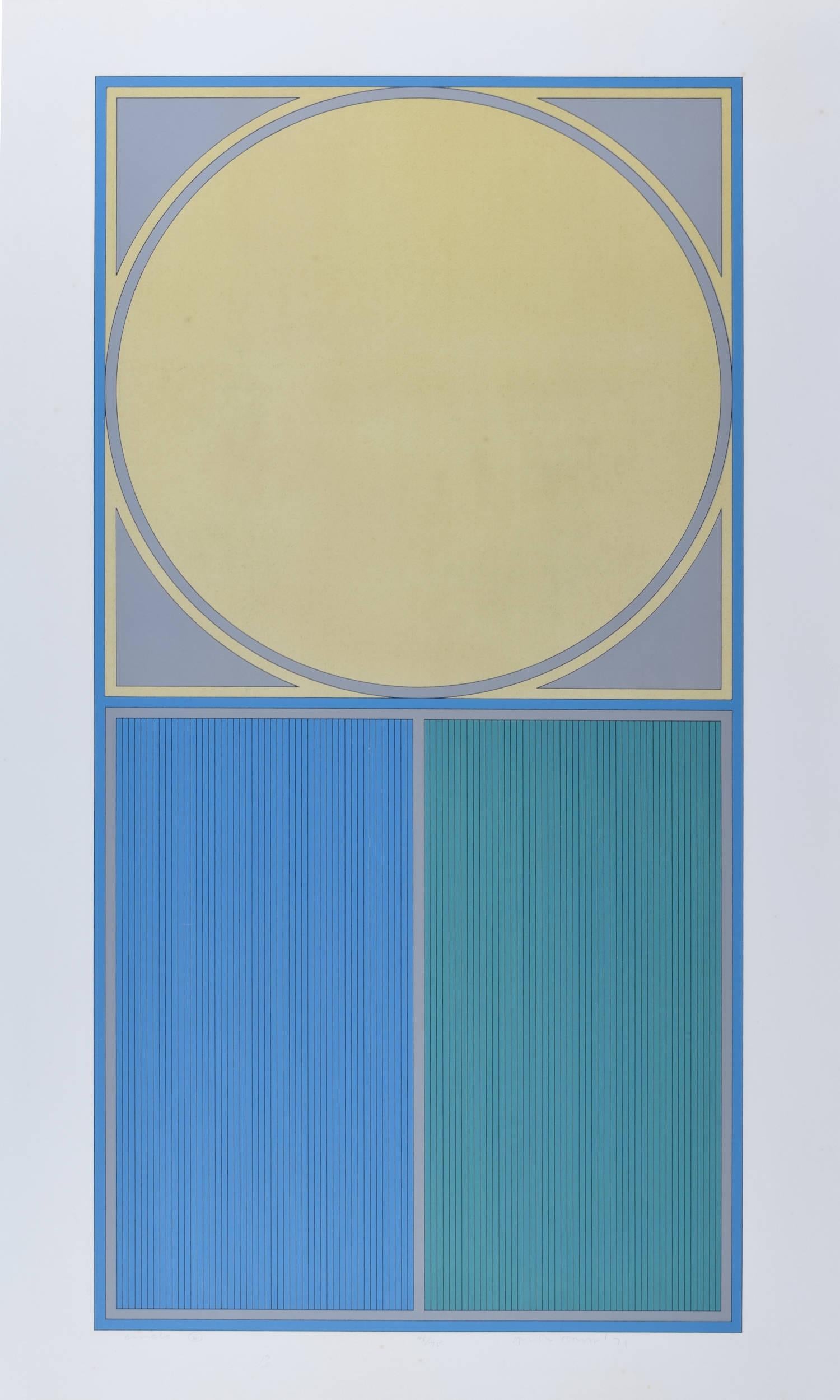
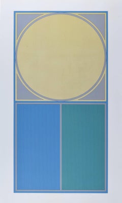
- Circle E blue and yellow modern abstract lithograph by Gordon HouseBy Gordon HouseLocated in London, GBTo see our other Modern British Art, scroll down to "More from this Seller" and below it click on "See all from this Seller" - or send us a message if you cannot find the artist you ...Category
20th Century Modern Abstract Prints
MaterialsLithograph
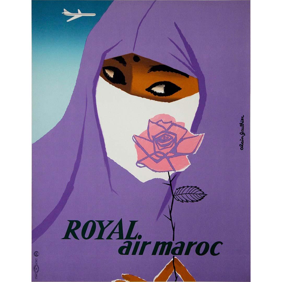
- 1958 Original Poster by Alain Gauthier Airline - Royal Air MarocLocated in PARIS, FRThe 1958 original travel poster by Alain Gauthier for Royal Air Maroc encapsulates the essence of adventure and discovery synonymous with air travel to Morocco. With its bold typogra...Category
1950s Prints and Multiples
MaterialsLinen, Paper, Lithograph
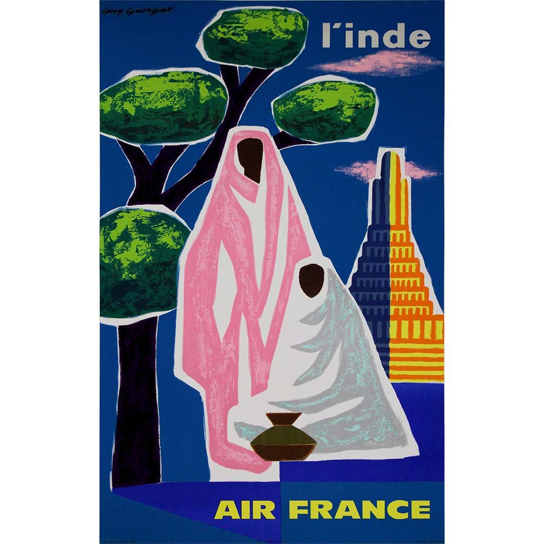
- 1962 Original travel poster by Guy Georget - Air France l'IndeBy Guy GeorgetLocated in PARIS, FRThe 1962 original travel poster by Guy Georget for Air France transports viewers to the enchanting realm of India, inviting them to embark on a journey of discovery and cultural imme...Category
1960s Prints and Multiples
MaterialsLinen, Paper, Lithograph
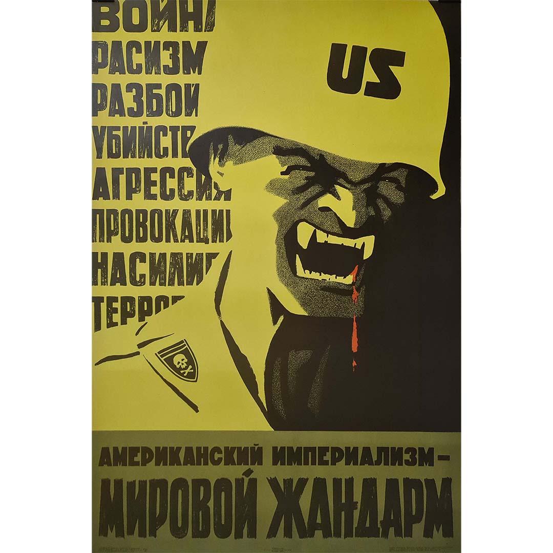
- The original Soviet poster from 1968, "American Imperialism is a World GendarmeLocated in PARIS, FRThe original Soviet poster from 1968, "American Imperialism is a World Gendarme (War, Racism, Provocation...)," stands as a vivid example of Soviet propaganda agitation. This poster ...Category
1960s Prints and Multiples
MaterialsPaper, Lithograph
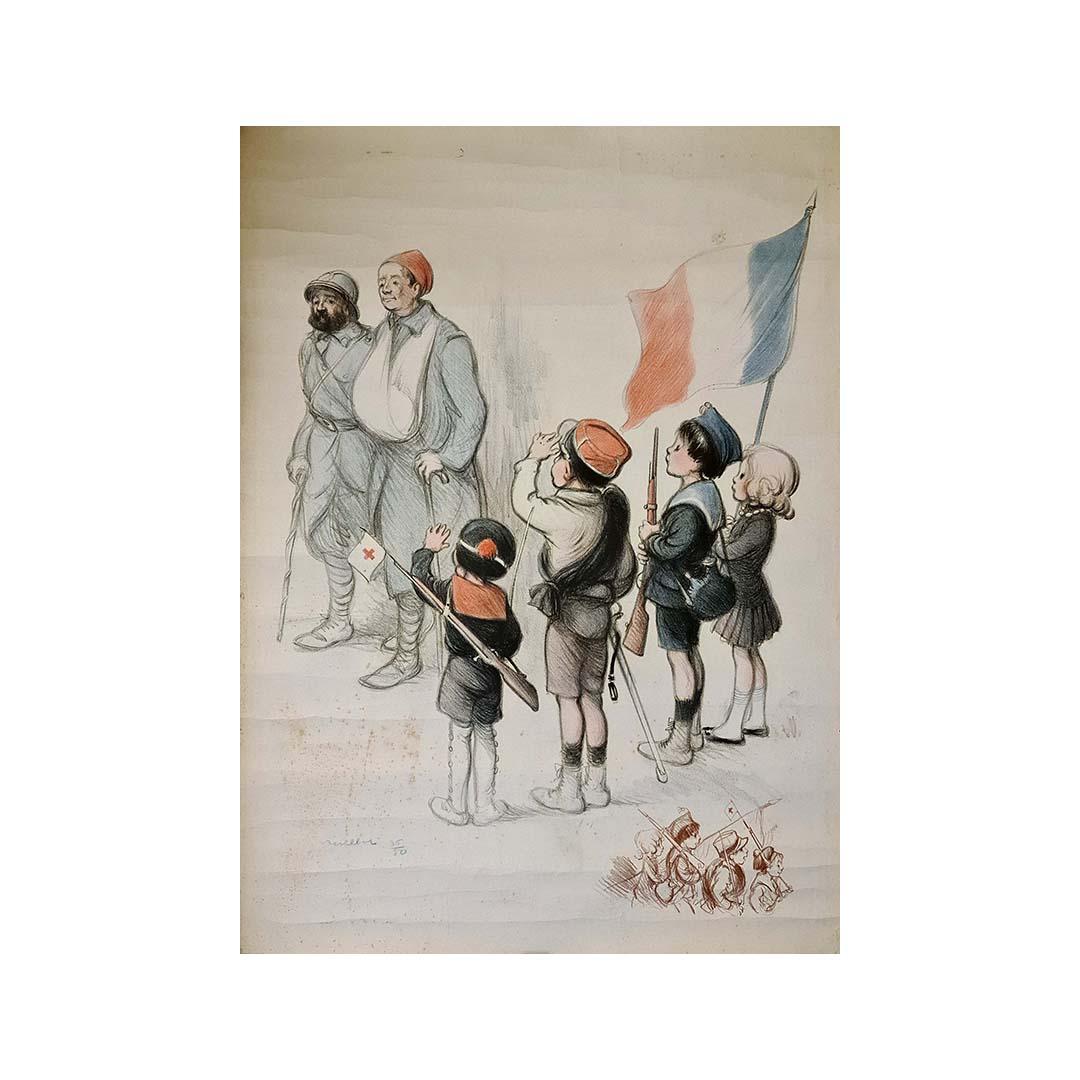
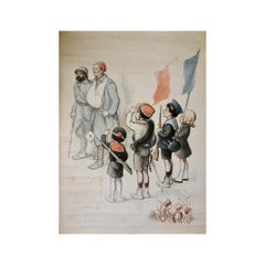
- Original lithograph by Poulbot of a scene from the first world war. This lithogrBy Francisque PoulbotLocated in PARIS, FROriginal lithograph by Poulbot of a scene from the first world war. This lithograph is numbered 36/50 and hand signed by the artist. Francisque Poulbot, born in Saint-Denis on Februa...Category
1910s Prints and Multiples
MaterialsPaper, Lithograph
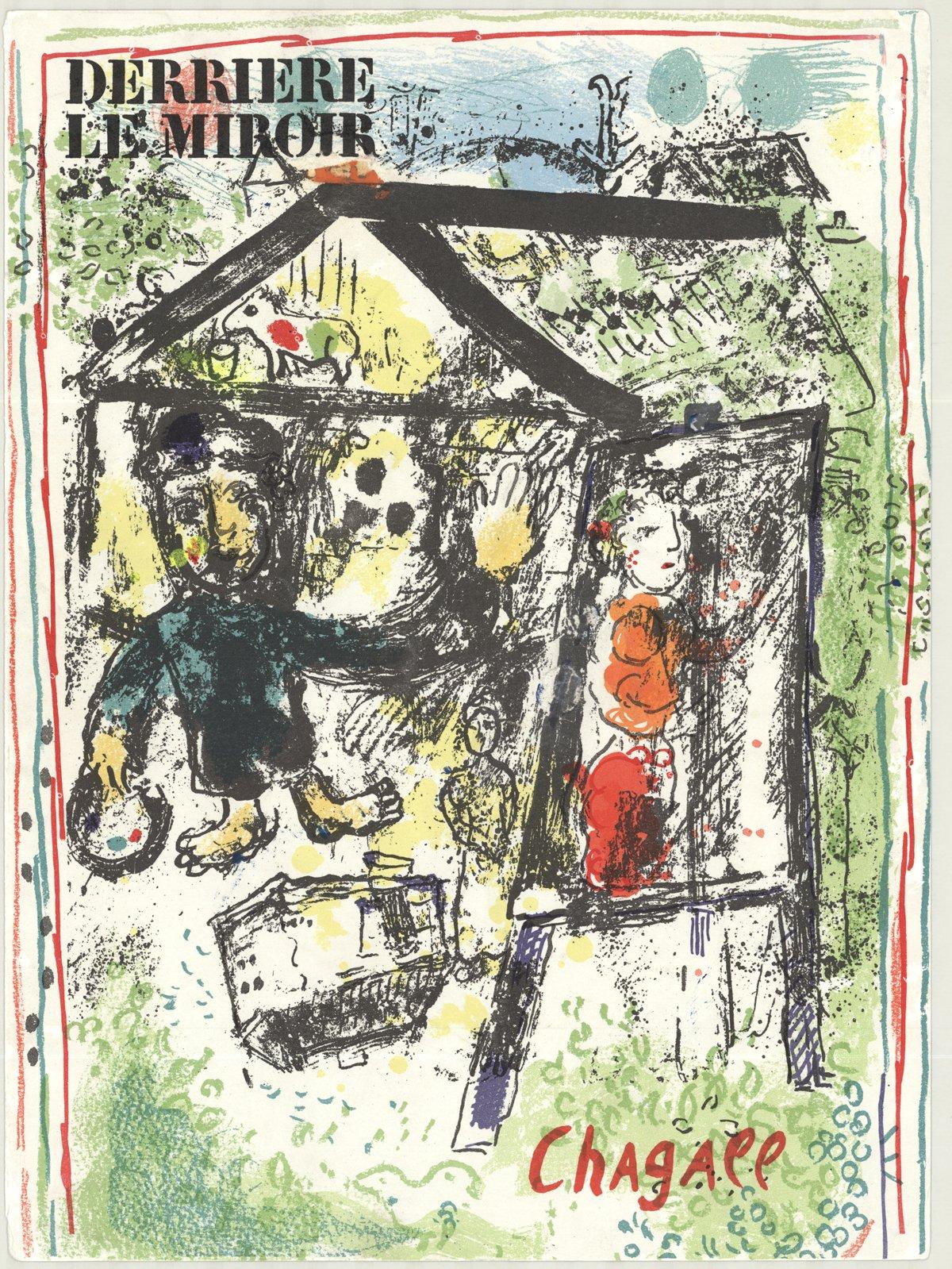
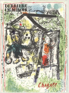
- 1969 Marc Chagall 'Derriere Le Miroir Cover'By Marc ChagallLocated in Brooklyn, NYPaper Size: 15 x 11 inches ( 38.1 x 27.94 cm ) Image Size: 15 x 11 inches ( 38.1 x 27.94 cm ) Framed: No Condition: B: Very Good Condition, with signs of handling or age Ship...Category
1960s Modern Prints and Multiples
MaterialsLithograph


Recently Viewed
View AllMore Ways To Browse
Antique And Art
The Antique Company
American Civil War
Battle And American
American Civil War Art Print
Native American War Art
Antique Civil War Prints
Japanese Style Mirror
Antique Prints Chicago
Antique Native American Prints
Civil War Battle
Lithograph By Mirror
Campaign Mirror
Mid Century Harbor Scene
Currier Lithographs
Currier And Ives
Curry And Ives
Japanese Art Set Of 4 Black