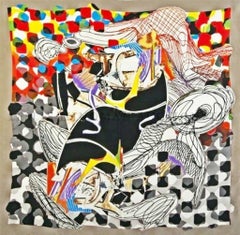
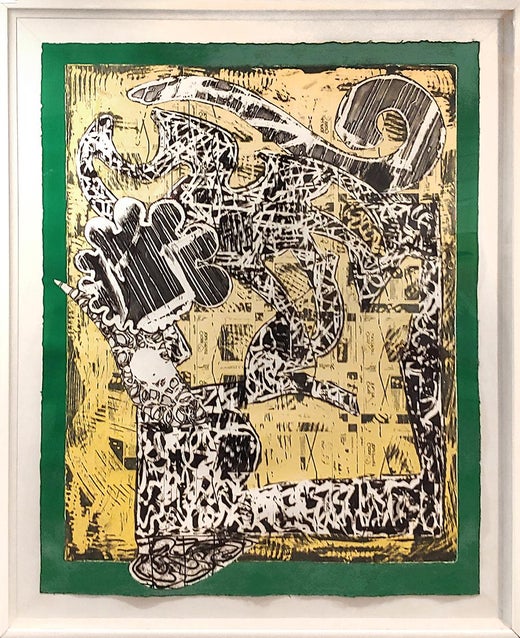
The Whale Watch Shawl (signed in indelible black marker) with Frank Stella COA

Frank StellaThe Whale Watch Shawl (signed in indelible black marker) with Frank Stella COA1994
1994
About the Item
- Creator:Frank Stella (1936, American)
- Creation Year:1994
- Dimensions:Height: 54 in (137.16 cm)Width: 54 in (137.16 cm)
- Medium:
- Movement & Style:
- Period:
- Condition:
- Gallery Location:New York, NY
- Reference Number:1stDibs: LU1745212945392
Frank Stella
Frank Stella was one of the central figures in postwar American art. A proponent of minimalism and non-representational abstraction, Stella was a painter, printmaker and sculptor.
A native of Massachusetts, Stella attended Phillips Academy in Andover and earned a BA from Princeton, where he studied art and color theory with Josef Albers and Hans Hofmann. Stella frequented New York galleries as a student and was intrigued by the work of Jackson Pollock and Franz Kline, both of whom were at the height of their creative powers in the late 1950s.
After moving to New York in 1958, Stella gravitated toward the geometric abstraction and restrained painting style of Barnett Newman and Jasper Johns.
Johns’s flat, graphic images of common objects such as targets and flags prompt viewers to question the essential nature of representation and whether these pictures are really paintings or simply new iterations of the items themselves. Stella pushed Johns’s reasoning further, considering paintings on canvas as objects in their own right, like sculptures, rather than representations. This led him to reject certain formal conventions, eschewing sketches and often using nontraditional materials, like house paint.
In 1959, Stella created his “Black Paintings,” series, in which bands of black paint are separated by thin, precise stripes of bare canvas. At a time when contemporary painting was all about wild gestures, thick paint and formal abandon, these pieces created a sensation. That same year, Stella's work was included in the exhibition "Sixteen Americans" at the Museum of Modern Art in New York, and he joined the roster of artists represented by Leo Castelli Gallery. In 1960, he began introducing color into his work and using unconventionally shaped canvases to complement his compositions.
In his “Eccentric Polygon” series, from 1965 and ‘66, Stella embraces asymmetry and bold color, creating forms delineated by painted fields and by the edges of the canvas. This series was followed by the 1967–70 “Protractor” series, characterized by colorful circles and arcs. Named after the ancient cities whose circular plans Stella had noticed while traveling in the Middle East during the 1960s, these works usually comprised several canvases set flush against one another so that the geometric figures in each section came together in a larger, more complex whole.
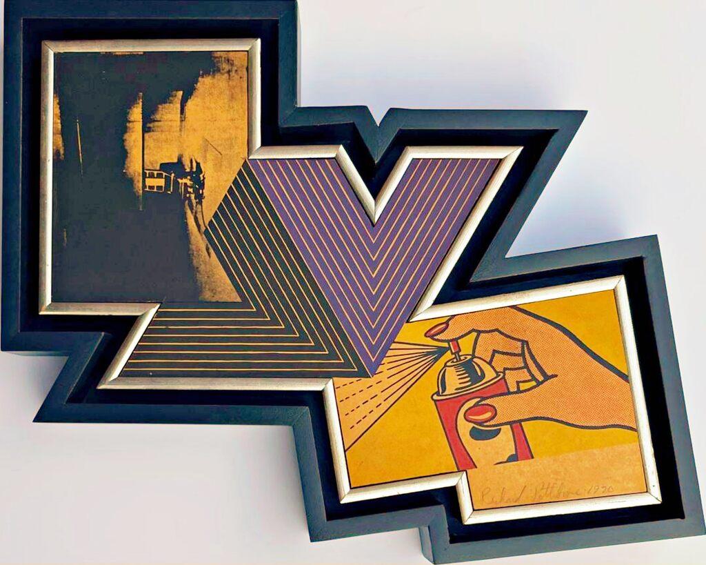
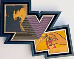
Also in the mid-1960s, Stella started exploring printmaking, initially working with Kenneth Tyler, of Gemini G.E.L., and later installing printing equipment in his own studio. In 1968, he created the “V” series of lithographs, which included the print Quathlamba I. Following a solo exhibition at the Museum of Modern Art in 1970, Stella began working in three dimensions, adding relief elements to paintings, which could almost be considered wall-mounted sculptures.
Stella’s 1970–73 “Polish Village” series was inspired by documentary photos and architectural drawings of Polish synagogues that had been destroyed by Nazis during World War II. The resulting works — composed primarily of paint and cloth on plywood — are more rugged and less polished than his previous series.
Herman Melville's Moby Dick was Stella's muse for a series of three- dimensional works he created in the 1980s in which waveforms, architectural elements and Platonic solids play a prominent role. During this period, Stella embraced a new, exuberant style that is exemplified in "La Scienza della Fiacca."
In 1997, the artist oversaw the creation of the Stella Project, a 5,000-square-foot work inside the Moores Opera House at the University of Houston. A large free-standing sculpture by Stella stands outside the National Gallery of Art in Washington, D.C.
Stella’s work is in the collections of numerous important museums around the world, including New York’s Museum of Modern Art and Metropolitan Museum of Art; the Menil Collection, in Houston; the Hirshhorn Museum and Sculpture Garden, in Washington, D.C.; and the San Francisco Museum of Modern Art. He was awarded the National Medal of Arts by President Obama in 2009, and was given the Lifetime Achievement Award in Contemporary Sculpture by the International Sculpture Center in 2011.
Find original Frank Stella art for sale on 1stDibs.
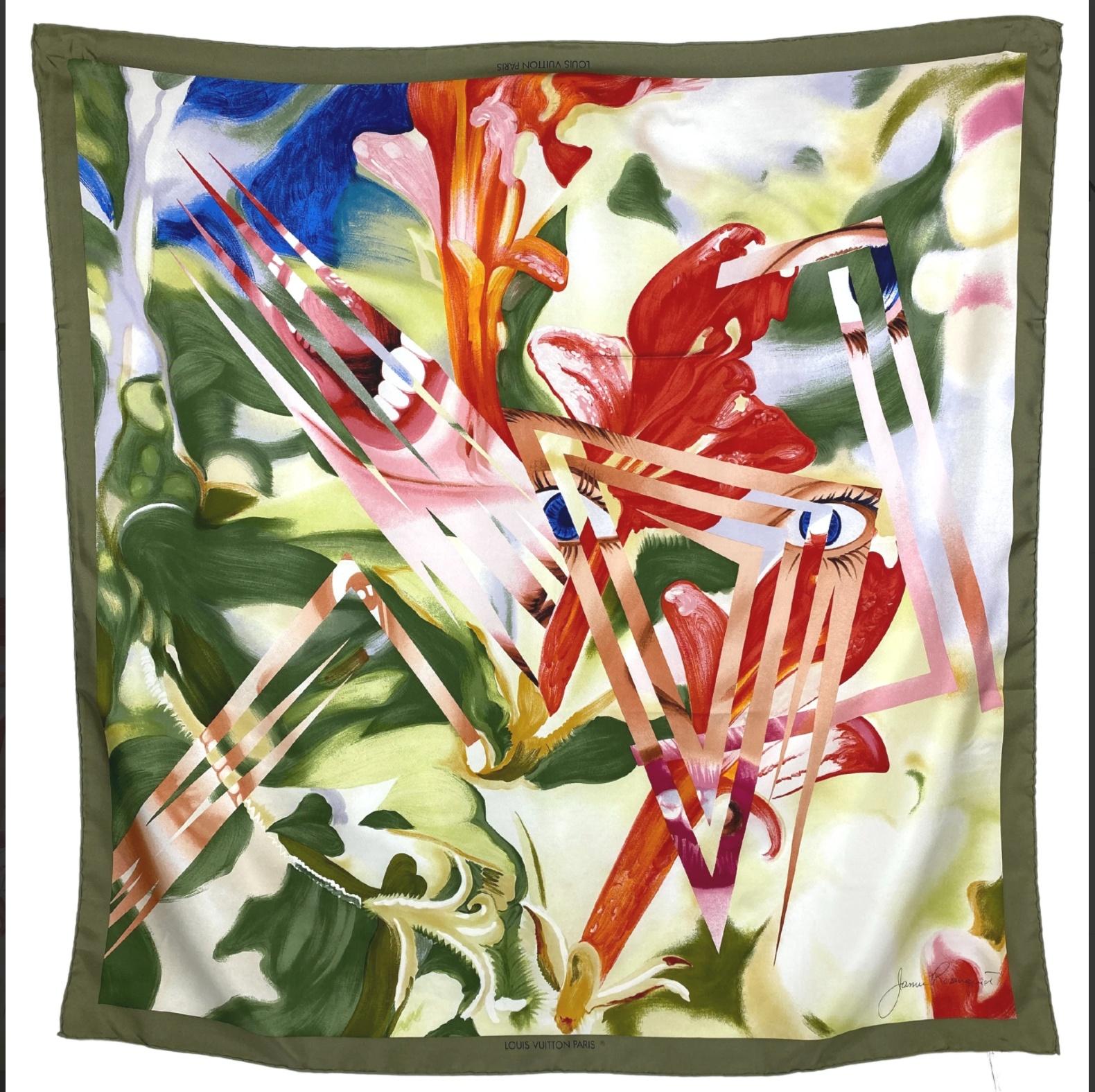
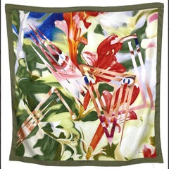
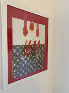
- Louis Vuitton Limited Edition Silk Scarf designed by James RosenquistBy James RosenquistLocated in New York, NYJames Rosenquist Limited Edition Vintage Louis Vuitton Silk Scarf, 1987 Screenprint on 100% Italian Silk Scarf . Signed on the plate 34 × 34 in 86.4 × 86.4 cm Limited Edition of 50...Category
1980s Pop Art Mixed Media
MaterialsSilk, Screen
- Aufbruch Aus Moskau MockBa: Suite of 20 signed prints top Russian artists 64/100Located in New York, NYVARIOUS ARTISTS AUFBRUCH AUS MOSKAU MOCKBA - PORTFOLIO OF TWENTY (20) ORIGINAL LIMITED EDITION SIGNED GRAPHICS, 1990 20 Limited edition, hand signed and numbered Screenprints, unfram...Category
1990s Pop Art Abstract Prints
MaterialsMixed Media, Screen, Linen, Pencil
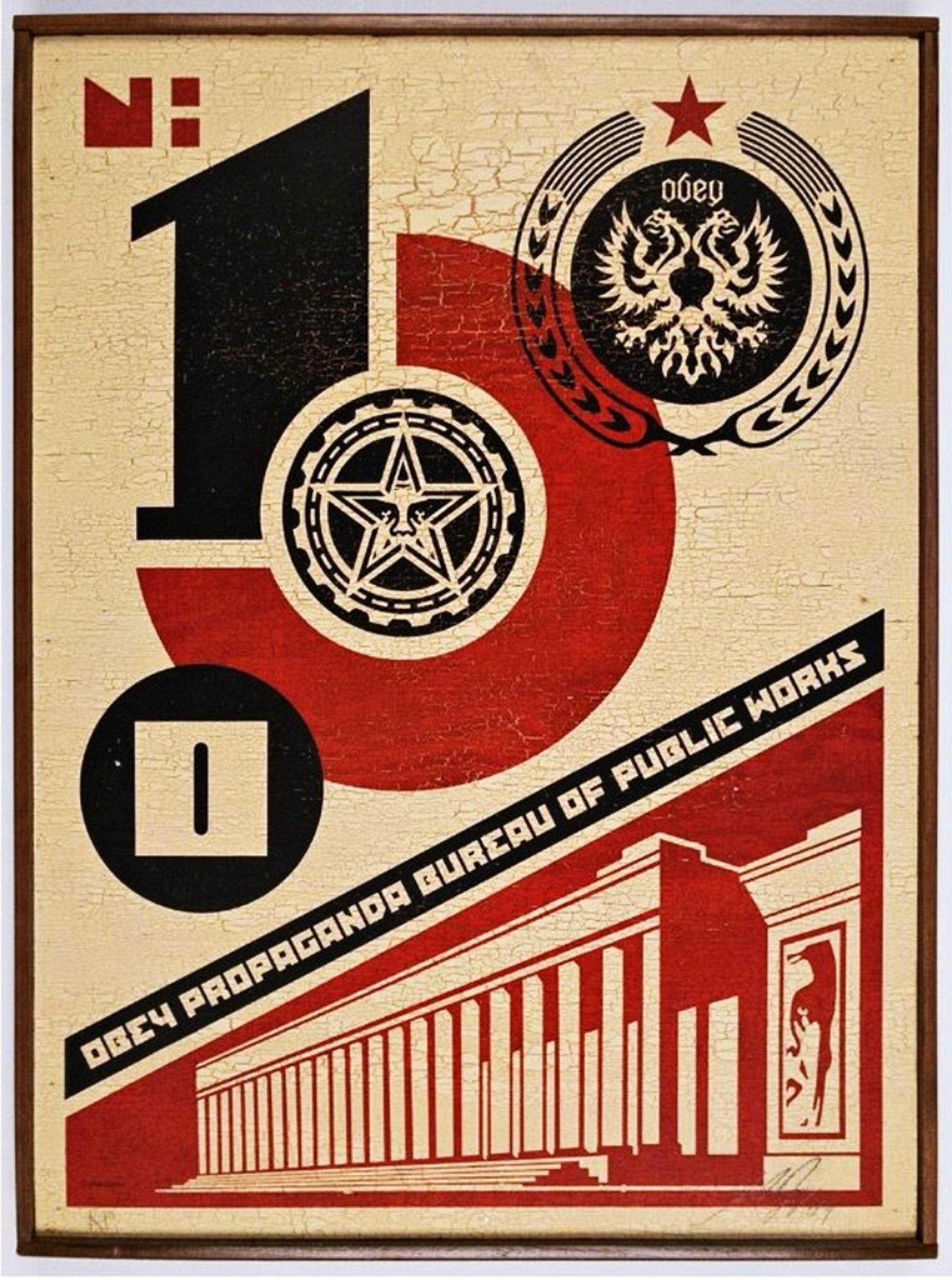
- Bureau of Public Works (Mixed Media on Wood) Twice Signed Artists Proof Ed of 2By Shepard FaireyLocated in New York, NYSHEPARD FAIREY Bureau of Public Works (on Wood), 2004 Mixed media silkscreen on wood panel. Hand signed and annotated on both the recto and verso. In original handmade artist's frame...Category
Early 2000s Pop Art Mixed Media
MaterialsWood, Mixed Media, Screen, Pencil
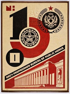 Shepard FaireyBureau of Public Works (Mixed Media on Wood) Twice Signed Artists Proof Ed of 2 , 2004$11,250 Sale Price25% Off
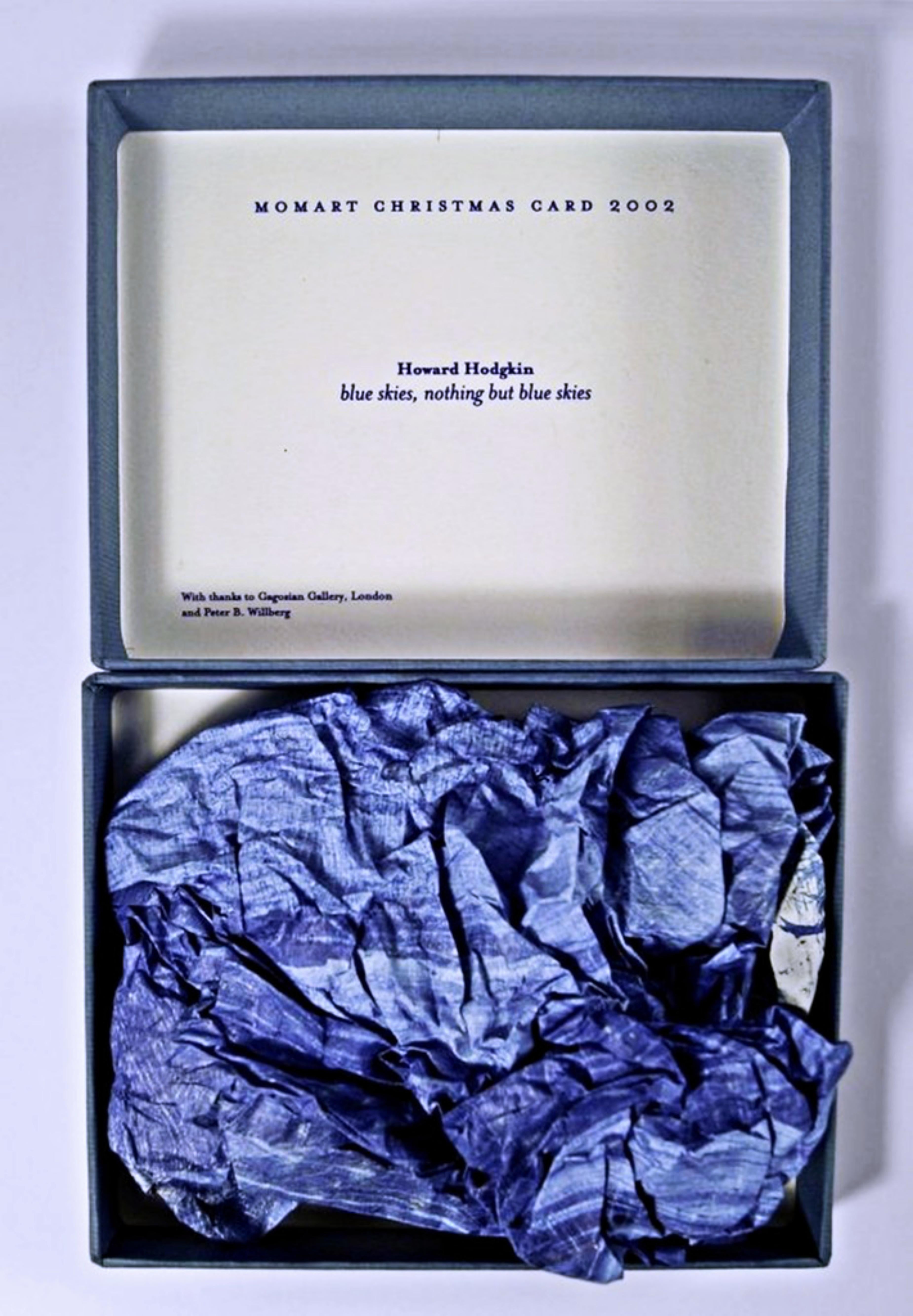
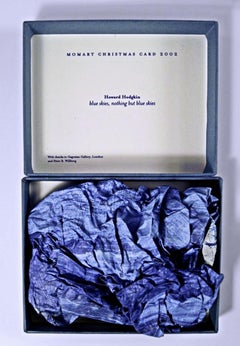
 - Blue Skies, Nothing but Blue SkiesBy Howard HodgkinLocated in New York, NYHOWARD HODGKIN Blue Skies, Nothing but Blue Skies, 2002 Screenprint in Colors, Scrunched Up and Presented in a Box 5 3/25 × 6 3/10 x 2 inches Edition of 500 (unnumbered) Momart is a British company specialising in the storage, transportation, and installation of works of art. Today, the company is best known for two things: its annual artist Christmas Card, and a 2004 warehouse fire that destroyed irreplaceable art works including Tracey Emin's famous "Everyone I Have Ever Slept With. Momart's clients include the Royal Academy of Arts, Victoria & Albert Museum, National Gallery, Tate Modern, Tate Britain and Buckingham Palace. The tradition of the MOMART "Christmas card" (which would later morph into actual artist-designed work) goes back to 1984 when the first object – a festive card – was designed for the company by Bruce McLean. Since then Momart collaborated on this project with many of the top British and international artists. The complete series of Momart Christmas cards is now part of the permanent collections of the Victoria and Albert Museum and the Tate. The present item is the vintage 2002 MOMART Christmas card, designed by Howard Hodgkin. It is a rich blue screenprint, scrunched up in a box - with the printed text MOMART CHRISTMAS CARD 2002 inside the box, the artist's name and work title, "Blue Skies, Nothing But Blue Skies" and a credit at the bottom "With thanks to Gagosian Gallery London and Peter B. Willberg." And that's the MOMART "gift". Very cool and collectible! Unnumbered, but known to have been issued in an edition of 500 About Howard Hodgkin For an artist, time can always be regained . . . because by an act of imagination you can always go back. —Howard Hodgkin One of England’s most celebrated contemporary painters, Howard Hodgkin (1932–2017) was deeply attuned to the interplay of gesture, color, and ground. His brushstrokes, set against wooden supports, often continue beyond the picture plane and onto the frame, breaking from traditional confines. Embracing time as a compositional element, his work is testament to his immersion in the intangibility of thoughts, feelings, and fleeting private moments. Hodgkin was born in London and grew up in Hammersmith Terrace. During World War II he was evacuated to Long Island, New York, for three years. In the Museum of Modern Art, New York, he saw works by School of Paris artists such as Henri Matisse, Édouard Vuillard, and Pierre Bonnard, which he could not easily have seen then in London or Paris. Back in England in 1943, Hodgkin ran away from Eton College and Bryanston School, convinced that education would impede his progress as an artist, though he encountered inspiring teachers at both schools. He then attended Camberwell School of Arts and Crafts (1949–50) and Bath Academy of Art, Corsham (1950–54). Hodgkin never belonged to a school or group. While many of his contemporaries were drawn to Pop or the School of London, he remained independent, initially marking his outsider status with a series of portraits of contemporary artists and their families. His first solo exhibition was at Arthur Tooth and Sons in London in 1962. Two years later he first visited India, following his interest in Indian miniatures, which began during his time at Eton. Collecting Indian art would remain a lifelong passion, which he initially supported by dealing in picture frames. In 1984 Hodgkin represented Britain at the Biennale di Venezia. His exhibition Forty Paintings reopened the Whitechapel Gallery, London, in 1985, and he won the Turner Prize the same year. In 1998 Hodgkin joined Gagosian, and the gallery presented his first show in the United States since his critically acclaimed 1995–96 exhibition at the Metropolitan Museum of Art, New York, which had traveled to the Modern Art Museum of Fort Worth, Texas; Kunstverein für die Rheinlande und Westfalen, Düsseldorf; and Hayward Gallery, London. His first full retrospective opened at the Irish Museum of Modern Art, Dublin, in 2006 and traveled to Tate Britain, London, and Museo Nacional Centro de Arte Reina Sofía, Madrid. In the autumn of 2016 Hodgkin visited India for what was to be the last time, completing six new paintings before his return to London. These works were shown at England’s Hepworth Wakefield in 2017, in Painting India, a show that focused on the artist’s long-standing relationship with the Indian subcontinent. Starting in the 1950s, Hodgkin maintained a parallel printmaking practice, translating his visual language into works on paper. Exploring the interactions of color and space on a grander scale, he produced theatrical set designs for Ballet Rambert, the Royal Ballet, and the Mark Morris Dance Group...Category
Early 2000s Pop Art Mixed Media
MaterialsMixed Media, Screen
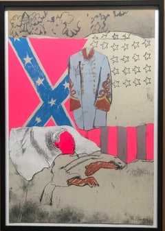
- The Last Civil War Veteran limited edition signed mixed media silkscreen collageBy Larry RiversLocated in New York, NYLarry Rivers The Last Civil War Veteran, 1970 Silkscreen and mixed media collage on paper 29 × 19 3/4 inches Frame included Hand signed and numbered 55/100 in graphite pencil lower front 1970 Mixed media collage multiple based upon famous Larry Rivers 1961 painting "The Last Civil War Veteran'. (In 1979-80, Rivers reprised this theme with another edition of 125, but this is the original 1970 print from the limited edition of only 100) In 1962, the Museum of Modern Art acquired The Last Civil War Veteran and by early 1963 put it on view. 1963 marked the hundred-year anniversary of the Emancipation Proclamation...Category
1970s Pop Art Abstract Prints
MaterialsMixed Media, Screen, Laid Paper, Pencil, Graphite
- The Appropriation piece: Andy Warhol, Frank Stella, Roy Lichtenstein Unique var.By Richard PettiboneLocated in New York, NYRichard Pettibone The Appropriation Print Andy Warhol, Frank Stella, Roy Lichtenstein, 1970 Silkscreen in colors on masonite board (unique variant on sculpted board) Hand-signed by artist, Signed and dated on the front (see close up image) Bespoke frame Included This is a rare example of Pettibone's iconic Appropriation Print, as it's silkscreened and sculpted on masonite board rather than paper, giving it a different background hue, and enabling it work to be framed so uniquely. The Appropriation print is one of the most coveted prints Pettibone ever created ; the regular edition is on a full sheet with white background; the present example was silkscreened on board, allowing it to be framed in 3-D. While we do not know how many examples of this graphic work Pettibone created, so far the present work is the only one example we have ever seen on the public market since 1970. (Other editions of The Appropriation Print have been printed on vellum, wove paper and pink and yellow paper.) This 1970 homage to Andy Warhol, Frank Stella and Roy Lichtenstein exemplifies the type of artistic appropriation he was engaging in early on during the height of the Pop Art movement - long before more contemporary artists like Deborah Kass, Louise Lawler, etc. followed suit. This silkscreen was in its original 1970 vintage period frame; a bespoke custom hand cut black wood outer frame was subsequently created especially to house the work, giving it a distinctive sculptural aesthetic. Measurements: Framed 14.5 inches vertical by 18 inches horizontal by 2 inches Work 13 inches vertical by 16.5 inches horizontal Richard Pettibone biography: Richard Pettibone (American, b.1938) is one of the pioneering artists to use appropriation techniques. Pettibone was born in Los Angeles, and first worked with shadow boxes and assemblages, illustrating his interest in craft, construction, and working in miniature scales. In 1964, he created the first of his appropriated pieces, two tiny painted “replicas” of the iconic Campbell’s soup cans by Andy Warhol (American, 1928–1987). By 1965, he had created several “replicas” of paintings by American artists, such as Warhol, Roy Lichtenstein (1923–1997), Ed Ruscha (b.1937), and others, among them some of the biggest names in Pop Art. Pettibone chose to recreate the work of leading avant-garde artists whose careers were often centered on themes of replication themselves, further lending irony to his work. Pettibone also created both miniature and life-sized sculptural works, including an exact copy of Bicycle Wheel by Marcel Duchamp (French, 1887–1968), and in the 1980s, an entire series of sculptures of varying sizes replicating the most famous works of Constantin Brancusi (Romanian, 1876–1957). In more recent years, Pettibone has created paintings based on the covers of poetry books by Ezra Pound, as well as sculptures drawn from the grid compositions of Piet Mondrian (Dutch, 1872–1944). Pettibone straddles the lines of appropriation, Pop, and Conceptual Art, and has received critical attention for decades for the important questions his work raises about authorship, craftsmanship, and the original in art. His work has been exhibited at the Institute for Contemporary Art in Philadelphia, the Museum of Modern Art in New York, the Museum of Contemporary Art in Miami, and the Laguna Art Museum in Laguna Beach, CA. Pettibone is currently based in New York. "I wished I had stuck with the idea of just painting the same painting like the soup can and never painting another painting. When someone wanted one, you would just do another one. Does anybody do that now?" Andy Warhol, 1981 Since the mid-1960s, Richard Pettibone has been making hand-painted, small-scale copies of works by other artists — a practice due to which he is best known as a precursor of appropriation art — and for a decade now, he has been revisiting subjects from across his career. In his latest exhibitions at Castelli Gallery, Pettibone has been showing more of the “same” paintings that had already been part of his 2005–6 museum retrospective,1 and also including “new” subject matter drawn from his usual roster of European modernists and American postwar artists. Art critic Kim Levin laid out some phases of the intricate spectrum from copies to repetitions in her review of the Warhol-de Chirico showdown, a joint exhibition at the heyday of appropriation art in the mid-1980s when Warhol’s appropriations of de Chirico’s work effectively revaluated “the grand old auto-appropriator”. Upon having counted well over a dozen Disquieting Muses by de Chirico, Levin speculated: “Maybe he kept doing them because no one got the point. Maybe he needed the money. Maybe he meant it when he said his technique had improved, and traditional skills were what mattered.” On the other side, Warhol, in her eyes, was the “latter-day exemplar of museless creativity”. To Pettibone, traditional skills certainly still matter, as he practices his contemporary version of museless creativity. He paints the same painting again and again, no matter whether anybody shows an interest in it or not. His work, of course, takes place well outside the historical framework of what Levin aptly referred to as the “modern/postmodern wrestling match”, but neither was this exactly his match to begin with. Pettibone is one of appropriation art’s trailblazers, but his diverse selection of sources removes from his work the critique of the modernist myth of originality most commonly associated with appropriation art in a narrow sense, as we see, for example, in Sherrie Levine’s practice of re-photographing the work of Walker Evans and Edward Weston. In particular, during his photorealist phase of the 1970s, Pettibone’s sources ranged widely across several art-historical periods. His appropriations of the 1980s and 1990s spanned from Picasso etchings and Brancusi sculptures to Shaker furniture and even included Ezra Pound’s poetry. Pettibone has professed outright admiration for his source artists, whose work he shrinks and tweaks to comic effect but, nevertheless, always treats with reverence and care. His response to these artists is primarily on an aesthetic level, owing much to the fact that his process relies on photographs. By the same token, the aesthetic that attracts him is a graphic one that lends itself to reproduction. Painstakingly copying other artists’ work by hand has been a way of making it his own, yet each source is acknowledged in his titles and, occasionally, in captions on white margins that he leaves around the image as an indication that the actual source is a photographic image. The enjoyment he receives in copying is part of the motivation behind doing it, as is the pleasure he receives from actually being with the finished painting — a considerable private dimension of his work. His copies are “handmade readymades” that he meticulously paints in great quantities in his studio upstate in New York; the commitment to manual labor and the time spent at material production has become an increasingly important dimension of his recent work. Pettibone operates at some remove from the contemporary art scene, not only by staying put geographically, but also by refusing to recoup the simulated lack of originality through the creation of a public persona. In so doing, Pettibone takes a real risk. He places himself in opposition to conceptualism, and he is apprehensive of an understanding of art as the mere illustration of an idea. His reading of Marcel Duchamp’s works as beautiful is revealing about Pettibone’s priorities in this respect. When Pettibone, for aesthetic pleasure, paints Duchamp’s Poster...Category
1970s Pop Art Mixed Media
MaterialsMasonite, Pencil, Screen, Mixed Media

- North End ( Reference to Chicago's gay sports bar in Boystown near Wrigley)By Nicholas KrushenickLocated in New Orleans, LANicholas Krushenick 's "North End" is a color silkscreen pencil signed, dated, and editioned; proof from the published edition of 200, . Nicholas Krushenick (American, 1929 – 1999) ...Category
1970s Pop Art Abstract Prints
MaterialsSilk, Screen
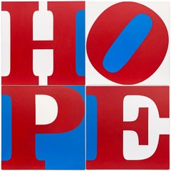
- HOPE (R/W/B) LARGE 4 PANEL PAINTINGBy Robert IndianaLocated in Aventura, FLOil and Silkscreen ink on triple primed canvas. Hand signed, dated, titled and inscribed "P/P" on verso by Robert Indiana. Printer's Proof edition. Total of 4 panels. Each panel ...Category
Early 2000s Pop Art Abstract Prints
MaterialsCanvas, Oil, Screen
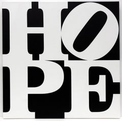
- HOPE (B/W)By Robert IndianaLocated in Aventura, FLOil and silkscreen on canvas Hand signed, numbered, and dated on verso by Robert Indiana. Edition IV/V. Part of a series that Robert Indiana created in support of Barack Obama’s p...Category
1980s Pop Art Abstract Prints
MaterialsCanvas, Oil, Screen
- BagsLocated in Santa Monica, CASilkscreen/Collage on Retail BagsCategory
21st Century and Contemporary Pop Art Mixed Media
MaterialsScreen
 $280 Sale Price20% Off
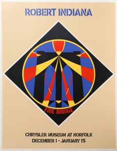
 - Fire Bridge, Pop Art Screenprint by Robert IndianaBy Robert IndianaLocated in Long Island City, NYArtist: Robert Indiana, American (1928 - ) Title: Fire Bridge: Chrysler Museum at Norfolk, December 1 - January 15 Year: circa 1965 Medium: Screenprint on Fabriano Paper Size: 30 x ...Category
1960s Pop Art Abstract Prints
MaterialsScreen
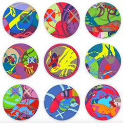
- The NewsBy KAWSLocated in New York, NY2018 The complete set of 9 screenprints in colors Sheet: 24 x 24 in., each Edition of 100 Each sheet signed, dated and numbered in pencilCategory
2010s Pop Art Abstract Prints
MaterialsScreen
 $120,000

Recently Viewed
View AllRead More
Get to Know the Artists Who Led the Op Art Movement
In the 1960s and '70s, the hypnotic creations of Op artists went mainstream and influenced the look of pop culture.
Welcome (Back) to the Wild, Wonderful World of Walasse Ting
Americans are rediscovering the globe-trotting painter and poet, who was connected to all sorts of art movements across a long and varied career.