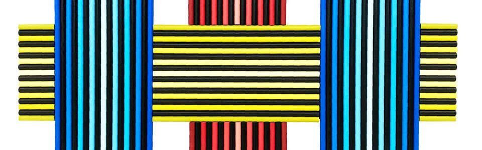
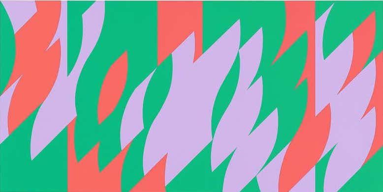
The Op art movement emerged in the 1960s, mirroring the counterculture of the time in its embrace of visual trickery, graphic shapes and bright colors.
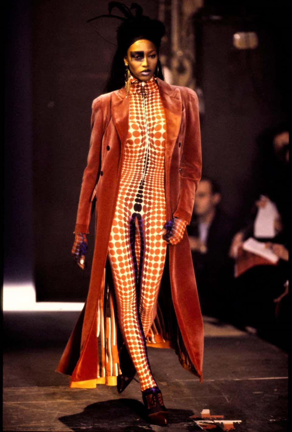
Spreading across Europe and the Americas, the style — whose name is short for “optical art” — influenced advertising, fashion and interior design before fading in the early ’70s.
Op art remained significant, however, for artists and scientists interested in the nature of perception. And today, it’s seeing a resurgence of interest from collectors and interior designers.
Op artists played with the principles of perception, manipulating line, shape, patterns and color to create the illusion of depth and movement. They drew on and evolved methods developed by past movements, from Impressionism to Abstract Expressionism, to produce intense visual experiences.
All the Op artists shared a focus on the gap between what is and what we perceive. Each, however, had a distinct approach to the issue and a unique visual style. Here, we discuss seven notable names in the movement and their individual approaches to its concerns.
Josef Albers
No artist has contributed more to our understanding of color than German-born painter, writer and educator Josef Albers (1888–1976). At the Bauhaus, Albers taught what was perhaps the first course dedicated to the study of how different hues interact with one another.
“In order to use color effectively it is necessary to recognize that color deceives continually,” he wrote in The Interaction of Color, a compilation of his 30 years of research into color theory at the Bauhaus, Black Mountain College and Yale University School of Art, where he was head of the department of design.
Albers dismissed the notion that colors could be understood solely through their physical properties. Instead, he emphasized their unstable, seductive, character and the necessity of observing their behavior in different contexts. “If one says ‘red’ — the name of color — and there are fifty people listening, it can be expected that there will be fifty reds in their minds,” he wrote. “And one can be sure that all these reds will be very different.”
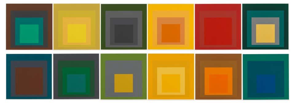
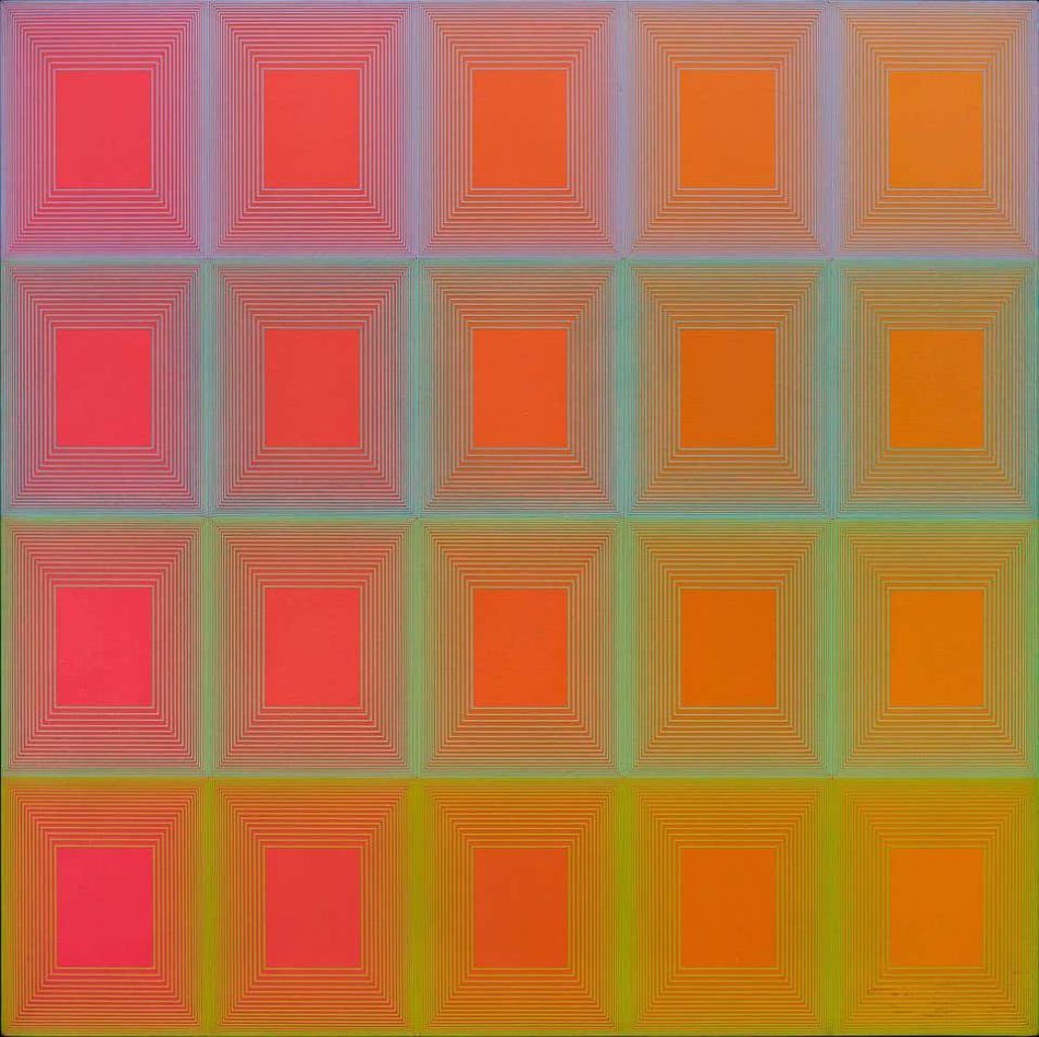
Albers works are studies in color perception. The paintings of “Homage to the Square” — his most iconic series, begun in 1950 and stretching over more than 25 years — investigate the perceptual mutations produced when colors are juxtaposed in nested squares.
The simplicity of these compositions is deceptive, demonstrating as they do how the illusion of dimensionality and afterimages can be created using entirely flat forms. Albers painted nearly a thousand “homages,” and his treatment of color as a metamorphosing, magical element was crucial to the development of the Op art movement.
Bridget Riley
British painter Bridget Riley’s visually spectacular abstractions seem far removed from natural forms. Riley, however, claims she draws her inspiration largely from nature, which she defines as a “dynamism of visual forces — an event rather than an appearance.”
Indeed, dynamism characterizes her work, which explores how simple geometric forms can create illusions of movement.
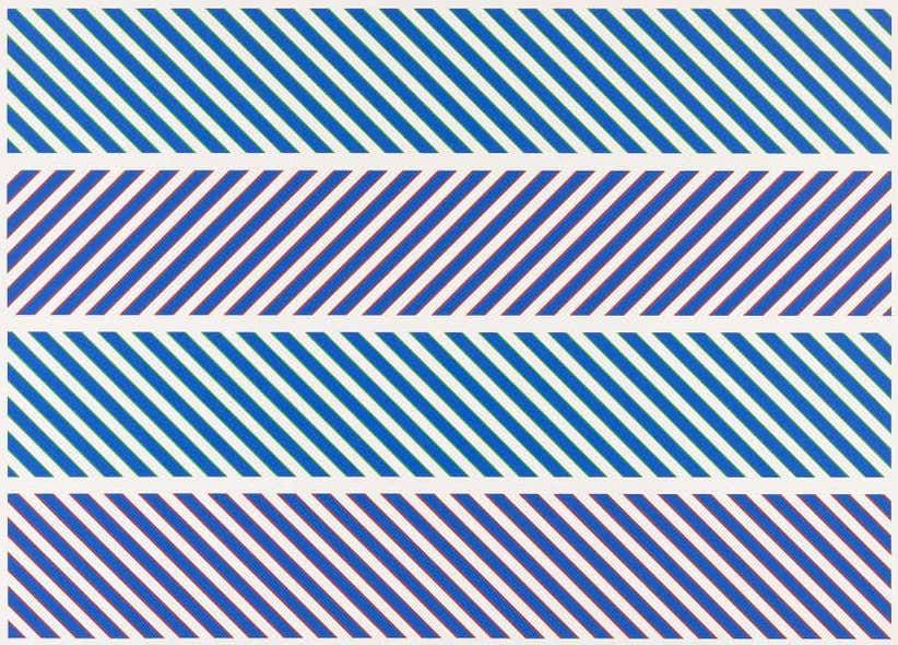
Born in 1931, Riley first came to worldwide attention in 1965, when she was included, alongside such other prominent figures as Victor Vasarely and Frank Stella, in the exhibition “The Responsive Eye” at New York’s Museum of Modern Art. The catalogue cover featured one of her paintings, Current (1964), composed of wavy black and white lines that seem to vibrate as they move from the top to the bottom of the canvas.
Since the 1970s, Riley has been experimenting with color, creating works like Nataraja (1993), made up of columns of brightly hued diagonal stripes that seem to pulse rhythmically. By instilling life, movement and energy into flat, geometric forms, she helped pioneer kinetic art.
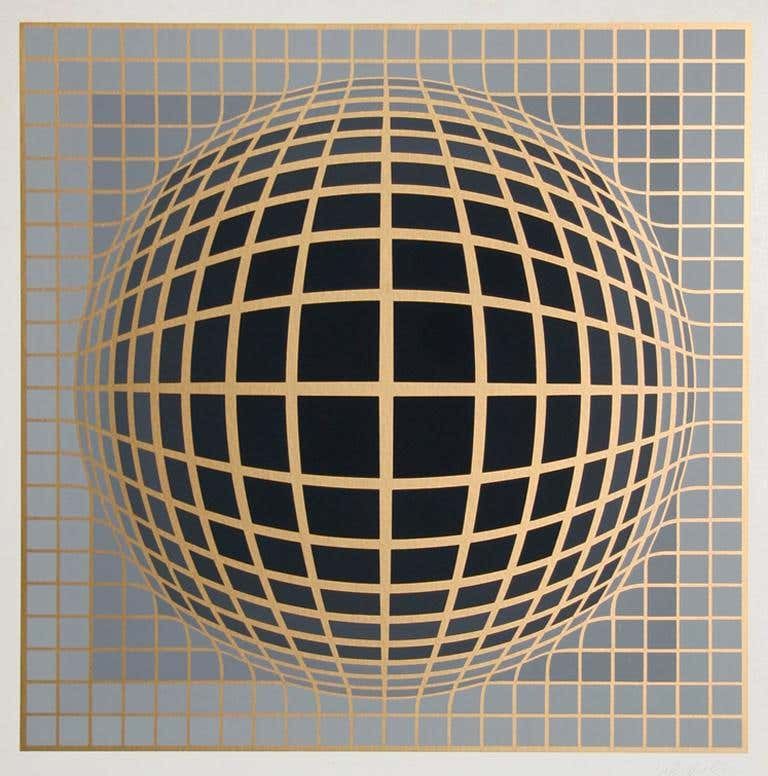
Victor Vasarely
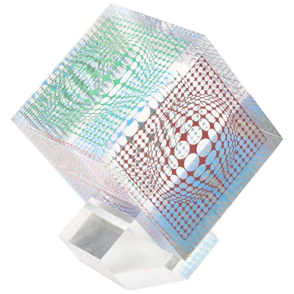
Widely considered the grandfather of Op art, the French-Hungarian painter Victor Vasarely (1906–97) created eye-popping geometric abstractions that play with the viewer’s perception of depth, perspective and motion. A classic example is the 1937 Zebra, which consists of undulating black and white stripes that suggest the form of the titular animal through optical trickery. The work is often credited as the earliest Op art painting.
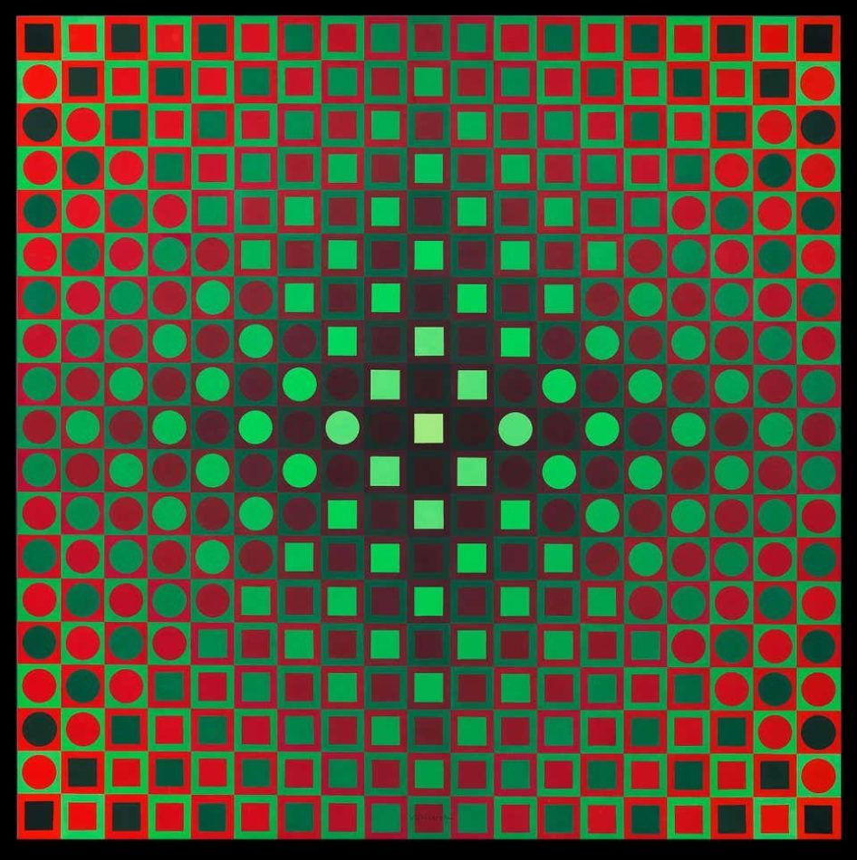
Such illusions were more than pleasing tricks for Vasarely, who insisted that “pure form and pure color can signify the world.” He wanted to “democratize” art by producing works in large editions at reasonable prices that were understandable across national and cultural boundaries. In the 1960s, he developed an alphabet plastique, or fine art alphabet, consisting of elementary visual building blocks that could be used in endless combinations to create original compositions. By employing this universal visual vocabulary and stripping away topical references, he sought to create what he called a “Planetary Folklore.”
Embodying Vasarely’s singular belief that art should serve a social function, accessible to all, these innovations may perhaps be his greatest contribution to 20th-century art.
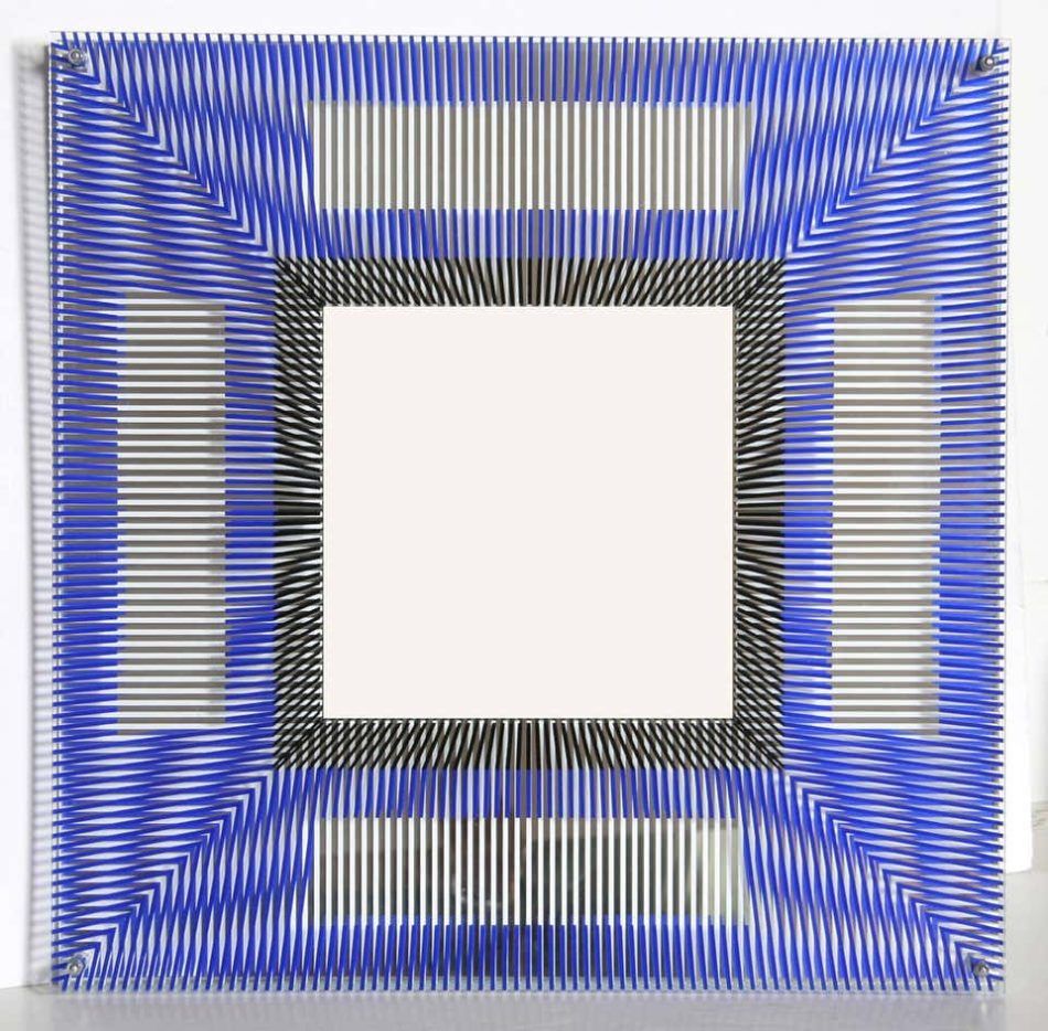
Jesús Rafael Soto
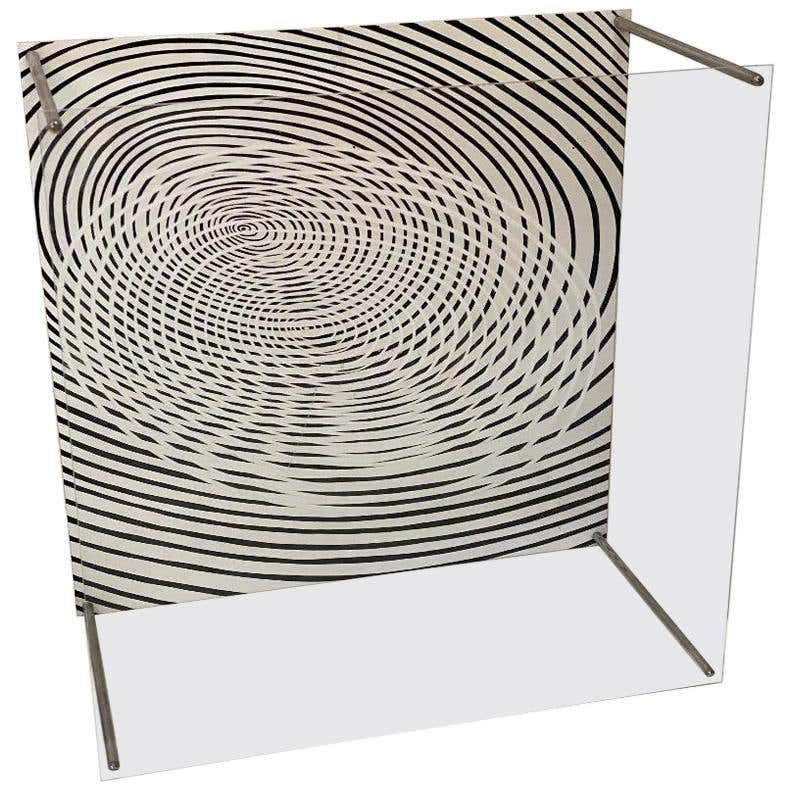
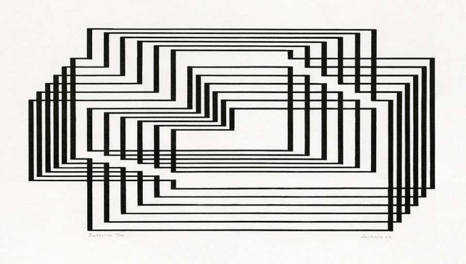
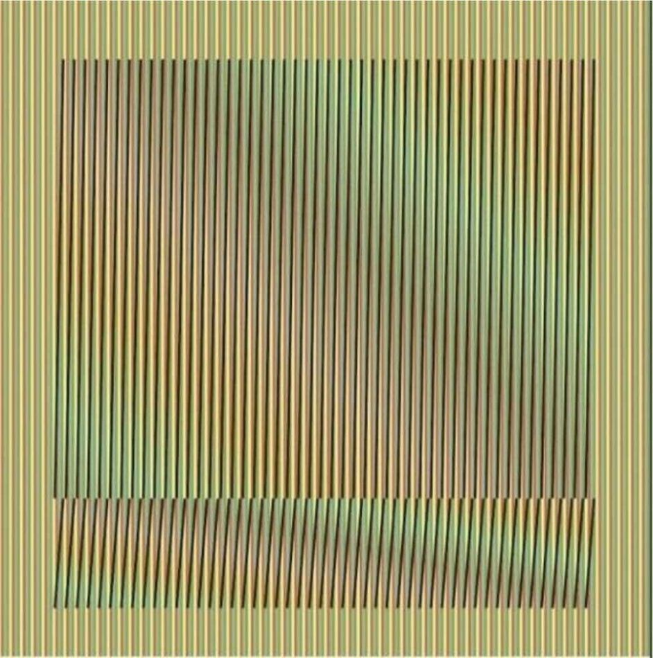
Venezuelan Op and kinetic painter ands sculptor Jesús Rafael Soto (1923–2007) is perhaps best known for his immersive installations, which respond to their environments and physically absorb the viewer in a dynamic sensory experience.
The exploration of space is central to Soto’s work. This is evident in his early paintings, of the 1950s, which create the illusion of movement through simple compositions and a limited palette. During the same period, he integrated industrial materials like nylon and steel into linear constructions that were part painting, part sculpture.
But Rafael Soto’s grandest and most enigmatic creations are his “Pénétrables.” Made up of thousands of long clear or colored plastic strands suspended from the ceiling or from free-standing steel or PVC frames, these geometric sculptures play with the perception of space, inviting viewers to act as participants by moving within and through them.
The strips of some of the installations were partly painted, forming shapes when seen from a distance. The Houston Penetrable (2014), at the Museum of Fine Arts, Houston, for instance, appears to hold a floating yellow ellipse.
Rafael Soto created 25 “Pénétrables” over the course of his career. Each further blurred the line between reality and illusion and established viewers as not just spectators but as integral parts of the artwork itself.
Richard Anuszkiewicz
“I’m interested,” Richard Anuszkiewicz (1930–2020) once said, “in making something romantic out of a very, very mechanistic geometry.” Anuszkiewicz sought to achieve this romance through works juxtaposing vibrant colors in geometric configurations. The perceptual effects he created helped define the American Op art movement.
Anuszkiewicz studied color theory at Yale under Josef Albers and was greatly influenced by Albers’s approach. “The image in my work has always been determined by what I wanted the color to do,” Anuszkiewicz explained in a 1974 catalogue. “Color function becomes my subject matter, and its performance is my painting.”
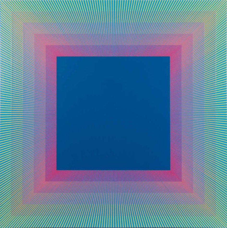
He departed from his mentor, however, in the pulsating, illusory qualities he gave his work. One of his most famous paintings, Deep Magenta Square (1978), although similar in composition to Albers’s “Homage to the Square” series, is distinctly Op art in the way the striations surrounding the central square seem to vibrate and jump off the canvas.
Anuszkiewicz spent his entire career exploring optical effects through the manipulation of line and color, producing spectacular and timeless pieces of art. “Working with basic ideas will always be exciting,” he said in 1977. “And if a color or form is visually exciting in any profound sense, it will be that way in 10 or 20 years from now.”
Carlos Cruz-Diez
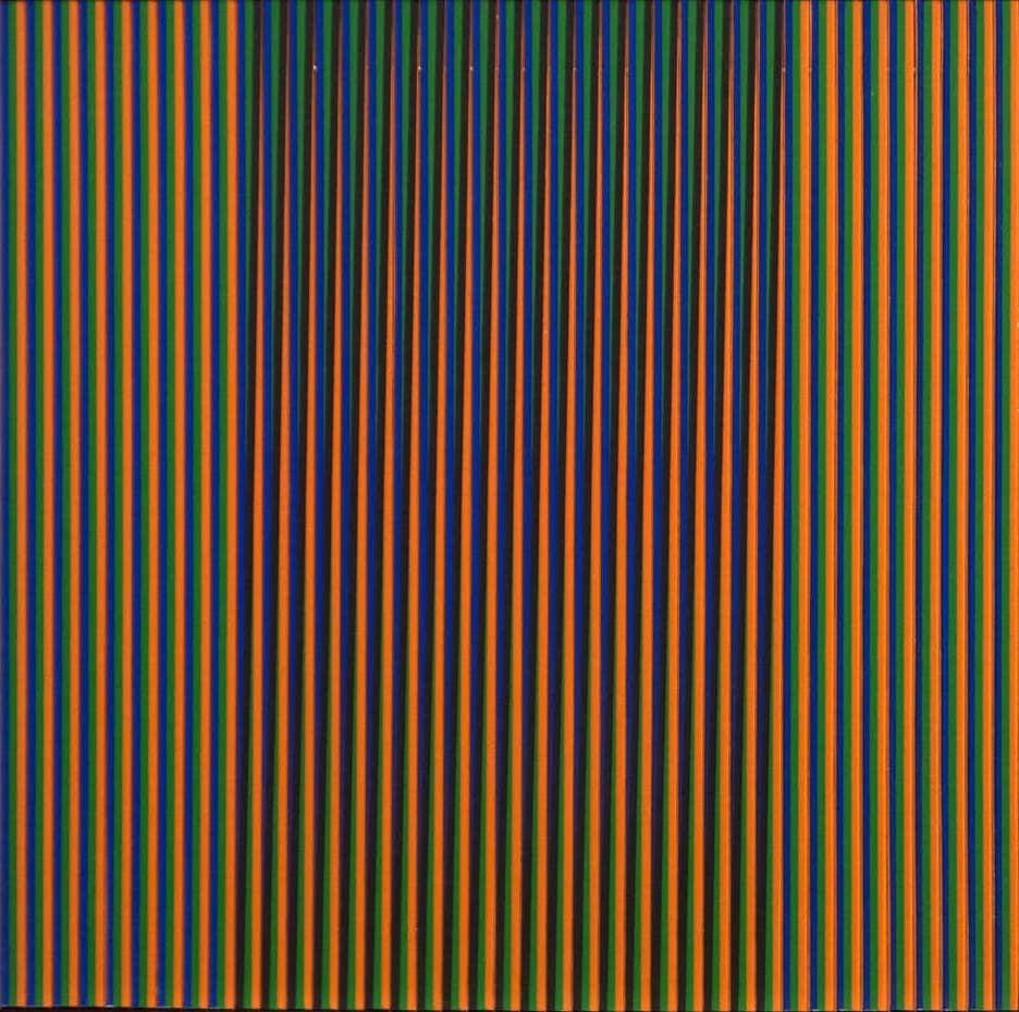
For Venezuelan artist Carlos Cruz-Diez (1923–2019), color was a dazzling, transient effect, which he attempted to capture on canvas and in light installations. The striking compositions he produced over his seven-decade career made him one of Latin America’s greatest postwar artists and a leading figure in the Op art movement.
“I don’t make paintings, nor sculptures. I make platforms for occurrences,” Cruz-Diez once said. “They are platforms where color is being produced, dissolved, generated in a perpetual instant. In it, there’s no notion of past nor future. In it is the notion of the present moment, just like life.”
Building on the chromatic explorations of Sir Isaac Newton, George Seurat and Josef Albers, he created striking paintings comprising lines of contrasting hues that appear to shimmer. He called these works physichromies.
Later in his career, Cruz-Diez shifted his explorations from paint to light. His “chromosaturations” are immersive environments consisting of three chambers, each flooded with a different-color light, which disoriented visitors and altered their perception. He also translated his chromatic illusions to public spaces, like the floor he created at the Simón Bolívar International Airport, near Caracas, and a pedestrian crossing outside the Broad Museum, in Los Angeles.
Cruz-Diez was a successful graphic designer as well, working for artist-clients like Roy Lichtenstein and Robert Rauschenberg. Across all these mediums, his work had the same boldness and immersive quality, engaging the viewer’s eyes, body and mind.
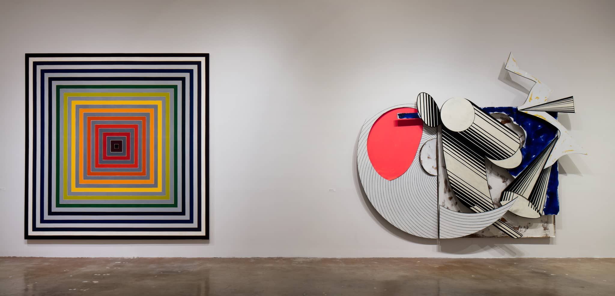
Frank Stella
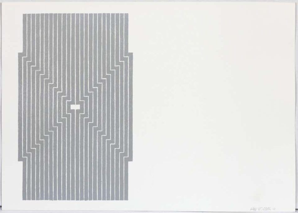
When Abstract Expressionism, with its wild gestural images, was at its peak, Frank Stella made waves with his muted and precise “Black Paintings” series (1959), composed of thick bands of black paint alternating with thin lines of raw canvas.
Born in 1936, Stella is an iconic figure in postwar American art, and his famous quip “What you see is what you see” has come to define the ethos of minimalism. His use of bold, pulsating bands of color and his inclusion in MoMA’s 1965 show “The Responsive Eye” cemented his place in the Op art movement.
Right from the start, Stella’s goal was to create maximum visual impact without symbolic meaning. “The big deal in postwar American painting was ‘its materiality,’ and so that was heaven for me,” he once said.
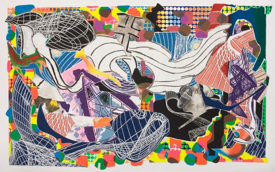
In his early paintings, he sought to transcend the limits of two-dimensionality. In the late ’60s, Stella began experimenting with shaped canvases, most famously in his “Protractor” series (1967–71), based on motifs in the Islamic art he saw during a trip to Iran.
These brightly colored, spherical canvases are among Stella’s most recognizable works. Later, he embraced three-dimensionality in massive multimedia reliefs inspired by Herman Melville’s Moby Dick. His experiments with both minimalism and maximalism make his oeuvre among the most diverse in modern art.