

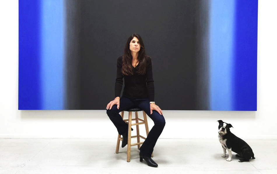
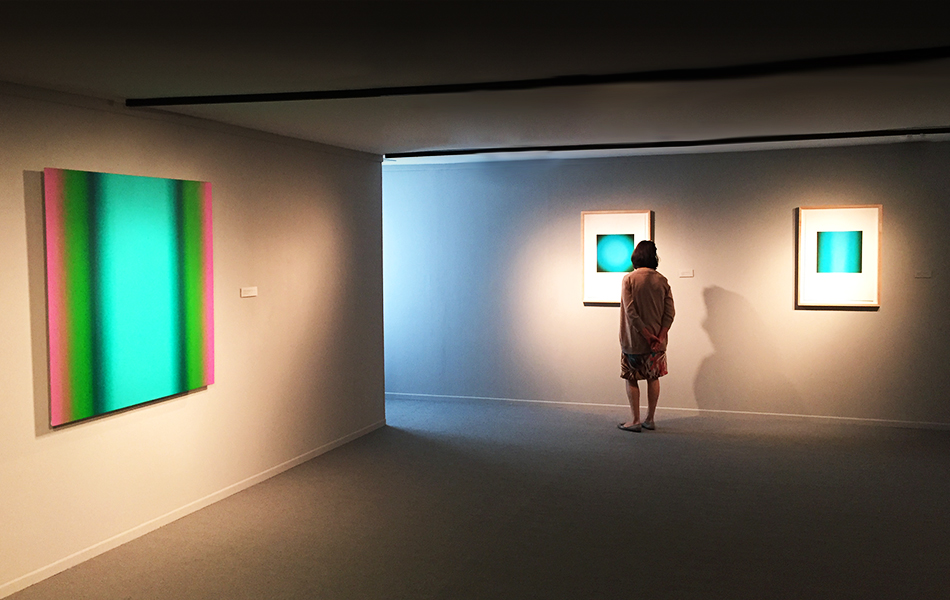
September 21, 2015Ruth Pastine with her paintings Blazen (Red Green) and Arc (Red Green), both 2008 (portrait by Donna Granata). Top: An installation view of her current show “The Inevitability of Truth” at Edward Cella Art and Architecture in Los Angeles (photo by Gene Ogami)
Ruth Pastine doesn’t finish paintings. Rather, as the California-based artist says of her seamless Color Field–esque abstractions, they “resolve.” Her paintings’ completion is as self-reflexive an act as if they were collections of pixels coalescing on a screen, but it would be a mistake to think of her works as somehow futuristically inspired or in pursuit of effects done better by digital technology. Her process is as analog as it comes, and squarely aimed at fixing you, the viewer, in the here and now.
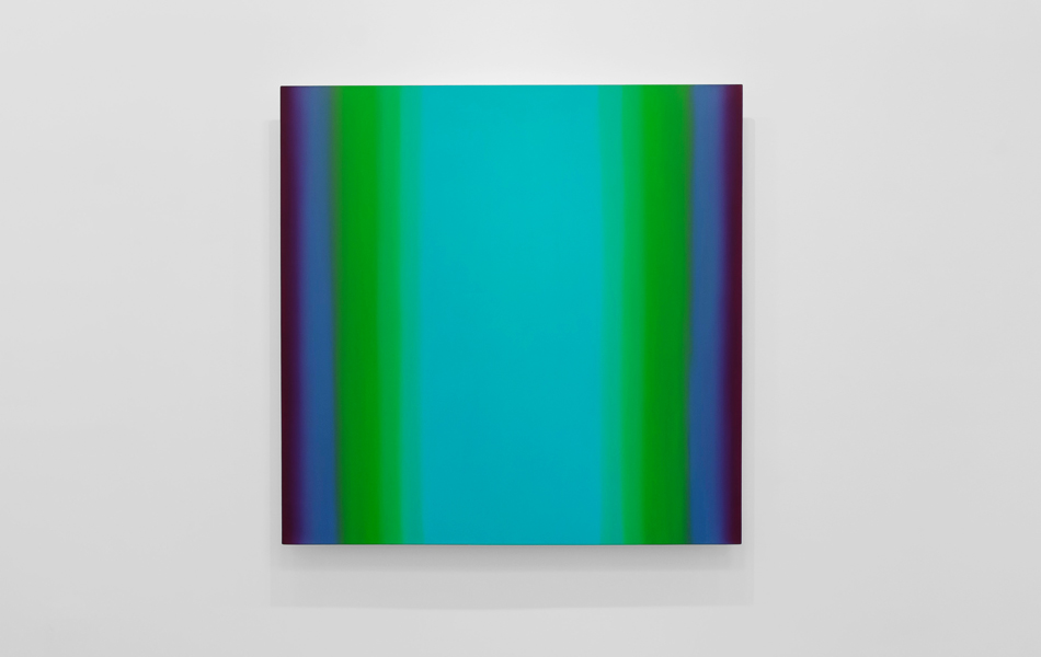
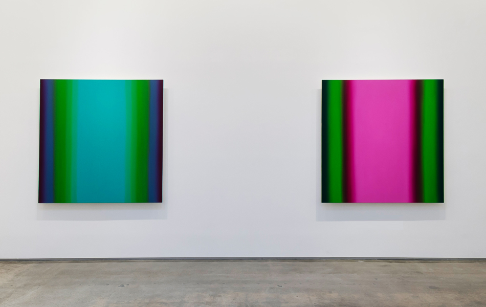
To gaze at one of Pastine’s works is to enter a force field created on the surface of the canvas. If the colors are hot, the space between your eye and the painting might seem to shimmer, as if in the desert. If the colors are cool, you might find yourself leaning forward slightly, a subconscious attempt to peer into their fathoms.
In her most developed series, two hues from opposing sides of the color wheel join uneasy forces, one either cranking up or dialing down the other’s power, setting up a perceptual volley between eye and mind that doesn’t quit until you blink. An amused Pastine reports: “People have asked, ‘Are they lit from the back with a light?’ They’re not, but they do have this glowing effect, and it’s not an illusion. When people see [the paintings] in person, there’s this movement, this activity. They happen.”

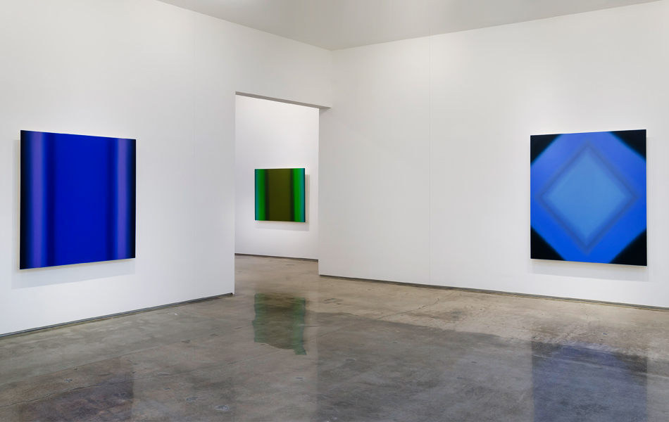
Inevitability of Truth 4-S7272 Diamond (Blue Orange/Blue Violet), 2015. Photo by Gene Ogami
When preparing for shows like her current outing at Edward Cella Art and Architecture in Los Angeles (through October 17), Pastine lines up her gessoed canvases on the walls of her skylit Ojai studio at about the height they will be hung in the gallery. She works on several pieces simultaneously, building up painstaking layers of color by hand until she has covered each canvas from edge to edge.
“I think people imagine that they’re painted in this very delicate fashion, but they’re actually very physical, very gestural, because I’m working the entirety of the surface,” Pastine explains. “The luminosity comes from being an arm’s distance from the canvas and seeing the opportunity to have it resonate.” That effect is also helped by her scrupulously smooth surfaces, which lend the works a sensuous quality that can be read as a silent riposte to the machismo of the abstract canon.
The experiential quality of the work aligns Pastine with minimalists like Dan Flavin or the California Light and Space artists. But unlike, say, James Turrell, whose practice might be described as materializing light, Pastine, an oil painter in a direct lineage from Claude Monet and Kazimir Malevich, seeks to capture light’s ultimate ineffability by dissolving it. “I think that’s one of my biggest awes and inquiries with painting,” she says. “When you put a mark on the canvas, it’s a physical thing. And then to have it disperse into a gaseous aura. . . . I’m just enthralled with the process and the transformation. It only happens by working months and months on these pieces, dissipating the material into the ethereal.”
““People have asked, ‘Are they lit from the back with a light?’ They’re not, but they do have this glowing effect.”
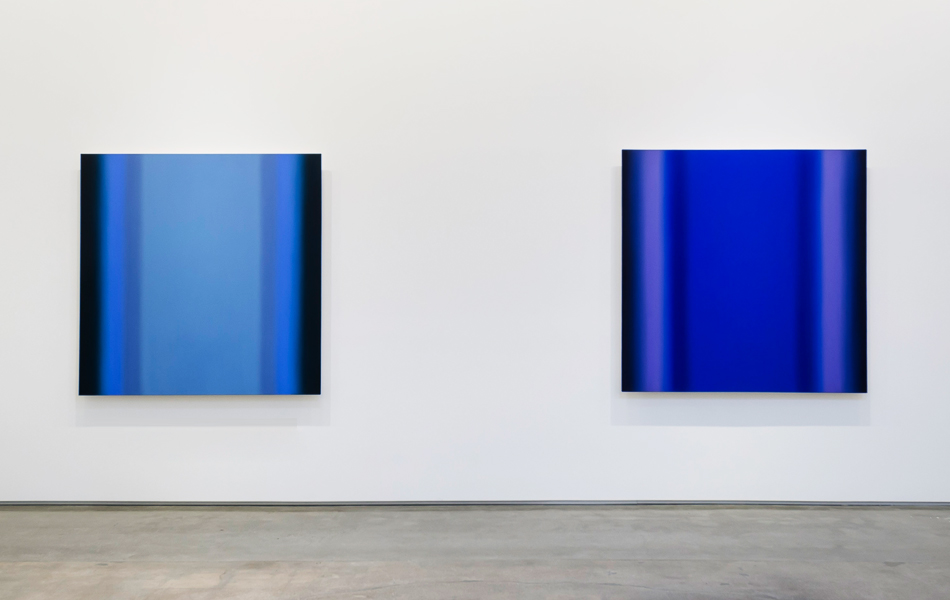

Inevitability of Truth 9-S6060 Square (Red Green/Red Light), 2015. Photo by Gene Ogami
Color theory has been a primary interest of Pastine’s since her days reading Michel-Eugène Chevreul and Josef Albers as an art student in her native New York. She obtained her BFA from Manhattan’s Cooper Union before shipping off to Amsterdam on an independent study grant at the Gerrit Rietveld Academie (named, of course, for the De Stijl designer who gave the world the Red Blue Chair in 1923). Upon returning she attended Hunter College for her MFA.
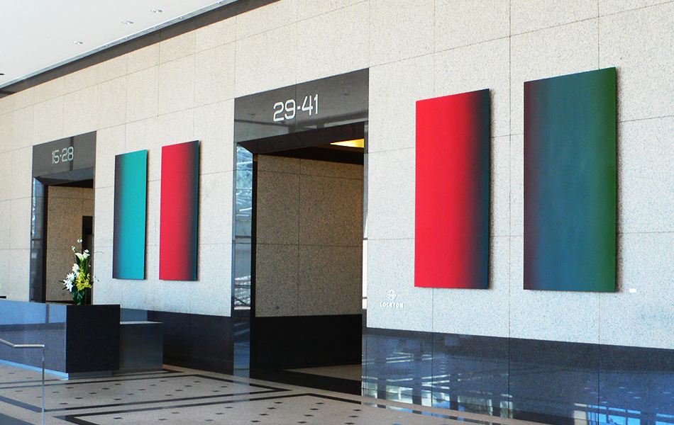
Practically without exception, Pastine has trod this path of inquiry for more than two decades, showing widely in Japan, New York and on the West Coast, where her incandescent abstractions find a natural home. Recently, her oeuvre has been reaching a wider audience. She had a career survey, titled “Attraction,” last year at the Lancaster Museum of Art and History, in California, and a show called “Present Tense: Paintings and Pastel Works on Paper” was mounted by the Carnegie Museum of Art, in Oxnard, California, earlier this year. Those who have passed through Ernst & Young Plaza in downtown Los Angeles may recognize her monumental 2009 installation “Limitless,” which features two pairs of paintings from her “Blue Orange” and “Red Green” series.

Inevitability of Truth 6-S6060 Square (Blue Orange/Blue Deep), 2015. Photo by Gene Ogami
The works on view at Edward Cella, part of a series titled “Inevitability of Truth,” embrace a strong internal architecture by introducing a new element: Superimposed shapes create frames within the six-foot-square picture plane. Now, not only do the colors vibrate, so do the spatial relationships. Pastine hit on the idea while taking a breather from painting with a series of pastels on paper, where “the limitation of this powder chalk medium, not being as fluid, was actually an opportunity to heighten these edges.” In the new works, she says, “This more charged surface has . . . brought this urgency into the experience for the viewer. It’s no longer a slow burn — we’re having some combustion here.”
“The way she’s projected the pictorial plane into the wall, portions of the image seem to recede, while other portions advance. The luminosity is much more present,” says Cella.
The tension of opposites, now made explicit, extends beyond her process into the philosophical content of the works. (As her abstractionist fellow-traveler Mark Rothko famously proclaimed, “There is no such thing as good painting about nothing.”) Although Pastine has abandoned referential titles and rejects a conceptual label for the paintings, she acknowledges that her method functions as a kind of metaphor for the unresolvable dialogue between presence and absence, chance and intent, and beauty and terror that fuels not only painting but also the human experience. Pastine transcends such paradoxes by embracing them, pushing her paintings ever farther into the realm of the sublime.