
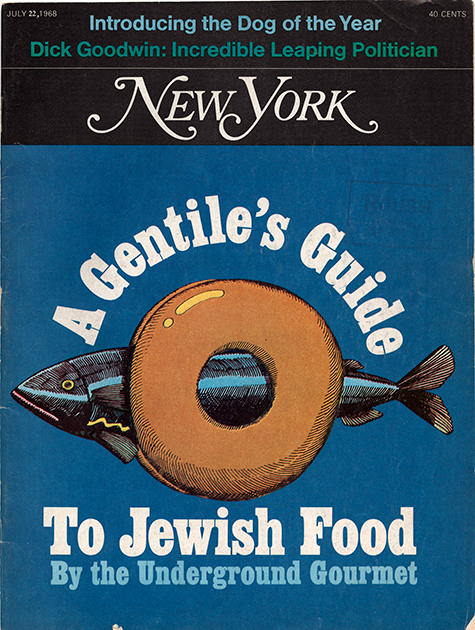
June 29, 2015Don’t look to Milton Glaser for idle chitchat, and never expect to hear the following meaningless utterances tumble from his learned lips: “Wow,” “Awesome,” “Amazing,” “Cool.” This is a man incapable of superficial conversation (one exception: food, about which he can rhapsodize endlessly; in addition to his many talents, he used to co-write a restaurant column called “The Underground Gourmet” for New York magazine).
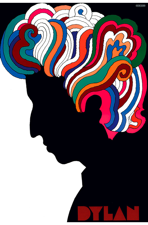
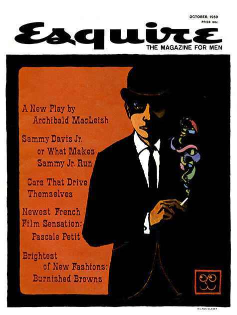
More likely, he’ll talk about the sorry state of urban architecture along Manhattan’s West Side Highway or why it is that people mistakenly and persistently use the words “design” and “brand’’ interchangeably — as if they were one and the same. Glaser is, after all, a graphic artist extraordinaire, one of the true giants of the 20th and 21st centuries. Should you need to be reminded of his portfolio, its highlights include the I ♥ NY logo (1977); the psychedelic Bob Dylan’s Greatest Hits poster (1967); and the visual identities of such iconic magazines as Esquire and New York, which he co-founded with editor Clay Felker in 1968. Then there are his distinguished honors, among them a lifetime achievement award from the Cooper-Hewitt National Design Museum in 2004 and the National Medal of Arts bestowed upon him by President Obama in 2009.
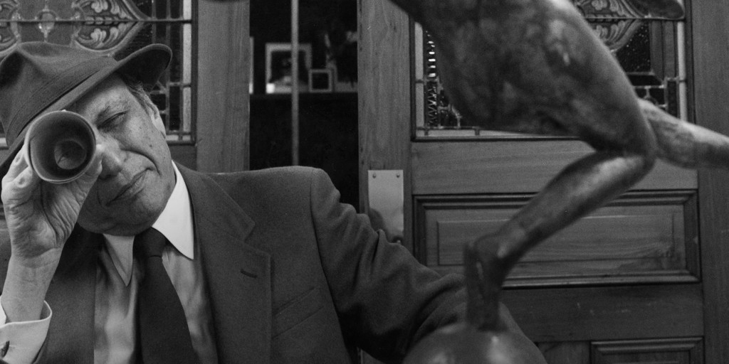
Glaser and fellow artist Shirley Girton Glaser, his wife of 58 years, live in New York’s Chelsea neighborhood with their cat (also named Chelsea). At 86, he still goes to his studio in the same Kips Bay townhouse every day. “The idea of not being able to go to the office terrifies the hell out of me,” he admits. There are stairs to climb, no elevator. But once at his desk, it is work as usual — if anything Glaser does could even remotely be called “usual.” A tall, quiet man (he reaches 6’2″), he is lately sporting a goatee that makes him look a little like F. Murray Abraham.
It was in this very environment, in an anteroom randomly filled with reminders of his accomplishments, that Glaser and I met on a frigid Friday late this winter. (We have known each other socially for more than 30 years.) When he speaks, it is with precision and forethought. Always contemplative, Glaser is especially so these days. “The problem with aging,” he laments, “is that so many of my contemporaries have passed on.” Those would include Felker; the Belgian artist Jean-Michel Folon (“He spoke no English. I spoke no French. We would talk for hours.”); and Joseph Baum, arguably America’s most inventive restaurateur and someone with whom Glaser collaborated on countless projects, including the Rainbow Room, in Rockefeller Center, and Windows on the World, in the World Trade Center.
Nonetheless, the commissions keep coming. His firm, Milton Glaser Inc., which he established in 1974, 20 years after co-founding the groundbreaking design firm PushPin Studios, turns down more jobs than it accepts — by choice. “I hate corporate work,” he says. Bid goodbye to lucrative assignments for the wolves of Wall Street. “And we won’t do anything that is harmful.” That means no cigarettes, industrial chemicals and a long list of potentially toxic products. “I also don’t want to do a replica of what I’ve done before.” Often, however, that is exactly what his pursuers want — another poster for the ages, another legendary logo, another prize-winning album cover.
Leonardo painted only one Last Supper and one Mona Lisa. He didn’t repeat himself so why should Glaser? And therein lies the dilemma for any artist: how to avoid being typecast. “Ultimately, your work is an act of defiance,” he explains. “The question is, ‘How do you keep the work alive and keep your own personal identity?’”
The answer, it appears, is constant and consistent reinvention. Glaser and I talk about Henri Matisse, who in the last chapter of his life turned to cutouts, the subject of a wildly popular recent exhibition at Tate Modern, in London, and the Museum of Modern Art, in New York. When we met, Glaser had just seen the Manhattan iteration on its final weekend. “The great mystery of Matisse,” he wonders aloud, “is why do these things — cut-out pieces of paper — affect me?” They affect him and thousands of others, it seems: MoMA extended the show’s run and attracted record-breaking crowds until the very end.
“The idea of not being able to go to the office terrifies the hell out of me.”


We contrast Matisse’s cutouts to the Metropolitan Museum’s equally important Cubism show of masterworks donated by Leonard A. Lauder and discuss why the Matisse was more successful in terms of attendance and acceptance. Perhaps, as one art-world insider told me, “It is because Cubism looks hard and Matisse looks easy.” Or, is it more simply, that Matisse delights while Cubism, whose father is Pablo Picasso, requires study and concentration?
“I used to prefer Picasso to Matisse,” Glaser confesses, “but my perception has shifted. Picasso derived a great many ideas from Matisse. Matisse initiated the ideas that then Picasso developed.”
Glaser refers to a controversial book, The Success and Failure of Picasso, by the British art critic John Berger. When it was published in 1965 — when Picasso was still alive and considered the greatest artist of the 20th century — it caused a sensation. Instead of kneeling at Picasso’s feet, Berger gives a less hagiographic view of the man and his work.
Glaser points to a passage about Les Demoiselles d’Avignon, painted in 1907 and long a star in MoMA’s permanent collection, which Berger deems the turning point for Picasso, who before that point, he wrote, “followed his own apparently lonely road in painting.” Berger continues: “By painting Les Demoiselles d’Avignon, Picasso provoked Cubism,” ultimately becoming the leader of a group of painters that included Georges Braque, Fernand Léger and Juan Gris.
A fascination with art and artists has captivated Glaser ever since he was a student at Cooper Union (from which he later received a lifetime achievement award in 2004). A child of the Great Depression, Glaser was born in the Bronx in 1929 to parents of Hungarian-Jewish descent, and he eventually attended the Fiorello H. LaGuardia High School of Music & Art, as it was then called.
In the 2009 documentary about him, To Inform and Delight, Glaser says, “When I was a kid, I discovered that I had prestige in the neighborhood. My friends could ask me to draw anything, which turned out to be, in almost all cases, naked ladies.”
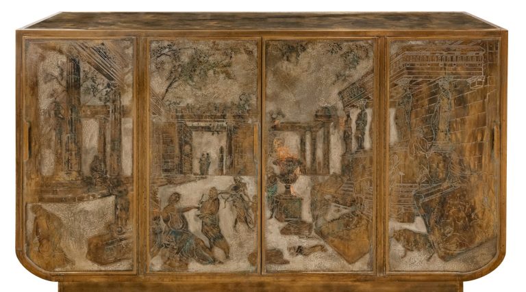
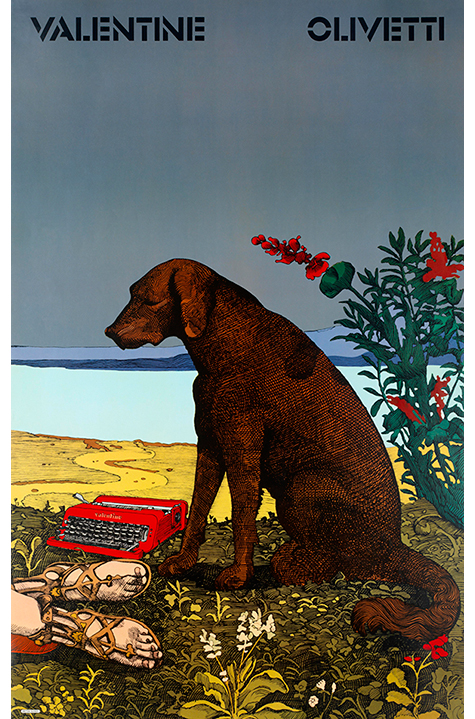
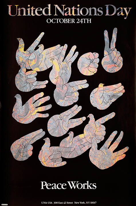
He’s come a long way from naked ladies. There is, in fact, hardly any subject he won’t take on — if, that is, it interests him intensely. Encompassing book and album covers, magazine and company logos, product design, re-imaginings of artists like Piero della Francesca and Monet, music festivals, subway art and even watches, Glaser’s repertoire is endless and dizzying.

Today, he is attracted to projects that are public oriented, such as his pro-bono poster illustrating the plight of refugees in Darfur. (“I don’t have the right to be indifferent,” he said in the documentary.)
And while his office is up-to-date technologically, he himself is not. “I’ve never touched a computer in my life,” he admits, “but I never spend a day without using one.” His method is to sit next to one of his associates — as a piano teacher might sit on the bench next to a student — and direct what he wants to occur on screen with color, typefaces, techniques and so on.
Before going to LaGuardia, Glaser was a promising student at the Bronx High School of Art and Science. When he decided to switch schools, his science teacher called him into his office. Instead of the reproach young Milton expected, the teacher handed him a box of French crayons and uttered three words: “Do good work.” And that’s exactly what he’s been doing ever since.