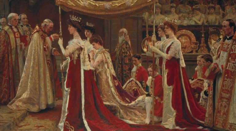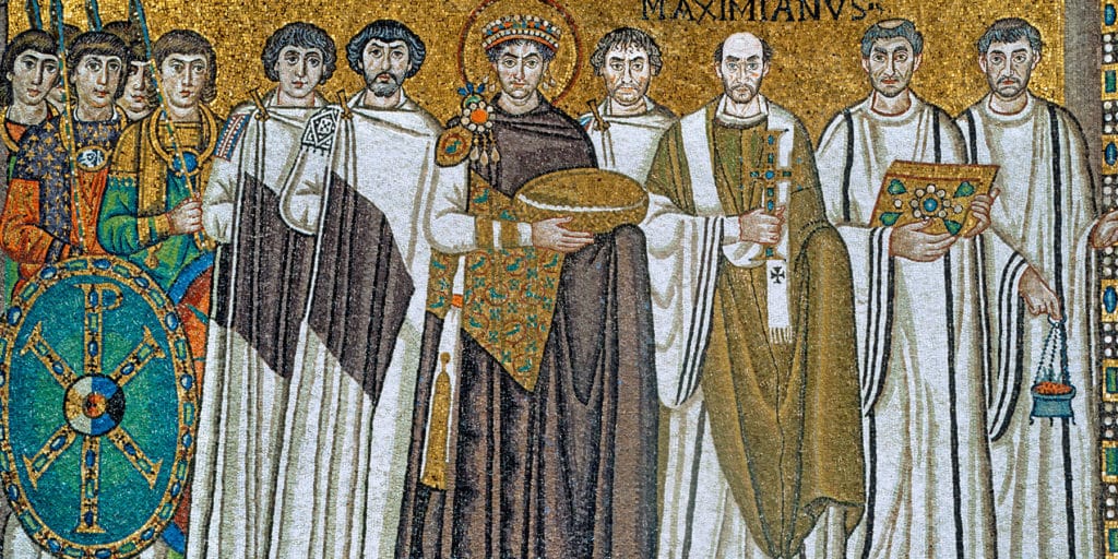

The Prophet Daniel, 1508–10, by Michelangelo Buonarroti. “He shaped volume through the interaction of bright colors, often using surprising combinations,” according to Stella Paul in her new book, Chromaphilia (Phaidon). Top: Justinian I and his Retinue, ca. 547, which shows “how purple was glorified in court regalia, for both the emperor and his retinue.” All artwork courtesy of Phaidon
April 10, 2017Color has delighted and fascinated human beings from the beginning of time: subject of obsession, ardor and debate. One artist, Yves Klein, was so captivated with a particular type of blue that he found chemists to formulate it, secured a patent for it, named it after himself and then used nothing else for years.
For hundreds of years, a royal shade of purple, conjured up by extracting mucus from the minute glands of certain species of marine snails found in the Mediterranean, was so rare — and so stunning — that laws were codified about its use. Penalties for misuse might even include death.
The German poet Goethe was so devoted to color that he wrote a treatise on it, which he considered to be his most important work, superior to any of the literature we think of as his peak accomplishment.
I wrote Chromaphilia: The Story of Color in Art (Phaidon) because no matter who you are, no matter what your background, education or passions might be, I’ll bet you will find something that speaks to you and leads you into meaningful thought if you start with color.
Color in art is a conversation starter like no other. I know this because I’ve had thousands of discussions and developed programs with literally millions of museum visitors over decades as a museum educator at the Metropolitan Museum of Art, and neither I nor viewers from all over the world ever tired of color’s many allures and surprises.

“For a moment, the city … became real,” Olafur Eliasson says of adding a nontoxic powder dye to Stockholm’s Strömmen waterway for The Green River Project, 2000. “The point was not even the Green River; the point was how it looked before and after.”

The Death of James Lee Byars, 1982/1994, by James Lee Byars. “The shimmering gold-leafed room is the permanent aftermath of an ephemeral performance piece the artist described as a kind of practice for his own death.”
Chromaphilia includes 240 images of some of the world’s most exquisite works of art, discussed as short case studies in how to look closely at art to uncover innumerable concerns about color that have transfixed artists from earliest prehistory to today. Where does color come from, how is it made, and why does that matter so much in constructing meaning?
From minerals that come from venerated places and symbolize deepest sacred belief systems, to bugs that yielded gorgeous red dyes that brought diverse cultures into contact, to greedy sabotage and intrigue in an alchemist’s workshop — the stories of how colors go from material to art carry meaning, and surprises.
What does artistic technique communicate about meaning? From Seurat’s tiny dots of paint that were meant to behave as if they were light itself to medieval artists’ patchwork-like patterning of brilliantly saturated colors that each retain their pristine and separate purity, the specific ways that colors are used signal ideologies — not merely styles.
Why is language about color so evasive, inexact and misleading? We hardly have the words in any language to describe what we see, let alone what it means, and sometimes we leap to bizarre conclusions. At one point, scholars questioned whether the Greeks could even see the color blue. For one thing, specific words for “blue” are remarkably scarce in literature such as Homer’s epics. And sometimes the words have more than one meaning: Rather than define a hue, the word can signify a quality such as “darkness” instead.

Study for the Apotheosis of Homer: Odysseus, ca. 1850, by Jean-Auguste-Dominique Ingres. “The figure’s intensely green garment is clear and delineated, its edges discreet in the relationship to the body it clothes and the space in which it is positioned.”
Why has color been such a hotbed of debate in ritual, religious, aesthetic and social doctrine? No matter what time period, somebody is engaged in deep discussion about whether to champion or repudiate color. Great art has come of this.
In the 16th century, there were debates about whether Michelangelo or Titian had the ideal approach to color. (Michelangelo’s use of color — with its crystalline clarity — signaled a kind of analytical intelligence to some, while Titian’s exuberant daubs and patches of color that blended on the canvas seemed to value spontaneity over intentionality.) In the 19th century, artists such as Ingres and Delacroix argued about whether color should even be taught in the Academy, where young artists learned essential skills and entered the profession. In the 20th century, Robert Morris strove to eliminate color, which he saw as extraneous to sculpture.
Chromaphilia is organized as the stories of 10 colors and color groups, with each chapter focusing on a color that has driven artists to make great art. Browsing 1stdibs, I chose the following six works that made me think of just a few of the things that I explore even further in my book:
Andy Warhol
Campbell’s Soup II Complete Portfolio, 1969

Red can be the color of passion, romance, charity, blood or violence. It can also signal commerce. The distinctive red of Campbell’s soup packaging was an instantly recognizable symbol in the 1960s of the banal. That combination of red on a white ground — the characteristic label — was one of the longest running and most successful brandings in U.S. history. Warhol appropriated this image of mass consumerism, introducing an interloper into the world of art, changing our tastes and redefining what constitutes fine art itself.
Louise Nevelson
Sky Case XII, 1974

Insistent monochrome was Nevelson’s sculptural signature: A single color blankets a whole construction and unifies its disparate fragments or details. Color erases the identity of the wooden scraps and detritus that compose her assemblages in a powerful transformation toward shadowy mysteries. All-encompassing color demanded an all-encompassing focus for this artist, who kept separate studios for work in black, white and gold. “When I worked on my blacks, I didn’t want my blacks or golds detracted from,” she said. For Nevelson, this matte and lusterless black held deep associative richness. “There is no color that will give you the feeling of totality,” she said. “Of peace. Of greatness. Of quietness. Of excitement.”
Jim Dine
Scissors and Rainbow, 1969

This image reminds us that the rainbow has been a powerful motif in art, literature, science and social and religious arenas for millennia. Artists, philosophers and scholars looked to this evanescent natural phenomenon to muse on chromatics and harmony. Nature’s fleeting yet vivid display seems a magnificent demonstration of a rational basis for harmony — with a specific set of colors lined up in a prescribed sequence. But how many colors are actually in a rainbow, and what is their definitive pattern? Aristotle asserted just three colors in a rainbow; Virgil wrote about a thousand. And Newton revolutionized scientific thought about color when he brought the rainbow into his laboratory, quantifying his prismatic rainbow of color as a spectrum of seven hues. That number is as poetic as any other; the actual effects are infinitely more subtle, with one color indistinctly blending into the next in a continuum that eludes metrics. But a set of seven colors evokes the seven notes in a musical scale, linking ideas about musical harmony and color harmony. However you define it or depict it, the color set of a rainbow is a gateway to thought.
Josef Albers
Palatial, 1965

Albers’s impact on generations of artists cannot be underestimated. Taking as a point of departure a relatively impassive and static format — the square — he celebrated colors’ powers of illusion and transformation. That simple square, Albers said, was “the dish I serve my craziness about color in.” Nested colors reveal the remarkable dynamics of color interaction, showing that what a color looks like depends entirely on what surrounds it. Same colors will look different; different colors will appear to be the same; colors can be made to advance, recede, vibrate, pulse or metamorphose. Above all, he taught us all (art students, scholars and art lovers alike) that “in order to use color effectively it is necessary to recognize that color deceives continually.”
Robert Motherwell
Elegy Fragment II, 1985

Robert Motherwell described black and white as protagonists. They tell a story of human suffering in purely visual terms. He referred to his many elegies as lamentations or funeral songs in response to the atrocities of the Spanish Civil War, and his use of the color black is an evocation of death, suffering and stoicism. Equally, Motherwell’s black carries specific references to Spanish culture, including poetry by Federico García Lorca about a matador’s fatal goring by a black bull. Those inky black shapes don’t describe narratives that can translate into verbal language, but they do communicate very strongly in abstract terms, making a statement that the artist wanted the public to know. He wrote: “They are all in black and white: celebrations of death, songs of mourning, elegies — barbaric and severe.”
Yves Klein
Table Bleue, 1961/1963

For Klein, the medium was crucial to the message — and his medium was emphatically unmodulated, intensely saturated ultramarine blue. Finding the right means to realize his vision of rich fields of velvety blue pigment involved eventually commissioning his own customized synthetic paint. He patented it as IKB (International Klein Blue), and from 1957 onward he used this pigment exclusively. With IKB, Klein had entered what he called his “epoca blu.” This he conceived as a transcendent vision of the boundlessness of space and dreams, quoting the French philosopher Gaston Bachelard: “First there is nothing, then a depth of nothingness, then a profundity of blue.”
PURCHASE THIS BOOK
or support your local bookstore