

The show reveals a lesser-known side of the Pop artist, captured here in Patricia Steur’s photograph Andy Warhol, 1982, available through Amstel Gallery. Top: Untitled (Bang), 1960. All photos © 2014 The Andy Warhol Foundation for the Visual Arts, Inc. / Artists Rights Society (ARS), New York
November 5, 2014Somewhere between all the commercial work he did as an ambitious young graphic designer in the early 1950s and his first real debut as a Pop artist a decade later, Andy Warhol produced a trove of incredibly charming drawings. Now, 30 of these rarely seen works are currently on view and for sale at New York’s Hirschl & Adler Modern, in a show that’s simply not to be missed. (It runs through December 6.)
The gallery had intended to display the works featured in “Bang! Andy Warhol Early Pop Drawings 1952–1962” in a Kabinet — or small exhibit — at its booth at Art Basel Miami Beach next month, says gallery director Shelley Farmer. But once these works on paper started coming together, all from private collections, and she saw how wonderful they were, she says she realized “that they really deserved a show in the gallery.”
The drawings span a fascinating decade in Warhol’s artistic development, when he closed the door on his successful graphic-design career to pursue, wholeheartedly, a career as a fine artist. The earliest work in the exhibition dates from 1952, the year of his first gallery show (of drawings), at Alexandre Iolas’s Hugo Gallery, in New York, and the latest comes from 1962, the year he debuted his Campbell Soup Cans at Ferus Gallery in Los Angeles. “We really wanted to show him as a draftsman, and how he worked out his processes on paper,” says Farmer.
The show certainly succeeds at that. While the works convey a side of Warhol familiar to many — his love of fashion, glamorous women, fresh color — we also get a wonderful sense of his relaxed yet expert hand, which isn’t as obvious in much of his other work. Indeed, those who think Warhol was a slave to mechanical reproduction, removed from the hands-on process of art-making, will be surprised to see just how prophetic these early drawings in ink, gouache and watercolor are of many of his later silkscreens.

On view at Hirschl & Adler, Untitled (Glamour Girl), 1961, reveals the artist’s early penchant for ignoring the suggested boundaries of outlines, allowing color to seep into and across his images in surprising ways.
Most prescient of all are the agitated yet assured “blotted” lines that dominate each image (and were a trademark of his earlier commercial work), providing a distinctly printed feel. It’s not surprising to learn that they are, in fact, prints — albeit unique ones — made by drawing an image with ink on a sheet of paper and then pressing that image down on another sheet. It’s not unlike the monotype process, except here Warhol used paper rather than a metal plate. “Warhol once said that anything with a printed look meant to him that more than one person wanted it,” says Farmer.
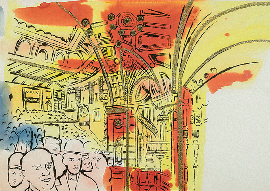
These lines are, in effect, early versions of the smudgy, imperfect outlines that would go on to form the structure of his Jackies, Marilyns, society portraits and more. In images like 1961’s The Night the Roxy Opened, which shows a crowd of revelers inside the legendary theater, we see swaths of bright orange and yellow watercolor spilling over these blotted lines, not unlike the passages of paint he used to color his portraits, where he never fully respected his outlines.
Writing in the small catalog for the show, critic Dave Hickey points out that one of Warhol’s favorite axioms was, “If you know what’s right, you can do what’s wrong.” Here, it seems that the artist is taking liberties with an artistic convention — the solid line, filled in neatly with color — for the sake of conjuring the human touch, while still retaining a sense of the mass produced.
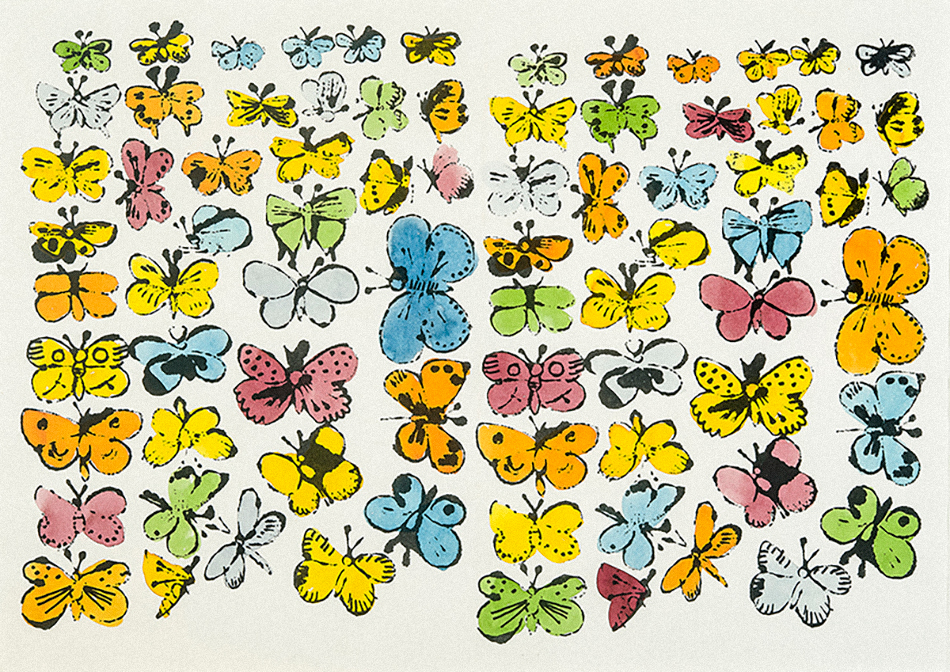
It also proves enlightening to see how early on Warhol was experimenting with seriality. His printing technique enabled him to create works like 15 Dollar Bills, 1962, for example, a grid of the same hand-drawn bill that appears slightly different in each impression. In works like Female Head with Purple Hair, circa 1959, he played around with rubber stamps of flowers and butterflies. And in the incredibly Pop Butterflies, 1955–56, he used ink and watercolor to create a highly decorative grid of colorful insects.
“Warhol once said that anything with a printed look meant to him that more than one person wanted it.” — Shelley Farmer

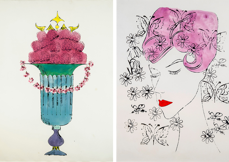
Urn With Two Legs, ca. 1958
In these works, we can also observe Warhol’s love of elegant, larger-than-life grand dames (1957’s Helena Rubinstein, say), as well as his wry sense of humor. The circa-1958 drawing Urn With Two Legs, for example, depicts an amphora decorated with two figures following each other around the vessel, one represented by a bare masculine leg, the other by an elegantly dressed feminine one in a skirt and high heel shoe — another motif of Warhol’s that he had nailed down early on.
His noses, rendered with such an economy of line, are fun to notice as well. This is clearly an artist who knew how to draw, and seeing the foundational work included in this show fosters a new appreciation for how he took that skill and transformed it into a whole other way of thinking about art-making, one that never ceases to amaze.

