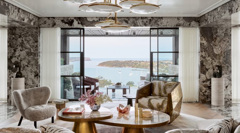
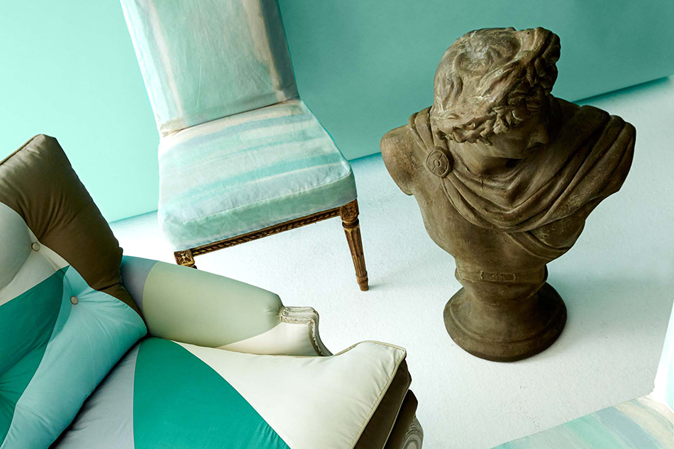
Miles Redd let his imagination soar when it came to conceiving his collection of fabrics and wallpapers for Schumacher. Here, Redd’s own 18th-century side chairs have been slipcovered in his Brighton Pavilion chinoiserie design. Top: Brighton Pavilion wallpaper provides a lively backdrop for a pair of antique side chairs upholstered in the Wave fabric. The chairs, console, mirror and bust belong to Redd. All images courtesy of Schumacher
October 19, 2015Dorothy Draper, Elsa Schiaparelli, Frank Lloyd Wright, Karl Lagerfeld — they all went to the drawing board for Schumacher, the venerable, 126-year-old wallpaper and fabric house. Now add to that celebrated list the name of Miles Redd, the New York City–based interior designer whose zestful, high-style rooms, shot through with a no-holds-barred embrace of glamour and a love of pattern that leaves no surface untouched, have secured his reputation as a master of classic decorating.
Redd’s many longtime fans include Dara Caponigro, a former shelter magazine editor who was the first to publish Redd’s East Village tub-in-kitchen railroad apartment before he was even out of college. (He studied fashion at Parsons School of Design and film at New York University.) In 2013, Caponigro became Schumacher’s creative director, and called Redd her second day on the job.
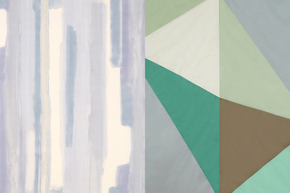
After a painstaking, nearly two-year process from that initial phone call through designing, sampling, production and distribution, Redd’s wide-ranging imagination is on display in the Miles Redd collection released by Schumacher just last month. The 10 evocatively named patterns in the line range from boldly graphic (the Wave, a cut velvet with a 1970s Op Art feel) to pretty and historic (Peacock, a chintz ode to the grand English country house) to subtly geometric (Deconstructed Stripe, a versatile allover print).
Redd, who once said rooms should always be “party-ready,” is flying high on the strength of his new association with the prestigious fabric and wallcoverings firm. Introspective sat down to chat with him about his new collection, with a bit of decorating philosophy thrown in.

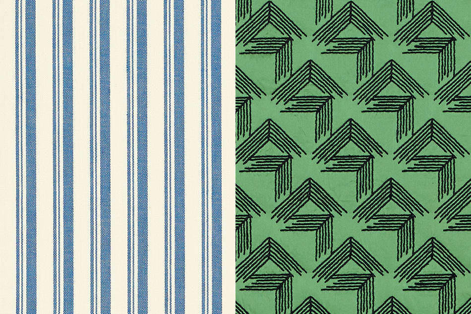
Deconstructed Stripe was made from a collage of wayward lines that pays homage to legendary decorator Albert Hadley.
The possibilities at the beginning of a project like this are limitless. How did you zero in on what you wanted to produce?
The wonderful people at Schumacher led me, and I was grateful for that. They knew what my sensibility was about and what their collection lacked. At one point, I wanted solid silk velvets, and they led me away from that, because they already have silk velvets. When you do a collection for someone, you go to the things that are your personality. I approached it like I was decorating a house. We kept things that were traditional as well as graphic, organic and modern. We made a large pile and edited it down to a smaller pile, and the strongest designs became obvious. There would be five or six people in the room, and we would all love the same things. If that’s not testament to what’s going to sell, what is?
You have an encyclopedic knowledge of decorative arts and an appreciation for so many different periods and styles, from chinoiserie to Cubism. How does one person’s sensibility encompass all those things?
I’m an eclectic person. It might be the same for you getting dressed in the morning: Some days you want to wear a little black dress, some days Marimekko, some days you’re a rich hippie, some days a lady. If you understand the pleasure of that, you understand my decorating.


The Peacock chintz reflects earlier fabrics by Schumacher, as well as the 1930s English country-house designs of John Fowler and Nancy Lancaster.
Is it possible for you to choose a personal favorite from among the patterns in the new line?
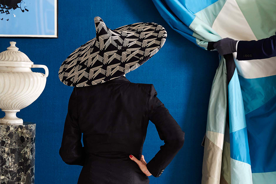
That’s a Sophie’s Choice, but to me, chinosierie papers like Brighton Pavilion make the most sensational rooms, period. Stick it in a closet or a double-height salon. I’ve never walked into a chinoiserie room I didn’t love. I had bought two panels of an antique Swedish paper and Schumacher was able to put them together seamlessly. They’re computer printed, but with the magic of technology you can have the feeling of a hand-painted room for a fraction of the cost.
How do you see the various wallpapers and fabrics in the new line being used in room settings?
One of the fabrics I’m sure I’ll use the hell out of is the Wave. It’s a stripe, but organic, because it’s curvy. I’d love to do a whole room in it, but even a pillow will give you a lot of bang. It would be marvelous down a hallway, too. I can’t wait to put Cubist on walls. That will be sensational in a powder room, walking into a divine Cubist moment. Tumbling Blocks is endlessly useful and goes with everything. It’s a small pattern and the colorways are soft. You can do an entire room in it — walls and furniture.

Redd’s antique French armchair wears Tumbling Blocks fabric.
The mirrored paper seems especially ingenious. How did that come about?
It’s inspired by a bathroom from a David Adler house in Chicago that I found and put back together in my own house on Elizabeth Street, in New York. It’s a shiny Mylar paper that looks like antique mirror in a grid pattern with silver star grommets. It sparkles without being garish. It’s reflective, but when you look at it you don’t see yourself, you see a faded, Rothko version of yourself. I can imagine a whole living room being done in it, or an entrance hall that doesn’t have a lot of natural light, and I long to use it on a ceiling.
What do you see as the role of wallcoverings in decorating today? Historically they’re so important, but in more recent times they’ve sort of come and gone, haven’t they?
Everything has always come and gone. I can’t think that way. You have to just go after what you love. Wallpaper is a bit of a commitment, but white paint is a commitment, too, and that can be the most depressing, banal thing. Wallpaper gives a room a background, a personality and a sense of mood.