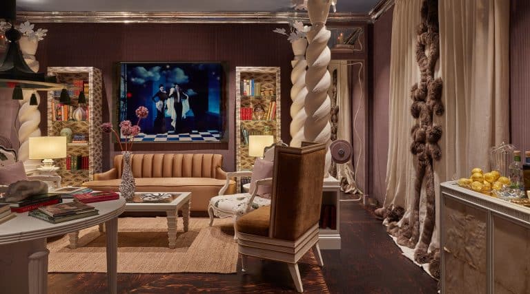
September 18, 2017Reinaldo Leandro and Ariel Ashe, of Ashe + Leandro, designed this London townhouse for clients for whom they had previously devised a Manhattan loft (portrait by Malcolm Brown). Top: A sofa by Antonio Citterio for Flexform upholstered in a Ralph Lauren buffalo check fabric sits opposite a pair of Gerrit Rietveld for Cassina armchairs.
The owners of this house in Belsize Park, north London, brought very little from their previous home. There is just the copper bathtub in the black-and-white-checked guest bathroom on the second floor and a slightly folksy tapestry of King Edward VIII (who became the Duke of Windsor after his abdication). They bought the latter several years ago at an antiques fair in Battersea Park.
“Everyone always asks, ‘Where the hell did you get that strangely badly sewn piece?,’ ” quips the wife, a jewelry designer. “We just both thought it was hilarious and had to have it.” They were, however, slightly nervous about showing it to their interior designers, Ariel Ashe and Reinaldo Leandro. “I said to my husband, ‘They might think it’s the most disgusting thing they’ve ever seen,’ ” she continues. They need not have been concerned. “We thought it was so much fun,” recalls the Venezuelan-born Leandro.
The New York–based Ashe + Leandro is one of today’s hottest design duos. Its clientele includes a number of celebrities, among them actress Naomi Watts and comedian Seth Meyers (who also happens to be Ashe’s brother-in-law). This house was for another. The husband is a famous rock musician. Ashe and Leandro had previously designed a loft in Manhattan for the couple, who decided to work with them again here. “We obviously had that moment, ‘Are we crazy? We’re based in London, and we’re going to hire someone who lives on the other side of the world to do this project?,’” recalls the wife. “But we were just so comfortable collaborating with them the first time that we didn’t want to try to find someone else to emulate that.” “They’re the easiest clients ever,” says Ashe. “They have really good taste and are really open to our ideas.”

On the side of the original Victorian house, a two-story extension was previously added, which is visible from the back garden. The house’s lateral space was one of the reasons the owners bought it.
The couple was drawn to the Victorian-era house largely because of its proportions. “London townhouses tend to be very tall and narrow, and dominated by a central staircase going all the way to the fourth floor,” notes the wife. “So, you spend your life running from bottom to top.” This one had been extended at one stage and offered lots of lateral space. It also had French doors at the back, which afforded great natural light. The interiors, however, were not particularly attractive. “The challenge was to look beyond what was existing,” says Leandro. There were fake cornices and fireplaces, colorful fabrics and ugly glass-tiled bathrooms, not to mention a multitude of tiny rooms. “It was,” he adds, “like a maze.”
The designers’ main goal was to open up the house and make it airier. They reduced the number of bedrooms, making each one larger. And they stripped away the unprepossessing architectural details that had accrued over the years, installing instead stylish plain paneling and creating thick walls and thresholds. “They make the house feel older,” explains Leandro.
They also demolished a partition between two rooms to create a voluminous sitting room and opened up part of the floor at its back to create a double-height space that connects to the family room below. The latter idea came from the owners. In their previous house, “we had all these beautiful rooms that we never went into,” says the wife. “Here, we knew we wanted to connect the spaces and make it more open plan.”
Ashe and Leandro share with their clients a common design sensibility, tending to the masculine and characterized by a love of black (“It brings a lot of depth to a scheme,” explains Leandro). “I veer toward the very simple,” says the wife, who relishes straight lines (it took some time for her to accept round penny tiles for the master bathroom floor). “And I’m not particularly into florals and pretty things.” Nevertheless, Ashe and Leandro managed to integrate several peachy-pink touches, as well as a set of wooden dining chairs of varied hues. “Every so often, Ariel and Rei would catch me at a weak moment,” she laughs. “It helps having them occasionally suggesting something a little out of the box. Otherwise, you get caught up in your own fears.”
Here, Reinaldo Leandro walks Introspective through the project.
Entry Hall

A copper pendant light by Tom Dixon hangs in the doorway, beyond which stands a Warren Platner chair. A pair of hand-shaped sconces from Blackman Cruz flank the entrance to the sitting room.
“The house had a really bad nineties renovation, and the only things to preserve were the staircase and a little fireplace near the front door. We kept the banister of the staircase but changed the spindles. They used to be a little bit more decorative, and we wanted something simpler. The new ones give the stairway a more contemporary polish while leaving the historical aspect of it intact. It has a very irregular shape, and the appeal of keeping it was very strong. We painted the spindles black because we thought the contrast with the white stairs would look more sculptural. Before, you came into the house and saw small doorways. We increased the size of the openings to make the house more welcoming and airy. We also knew we wanted a very Scandinavian-style matte floor. We always like light floors. They brighten a room and are easier to maintain.”
Sitting Room

Ashe + Leandro designed the custom window banquette, which is upholstered in a blush-colored silk velvet from Northcroft Fabrics. The pair of vintage floor lamps behind the banquette are by Lampe Gras.
“We liked the idea of employing wall moldings and decorative baseboards throughout. But we thought about how to do it in a more modern way. That’s why all the carpentry is stripped of detail and square-edged but in a pattern of stepping. We even applied the stepping in designing the Nero Marquina marble fireplace. The wall color is Elephant’s Breath, from Farrow & Ball. It gives the room a very soothing, warm, inviting feeling. Even though this is more of a formal living room, the clients didn’t want it to be stuffy. The peach of the banquette was inspired by the floors, whose wood has a touch of rose. The coffee table was the only thing we had trouble with. To almost everything else, the clients said yes right way. They very politely asked for alternative options, and we laughed so hard. We said, ‘We’ll give you fifty coffee table options!’ But we love the way the copper bases of the ones we chose pick up the peach. Then, we found the Hanna Liden umbrella photos, which we like because of the rain in England. I guess London has a really bad reputation with us Americans!”
Double-Height Space

A 1970s Italian Sputnik chandelier is mounted on the ceiling of the double-height space that spans from the sitting to the family room, which contains floor-to-ceiling bookcases. The pink chair is from an antiques store in Notting Hill.
“Originally, the house was little rooms and little rooms, and you’d go via one room to get to others. The client’s first wish was for us to make it as open as possible. That’s where the idea came from of pushing through to create this double-height space. To keep it open, we didn’t want a heavy balustrade, which would block the light that comes through the tall windows. We were going to put in a steel handrail but thought it would feel cold to the touch. So, we ended up using ebonized wood. We designed the catwalk to be able to access all the books and wanted to use some permeable surface on it. I kept seeing this perforated metal on sidewalks and said, ‘Why don’t we use that and powder coat it black?’ We bought the vintage Italian chandelier from Lamberty, on Pimlico Road. We were looking for a big statement piece, and it was one of the first purchases we made.”
The Office

The wife’s office features a tapestry depicting King Edward VIII of England that the couple bought at the Decorative Antiques and Textile Fair in Battersea Park, London. The piece hangs over a built-in bench with storage that is upholstered in a striped fabric from C&C Milano. The vintage Moroccan rug was sourced in Marrakech.
“We were looking for luxury but comfort. That was a big thing for the clients. This is a family home, where they’ll grow with the kids. This is more the wife’s space. She knew that she wanted a built-in sitting area where she could read and have filing cabinets. The drawers underneath the banquette are where she hides all her equipment, even her printer. There are a lot of simple geometric patterns throughout the house and a lot of black and white. That speaks to our aesthetic: It’s not very fussy. We also use Moroccan rugs in all our projects. They have contemporary graphic patterns and are nice to step on. This one was particularly appropriate because it appeals to the clients’ love of straight lines.”
Master Bedroom

Ashe and Leandro sourced the pair of 1930s Italian chairs, which are from Caira Mandaglio, through their friend and fellow designer Billy Cotton. A Lindsey Adelman Branching Disc ceiling light hangs over the space, which contains a vintage rug from Iran and a bed by Antonio Citterio for B&B Italia.
“We were very inspired by the clients’ style, which is monochromatic. Here, we wanted to work with sharp, clean contemporary lines and with elements, like the canopy bed, that create a really strong contrast with the white walls. We chose a four-poster because of the scale of the room, which has a very high ceiling. We found the vintage Italian chairs through a friend, Billy Cotton, and immediately fell in love with them. They’re really sculptural and a little Giò Ponti–esque. For the walls, we framed pages from an old book of French love poems. It’s a bedroom, and we thought it was really romantic to use them. Plus, they create a nice linear repetition.”
Master Bathroom

A double shower made of Nero Marquina marble and glass stands at the center of the space, which also includes a soaking tub.
“This space was all about openness and feeling luxurious. The old bathroom was very, very tiny. We expanded out, starting by installing a skylight and centering the double shower beneath it, using these two monolithic walls to define the space. We wanted to include architectural detailing similar to that in the other rooms. We have black tile going up to the chair rail and the same stepping pattern for the moldings as in the sitting room. We then rounded all the corners of the room to soften it a bit. That was one of the things we needed to sell the clients on, because they’re not at all into curves. We used the same Nero Marquina marble as for the fireplace in the sitting room, since we wanted a consistency in the stones employed. We then offset it with gold fixtures to create more of a statement and to make the space feel a little more glamorous.”
Mud Room

Wall lights from Lampe Gras are mounted above a custom banquette, which is upholstered in a solution-dyed acrylic fabric from Perennials. The black concrete tiles lining the floor extend into the kitchen.
“The mud room is actually the everyday entry to the house. You’re coming in from the street, and we wanted to create this idea of inside-out. So, we installed custom dark concrete pavers, which also flow through to the adjoining kitchen. It’s the only dark room in the house, and it feels cozy with the painted walls. We chose the blue because we thought it would give it a bit of a contemporary country feel. The sconces create a repetition and have a strong sculptural quality.”
Kitchen Dining Area

A Deanna Thompson painting hangs over the dining table, which is surrounded by multicolored chairs by David Geckeler for Muuto. A chandelier by Michael Anastassiades (and a skylight) illuminate the space.
“Family is very important for the clients, and here, they wanted wipeable chairs where the kids could eat and enjoy themselves. The rest of the kitchen is black and white, and we felt there was a need to inject some color. What’s nice is that in the summer, when the flowers are blooming, the hues of the chairs mimic the tones of the garden. The chandelier is by Michael Anastassiades. We wanted something that was strong and geometric but didn’t overpower the view to the outdoors. We also didn’t have that much ceiling height. So, we needed a piece that would not hang too low. It turned out to be the perfect fit.”
The Family Room

The kid-friendly sofa and ottoman are by Patricia Urquiola for B&B Italia. The space also includes a pair of vintage Model 925 chairs by Tobia Scarpa for Cassina and the George Herman painting Punch, After Muybridge.
“It was very important for this to be right off the kitchen. They have two kids who are very active, and this room is basically about the big comfortable sofa floating in the middle of the space. There isn’t even a coffee table. The ottoman plays that role. The sofa is one of the few pieces in the house that is sculptural and not straight-edged. There’s not a hard corner to it. So, you can easily jump on it from every angle, and it invites bouncing around on it. The two vintage Tobia Scarpa chairs add a more grown-up layer to the space. They were not chosen for their comfort, simply for their beauty.”