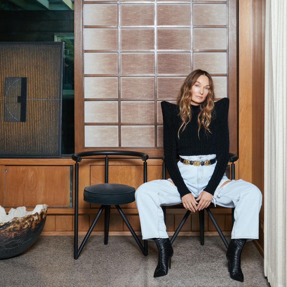
February 22, 2026There are designers whose aesthetic is immediately recognizable — you know it when you see it — and then there are those whose interiors register on an instinctive level, more felt or experienced than observed. Martin Brudnizki belongs firmly to the latter camp.
Over the past quarter century, the Swedish-born, London-based designer has built an impressive and diverse body of work that’s defined by mood and movement rather than formula. His designs — opulent schemes for the new location of storied London club Annabel’s and the bar in that city’s historic Art Deco Dorchester hotel, as well as Miami’s Soho Beach House, Paris’s Le Grand Mazarin hotel and too many private residences to count — are expressive, layered and deeply considered but never stiff.
Even at their most maximalist and decorative, moreover, his spaces are grounded by the goal of improving the ways people live and gather, linger and connect. An emotional intelligence runs through all his work.

Brudnizki’s debut book, My Life in Colors — recently published by Rizzoli, coinciding with his studio’s 25th anniversary — wisely resists the pat conventions of celebratory monographs. “What I didn’t want to do was a portfolio,” he says.
Instead, he split apart the rooms of various projects and then reorganized them by hue, making that both subject and structure. “It was staring me in the face that it was all about color. That is the common denominator of my work,” the designer tells Introspective. “And color is about emotions, absolutely.”
Here, Brudnizki talks about how texture, pattern, layout, narrative and, most importantly, color combine to inform the atmosphere of his spaces — and about how those ideas can shape the way we think about our own homes.
BLUE: Vesper, at the Dorchester, London

In designing Vesper, the sultry lounge at London’s Dorchester hotel, Brudnizki started “with a story,” he says. “There was a book published by the hotel in 1931 called A Young Man Comes to London” — written by Michael Arlen with illustrations by Cecil Beaton — “which was about Beaton in a way, and all those Bright Young Things.”
Drawing inspiration from that book, plus the work of the period’s preferred interior designer, Syrie Maugham, Brudnizki clad the walls in what he describes as “very cubist” medium-tone straw-marquetry panels, then added “color to make it all pop”: warm blues in the bespoke barrel chairs by George Smith that sit at the wood pedestal tables, rich green in the sofas nestled in the window alcoves.
Blue “is a bold color, ideal for bars and nightclubs — a boon companion to . . . your artistic self, to ecstasy,” Brudnizki writes in the book. The green used here, he adds, “stands out from the more muted background of the natural finish[es].”
To provide warmth and a sense of rhythm, the designer layered in metallic elements, like the mirrored pilasters and silver-leafed ceiling, which he characterizes as “almost like water.”
GREEN: The Garden Terrace, at Annabel’s, London

In approaching this alfresco eatery at Annabel’s, Brudnizki began with context. “Because this is a garden terrace and it has all this foliage, it’s already so green,” he says of the space, inspired by Georgian orangeries. He complemented all this verdure by upholstering the seating in brilliantly clashing patterned fabrics, some in green, some quite the opposite. A Colefax and Fowler leopard print — with surprising green spots — clads the banquettes, while a red-and-beige chevron design adorns the Fermob garden chairs.
“It’s all about the tone,” says Brudnizki, explaining how he makes different hues play well together. With patterns, he prefers to “put a stripe next to a floral next to a geometric — never floral next to floral — because you need something to separate the dizziness.”
Additional furniture on the terrace includes custom dark-stained-wood bistro tables with marble tops and oversize vintage planters. Illuminating the whole is a mix of custom table lamps and Urban Electric Co. lanterns. “Lighting is everything,” Brudnizki states. “It’s how you make day go to evening.”
Hidden in the foliage is a classical-style statue of a female nude from the personal collection of Annabel’s owner, Richard Caring.
ORANGE: Binderton House, West Sussex

In his own rural retreat — a two-bedroom apartment within the historic Georgian-style West Sussex country manor Binderton House, once owned by British prime minister Anthony Eden — Brudnizki designed what he calls the “bathroom of my dreams.”
Once again, he constructed his scheme around a narrative, imagining “a house that belonged to a little family who’d hit hard times, maybe an American buccaneer. The daughter then married and wanted to redecorate. She designed a classic bathroom with a bit of Art Deco, very un-English.”
The floor is an elegant grid of polished Giallo Siena and Arabescato marbles; the former also clads the walls. The story is elaborated on in the accessories: an alabaster column lamp, a hanging star lantern, a pair of Biedermeier-style cherrywood nightstands with black lacquer tops and a 1950s slipper chair reupholstered in a Jean Monro floral. Together, Brudnizki says, these pieces recast the room as a place for conversation and lingering.
NEUTRAL: Daphne’s, London

“The allure of neutral colors,” Brudnizki writes in the book, “lies not only in their aesthetic appeal but also in their ability to offer a sanctuary from the chaos of modern life.” That calming influence is very much in evidence in his update of the chic Italian restaurant Daphne’s, in London’s Chelsea, where stylish types have held court for more than 60 years.
Using cloudlike, light-as-air swathes of ivory-toned fabric, Brudnizki created a canopy that is practical as well as decorative. “It gives great softness,” he explains, and helps “deal with noise,” while also diffusing light. The mirrored walls make the space feel bigger and create a social vibrancy he likes. “It’s all about the ‘see and be seen,’ ” Brudnizki says, “understanding what’s going on in the room, creating this frisson of excitement.”
A custom onyx fireplace provides a dramatic new focal point. “There was a mantel there,” Brudnizki says, “but we wanted to create something more Italian, more friendly.”
What color there is in the space comes largely from the artworks flanking the mantel: a portrait of a young woman sporting a pop of red lipstick and an abstract contemporary picture by Howard Hodgkin.
YELLOW: The Nook, at the Broadwick Soho, London

This hidden-away parlor room at London’s Broadwick Soho hotel posed a technical problem for Brudnizki. “It was in the worst space possible,” he says, citing its rear location and nearly complete lack of sun, save for a small skylight.
He addressed these drawbacks by deploying sunny, golden-hued fabric to create a sense of light, layering in luxe textures and earthy greens and blues for richness. “[I]t can seem subversive to pair yellow, a color synonymous with life and joy, with darker tones,” he writes in the book, but those somber hues can “help ground a yellow room, giving it atmosphere and depth.”
Brudnizki used a deep-yellow chintz on the walls and for the curtains framing the newly introduced stone fireplace from Jamb. He “took advantage of a good ceiling height and added a large vintage Murano chandelier,” he says, pointing to this, along with the vintage fan-shaped fireguard in front of the fireplace, as a lucky find.
BROWN: The Beekman, New York

At the Beekman hotel in downtown New York, Brudnizki once again worked with contrast, this time to give the monumental 19th-century former office building a more human scale and infuse it with a bit of whimsy. Brown-stained richly grained wood paneling pairs with a marble mosaic floor and glazed ceilings. Each element befits the structure’s sense of history and age.
To counterbalance that gravitas, Brudnizki covered the reception desk in vintage Persian rugs that seem almost to have been casually tossed over a piece of furniture. “I wanted it to be more fun,” he says. “You’re meant to walk in and do a double take. You stand there, you put your hands on them — it’s tactile.”
An artwork by Nathalia Edenmont hangs behind the desk, while bespoke beaded lamps provide more texture and further soften the formality. So too do the different tones of brown, a hue that, Brudnizki writes, feels “like a simple, honest and warming color.”
RED: Fouquet’s, New York

In creating the New York outpost of the Paris brasserie Fouquet’s, Brudnizki wanted a lightly updated version of the 19th-century original. Located on the Champs Élysées, that premier iteration is immediately recognizable for its liberal use of red: on its awnings, terrace chairs and velvet interior seating. Brudnizki’s stateside version deploys red with more surgical precision, demonstrating how discipline and restraint can make even the strongest colors feel refined and sophisticated.
Because of its potency, “you don’t need a lot of red,” he explains. And indeed, he limited its use to the leather bar stools, velvet dining chairs, table-top votives and piping on bar-top lamps, all of which punctuate an otherwise largely neutral palette.
Even with this predominantly two-tone palette, the room conveys a sense of variety thanks to it mix of surface treatment. When you work with only a few hues and materials, Brudnizki says, “it’s important that you deploy different types of finishes.”
BLUE: Chiki, at the Four Seasons Los Cabos at Costa Palmas

For the private dining room at Chiki — the lounge and bar at the Four Seasons in Los Cabos, Mexico — Brudnizki used blue as both a spatial marker and an emotional trigger.
The vibrant hue of the dining nook was inspired by Frida Kahlo’s Mexico City home, Casa Azul. “It’s just paint, but it’s a very rough surface,” Brudnizki says, noting that because of its dryness and matte finish, it absorbs rather than bounces light, unlike most of the other surfaces in the room. (Mexican master architect Luis Barragán used the same technique to impart a softness and tactility to walls.)
The fact that Kahlo blue appears only in the recess enhances its intensity. “It becomes the most important boost,” Brudnizki says, making the room feel nocturnal, secretive and charged with glamor.
The reflective surfaces used elsewhere — like the mirrored mosaics adorning the walls, designed with Puerto Rican artist Celso González — give the space a more expansive feel, while a dramatic fabric canopy maintains a sense of intimacy. The large Murano Palmette chandelier overhead, meanwhile, emits a soft, diffused light that dances off the mirrored mosaics beautifully.
PINK: Reception at the Broadwick Soho, London

The combination of pink and green “feels very Italian and very happy,” Brudnizki writes in the book, noting that pairing a pink hue with stronger colors and avoiding pastel versions prevents it from being overly sweet.
He brought that observation to bear in the theatrical reception area of the Broadwick Soho, which displays a clear chromatic hierarchy. “Green is the dominant color and pink the supporting player,” says Brudnizki, who painted the walls and trim pistachio, then lined the area above the picture rail with a rosy-hued fresco-like paper inspired by the birds in a 17th-century Johann Walter painting. The upholstered reception desk, the trim on the fringed chairs and the glass chandelier provide further pink flourishes.
For the Broadwick, Brudnizki created another imagined narrative to guide his design, explaning, “We invented a story of an American grandmother who owned this townhouse in Soho — and it became where London met Studio 54.” To bring the tale to life, he integrated a 19th-century French bookcase, occasional table and Anatolian rug, plus a pair of 1940s Italian armchairs by architect Guglielmo Ulrich.
The resulting space, says Brudnizki, is “fresh, colorful, and it has a different point of view,” reminding guests that they are in the hedonistic, joyful heart of Soho.
BLUE: Le Grand Mazarin, Paris

Brudnizki had all the guest rooms of Paris’s Le Grand Mazarin hotel painted, he writes, “a soft and ethereal Gustavian blue,” a color he loves because it “works as the perfect canvas for the design highlights on top.”
Among the highlights here is a dramatic canopy made from an Aubusson-style woven tapestry depicting a lush woodland scene and hung from the ceiling over the bed. Others include a Murano flush-mount ceiling fixture, custom earthenware bedside lamps by Maison Lucien Gau and contemporary abstract Paintings.
Gustavian blue, a traditional neoclassical color, is “the perfect neutral for those who do not want to use an off-white,” Brudnizki writes, noting that at Le Grand Mazarin, it “helps the tapestry headboards stand out while ensuring they do so in a soft and sensitive way.”