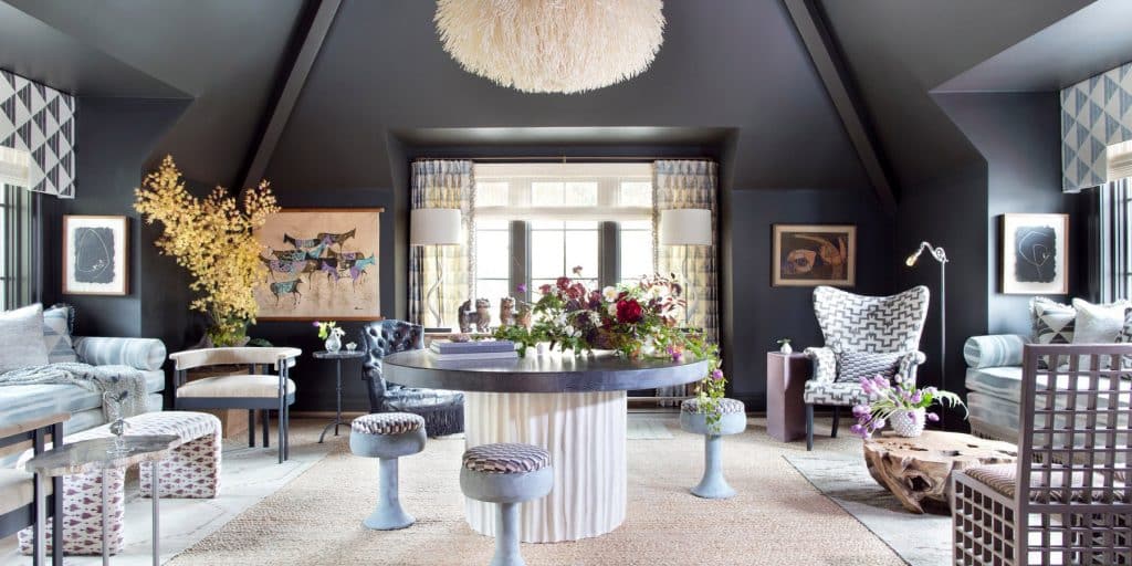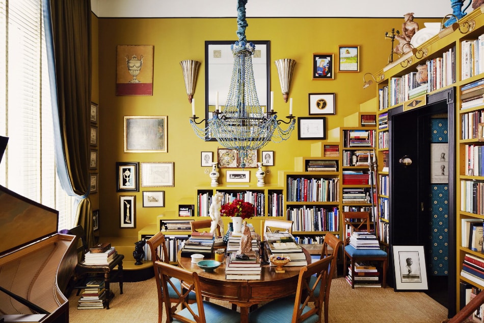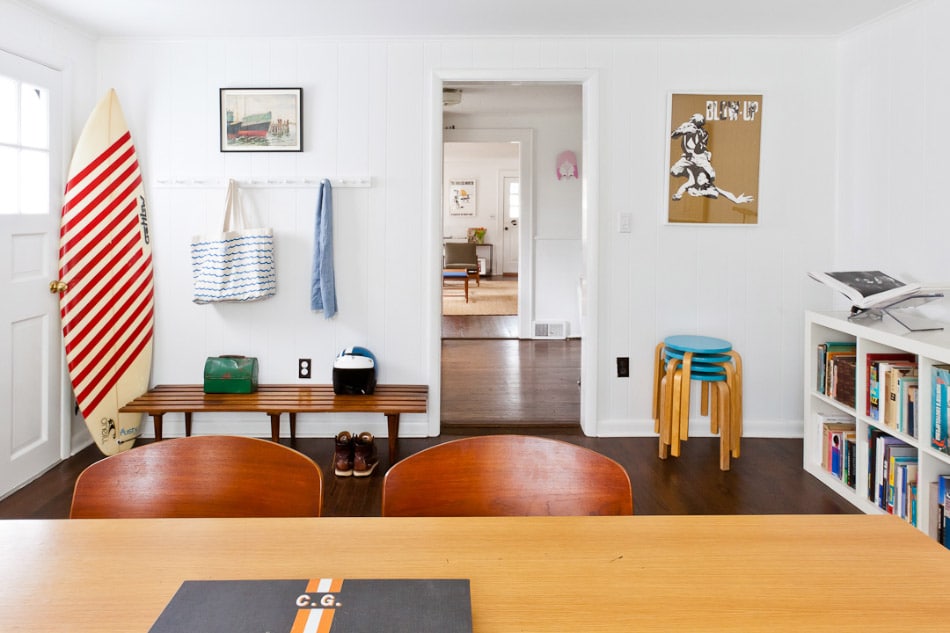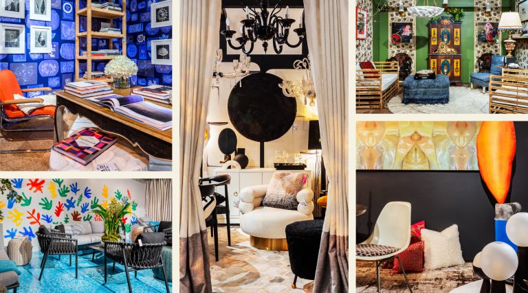
May 20, 2018Benjamin Moore’s Antiguan Sky plays to the tropical environs of designer Tom Scheerer’s Harbour Island, Bahamas, home (photo © Francesco Lagnese/OTTO). Top: A fierce shade of Jaguar, from Sydney Harbour Paint Company, features in this Atlanta showhouse by Cloth & Kind (photo by Sarah Dorio).
In my 19th-century home in New York’s Hudson Valley, I live with Dead Salmon, Mole’s Breath and Mouse’s Back. No, that’s not a mashup of a grocery to-do and an exterminator’s hit list. It’s a menagerie of names from the acclaimed British paint company Farrow & Ball (referring to a marvelous drab rose, a cool gray and a squeaky brownish tone).
People all say they love color — in annual color issues of decorating magazines, for instance — but do they really? Many of us who truly adore it agree with the decorator Steven Gambrel: “I love paint.” And if you do, you must choose a really good brand.
Diving into this topic made me realize that there’s a universe of fine coatings out there. And demand for them has surged, since color itself has staged something of a comeback of late. After a decade or so of beiges, greiges and putties, bold and saturated tones are back. The collective consciousness has coalesced around the idea that color is a powerful aesthetic tool rather than just an extraneous extra.
So which paint to pick? As the French say: A chacun son goût. It turns out that paint is a luxury product just like any other, and the composition of what’s in the can makes or breaks a room.
For his elite clients, Gambrel is known for subtle and complex paint jobs — for instance, fashioning kitchen cabinets that have two or three colors on each panel, a delicately modulated Mahler quartet where many so-called high-impact paint jobs are more of a Sousa march. “Instead of making a statement, I want to enhance an idea” is how he puts it.
Like a surgeon, Gambrel uses the different paint brands as tools, employing certain ones for certain tasks. “If I’m looking for a high-gloss finish, it’s Fine Paints of Europe,” he says.

Consort went with a cobalt blue from Portola Paints to set off colorful artwork and graphic prints in Jessica Alba’s L.A. guesthouse. Photo by Chris Patey
For a more matte effect, Gambrel often goes with Benjamin Moore’s high-end Aura line, introduced in 2006. Last year, the company introduced another top-flight line, specifically for decorators, called Century — proof that it sees rich opportunity in an area where Fine Paints and Farrow & Ball dominate.
The decorator Tom Scheerer, himself a deft employer of the whole color spectrum, notes that “presentation and marketing” have a big role in this elite sphere of paints — it’s true, I am a happy victim of Anglophilia in my preference, to be sure. Scheerer adds, “Some people just prefer certain brands.” And John Lahey III, who owns Vermont-based Fine Paints, wouldn’t disagree.
“My father started the company in 1987, when the imported craze started taking off,” Lahey tells me (the family was originally in the wine business, another industry where taste is all). The paints are made in the Netherlands, which has long been associated with high-quality coatings — thus the country’s lingering presence in names like Dutch Boy.
And just because marketing is involved doesn’t mean there’s no difference in quality. “We sell the quality first and the colors second,” says Lahey. “It’s not so much what’s in it but what’s not in it.” The paint materials are ground longer, milled more finely, creating a smaller particle size and hence more durability, he says.
The decorator John Gachot — who, with his equally talented wife, Christine, runs Gachot Studios — states that Fine Paints has been his go-to for adventures in glossiness. He recalls using it on the shiny ceiling he created for the powder room of fashion designer Marc Jacobs’s townhouse, where it took 10 coats, and much sanding, to arrive at a “rare orange” color. “Paint is almost like an architectural element,” he says. “It can really tie a place together.”

The combination of Farrow & Ball’s Elephant’s Breath, on the walls, and blush-colored silk velvet, on the custom banquette, creates a warm and inviting effect in this rock star’s home designed by Ashe + Leandro. Photo by Stephan Julliard
Gachot adds that Donald Kaufman Color — which offers hundreds of fascinating hues and a Color of the Month on its website — has a cult-like following for good reason: “It’s not so much that he offers magic paint that makes anything look good. It’s that he used to be an abstract, minimalist painter, and he understand the subtlety of how things reflect light.”
To my eye, the Farrow & Ball line creates a depth that makes my modestly sized 1834 rooms seem more spacious and more intriguing and helps the Greek Revival details stand out. So, I was excited to talk to Joa Studholme, international color consultant for the Dorset-based firm and keeper of the flame for super-fans like me.
Studholme creates the new colors that the company releases every few years — among them, the Mole’s Breath adorning my parlor. Her 2016 introductions included Inchyra Blue, a moody, greenish hue; and Peignoir, which is Dead Salmon’s romantic but flighty younger sister, the Sensibility to the Sense. (One could write a dissertation on the semiotics, sense and nonsense behind the naming of paints.)
Studholme is a font of fun facts about the company, which was founded in 1946 and rebooted in the 1990s. Did you know that one of the original yellows was made from the urine of cows in India that ate mango leaves, thus producing the perfect sallow tone? No longer, sadly.
“Paint is almost like an architectural element,” says John Gachot. “It can really tie a place together.”

Summer Thornton chose a festive pinkish Cinco de Mayo by Benjamin Moore for this Royal Tenenbaums–inspired Chicago home. Photo by N. Johnson, B. Ambridge, J. Thornton
Originally, Farrow & Ball’s palette reflected the hues used in National Trust properties in England, the source of some of the marvelous English drabs that the firm still offers (you can feel the damp of a Cotswolds morning when you look at them).
“The ingredient quality is the difference,” Studholme tells me. “They are sourced from all over, and every color we make has at least five different ingredients — it’s not dropping a bit of dye in a bucket.” The China clay employed in all the company’s paints has a special chalky quality, creating “unrivaled depth,” she notes, adding, “In the right light, you feel like you could dive into the wall.”
Gachot is a fan of Farrow & Ball’s relatively limited palette: Like a restaurant with a well-curated main dish list, the company has done some of the work for you. This “makes your life easier,” says the designer, whose go-to hue right now is Wimborne White, because it’s “so juicy, and makes furniture and woodwork pop.”
Of course, high-end paint jobs are done by actual people, so the savvy designer defers to the hand of the artist. “I rely on the craftsmen on a job to decide the paint,” says Scheerer. “I give them a lot of leeway.” (He recalls the bright red chosen for a porch floor by the color-loving decorators Diamond Baratta as evidence of how important the perfect paint is: “I wish I’d thought of it.”)
Scheerer’s approach is sensible, generous and demonstrates his true professionalism. But for my new kitchen, I would prefer painters who are prepared to take loving care with Eating Room Red, Strong White and Purbeck Stone, all from you-know-where.
