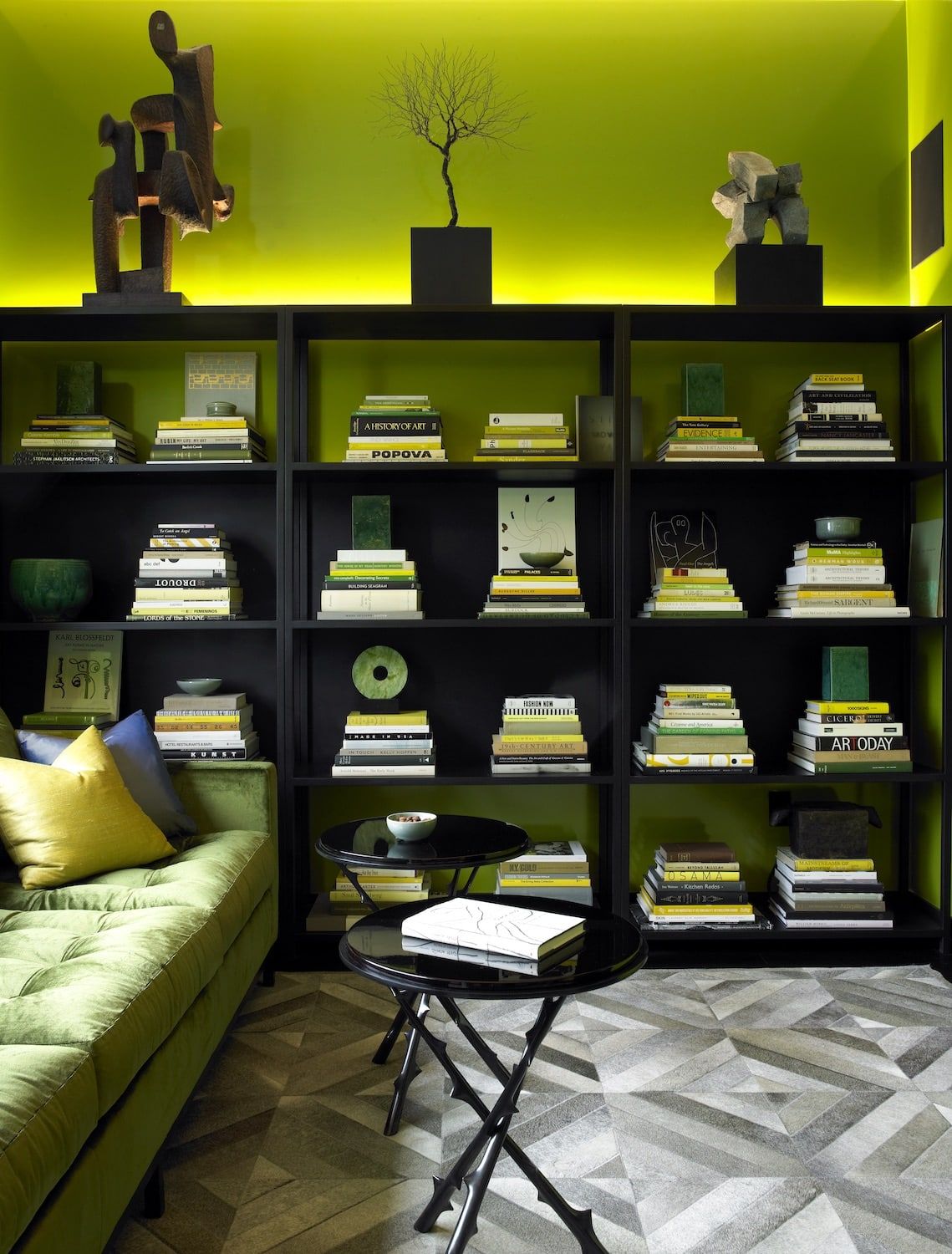
Hague Blue
“One of my favorite paint colors is Hague Blue by Farrow and Ball. I used it in this 12-foot-tall bespoke library in Greenwich Village, wrapping the room from the base molding up the walls. The feeling of being enveloped in one deep color is very soothing. It has an almost spiritual quality. The Hague Blue grounds the busy green in a restful way, providing a happy color marriage.” — Rebekah Caudwell
Photo by Simon Upton
Rose Parade
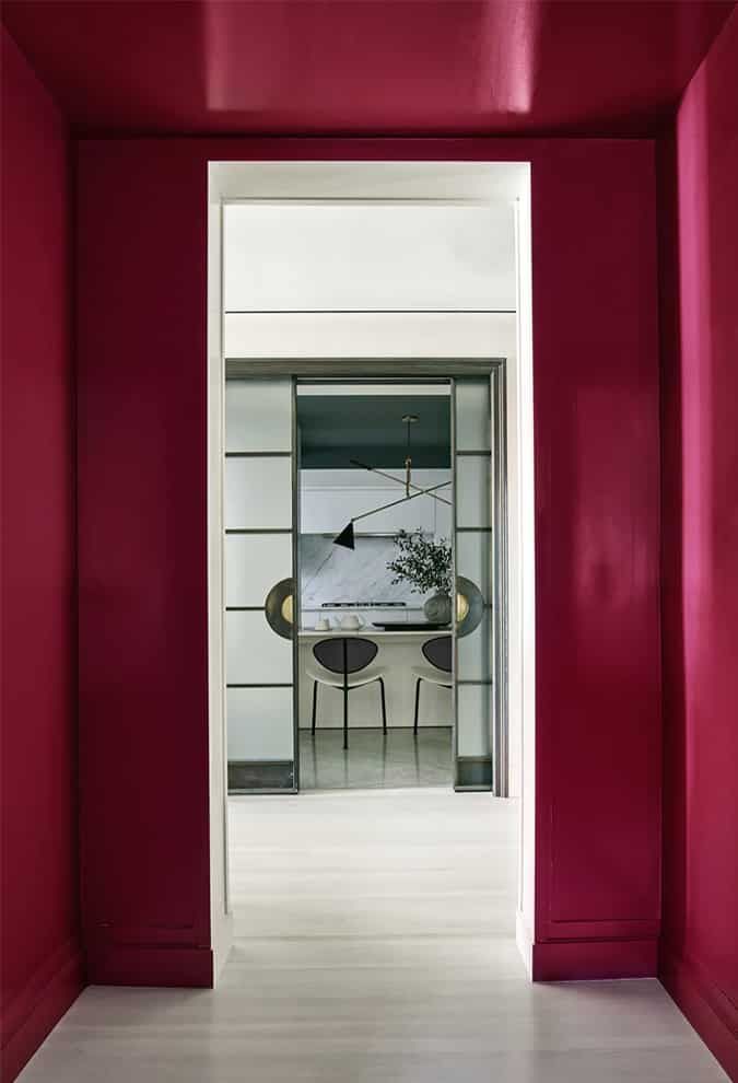
“I really love Rose Parade by Benjamin Moore. Here, I have used it from floor to ceiling in a small vestibule off a series of bedrooms. It is a sort of a ‘bold before the storm’ concept to queue up some of the more tonal rooms surrounding it. The color’s depth, saturation and richness have an invigorating effect, like when you feel flushed from excitement and your cheeks go the same color!” — Kelly Behun
Photo by Richard Powers
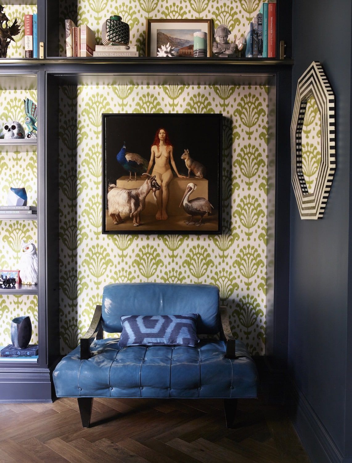
Acid Green
“The paint color I love right now is acid green. In this library, we used it for a lacquer on the walls. As an internal room within the apartment, the space offers relief from other areas and the color provides a moment of surprise. The intensity of this particular green makes it fresh — referring to nature, although it’s not a color we often see in nature.” — David Mann, MR Architecture + Decor
Photo by Mark Roskams
Lulworth Blue
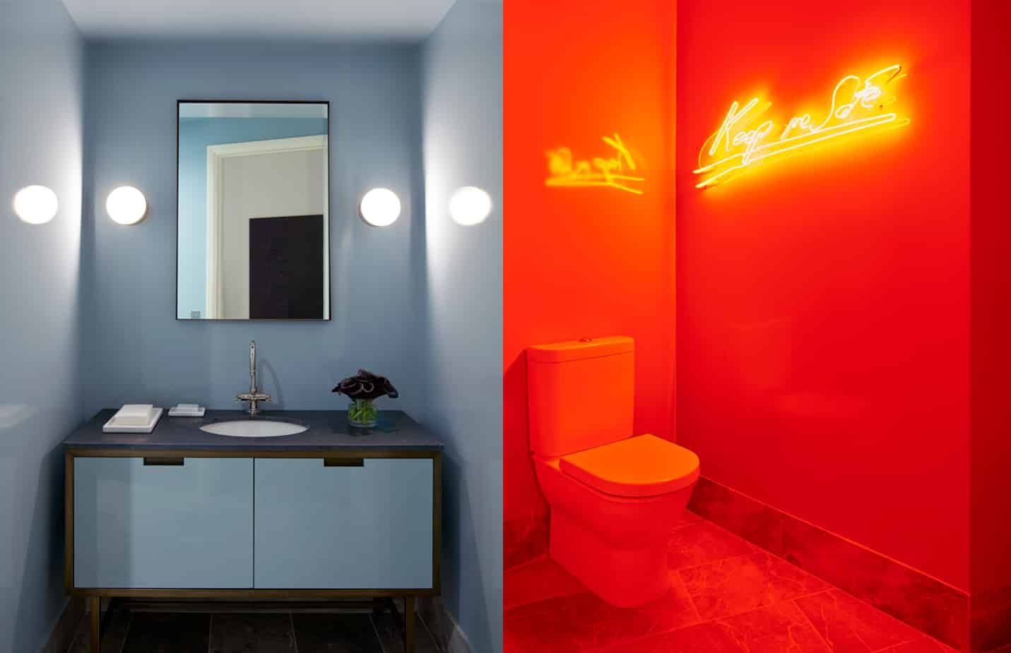
“I particularly like Lulworth Blue by Farrow and Ball. We used it in a powder room, on the walls, ceiling and millwork, in Farrow and Ball’s full-gloss finish. With its reflectivity and muted tone, the blue goes fully red when you turn on the neon piece by Tracey Emin.
Depending on the surrounding finishes or lighting, the color is very flexible. It changes with the daylight, from morning to night, and takes on a different intensity given the palette of the pieces you put next to it.” — Christine Gachot, Gachot Studios
Photo by Jason Schmidt
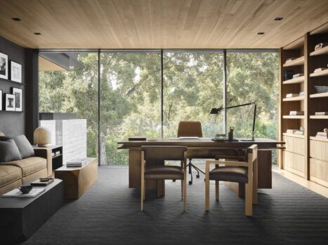
Stormy Sky
“I love using Benjamin Moore’s Stormy Sky 1616 because it can be dramatic, but it can also be translucent. It is beautiful with white and with metals of all finishes. I have used it on exteriors and in kitchens. This color also works well as a base to add other hues. I’ve even done 50-50 mixes starting with this shade.” — Windsor Smith
Photo by Michael Wells