July 21, 2019Coastal stereotyping is notorious: West Coasters gad about in yoga pants; East Coasters carry Proust. However reductive such characterizations are, there’s some truth in the observation that each region manifests cultural and artistic dispositions consistent with its history and locale.

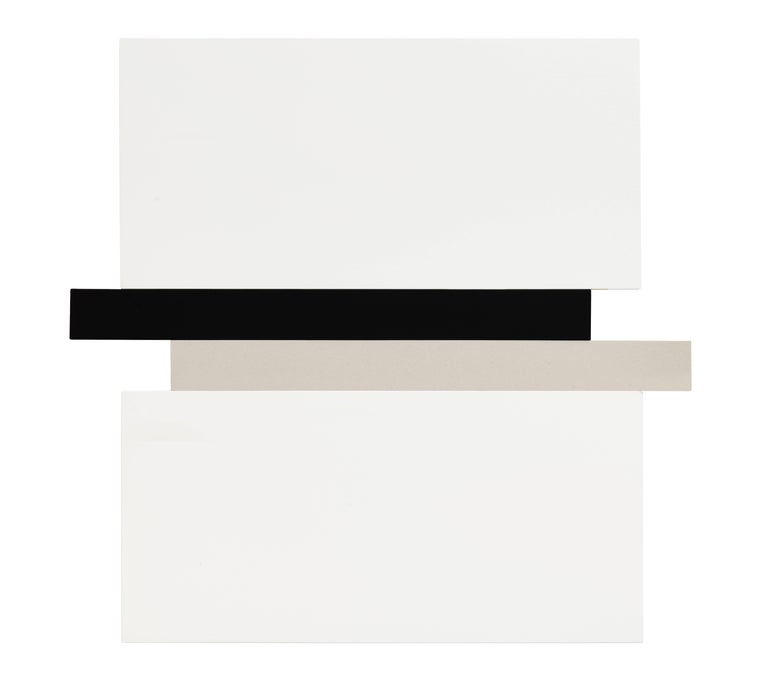
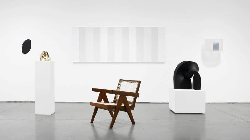
From his eponymous gallery in Laguna Beach, California, Peter Blake has championed West Coast minimalism for a quarter of a century (portrait by Chad Mellon). Top: His current exhibition, on view through August 4, celebrates the genre and the gallery’s 25th anniversary by showing such works as, from left, James Hayward‘s Abstract #152, 2009; Craig Kauffman’s Untitled, 2001; and Lita Albuquerque‘s Untitled, 2018. All photos courtesy of the gallery unless otherwise noted
The angst-filled, tradition-busting 1960s — typified by drip paintings, happenings, junk art, assemblage, environments and Pop art — was followed by an era in which American artists returned to elegant, carefully worked, often industrial materials and an attention to precise geometry. This was the case on both coasts, but creatives on each side of the country worked with their own regional twist.
Dubbed minimalism, the New York iteration was formulated by now very famous, mostly male exponents — Donald Judd, Frank Stella, Ellsworth Kelly, et al — who were not just artists making pristine pieces but also heady essayists and critics.
Peter Blake has spent 25 years collecting, studying and exhibiting West Coast minimalism dating from the late ’60s through today, and he says that the version espoused in California, especially Los Angeles, “was and continues to be no less conceptually rigorous than New York minimalism, but sexier, more sensual, reflecting the atmospheric qualities and lifestyle here.”
Blake’s eponymous gallery in the gorgeous seaside suburb of Laguna Beach — about 90 minutes from the L.A. civic center — is the longest-running space focusing on West Coast minimalism. (He intermingles artworks in that aesthetic with highly collectible 20th-century furniture.) His current show, running through August 4 and commemorating the gallery’s 25th anniversary, is a grand celebration of the genre, featuring California minimalists — both lesser known and ones who have been the focus of major museum surveys — including Lita Albuquerque, Larry Bell, Billy Al Bengston, Mary Corse, Laddie John Dill and Hadi Tabatabai.
California minimalism has been dubbed Light and Space, the Cool School and Finish Fetish. From transcendent works like Corse’s oscillating bands of painted light to more playful ones like Bengston’s chevrons on tin, all the pieces radiate shimmery seduction. Introspective caught up with Blake to talk about the movement and his quarter-century career as a gallerist.

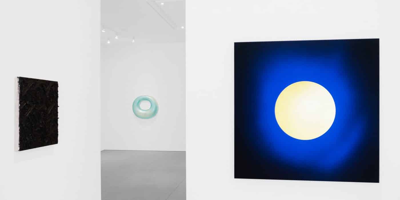
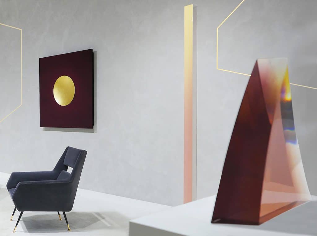
John M. Miller‘s Untitled (BK3D), 1995, hangs between De Wain Valentine’s Concave Circle Rose, 1968–2014 (left), and Joe Goode‘s Moon River (MNmm 01), 1997.
How would you distinguish California minimalism?
New York minimalism is very esoteric, even a bit austere. West Coast minimalism is more flowing, has a quality of play to it. The moniker Finish Fetish is apt, because the work exudes sensuality, unapologetic beauty and — yes, I guess — the essence of fetish, which is desire.
I think all the names used to describe this genre suggest the diversity of how it is practiced here. The work is much more varied than what was programmatically produced under the name minimalism in other places.
You have said that California minimalist art reflects its place of origin. What exactly did you mean?
Artists doing this work use polyester, resins, plastics, shaped acrylics — materials from the surfing and skateboarding cultures, as well as the aerospace and auto industries that are concentrated on this coast.
West Coast geography is referenced as well?
California in general, but L.A. in particular, expands outward — you see water and horizons. California has every climate, every atmospheric quality. This generates unique sunsets, as well as aerial and perspective effects not found elsewhere. This is ubiquitous and cannot help but influence artists here.

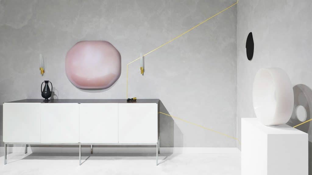
Tony DeLap’s Perplexity, 1988, can be seen through De Wain Valentine’s Concave Circle Rose, 1968–2014.
How does that translate to the work?
There are certain ways that artists here use materials — in both two and three dimensions — so that light dances across and through surfaces, mirroring the natural light and sensibility of our coast. You see this in almost every piece in this anniversary show, where clear resins or remarkably handled luminescent pigments reflect and bend light to produce lush illusions.
Some of the names in your anniversary show, like Joe Goode and Larry Bell, will be familiar to international art fans. Bell had a wonderful career survey last year at the Institute of Contemporary Art in Miami, and Goode is in major world museums. Some of the other names, however, may be new to nonlocals.
All of these artists are respected veterans, but I do not simply show “art stars.” I just focus on good work.
True enough, but you have pieces here lent from major collections. Some are valued in the six figures, and some are so historically important they are not for sale. So, provenance, art history and critical acclaim do underpin this twenty-five-year show.
Of course, people always buy art that will be an investment. But we have had many grad students and budding curators visit the gallery over the years, and they want so badly to pin a label or an art history movement on the work they are looking at. I tell them and all my clients to just take in the work irrespective of labels, on its own terms, to trust their instincts, to go with whatever moves them. I have always trusted my instincts. That is how I ended up as an art dealer.
Can you explain?
I’ve always been architecturally inclined, but I come from a line of serious restaurateurs — my father and his father. In 1993, I had just been promoted to general manager of a major restaurant and was walking home from celebrating that huge career step when I saw this very geometric, clean, sharp-angled space for rent. I thought it would make a great space for the kind of art I have always been attracted to, so I signed a lease two days later.
Recent Peter Blake Gallery Exhibitions and Fair Presentations

That is pretty audacious in the art world, where lasting for twenty-five years as a gallerist is no easy feat.
That is how I operate, and it seems to work. I got the notion to run for city council in Laguna Beach this year and won, so now I’ve added the political dimension to my skill set.
Did you give up the food business when you opened the gallery?
I ran the restaurant and gallery concurrently for three years, then I devoted my time exclusively to becoming a respected dealer.
The most famous art historical minimalists were males. I am fascinated that you have very fine work by women, including Mary Corse and Lita Albuquerque.
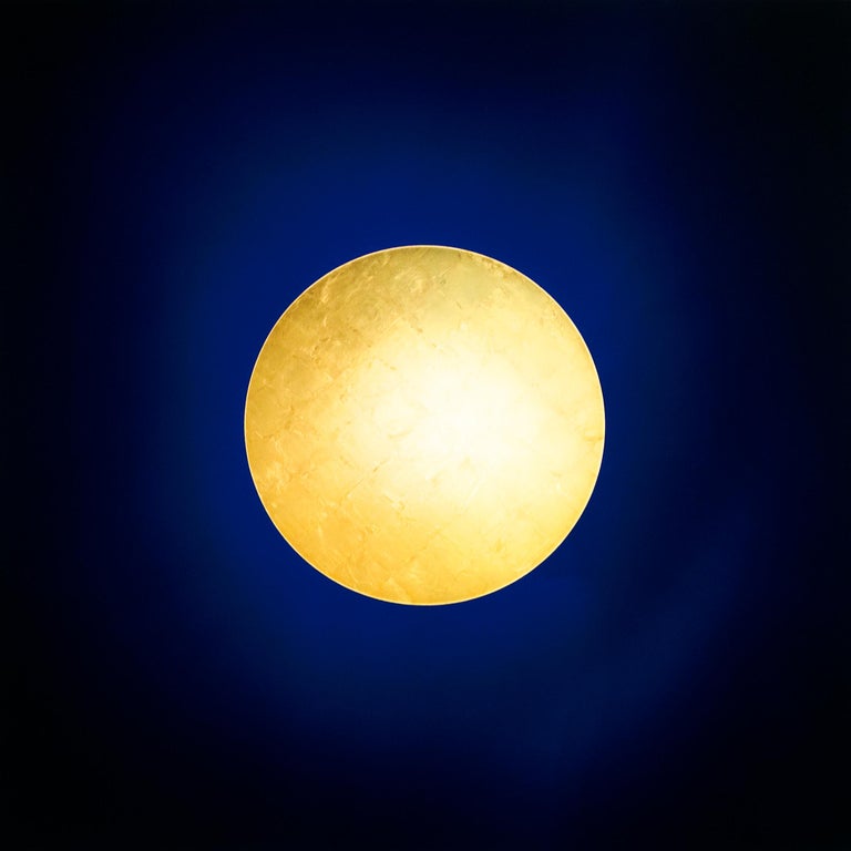
Lita Albuquerque is a major artist. Besides her abstract paintings, which are shown worldwide, she did a huge project with climate scientists using ninety-nine blue spheres arranged in the ice of the South Pole in exact, calculated alignment with ninety-nine stars. Mary Corse is one of the most technically subtle artists working in this style. It is the diversity of California minimalism that intrigues me.

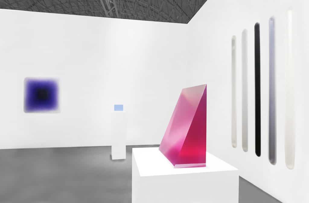
Peter Alexander‘s 1/10/14, 2014, stands to the left of Billy Al Bengston’s Mesquite Western Series, 1969, on the back wall, and Ron Nagle’s Teens of August, 2009.
What’s in the offing for the next twenty-five years?
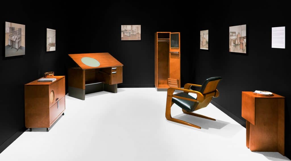
My wife and I have been longtime avid collectors of historic and modern design, from Le Corbusier to the Italians to Brasileiro. We had tons of excellent, even historic objects in storage, and in 2016, we decided to mount a not-for-sale exhibition, a kind of passion project displaying our collection. We titled the show “The Tendency of the Moment | International Design: Bauhaus through Modern.”
I had built a strong reputation as a fine-art gallerist, so that hybrid show was a dangerous move.
How so?
Fine art can have a very purist orientation. Somehow, if you are a fine-art dealer, moving into functional objects is risky. But that is the direction I am moving in.
That surprises me. The entire tradition of modernism and even postmodernism stresses the unity or cross-pollination of all plastic arts. It was no accident that Bauhaus artists were painting geometric patterns and designing equally stunning architectonic teapots.
In theory, that’s true. But in practice, it took us a while to convince — or rather educate — collectors, the public and even some of our artists that this pairing makes perfect sense. Neither discipline is diminished by the other.

Comparing West Coast minimalism to its East Coast counterpart, Blake says that the Pacific version “was and continues to be no less conceptually rigorous than New York minimalism, but sexier, more sensual, reflecting the atmospheric qualities and lifestyle here.”
Is that resistance lessened today?
Absolutely. These connections are now being featured in major museum surveys, in the premier art fairs and blue-chip galleries — Gagosian’s pairing of John Chamberlain’s metal sculptures with key architectural elements by famed designer Jean Prouvé comes to mind here.
As the connections between fine art and fine design become better understood, my gallery is doing quite well in both arenas. But I was ahead of the curve, and I had to proceed with care — and courage.
Talking Points
Peter Blake shares his thoughts on a few choice pieces.