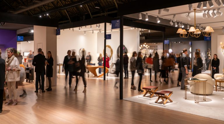

The exhibition “Too Fast to Live, Too Young to Die: Punk Graphics, 1976–1986,” at New York’s Museum of Art and Design, examines the role of graphic design in punk. Above: Arturo Vega designed this 1975 poster for the Ramones (image courtesy of Howl! Happening/The Arturo Vega Foundation). Top: Installation view of the exhibit (photo by Jenna Bascom).
May 19, 2019The Sex Pistols, the Ramones, the Cramps, the Clash — bands like these are synonymous with punk. But music was only one part of this 1970s movement, which was defined by youth, rough and fast-paced sounds and antiauthoritarian, anti-commercial attitudes. From its inception, punk was deeply intertwined with art and fashion, as well as music.
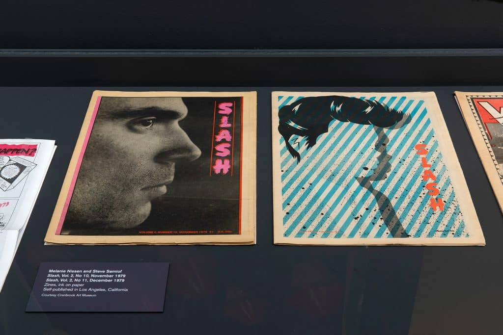
“Too Fast to Live, Too Young to Die: Punk Graphics, 1976–1986,” at New York City’s Museum of Arts and Design (MAD), is the first exhibition to look at the role of graphic design in defining punk, as well as post-punk, the expansive movement that succeeded it. In album covers, posters, flyers, zines and the like, young artists, some of whom later became famous, used inventive techniques to capture the movement’s youthful riotousness.
“Graphic design gave punk its identity,” says Andrew Blauvelt, director of the Cranbrook Art Museum and MAD curator at large for design, who curated the exhibition. “It was what people saw before they listened to an album or went to a show. Young designers, often people without formal training, were part of the scene, and they had complete freedom to create a new visual language.” This new language was characterized by rough, DIY collages — often in screaming colors — as well as appropriation and shocking subversion of existing images.

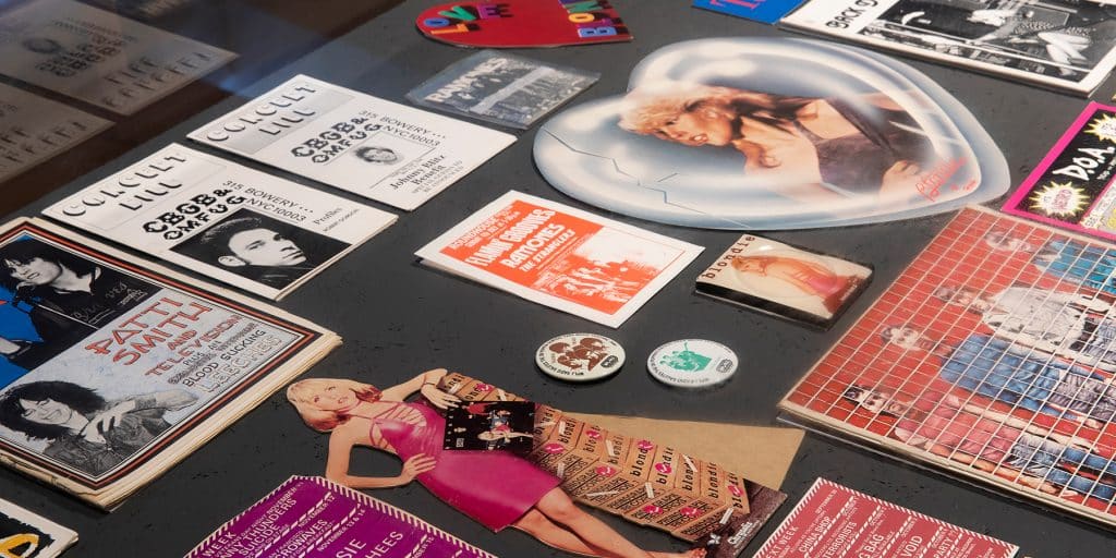
The show includes a vibrant array of buttons for bands like the Clash and Blondie. Photo by Jenna Bascom
Music historians debate about exactly when and where punk started. Purists claim it started in 1975 in New York and quickly moved to London, where it exploded. Patti Smith was the first punk artist to be signed to a major label, Arista Records. The Talking Heads formed around the same time, playing dive clubs on the Lower East Side. The bands typically didn’t have formal music training. “Your passion counted more than your chord changes,” Blauvelt notes. The songs were quick, the sound raw, and the lyrics reflected a suspicion of authority, anticapitalism and anti-consumerism. The music was, in part, a reaction to the commercialization of rock and roll by the record industry: long concept albums, grandiose guitar solos, a lot of postproduction work, rock operas. Punk groups wanted to revive the original rough-and-tumble sounds of the 1950s and ’60s.
A lot of punk musicians had art backgrounds. The Talking Heads met as students at Rhode Island School of Design. Before music, Patti Smith’s primary interests were poetry and drawing. The arts intermingled in ’70s New York.

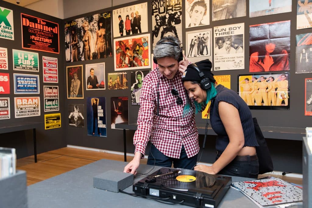
The exhibition features posters for influential bands like The Cramps and Siouxsie and the Banshees. Photo by Jenna Bascom
Across the pond, on Kings Road in London, Malcolm McLaren and his then-girlfriend, Vivienne Westwood, opened the clothing shop Too Fast to Live, Too Young to Die, from which the exhibition takes its title. McLaren had studied art and been a band manager in the U.S. He recognized that the nascent punk movement needed a radical new style. He and Westwood began codifying punk fashion, with an aesthetic that was dirty, shocking, offensive and sick. The clothing was torn, including bondage elements like chains, and T-shirts featured such provocative images as genitalia, swastikas and crucifixes. (Some wearers were arrested.) In 1974, they renamed the store SEX, selling obscene lingerie and bondage outfits that young people wore on the street to shock people.
Punk Style at MAD


In 1975, McLaren was instrumental in forming the quintessential, if short-lived, punk band the Sex Pistols, recruiting its legendary lead singer, Johnny Rotten, and serving as its manager. “There was no precedent for them,” Blauvelt says of the group’s musicians. They were theatrically shocking, once spewing profanities on national television. With their anarchic worldview and ragged look, they quickly became famous and almost immediately inspired numerous other acts.
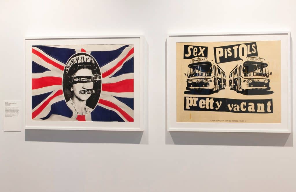
To design the band’s graphic brand, McLaren hired the artist Jamie Reid, who took cues from the French Situationist International group, which emphasized social critique. Shunning typical music-industry practices like putting a photo of the band on an album cover, he developed a ransom-note typography for Sex Pistols posters that became popular for punk groups in general. Cutting letters out of magazines was cheap, and the crude DIY look fit the movement.

Jamie Reid and Trevor Key created The Great Rock ’N’ Roll Swindle film poster, 1979, appropriating a consumerist image — the American Express card — and labeling the artist as prostitute and the record company as pimp. Image courtesy John Marchant Gallery. Copyright Sex Pistols Residuals

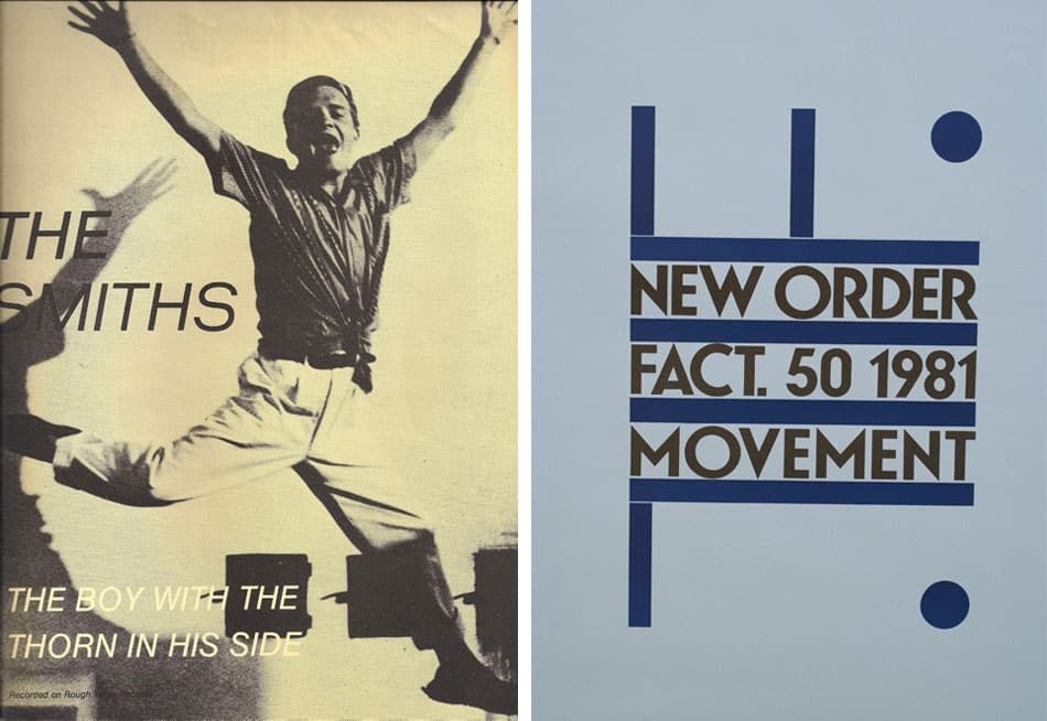
Joy Division’s 1979 album Unknown Pleasures was designed by Peter Saville. Courtesy Warner Music
For the Sex Pistols’ only studio album, Never Mind the Bollocks, Here’s the Sex Pistols, Reid appropriated a Cecil Beaton portrait of Queen Elizabeth II for an Andy Warhol–style mashup. The image was repeated numerous times — photocopied and then collaged — and the result silkscreened in red and acid green. A safety pin, which became part of the punk fashion vernacular, is collaged onto the queen’s lip, like a piercing (the technique harks back to Dada collages, which used little pieces of images from newspapers and magazines). Other Sex Pistols posters critiqued consumerism by adopting idyllic images from travel brochures and pictures of American Express cards and mercilessly satirizing them (although appropriation existed before the punk movement, it became a codified artistic practice in the ’70s). The AmEx-inspired poster, for instance, labels the artist as a prostitute and the record company as a pimp.
The movement after 1977 is “technically post-punk,” Blauvelt says, and includes such subcultures as goth and industrial. In the ’80s, noted contemporary artist Raymond Pettibon created flyers and other materials for Black Flag, an influential post-punk band of which his brother was a member. The flyers, which showcase the drafting prowess that would make Pettibon famous, feature unsettling images like cemeteries. The names of Black Flag’s opening acts reflect punk influences: Fear Stains, Caustic Cause, Wasted Youth Descendants.

The Talking Heads’ 1980 album Remain in Light was designed by M&Co. (Tibor Kalman) and Tina Weymouth, Chris Frantz, Walter Bender and Scott Fisher. Image courtesy of Warner Music
The ’80s New Wave was, in a way, a punk successor, with bands like Depeche Mode creating punk-influenced music using synthesizers. They “made punk danceable and sellable,” Blauvelt says. In graphic design, New Wave was characterized by primary shapes, bright Day-Glo colors, patterns and layering. Then-emerging artist Keith Haring was on the outskirts of the movement; Jean-Michel Basquiat had a noise band called Gray that performed at New Wave clubs. The movement even infiltrated furniture design, undoubtedly influencing the Italian Memphis Group, Blauvelt says.
Although the exhibition doesn’t include any contemporary art, punk continues to resonate with designers across mediums. Among these are Lauren Larson and Christian Lopez Swafford, of Material Lust, whose abiding love for punk guides their functional sculpture practice. (Their favorite punk band is the Misfits, who formed in 1977 and still perform today.) The pair’s most recent collection includes a wall sculpture incorporating zip ties used as handcuffs in the French Yellow Vest protests and a sculptural table covered in a black hoodie bearing the word “police” repeated in white, evoking today’s 1984-esque omnipresence of authority. “It’s not literal,” Swafford says. “We would never make a table inspired by punk — that would make me cringe — but the principles permeate all we do.” Adds Larson, “We hope people feel unsettled by our work in a way that makes you nostalgic about listening to punk as a teenager.”
“Punk transcends any one discipline,” Blauvelt concludes. “If it isn’t the subject of people’s work, it’s the soundtrack in their studios.”