
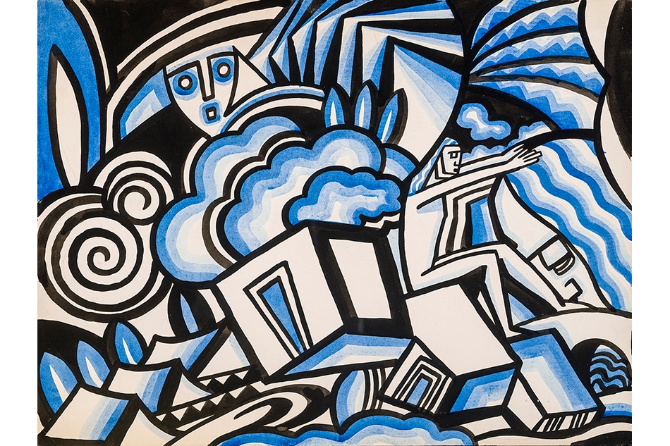
April 29, 2018Winold Reiss came to the U.S. with high hopes of painting Native Americans and accomplished much more. Here, he is pictured in a buckskin jacket on a sketching trip in Montana, ca. 1934 (portrait © Tjark Reiss, courtesy of the Reiss Archives). Top: City of the Future, Panel II, ca. 1936 (photo © Michael Tramis, all photos of artworks courtesy of Hirschl & Adler Galleries).
In the March 1931 issue of the in-house magazine of chemical giant DuPont, between page-long paeans to the latest in “sensible athletic underwear” (“knit of pure DuPont Rayon,” of course) and the wonders of “transparent moistureproof Cellophane” is a feature on artist, designer and illustrator Winold Reiss (1886–1953). At once innovative and astonishingly versatile, the German-born New Yorker was the human equivalent of a DuPont polymer. Hirschl & Adler has borrowed the article’s plucky lead — “Winold Reiss will not be classified” — to title its exhibition of Reiss’s work, on view through May 25 at the gallery’s new home, in Manhattan’s Fuller Building, on 57th Street.
DuPont’s profile of this “modern Cellini” was motivated by more than admiration for his gifts. An inveterate experimenter who was drawn to new materials, Reiss worked as a color consultant for DuPont and was a reliable source of glowing product endorsements. The company magazine’s visit to his Greenwich Village studio-cum-art-academy finds him praising DuPont’s Muralart (a proto-Formica) as “the most valuable material for interior decoration because of its wonderful surface, which lends itself so well as a background for ornamentation.” He was equally enamored with Fabrikoid: nitrocellulose-coated cotton cloth that was marketed as a leather substitute.
“A very interesting thing happened on my 1927 trip to Glacier National Park,” Reiss told the DuPont Magazine. “I took along with me a number of pieces of Fabrikoid which I gave to the Indians. When they had proved to their satisfaction that it was waterproof they made it up into jackets and trousers and used it for no end of things in their tents. I did not have half enough of it.”
This is Reiss at his genre-bending, classification-defying best: an Old World transplant bringing modern industrial materials to the New World natives, who were among his favorite portrait subjects, pivoting deftly from art to commerce and back again.

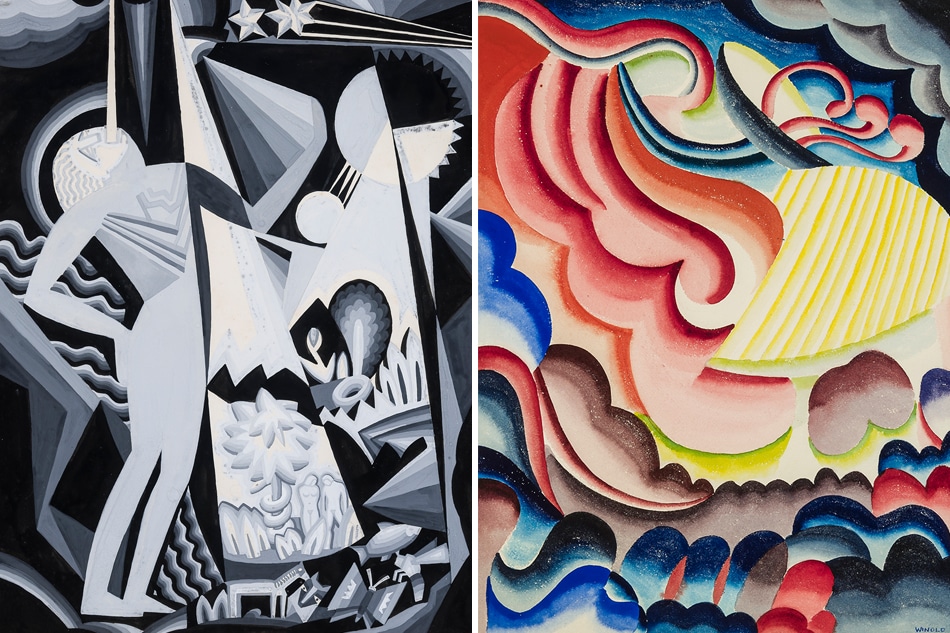

Separated Spear Woman in Snake Headdress, 1936. Photo © Eric W. Baumgartner
A second-generation artist (his father, Fritz, was a Düsseldorf-trained painter who worked as an illustrator), Reiss studied in Munich, first with Art Nouveau artist, designer, sculptor and architect Franz von Stuck, at the Royal Academy of Fine Arts, and then with master muralist Julius Diez, at the School of Applied Arts. “While Reiss absorbed stylistic influences from both of these men, perhaps the most lasting lesson was the freedom with which German fine artists crossed genres, working in the fine arts and the applied arts as circumstances warranted, without prejudice to their standing in either field,” writes Arlene Katz Nichols in Hirschl & Adler’s catalogue essay.
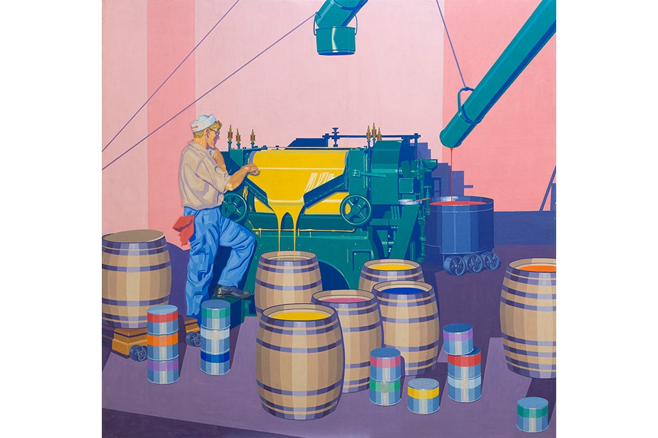
A hustler, Reiss hit the ground running when he arrived in the United States in 1913, determined both to build his career and to support his young family. “He worked at illustration, poster design, fabric design, furniture design, and interior decoration, all the while establishing his own art school and pursuing his higher calling as an easel painter,” writes Nichols.
Students at his Winold Reiss Art School included Aaron Douglas, Marion Greenwood, Ludwig Bemelmans (who attended largely to meet girls, according to Reiss’s late son, Winold Tjark) and Ruth Light Braun. Hirschl & Adler’s 2002 show of Braun’s work led the gallery to get in touch with Reiss’s estate and learn the full scope of his work. “We were astounded by the quality and beauty across numerous mediums and subjects,” says Tom Parker, associate director of Hirschl & Adler. “The artist’s oeuvre is a wellspring of artistic excellence and historical importance that is still under-recognized.”
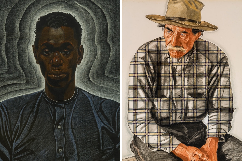
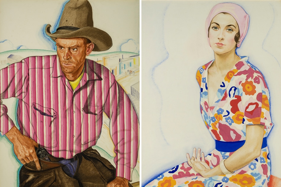
The current exhibition, of approximately 40 works, spans four decades of Reiss’s paintings, pastels, watercolors, drawings and murals, including a selection of the portraits of Native Americans (specifically the Blackfoot people of Montana and Canada) for which he is best known. “My father had come to the U.S. with the idea of painting American Indians,” W. Tjark Reiss recalled in a 1993 essay. “He thought the Indians would be living in the countryside outside the cities, much as the European peasants did. He was quite surprised to find that most of the Indians were far away in the West.”
Reiss found fertile ground for portraiture due north — in Harlem. “Throughout his career, Reiss demonstrated an interest in people of different ethnicities, particularly those he perceived as disenfranchised in one way or another,” says Parker. “That fascination would lead to his striking portrayals of African-Americans and his prominent role in the creation of a visual language for the Harlem Renaissance.” Among his subjects were W.E.B. Du Bois, Langston Hughes, Zora Neale Hurston and Paul Robeson.

Portrait of Sari Patton, 1925. Photo © Eric W. Baumgartner
At times merely illustrative, Reiss’s portraits can flicker with Expressionistic humanity, like Alice Neel by way of Schiele. His love of color is a defining feature. “He particularly liked bright colors, especially ultramarine blue and English vermillion red,” noted his son. “Except in his woodcuts and pastel drawings of people with black hair he did not know the color black. He was quite adamant about this, and knew that in reality, what most people saw as black was usually a deep purple.”
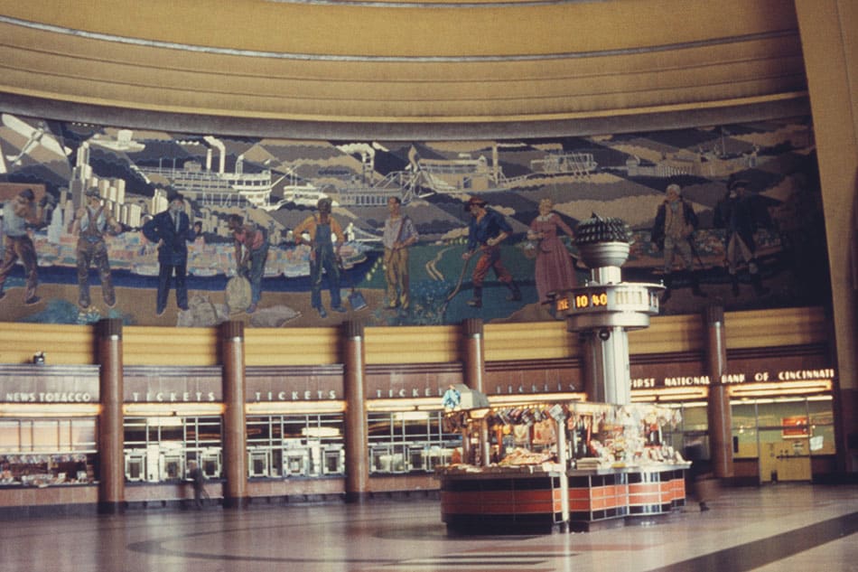
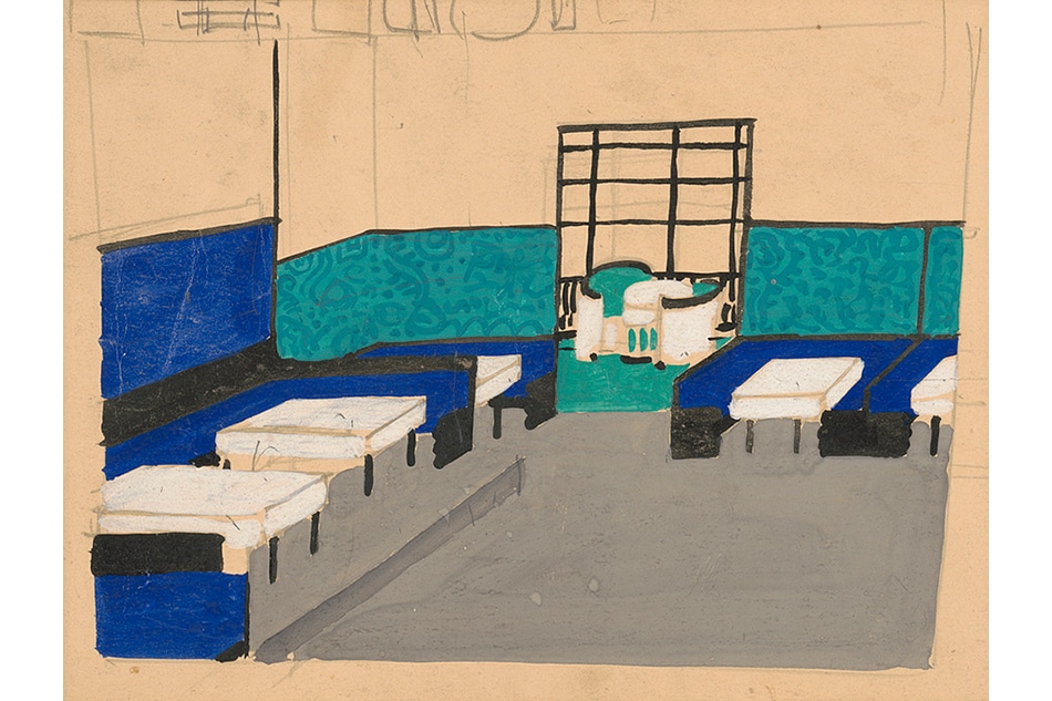
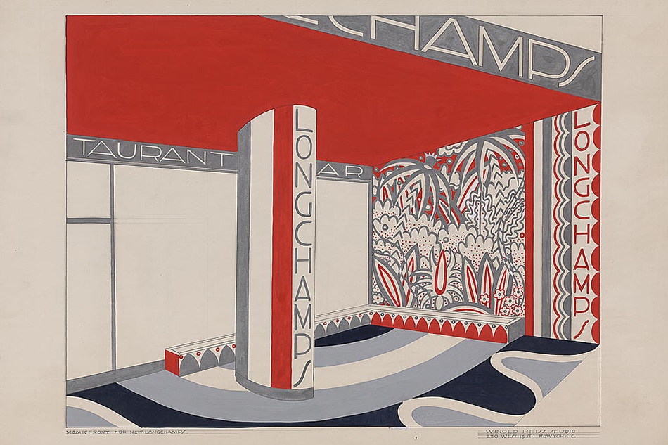
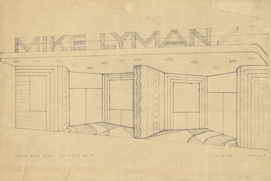
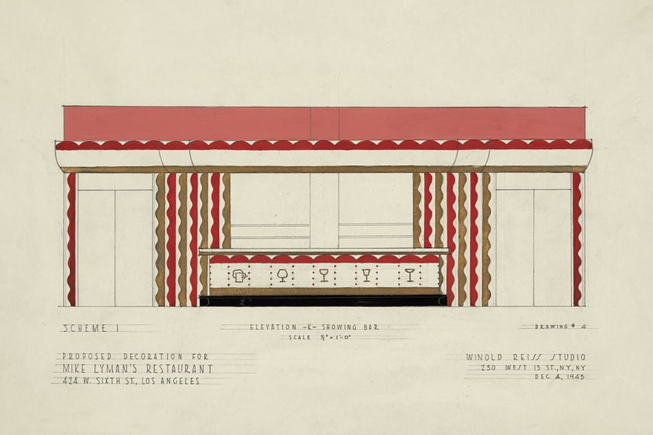
When it came to design, his German and Viennese influences were even more pronounced. “Reiss’s designs were flattened and heavily graphic in appearance at a time when the graphic aesthetic was very new to audiences,” says Parker. In the interiors he designed for such projects as the Restaurant Crillon in Manhattan and the Hotel St. George in Brooklyn Heights, as well as the murals he created for the Cincinnati Union Terminal (the resulting glass mosaics occupied 11,908 square feet of the Art Deco train station), he aimed for nothing short of the Wiener Werkstätte ideal of the Gesamtkunstwerk.
“Probably a reason for his success in interior design was that his specifications regarding upholstery, curtain material, floorcoverings, tabletops, menus, matchboxes, and even advertising were all coordinated to complement the murals and pictures,” his son recalled.
For Ford Peatross, founding director of the Center for Architecture, Design and Engineering in the Prints and Photographs Division of the Library of Congress, Reiss’s boundary-blurring approach made him far ahead of his time, paving the way for designers like Raymond Loewy, Norman Bel Geddes, Donald Deskey and Walter Dorwin Teague. According to Peatross, “The decorative vocabulary of the Vienna Secession movement, the bold colors and forms of German Expressionism and the conventions and abstractions of African art, all evident in Reiss’s early work, were to be transformed into something distinctly American.”