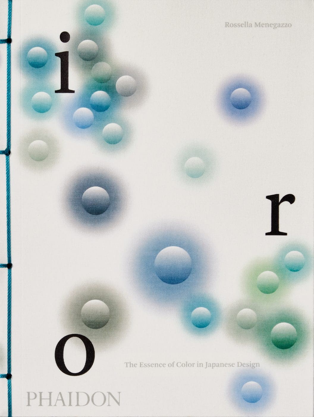
June 12, 2022For those who breathlessly await the coronation of one of Pantone’s 2,000-plus hues as Color of the Year— and even for those who don’t — the recent publication IRO: The Essence of Colour in Japanese Design (Phaidon), by Rossella Menegazzo, is a refreshing tonic.
“Talking about color in Japan means talking first and foremost about the natural world: seasons, plants, flowers, fruits, vegetables, the processes of blossoming and withering, insects, animals and mollusks, as well as stones, minerals and ashes,” Menegazzo writes. Indeed, the names of Japanese colors make highly specific floral, faunal and metallic references: sooty bamboo, silver mouse gray and yellow dead leaf, not to mention rust storage room (a greenish gray) and mercury rubbing (an icy teal).
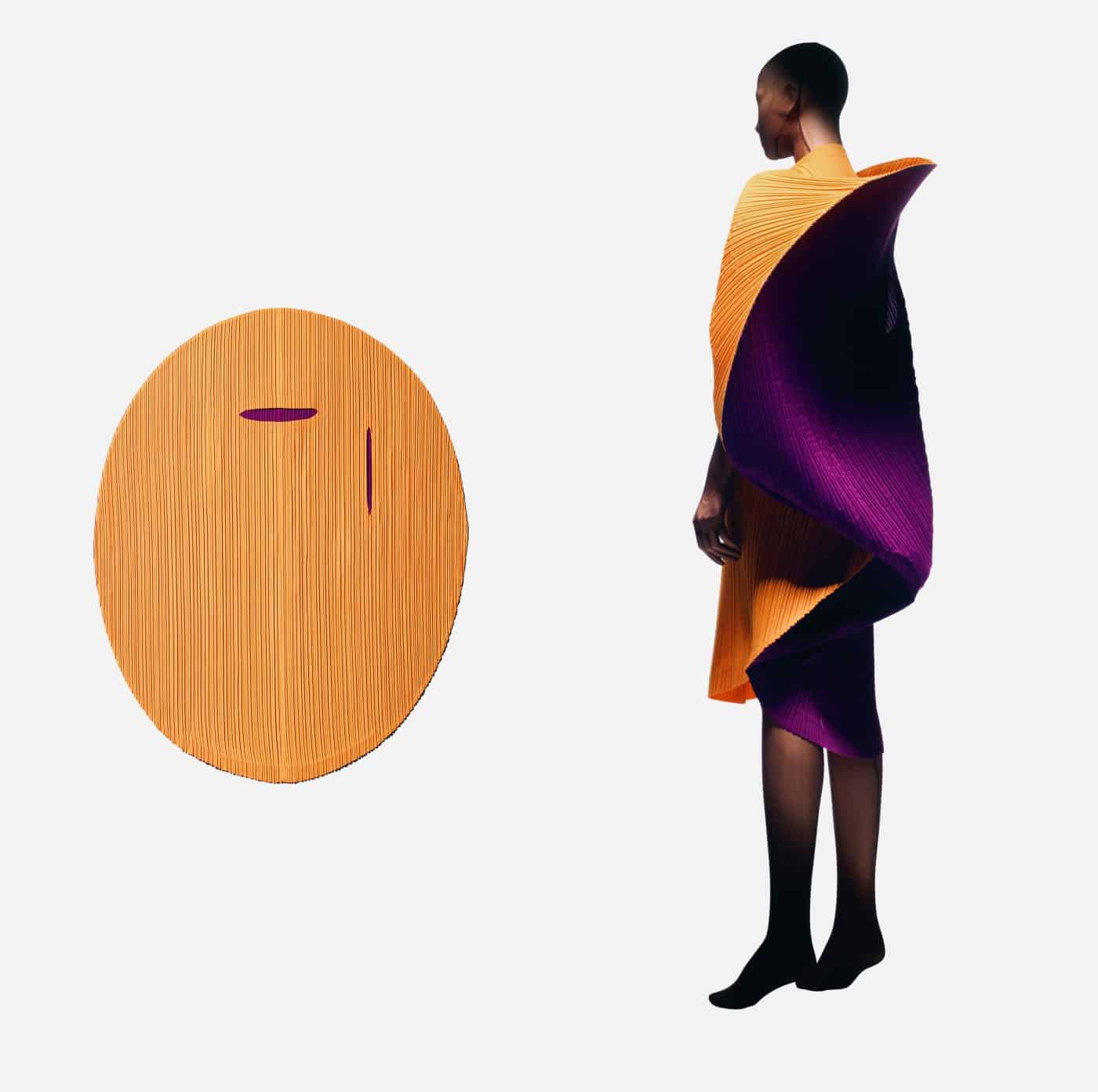
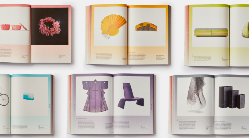
Destined for the personal libraries of design, art and fashion aficionados, the sumptuous tome is a sequel of sorts to Phaidon’s 2014 WA: The Essence of Japanese Design, a survey of contemporary objects categorized by their materiality and coauthored by Menegazzo, an authority on ukiyo-e (woodblock) artists Hiroshige, Hokusai and Kuniyoshi. IRO explores how a rainbow of 200 lusciously organic traditional Japanese colors has enlivened everything from antique Edo period lacquerware, raku and paper screens to iconic mid-century furniture by Isamu Noguchi and Sori Yanagi, 1990s couture by Issey Miyake and contemporary household objects by Nendo.
In her introductory essay and the captions that accompany the handsome photographs, Menegazzo meditatively traces the lineage of the traditional Japanese color spectrum through centuries of change in social status, costume, cuisine, tea ceremonies, literature, art, craft and design. The author is equally thoughtful in the curation of products, both high (Yanagi’s 1956 Butterfly stool, which represents the color clove tea brown) and low (washi tape in cosmos pink), antique and brand-new.
Admirably, in a book that proves valuable for collectors and color obsessives, the scholarly Menegazzo throws a spotlight on elegantly modern mid-century Hakusan porcelain and the 1980s Memphis-adjacent vases and chairs of Shiro Kuramata. She also highlights a vast array of contemporary Japanese designers, including both well-known talents whose work is produced by such brands as Edra, B&B Italia, Established & Sons and Holmegaard and rising stars like Shin and Tomoko Azumi and Toshiyuki Kita.