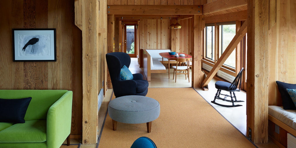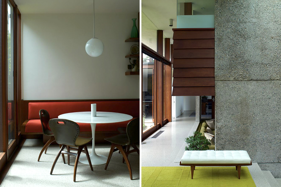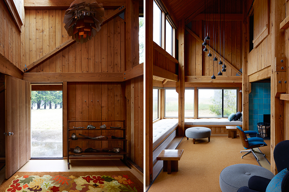
Los Angeles-based designer Kay Kollar has established a niche as a careful and considerate rehabilitator of down-on-their-luck and most often modernist residences (portrait by Barbara Katz). Top: In a William Turnbull–designed Binker Barn at the famed Sea Ranch community, on California’s Sonoma Coast, a Hans J. Wegner sofa from L.A.’s Denmark 50 keeps company with a vintage wing chair and the client’s own childhood black rocking Windsor chair. All photos by Richard Powers
August 1, 2016It doesn’t take much to ruin good design: faux finishes slathered over surfaces like cream cheese; old toiles that take a room hostage; Lego-like expansions built on previous additions. The future is going to happen, and when it does, the foolhardy — or overzealous — will have managed to make many once architecturally significant houses anything but.
Fortunately, there are interior designers whose sense of duty and impeccable taste allow them to put such iconic residences back together. Among the finest in this camp, Los Angeles–based Kay Kollar has collaborated with like-minded architects on the aesthetic resuscitation of some pretty serious feather-in-the-cap California homes, many of them vacant for years, structurally unsound or otherwise in dire need of some TLC. Among the highlights: Harwell Hamilton Harris’s 1948 concrete, stucco and wood International Style–gone–Californian English house in Beverly Hills; Carla Ridge, the 1965 pavilion-like party home of The Tonight Show producer Freddie de Cordova and his wife, Janet, in Trousdale Estates; and a 1967 timber-clad William Turnbull–designed Binker Barn at the Sea Ranch, the pioneering development set against blown-back cypresses on the Sonoma Coast. Right now, she’s waiting for the V’Soske rugs to arrive to finish the Georgian plantation–style Mary Astor House, built in 1925 in Pacific Palisades for the eponymous silver-screen star. That landmark house had been abandoned for some time, having previously struggled with a personality split between its old and ill-conceived newer sections.

At the Sea Ranch home, Wegner dining chairs surround a Paul McCobb table, all from Denmark 50. The vintage brass pendant light fixtures are Dutch, found at L.A.’s Gallery L7, and the dishes are Heath Ceramics.
In each of her projects, Kollar focuses on creating easy livability for her clients, which for her means avoiding any of the coldness of a museum reproduction — no matter how historically important the place may be. “I think we’ve all been in those houses where somebody has tried to replicate exactly what was there before. The present moment is missed,” the slim, ginger-haired Kollar, dressed in a black Maison Margiela tunic and Emma Hope velvet mules, remarked when she recently sat down for an interview in her studio atop Culver City’s Helms Bakery, a former bread factory rethought as a patchwork of design studios and furniture showrooms. “As the designer, you’re feeling the original intention of what was there. But you can’t be a slave to it, or be so insistent on replicating that, either.”
Kollar most often uses color and design collage to channel what she sees as the original intent of a building. She’ll mix hundreds of colors to find the right array of hues to dial up architectural detailing, say, while also dialing down the prominence of the walls, so the clients’ collection of paintings by 20th- and 21st-century greats — Morris Louis, Helen Frankenthaler, David Hockney, Sam Francis — can stand out.
In period homes, Kollar is not afraid to mix vintage, contemporary and custom design, setting, for example, seating by Giò Ponti and Harvey Probber together with a Gary Hutton steel-and-glass coffee table in the den of the de Cordova home, which she worked on with late California modernist architect Steven Shortridge. Her most beloved L.A. dealers are key to this process. She once sourced vintage Vladimir Kagan Capricorn furniture from J.F. Chen to redefine a rooftop garden. A 19th-century wooden birdcage paired with a rustic drop-leaf table from Lee Stanton Antiques lent texture to a mid-century modern wine room. At Fat Chance, she has uncovered sought-after Tommi Parzinger sideboards and lamps, while trips to Downtown have yielded T.H. Robsjohn-Gibbings tables and Paolo Buffa sideboards. Her go-tos for contemporary furniture are Thomas Lavin, Holly Hunt. Over the years, she has reupholstered a pair of what she describes as “beautiful classic” Rose Tarlow Othello sofas three times for the same clients as they’ve moved houses. In a Kollar home, everything is inspired by the building’s original period, yet nothing is beholden to its past. “There are so many beautiful things out there,” she says. “There’s no need to be a purist.”
In a Kollar home, everything is inspired by the building’s original period, yet nothing is beholden to its past.

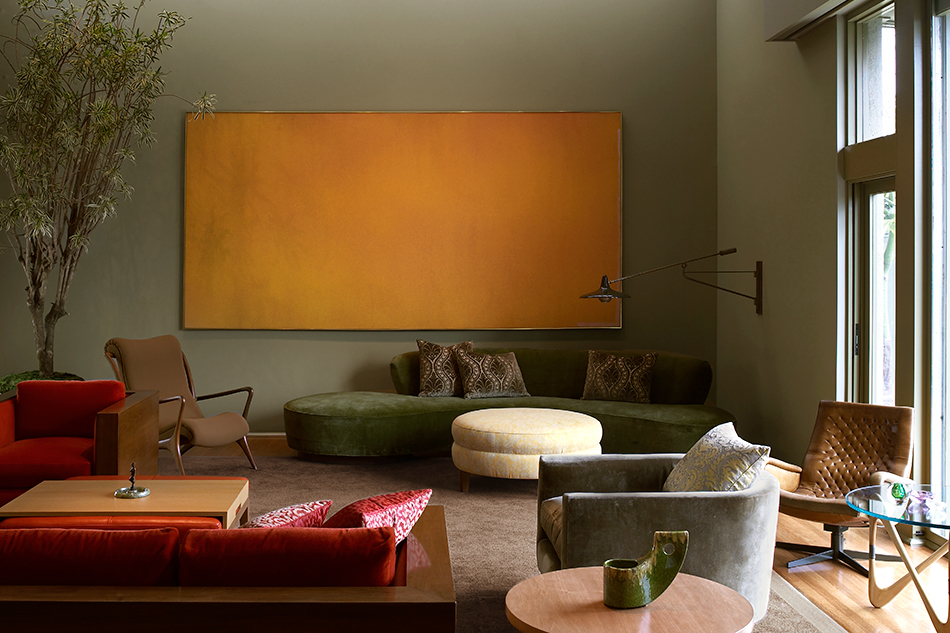
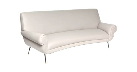
For Carla Ridge — the former home of The Tonight Show producer Freddie de Cordova and his wife, Janet, built in L.A.’s Trousdale Estates in 1965 — Kollar commissioned the coppery-red curtains from textile designer Gretchen Bellinger. She found the sofa at Paul Marra Design, in L.A.; the Fortuny-upholstered vintage wing chair at Downtown; and the organic wooden coffee table from J.F. Chen, also in L.A. The red-leather ottoman is her own design, while the pair of chairs are by Giò Ponti.
To solve problems in these collages of old and new, Kollar relies on custom furnishings. In the de Cordova house living room, finding treatments for the arresting 11-foot-tall red-cedar windows proved a particular challenge. “I tried every gigantic piece of fabric from showrooms,” she says of her search for large-scale window dressings, “and then it finally came to me: We could develop a color for the drapes that would be almost identical to the unbelievable coppery redwood framing the windows.” She knew of a fabric by textile designer Gretchen Bellinger called Isadora, which she describes as “a very fine, almost Fortuny-like pleated-silk fabric.” (A sample is now in the permanent collection of the Metropolitan Museum of Art.) “I worked with Bellinger’s team, and they, in turn, worked with their fabric mill in France to achieve the perfect shade.”
An obsession with material has long been part of the development of Kollar’s aesthetic and process. Although an interior designer by trade, one who has lived in California for the past 20 years, the Tulsa, Oklahoma, native is an architect by training. In 1982, right out of Cooper Union School of Architecture and working under New York powerhouse James Polshek, Kollar found herself drawn, like a moth to the flame, to the “color, texture and immediacy” of the Manhattan firm’s interiors department. “Jim was a total mentor. He helped me get my first freelance interiors job, which was his brother-in-law’s medical office.”
After working simultaneously on these side projects and at Polshek, Kollar moved to the high-end home-design outfit DePolo/Dunbar during the New York firm’s 1980s heyday. Eventually — because there’s never really a right time — she decided, “One client was enough to go solo,” and she put out her own shingle. Her first official residential project as Kay Kollar Design, in 1988, was in the Upper West Side’s landmark Apthorp building.

In the office-meets-library studio space of the English House, a mid-century French desk from Galerie Sommerlath is paired with a purple-leather desk chair from Paul Marra, while a Josef Hoffmann settee and a club chair sit on either side of an armless sofa by Kollar. The brass-and-glass coffee table is by Ponti and the side tables by Paul Laszlo.
She first established her business in the East Village, subsequently moving uptown. Soon, however, Kollar made the much bigger move to Los Angeles — “on a prayer,” she notes, since her client base at the time was entirely in New York. After she moved to California, she quickly began a project with Southern California architect Michael Rotondi — but, since the project was in New Jersey, she commuted back and forth for several years.
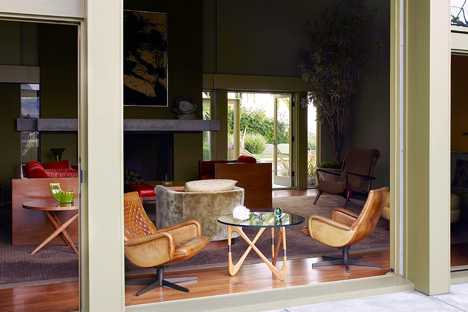
Upon finishing that job, Kollar turned her attention more fully to the Golden State, winning accolades for her work on the English House in Beverly Hills. (The house is featured alongside projects by other L.A. aesthetic arbiters like Commune and Kelly Wearstler in Anthony Iannacci’s new Monacelli Press book Hollywood Interiors: Style and Design in Los Angeles.) A collaboration with L.A.’s Chu+Gooding Architects, Kollar’s English House redesign serves as a compelling case study of her work with bold neutral color. Abandoned for five years, the much-published house by Harris, a student of Frank Lloyd Wright’s and an unsung hero of mid-century design, was a victim of early neglect and fell into a state of disrepair. Worst of all, at least from Kollar’s perspective, everything had been painted white.
Color, Kollar thought, would be a dynamic way to “knit the house together” while also accommodating the substantial art collection, which was acquired and installed with the help of her client’s father, a famous art dealer.
“The English House has this amazing panoramic view,” she points out, “and yet it’s all very intimate. I’d wanted an indoor-outdoor relationship with colors that are part of that natural world. The palette is an array of earth tones derived from the site and its views into the surrounding landscape: warm greens, browns, golds, oranges, reds, lavenders, purples — California colors.” For the architectural details, like soffits, ceilings and molding, she used a variety of subtly toned hues and wood stains to highlight them.
Kollar received validation for her color studies when, deep into the process of building her palette, the design team stumbled on a set of original swatches from the Harris era. “Those colors were very much in the same spirit as what I’d been working on. They were different, yet they spoke the same language of the period.”

In the English House kitchen, a George Nelson clock punctuates the orange walls above a T.H. Robsjohn-Gibbings table and chairs. Kollar designed the bar stools.
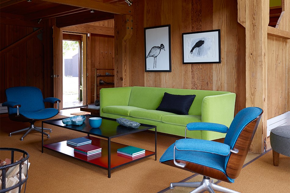
Given Kollar’s penchant for bold neutrals, it might seem counterintuitive that she would employ a shock of vibrant color at the fog-swept Sea Ranch house, a project completed with architect Douglas Thornley. She saw vibrant hues, however, as appropriate to the context. “I wanted to use clear color to enliven it but within the language of that Sea Ranch aesthetic and of the time it was built, during the era of sixties Pop,” she explains of the judicious use of color blocks for the Binker Barn project. After sandblasting walls and installing cork flooring, she gave the serene living room a jolt with brightly upholstered Ico Parisi and Hans J. Wegner seating, all in conversation with a black-steel-and-red-lacquer coffee table and ottomans of Kollar’s design. Oceanic blue Kibak tile surrounding the fireplace “lifted and animated” the room.
Most striking, however, are the interior doors, which, painted in solid blocks, became panels of art. “We used a beautiful lime green, yellow and orange. Those planes, embedded in the rustic wood wall, with attention on incredible hardware, meant the house didn’t need artwork. It is all very contemplative because it is so simple.”
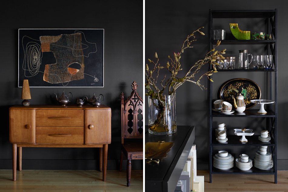
Kollar seeks just that sort of uncomplicated beauty in all her interiors, in the environments she creates for herself — her quiet new studio is robed in a warm gunsmoke gray that changes color with the light — and in life. She feels that simplicity fuels her creative process, and she finds it nowhere more so than when she leaves the L.A. design world behind. She recharges best, she says, when watching the light and landscape open up during the cleansing three-hour drive from the airport in El Paso, Texas, to the artist’s community of Marfa, Texas, where she has owned a house since 2000. “It’s like a sanctuary for me,” Kollar sighs. “For years and years, I had four white plastic lawn chairs and painted the walls an amazing shade of light gray. That was it. I loved it for that.” How’s that for design with simplicity?
