April 17, 2022Victor Pasmore had a knack for exploding expectations. In 1938, at the age 30, he left his job as a clerk in London’s Public Health Department to become a full-time painter. A decade later, after firmly establishing himself as one of Britain’s most lauded Postimpressionists, he switched gears again — going full abstract.
Art historian Herbert Read called Pasmore’s stylistic sea change “the most revolutionary event in postwar British art.” Indeed, it was a shock to many in Pasmore’s circle and presaged a five-decade-long career marked by indefatigable experimentation. In Pasmore’s hands, nimble, searching lines, vast, bracing floods of color and staccato dots, drips and sprays reconstituted, insistently reinventing themselves.
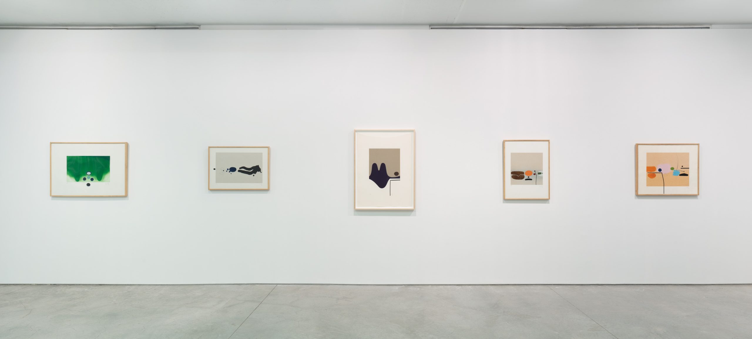
A new exhibition at Marlborough Gallery, New York, through April 30 traces the evolution of these abstractions through the lens of Pasmore’s printmaking practice, which complemented his canvases, three-dimensional constructions and architectural projects from the 1960s until his death, in 1998.
“Interestingly, Pasmore began as a figurative artist, though subsequently began interrogations into abstractions, which grew increasingly geometrical in style,” notes Bianca Clark, head of graphics at Marlborough. “The prints included in the exhibition were selected to highlight Pasmore’s range of techniques and scales that he employed throughout his printing practice.”
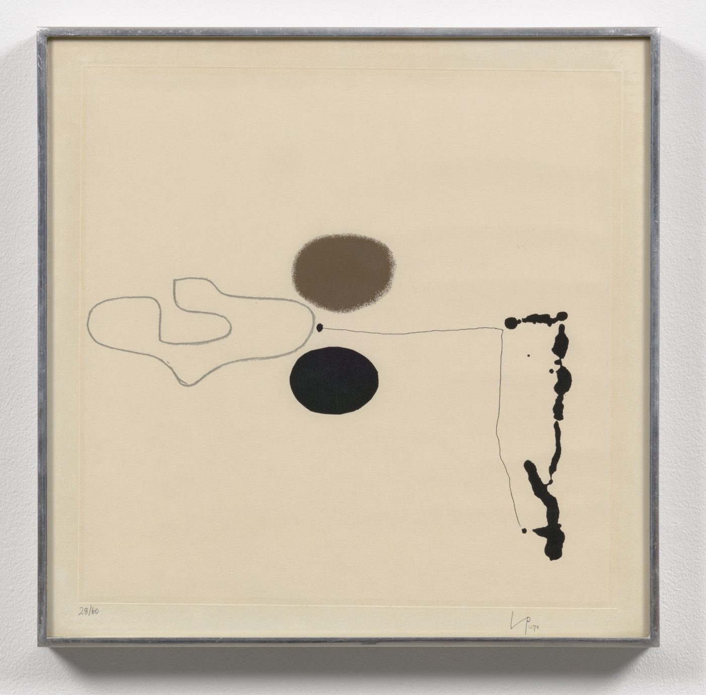
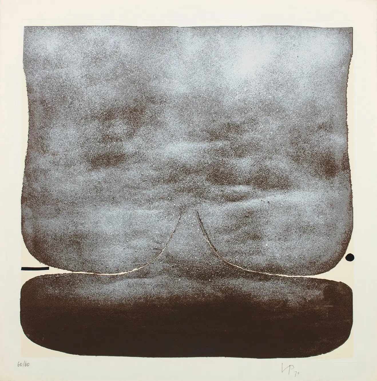
The earliest examples, like Points of Contact No. 7 (1965), reveal the artist’s midcareer constructivist proclivities, with quivering arrangements of irregular shapes that balance precariously, but lyrically, on and around one another.
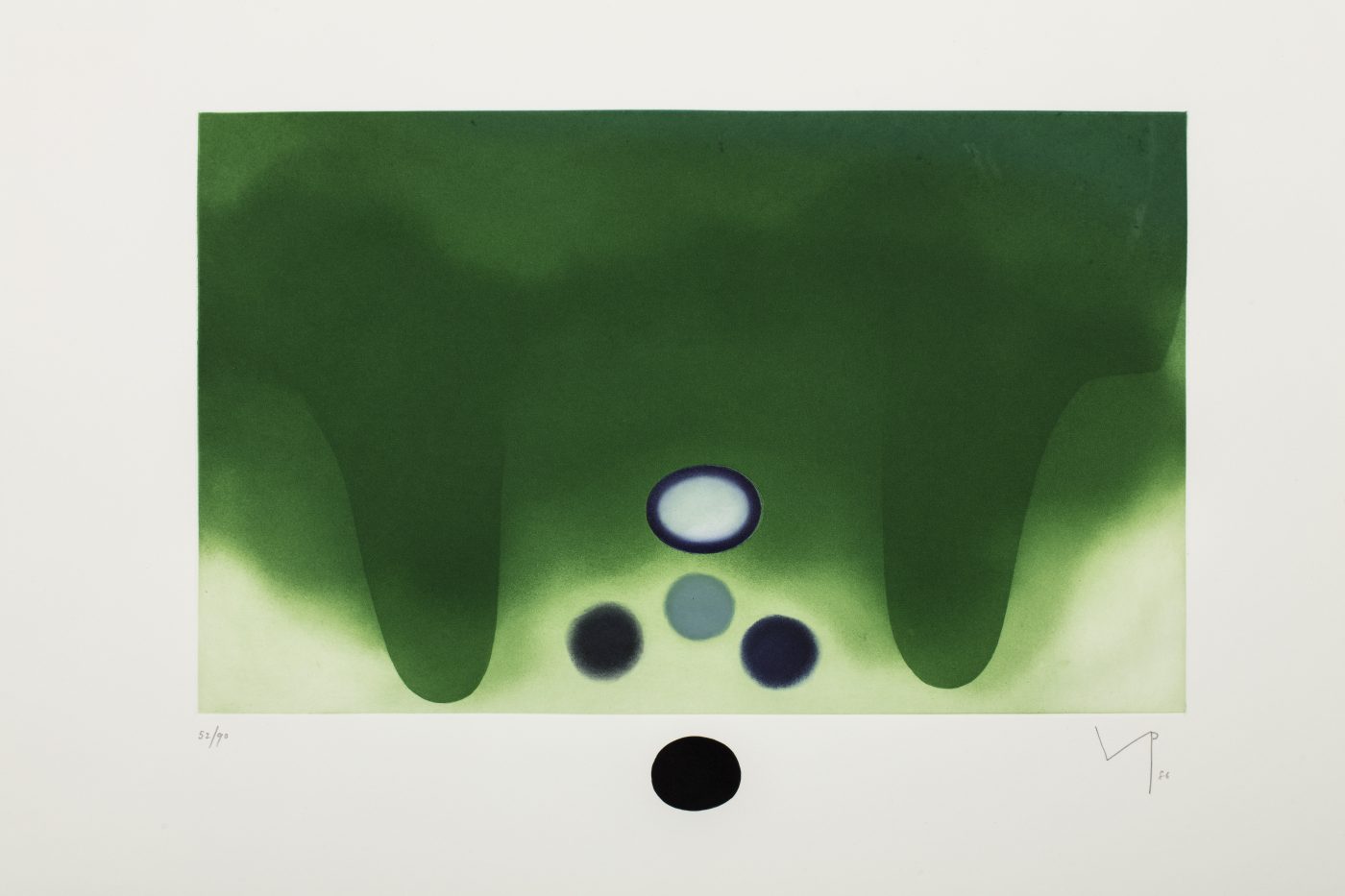
Later pieces, like the standout II Labirinto della Psiche (1986), showcase his turn toward seeping tides of saturated color, where narrow voids double as meandering lines and small overlaid shapes offer provocative shifts in scale and hue. The works prove critic Clive Bell’s 1945 assessment of the artist’s stylistic future: “I prophesy that the art of Pasmore will not stand still.”
While Pasmore began his full-time artistic career as a somewhat traditional representational painter, he always questioned convention, surrounding himself with a diverse array of artists. In 1937, even before he left his government job, he helped establish a painting academy at 12 Fitzroy Street in London (later dubbed the Euston Road School), a space for exuberant art making and dialogue.
During World War II, after his apartment was destroyed by Nazi aerial bombing, Pasmore devoted himself to the radical writings of Van Gogh, Cézanne and Gauguin, in books he discovered at a home where he took refuge. He pushed at boundaries beyond art, too, registering as a conscientious objector; his application was rejected, and he was imprisoned for protesting enlistment.
These events fueled his most radical stylistic transition: into experimental abstraction. Recollections of friends and students paint a picture of the man on the brink of this shift.
Abstract artist Gillian Ayres, who studied under Pasmore at the Camberwell School of Art in the 1940s, called him her favorite teacher, as much for his rebellious spirit as for his guiding instruction. “Victor was woolly-headed, delightful, imaginative,” Ayres once declared. “His friends all saw him as a sort of genius. And he could be belligerent to them, but by nature he wasn’t really like that. He was fuzzy, intelligent and wayward.”
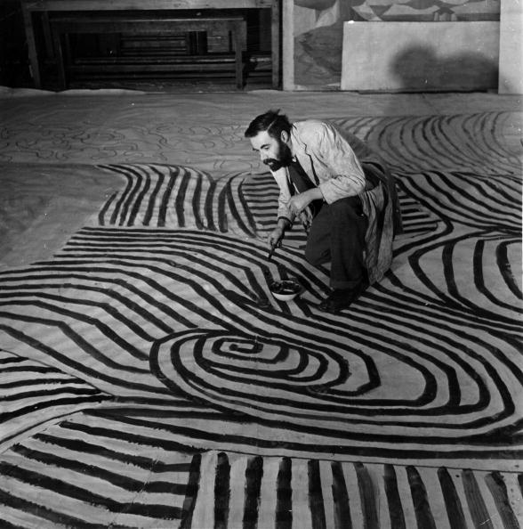
Inspired by artists like Paul Klee and Piet Mondrian, Pasmore gradually jettisoned recognizable content in his paintings. Trees became bursts of pointillist dots, mist rising from a river was translated into amorphous, heady clouds of pigment. Soon, canvases covered in wild, distended coils of line emerged from Pasmore’s Hammersmith studio.
Around 1950, art historian Lawrence Gowing recalled meeting up with artist Kenneth Clark just after Clark glimpsed Pasmore’s new direction for the first time: “Honest puzzlement shone from his eyes. He said, ‘Victor really is extraordinary. Do you know he is scrawling spirals all over his pictures? Really, he is the most eccentric man! Great, rampant curlicues like nothing on earth.’ ”
In Pasmore’s words: “It caused a big stir, because I was well-known as a landscape painter. I had a big reputation.”
As his interest in abstraction deepened, so too did Pasmore’s investigation of mediums beyond paint and canvas. Three-dimensional geometric constructions made of Perspex (a transparent plastic) and wood expressed his growing preoccupation with pure geometry — a means to what he saw as pictorial freedom and objectivity.
A spiraling ceramic mural, created in 1951 for the Festival of Britain, veered toward immersive architecture, abstracting physical surroundings; actual architectural design followed.
Perhaps most persistently, as Pasmore’s geometries softened in the 1960s, he embarked on a decades-long printmaking practice that both reflected and informed his stylistic developments through the rest of his life.
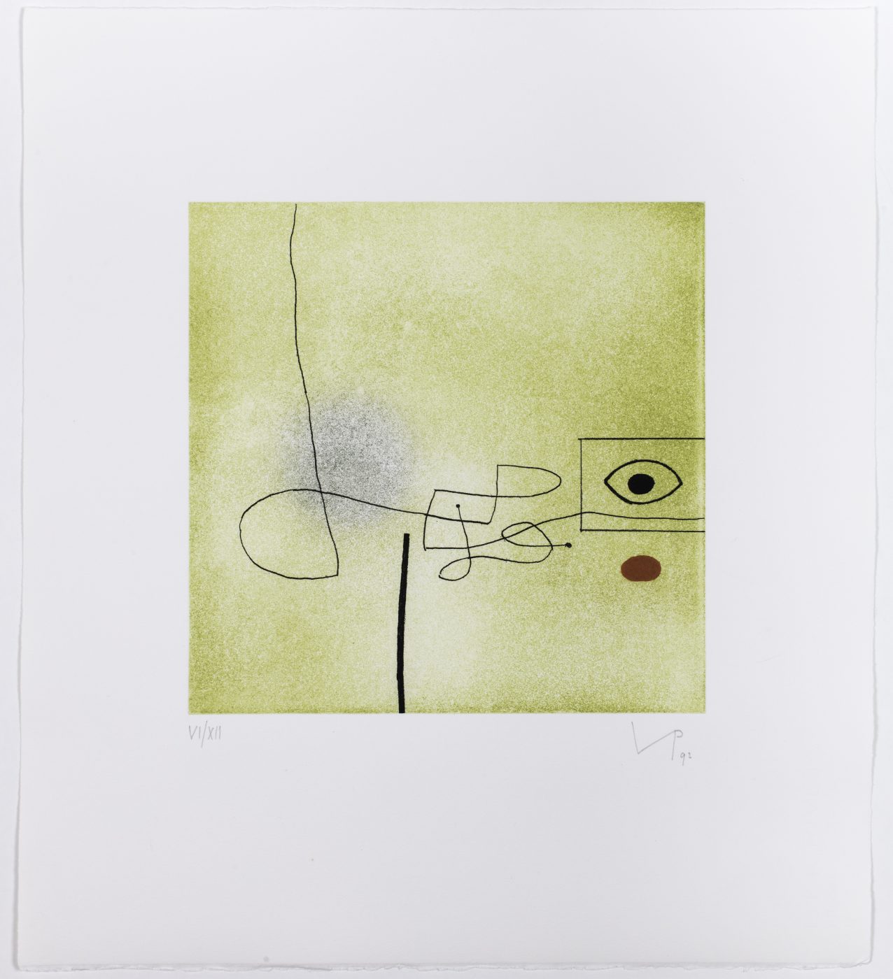
This investigation coincided with Pasmore’s relocation from London to Malta, whose sun-drenched, kaleidoscopically vibrant landscapes influenced his compositional structure and palette. As Marlborough’s Bianca Clark notes, “The artist’s use of bright colors reflects this geographical shift, in addition to his longstanding connection to the Mediterranean.”
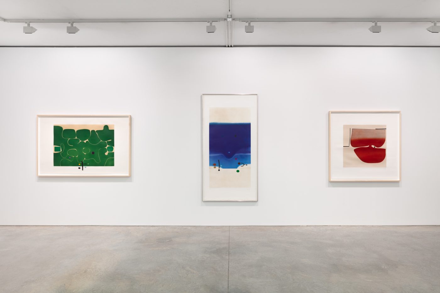
The 20-odd works included in the Marlborough exhibition begin here, forming a rich yet digestibly concise characterization of the second half of Pasmore’s career, when he tuned his abstractions through shape-shifting combinations of roaming lines, biomorphic planes and deepening color.
“Victor really is extraordinary. Do you know he is scrawling spirals all over his pictures? Great, rampant curlicues like nothing on earth.”
Over the course of 30 years, he collaborated with six different printers, located from London to Rome, each of whom “inspired the artist to work in a unique style that was specific to them,” Clark says. “The printmaking process served as a collaboration between Pasmore and the printer, with the artist drawing on the studio’s particular skills and developing images in conjunction with them.” Each printer and corresponding technique (etching, aquatint, screen print) allowed for new variations and unexpected outcomes — a process that fed the artist’s perennial hunger for experimentation.
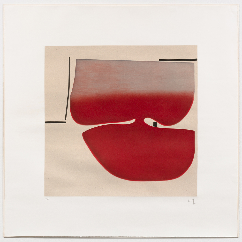
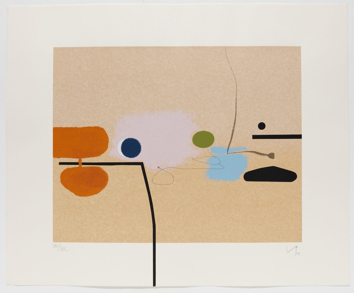
Two works from the 1980s, for instance, evidence playful compositional variety. In SENZA TITOLO (1982), a dense, organic red form spreads from top to bottom, narrowing then widening like an ambulatory amoeba or a knotty, spreading feeling of apprehension. Blue Fantasy 2 (1986), on the other hand, favors negative space: An uncanny combination of floating pink and yellow ovals, an angular black line and careening blots of light blue dance around each other, tension building wherever they threaten to touch.
These, like most pieces in the show, reflect a particularly telling phrase that Pasmore coined for his 1972 exhibition, “The Image in Search of Itself,” at Marlborough’s London space. In the corresponding catalogue, he adapted Goya’s famous aphorism “While reason sleeps monsters are born” to form his own motto — one that powered his abstractions: “While reason sleeps the symbol awakes.”
In other words, eschewing recognizable content opens the mind to new ideas, associations and pathways. Or as artist Norbert Lynton aptly described Pasmore’s renegade spirit, “Line has always tempted him into adventure.”