February 20, 2022Christina Nielsen has always had a passion for interiors. But as a young adult starting her college education, she says, she felt the field was perhaps “too saturated” for her to make a mark. So, she decided to focus on her love of art instead, thinking she might pursue a career as an art adviser.
While studying art history, photography and French at NYU, she interned at Christie’s, and after graduating, she worked as an editorial assistant and stylist at Vogue magazine. Still unsure exactly what she wanted to do, she “took a leap” and left New York for London, where she earned a master’s degree in contemporary art and business from Sotheby’s Institute of Art. It was in London, where she had spent her childhood summers visiting relatives, that her career got an unexpected start.
Nielsen’s father, a horse breeder and owner, asked her to design the family’s private box at Ascot Racecourse, which they also rented out to other racing fans throughout the season. As she frequently attended events there, she knew the setting well.
She reimagined the space, which she describes as “not overly equestrian,” to feel like a warm, welcoming study, incorporating influences from England, Morocco, France and Italy. It immediately garnered praise from other box holders and, perhaps more importantly, inquiries about future projects, both residential and commercial.
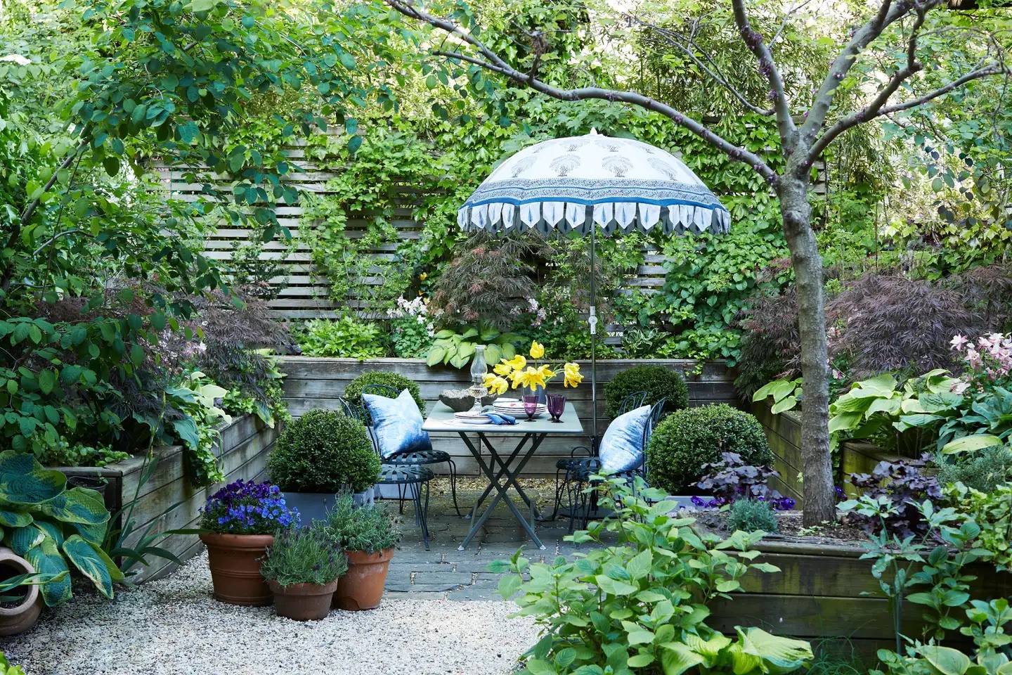
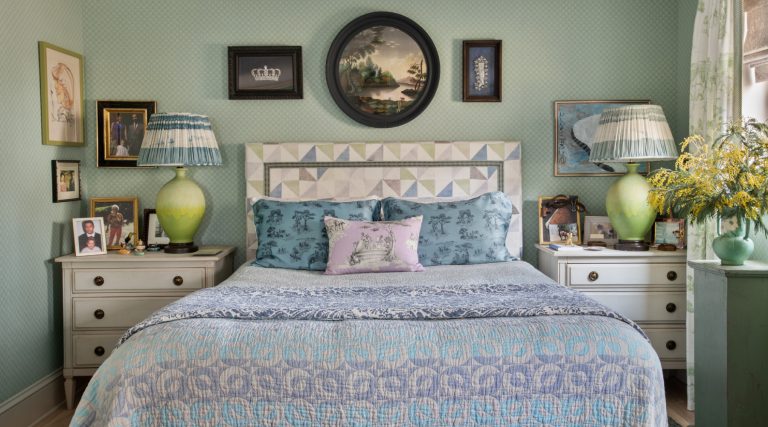
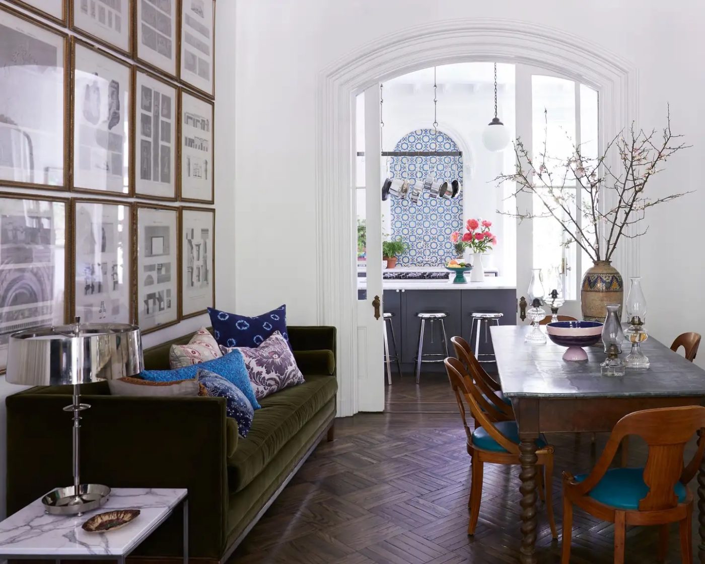
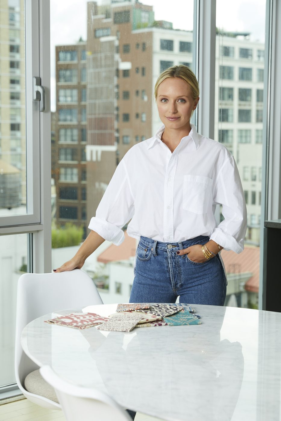
Suffice it to say, Nielsen was off to the races and, in spite of her early misgivings, opened Christina Nielsen Design in 2018, accepting commissions in the U.S. and abroad. Today, this self-proclaimed maximalist is known for her ability to mix patterns and deftly combine periods and styles. Currently based in Brooklyn, Nielsen spoke to Introspective about great art photographers, hiding storage spaces and why there’s no reason to be afraid of the color mustard.
Where do you find inspiration?
My mom was a frustrated interior designer who went to Parsons but stopped pursuing design while raising three children. All of her friends were either designers or landscape architects or artists. I grew up in that world, and it opened my eyes to design at a young age, which was very inspiring.
These days, it’s important to me to put my phone down and really appreciate my surroundings. In this era, people are so addicted to their screens, and I think that inhibits creativity, especially when you’re traveling.
Who is your favorite designer?
I’m a big fan of Robert Kime because he is the epitome of British design — perfectly imperfect, quirky accents, rooms full of honesty and character. All of his rooms feel full of depth.
I love Rose Uniacke for her “less is more” approach, where the bones of a space speak for themselves and nothing ever feels forced. She is the queen of minimalism, yet one with such a studied eye for antiques and the beauty of raw materials.
Also, Beata Heuman’s whimsicality and eclecticism never fail to amuse me!
Who is your favorite artist?
I love Cy Twombly’s fluid brushstrokes and his use of color and contrast. I feel as if his work fits within any project. Matisse tops my list as well, especially his cut-out series. His use of colors and layers and patterns is extraordinary.
But photography is my preferred medium. Wolfgang Tillmans is one of my favorites for the way he uses his camera to capture society. His work reminds me a bit of Nan Goldin’s in that it’s candid and uncut. And I’ve been a big fan of Marilyn Minter’s surrealist photography since I was a teenager. She uses her lens to create a dialogue on contemporary culture and the pressure women face to live up to a romanticized image. It’s very raw and powerful.
What are your favorite design periods?
Right now, I’m gravitating toward the clean, elegant lines of nineteen-seventies Italian furniture, which I pair with more traditional fabric. I find these pieces to also be versatile and malleable.
The English Regency era is high on my list for its timelessness. Something like the French Rococo period can feel uptight, and it fits a very specific aesthetic, but English Regency pieces are quite versatile. I have such an appreciation of the organic materials and the craftsmanship of the era.
I’m also drawn to the minimalism and timelessness of Georgian architecture, and I’m always gathering inspiration from Moorish architecture. I love the ornate detail and the unique shapes and curves and tile. Every aspect of that architecture is very inspiring.
Who is your personal style icon?
I love Carolyn Bessette-Kennedy for putting minimalism on the map in the nineties. I also love Brigitte Bardot’s classic Parisian style and how elegant and sophisticated Grace Kelly was. Diana, Princess of Wales, always had an eye for doing something daring and different.
In terms of contemporary style icons, I like Pernille Teisbaek. She’s a Copenhagen-based designer and stylist, and I like that she speaks to that Bessette-Kennedy minimalist aesthetic.
What is your favorite historic house?
I’d say those Grade II listed London townhouses that have oversize windows and beautiful moldings and details but are still very clean and timeless. They’re like blank canvases — you can do anything with the interiors.
What do you think is the most underappreciated design idea?
I’ll use skirting on any sort of furniture. For me, it’s a surefire way to establish storage, which is not readily available in places like New York. You can have a beautiful ruched fabric to disguise what’s underneath.
What’s one thing you’ve done that shouldn’t have worked in a project but did?
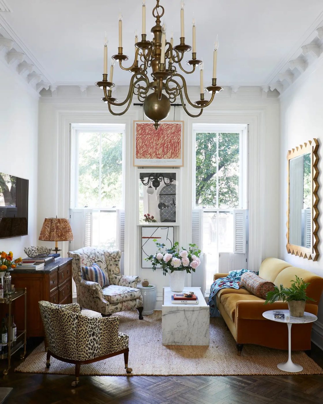
A lot of people have an aversion to the color mustard, but for me, it’s a jewel tone that can be used as a neutral. I used a mustard-colored velvet sofa for a client’s living room. I wasn’t sure if it was going to work, but the client loved it.