August 3, 2025The Berlin-based designer Gisbert Pöppler is a master with color. In his interiors, he mixes hues in daring, exciting and often surprising ways. In a family apartment in the city’s southwest, he created a thrilling staircase hall that juxtaposes a lime-green ceiling, yellow walls, a salmon handrail and maroon-toned treads and risers. For another residential project in the German capital, he painted the different rooms sky blue, forest green, deep burgundy, golden yellow and royal blue. Pöppler considers colors to have spatial qualities that help emphasize three-dimensionality. Clients he works with need to place their trust in him, he says, noting, “Most are afraid that if a scheme is not white, it will be dark.”

Pöppler was raised in a family home decorated in “shades of beige and black” near Bremen, in the north of Germany. He claims his love of hues is not a backlash against his upbringing, but rather against his training as an architect. “In the nineteen eighties and nineties, architects were very into white, gray and exposed concrete,” he says. “And they still are.” Not Pöppler. “Sometimes clients will explain there are colors they don’t like, which is shocking, because I don’t have any, although perhaps I haven’t yet found the right green.”
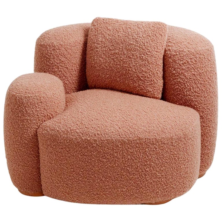
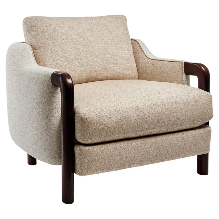
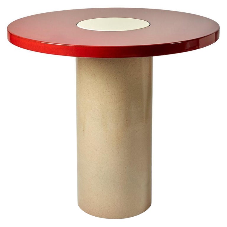
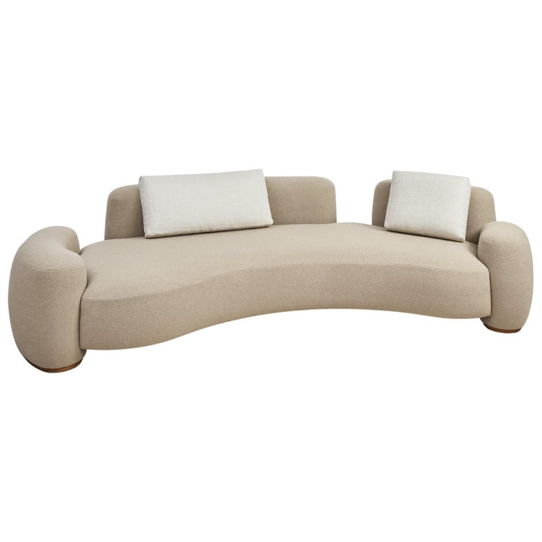
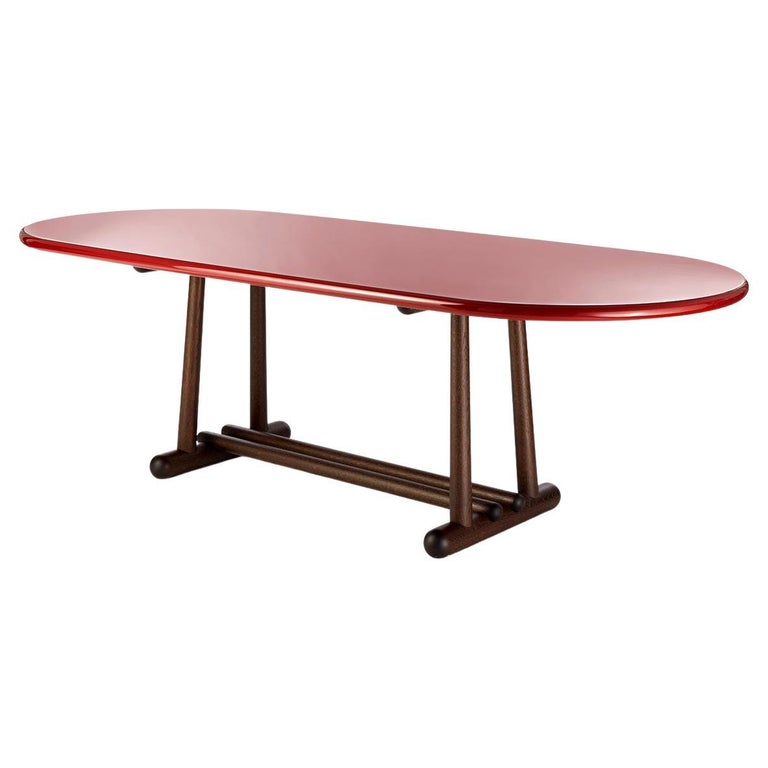
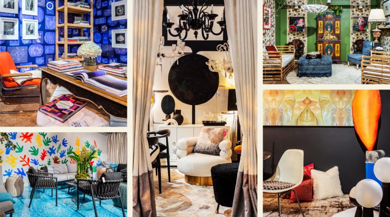
Appreciating his furniture designs, which are sold on 1stDibs, takes less of a leap of faith. Their elegance is obvious and their proportions wonderfully pleasing, while a significant part of their appeal lies in their intricate and highly thought-out details. The foot of his pentagonal solid-oak Louis table, for instance, consists of five branches radiating from the base in a star-like formation. The branches are also five sided, resulting in a fine ridge on top of each one. “You can massage your feet on them,” says Pöppler. The slope of the edges of his Kayak dining table is steeper at the ends than along the sides. He loves working with rounded shapes, finds inspiration in the aesthetic of 1940s France (“There was a modernity, but one that was still anchored in tradition”) and embraces fine craftsmanship. He talks about the complexity of upholstering his cozily curvaceous Baba chairs and the fact that the unlacquered versions of his Belenus dining table have veneer tops and solid edges fashioned from the same slab of wood. “It’s not something that’s easy to achieve,” he says.

A number of his creations anchor the interiors of a villa located in Hohenhagen, an early-20th-century garden city in the Ruhr Valley that was founded as a somewhat utopian project by a local banker named Karl Ernst Osthaus, who believed that everyday living could be transformed through art and design. Architects like Peter Behrens and Walter Gropius worked there, and Osthaus commissioned a villa for himself, called Hohenhof, from Henry van de Velde, who imagined it as a Gesamtkunstwerk, or “total work of art.” Van de Velde designed almost everything, down the cutlery and the dress Osthaus’s wife wore to host parties, and commissioned Henri Matisse to create a tiled triptych, titled Nymph and Satyr, for the winter garden.


A few hundred yards away, the villa of Pöppler’s clients (a couple who run a pharmaceutical company) dates from the early 1920s and was conceived by local architects Leopold and Heinrich Ludwig, with a facade that is “very special,” Pöppler says. “There are these strange bricks that were like leftovers. They were usually thrown away because they were burnt and oddly formed.” To his mind, they help to give the house an incredibly textural quality.
Initially, his clients simply called upon him to work on a color concept for the interior and assist with a bit of furniture. Things changed radically on his first visit. The villa had been completely renovated in the 1980s, and although the landmarked exterior had remained intact, everything inside had been modified. “When we walked outside, I told them to take a deep breath,” he recalls. “I said, ‘There’s nothing original. Let’s take out as much as we can.’ ”

One of the most bizarre features was the staircase, which didn’t properly meet the second floor and required a three-inch ramp connecting the two. He built a new staircase within a tunnel-like portal, with an arched form clad on the sides with cedarwood at the bottom and red linoleum above. “It was very complicated to build, very challenging,” Pöppler says.
Particular attention was paid to the architectural details. Pöppler often takes classical elements and gives them a contemporary twist. The ornamentation on the entry hall ceiling is based on an elaborate design he spotted in a Venetian palazzo. “I reduced and reduced it,” he says. It is only one of several very specific ovals found throughout the house, inspired both by the facade’s curved details and by the work of the 20th-century Italian architect and designer Luigi Caccia Dominioni, who integrated that particular shape into many of his buildings. “It was the first time I saw an oval that is hardly an oval,” says Pöppler. “You take a round form and you just press it a little on the sides.”

The rooms on the ground floor each have a chair railing that is a different shade from the rest of the wall. It is also flush with the plaster above it, rather than in relief, as would traditionally be the case; the two planes are separated by a small recess that creates a shadow. “I would never put two colors on one wall without a gap,” he says.
The chair railings’ different finishes — lacquer in the garden room and stainless steel in the entry hall — were chosen for their dog-friendly durability, as was the terrazzo flooring. The homeowners have a Saint Bernard and a collie, who are extremely active. “They run around the garden like crazy and jump in the pond,” says Pöppler. “The chair railings are easy to clean, and terrazzo, unlike parquet, is scratch resistant.”


When it comes to furnishings, Pöppler doesn’t have a cookie-cutter approach. He is a firm fan of vintage French furniture but found that style a little too “serious” for his clients here. “When they have guests, they don’t start to clean the whole house and put the newspaper away,” he says. “They are very casual.” Instead, he created a laid-back family room with an ultra-comfortable custom sectional sofa and then integrated elements of 20th-century Italian design. “It’s sometimes unconventional and displays a more playful approach,” he notes. The garden room brings together a lollipop-like Gae Aulenti Parola floor lamp and a trio of Draga & Aurel sconces in flashy pink, yellow and orange tones. Pöppler loves the 1970s Caccia Dominioni crystal-and-mirror-topped T20 coffee table. “The room almost floats through it,” he says.

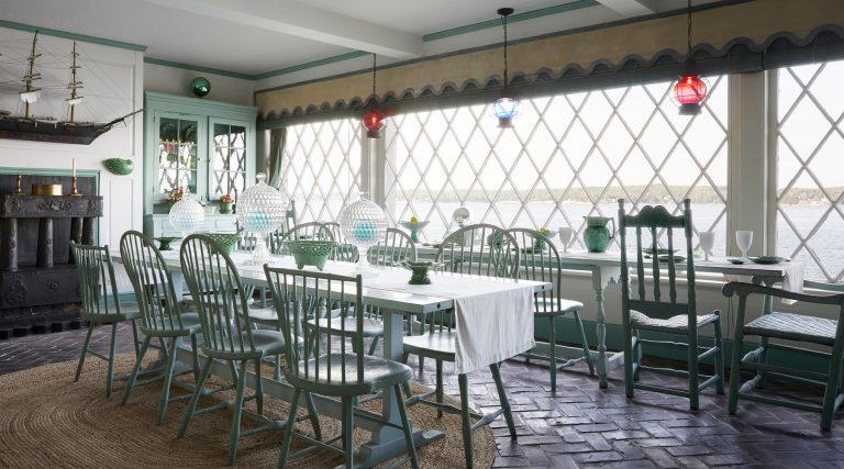
Whimsy can be found in the winter garden, too, where Pöppler introduced seating from Svenskt Tenn covered in Josef Frank–designed floral fabrics to create a link to the outdoors. He appreciates that the chairs are a bit lower than is customary. “I typically like it when proportions are not quite standard,” he says. The 1980s Tecnolumen pendant hanging over the breakfast table, meanwhile, reminds him of a crystal ball.

In the bedrooms, Pöppler really went to town with color. The bed in the primary suite is covered with a multihued Dadi cashmere throw from his own collection. “We use the same company that produces the cashmere for Hermès,” he says. “So, it’s like the best in the world.”

A guest room brings together a heady combination of colors — gold, orange, red, three shades of green and two of blue, as well as a rich burgundy, covering a set of Pöppler-designed modular armchairs. “My clients weren’t initially convinced when we’d only painted the walls,” he recalls. “But you always need to wait until the end when everything comes together. Now, they really love it.”