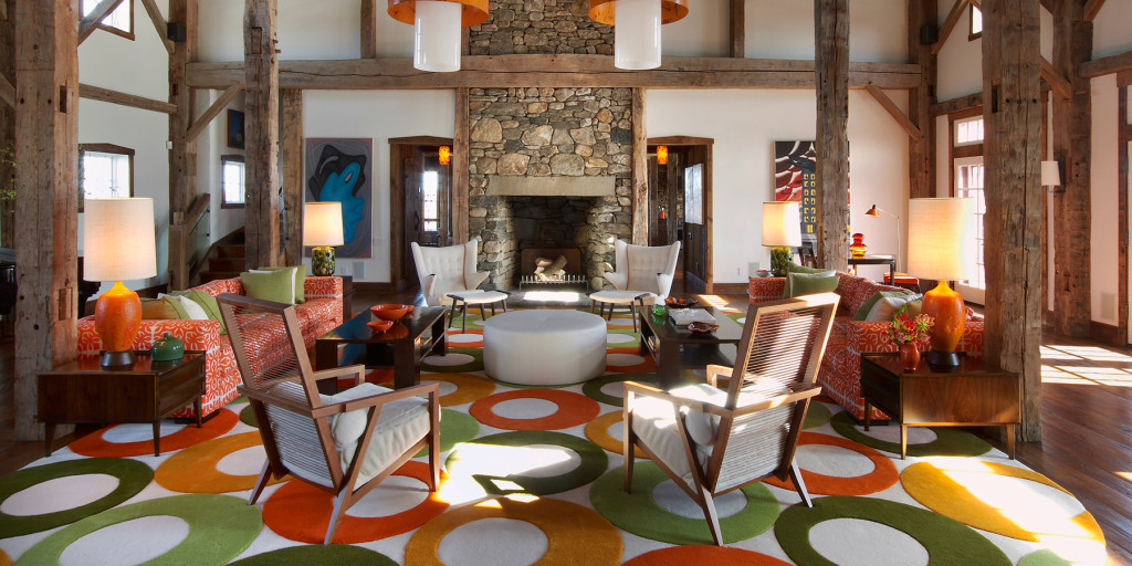

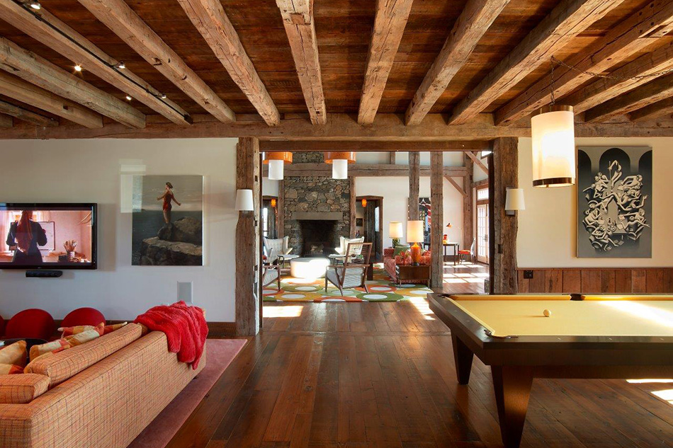
An assured use of colors, intriguing shapes and sumptuous materials helped New York decorator John Barman earn a clientele with bold-faced names (portrait by Hans Fahrmeyer). Top: In a 19th-century Connecticut barn — featured in the designer’s new monograph — Barman created a scheme that combines citrus hues with a laid-back, mid-century vibe (note the Hans J. Wegner Papa Bear chairs). Photo by Eric Laignel
February 29, 2016Vivid, velvet-covered interiors are a specialty of decorator John Barman, a New York native who has helmed his own firm for more than 20 years. Based on Park Avenue and 59th Street, where midtown Manhattan meets the Upper East Side, Barman understands what makes both those neighborhoods tick. He’s a Wharton graduate who draws on his business chops to run the show and he’s devoted to giving his well-to-do clients eye-catching, luxurious residences.
The new book John Barman Interior Design (Monacelli Press, $60), which Barman wrote with design expert Anthony Iannacci, demonstrates why his roster of clients includes such high-profile names as TV anchor George Stephanopoulos, jazz great Wynton Marsalis and real-estate developer Larry Silverstein.
In his spaces, Barman deploys rich materials and compelling shapes in an uncrowded way, allowing each room to shine. A mastery of high-impact tones and hues are also part of the equation. “I work with color more than other people,” says Barman, who employs a handful of helpers in his residential-focused business. It’s a statement that will ring true for readers who flip through this chromatic volume. “I might have had more clients if I had done beige,” he adds, laughing.
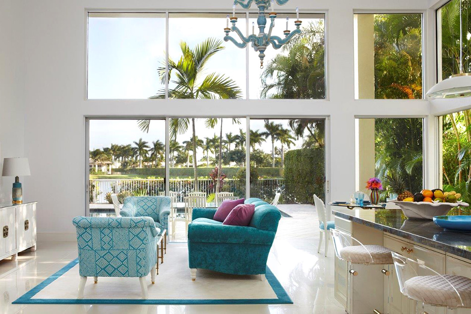
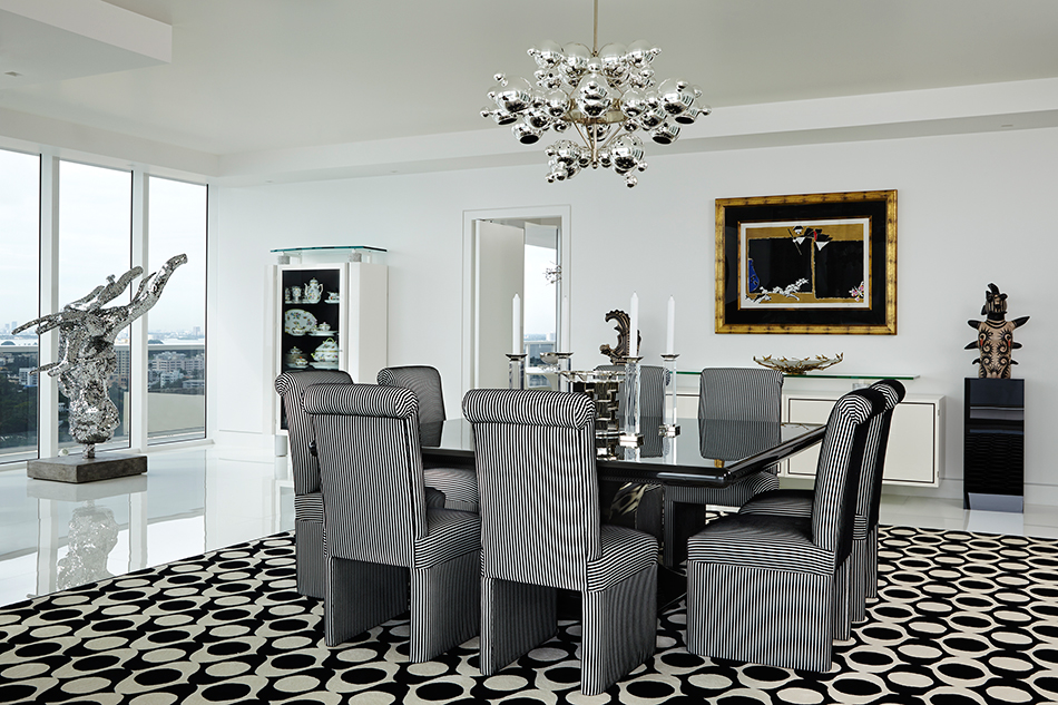
The prevalence of neutral interiors is actually something of a pet peeve for Barman. “Throughout history, up until 1990, everyone used color,” he says. Then the Beige Era set in, followed by the current Gray Era. That is not to say that the designer won’t adhere to a neutral palette if a client specifically requests it, as is demonstrated by the book’s spread on a black-and-white design he cultivated for a Miami Beach condo, working with Kelly Stuart Graham, the design director of Barman’s eponymous firm and his frequent collaborator. According to Barman, the ocean outside the picture windows provides chromatic interest, while numerous patterns add pizzazz.
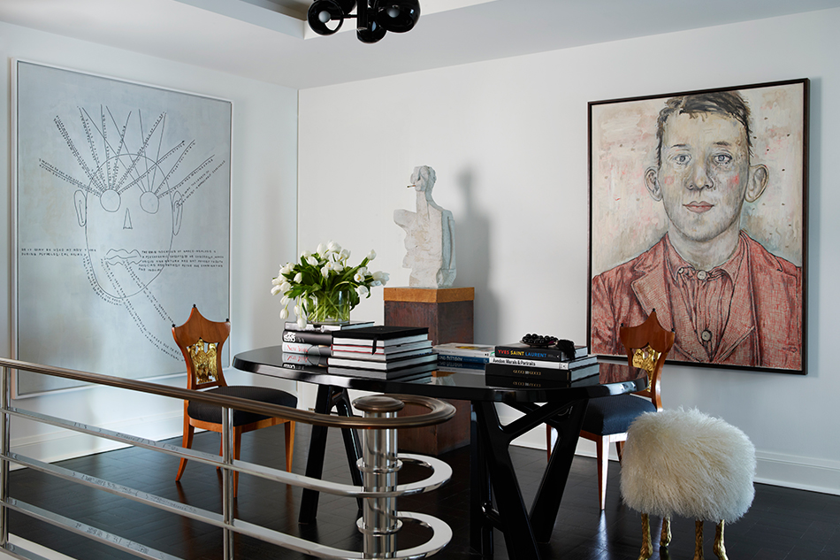

In the Mimran maisonette, the wall along the staircase features art by Al Held. The custom railing is made of polished nickel. Photo by Simon Upton
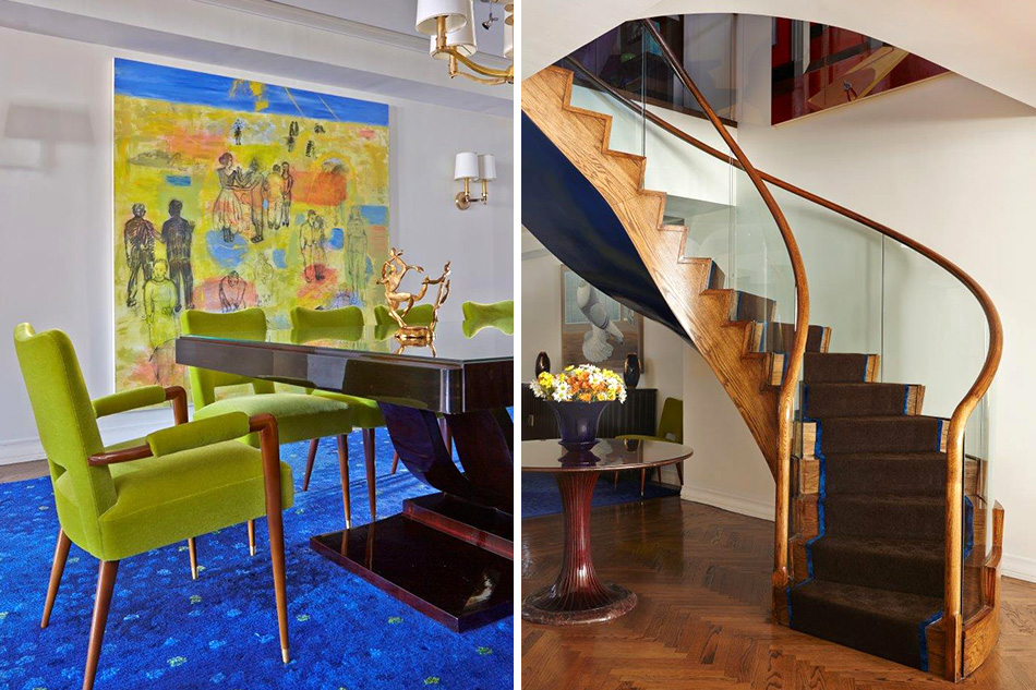
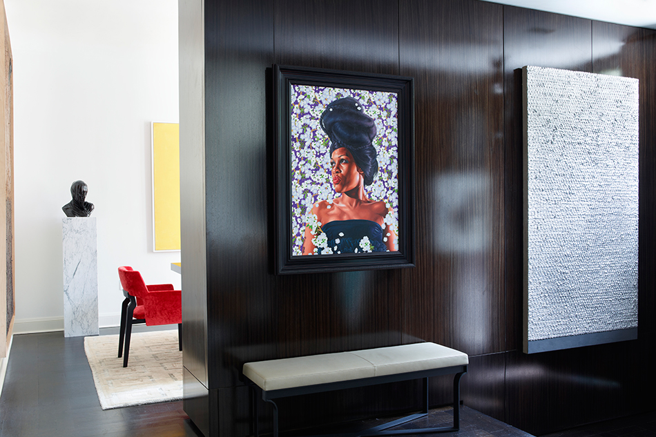
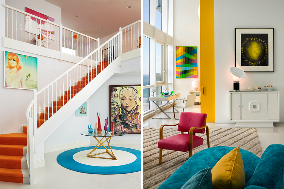
Barman prefers to riff on the color in an art collection when he can, and it’s something of a signature. “If you have a good picture, take from that,” he says of his philosophy. Case in point: a lavish, two-story maisonette Barman outfitted on the Upper East Side for Joe Fresh founder Joe Mimran, which is stuffed with artworks by Larry Poons, Thomas Houseago and Kehinde Wiley, among others. Energy from a big, bright yellow Alex Katz portrait — a “good picture,” indeed — is beamed to the contemporary dining chairs covered in a deep orange velvet, while an unconventional Lindsey Adelman lighting fixture hangs overhead. Barman’s flair for Art Deco styling can be seen in the curves of the grand stair rail, courtesy of architect Edward I. Mills. The gleaming polish is typical Barman: “I like a little shine,” he says.
Of course, a bright color or two would be meaningless if a room’s arrangement were somehow off-kilter. “The foundation of my decorating is not color but the layout,” Barman says. And his layouts are “very classical,” in his words. “It’s about how you’re going to use the rooms. It’s about functionality.”
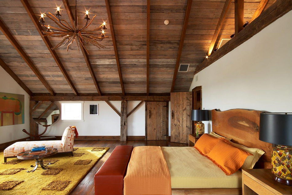
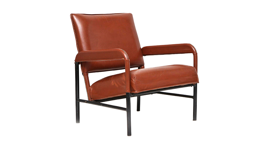
For a 10,000-square-foot converted 19th-century barn in Litchfield County, Connecticut, functionality meant tightly edited multiple seating arrangements, plenty of space for games — the husband is a Ping-Pong fan — and an interesting use of the structure’s volumes, such as the breakfast room, which was tucked into the barn’s silo shape. The house bursts with fiery color and is salted with a mix of contemporary and vintage pieces, like Hans J. Wegner Papa Bear chairs in fluffy, oatmeal-colored wool and Pierre Paulin’s iconic Mushroom chairs. “Clean lines were needed because of the overwhelming structure of the barn, which could come across as dark,” Barman says. You can’t miss the living room rug, an eye-popping custom creation by Christine Van Der Hurd called Olives — imagine that the contents of a martini made in Candy Land had exploded into circular fragments of red, green and yellow, and you’ll have an idea of the effect.

Lit by a small Maison Charles chandelier in an alcove, the sitting room of a Sutton Place townhouse in New York features green-and-gold flocked wallpaper. Photo by Anastassios Mentis
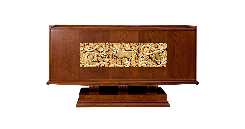
Bold rugs infuse nearly all Barman’s rooms with personality. For a New York City residence combining two apartments — one above the other, connected by a Jungenstil-esque curving wooden staircase — the decorator placed a bespoke blue-and-green-spotted rug under a custom Art Deco–style dining table and credenza from New York’s Lorin Marsh, finishing the room with Jules Leleu dining chairs upholstered in acid-green mohair and sourced from Maison Gerard.
John Barman Interior Design includes at least two clients represented by multiple homes. “For a lot of clients, I’ll do more than one,” Barman says, noting that this comes with its own set of challenges. “It’s easier, because you know their taste, but you want it to be different. Sometimes, they want it to be the same.”
One certainly won’t confuse the three residences belonging to a jet-setting client— in New York City, East Hampton and Boca Raton, Florida — which are shown in the book. Each is distinct and demonstrates another of Barman’s strengths: enriching wallcoverings. “I think wallpaper is great unless the paint job is really good,” he says. “It gives such a quality look.”
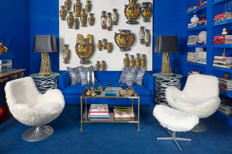
For instance, in the midtown New York apartment, a massive affair near Sutton Place, bright-blue flocked wallpaper enlivens the dining room, while an even more out-there, botanical-inspired flock in green and gold adorns the sitting room. The latter gets extra shock value from the snake in the Piero Fornasetti rug. Slightly more demure is the blue and gold Chinese print fabric surrounding the dining room of the Hamptons house, which, like the rest of the design, was derived from the color in a Chinese painting hanging over the living-room mantel.
As in all Barman’s work, there’s method in the madness — and a whole lot of pleasure to derive from looking at it.
John Barman’s Quick Picks on 1stdibs


or support your local bookstore