November 21, 2021Ask the Porto, Portugal-based design duo Jacques Bec and Artur Miranda for their architectural heroes, and they immediately name one person: the mid-century Italian modernist Piero Portaluppi, who is best known today for his rationalist Milanese masterpiece, the Villa Necchi Campiglio, in Milan.
“He had wonderful classical references and an incredible eye for proportions,” says Bec. Adds Miranda, “When we do architectural work, it’s neither decorative nor delicate. It’s always quite solid and serious, and we love working with large volumes.”
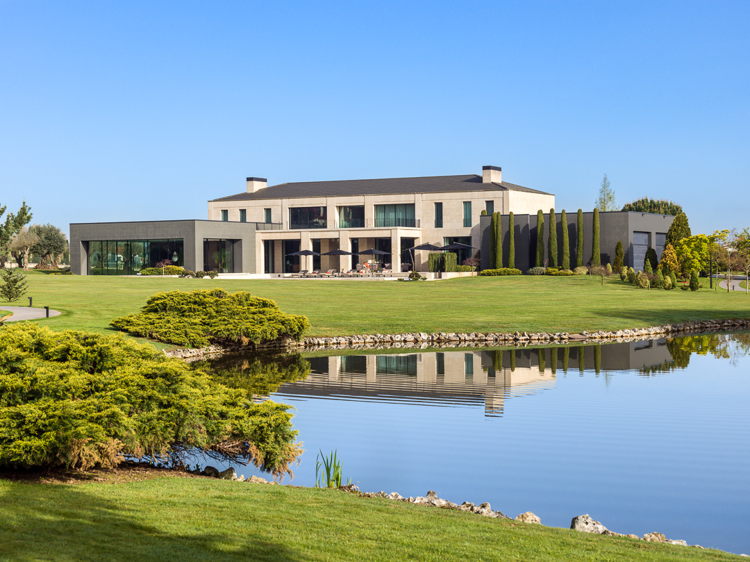
So, one could hardly imagine a more fitting commission than this family home: Sitting on 50 acres in a town to the north of Porto, and hidden from the road behind a rather inconspicuous wall, it measure more than 14,300 square feet.

The owners — a couple with three young boys — originally envisioned it as even bigger.
Before approaching Miranda and Bec’s architecture and design firm, Oitoemponto, they drew a sketch of how they pictured the structure. “It was totally out of proportion,” recalls Miranda. “I put it on a Xerox machine and reduced it by a third. Even now, the corridors are so long the owners could get around on Segways.”
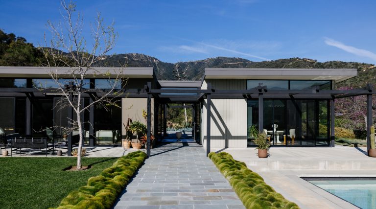
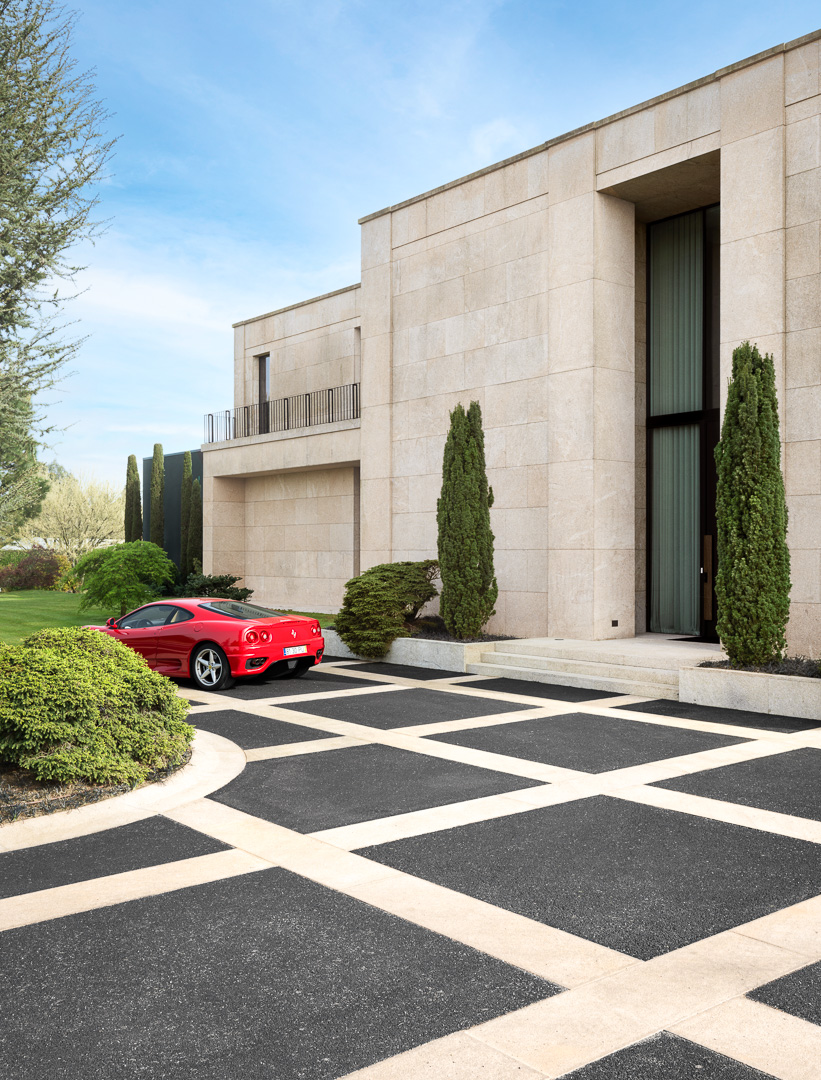
Built largely of local white granite, the exterior is structured and rhythmic, with rigorous lines and aligned openings. “We wanted something timeless,” says Bec, “and right from the start, our aim was to create a sense of transparency.”
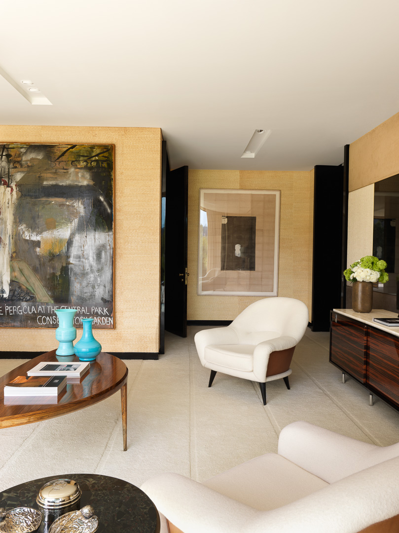
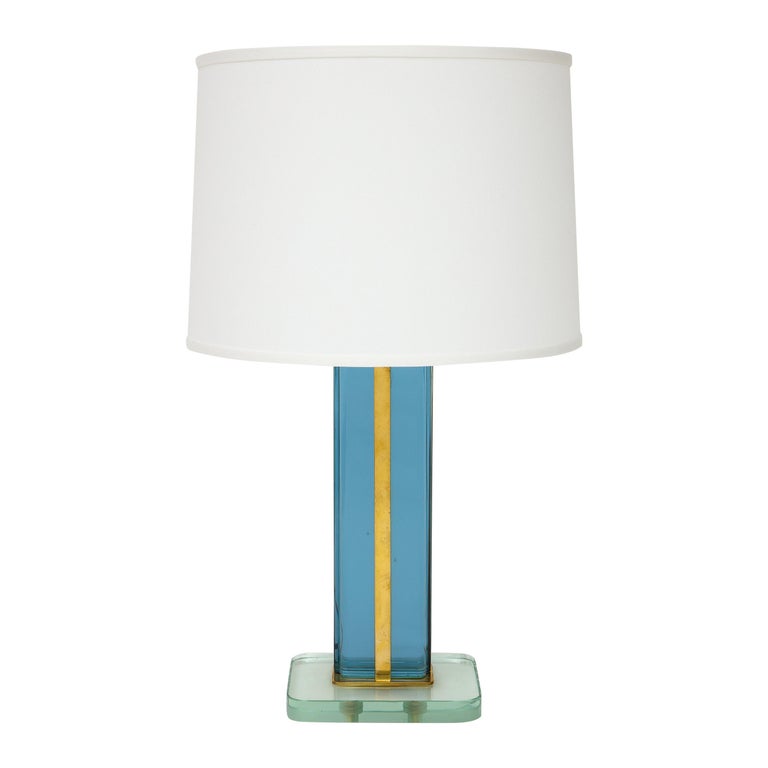
Inside, Miranda and Bec employed a limited number of materials: bronze Armani marble, polished Venetian plaster, lacquer, wood veneer. And they furnished the rooms with objects their clients had acquired over the years — the sitting room’s 1970s BD LUMICA TABLE LAMP, for instance, and pair of Paco Rabanne leather-clad armchairs the couple spotted in Oitoemponto’s booth at the 2015 AD Intérieurs showhouse event in Paris.
Before construction began on the house, the clients chose another two artworks from Bec and Miranda’s Porto showroom: a large-scale abstract by Shinique Smith and a blurred-looking painting of a tiger by German artist Stephan Kaluza.
Ask the designers their tricks for furnishing such large volumes, and they cite the need for overscale pieces — but not too many.
“The true luxury in this kind of home is to leave empty space,” explains Bec. And although the monumentality of the house may suggest a certain ostentation, its laid-back owners actually lead a discreet life.
“For them, it’s not a house for show,” says Bec. “It’s simply a family home, a place where they bring together their loved ones.”
Here, he and Miranda take us on a tour.
THE ENTRY HALL
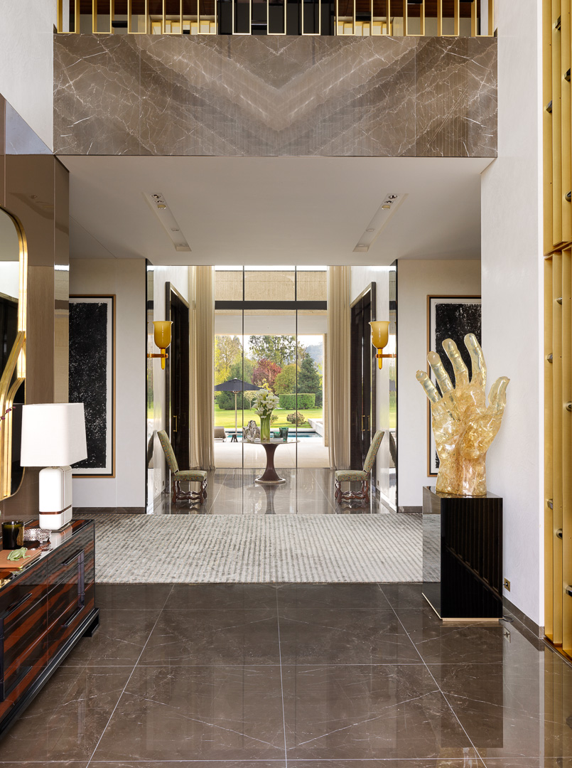
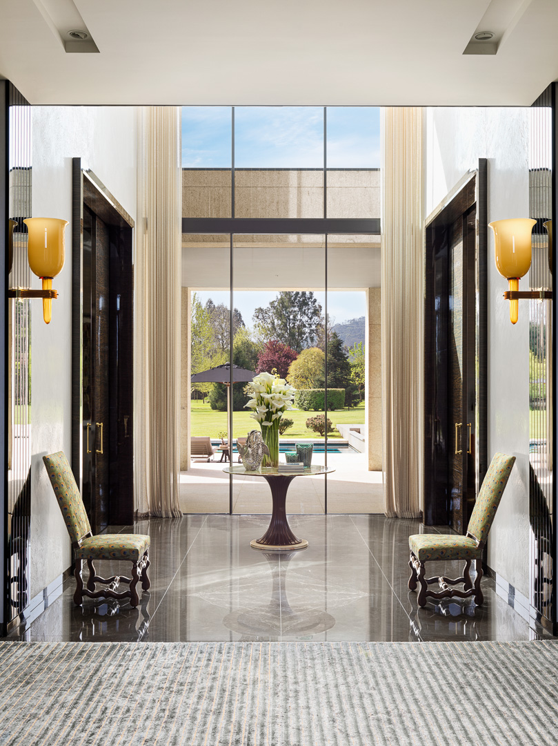
“The first thing you see when you enter the house is the garden,” says Bec. “We really wanted to create that connection between indoors and out.” The other thing you can’t fail to notice is the soaring ceilings, which shoot up 23 feet.
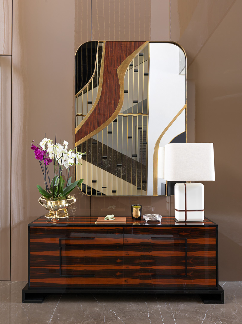
The decor by the front door is “quintessential Oitoemponto,” says Miranda, who, with Bec, designed the Brazilian-rosewood and lacquer Shanghai chest, the Copacabana mirror above it and the white Tiete table lamp.
The Mano sculpture, a resin hand filled with wheat, is by Pierre Giraudon, who helped the French artist César create his legendary crushed-metal sculptures known as Compressions.
“As light enters the house from all sides, it affords the transparency the work warrants,” says Bec.
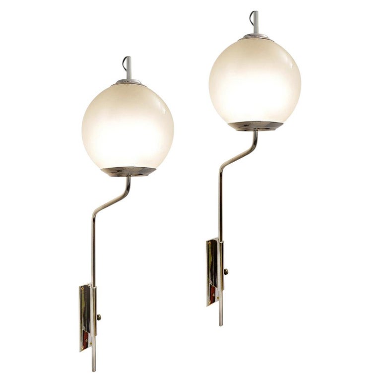
At the other end of the entry hall, the look is more mid-century Italian. The designers juxtaposed a circular table by Osvaldo Borsani with a pair of amber-colored glass Gio Ponti sconces that are nearly three feet tall. “They’re enormous, but in this house, they’re the perfect size,” says Miranda.
Underneath each stands a Louis XIV chair. “In all our projects, we like to mix styles and periods to give the impression that the furnishings have been accumulated over time,” notes Bec. “It’s as if our clients inherited these from one of their grandmothers.”
THE STAIRCASE
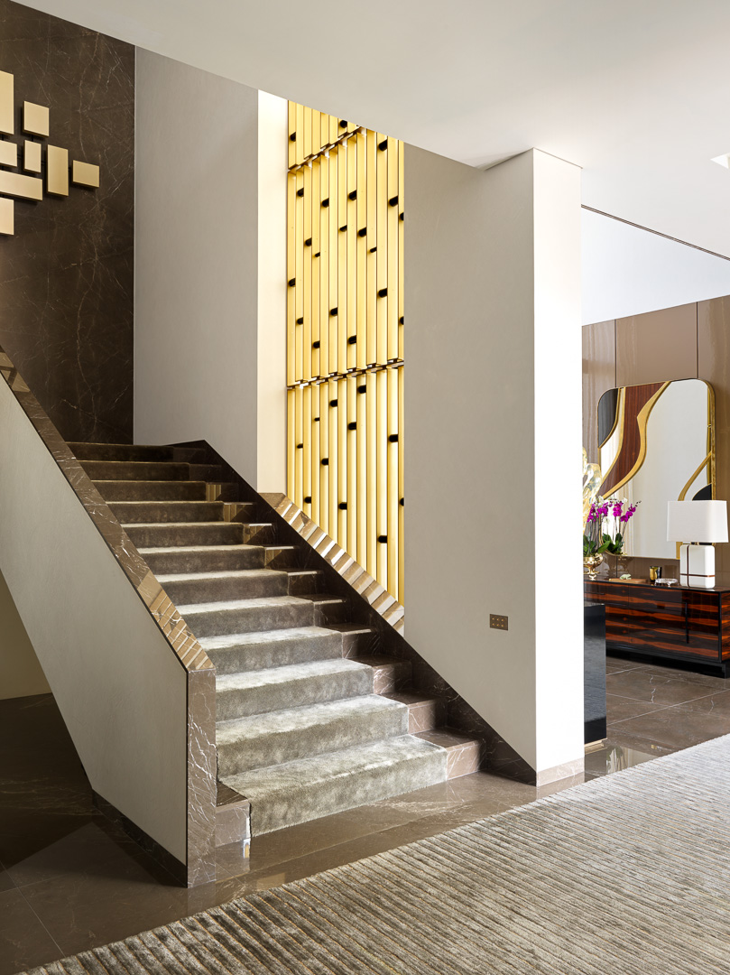
The quasi-minimalist design of the stairs is offset by a dramatic double-height partition made of anodized aluminum interspersed with rectangles of lacquered wood in a syncopated design. The pattern echoes that of the adjacent wall-hung light sculpture, created by Brazilian architect Italo Della Manna for an apartment in São Paulo in 1959.
Their similarity, however, owes more to serendipity than intent. “We hadn’t necessarily envisioned they’d go together so well,” admits Bec. “Sometimes, it’s as if our subconscious guides us.”
One thing they did anticipate was the necessity to sand the bronze Armani marble on the staircase wall to give it a matte finish. “If it had been shiny like in the rest of the house, you’d have been able to see the reflection of the sculpture’s light bulbs,” explains Bec.
THE LIVING ROOM
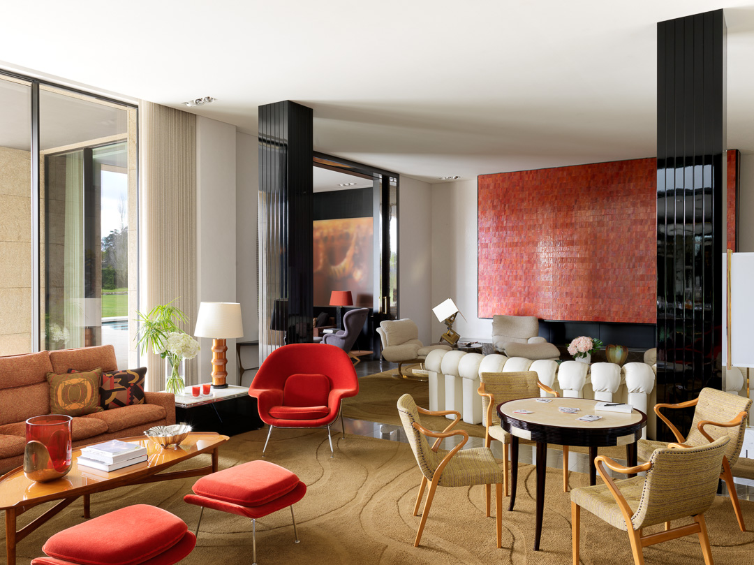
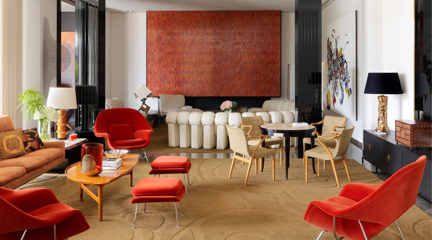
This room is dominated by an expansive chimney breast clad in what at first glance looks like orange ceramic tiles but in fact are squares of copper. “They’re deceptive,” says Miranda. “It’s only when you get up close that you realize what they are.”
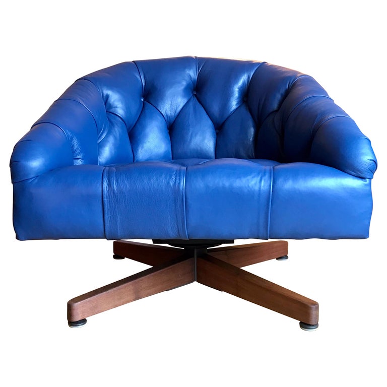
Their orange tones are reiterated in the upholstery of EERO SAARINEN WOMB CHAIRS AND OTTOMANS. These are among a number of iconic 20th-century designs scattered throughout the house, which also include the DE SEDE LEATHER SOFA. “It’s good to have items that are more familiar,” says Miranda. “They prevent things from becoming too eclectic.”
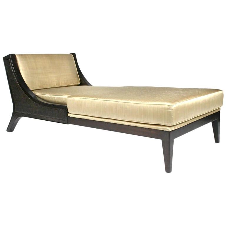
More originality is displayed by other vintage finds: the 1970s Lumica table lamp and pair of chaise longues by the fireplace, created by fashion designer Paco Rabanne for his own apartment; the ALDO TURA parchment and lacquer games table surrounded by a set of chairs by Axel Larsson; and the walnut cocktail table created for BAKER FURNITURE by FINN JUHL.
The hand-tufted rug is custom, its pattern based on a Tibetan motif. “It’s a large, stylized cloud, which helps to bring calm and snugness to the space” says Bec.
THE DINING ROOM
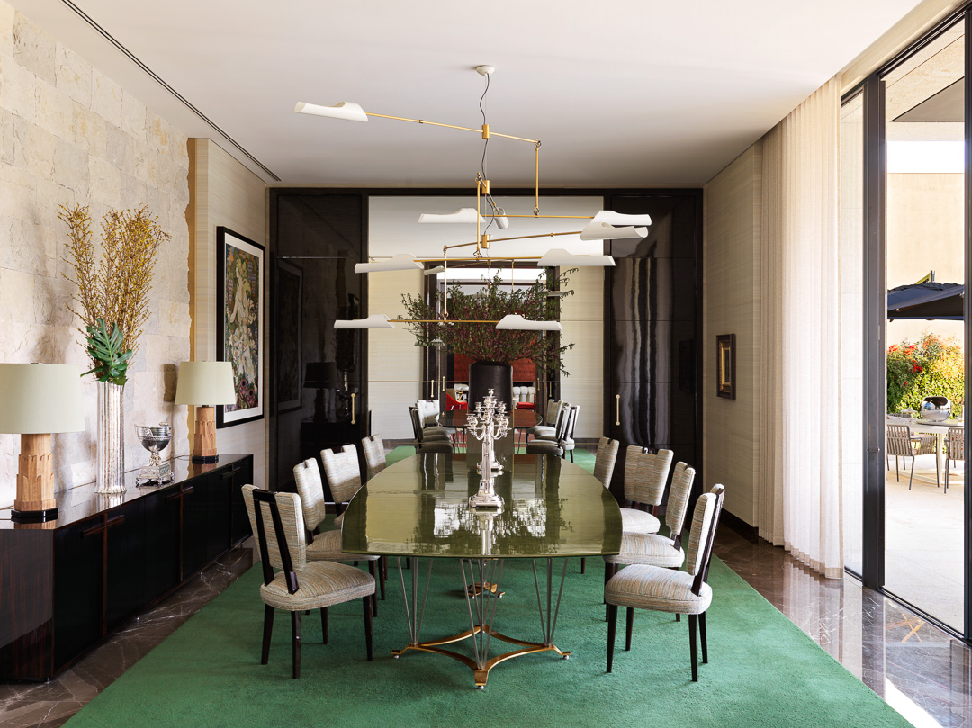
A constant in Oitoemponto’s work is the confronting of elements that are diametrically opposed. A perfect case in point: the juxtaposition of a raw silk paper from Phillip Jeffries and rough-hewn stone on the walls. “When something is sophisticated, it’s good to counterbalance it with an element that jars a little,” says Miranda.
The 1962 lacquer-topped dining table from Maison Leleu is one of the designers’ favorite finds for the house. “It looks like nothing else,” Bec says. “In a way, it’s very classical in inspiration, but at the same time, its structure almost foreshadows the nineteen seventies.”
Here, it sits in conversation with a pair of Philippe Parent raw-oak table lamps, a set of custom dining chairs based on an American model from the fifties and a David Weeks chandelier selected for its substantial dimensions.
The mirrored wall, meanwhile, attests to Bec and Miranda’s enduring love of reflections. “They bring a touch of magic to every room,” the former explains.
THE FAMILY ROOM
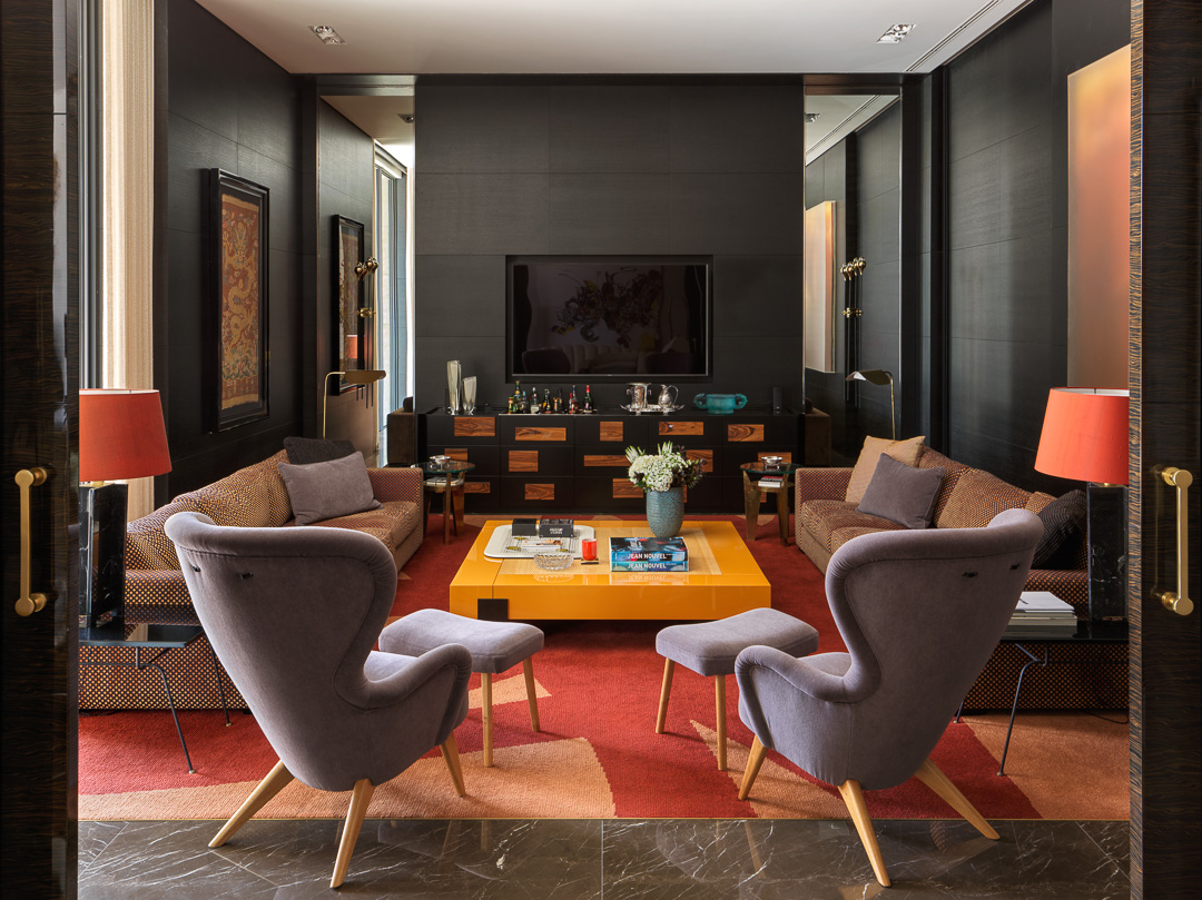
With its ebonized-oak walls, the family room was conceived more or less as a black box — but one that is far from claustrophobic. “We installed mirrors, as well as a sliding panel that opens onto the indoor pool,” Bec says. “Otherwise, it could have been a little anxiety-inducing.”
As is the case throughout the house, the furnishings are a savvy mix of custom and vintage pieces.
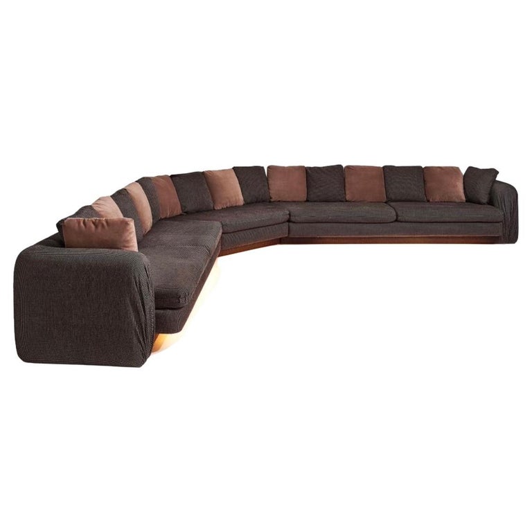
The sofas, cocktail table and black marble lamps were all designed by Oitoemponto. So was the rug, whose motif was suggested by the brushstrokes of French painter Pierre Soulages. “Everything was so symmetrical that we needed some freer forms to loosen things up,” says Miranda.
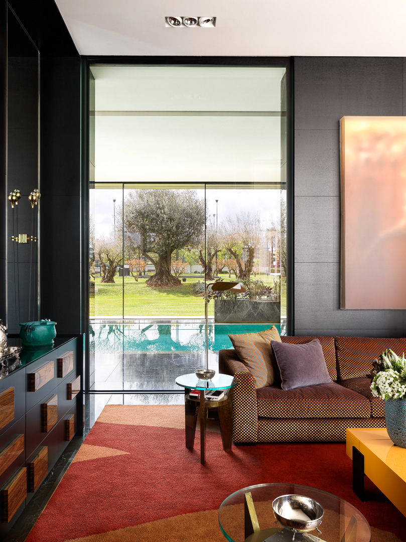
The vintage pieces in the room include the armchairs and ottomans by mid-century Finnish designer Carl-Gustav Hiort af Ornäs and a pair of 1970s unsigned occasional bronze and glass tables.
In a way, the ebonized-oak and walnut bar is itself a mix of old and new. Imagined by Bec and Miranda, it has handles inspired by a Ponti chest.
THE OFFICE
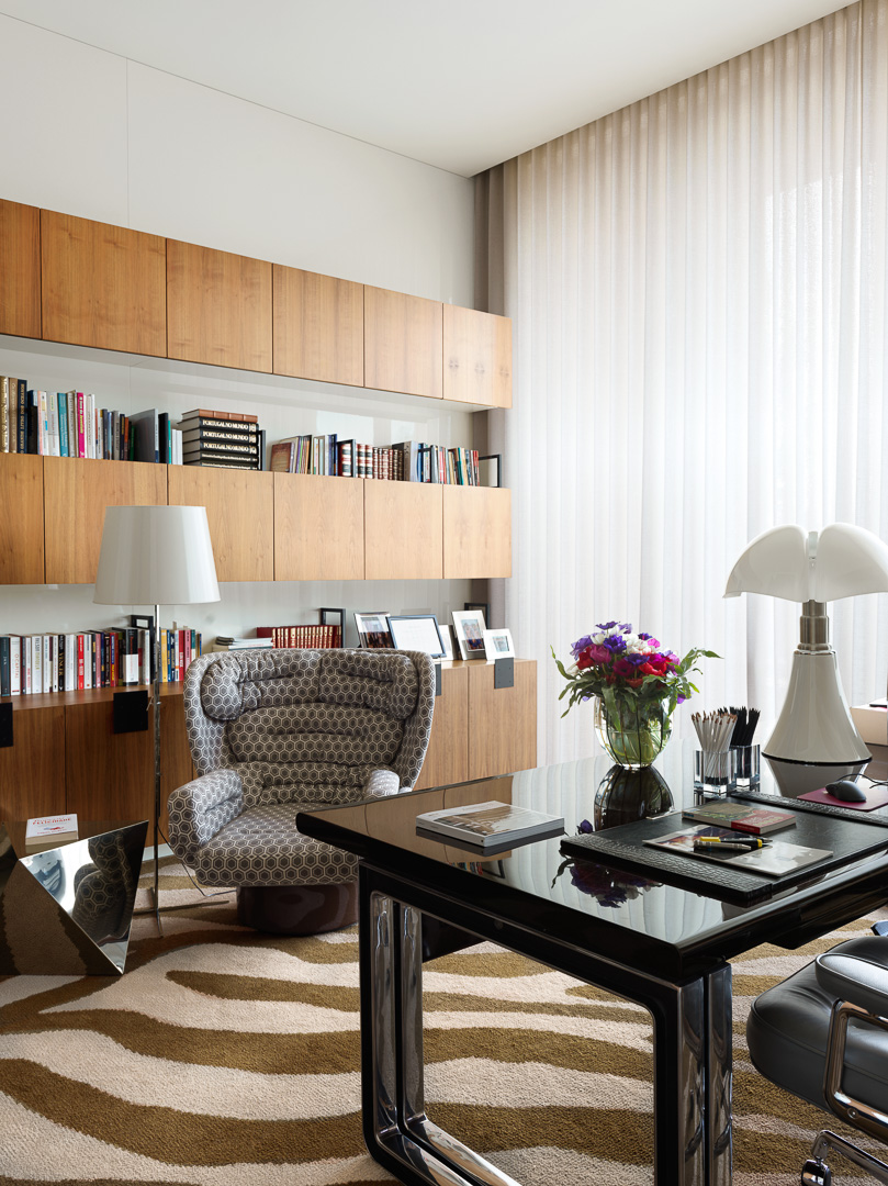
In the office, a custom rug once again provides a bracing jolt of pattern, here in the form of an enlarged zebra print. Several pieces are by legendary 20th-century Italian designers: a rosewood and polished-aluminum desk created by Osvaldo Borsani for Tecna, a Gae Aulenti Pipistrello lamp and a Joe Colombo Elda armchair upholstered in a David Hicks–like fabric with a hexagonal pattern.
The 1980s floor lamp in front of the walnut and lacquer storage unit has a telescoping base. “You can lower it so much it almost becomes like a table lamp,” says Miranda.
THE LANDING
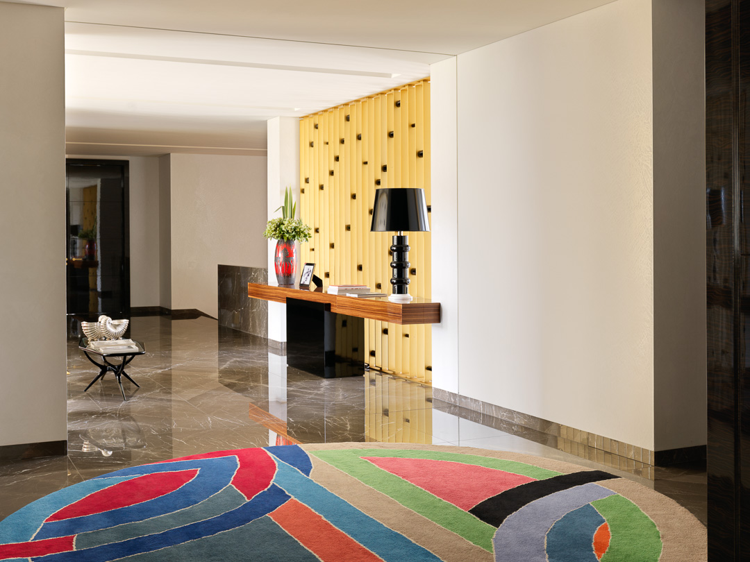
The focal point of the second-floor landing is a brightly hued Frank Stella rug. It was commissioned by the New York dealer Charles Slatkin for the 1968 exhibition “American Tapestries,” which featured designs by some 20 contemporary artists, including Robert Motherwell, Roy Lichtenstein and Andy Warhol. “It’s great to have a Stella, even on the floor,” quips Miranda.
In the background, a black lacquer and white Lucite Oitoemponto lamp and a vintage Danish ceramic vase stand on top of a custom console table made from zebrano and lacquer. Its design is illustrative of the way Bec and Miranda play with intersecting volumes, in both their furniture and their architecture. “It’s something you find throughout the house,” notes Bec.
THE MAIN BEDROOM
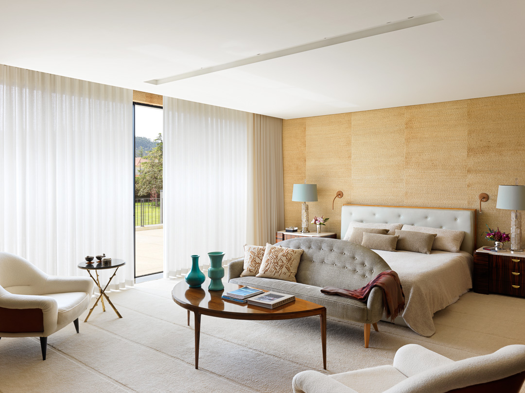
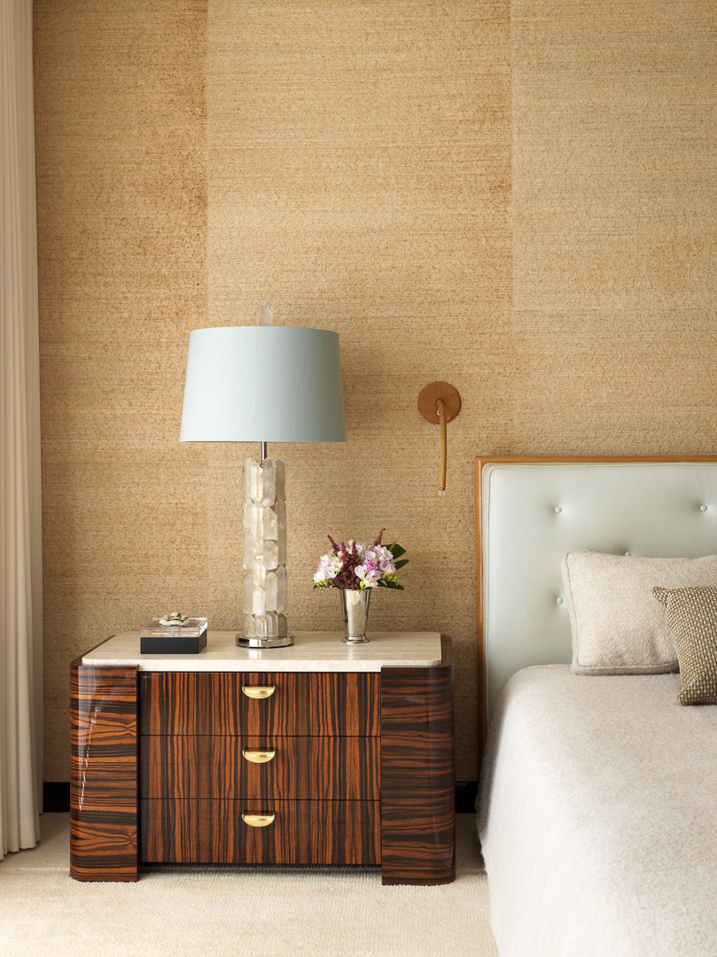
Bec and Miranda are certainly not the first designers to aim for a “cocoon-like” bedroom, but the one they have created here is particularly stylish.
The raw-linen wallpaper, which has both textural and acoustic qualities, is a key element. Another is the extremely plush wall-to-wall hand-knotted Portuguese carpet.
A certain softness is imparted by the rounded forms of much of the furniture, like the pair of Charles Ramos armchairs, the Kerstin Hörlin-Holmquist Paradiset sofa and the semicircular rosewood cocktail table by Johannes Andersen. A notable exception is the Épines occasional table by Hervé Van der Straeten, with its prickly, thorn-bedecked legs.
Beside the door hangs an artwork by James Brown. The other painting in the room is by James Lavelle and used to be in Bec and Miranda’s personal collection.
THE MAIN BATHROOM
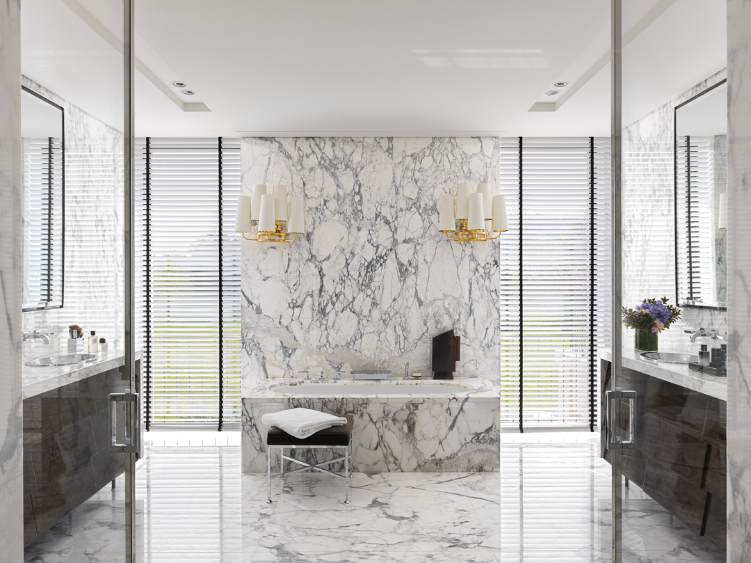
In many ways, the bathroom could hardly be more conventional. It is swathed in expanses of Calacatta marble and presents almost perfect symmetry. An original twist, however, is provided by the two gilded sconces, from French manufacturer Delisle’s Fifties collection.
“They’re completely in contrast with the cold, almost antiseptic ambience of the rest,” says Miranda. “They’re more like something you’d find in a ballroom.”
The floor-to-ceiling windows have an ingenious feature: When they’re open, a guardrail slides out from a pocket in the wall to prevent accidental falls.
THE DRESSING ROOM
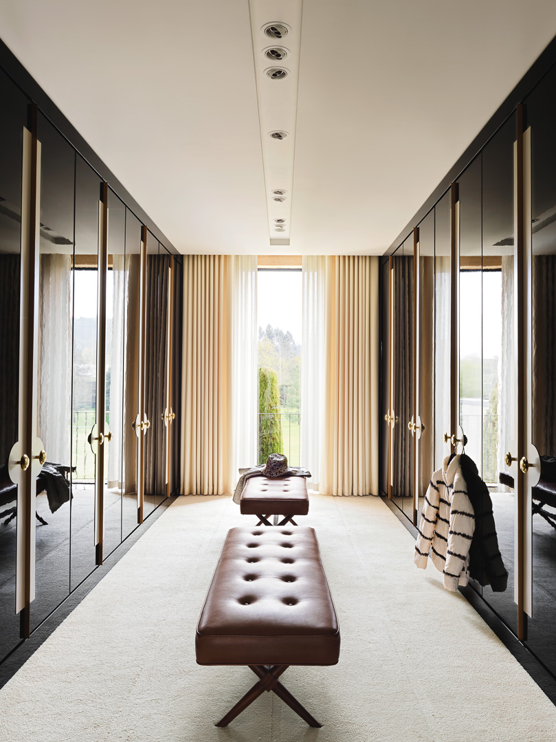
Functionality is very much at the heart of the design of the adjacent dressing room. The leather and walnut benches, inspired by T.H. Robsjohn-Gibbings, for instance, are not just elegantly decorative. “The husband travels constantly for work. So, it was important to have somewhere he could pack a suitcase in five minutes,” explains Bec.
He and Miranda designed the closets’ large doorknobs to double as hangers from which the husband could suspend items he wants to take with him. And if that were not practical enough, there is also a chute with a trapdoor inside one of the closets that is connected directly to the laundry room below.
THE INDOOR POOL
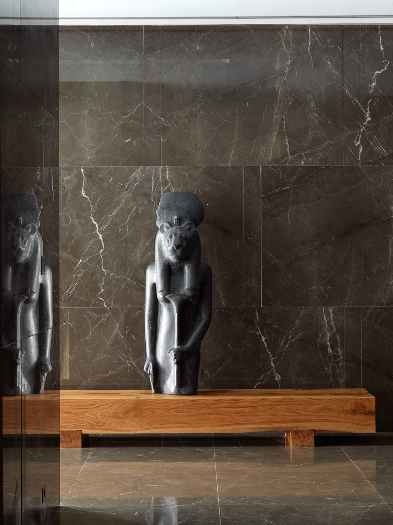
The entry to the indoor pool is indisputably dramatic. Visitors are greeted by a mold — formerly belonging to the Louvre Museum — of a sculpture of the Egyptian goddess of healing, Sekhmet, standing atop a solid oak bench.”
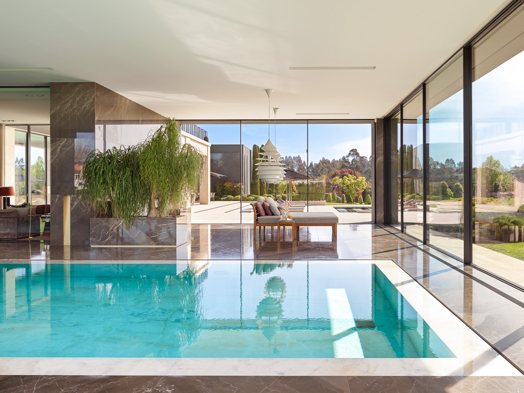
In designing the pool, Bec and Miranda’s main goal was to open it up as much as possible to the surrounding garden. Beside the pool is a lounge area, facing out to the landscape, where the family gathers on weekends. The chaises are by Philippe Starck for Sutherland, and the pair of oversized ceiling lights above are from Louis Poulsen. The finishing touch is a pair of planted trees, chosen for their adaptability to the indoor pool environment. “They’re able to withstand the high humidity and heat,” says Bec.
THE OUTDOOR POOL
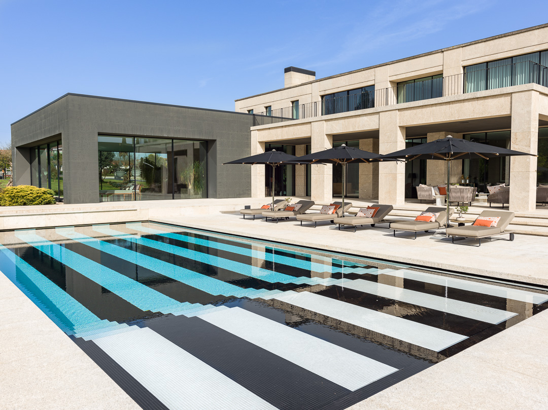
Initially, Bec and Miranda intended to line the outdoor pool with an exuberant mosaic leaf pattern. “We thought it would be good to have something in contrast to the more serious spirit of the architecture,” says Miranda. But they worried their clients would quickly tire of such an audacious gesture.
Instead, they took a rigorous, graphically linear approach, using tiles from Bisazza to create an awning stripe. “The husband loves swimming, so we decided to give him lanes, but in a decorative fashion,” says Bec.
As for the furniture, they wanted it to be as low-key as possible. To that end, they chose black parasols from Royal Botania to go with Kettal loungers.
“If they’d been white, they would have been like large splotches,” says Miranda. “The black fades much better into the decor.”
