Items Similar to Marcel Proust, Unique Acetate delivered by Andy Warhol to Chromacomp Inc. Framed


Want more images or videos?
Request additional images or videos from the seller
1 of 7
Marcel Proust, Unique Acetate delivered by Andy Warhol to Chromacomp Inc. Framedca. 1976
ca. 1976
$20,000
£15,081.99
€17,443.04
CA$28,059.89
A$31,190.31
CHF 16,349.29
MX$380,909.21
NOK 204,111.51
SEK 192,030.85
DKK 130,189.78
About the Item
Intended for Andy Warhol
Marcel Proust, ca. 1976
Acetate positive acquired directly from Chromacomp, Inc. Andy Warhol's printer in the 1970s.
Derivative on acetate, based on a photo by Otto Wegener
Accompanied by Letter of Provenance from the representative of Chromacomp, Andy Warhol's printer
Frame included:
Elegantly framed in a museum quality white wood frame with UV plexiglass.
Measurements:
Frame:
17.75 x 14.75 x 1.5 inches
Photograph:
10.75 x 7.75 inches
This unique photographic positive acetate is of the 19th and early 20th century French novelist Marcel Proust, who's chef d'oeuvre A la recherche du temps perdu inspired some Warhol titles.
Warhol would transfer the acetate to a transparency, allowing an image to be magnified and projected onto a screen. Warhol created a silkscreen painting of Marcel Proust and sent this acetate to his printer, Chromacomp, Inc. for consideration as a silkscreen multiple, which was never made.
This acetate was brought by Warhol to Eunice and Jackson Lowell, owners of Chromacomp,Inc. a fine art printing studio in New York City. During the 1970s and 1980s, it was the premier atelier for fine art limited edition silkscreen prints; indeed, Chromacomp was the largest studio producing fine art prints in the world for artists such as Andy Warhol, Leroy Neiman, Erte, Robert Natkin, Larry Zox, David Hockney and many more. All of the plates were done by hand and in some cases photographically.
Warhol had considered creating limited edition prints with Chromacomp of his famous portrait of Proust based upon this photographic image. The original painting was commissioned by art dealer Marie-Louise Jeanneret for a group of Italian collectors and avid Proust enthusiasts, Warhol's original four acrylic and silkscreen ink on linen works were based on a famous 1895 photograph of the French novelist captured by Otto Wegener.
Marcel Proust, the distinguished French novelist, literary critic, and essayist, achieved renowned for his monumental 1908 seven-volume novel In Search of Lost Time. The literary masterpiece delved into the intricacies of memory, time and the profound complexity of the human experience. Proust's literary genius revolutionized the landscape of literature, leaving an enduring impact on the Parisian cultural scene at the turn of the century. About 50 years later, Andy Warhol emerged as a visionary artist who challenged artistic conventions, exploring themes that resonated with Proust's own ideas. Warhol, a trailblazer in his own right, delved into philosophical reflections on consumerism, mass production and the nature of fame. His artistic endeavors mirrored Proust's explorations, albeit through a contemporary lens, as he sought to redefine the boundaries of art and popular culture.
About Andy Warhol:
Isn’t life a series of images that change as they repeat themselves?
—Andy Warhol
Andy Warhol’s (1928–1987) art encapsulates the 1960s through the 1980s in New York. By imitating the familiar aesthetics of mass media, advertising, and celebrity culture, Warhol blurred the boundaries between his work and the world that inspired it, producing images that have become as pervasive as their sources.
Warhol grew up in a working-class suburb of Pittsburgh. His parents were Slovak immigrants, and he was the only member of his family to attend college. He entered the Carnegie Institute of Technology (now Carnegie Mellon University) in 1945, where he majored in pictorial design. After graduation, he moved to New York with fellow student Philip Pearlstein and found steady work as a commercial illustrator at several magazines, including Vogue, Harper’s Bazaar, and the New Yorker. Throughout the 1950s Warhol enjoyed a successful career as a commercial artist, winning several commendations from the Art Directors Club and the American Institute of Graphic Arts. He had his first solo exhibition at the Hugo Gallery in 1952, showing drawings based on the writings of Truman Capote; three years later his work was included in a group show at the Museum of Modern Art for the first time.
The year 1960 marked a turning point in Warhol’s prolific career. He painted his first works based on comics and advertisements, enlarging and transferring the source images onto canvas using a projector. In 1961 Warhol showed these hand-painted works, including Little King (1961) and Saturday’s Popeye (1961), in a window display at the department store Bonwit Teller; in 1962 he painted his famous Campbell’s Soup Cans, thirty-two separate canvases, each depicting a canned soup of a different flavor. Soon after, Warhol began to borrow not only the subject matter of printed media, but the technology as well. Incorporating the silkscreen technique, he created grids of stamps, Coca-Cola bottles, shipping and handling labels, dollar bills, coffee labels, and more, breaking down the images to their basic graphic components.
In 1963 Warhol established a studio on East 47th Street, which became known as the Factory and served as a cultural hub for artists, models, performers, and socialites. His inner circle comprised his Superstars, who played a major role in both his work and his social life. Interested in the production of fame, Warhol began to screen-print images of celebrities and public figures, from Marilyn Monroe and Elvis Presley to Jackie Kennedy and Mao Zedong. Expanding his practice, as well as his cultural influence, he produced records (The Velvet Underground & Nico), started a magazine (Interview), and made avant-garde films, such as Chelsea Girls (1966), Blow Job (1964), and Empire (1964), which have become classics of the underground genre.
Following a close run-in with death when Valerie Solanas shot him in 1968, Warhol entered a more subdued, isolated period, working primarily on a commissioned basis and painting portraits for various patrons, while also revisiting themes from his earlier work. He then began to pursue a new interest in abstraction, first with his Oxidations (1977–78), made by allowing friends and acquaintances to urinate on canvases painted with metallic pigments, and later with his Rorschach (1984) and Camouflage (1986) paintings.
By the early 1980s Warhol was producing work across media with a renewed vigor, hosting half-hour programs on MTV, publishing books, and collaborating with younger artists including Jean-Michel Basquiat, Francesco Clemente, and Keith Haring. His abstract series coincided with large-scale works that looked back at masterpieces by Leonardo da Vinci: he screen-printed images of the Mona Lisa (1503) and created several monumental canvases of The Last Supper (1495–98). Warhol’s ability to seamlessly combine art historical reference, abstract patterns, and mass media set new standards for the role of the artist, permanently blurring the lines between commercial and fine art.
- Courtesy of Gagosian Gallery
About Marcel Proust:
Marcel Proust was born on July 10, 1871 in the Paris suburb of Auteuil. His father, Dr. Adrien Proust, was one of France's most distinguished scientists. His mother, Jeanne Weil, was a well-educated woman who loved the great classic writers of the 17th century, especially Molière and Racine. Marcel's only sibling, Robert, was born in 1873. The hypersensitive Marcel suffered all his life from a number of ailments, especially asthma. Although he earned university degrees in philosophy and law, he always knew that he wanted to be a writer.
In 1910, he had his bedroom lined with cork to block out the deafening noise of daytime Paris because he slept during the day and wrote through the night, after returning home from some of Paris's most exclusive salons. He was known as the city's most famous recluse, he even called himself an owl because he wrote while listening to his “nocturnal Muse.” Swann’s Way, the first volume of In Search of Lost Time, was published in November 1913 and was headed for a fourth printing when World War I broke out.
Proust continued to write, incorporating the unprecedented conflict into his story of contemporary French society. In 1919, Within a Budding Grove was published and won the Prix Goncourt, France's most prestigious literary prize. The final three years of his life saw the publication of The Guermantes Way and Sodom and Gomorrah. The Captive, The Fugitive, and Time Regained were published posthumously. The novel's main themes are time and memory and the power of art to withstand the destructive forces of time.
- Courtesy of Proust-ink
- Creation Year:ca. 1976
- Dimensions:Height: 17.75 in (45.09 cm)Width: 14.75 in (37.47 cm)Depth: 1.5 in (3.81 cm)
- Medium:
- Movement & Style:
- After:Otto Wegener (1849 - 1924, Swedish, French)
- Period:
- Condition:In original studio vintage condition as delivered and handled by Andy Warhol.
- Gallery Location:New York, NY
- Reference Number:1stDibs: LU1745214937502
About the Seller
5.0
Platinum Seller
Premium sellers with a 4.7+ rating and 24-hour response times
Established in 2007
1stDibs seller since 2022
450 sales on 1stDibs
Typical response time: 2 hours
- ShippingRetrieving quote...Shipping from: New York, NY
- Return Policy
Authenticity Guarantee
In the unlikely event there’s an issue with an item’s authenticity, contact us within 1 year for a full refund. DetailsMoney-Back Guarantee
If your item is not as described, is damaged in transit, or does not arrive, contact us within 7 days for a full refund. Details24-Hour Cancellation
You have a 24-hour grace period in which to reconsider your purchase, with no questions asked.Vetted Professional Sellers
Our world-class sellers must adhere to strict standards for service and quality, maintaining the integrity of our listings.Price-Match Guarantee
If you find that a seller listed the same item for a lower price elsewhere, we’ll match it.Trusted Global Delivery
Our best-in-class carrier network provides specialized shipping options worldwide, including custom delivery.More From This Seller
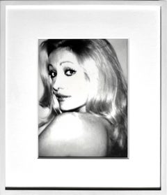
View AllAndy Warhol, Baroness de Waldner unique acetate of Brazilian actress provenance
By Andy Warhol
Located in New York, NY
Andy Warhol
Baroness de Waldner, ca. 1975
Unique Acetate positive
This piece comes with a signed letter of provenance from the representative of Chromacomp, Warhol's printer.
Frame i...
Category
1970s Pop Art Portrait Photography
Materials
Photographic Film, Mixed Media
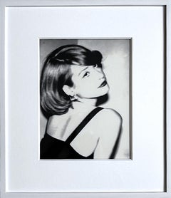
Nicola (Nicky) Weymouth, unique acetate positive of British socialite provenance
By Andy Warhol
Located in New York, NY
Andy Warhol
Nicola (Nicky) Weymouth, ca. 1976
Acetate positive, acquired directly from Chromacomp, Inc. Andy Warhol's printer in the 1970s. Accompanied by a Letter of Provenance from the representative of Chromacomp
Unique
Frame included:
Elegantly framed in a museum quality white wood frame with UV plexiglass:
Measurements:
Frame:
18 x 15.5 x 1.5 inches
Acetate:
11 x 8 inches
This is the original, unique photographic acetate positive taken by Andy Warhol as the basis for his portrait of Nicky Weymouth, that came from Andy Warhol's studio, The Factory to his printer. It was acquired directly from Chromacomp, Inc. Andy Warhol's printer in the 1970s. It is accompanied by a Letter of Provenance from the representative of Chromacomp. This is one of the images used by Andy Warhol to create his iconic portrait of the socialite Nicola Samuel Weymouth, also called Nicky Weymouth, Nicky Waymouth, Nicky Lane Weymouth or Nicky Samuel. Weymouth (nee Samuel) was a British socialite, who went on to briefly marry the jewelry designer Kenneth Lane, whom she met through Warhol. This acetate positive is unique, and was sent to Chromacomp because Warhol was considering making a silkscreen out of this portrait. As Bob Colacello, former Editor in Chief of Interview magazine (and right hand man to Andy Warhol), explained, "many hands were involved in the rather mechanical silkscreening process... but only Andy in all the years I knew him, worked on the acetates." An acetate is a photographic negative or positive transferred to a transparency, allowing an image to be magnified and projected onto a screen. As only Andy worked on the acetates, it was the last original step prior to the screenprinting of an image, and the most important element in Warhol's creative process for silkscreening. Warhol realized the value of his unique original acetates like this one, and is known to have traded the acetates for valuable services. This acetate was brought by Warhol to Eunice and Jackson Lowell, owners of Chromacomp, a fine art printing studio in NYC, and was acquired directly from the Lowell's private collection. During the 1970s and 80s, Chromacomp was the premier atelier for fine art limited edition silkscreen prints; indeed, Chromacomp was the largest studio producing fine art prints in the world for artists such as Andy Warhol, Leroy Neiman, Erte, Robert Natkin, Larry Zox, David Hockney and many more. All of the plates were done by hand and in some cases photographically. Famed printer Alexander Heinrici worked for Eunice & Jackson Lowell at Chromacomp and brought Andy Warhol in as an account. Shortly after, Warhol or his workers brought in several boxes of photographs, paper and/or acetates and asked Jackson Lowell to use his equipment to enlarge certain images or portions of images. Warhol made comments and or changes and asked the Lowells to print some editions; others were printed elsewhere. Chromacomp Inc. ended up printing Warhol's Mick Jagger Suite and the Ladies & Gentlemen Suite, as well as other works, based on the box of photographic acetates that Warhol brought to them. The Lowell's allowed the printer to be named as Alexander Heinrici rather than Chromacomp, since Heinrici was the one who brought the account in. Other images were never printed by Chromacomp- they were simply being considered by Warhol.
Warhol left the remaining acetates with Eunice and Jackson Lowell. After the Lowells closed the shop, the photographs were packed away where they remained for nearly a quarter of a century. This work is exactly as it was delivered from the factory. Unevenly cut by Warhol himself. This work is accompanied by a signed letter of provenance from the representative of Chromacomp, Andy Warhol's printer for many of his works in the 1970s.
About Andy Warhol:
Isn’t life a series of images that change as they repeat themselves?
—Andy Warhol
Andy Warhol’s (1928–1987) art encapsulates the 1960s through the 1980s in New York. By imitating the familiar aesthetics of mass media, advertising, and celebrity culture, Warhol blurred the boundaries between his work and the world that inspired it, producing images that have become as pervasive as their sources.
Warhol grew up in a working-class suburb of Pittsburgh. His parents were Slovak immigrants, and he was the only member of his family to attend college. He entered the Carnegie Institute of Technology (now Carnegie Mellon University) in 1945, where he majored in pictorial design. After graduation, he moved to New York with fellow student Philip Pearlstein and found steady work as a commercial illustrator at several magazines, including Vogue, Harper’s Bazaar, and the New Yorker. Throughout the 1950s Warhol enjoyed a successful career as a commercial artist, winning several commendations from the Art Directors Club and the American Institute of Graphic Arts. He had his first solo exhibition at the Hugo Gallery in 1952, showing drawings based on the writings of Truman Capote; three years later his work was included in a group show at the Museum of Modern Art for the first time.
The year 1960 marked a turning point in Warhol’s prolific career. He painted his first works based on comics and advertisements, enlarging and transferring the source images onto canvas using a projector. In 1961 Warhol showed these hand-painted works, including Little King (1961) and Saturday’s Popeye (1961), in a window display at the department store Bonwit Teller; in 1962 he painted his famous Campbell’s Soup Cans, thirty-two separate canvases, each depicting a canned soup of a different flavor. Soon after, Warhol began to borrow not only the subject matter of printed media, but the technology as well. Incorporating the silkscreen technique, he created grids of stamps, Coca-Cola bottles, shipping and handling labels, dollar bills, coffee labels...
Category
1970s Pop Art Black and White Photography
Materials
Photographic Film
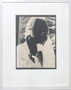
Ivan Karp
By Andy Warhol
Located in New York, NY
Andy Warhol
Portrait of Ivan Karp, ca. 1975
Acetate negative acquired directly from Chromacomp, Inc. Andy Warhol's printer in the 1970s.
Accompanied by Letter of Provenance from the...
Category
1970s Pop Art Black and White Photography
Materials
Photographic Paper
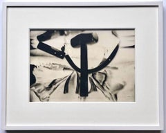
Hammer & Sickle, acetate of iconic image, given by Warhol to Chromacomp Inc.
By Andy Warhol
Located in New York, NY
Andy Warhol
Hammer & Sickle, 1976
Acetate negative acquired directly from Chromacomp, inc. Andy Warhol's printer in the 1970s. accompanied by a signed letter of provenance from the r...
Category
1970s Pop Art Black and White Photography
Materials
Mixed Media, Photographic Paper, Photographic Film
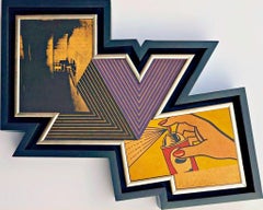
Richard Pettibone The Appropriation Warhol, Stella, Lichtenstein, Unique Signed
By Richard Pettibone
Located in New York, NY
Richard Pettibone
The Appropriation Print Andy Warhol, Frank Stella, Roy Lichtenstein, 1970
Silkscreen in colors on masonite board (unique variant on sculpted board)
Hand-signed by artist, Signed and dated on the front (see close up image)
Bespoke frame Included
This example of Pettibone's iconic Appropriation Print is silkscreened on masonite board rather than paper, giving it a different background hue, and enabling it work to be framed so uniquely.
The Appropriation print is one of the most coveted prints Pettibone ever created ; the regular edition is on a full sheet with white background; the present example was silkscreened on board, allowing it to be framed in 3-D. While we do not know how many examples of this graphic work Pettibone created, so far the present work is the only one example we have ever seen on the public market since 1970. (Other editions of The Appropriation Print have been printed on vellum, wove paper and pink and yellow paper.)
This 1970 homage to Andy Warhol, Frank Stella and Roy Lichtenstein exemplifies the type of artistic appropriation he was engaging in early on during the height of the Pop Art movement - long before more contemporary artists like Deborah Kass, Louise Lawler, etc. followed suit.
This silkscreen was in its original 1970 vintage period frame; a bespoke custom hand cut black wood outer frame was subsequently created especially to house the work, giving it a distinctive sculptural aesthetic.
Measurements:
Framed 14.5 inches vertical by 18 inches horizontal by 2 inches
Work
13 inches vertical by 16.5 inches horizontal
Richard Pettibone biography:
Richard Pettibone (American, b.1938) is one of the pioneering artists to use appropriation techniques. Pettibone was born in Los Angeles, and first worked with shadow boxes and assemblages, illustrating his interest in craft, construction, and working in miniature scales. In 1964, he created the first of his appropriated pieces, two tiny painted “replicas” of the iconic Campbell’s soup cans by Andy Warhol (American, 1928–1987). By 1965, he had created several “replicas” of paintings by American artists, such as Warhol, Roy Lichtenstein (1923–1997), Ed Ruscha (b.1937), and others, among them some of the biggest names in Pop Art. Pettibone chose to recreate the work of leading avant-garde artists whose careers were often centered on themes of replication themselves, further lending irony to his work. Pettibone also created both miniature and life-sized sculptural works, including an exact copy of Bicycle Wheel by Marcel Duchamp (French, 1887–1968), and in the 1980s, an entire series of sculptures of varying sizes replicating the most famous works of Constantin Brancusi (Romanian, 1876–1957). In more recent years, Pettibone has created paintings based on the covers of poetry books by Ezra Pound, as well as sculptures drawn from the grid compositions of Piet Mondrian (Dutch, 1872–1944). Pettibone straddles the lines of appropriation, Pop, and Conceptual Art, and has received critical attention for decades for the important questions his work raises about authorship, craftsmanship, and the original in art. His work has been exhibited at the Institute for Contemporary Art in Philadelphia, the Museum of Modern Art in New York, the Museum of Contemporary Art in Miami, and the Laguna Art Museum in Laguna Beach, CA. Pettibone is currently based in New York.
"I wished I had stuck with the idea of just painting the same
painting like the soup can and never painting another painting.
When someone wanted one, you would just do another one.
Does anybody do that now?"
Andy Warhol, 1981
Since the mid-1960s, Richard Pettibone has been making
hand-painted, small-scale copies of works by other artists — a
practice due to which he is best known as a precursor of appropriation art — and for a decade now, he has been revisiting subjects from across his career. In his latest exhibitions at
Castelli Gallery, Pettibone has been showing more of the “same”
paintings that had already been part of his 2005–6 museum retrospective,1
and also including “new” subject matter drawn from
his usual roster of European modernists and American postwar
artists. Art critic Kim Levin laid out some phases of the intricate spectrum from copies to repetitions in her review of the
Warhol-de Chirico showdown, a joint exhibition at the heyday
of appropriation art in the mid-1980s when Warhol’s appropriations of de Chirico’s work effectively revaluated “the grand
old auto-appropriator”.
Upon having counted well over a dozen
Disquieting Muses by de Chirico, Levin speculated: “Maybe he
kept doing them because no one got the point. Maybe he needed the money. Maybe he meant it when he said his technique
had improved, and traditional skills were what mattered.”
On
the other side, Warhol, in her eyes, was the “latter-day exemplar
of museless creativity”.
To Pettibone, traditional skills certainly
still matter, as he practices his contemporary version of museless creativity. He paints the same painting again and again,
no matter whether anybody shows an interest in it or not. His
work, of course, takes place well outside the historical framework of what Levin aptly referred to as the “modern/postmodern wrestling match”,
but neither was this exactly his match
to begin with.
Pettibone is one of appropriation art’s trailblazers, but his diverse
selection of sources removes from his work the critique of the
modernist myth of originality most commonly associated with
appropriation art in a narrow sense, as we see, for example, in
Sherrie Levine’s practice of re-photographing the work of Walker
Evans and Edward Weston. In particular, during his photorealist
phase of the 1970s, Pettibone’s sources ranged widely across
several art-historical periods. His appropriations of the 1980s
and 1990s spanned from Picasso etchings and Brancusi sculptures to Shaker furniture and even included Ezra Pound’s poetry.
Pettibone has professed outright admiration for his source artists, whose work he shrinks and tweaks to comic effect but, nevertheless, always treats with reverence and care. His response
to these artists is primarily on an aesthetic level, owing much
to the fact that his process relies on photographs. By the same
token, the aesthetic that attracts him is a graphic one that lends
itself to reproduction. Painstakingly copying other artists’ work by hand has been a way of making
it his own, yet each source is acknowledged in
his titles and, occasionally, in captions on white
margins that he leaves around the image as an
indication that the actual source is a photographic image. The enjoyment he receives in copying
is part of the motivation behind doing it, as is
the pleasure he receives from actually being with
the finished painting — a considerable private
dimension of his work. His copies are “handmade
readymades” that he meticulously paints in great quantities in his studio upstate in New York; the commitment
to manual labor and the time spent at material production has
become an increasingly important dimension of his recent work.
Pettibone operates at some remove from the contemporary art
scene, not only by staying put geographically, but also by refusing to recoup the simulated lack of originality through the
creation of a public persona.
In so doing, Pettibone takes a real
risk. He places himself in opposition to conceptualism, and he is
apprehensive of an understanding of art as the mere illustration
of an idea. His reading of Marcel Duchamp’s works as beautiful
is revealing about Pettibone’s priorities in this respect.
When
Pettibone, for aesthetic pleasure, paints Duchamp’s Poster for
the Third French Chess...
Category
1970s Pop Art Abstract Prints
Materials
Masonite, Pencil, Screen
Untitled, from the Art Against AIDS Portfolio
Located in New York, NY
Gael Stack
Untitled, from the Art Against AIDS Portfolio, 1988
Woodcut on paper with deckled edges. Hand signed. Numbered. Printer's and Publisher's Blindstamp. Unframed.
Hand signed and numbered on the lower recto (front) with printer's and publisher's blindstamp. Edition 38/50
20 × 15 inches
Publisher
Little Egypt Enterprises, Houston, TX
Provenance
Art Against AIDS Portfolio, numbered 38/50
This beautiful limited edition woodcut by Gael Stack was published in 1988 as part of the Art Against Aids portfolio, numbered 38/50. Superb provenance as it is was acquired from the original Art Against AIDS Portfolio published in Houston, Texas. This will be the first time the work will be removed from the portfolio. The late 1980s was the height of the AIDS epidemic, and this was one of many efforts by the creative community to raise funds to assist in fighting this deadly scourge that disproportionately affected the artistic community.
Measurements:
20 x 15 inches (sheet)
8 1/4 x 12 inches(image)
The complete Art Against AIDS Portfolio is comprised of 10 prints, in black and white and color, from 10 artists.
About Gael Stack:
Gael Stack is a Texas painter. She lives in Houston and has work in the permanent collections of several museums. Stack has worked as a professor at the University of Houston...
Category
1980s Contemporary Figurative Prints
Materials
Woodcut, Pencil
You May Also Like
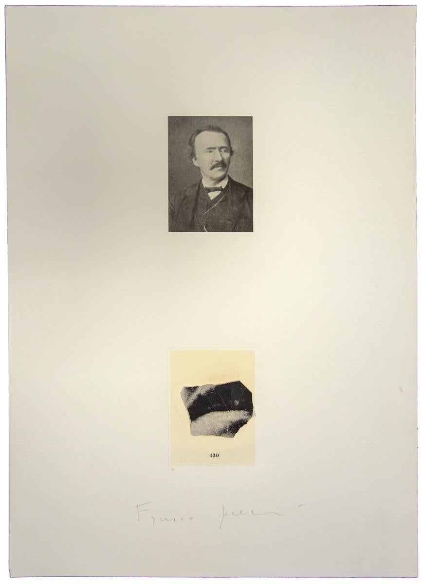
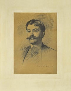
Portrait - Vintage Offset Print by Franco Sarnari - 1970s
By Franco Sarnari
Located in Roma, IT
Portrait is a vintage offset print realized by Franco Sarnari.
Hand-signed in pencil.
Good conditions.
Realized with precise strokes, the work represents a Portrait and fragment ...
Category
1970s Contemporary Figurative Prints
Materials
Offset
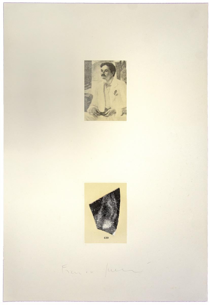
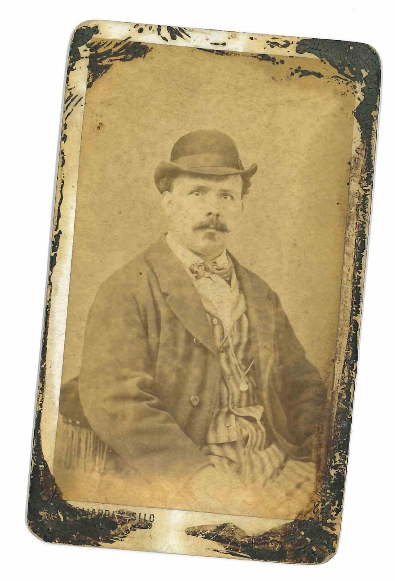
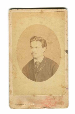
Historical Photo - Portrait - Vintage Photo - 19th Century
Located in Roma, IT
Historical Photo - Portrait is a vintage photo, realized in the late 19th Century by Fermanelli & Betti Studio. .
The artwork is a well-balanced composition.
Category
19th Century Modern Figurative Photography
Materials
Photographic Paper
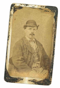
Portrait - The Old Days - The Early 20th century
Located in Roma, IT
Portrait- The Old Days is a black and white vintage photo, silver salt print, realized in the early 20th century.
It belongs to historical album including historical moment, royal ...
Category
1910s Modern Figurative Photography
Materials
Photographic Paper
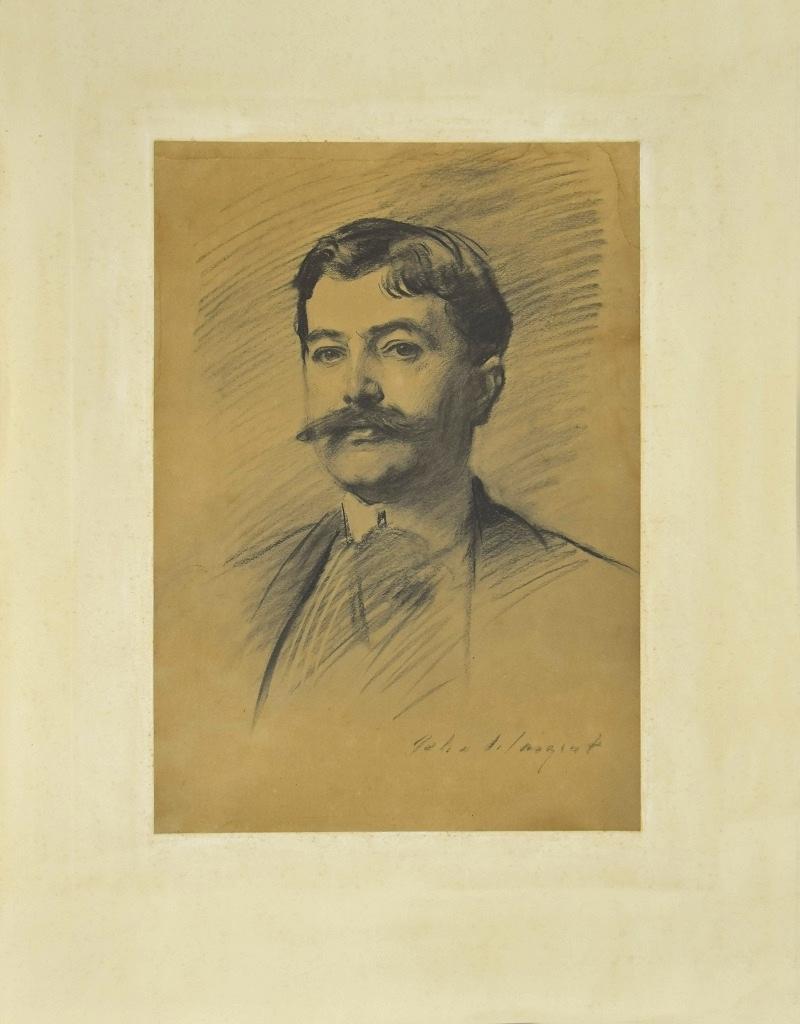
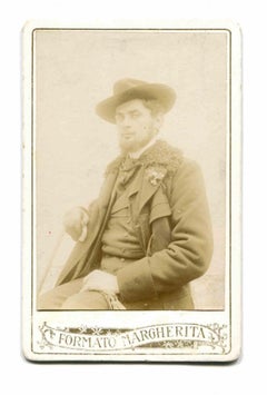
Portrait of a Man - Phototype Print Late 19th Century
Located in Roma, IT
Portrait of a Man is a wonderful phototype print realized in the second half of XIX century.
Signed on the lower right margin.
Fair conditions, with a browing of paper due to the t...
Category
Late 19th Century Modern Figurative Prints
Materials
Photogravure
Historical Photo - Portrait of Aurelio Mistruzzi - Early 20th Century
Located in Roma, IT
Historical Photo - Portrait of Aurelio Mistruzzi is a vintage photo, realized in the Early - 20th Century .
The artwork is a well-balanced composition.
Category
Early 20th Century Modern Figurative Photography
Materials
Photographic Paper
More Ways To Browse
Velvet Framed Art
Vintage Cork Art
Andy Warhol Record
Andy Warhol 1976
Coca Cola Vintage Art
The Last Supper Art
Chelsea Plate
David Hockney Studio
Basquiat Record
American Atelier At Home
Vogue Mirror
Clemente Francesco
Andy Warhol Bill
Writers Block
Jean Michel Basquiat Record Art
Italian Display Case 1970
1970s Printed Mirror
Erte Screen