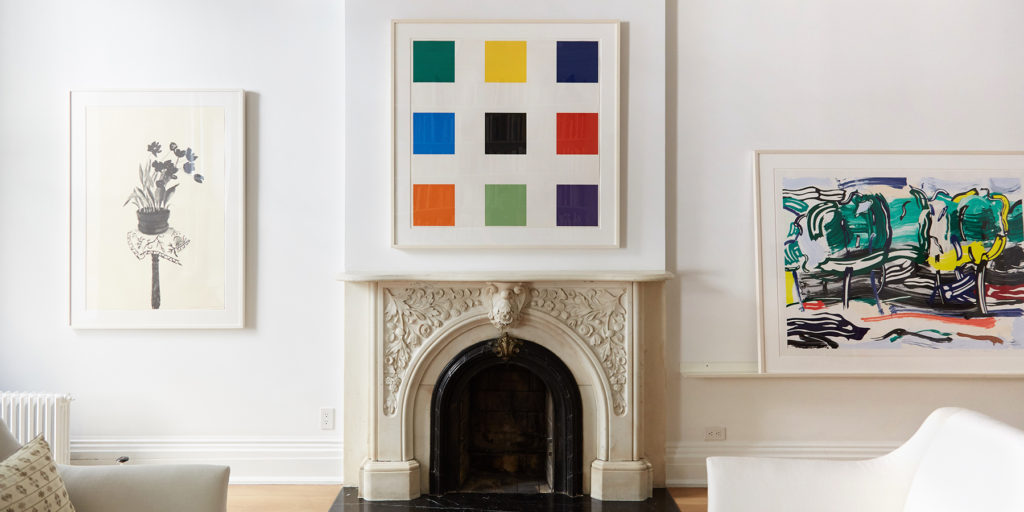

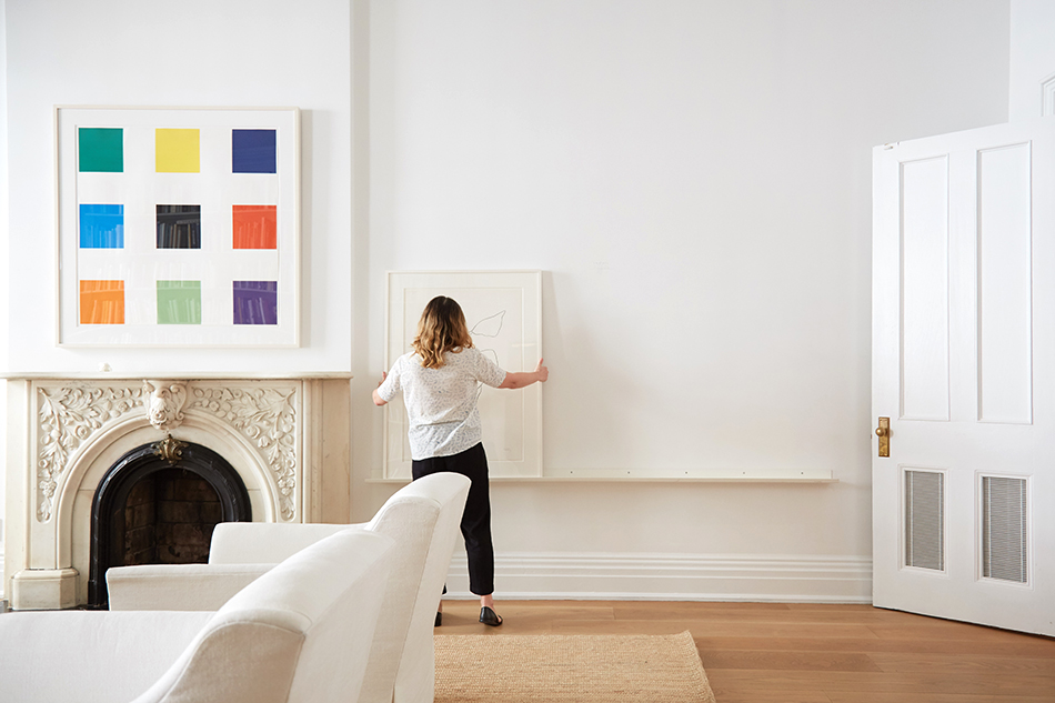
For more than 30 years, New York dealer Susan Sheehan has made modern prints and works on paper her specialty. Today, she focuses especially on what she calls “the greatest hits of post-war American art.” These include pieces by Ellsworth Kelly and Roy Lichtenstein, whose respective works Nine Squares, 1977, and Road Before the Forest, 1985, can be seen at top, hanging above and to the right of the fireplace. David Hockney‘s Black Tulips, 1980, hangs to the left.
October 31, 2016Dealer Susan Sheehan — a specialist in prints and works on paper who will show this week at New York’s International Art Fair for Prints & Editions, the annual extravaganza organized by the International Fine Print Dealers Association (IFPDA) — has seen many changes since she opened her first gallery, on the Upper East Side of Manhattan, in 1985. “It was a very different time in the art world,” she says now.
Sheehan got into the business in the normal way — “Desperation,” she deadpans. “I was living in New York as a recent college graduate without a job, and a position in an art gallery sounded like a good idea.” (It no doubt helped that her parents were collectors, mostly of 20th-century American art, including works by Stuart Davis and Andy Warhol.)
After graduating from Barnard, Sheehan lucked into a job at the now-closed American art specialist Kennedy Galleries. “At the time, Kennedy Galleries was the preeminent print dealer in America,” she recalls. “The gallery was one of the oldest in the country and its holdings were immense. We were visited by top museum curators and important collectors from all over the world. Who wouldn’t be hooked for life after that early introduction?”
Sheehan left Kennedy in 1985, becoming a player in the second wave of female dealers to strike out on their own, in the late 1970s and early ’80s. These gallerists — who include the likes of Mary Boone, Barbara Gladstone, Paula Cooper and Marian Goodman — brought their own unique perspectives on artists to the market.

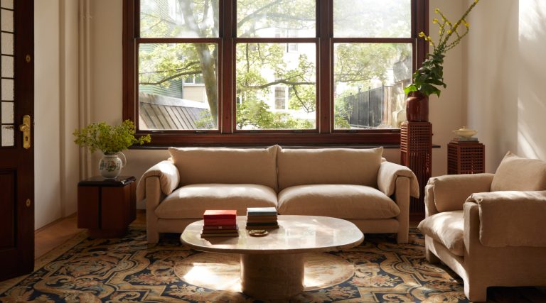
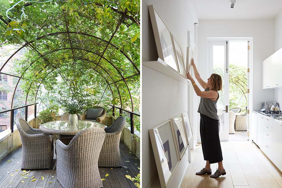
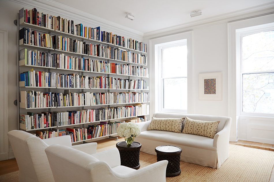
Sheehan lives and works out of a 19th-century brownstone near Gramercy Park. Built in 1850, it was later renovated by the Herter Brothers architects, stalwarts of the Aesthetic Movement in New York.
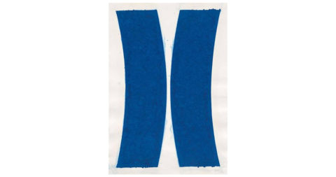
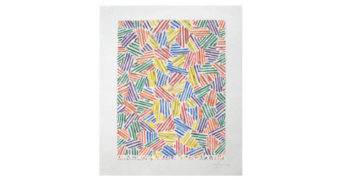
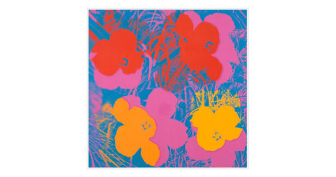
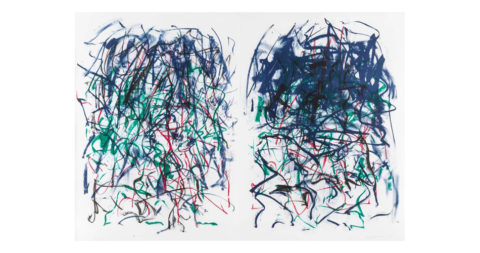
The determined and forthright Sheehan was no exception. Having left Kennedy, she wanted to stick with prints but in her own way, with a more modern spin. Over the years, she has moved from early-20th-century art to later works. Now, her core artists are what she calls “the greatest hits of post-war American art.” She puts particular emphasis on Pop and minimalist prints and works on paper, including those by such heavy hitters as Warhol, Ellsworth Kelly, Joan Mitchell, Bruce Nauman, Agnes Martin, Roy Lichtenstein, Jasper Johns and Louise Bourgeois.
Her business has had different homes over the years, but these days, she’s based near Gramercy Park, in an 1850 brownstone that she owns and also calls home. The gallery’s location on an upper floor of the building — whose façade and grand interiors were redone by the famed Herter Brothers architects at the end of the 19th century — gives her works a full and rich residential setting. She operates on a by-appointment-only basis, with a large selection of pieces readily available to collectors.
Ask Sheehan about the biggest change she’s seen over her three-plus decades of dealing in this material, and she’s got a ready answer: “Today, a great deal of our business is generated on the Internet,” including her 1stdibs storefront, she says. “I would say that it’s probably sixty to seventy percent of our annual sales. I absolutely, positively never could have imagined that when I started.”
There’s also been a shift in who her buyers are. “We are doing an enormous amount of business with art consultants and decorators,” says Sheehan, who works with a staff of three. “Something like an art consultant was probably unheard of in the nineteen eighties, unless it was a big corporate art collection.”

In Sheehan’s inventory storeroom, Lichtenstein’s Crying Girl, 1963, leans against shelves containing small-scale framed works.
Beyond the gallery itself, Sheehan puts her best foot forward when showing her wares at fairs. These venues are especially important since she doesn’t have a public exhibition program. She was a founding member of the IFPDA more than 25 years ago, and the association’s New York fair — running this week from November 2 to 7 at the Park Avenue Armory — is one of the most important of the year for her. “That show tends to be very museum-centric. There are a lot of curators who come,” she says. “It’s a fair with a very broad range of material on display.”
Sheehan knows she has to up her game for this seasoned clientele. “I would not bring a standard-issue Warhol print,” she says. “I might bring a really rare, hand-colored Bourgeois from the nineteen sixties, though.”
Partly because prints are multiples, and partly because she’s a careful, detail-oriented type, Sheehan spends a lot of her time sifting through material. “I’m not a gallery that has a roster of artists to take things on consignment,” she says. “Since I buy all of my inventory, I have to really pick and choose. If I have to think about it, I probably look at eight to ten thousand prints a year, and we probably buy three hundred.”
Of course, the image itself — that is, the subject depicted — is vital. But when it comes to the crucial criteria for judging a print worthy of collecting, Sheehan is adamant that “condition is number one, condition is number two, and condition is number three.”

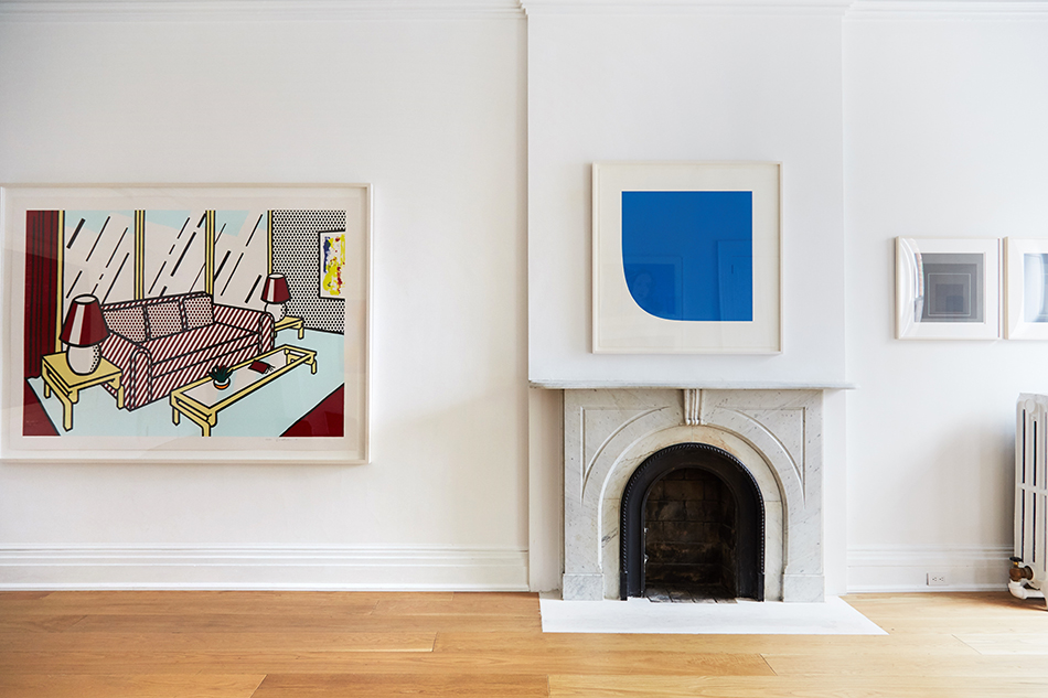
Kelly’s lithograph Light Blue with Orange, 1965, glows between two of the gallery’s large windows.
She considers ignoring such factors as “faded colors, large tears, trimmed margins and untreatable stains” the most common mistake made by beginning collectors. “I can’t tell you the number of times that clients show me things that they bought at auction — they think it was such a great deal because it was so cheap. But it’s something I wouldn’t have bought in a million years.”
The presence of forgeries in the market, meanwhile, requires “you to really know what you’re doing,” she cautions. “It’s amazing the number of unbelievably good fakes there are out there, particularly of things like Lichtenstein, Warhol and Joan Mitchell.”
Currently, Sheehan is seeing new opportunities with collectors across the globe. “I would say we have a lot more European inquiries than before,” she says. “We tend to get Asian business, especially from Japan and Korea.” That may be attributable, she adds, to the fact that “some of the most beautiful prints ever were made in Japan.”
Given the astonishing rise in art prices over the last decades, Sheehan is bullish about prints. She believes they will always have a place for buyers, from tentative beginners to seasoned pros who want to round out a collection. Value, she finds, matters to both groups.
“You’re getting real art by important artists,” she says of the medium’s lasting allure, “and it’s in more people’s price range than a multimillion dollar painting.”
Certainly, Sheehan is confident she found her calling. “I don’t ever remember really wanting to do anything else as a career except be surrounded by art and artists,” she says. “I’m a deeply visual person who happens to have a keen interest in the business of art too. Being an art dealer is the perfect synthesis.”
Talking Points
Susan Sheehan shares her thoughts on a few choice pieces.