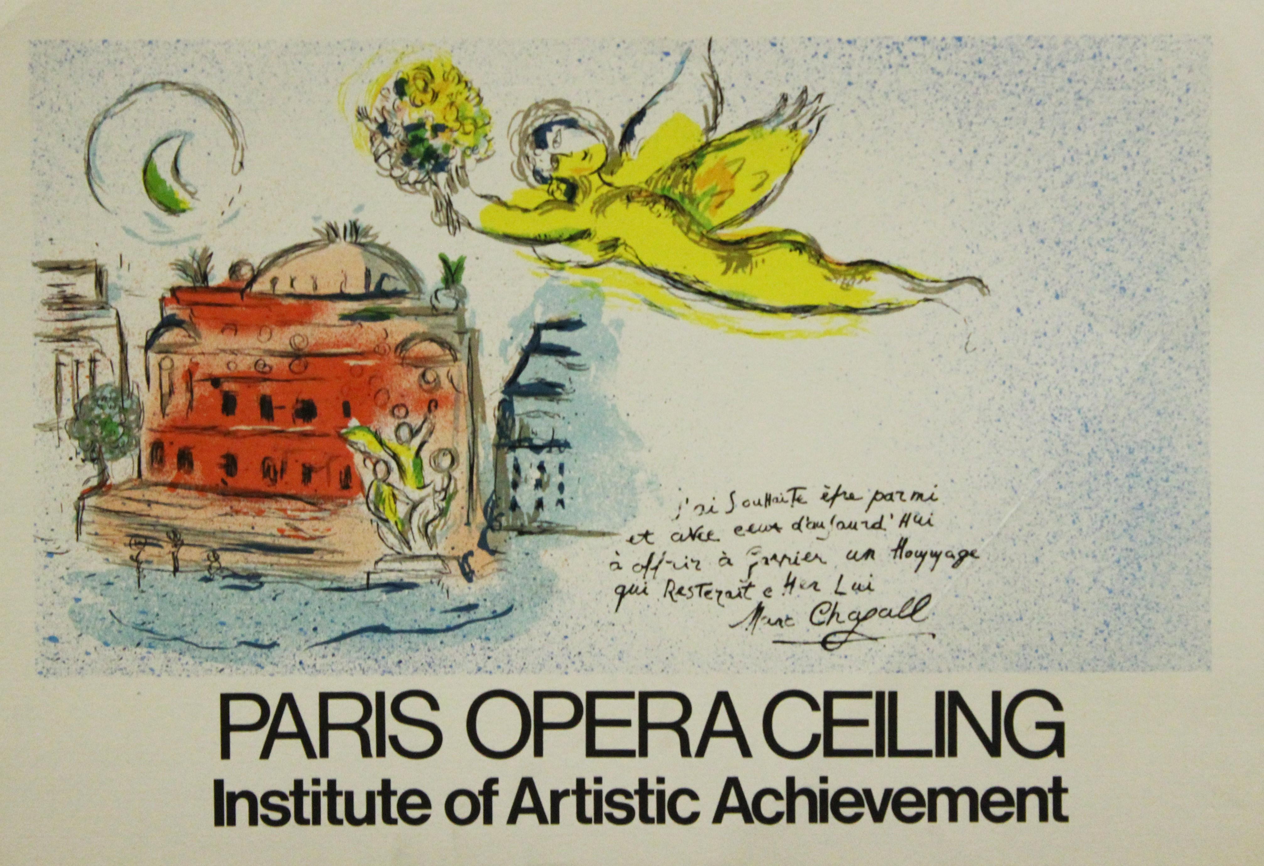
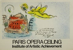
Ceiling of the Paris Opera House
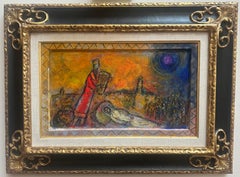
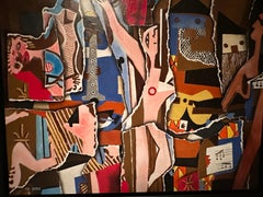
This is a print made by Center Art Galleries-Hawaii, Inc. You can google their name to get a sense of the litigation surrounding this manufacturer, who made prints and passed them off as real.
The value is in the beautiful framing. Please note the shipping cost as the piece is very large (frame is 47" x 47").
In 1960, the Minister of Cultural Affairs André Malraux made what in those days was the bold as well as spectacular gesture of commissioning Marc Chagall to paint a new ceiling for the Opéra. True, there was a recent precedent, the rather unsuccessful ceiling painted for the Louvre’s Salle Henri II by George Braque in 1952. And in fact, Malraux would follow up the year after and commission André Masson to do a ceiling for the Théâtre de l’Odéon. Was this an attempt to smash open the orderly but closed world created by Charles Garnier. A media coup at a time when the media were taking over the world.
An act of sacrilege. Chagall’s painting now covered the work of another artist, who, like all the pompier (as the nineteenth century academic painters were known), was out of favor. (That said, he would not remain there for long: less than two decades later, Lenepveu’s design was given the honors of the new Musée d’Orsay.) The action was sacrilegious, above all, with regard to Garnier’s principle of harmony, a principle observed by all the artists working under him, and even, to a certain degree, by Carpeaux. But then of corse Garnier was no longer there to safeguard the unity of his palace of dreams.
Chagall’s ceiling did, without a doubt, make the Palais Garnier fashionable again. Just as, twenty years later, Buren’s columns put the spotlight on the Palais-Royal, which Parisians had totally forgotten, and were a great improvement on the car park that had dishonored its cortyard for decades without anyone seeming to care. And just as, thirty years later, Pei’s pyramid made the Louvre an international talking point: not that the museum was lacking in claims to fame, but this relatively marginal architectural intrusion ensured that the “Grand Louvre” programme got plenty of global media coverage. Whatever one may think of their artistic merits, there is no denying that these three “gestures” were highly successful in terms of communication. And that, it would seem, was Malraux’s main concern at the Opéra.
Likewise, all three interventions brought an element of continuity as well as rupture. Pei’s pyramid certainly broke with the Renaissance and Napoleon III facades of the Louvre, but it echoes the obelisk on Place de la Concorde. Buren’s columns clearly continue the colonnade of the Galerie d’Orléans, even if they are truncated and striped; and Chagall’s ceiling, while it incontestably breaks with the harmony of the auditorium, is, in many respects, in profound continuity with Garnier’s work (Chagall was an attentive reader of “Le Nouvel Opéra”).
First of all, with his sharp, fresh hues – his “admirable prismatic colors” (André Breton) – Chagall continues and completes the reintroduction of color, which was so important to Garnier. Chagall’s own gift for color is something he had discovered when he came to Paris: “In Russia everything is dark, brown, grey. When I came to France, I was struck by the shimmering colors, the play of light, and I found what I had been blindly groping for, this refinement of matter and uninhibited color.” In Paris, “things, nature, people were lit up by this ‘light-freedom’ and seemed to bathe in a colored bath.” Moreover, this ceiling completes the Palais Garnier’s “pantheon” of illustrious composers throughout the ages.
It thus adds some of the architect’s contemporaries, such as Wagner .and Berlioz who were “over-looked” in his iconographic program (Verdi was the only living composer to be represented by a statue at the inauguration in 1875). It also introduces some major composers from the late nineteenth and early twentieth centuries, including three from the relatively recent Russian school (unknown in France until Diaghilev’s time). What’s more, Chagall evokes these composers through an “Olympus” of characters from their operas. As readers will recall, “Olympus” was Garnier’s generic term for theatre ceilings.
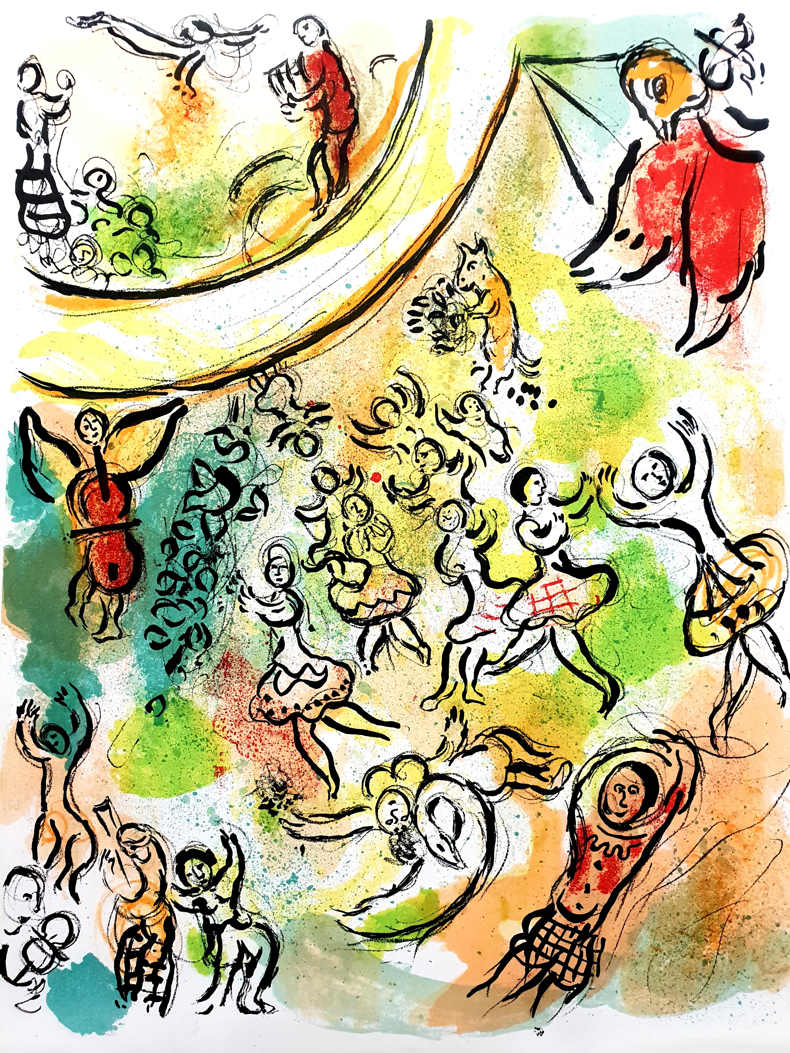
Chagall was a lyric painter, and the correspondence, the sympathy linking his ceiling to Garnier’s building runs deeper that one might think. Chagall’s painting is, to borrow the word used by Guillaume Apollinaire when he first visited the artist’s studio at La Ruche in 1912, “super-natural” (this world would later be replaced by surrealist”), and so is Garnier’s enchanted palace. Chagall’s was a religious, even mystical spirit for whom love was the force that bound together and moved everything in the universe, whose creatures and objects were part of a total motion without top or bottom, gravity or resistance – perfect for painting an opera ceiling!
Even more profoundly, Chagall was drawn to an ideal of total theatre. Already, in his home town of Vitebsk, during his brief spell as director of the Academy of Fine Arts, he scandalised local Communist leaders by getting all the local house painters to help him decorate the place with green cows and flying horses in the celebration of the first anniversary of the October Revolution. And when he worked on the renovated Jewish State Theatre in Moscow, between 1919 and 1921, his vision embraced the whole of the auditorium, so that spectators were surrounded by panels whose designs echoes the sets and costumes on stage. Total theatre, just like Garnier. Like him, Marc Chagall dreamed of a theatre in which setting and action were one.
Chagall refused to be paid for his ceiling. The State covered only the material costs of the work, which was executed between January and August 1964. The painter worked at the Musée des Gobelins, then at the workshop built by Gustav Eiffel at Meudon (it later became an aviation museum) and finally at Vence. Chagall ceiling was inaugurated on 23 September 1964.
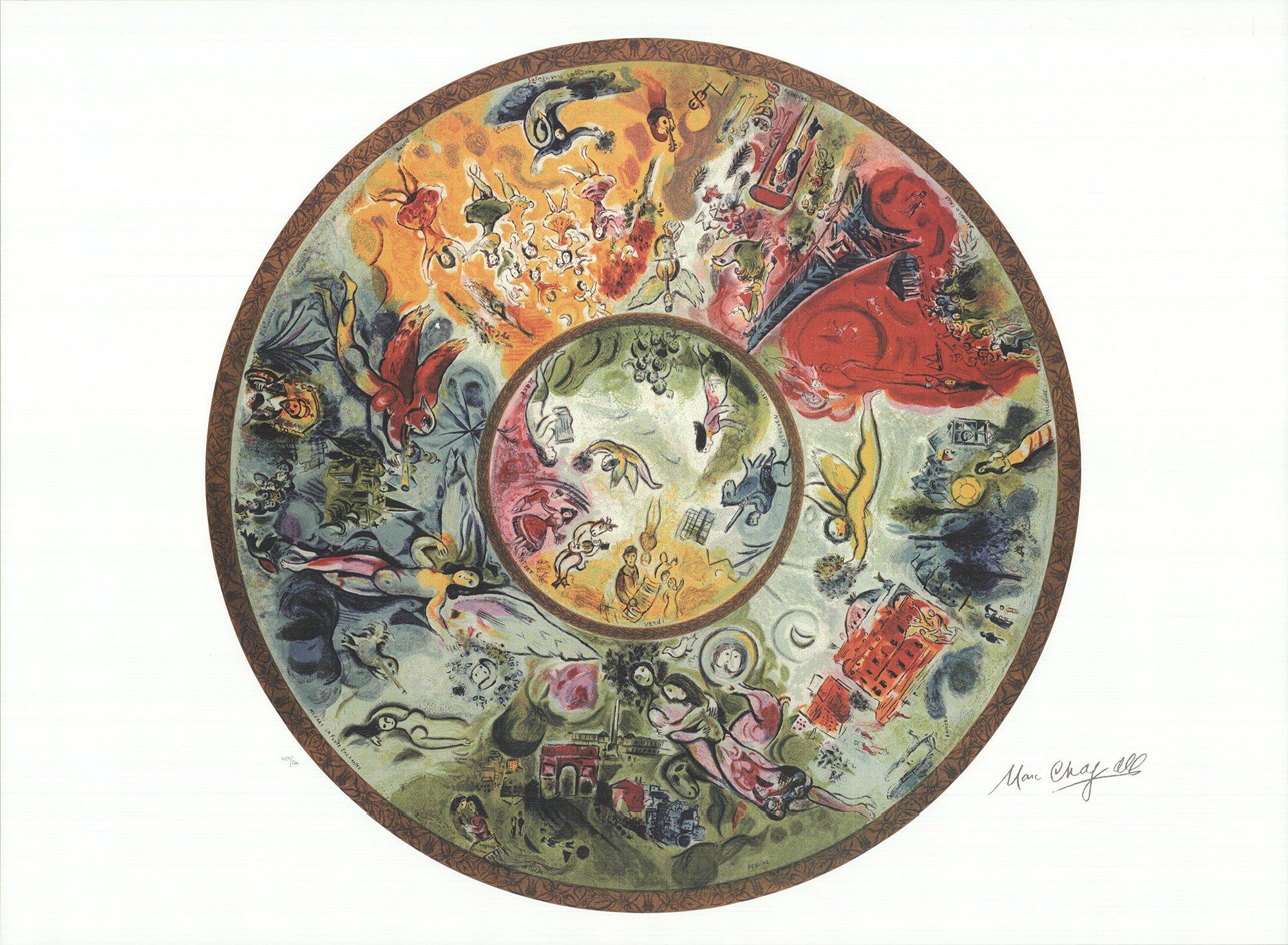
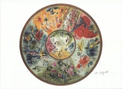
The ceiling consists of twelve canvas panels plus a round central panel totalling about two hundred and forty square metres and mounted on a plastic structure.
CENTRAL PANEL
Going clockwise from stage right, the central panel evokes the following for composers and works:
Bizet, “Carmen”. Dominant color: red. Carmen with the bullring, plus a bull and a guitar.
Verdi, work not specified, possibly “La Traviata”. Dominant color: yellow. Behind a young couple, a bearded man (Germont’s father.) holds a half-unrolled scroll.
Beethoven, “Fidelio”. Dominant colors: blue and green. Leonora’s movement towards the blue cavalier, who brandishes his sword.
Gluck, “Orpheus and Eurydice”. Dominant color: green. Eurydice plays the lyre (Orpheus’s instrument) and an angel proffers flowers.
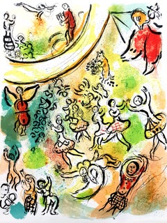
MAIN PANEL
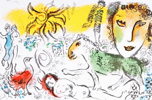
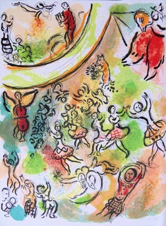
Moussorgski, “Boris Godounov”. Dominant color: blue. In the middle, at the center, the Tsar sits on his throne wearing the insignia of power; above him we see a winged, monster-headed fame and, in green, the city of Moscow; on the right, on the other side of Walter and Borgeois’ “Hebe”, at the center of the scene, the people (Chagall: “I consider the people the most sensitive element of society”).
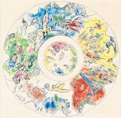
Mozart, “The Magic Flute”. Dominant color: light blue. As in “The Apparition” (1917, Gordeiev Collection, Moscow), a giant angel fills the blue sky while a bird (according to some sorces, a cock), plays the flute. Chagall, who in 1965-1966 designed the sets and costumes for the 1967 Metropolitan Opera production of The Magic Flute, here takes an amiable liberty with the opera, in which the magic instrument is given to Tamino and not to the bird-man Papageno.
Wagner, “Tristan and Isolde”. Dominant color: green. Leaning languorously towards Walter and Borgeois “Daphne”, the couple nestles below the Arc de Triomphe, lit up with the red of passion, and Place de la Concorde, two of Chagall’s favorite subjects, along with other Parisian monuments (“My art needs Paris as a tree needs water,” he wrote).
Berlioz, “Roméo et Juliette”. Dominant color: green. The embracing lovers are seen with a horse’s head and a « character sign » redolent of Chagall’s 1911 painting “The Holy Coachman” (“Le Saint voiturier au-dessus de Vitebsk”, private collection, Krefeld): it ends in a nimbus or glory (.) which frames their faces.
Rameau, work not specified. Dominant color: white. On the illuminated façade of the Palais Garnier, which is also red with passion, Carpeaux’s “The Dance”, covered in gold, takes monumental proportions.
Debussy, “Pelléas et Mélisande”. Dominant color: blue. Lying alongside the head of “Clytia” sculpted by Walter and Borgeois, Pelléas watches Mélisande from the window in a playful reversal of roles (according to Jacques Lasseigne, Chagall endowed his Pelléas with the physiognomy of André Malraux). Above them, a crowed head (King Arkel.).
Ravel, “Daphnis et Chloé”. Dominant color: red. Along with the (blue) sheep and temple of the first act, the extraordinary figure of the Siamese couple (“There was a time when I had two heads / There was a time when these two faces / were coated in amorous dew / And melted like the fragrance of a rose…” – poem by Chagall), which Chagall had already included in the curtain that he painted for the Opéra in 1858, and which can be seen as completing the amorous osmosis begun in “The Walk”, a painting from 1929 showing a couple standing/walking head-to-foot in the street. It is naturally accompanied by a Eiffel Tower, a recurrent motif in Chagall’s paintings. In 1958 Chagall designed the sets and costumes for Georges Skibine’s revisiting of the choreography of “Daphnis et Chloé” [3 In 1961 he illustrated the publisher Tériade’s edition of the original tale, attributed to Longus.
Stravinsky, “The Firebird”. Dominant colors: red, green and blue. In the top left area, the painter (Chagall) with his palette and the bird which, curiously, is green; on the right, an angel musician whose cello is also its body, stands near the magic tree containing the bird. Below are the domes and roofs, no doubt of the magic castle, and a bird, red this time, flying down towards a crowned couple beneath a canopy. To one side, a young married couple, a peasant carrying a big basket of fruit on his head and an orchestra. Should the proximity of the Eiffel Tower (in the Ravel section of the ceiling) be taken as an allusion to “Les Mariés de la Tor Eiffel” (1928). To the right, above the head of Walter and Borgeois’ “Pomona”, a violinist bends lovingly over his instrument. Chagall designed the sets and costumes for the Metropolitan Opera’s production of “The Firebird” in 1945 (choreography by Massine).
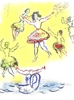
Tchaikovsky, “Swan Lake”. Dominant color: golden yellow. At the bottom, a swan-woman on a blue lake, leaning backwards and holding a bunch of flowers; at the top, a surprising angel-musician, whose head and body are one and the same as its instrument.
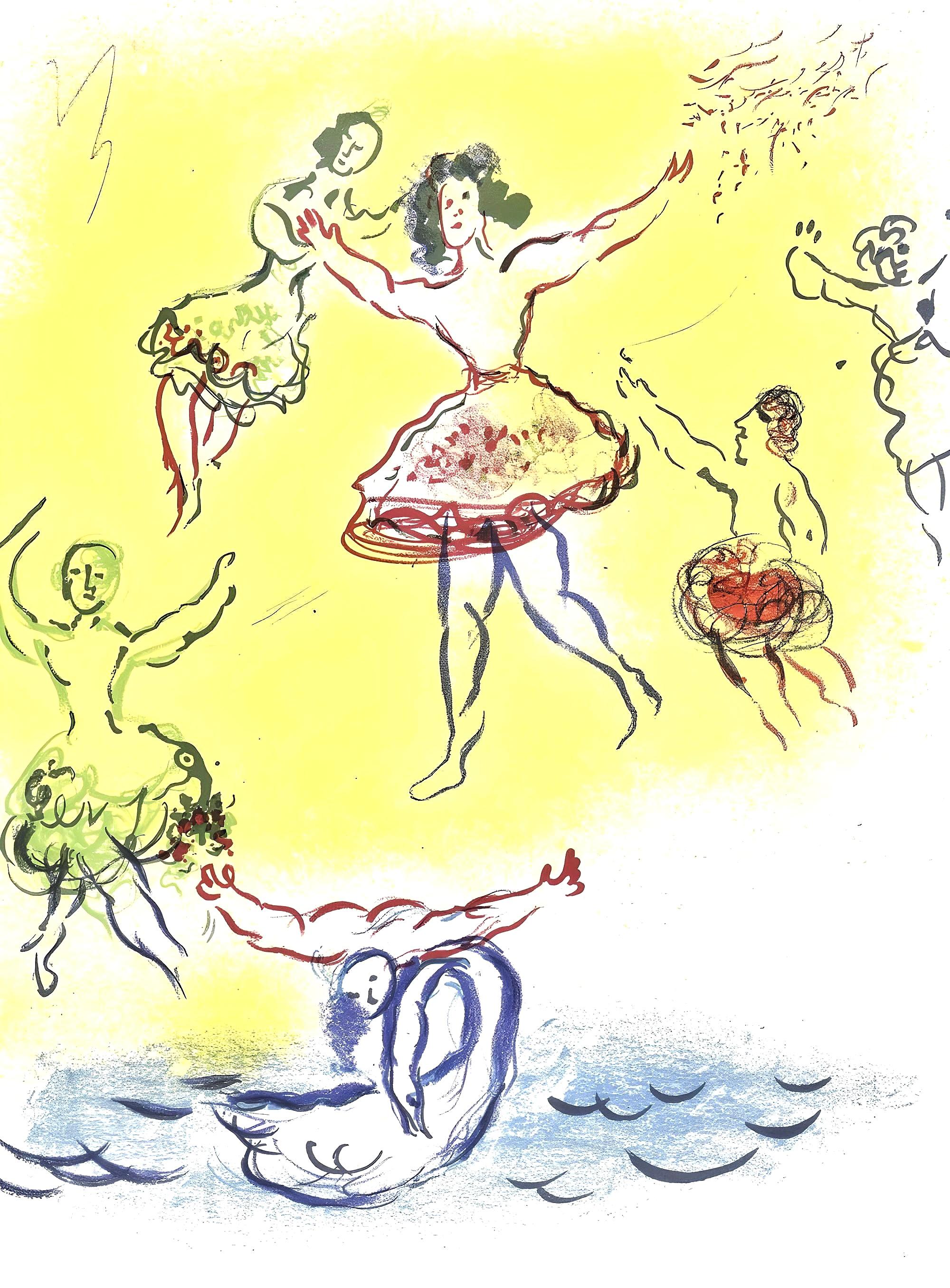
Adam, “Giselle”. Dominant color: golden yellow. The peasants’ dance under the village trees at the end of the first act.