
April 24, 2022“They loved color,” designer Laura Hodges recalls of the clients who purchased this Baltimore loft. “They particularly mentioned purple.” The apartment — a mid-2000s addition to the circa 1866 Canal Street Malt House, which originally stored grain prepared for the city’s breweries — had belonged to the building’s developer.
Purple is many things. It can signify bravery, valor, power and nobility, for instance. But purple is not a color we usually associate with calm. And calm is paramount for Hodges, who proclaims that “home is a sanctuary that can renew us each day” and “support a balanced life.” Most of her projects lean toward subdued white or neutral interiors. “The use of so much color,” she admits, “was a stretch for me.”
Her solution was to allow purple’s building blocks, red and blue (in conjunction with other jewel tones), to inform the predominant palette. Then, she deployed a suite of her signature moves — sustainable reuse, vintage finds, global accents and measured application of pattern — to ground the design in a way that telegraphs warmth and stability. These qualities create a sense of reassurance that establishes its own brand of calm.
“The loft was very industrial,” remembers Hodges. “You could see how everything was put together. There was nothing decorative or pristinely finished.” Part of her directive was to blunt the industrial edge, which she accomplished by, among other tactics, disguising things she could not make go away. Below the pine ceiling, for example, were silver-colored HVAC vents and plumbing. “Painting them black helped them disappear,” she says.
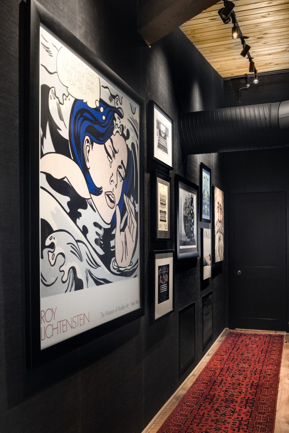
Her clients liked the black grasscloth installed by the developer in the entry and hall that lead into the 3,000-square-foot open-plan space. Hodges, too, appreciated the wallcovering’s dramatic potential. “You enter in the dark, then it opens to light,” she explains. But she added lively graphic punches with a bright red vintage Turkoman runner from Afghanistan and colorful works from the owners’ considerable art collection.
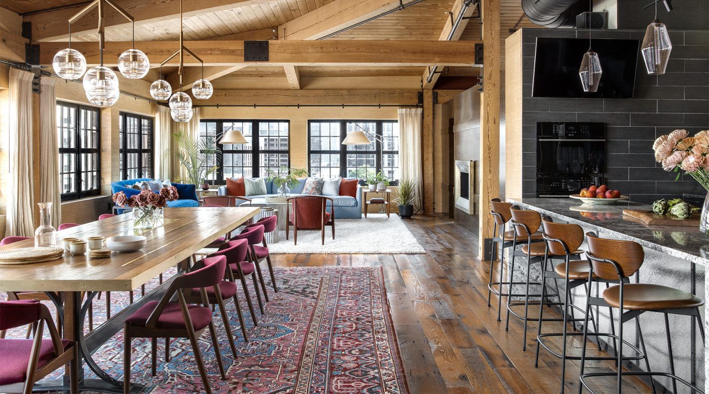
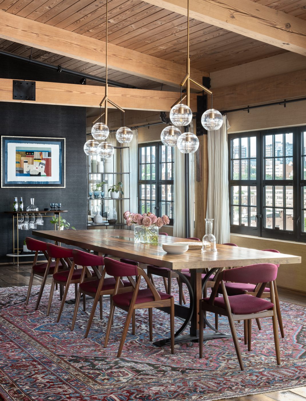
The moody transition space opens to an enormous room flooded with light and views, thanks to equally enormous blackened-steel-framed windows facing south and east. The space is sectioned into three areas: kitchen at right, dining room at left and living room behind that. Rugs anchor the latter two, while an island divides the kitchen.
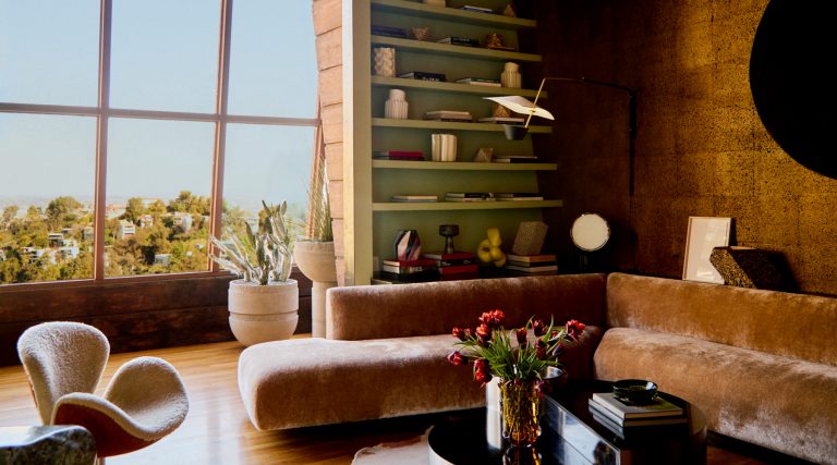
Here, the effects of Hodges’s strategy of creating a sense of warmth and stability are evident. “There’s something settled about it,” she says of the space. “I kept seating low so you feel the horizontality of the space and your eyes go right out to the view.” To emphasize that settled feeling, she explains, “it was important to use a lot of upholstered furniture to soften the space and make it feel cozier.”
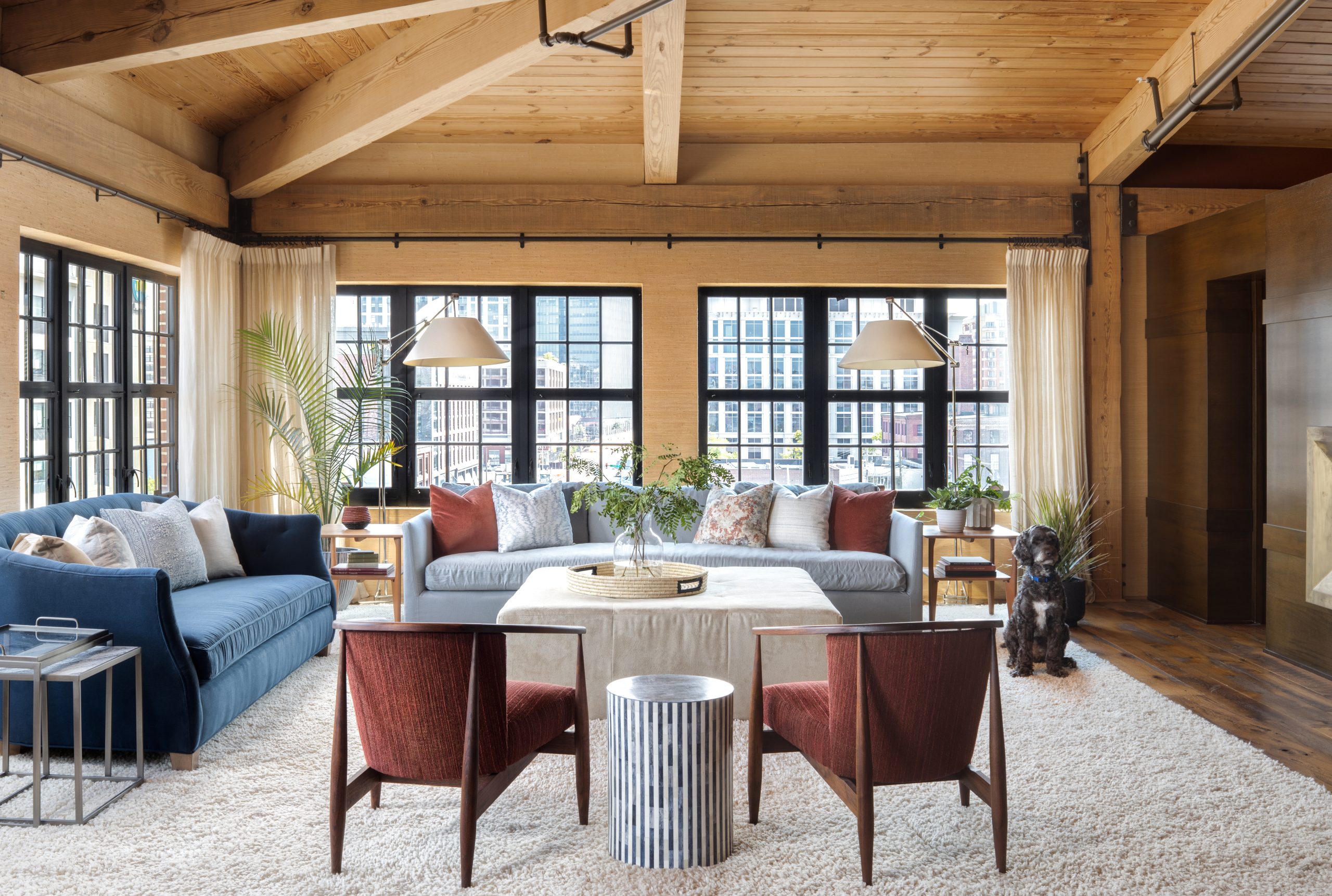
Arranged in front of the windows at the far end of the room are a Lee Industries sofa in sapphire-colored velvet, a linen-and-alpaca-blend Verellen sofa that skews aquamarine and a pair of 1960s Danish chairs that sport a textured cinnabar-toned wool. Picking up on the vintage chic of the chairs, Hodges added 1950s Heywood Wakefield tables. The plush rug underneath is a subtle nod to 1960s shag carpets.
There is a conspicuous lack of pattern. “I like solid blocks of color,” Hodges explains. “It’s bold and impactful, and it’s easy to change. Pattern dates things a little faster.”
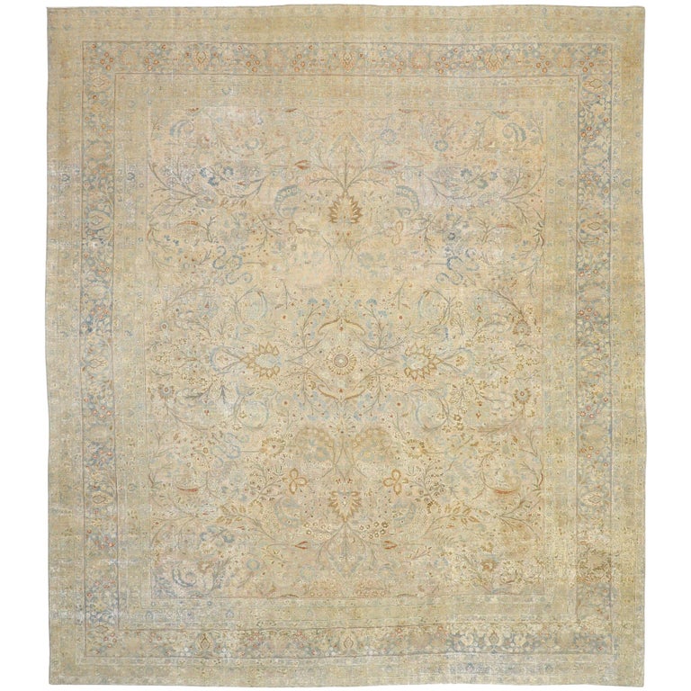
She continued the mid-century vibe in the dining room with 1960s Danish chairs, covered in a garnet Kvadrat wool and placed around a custom wood and steel table that belonged to the home’s former occupant. Above this, Hodges suspended two of Sean Lavin’s Sedona chandeliers for Circa Lighting. Anchoring the space is a 1950s Persian Bakhtiari rug. The use of vintage rugs and furnishings instills a sense of history, Hodges notes, further grounding an apartment that floats five floors above the Baltimore streets.
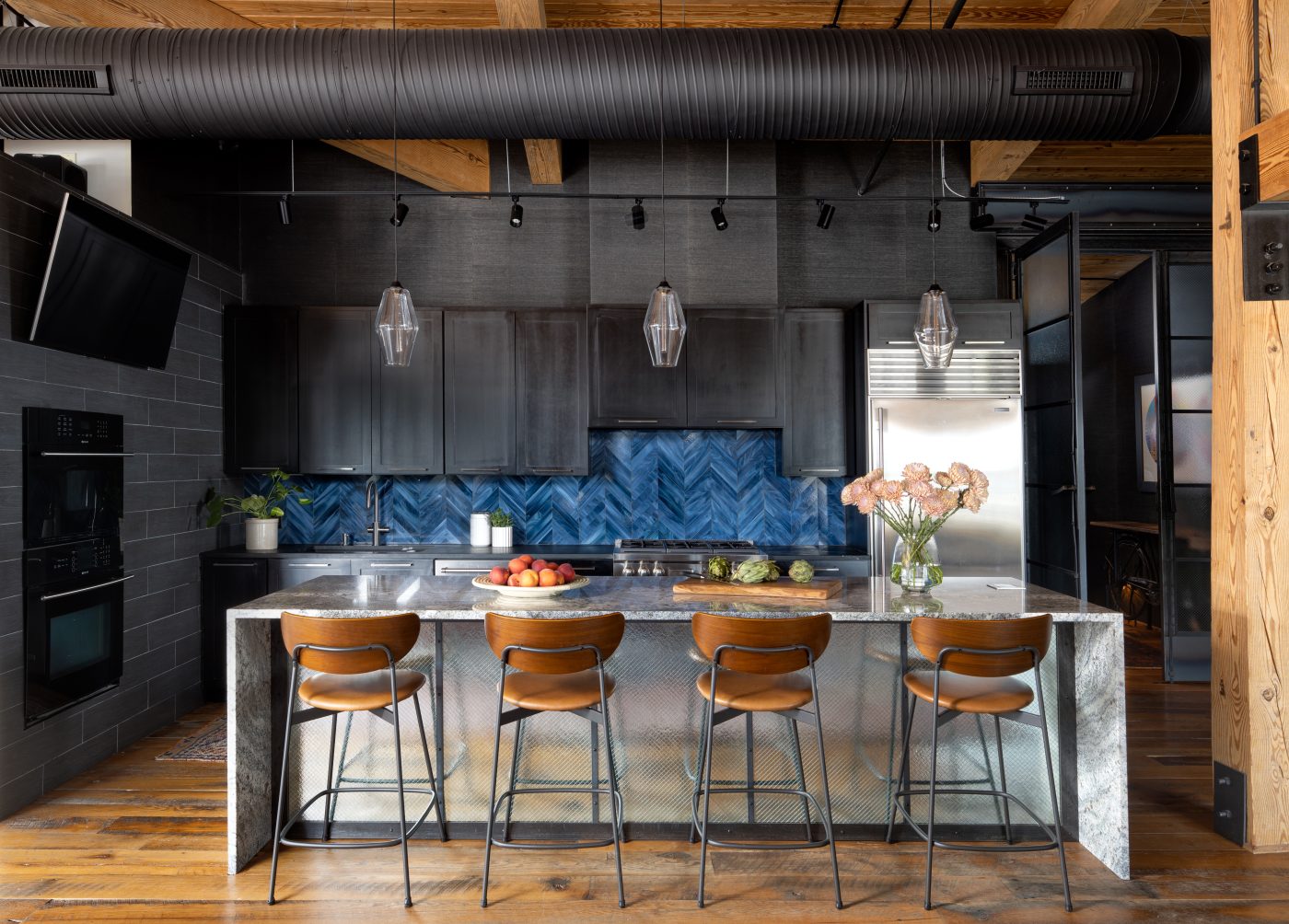
One could say that history informed her choice of blue glass tiles for the kitchen backsplash too. “Those were very much out of my comfort zone,” Hodges concedes. “That blue is so specific. Usually, in a backsplash that you can’t change easily, I would go with a more neutral tone. But the chevron pattern is a universally appealing look and has a timelessness to it. So, we took a chance.”
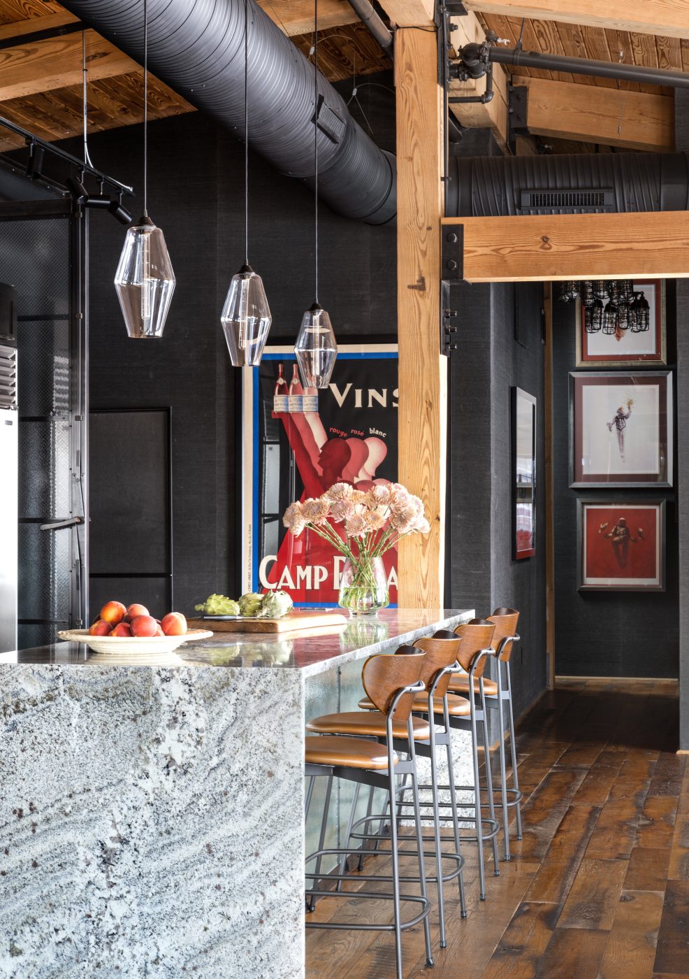
The backsplash also brightens the dark soapstone tiles of the kitchen walls and the black cabinetry the developer had installed. The wood of the island was in bad condition, so she replaced it with a granite top and faced it in a textured steel. Both materials further lighten the architectural envelope of this utilitarian space — the granite with its veined white color, the steel with its reflective qualities — as do the Niche pendants over the island.
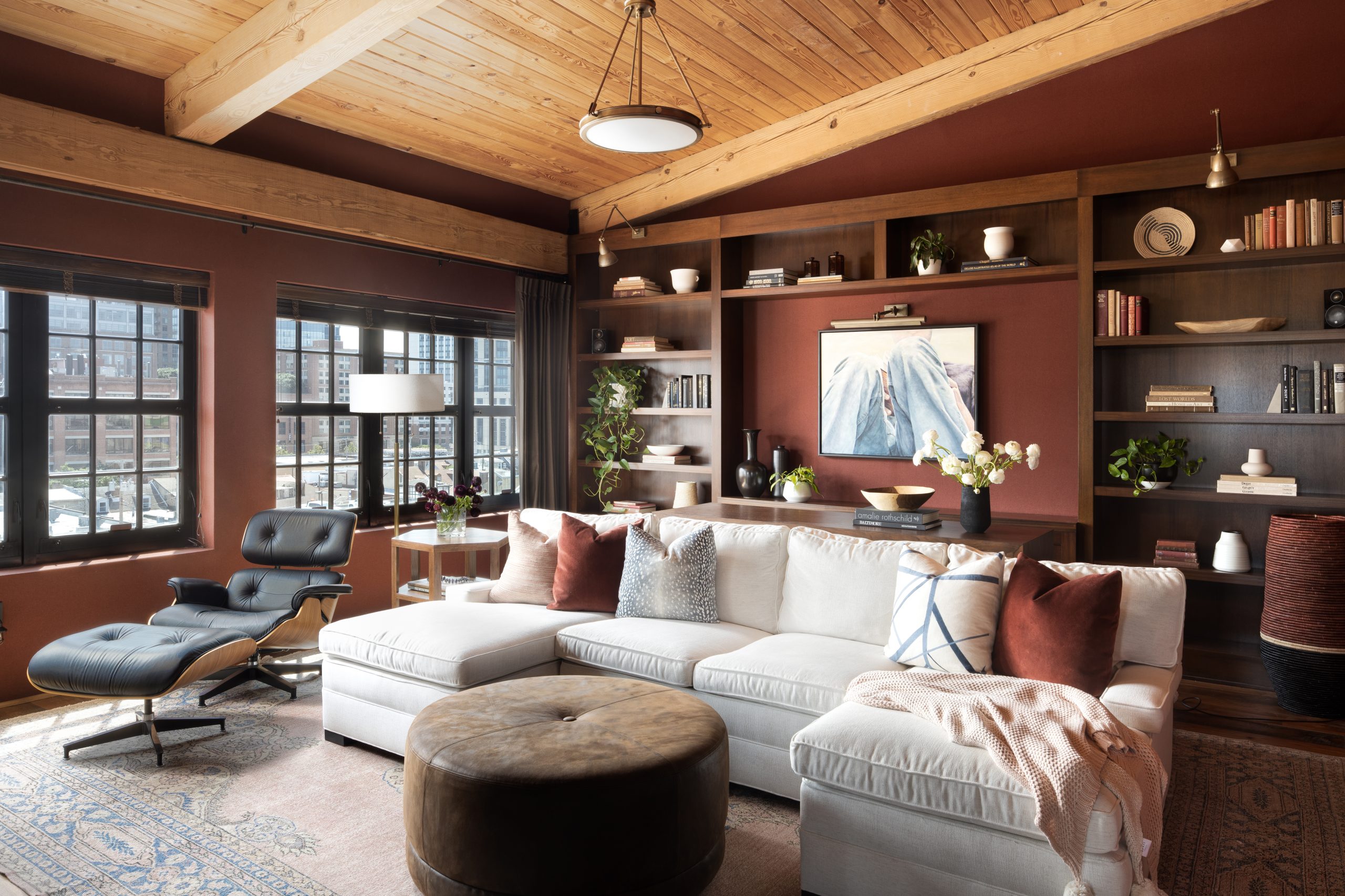
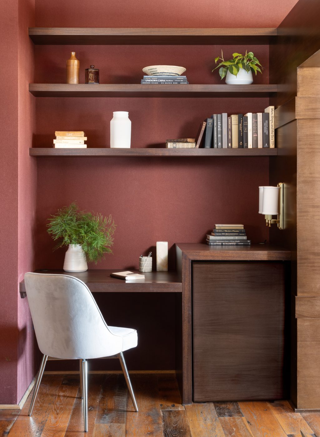
True to her commitment to sustainable reuse, Hodges didn’t discard the old wood from the island. One of the homeowners needed a place to work, and a desk would have been a tight squeeze in quarters already containing a large sectional sofa and the clients’ classic Eames lounge and ottoman atop a hand-knotted Turkish rug. Hodges had noticed a shallow corner niche in the living area that was essentially wasted space. So, she repurposed the kitchen-island wood, creating a custom built-in desk and shelves.
In addition to problem solving, this space exemplifies two other signatures of Hodges’s interiors: the use of artisanal objects from around the world and a deft deployment of texture to create warmth. The designer, who was raised in Northern England, boasts a lineage that blends Norwegian (a grandmother) with British (mother) and Jamaican (father). An appreciation for diverse cultures is in her genes, propelling her on journeys around the globe to more than 30 countries.
Hodges served stints with designers Thomas Jayne and Jamie Drake in New York before finally settling in Baltimore to be close to her parents, who live in Maryland. “Working with Thomas Jayne and Jamie Drake helped me develop a deeper appreciation for craftsmanship, attention to design details and respect for historical design styles,” observes Hodges. (One might see Drake’s influence as well in her adept use of color in this apartment.)
Reflecting Hodges’s wanderlust, this room is filled with items from sources both far-flung and local. These include Ugandan and Rwandan baskets, Zambian wood bowls, Indian sand-cast vases and knit throws and ceramics by Washington, D.C.–based artist Kate Hardy.
Also, she says, “I use texture on the walls, so there is more there than is immediately apparent.” At first sight, the rust color on the walls could be mistaken for paint. But it is actually fabric, another cozy touch that adds to the sense of groundedness and warmth — and, in the end, calm.