April 10, 2022To say Chicago-based designer Summer Thornton is averse to white would be a stretch. The color has dominated a handful of her projects, including a French Tudor remodel and a home in Lincoln Park. But as her recently released book, Wonderland: Adventures in Decorating (Rizzoli) reveals, white interiors are the exception more than the rule.
“Most of our firm’s work is a lot more colorful,” she admits. In the case of an 8,000-square-foot, six-bedroom new build in an artsy quarter of the Windy City, however, “the only things we had to work with to vary the palette were textures and tones, so we leaned more into those.”
This was not Thornton’s first go-round with these clients, a couple with two young children. She had designed their former residence a few blocks away. The wife, recalls the designer, “always had a tendency toward a neutral palette, but it went cooler and a little less formal here.”
Because the pair were building the new three-story house across multiple lots, “we were able to play more with horizontal space and have more light than you get in a standard row house,” Thornton explains. “Any city dweller wants more light.” Thornton used white to optimize that abundance of natural light, which streams in through expansive steel-framed windows and French doors.
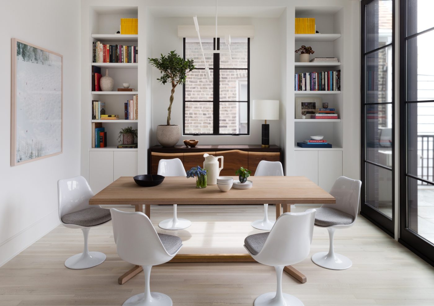
Much of the couple’s furniture made the transition from the former address, but it was refinished or recovered to fit the new program. Most daring, perhaps, was her treatment of a mahogany Sheraton-style dining room table that had belonged to the husband’s grandmother. “It was very experimental to take this family heirloom and bleach it white,” says Thornton. The result, however, was spectacular.
Thornton recovered the couple’s 1940s French dining chairs in a blue-gray (blue, the wife’s favorite color, is an accent throughout) and added new host chairs. Still in an experimental groove, she had an artisan wrap the room in thick bands of burlap, leaving the bottom fringe exposed and painting the unconventional wall covering white. It has the effect of horizontal stripes but imparts far more texture.
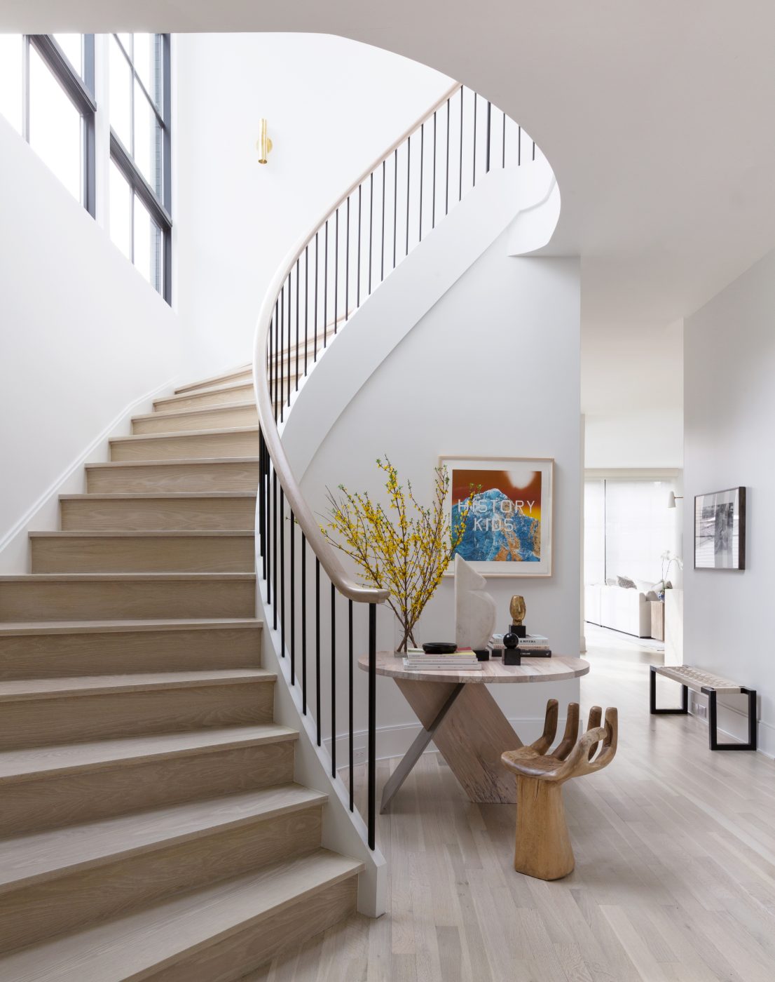
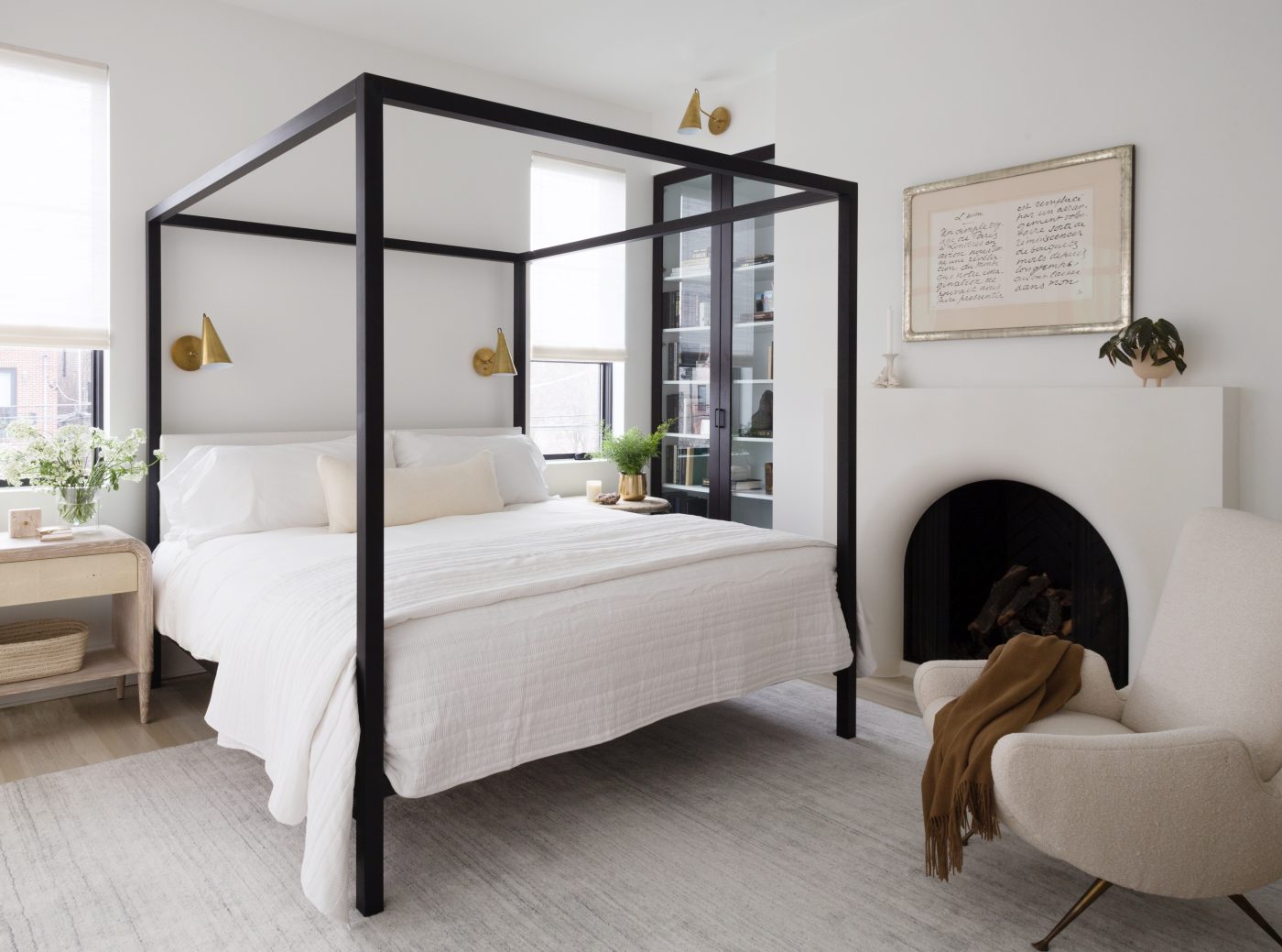
Thornton set the mood for the home in the entry hall. The luxurious width of the building is immediately apparent in the generous elliptical staircase. “In row houses,” the designer notes, “the stair is right in front of you and goes straight up. This is much more chic.”
Besides establishing the expansive sense of proportion, a vignette at the base of the stair foreshadows the design themes used throughout the house. With the chair and custom natural-wood table, “you see that sculptural shapes are going to be important,” she continues. “You also understand the minimal palette of materials and the prevalence of curves and modern art.” (The piece behind the table is by Ed Ruscha.)
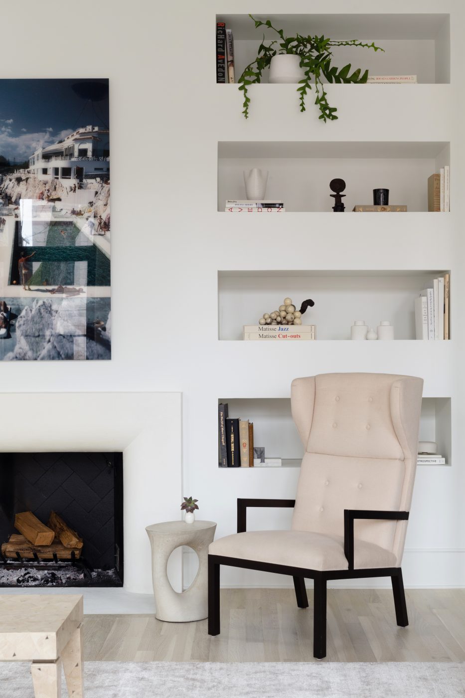
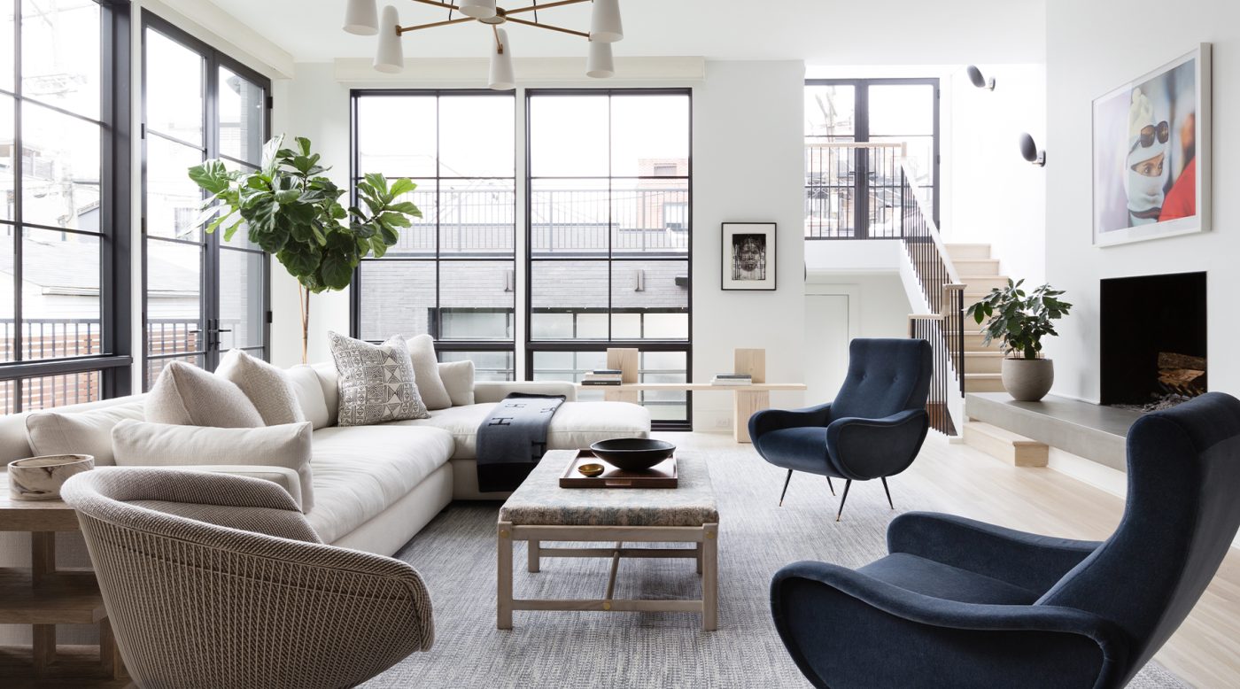
Sculptural shapes repeat in the living room with a Julian Chichester Whitby wing chair, recovered in a creamy white wool, and a curvaceous cast-concrete Kreten side table from Souda next to it. Above the mantel hangs a large Slim Aarons photo.
In this room one sees how Thornton’s play of texture and tone vivifies a mostly monochromatic space. The chair, table and built-in plaster shelving and fireplace are all tonal and textural variations arising out of the same blanched color scheme. Together they cover the gamut from cool to warm, flat to glossy, natural to man-made.
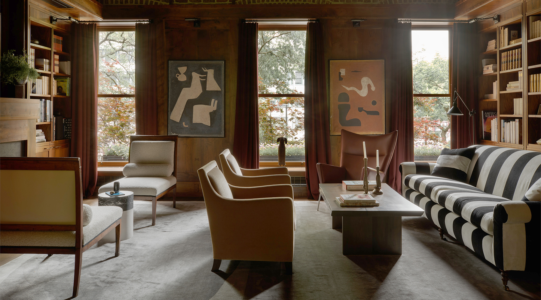
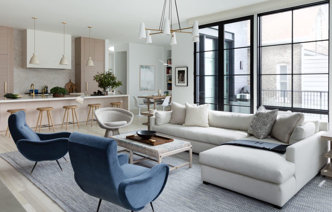
The most-used space is the family room, highlighted in this year’s 1stDibs 50 and part of an open plan that also includes the kitchen and breakfast area. It follows the same program, though here Thornton injected other elements as well.
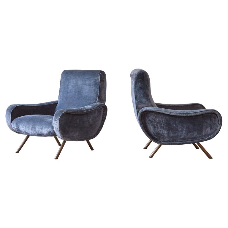
For one thing, there is more color, thanks in part to the Marco Zanuso Lady chairs upholstered in navy mohair velvet, a Warren Platner chair covered in a tweedy wool with hints of brown, and a Brunschwig & Fils rug with a blue tint in the weave.
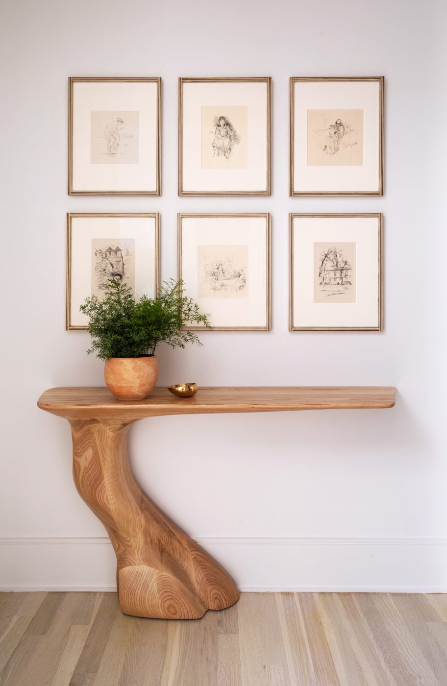
The most color comes from artworks, like those by Harry Benson (his photo of Jackie O in a ski mask graces the fireplace) and Jeff Koons. But even some of these — a sextet of Whistler drawings over an asymmetrical Frolic console from Amorph, for example — are also fairly muted.
In the end, Thornton relished the challenge to her more colorful predilections. “As a designer or as a client,” she says, “you never want to create the same thing again.”