All photos by Matt Wier
Along with teddy bears, love letters and books, a curious new museum in Hollywood includes a piñata, a meat smoker and a street sign. Opened in June, the Museum of Broken Relationships is composed of anonymously donated objects, and their accompanying stories, of lost love.
“The museum is an exhibition of our collective emotional history,” says Alexis Hyde, the museum’s director. Following the original Museum of Broken Relationships, in Zagreb, Croatia, this Southern California outpost receives “around 10 new objects per week,“ Hyde notes. “I think some of the standout donations that resonate with visitors the most are the removed breast implants and the mirror at the end. They both speak to incredible emotional journeys, transformations and acceptance of one’s self.”
Los Angeles–based Brown Design Group, led by Ryan Brown, was tasked creating with the museum’s design. Called on by owner John B. Quinn, for whom the firm had previously designed L.A.’s Q Restaurant, Brown and his team brought their signature warmth to the space. “It has a lot of the elements you would see in a typical art gallery or museum,” Brown says, “but then we put this kind of fresh and warmer perspective on it.” The museum team was more than happy with the results. Brown “was open to ideas on how to keep things modular and our lack of foreknowledge to know what types of items we were getting,” says Hyde. “But it is mostly his incredible vision. The design he put together made my job so much easier and has created a place where people feel safe to be emotional and vulnerable.”
Here, Brown takes us on a tour of the museum’s specific design elements.
Director Alexis Hyde said that “the objects can be profoundly ordinary, and it is important to elevate them to a place of reverence.” How did you help them do that?
In a typical museum, the object is at the forefront and the text is secondary. What we tried to do is create spaces that helped to focus the attention on both simultaneously.
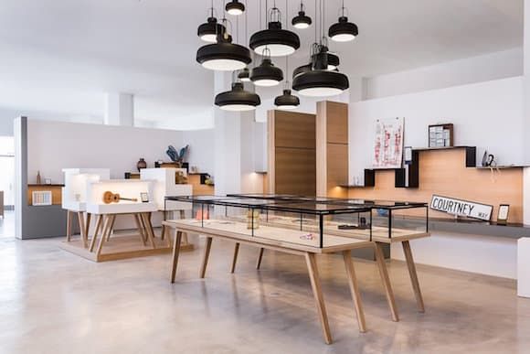
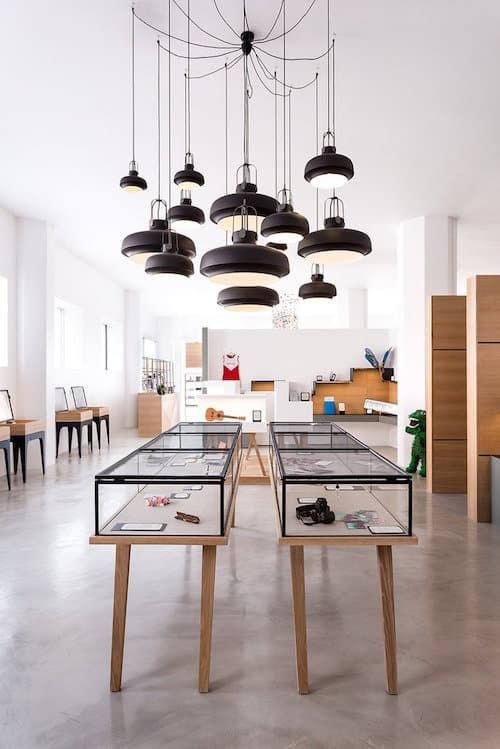
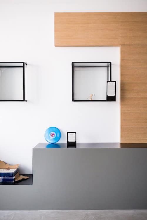
For instance, in these first two images, we have these long cases. They are quite large, about 12 feet, and are inspired by high-end jewelry cases. There are just a handful of objects in each — a set of books, a necklace, postcards. It makes this huge impact to see these kind of everyday, ordinary objects in such a beautiful display case.
The same thing in the second photo. These cases were, again, inspired by a jewelry case. They have glass lids that close down. It makes the objects feel really special, because they are, because of the story that is attached to them.
And the group of pendant lights?
They are called the Copenhagen pendant from the Danish brand &tradition. They come in three sizes. Their color relates to the steel we used throughout the museum, but we just wanted something spectacular in the space. Also, there are very high ceilings, so we dropped the pendants down to help fill that void and create a kind of central focal point.
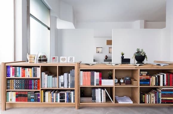
Brown Design Group custom designed all the furniture elements in the museum, including this bookcase.
This is part of the gift shop right when you first walk in. We didn’t want it to just feel like a bookcase, so there are some interesting and intricate details like the legs. I see them almost like a decorative strap on a box or suitcase. And then on the right hand side on the top we cut this at varying angles with the intention of displaying books under glass. So the books are open to interesting pages and there is a glass top over them. The bookcase has a cerused finished, which accentuates the natural grain of the oak.
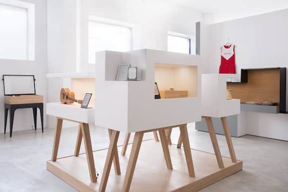
And what’s the background on this white display case?
There is a very large area in middle of the museum where the intention was to be able to use this space for events. So these are actually on wheels concealed under the platform, so this whole unit can be rolled out. And these white displays on legs — we wanted another element, something a little bit different with a bit of height on them, so we were playing with varying height levels here. Additionally, we wanted these displays to be experienced in 360 degrees, knowing that one person can be standing on one side and looking at an object and reading about it, while someone is on the other side experiencing something different.
It was important for there to not be too many objects, so we could have space in between the objects, because people relate to the stories in different ways, and some of them are quite emotional for some people. We wanted them to be able to have that experience without feeling like someone else was standing over them. So we tried to create a space where each visitor can have an individualized, private experience.
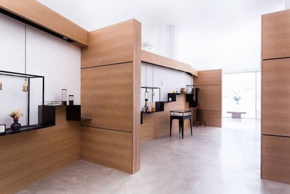
Metal shelving runs throughout the space, as seen in this image.
These shelves were all custom fabricated by an incredible woman who does iron-welding. She was on site for probably two months. It creates an interesting sort of play on diagonals with the shelves moving up and then back down again. And, to break up the simplicity of having a lot of objects just sitting out in the open, there are about three glass cases, again, a jewel case component, that are made of the same steel. The pendants, part of Tom Dixon’s Cog series, drop down from above into the boxes to illuminate the objects.
Did the museum’s curation affect how you divided the space?
There is a ton of light in the space — there are windows on both sides — and we also had to create some areas that were a little bit darker for the heavier subjects, because we wanted visitors to experience that in a different way. In terms of the curation, the stories are a bit lighter to begin with, but as you work your way around they gradually get a bit heavier. And then as you come back out, towards the end, they lighten back up again, because we don’t want to leave people with a depressed feeling. So we divided the space up in such a way that we were able to partition areas without completely closing them off to create small rooms with about eight to 10 objects in them.
These little wing walls pop out because we didn’t want to fully separate each of the rooms, because then they would just feel really small, especially with the high ceilings. So we brought these wing walls out to delineate the spaces slightly, again offering a bit more privacy as the visitor walks through.
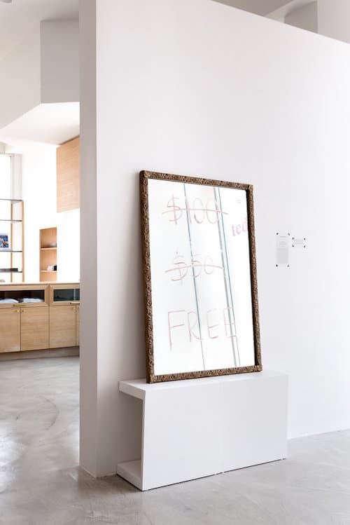
This is the mirror at the end of the exhibition that Alexis spoke about.
Knowing that the museum is fluid, we left one long wall open so it could display larger objects. That the mirror is displayed on this one big wall by itself certainly elevates the object from just a simple mirror to something quite special.
One of the challenges in designing the museum was not knowing what was going to go where exactly and providing them with options. What we tried to do was create areas that could be used for small objects and large objects alike, by varying the components. So a lot of the elements with the exception of the kind of undulating metal shelving that’s attached to the wall can be moved around and played with to accommodate the curation.
As in this image?
Here, again, we used the same materials but in a different way. You’ve got the steel shelving, you’ve got the oak wood, and then we have the glass and steel cases, and these boxes actually sit about halfway inside the wall and protrude about halfway out. We did this so we could light the boxes from above with LED lights hidden in the wall above the boxes. And there is a lot of play in terms of depth here, you’ve got the white wall at one level, the oak a few inches forward from that, the glass boxes are a few inches forward of that, and then the shelving below is a few inches proud of that. It creates this nice dynamic, again, to really elevate the objects from the ordinary to the extraordinary.
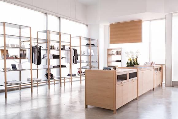
And here we are back at the gift shop.
The design elements that flow through the rest of the space — the whites, grays and the oaks — are carried through here as well. But we wanted to move beyond the standard museum gift shop. We all like going into a store where things aren’t crammed, where you can actually see what’s on display, so we used a decent amount of square footage here. And it’s great with the backlight of the windows, this happens to be the corner of Hollywood Boulevard, so it just gets flooded with light and creates a cool backdrop for everything that’s along the window.
At the top is an LED display. Alexis came up with this. It displays, primarily, tweets and Instagrams that people have posted about the museum. Passersby stand in front of the display and read it.
One of the coolest things about this museum is that literally anyone can go into it and be able to relate to a number of the objects. So I think creating an individualized experience along with laying out the museum in such a way that it was modifiable for the curators were the two big factors.