September 21, 2025In the 1957 movie Funny Face, Kay Thompson plays the indomitable Maggie Prescott, editor of a fictional Vogue-like magazine. In her famous musical number, Prescott exhorts her minions to “Think Pink,” ordering everything — dresses, hats, panty hose, shampoo, et cetera — to be made in this particular shade. After the final chord has sounded, someone asks the gray-clad Prescott why she isn’t wearing pink. “Wear pink? Me?!?” she responds incredulously. “I wouldn’t be caught dead.”
Interior design can sometimes be like this, with occasional “designers’ own homes” issues of shelter publications revealing that decorators’ personal aesthetics can differ significantly from the signature look for which clients seek them out.

At first blush, one might find only contradictions between the urbane, jewel-toned Upper West Side, Manhattan, apartment of Kristin Tarsi — partner with Anna Baraness in New York–based Studio AK — and the lighter, more organic spaces the design firm crafted for clients in Coral Gables, Florida. But the truth is that one is not the antipode of the other. In fact, certain precepts are foundational to both.
Studio AK is known for sophisticated interiors that are sensually evocative, comfortable and personal yet also cleanly modern, uncluttered and (at least apparently) simple. If some of these qualities seem at odds with one another, that’s the point. “A big part of our aesthetic is contrast,” says Tarsi. “We aren’t queens of beige.”
Adds Baraness, “An important element of that is textural contrast. The frame of a sofa might be leather, while its cushions could be linen. Or the frame of a table is wood, but the top might be leather. It’s more the idea of materiality and layering.”
The two women met while working at Victoria Hagan Interiors. They both left to start eponymous design firms of their own but then consulted with each other so often that they finally decided to join forces in 2020.
Even before her time at Hagen, Baraness had been inculcated with the importance of materiality while working for British designer Jonathan Reed, in London, after receiving her design degree at Ryerson University, in Toronto. “Jonathan helped me understand the integrity of materials,” says Baraness, who also did a stint with Helen Green in the U.K. , moving to New York when her husband was transferred there for work.

Tarsi, for her part, grew up in eastern Pennsylvania and went to Tulane for business studies, then entered Teach for America, which brought her to New York. “Through visiting schools,” she says, “I thought about environments and their effects on the psyche.” After getting a degree in design at Parsons, she landed the job with Hagan.
Both credit the award-winning designer for teaching them about creating aesthetically pleasing but rigorously functional spaces. “Her attention to detail is amazing. An eighth of an inch makes a big difference,” says Tarsi. “A sixteenth of an inch makes a big difference!” Baraness adds, laughing.
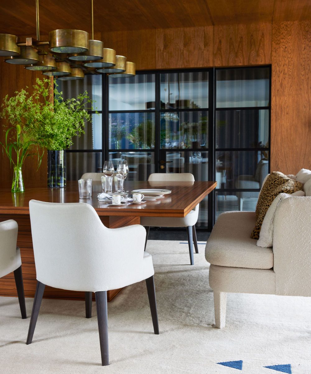
The pair brought all these lessons and more to bear in their recent renovation of a five-bedroom Coral Gables home for a young family. Although the clients enjoy its proximity to the water, they “didn’t want it to feel like a beach house,” Tarsi says.


Built in the early 2000s, the house had graciously proportioned rooms, and the homeowners “wanted that sophistication,” Baraness remembers. However, it also had “a level of heavy detailing, and the clients wanted it to be lighter. So, we simplified the fireplaces and other features.” The designers also treated the walls with matte Venetian plaster to add depth to the interior envelope. A consistent palette helped enhance the sense of flow between the rooms, many of which were visible from one another.
Natural materials contrast with man-made ones in the entry hall, where Baraness and Tarsi retained the original coquina-limestone floor but jettisoned Spanish-style twisted-metalwork on the balustrade in favor of a more-modern iron profile capped with an oak banister.
Illumination is provided by an Atelier Alain Ellouz alabaster chandelier whose black-steel frame echoes the stair, as well as Rose Uniacke for Dagmar sconces. Adorning a wall is a tapestry by Gabriel Kuri meant to look like a dry-cleaning receipt. “This is a big statement,” says Baraness. “So, everything around it is neutral and calm to support it.” The entry sets the mood for spaces throughout the house that repeat its mixture of materials and blend it with a blue palette whose grayer slate shade keeps it from seeming like a nautical cliché.


Given the urban location of Tarsi’s renovated prewar apartment in Manhattan, the entry hall there is swankier, though not ornate. The walls are clad in a high-gloss Phillip Jeffries wallcovering, and the new herringbone floor — the original was beyond repair — preserves some of the residence’s prewar character. An artwork by Marielle Guegan, available through Balsamo, adds movement and color, as does a meandering custom Bola Disc light fixture by Pablo Studio, which disguises an immovable off-center ceiling plate.
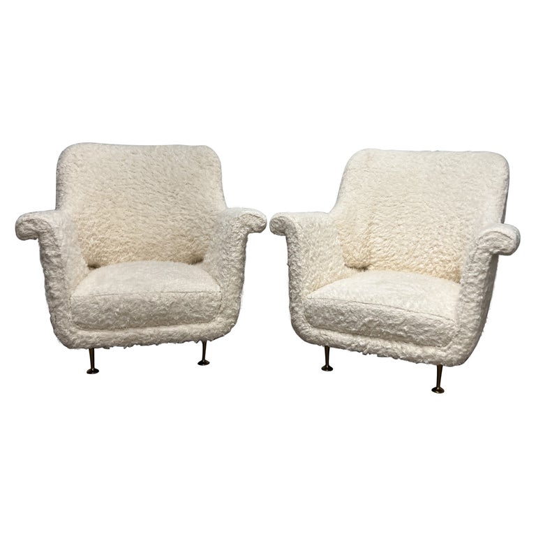
At the Coral Gables project, the designers anchored what Baraness refers to as “the formal — quote unquote — living room” with a massive customized travertine and oak coffee table by Buket Hoșcan Bazman. There’s more natural stone in the fireplace surround and more wood in mid-century-modern Italian teak chairs from Monc XIII. The sofa fabrics, though somewhat tailored, are casual linen and made to look like slipcovers.


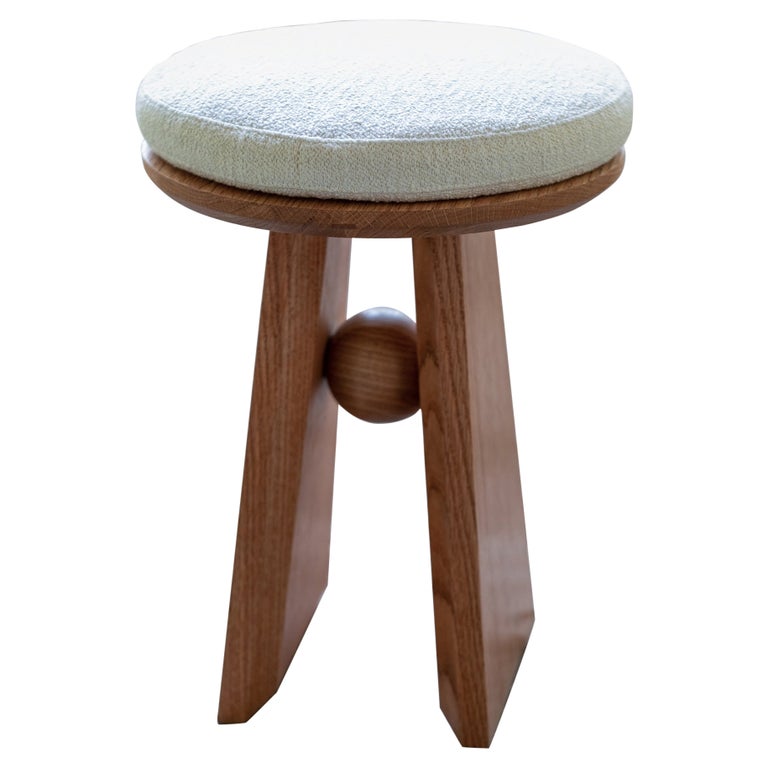
In contrast, saturated color embues Tarsi’s Manhattan living room. The deep slate-blue chenille sofa is decorated with lavender Fortuny silk pillows. But the room also boasts wood, here in the form of a vintage stool and her grandmother’s steamer trunk turned side table, both layered with patina. Christian Liaigre sconces illuminate an artwork by Andrea Alkalay.
Although the two living rooms have different atmospheres befitting their locations, the underlying visual interest of both is in the mix of materials — hard with soft, casual with formal, neutral with pops of color. Pattern is also mostly absent, as is clutter.
“We’re looking to create an oasis for our clients,” Baraness says. “Part of that is to be relaxed and comfortable where you are. If there’s not a lot of clutter, it evokes a sense of calm. We want people to feel things in our spaces. If you can feel at peace in the environment you’re in, it’s easier. So, every piece is considered.”


Of the Manhattan apartment, Tarsi observes, “My husband hates knicknacks and decoration. The beauty is really in the scale, proportion and mix of pieces, and less about a composition with lots of things competing for your attention all at once.”
Pattern shows up instead as texture. Both dining rooms and living rooms, for instance, are grounded with rugs that convey tone-on-tone pattern through varying pile heights. Pattern does appear, but for the most part, it is understated and, like the rugs, tone on tone.
In a Coral Gables guest bedroom, the designers paired a minutely grid-patterned two-tone rug made of wool and banana silk with a woven bench and a subtly striped bolster pillow and blanket. The Upper West Side primary, although far more colorful, showcases a moiré silk-like wallcovering, a custom chenille-swathed bed with an almost imperceptible stripe, curtains embroidered with tiny flowers and a Stilnovo pendant with an etched swirl pattern on the glass.


The one real divergence between the two projects is in the children’s bedrooms. The daughter’s room in Coral Gables conveys femininity with its soft profiles and pale tones, but except for obvious children’s items like toys, it could just as easily serve as a guest room.
In Manhattan, Tarsi — unlike Thompson’s Maggie Prescott character in Funny Face — embraced pink.
“I love the color,” Tarsi says. “So, I made sure my daughters inherited that love.” Interestingly, the designer manages to make the hue look like a neutral by using it all over — on the walls, bed linens and lighting. It even appears in the Paule Marrot artwork above the bed.
Would that be enough to sway Prescott’s sartorial preference for gray and black? Not likely. But when it comes to comparing the personal style of Studio AK’s designers with the firm’s signature house style, the two seem to be very well aligned indeed.