Items Similar to Indian Modern Art Master Limited Edition Colour Lithograph Published Work
Want more images or videos?
Request additional images or videos from the seller
1 of 16
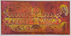
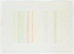
Manu ParekhIndian Modern Art Master Limited Edition Colour Lithograph Published Work1973
1973
On Hold
$750.23
On Hold
£550
On Hold
€638.84
On Hold
CA$1,033.62
On Hold
A$1,127.31
On Hold
CHF 597.17
On Hold
MX$13,514.87
On Hold
NOK 7,605.34
On Hold
SEK 6,954.52
On Hold
DKK 4,772.79
About the Item
Manu Parekh is one of India's best known and respected artist's. He is from a generation of Indian artist's who have both a great generosity of spirit and are humble about their contribution to the formation of modern Indian Art.
Manu Parekh, colour lithograph
Year: 1973
Edition: 31/50
Sheet size: 37.6 x 50.4 cm
Plate size: 26 x 32 cm
Manu Parekh is from a family of artists, his wife Madhvi and daughter Manisha are both established and recognised artists in their own right. The family is a pivitol part of the contemporary art scene.
Parekh is an artist that continually questions his practise and moves fluidly between mediums; painting, drawing and printmaking. Born in Gujarat in 1939 he witnessed one of the most harrowing of events of the 20th century, Partition. Ruptures often create a questioning and like many other artists Parekh found himself wondering what is was that he should be trying to portray in his art. Trained at the JJ school in Mumbai he also worked at another of the great institutions of creative production, just outside of Calcutta. He spent many years painting at Benares, the most holiest of cities on the banks of the Ganges. It is these later painting that he perhaps better known for.
However, like many artists there is much about Manu Parekh's work that we do not know. He does not think of his work in terms of a steady progression over the decades. It would be interesting to understand what the image in this lithograph makes reference to. What we can see, are a palette of colours, eclectic and bright that he has used throughout his career, in particular the vibrant purple and strong orange.
It is believed this print was made for a portfolifo of Limited Edition Prints by leading Indian artists for the Lalit Kala Akademi (The fine Art Academy) in Delhi.
- Creator:Manu Parekh (1939, Indian)
- Creation Year:1973
- Dimensions:Height: 14.81 in (37.6 cm)Width: 19.85 in (50.4 cm)
- Medium:
- Movement & Style:
- Period:
- Condition:No rips or tears, colours are fresh and not faded.
- Gallery Location:Norfolk, GB
- Reference Number:Seller: ManuParekh1stDibs: LU1670213620012
Manu Parekh
Born in Ahmedabad, Gujarat, Manu Parekh studied at Sir J. J. School of Art, Bombay. Considered one of the most influential contemporary artists or the 20th/21st century, Parekh is part of a celebrated group of artists based in Delhi. Perhaps best known for his Banaras series, Parekh’s works are characterised by his intuitive use of colour, bold brushstrokes, and prominent lines. He has experimented with colourful abstractions, sexual imagery, and figuration, responding as much to nature as to daily life and social issues. The women in his works are represented as nature spirits, plant forms, germinating seeds and allegorical figures, recalling mythological traditions. As with many of his contemporaries, artists such as K G Subramanyan and Jyoti Bhatt, Craft has been a long-term interest and association with the Weavers’ Service Centre as a consultant designer gave him the opportunity to work with craftspeople from diverse regions of India. Parekh received the President of India’s silver plaque and the All India Fine Arts and Crafts Society’s award in 1972 and the national award of the Lalit Kala Akademi, New Delhi, in 1982. In 1992, he was honoured with the Padma Shri by the Government of India. His retrospective show at National Gallery of Modern Art also travelled to Mumbai and Bengaluru. He lives and works in New Delhi along with his artist wife, Madhvi Parekh.
About the Seller
5.0
Gold Seller
Premium sellers maintaining a 4.3+ rating and 24-hour response times
Established in 1999
1stDibs seller since 2021
64 sales on 1stDibs
Typical response time: 7 hours
- ShippingRetrieving quote...Shipping from: Norwich, United Kingdom
- Return Policy
More From This Seller
View AllAbstract Landscape India Rajasthan Editioned Linocut Print Natural Blue Green
By Mukesh Sharma
Located in Norfolk, GB
There is a natural and raw understanding in Mukesh Sharma’s prints that depict, and are influenced by, the Rajastani communities of his home town in rura...
Category
1990s Abstract Abstract Prints
Materials
Archival Paper, Linocut, Archival Pigment
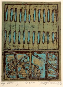
Abstract Landscape India Light Viscosity Print Yellow Red Orange Nature Harmony
By Mukesh Sharma
Located in Norfolk, GB
There is a natural and raw understanding in Mukesh Sharma’s prints that depict, and are influenced by, the Rajastani communities of his home town in rura...
Category
2010s Abstract Abstract Prints
Materials
Archival Ink, Archival Paper
Abstract India Landscape Rajasthan Light Viscosity Print Natural Jali Earth Red
By Mukesh Sharma
Located in Norfolk, GB
There is a natural and raw understanding in Mukesh Sharma’s prints that depict, and are influenced by, the Rajastani communities of his home town in rura...
Category
Early 2000s Abstract Abstract Prints
Materials
Archival Ink, Archival Paper
Abstract Landscape Rajasthan Light Viscosity Print Natural Seasons Earth Blue
By Mukesh Sharma
Located in Norfolk, GB
There is a natural and raw understanding in Mukesh Sharma’s prints that depict, and are influenced by, the Rajastani communities of his home town in rural India. In these Limited Edi...
Category
1990s Abstract Abstract Prints
Materials
Archival Ink, Archival Paper, Archival Pigment
Abstract Landscape India Rajasthan Light Natural Mustard Earth Blue Yellow
By Mukesh Sharma
Located in Norfolk, GB
There is a natural and raw understanding in Mukesh Sharma’s prints that depict, and are influenced by, the Rajastani communities of his home town in rura...
Category
1990s Abstract Abstract Prints
Materials
Archival Ink, Archival Paper, Linocut
Abstract Landscape Rajasthan Light Viscosity Print Natural Green Turquoise
By Mukesh Sharma
Located in Norfolk, GB
There is a natural and raw understanding in Mukesh Sharma’s prints that depict, and are influenced by, the Rajastani communities of his home town in rura...
Category
1990s Abstract Abstract Prints
Materials
Archival Ink, Archival Paper, Archival Pigment
You May Also Like
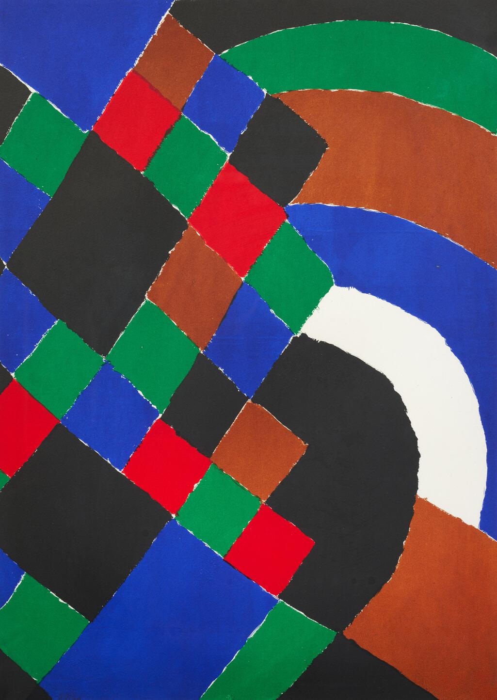
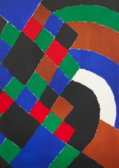
Rythme-couleur - Hand-signed and numbered original lithograph, 1962
By Sonia Delaunay
Located in New York, NY
Sonia Delaunay
Rythme-couleur, 1962
Lithograph on Fabriano wove paper
27 3/5 × 19 7/10 in l 70.2 × 50 cm
Frame included - 32 1/3 x 24 4/5 l 83 x 63 cm
Edition of 40
Condition: Overa...
Category
1960s Abstract Geometric Abstract Prints
Materials
Lithograph
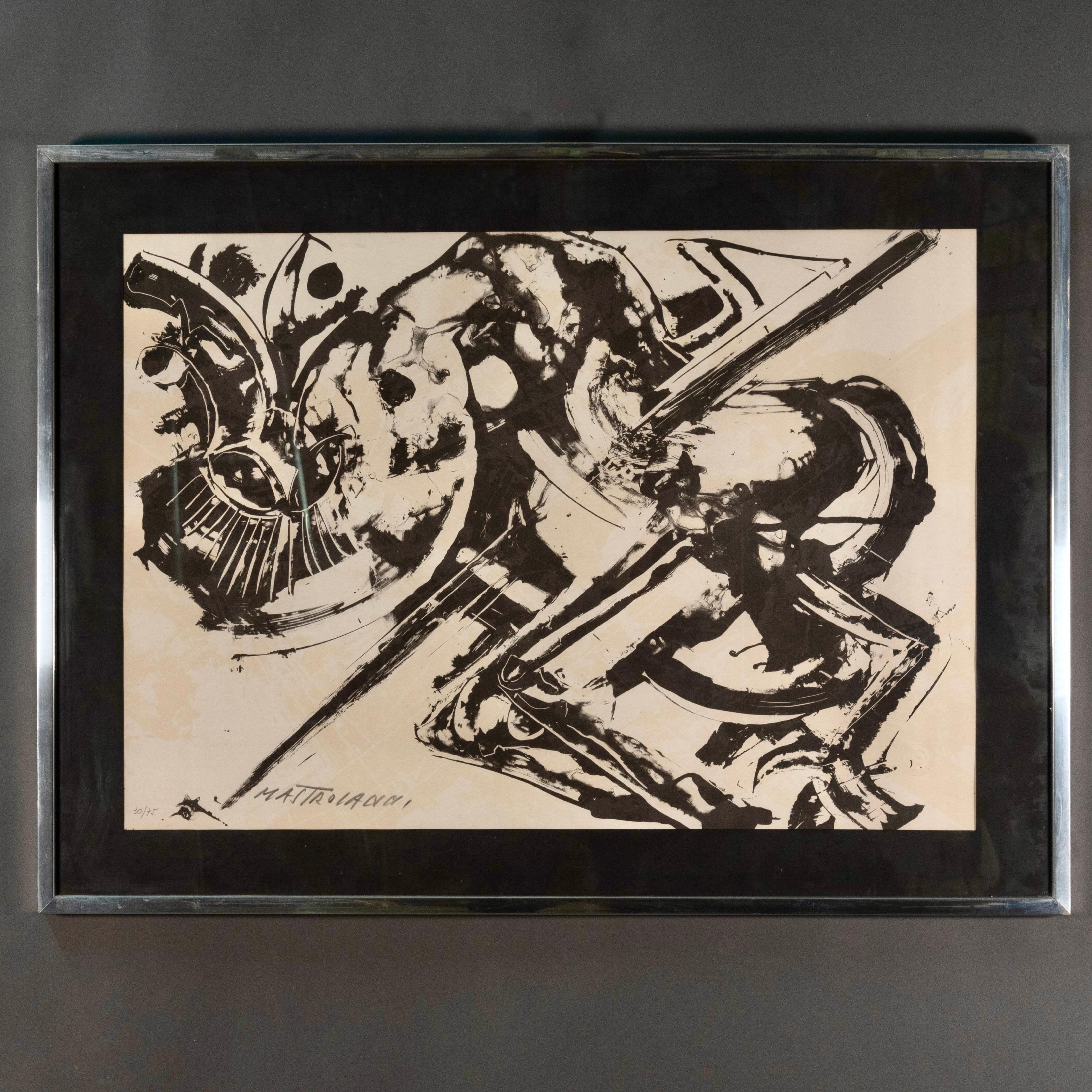
Umberto Mastroianni Italian Signed 1960s Original Black and White Etching
By Umberto Mastroianni
Located in Roma, IT
Umberto Mastroianni 1960s Original Etching
Beautiful black and white lithograph by the great 20th century Italian artist Umberto Mastroianni.
This work best represents the work of o...
Category
Mid-20th Century Abstract Abstract Prints
Materials
Lithograph

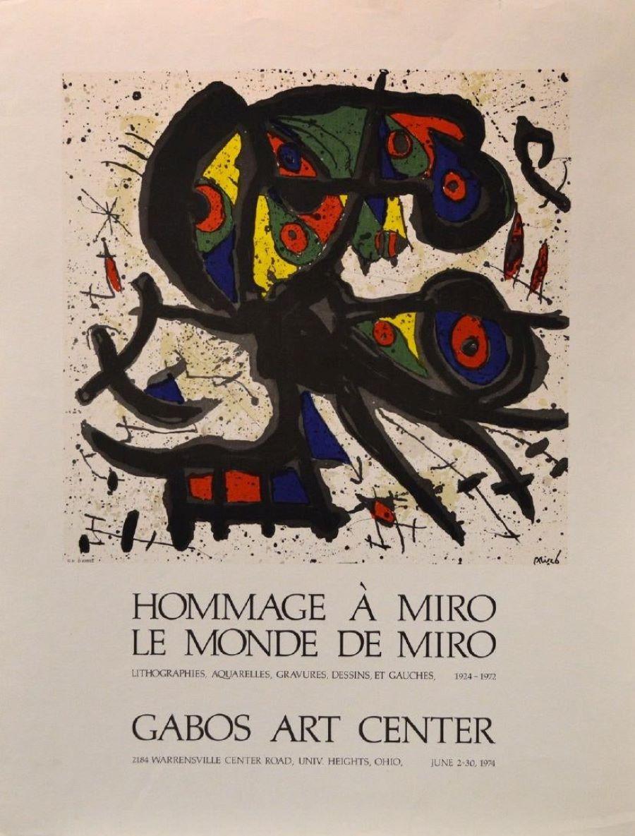
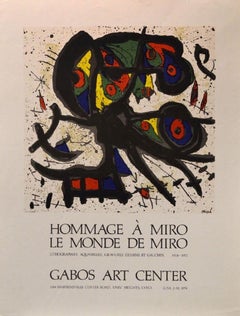
"Hommage á Miró, Le Monde de Miró" Gabos Art Center, Event Poster
By (after) Joan Miró
Located in Chesterfield, MI
"Hommage á Miró, Le Monde de Miró, Lithographies, Aquarelles, Gravures, Dessins, et Gauches 1924-1972, Gabos Art Center, Univ. Heights, Ohio. June 2-30 1974" Event Poster; After JOA...
Category
1970s Abstract Abstract Prints
Materials
Lithograph
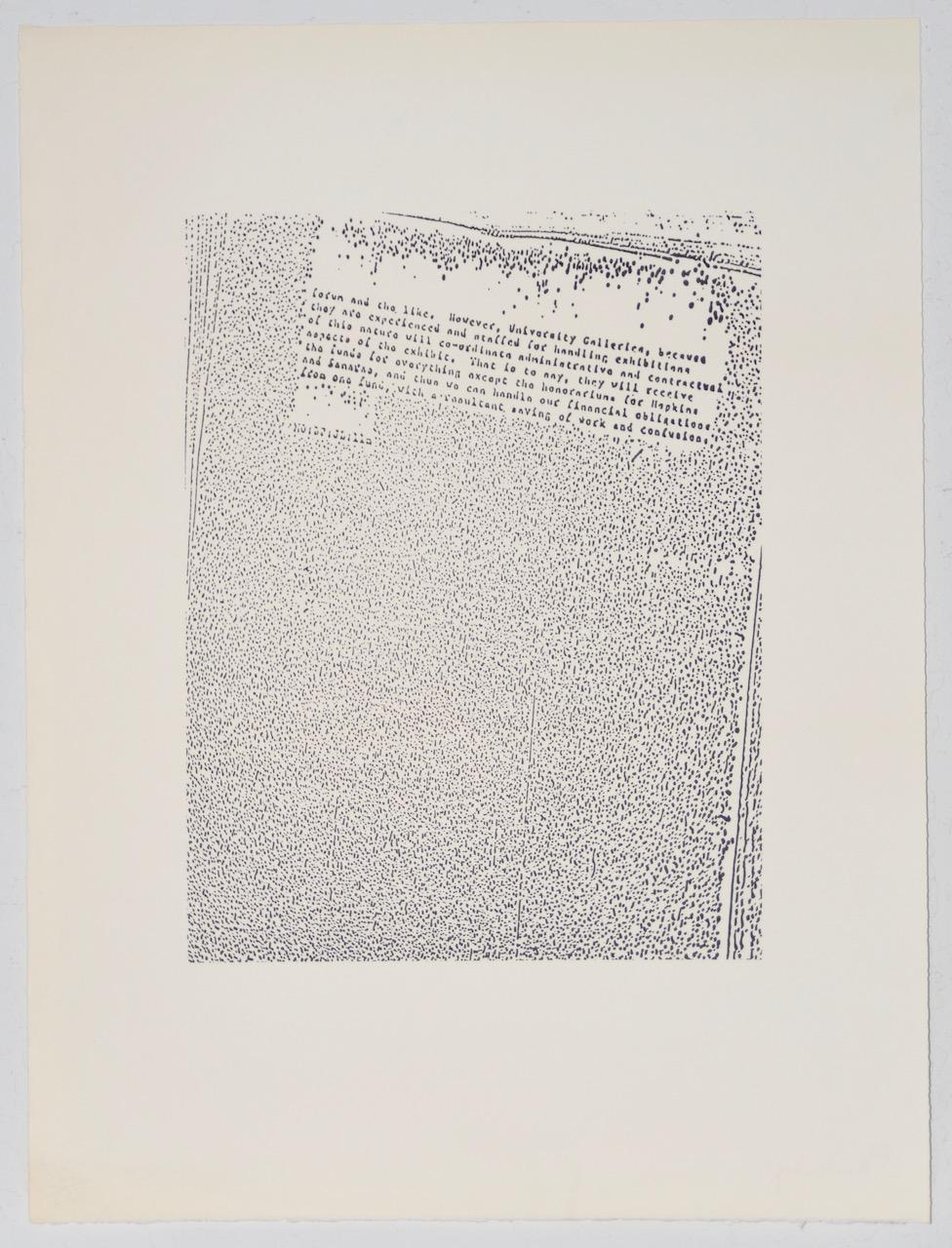
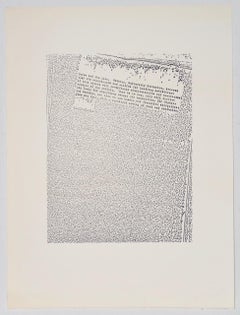
John Link (American, b.1942) "Untitled" Limited Edition Lithograph c.1973
By John Link
Located in San Francisco, CA
John Link (American, b.1942) "Untitled" Limited Edition Lithograph c.1973
Rare mid 20th century lithograph by noted American artist John Link.
The lithograph shows an area of illegible text surrounded by a block of black dots.
Art dimensions 16" x 20". The hand made paper measures 24" x 32".
Pencil signed and numbered by the artist. Number 32 out of 60.
Very good condition. Comes unframed.
John Link studied at the University of Oklahoma. Exhibitions include: Joslyn Biennale; Oklahoma Art...
Category
Mid-20th Century Abstract Expressionist Abstract Prints
Materials
Lithograph
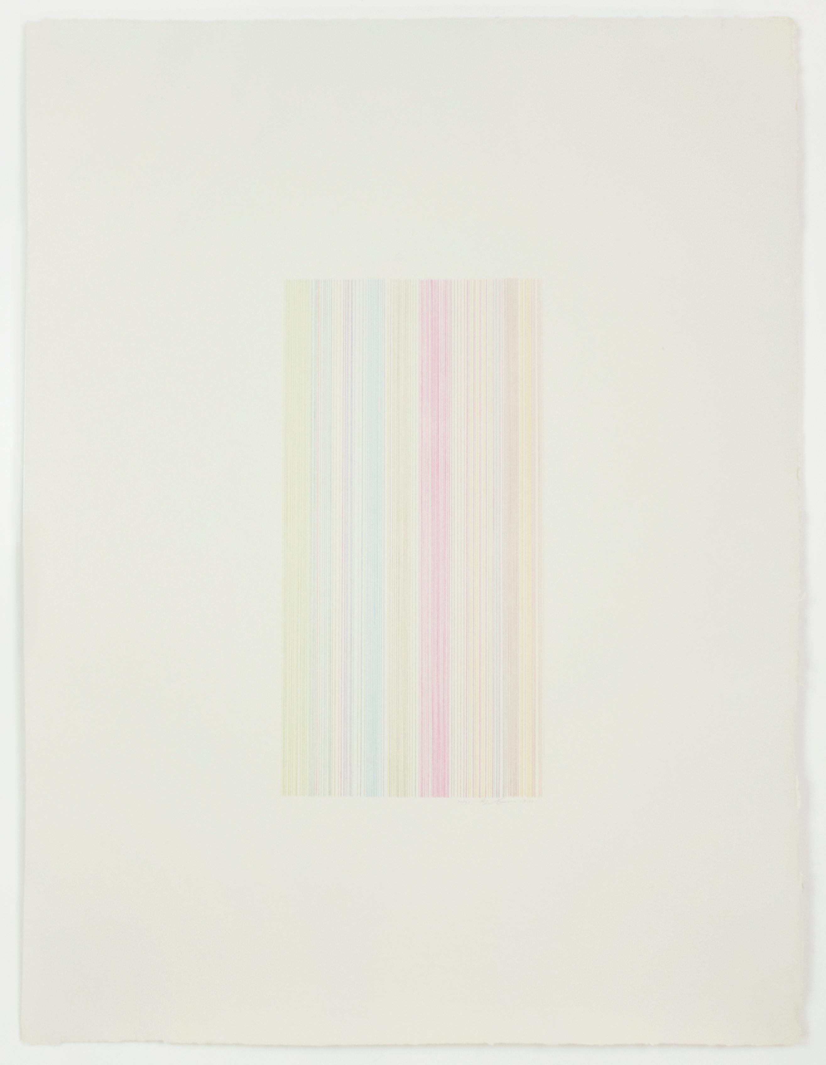
Tightrope: abstract modern minimalist color field drawing with rainbow colors
By Gene Davis
Located in New York, NY
Rainbow shades shine in delicate clusters of vertical lines, in this abstract, geometric lithograph. Vibrant yellow, green, magenta pink, blue and brown take on the organic quality o...
Category
1970s Abstract Abstract Prints
Materials
Lithograph
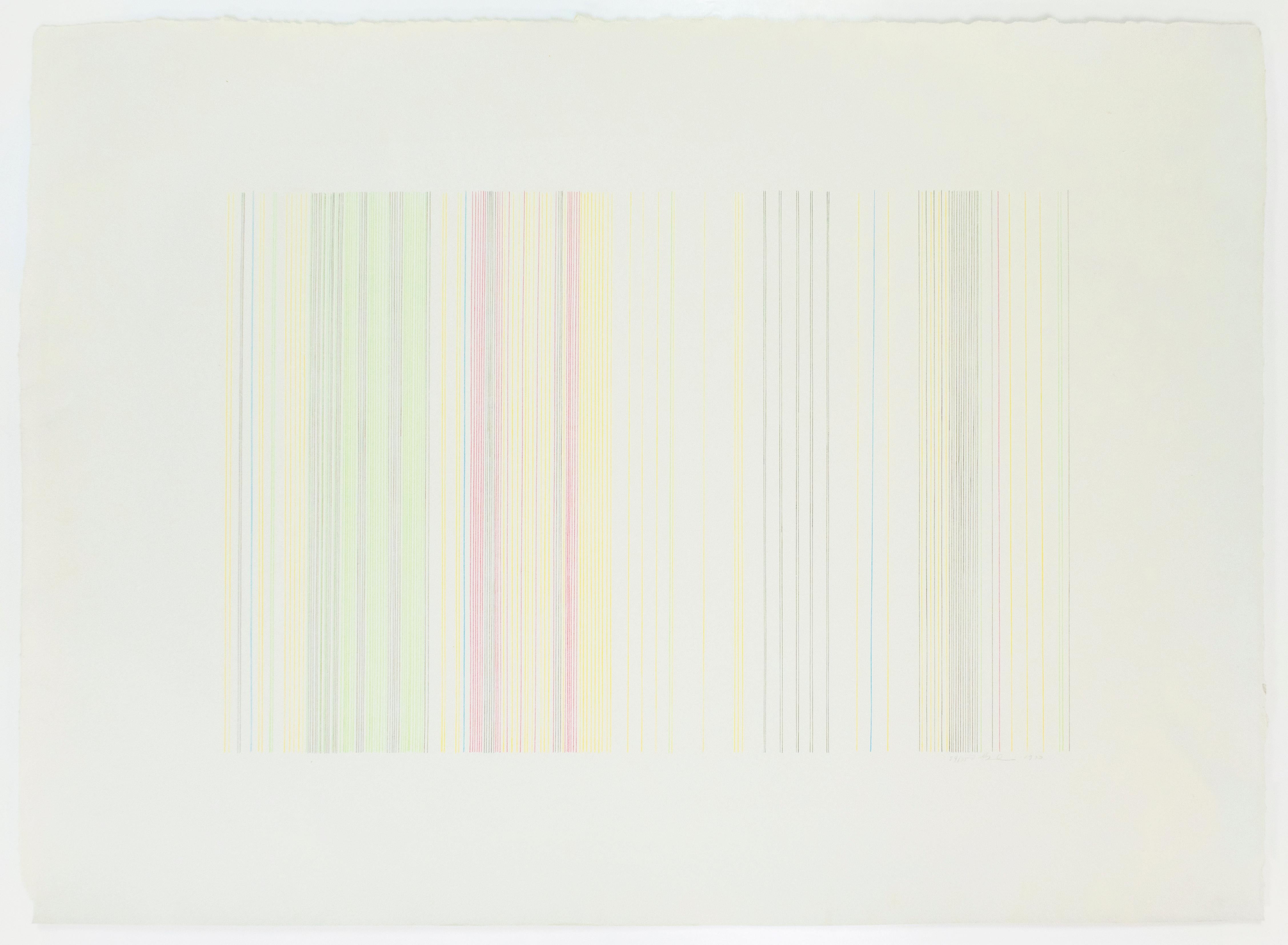
Witch Doctor: abstract modern minimalist color field drawing with rainbow colors
By Gene Davis
Located in New York, NY
Vibrant magenta, yellow, orange, brown, purple, lime green, jungle green, dark green, cerulean, and sky-blue lines take on the organic quality of handmade paper, resulting in this su...
Category
1970s Abstract Abstract Prints
Materials
Lithograph
More Ways To Browse
Richard Reed
Robert Motherwell Elegy
Robert Natkin Lithograph
Shinoda Toko
Sister Corita Prints
Vintage Field And Stream Cover Art
Warhol Rose
11 Pop Artists
Agam Agamograph
Alexander Calder Braniff
Anuszkiewicz Signed
Arthur Boyd
Ballet Russe Costume
Calder Print Sun
Cobra Art Signed
Dollar Bill Painting
Exhibition Poster 1984
Gagosian Poster