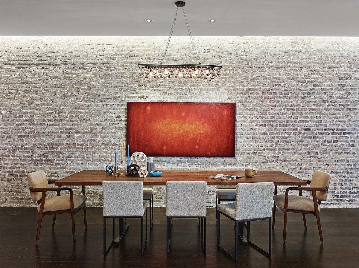
Crosby Street loft dining room by Tamara Eaton Design. Photo by Frank Odeman
The September return of the pumpkin spice latte has become the unofficial harbinger of fall since Starbucks launched the beverage in 2003. Since then, pumpkin spice has become a beloved — and ubiquitous — flavor for all manner of seasonal snacks and scents. But you don’t have to relegate the autumnal trend to your morning coffee. Pumpkin spice (the color, not the flavor) works just as well when it comes to your home decor.
Accessories
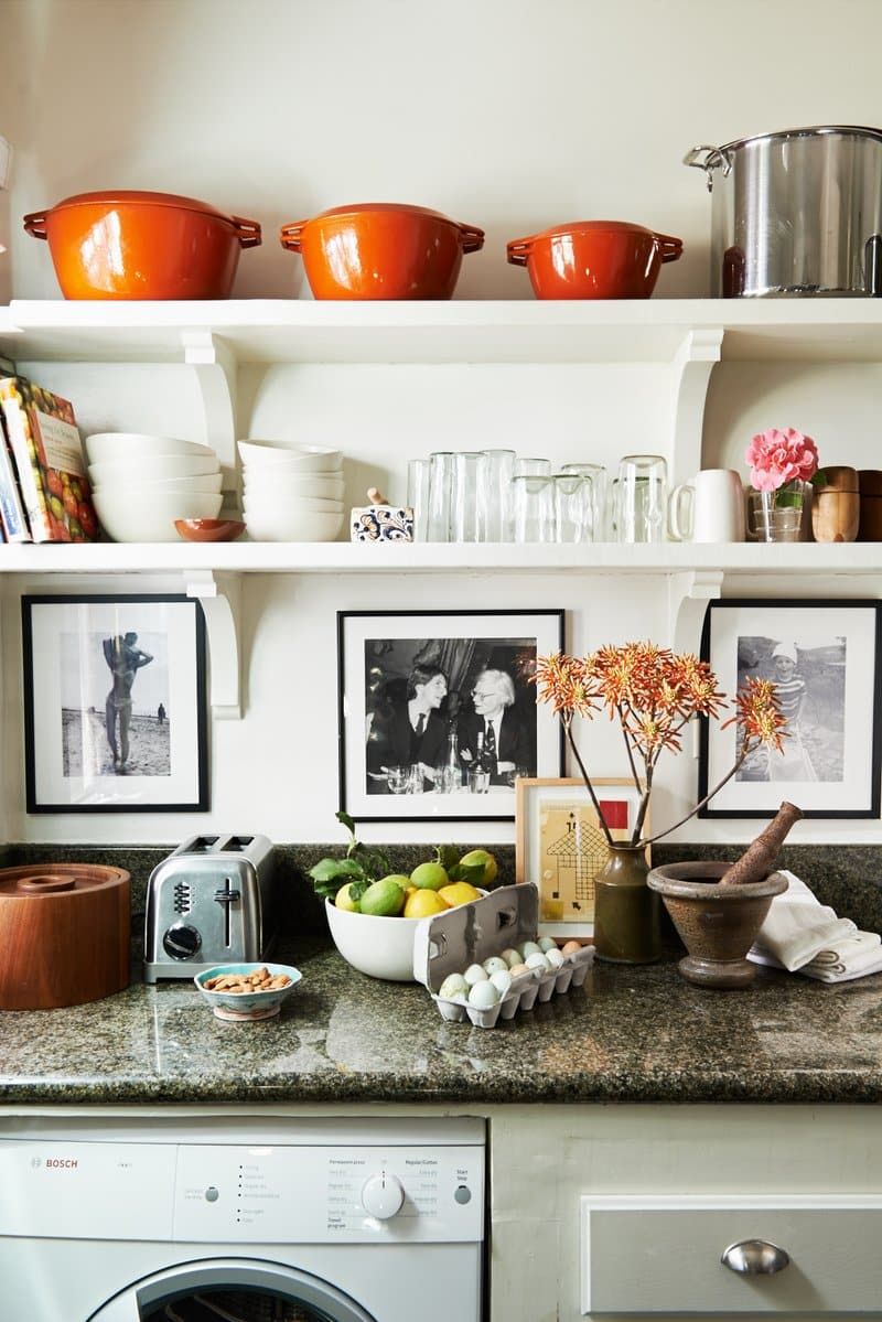
West Hollywood kitchen by Peter Dunham Design. Photo by Karyn Millet
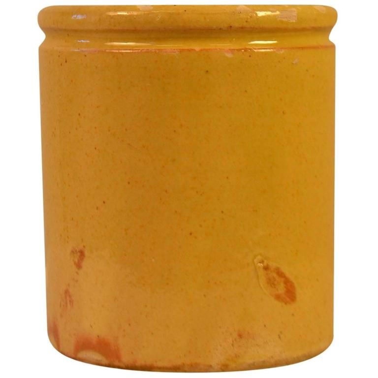
When it comes to adding the rustic hue to your open shelving, designer Peter Dunham advises to “keep it simple.” He says, “Choose two shapes of glasses, matching crockery and something vintage or artisanal to make the mix more deliberately interesting.” For this bohemian West Hollywood kitchen, Dunham kept “the basics white or neutral” and used the orange hue as a contrasting accent through the ceramic pots, cookbook and flowers.
Textiles
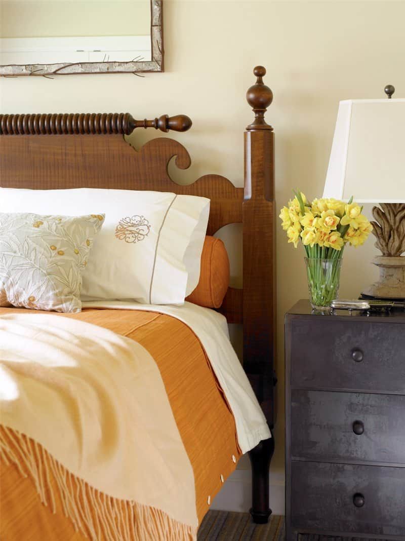
Wisconsin lake cottage bedroom by Kathryn Scott Design Studio. Photo by Ellen McDermott
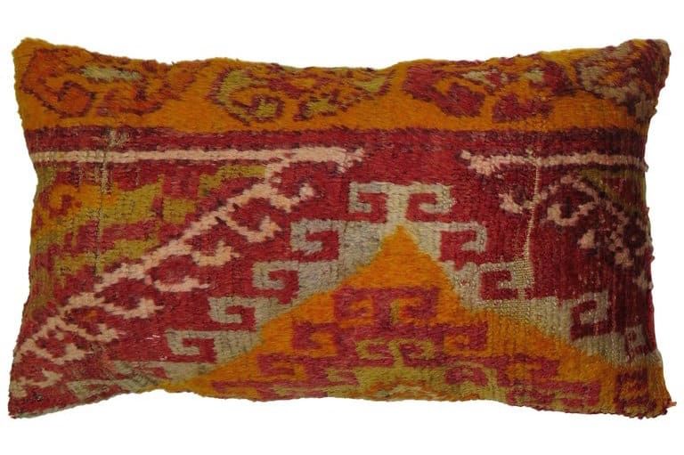
Switching out your summery quilt for a burnt orange duvet is the kind of seasonal spruce up that requires little commitment. The textured version in this Wisconsin lake cottage bedroom by Kathryn Scott is both inviting and refined. The subtle accents in the throw pillows and rug help to tie the look together.
Art
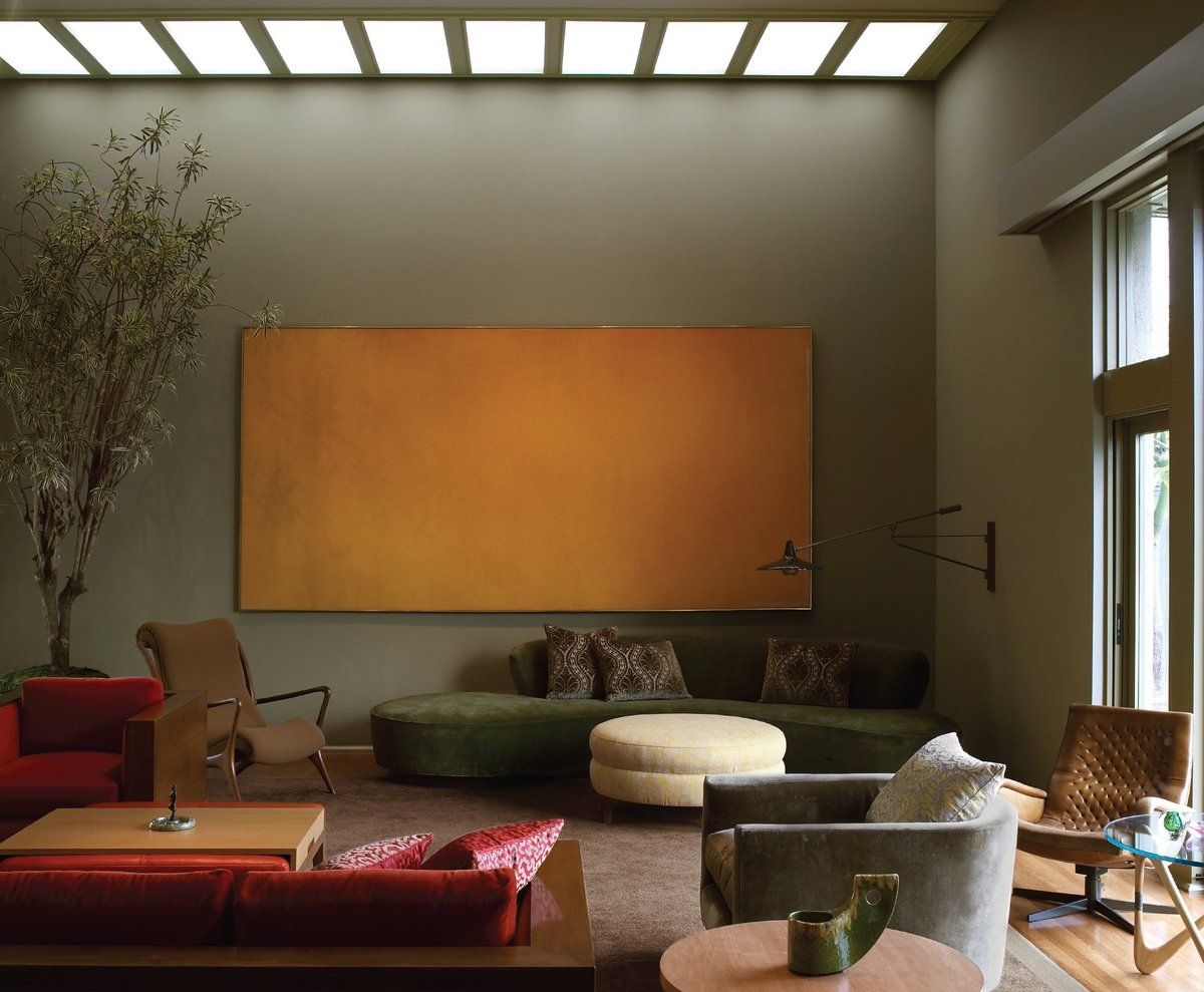
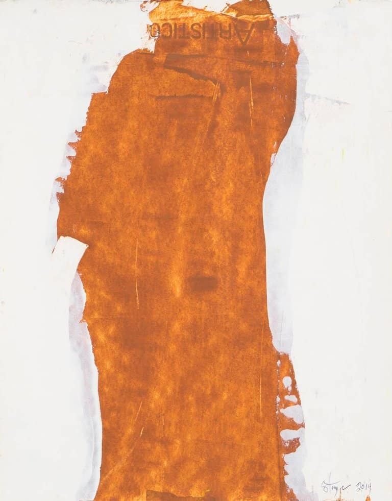
A simple yet dramatic color field painting warms up the living room in this 1947 house by Harwell Hamilton Harris. Interior designer Kay Kollar says the design was “inspired by the surrounding landscape and distant views.” She adds, “The palette of wall colors became the bridge, providing saturated backgrounds for the art and linking interior to the exterior. The spirit of the room started with the 1960s painting by Jules Olitski. The rugs and large scale pieces of furniture came next, followed by the smaller pieces.”
Flooring
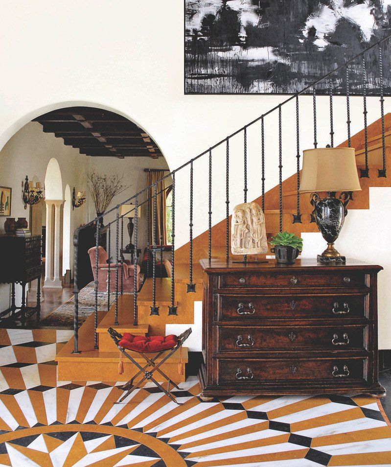
Spanish Revival entryway by Madeline Stuart. Photo by Janice Barta
“Orange has two peculiarities,” Dunham says. “First, it’s one of the few colors that goes well with almost every other color, and second, it’s a bold but still very livable color.” These two tenets are perhaps no better exemplified than with this incredible Mediterranean tiled floor in an entryway by Madeline Stuart. The Spanish Revival hallway makes the case for a dramatic entry with the dimensional tile work and expert layering of color, texture and scale. From the pop of red velvet on the stool cushion to the twisted iron balusters, each design element works harmoniously to bring the floor to life.
Furniture
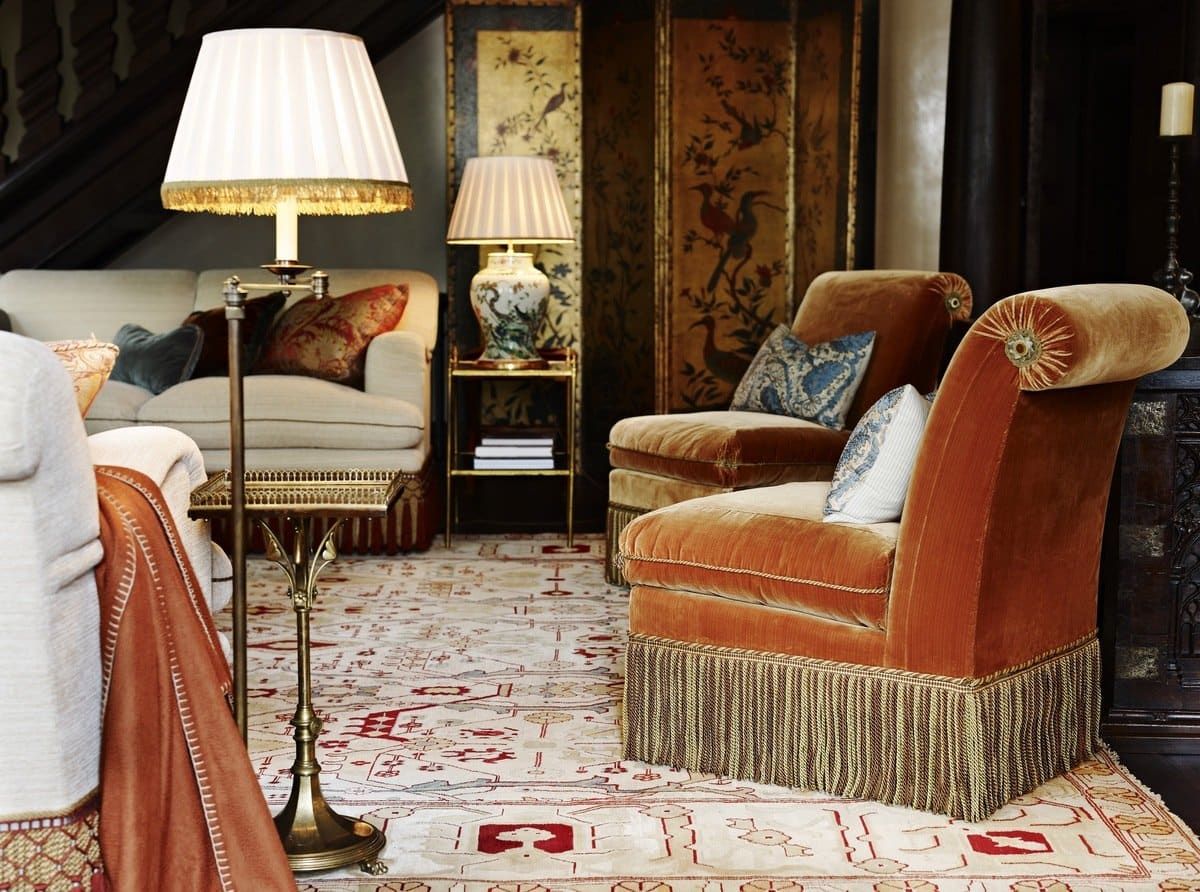
London House drawing room by Douglas Mackie. Photo by Gary Hamill
What’s more autumnal than an orange set of chairs coupled with a soft throw blanket in a lamp-lit drawing room? Douglas Mackie’s pumpkin-colored choices in this London home are luxe nods to the spicy hue. And when it comes to decorating with the burnt orange color, Kollar says to simply “think classic Hermès box.” She says, “My advice for using this color is that it feels authentic to the spirit of place. Otherwise, color can feel applied, artificial or short-lived.”
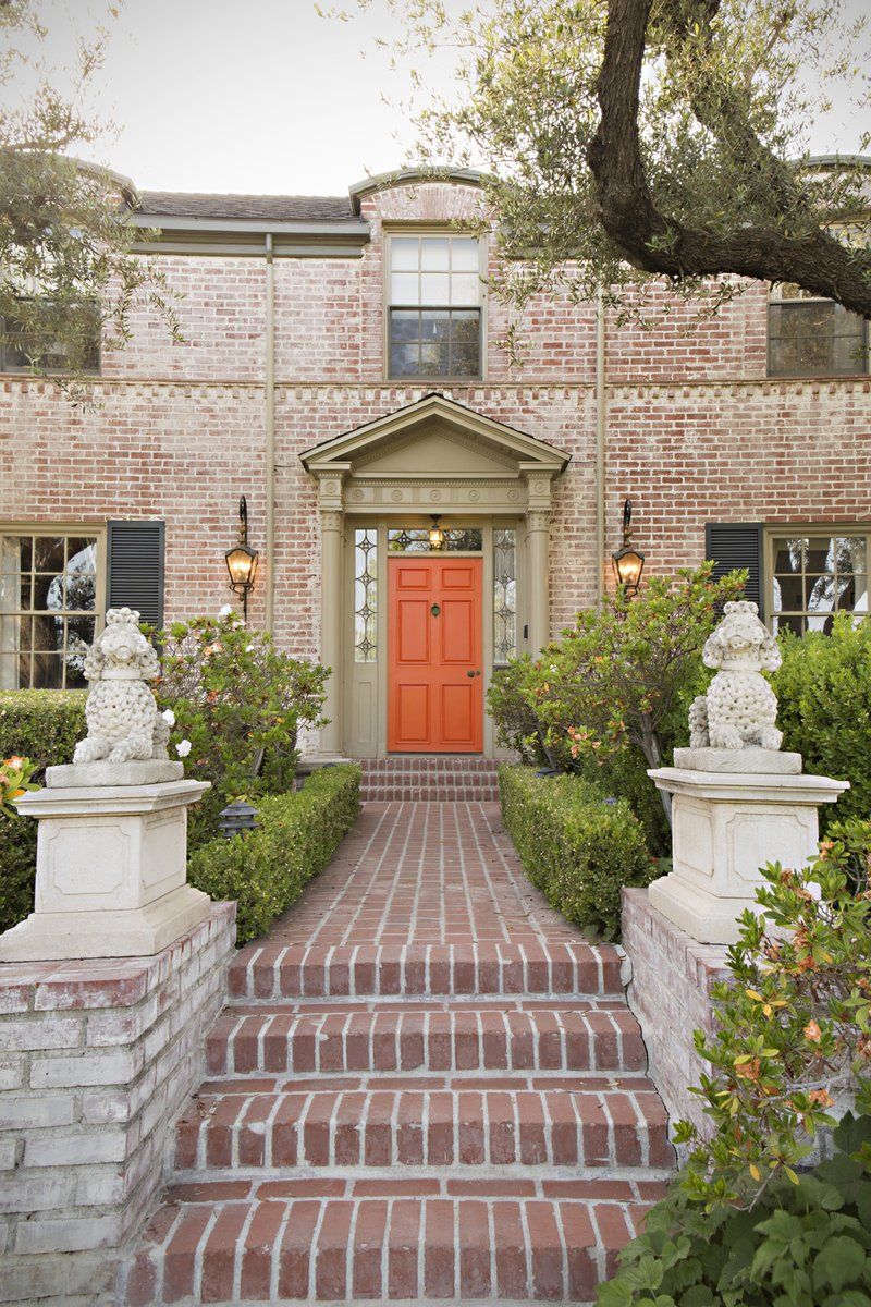
Hancock Park exterior by Woodson and Rummerfield’s House of Design. Photo by Karyn Millet
For a bright punch of pumpkin spice, consider painting your front door like this Los Angeles family home by Woodson and Rummerfield’s House of Design. The bright hue adds a sense of warmth to the stately brick residence, but it would also look great on a mid-century ranch or bohemian cottage.
