Stella Paul is enamored by the color red. “Red communicates many different things. It can be a signpost for sweet romance or savage violence. It’s at the center of much thought and action,” the art historian, author and self-admitted chromaphile says. “Red is everywhere, and in all kinds of manifestations. Its prevalence is astonishing.”
Paul’s foreword in Red: Architecture in Monochrome (Phaidon), examines how red enhances contemporary buildings and other structures. Whether used on a bridge in a bucolic English valley or on a media headquarters in New Delhi, red is transformative to the architecture it sheaths and the environment it is part of. Below, we take a look at seven examples from Paul’s book that make the case for seeing red all over.
Nuestra Señora del Carmen Neuropsychiatric Center by José Javier Gallardo
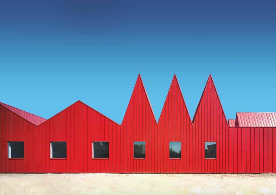
“Here, the color red communicates an active, dynamic, welcoming presence. It’s almost like a vibrant beacon, vitally calling attention and beckoning,” Paul says of this psychiatric facility in Zaragoza, Spain.
The striking design helps demarcate how certain spaces are utilized: the highest-pitched roof is above the common room, the shorter gables are above the bedrooms, and the flat roofs are above staff quarters.
The building tackles the notion mental illness that mental illness should be hidden, as the bold zinc-cladding very much makes itself seen against the bright-blue Spanish sky.
Barcode by Vitruvius & Sons
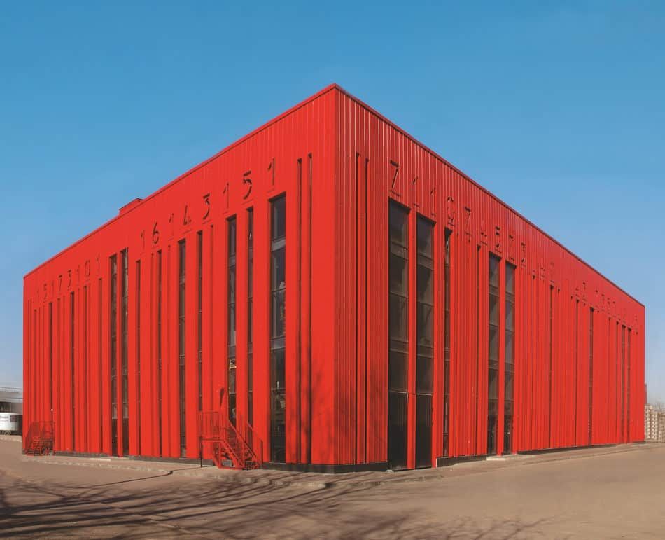
The Barcode shopping mall in St. Petersburg, Russia, holds a lot of meaning within its walls. “The explicit reference to digital barcodes reinforces the purpose of this application of the color red, as a high-voltage invitation to shop,” Paul says.
She also notes that in Russian, the words for red and beautiful share a common root. “It’s a powerful connection,” she says, especially given that the color has previously served as a symbol for both the aristocracy and the Russian Revolution.
There are six floors of shops in the mall, with the numbers on the facade serving as windows for the sixth floor. The building’s location amid uniform, gray concrete structures makes its exuberance even more pronounced.
PaperBridge by Steve Messam
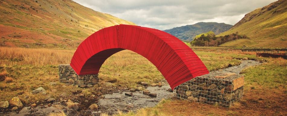
At first glance, this red bridge does not appear a natural fit in the English Lake District, but it is actually made of locally produced sheets of paper (compressed wood pulp and water). “The vivid color emphatically punctuates a natural landscape,” Paul says.
She points out that depending on the season, it can stand in stark contrast to the green landscape, noting that red and green are complementary colors.
Flex-Red by Cerejeira Fontes Architects
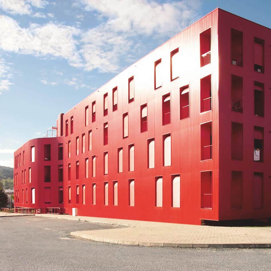
The perforated and corrugated metal skin of this apartment building truly pops against the cerulean sky and green hills of Gualtar, Portugal. “The contrast of a whole building against its surroundings can be arresting,” Paul says.
Here, the bright red exterior acts as a shield against the heat of a typical summer day. Balconies and terraces are sheltered by the facade, allowing breezes to pass through and cool off the residents.
Harpa Concert Hall by Henning Larsen Architects
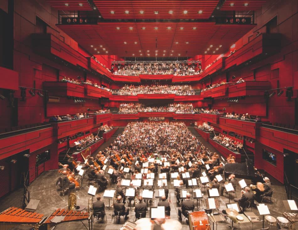
In this concert hall in Reykjavik, sensory overload is created in the best possible way. To complement the acoustics, the architects made the auditorium a visual delight with red-lacquered birchwood that is native to Iceland.
The space is dubbed Eldborg, which translates to Fire Mountain. It is designed to “make the audience feel cocooned, happy and poised for something special,” says Paul.
The Digit by Anagram Architects
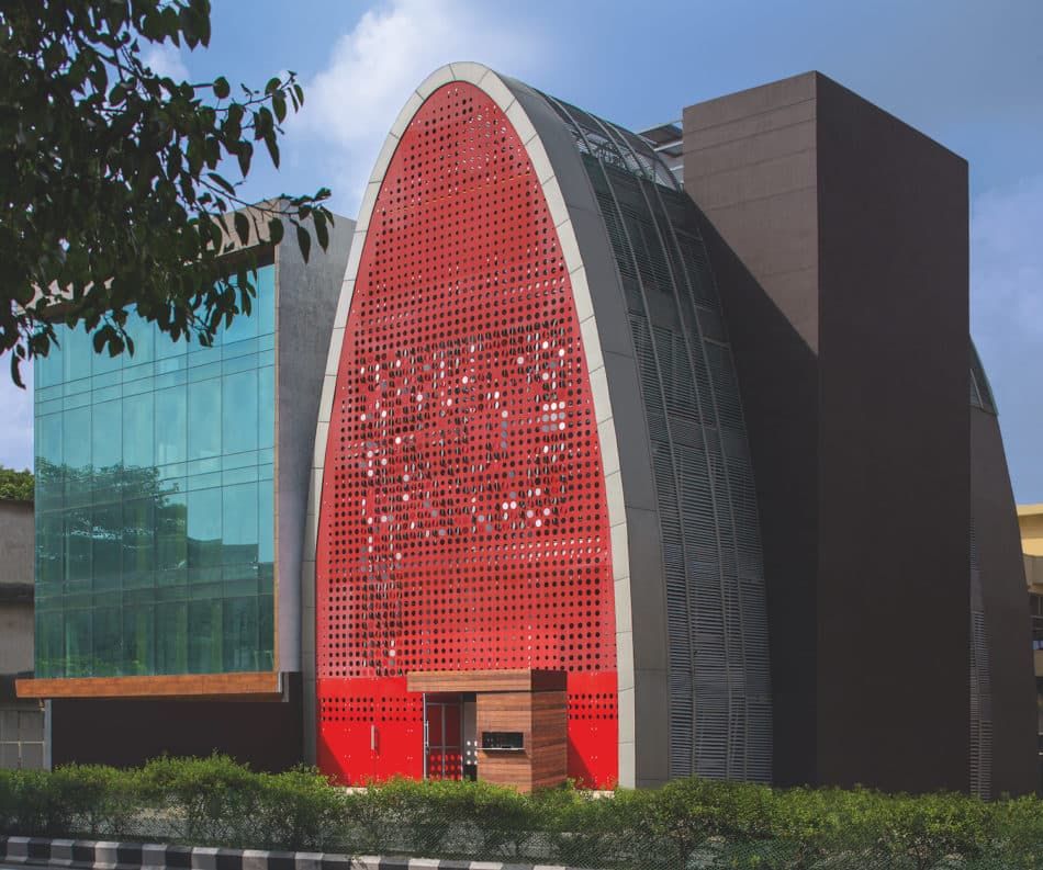
A media company’s headquarters in New Delhi is as vibrant as the content it creates. The idea of “identity” inspired the design: the building is thumb-shaped (hence, its name, the Digit) with a facade covered by disk-shaped windows that can pivot to help reduce sun and noise as needed. The structure’s widest parts are where most the staff sit. Senior management occupies the upper, narrower floors.
Kunshan Visitor Center by Vector Architects
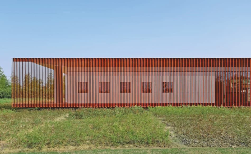
The variability of the color red is on full display at the visitor center of a luxury hotel in Jiangsu Province, China. Made of perforated burnt-sienna corten steel and red wooden louvers, the screens fade away into the idyllic background punctuated by rice fields. “Red can be very understated, melting almost seamlessly into broader environments,” Paul says.