Although some prefer to wait for paint brands to announce their much-anticipated colors of the year, our designers — of interiors and furniture — have already predicted summer’s biggest color trends, and they aren’t what you’d expect.
Summer hues are generally bright and sunny: canary yellow or watermelon pink. This year, however, we’re seeing a more toned-down palette, reminiscent of Beverly Hills in the 1950s — think burnt orange, powder blue and vintage linen. Here, we present the inside scoop on which seven shades are heating up this season.
Moss Green

Somewhere between a jewel tone and a pastel, this gentle shade with subtle yellow undertones can almost work as a neutral. Green, which represents life, nature and energy, is also associated with growth and harmony. Why not bring ultrapositive moss green into your home?
Buttercream Yellow

Cheerful yellow stands for freshness, happiness, positivity, clarity and optimism. Using the hue in accents here and there can brighten a room and your mood. Yellow can be a bit aggressive, however, so go for a rich yet subtle buttercream shade.
Pale Lilac

As experts in the language of flowers well know, the bloom that lends its name to this soft purple hue symbolizes first love. Perfect for the summer months, pale lilac is as tranquil as it is welcoming.
Burnt Orange

Pure orange may be a bit bold, but toned down, it makes a chic design statement — especially in a slightly burnt shade. The color combines the energy of red and the happiness of yellow, so a few burnt orange moments in your home and closet makes for seriously good vibes.
Overcast Gray

During the summer we may worship the sun, but there’s something soothing about a cloudy day. The shade of neutrality and balance, overcast gray is subtly powerful.
Powder Blue

Blue is a perennial favorite. This unique shade, however, is strictly for summer. Powder blue, the color of the sky and sea, radiates serenity. For that reason, it’s typically associated with depth and stability — two things we could all use in our lives!
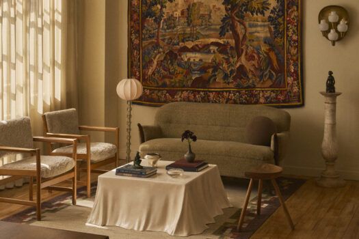
Vintage Linen

White is associated with light, goodness, innocence and purity, but designers are branding the slightly sepia shade known as vintage linen as more worldly and stylish. Pairing beautifully with warm metal accents, this creamy color is a go-to for any beach house.