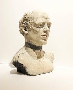
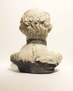
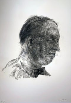
By David Becker
Located in Chicago, IL
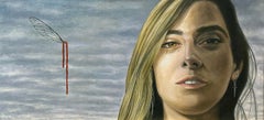
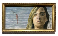
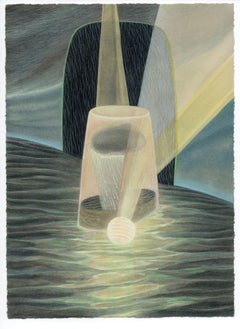
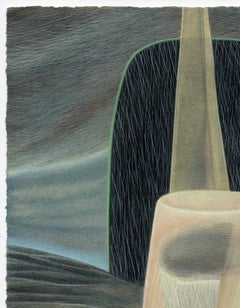
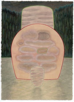
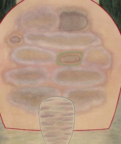
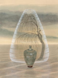
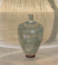
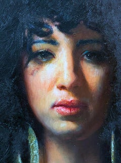
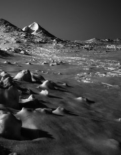
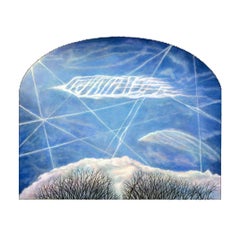
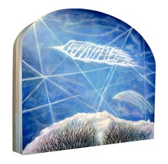
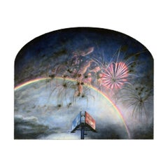
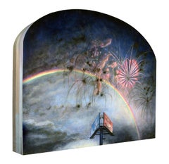
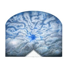
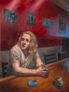
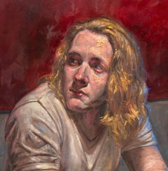
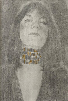
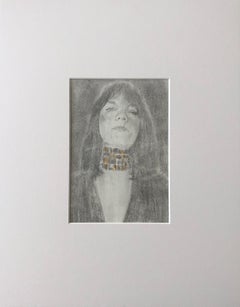
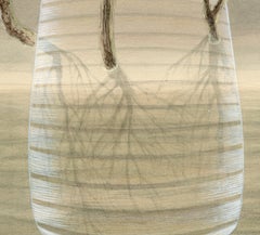
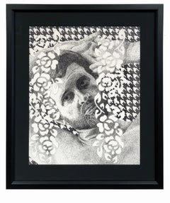
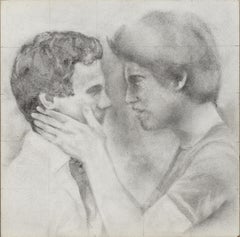
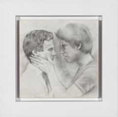
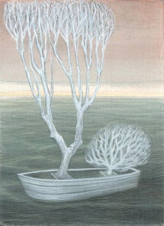
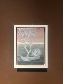
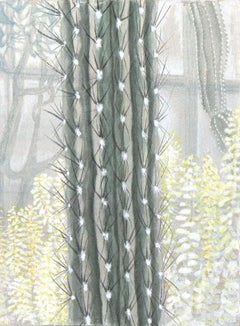
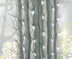
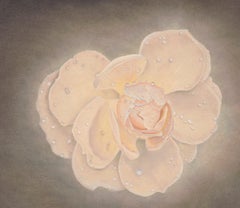
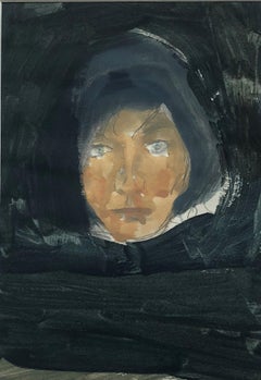
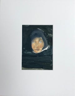
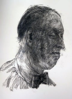
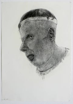
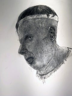
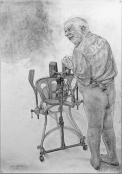
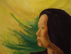
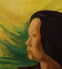
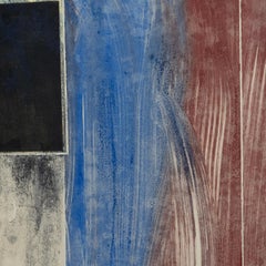
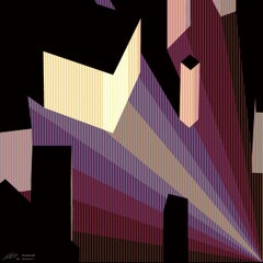
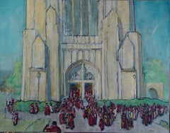
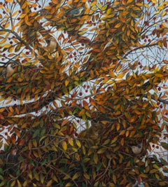
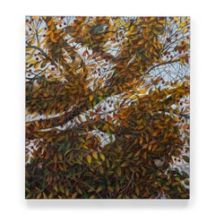
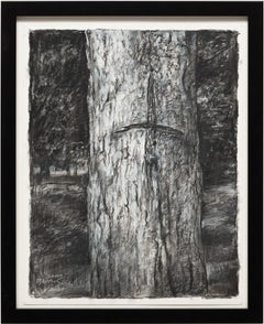
The dramatic, rich markings left by charcoal appear in the earliest primitive cave painting of early humans, which are believed to have been drawn with the charcoal created from burnt sticks. Of the various kinds of charcoal available today, David Becker often chooses vine charcoal which provides a smooth, softer line. Able to produce lines with either a subtle or strong quality, charcoal is wildly versatile, allowing Becker to approach texture, shading and tone with ease. He is able to capture both gestures and emotions with an intuitive mixture of the soft and the dark.
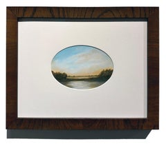
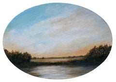
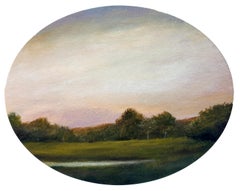
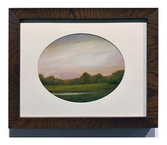
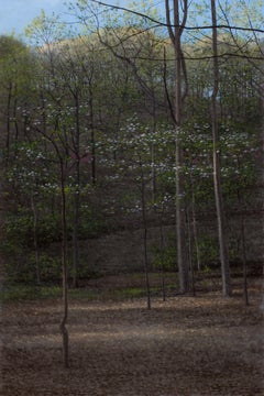
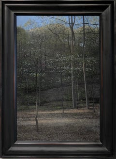
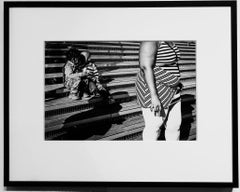
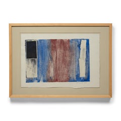
David Becker
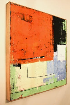
Reflection #1
charcoal on paper
36h x 25w in
91.44h x 63.50w cm
DB0009
David Becker
Exhibitions
2017 Figure8, Gallery Victor Armendariz, Chicago, IL
Coming Attractions, Gallery Victor Armendariz, Cicago, IL
2012 Eye Teeth Group Show, Paint Creek Center for the Arts, Rochester, MI
2011 Art Chicago 2011, Merchandise Mart, Chicago, IL
2010 Art Chicago 2010, Merchandise Mart, Chicago, IL
2009 David Becker Retrospective, Ann Nathan Gallery, Chicago, IL
Art Chicago 2009, Merchandise Mart, Chicago, IL
The 184th Annual Exhibition of Contemporary American Art, National Academy Museum, NYC
Selections, Ann Nathan Gallery, Chicago, IL
2008 Art Chicago 2008, Represented by Ann Nathan Gallery, Merchandise Mart, Chicago, IL
2007 Unruly Muse, Ann Nathan Gallery, Chicago, IL
SOFA NY (Sculptural Objects Functional Art), Ann Nathan Gallery, 7th Regiment Armory, NY, NY
Art Chicago, Merchandise Mart, Ann Nathan Gallery, Chicago, IL
2006 Palm Beach³, Ann Nathan Gallery, Palm Beach, FL
2005 SOFA NY (Sculptural Objects Functional Art), Ann Nathan Gallery, 7th Regiment Armory, NY, NY
Art Chicago in the Park, Butler Field, Ann Nathan Gallery, Chicago, IL
Ann Nathan Gallery, Chicago, IL
Palm Beach³, Ann Nathan Gallery, Palm Beach, FL
2004 Contemporary Prints: National Academy Museum Collection, National Academy of Design, NYC
Art Chicago 2004, Ann Nathan Gallery, Chicago, IL
Fantastic & Visionary Art, touring exhibit: Orange, Manning, Riddoch, & Ballart Gallery, Australia
Return of the Men, Peltz Gallery, Milwaukee, WI
2003 Art Chicago 2003, Ann Nathan Gallery, Chicago, IL
Fantastic & Visionary Art, touring exhibit: Orange Regional Gallery, New South Wales, Australia
National Academy of Design 178th Annual Exhibition, NY, NY
2002 Art Chicago 2002, Ann Nathan Gallery, Chicago, IL
Art of the 20th Century, Ann Nathan Gallery, Park Ave. Armory, NY, NY
Outsider Art Fair, The Puck Building @ Houston & Lafayette Sts., NYC
Self and Other Portraits, Wisconsin Artists, Charles Allis Art Museum, Milwaukee, WI
Return of the Men, Peltz Gallery, Milwaukee, WI
2001 Beyond the 50's, May 4 - July 1, Exhibit A, A Gallery of Art & Design, Birmingham, Michigan
Outsider Art Fair, January 26-28, The Puck Building @ Houston & Lafayette Sts., NYC
"FANTASTIC ART", April/May, Orange Regional Gallery, Orange NSW, Australia.
David Becker: Etchings and Engravings, Ann Nathan Gallery, Chicago, solo exhibition of prints, February.
2000 Four person exhibition, Columbus State University, Columbus, Georgia, Oct. 31 - Nov. 27, 2000.
1999 National Academy 174th Annual Exhibition, NY
University of Wisconsin-Madison Faculty, Elvehjem Museum of Art, Madison, WI
Treasures Revealed: 19th and 20th Century American Works on Paper, National Academy, NY
1995 Bharat Bhavan International Biennial of Prints, Bhopal, India
Contemporary Prints, Selections from John Szoke Gallery, NYC, Drew University, Madison, NJ
Collection Update, 1994, National Academy of Design Museum, NY
1994 David Becker and Robert Sholties, Peconic Gallery, Suffolk Community College, Riverhead, NY
In Black and White: Works by Four Printmakers, Atrium Gallery, University of Connecticut, Storrs
Aesthetics of Athletics: Sports, Games, and Exercise, Charles A. Wustum Musem, Racine, WI
GMI IX Award Winners, Art Center Gallery, Central Missouri State University, Warrensburg
1993 Take Home a Nude benefit auction, NY Academy of Art Graduate School Of Figurative Art, NY
1993 American Prints: Last Half 20th Century, Jane Haslem Gallery, Washingtion, DC
Outstanding American Prints, Anderson Arts Center, Kenosha,WI
National Academy of Design 168th Annual Exhibition, NY
David Becker: Etchings, Davidson Galleries, Seattle, WA
Portraits, Davidson Galleries, Seattle, WA
1992 The Print Fair, 7th Regiment Armory, NY
1991 166th Annual Exhibition, National Academy of Design, NY
Alma College Collection, Detroit Institute of Arts, Detroit, Michigan
Modes of Expression, Potsdam College, SUNY, Potsdam, NY
1990 With Nothing On, Prints and Drawings of the Nude, New Orleans Museum of Art, LA
Prints by Printmakers, Staller Art Center, SUNY-Stonybrook, NY
Publications/Reviews
2007 November 60 Years of North American Prints: 1947-2007, Boston U. Art Gallery, Boston, MA
2003 July 11 Isthmus, Madison, “Welcome to My Nightmare,” by Robert Cozzolino.
2001 March 14 The Wall Street Journal, "Time Off: A Week of Diversions."
Review of Progressive Printmakers (LVM) exhibition.
2001 February Isthmus, Madison, "America's Printland," by Jennifer Smith.
2001 February Capital Times, "The Crowned Prints," by Kevin Lynch.
1999 July Progressive Printmakers: Wisconsin Artists & the Print Renaissance.
1995 – 1999 Who’s Who in America.
1993 Summer The Journal of the Print World, review.
March 14 The New York Times, review.
March 12 The Daily Oklahoman, review.
1990 Dec. 13 The Capital Times, review.
April 28 The Washingtion Post, review.
March 25 The New York Times, review.
Summer The Journal of the Print World, review.
Selected Collections
- additional collections available on requestArkansas Arts Center Foundation, Little Rock, AR
Art Institute of Chicago, Chicago, IL
Brooklyn Museum, NYC
Butler Institute of American Art, Youngstown, OH Detroit Institute of Art, Detroit, MI
Elvehjem Museum of Art, U of Wisconson-Madison
Honolulu Academy of Arts, Honolulu, HI
Library of Congress, Washington, DC
Metropolitan Museum, Miami, FL
Museo de Arte Moderno, Cali, Columbia
National Academy, NY, NY
National Museum of American Art, Washington, DC
New York Public Library, NY
Portland Art Museum, Portland, Oregon
Rose Art Museum, Brandeis University, MA
United States Information Agency, Prague, Czech.
Alberta College of Art, Alberta, Canada
Albion College, Albion, MI
Alma College, Alma, MI
Art Center, South Bend, IN
AT&T Corporate HQ, Plainfield, NJ
Boston Printmakers, Boston, MA
Bradley University, Peoria, IL
Columbia Green Community College, Hudson, NY
Columbus State University, Columbus, GA
Davidson College, Davidson, NC
Dickinson College, Carlisle, PA
Georgia State University – Atlanta
Hope College, Holland, MI
Hunterdon Art Center, Clinton, NJ
Kansas State University, Manhattan, KS
Madison Art Center, Madison, WI
Marui Imai Inc., Sapporo, Japan
Milwaukee Art Center, Milwaukee, WI
Minot Art Association, Minot, ND
North Carolina Print/Drawing Society, Charlotte, NC
North Texas State University – Denton
Ohio University – Athens
Oklahoma Art Center, Oklahoma City, OK
Oklahoma State University, OK
Quad Graphics, Milwaukee, WI
Silvermine Guild of Arts, New Canaan, CT
Springfield College, Springfield, MA
St. Lawrence University, Canton, NY
State University of New York – Fredonia
State University of New York – Potsdam
Trenton State College, Trenton, NJ
University of Arizona Museum of Art, Tucson, AZ
University of Colorado-Boulder
University of Dallas, TX
University of Louisville, Louisville, KN
University of Manitoba, Winnipeg, Canada
University of North Dakota – Grand Forks
University of South Dakota – Vermillion
University of Tennesse – Knoxville
West Chester State College, West Chester, PA
Western Kentucky University – Bowling Green
Private Collections
Carla Leighton, New York, NY
Marc Hauser, Chicago, IL
Michael John Hofer, Chicago, IL
Drs. Mark & Helene Connolly, River Forest, IL
Jamie Kalikow, New York, NY
Dianne & Jim Blanco, Chicago, IL
Denise Roberge, Palm Desert, CA
Tish & Philip Messinger, Creskill, NJ
Brian Wesphal & Michael McVicker, Chicago, IL
Ralph Privoznik, Lafayette, IN
Candice Groot, Evanston, IL
Shomaker/Ruud Collection, Chicago, IL
Braden Berkey and Robert Bartlett, Chicago, IL
Bill and Karyn Silverstein, Highland Park, IL
Steve Weitz, Lovettsville, VA
Mary Allice Wimmer, Madison, WI
Ann & Robert Avery...
Category
21st Century and Contemporary Contemporary Chicago - Art
MaterialsArchival Paper, Charcoal