By Bruno Surdo
Located in Chicago, IL
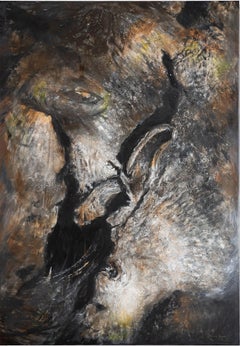
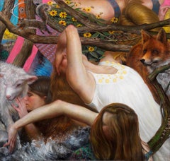
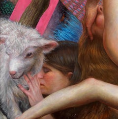
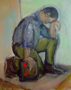
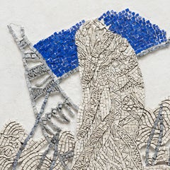
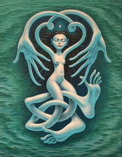
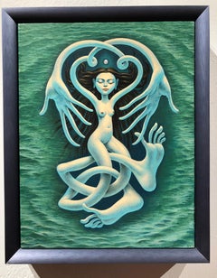
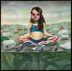
This painting exemplifies Bruno Surdo’s synthesis of Renaissance figuration, Northern allegory, and psychological symbolism. Female figures twist and overlap beneath a lattice of tree branches, while animals—a lamb, fox, squirrel, hummingbird—inhabit the same compressed pictorial space. The interlocking limbs and diagonals recall High Renaissance and Mannerist strategies of sculptural composition, and Surdo’s atelier training is evident in the anatomical precision and volumetric modeling of flesh. Yet the scene feels intentionally dense and claustrophobic. Rather than a pastoral idyll, the forest becomes charged—alive with tension, concealment, and layered meaning.
The symbolic animals situate the work within a long art historical lineage. The lamb evokes innocence or sacrifice; the fox suggests cunning and instinct; birds often signify fragility or spirit; the spider embedded in the branches recalls vanitas traditions of the Dutch Golden Age, where small creatures signal mortality and hidden threat. However, the background introduces an additional, more psychological register: the partially obscured eye and the numbers 3, 5, and 7. These are not naturalistic elements; they intrude like fragments from another realm. Their presence subtly aligns with Jungian thought—an area of interest for Surdo—where numbers function as archetypal structures of order within the psyche. In Jungian symbolism, such numbers carry qualitative meaning rather than mere quantity, suggesting stages, wholeness, embodiment, or cycles of psychic development. Their appearance within the forest—traditionally a metaphor for the unconscious—suggests the mind’s attempt to map or structure instinctual terrain.
The eye, half-hidden behind branches, intensifies this reading. It can be understood as a symbol of awareness or consciousness emerging from within the thicket of instinct. Rather than divine omniscience, it feels psychological—an archetypal “watcher” embedded in the natural world. The forest thus becomes more than environment; it reads as psychic landscape. Surdo collapses civilization and instinct, rational structure and animal impulse, into a single visual field.
Within his broader oeuvre—often concerned with the tension between performance and authenticity, order and chaos—this work becomes a contemporary myth of the psyche. Renaissance form provides authority and structure, while allegorical animals and Jungian symbols suggest the layered architecture of the unconscious. The result is a painting that feels timeless yet inwardly modern: a meditation on innocence, predation, awareness, and the hidden numerical and symbolic frameworks through which the human mind seeks to understand its own wilderness.
Bruno Surdo
Nature's Web of Dependency
oil on canvas
64h x 66.50w in
162.56h x 168.91w cm
BRS082
Bruno A. Surdo
b. Chicago, 1963
EXHIBITIONS
2021 Ethos + Truth, Gallery Victor Armendariz, Chicago, IL
2020 Realities, Gallery Victor Armendariz, Chicago, IL
2018 Liberation, Gallery Victor Armendariz, Chicago, IL
Blood Sport, Gallery Victor Armendariz, Chicago, IL
Art on Paper 2018, Gallery Victor Armendariz, Pier 36, New York, NY
SOFA Chicago 2018, Gallery Victor Armendariz, Navy Pier, Chicago, IL
2017 POP!ARAZZI, Gallery Victor Armendariz, Chicago, IL
Coming Attractions, Gallery Victor Armendariz, Chicago, IL
2015 SOFA Chicago 2015, Ann Nathan Gallery, Navy Pier, Chicago, IL
Bruno Surdo: Allegories, Ann Nathan Gallery, Chicago, IL
2014 Bruno Surdo: Respond, Ann Nathan Gallery, Chicago, IL
Modern Metaphors, Rockford Art Museum, Rockford, IL
2013 Bruno Surdo: Revelations, Ann Nathan Gallery, Chicago, IL
Vice + Virtue, Northern Illinois University Museum of Art
2012 Contemporary Realism Biennial, Fort Wayne Museum of Art, Fort Wayne, IN
2011 Bruno Surdo, University of St. Francis School of Creative Arts, Fort Wayne, IN
Uncensored, Ann Nathan Gallery, Chicago, IL
2010 Art Chicago 2010, Ann Nathan Gallery, Merchandise Mart, Chicago, IL
2009 Art Chicago 2009, Ann Nathan Gallery, Merchandise Mart, Chicago, IL
2007 Bruno Surdo, Art Institute of Indianapolis, Indianapolis, IN
2006 Context/Content: Making Meaning with the Figure, University of Arkansas, Conway, AR
Creative Imaginings, Mobile Museum of Art, Mobile, AL
Bruno Surdo: Cycles, Ann Nathan Gallery, Chicago, IL
2005 Art Chicago 2005, Ann Nathan Gallery, Chicago, IL
2004 Tragedy, Memory, & Honor, Richard M. Daley Center, Chicago, IL
Art Chicago 2004, Ann Nathan Gallery, Chicago, IL
Group Show, Arcadia Gallery, New York, NY
Drawings VII, Koplin Del Rio Gallery, West Hollywood, CA
Armory Show, New York Armory, New York, NY
2003 Paintings & Drawings, College of Lake County, Grayslake, IL
The Art Show, New York, NY
Bruno Surdo: New Work, Ann Nathan Gallery, Chicago, IL
Art Chicago 2003, Ann Nathan Gallery, Chicago, IL
2003-10 International Show of Contemporary Artists, Chicago Art Open, Chicago, IL
2002 Bruno Surdo: Perception of Appearance, Frye Museum, Seattle, WA
Tragedy, Memory, & Honor, Richard M. Daley Center, Chicago, IL
Bruno Surdo: Transcendence, Ann Nathan Gallery, Chicago, IL
Art Chicago 2002, Ann Nathan Gallery, Chicago, IL
Tragedy, Memory, & Honor, Ann Nathan Gallery, Chicago, IL
2001 Magic Vision, Arkansas Art Center, Little Rock, AR
1998 Evanston and Vicinity Artists, Evanston Art Center, Evanston, IL
1996 Bruno Surdo: A Personal View, University of Wisconsin, Kenosha, WI
1995 Bruno Surdo: Recent Works, College of Lake County, IL
AIDS in Our Society, Loyola University, Chicago, IL
Bruno Surdo: Life, Struggle, and Hope, Chicago Cultural Center, Chicago, IL
2001 Magic Vision, Arkansas Art Center, Little Rock, AR
Bruno Surdo: Dualities of Life, Ann Nathan Gallery, Chicago, IL
1999 Group Show, Ann Nathan Gallery, Chicago, IL
1998 Group Exhibition, Fine Arts Building Gallery, Chicago, IL
1995 Spiritual Inquiries, Struve Gallery, Chicago, IL
1994 Recent Works, The 14th Annual Juried Exhibition for Lake County Artists, Grayslake, IL
Go Figure, Figurative Works on Paper, Chicago Printmakers Collaborative, Chicago, IL
SELECTED COLLECTIONS
The Re-Birth of Venus, Temporary Loan, Fort Wayne Museum of Art
Arkansas Art Center, Little Rock, AR
College of Lake County, Greyslake, IL
Flashpoint Academy, Chicago IL
John Robert Wiltgen Design
Shoemaker Ruud Collection
Julie & Thomas Danilek
Michael Vozzella and Mike Silver
Benjamin Fernandez
Tom Braake
Betsy Colburn
Michael Diemand & Lor LaRose
Michael Staab & Kathy Brock
Bruce Leep
Frank Tzurect
Mary Foley
Rosalyn Carlson
Mimmy Turney
Janet Long Halstead
Billy Hunt
Carol Galli
Myles Kerrigan
Honorable & Mrs. Edwin Berman
Theodore Gage
Northrop Art Museum
Past Present & Future Company
Dr. James & Peggy Kemmler
Salvatore Monastero
Nix & Virginia Lauridsen
Joel Miller
David & Marlene Zerkel
Ann & Andy Abel
Claudia Rush
Marc Miller
Leonard Goldberg
Lawrence Pucci
Howard Tullman Collection
Susan & Manny Kramer
James Rinnert
Richar Interiors
Michael & Nancy Colt
Khalid Altijir
Dr. Joe Grodman
Beryl & Jack Gore
Larry Wolf & Eric Naegle
Chuck Wolandi
Jack Schwab & David Sandelin
Thomas Kaczmarek
Marti Dinerstein
Craig & Michael Golden...
Category
21st Century and Contemporary Contemporary Chicago - Art