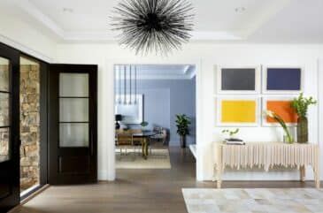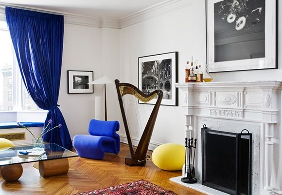
In a living room in New York’s Gramercy Park, Alexandra Loew brought in whimsical yellow Tato stools to offset the traditional architectural details. Photo by Justin Bernhaut
Pantone’s 2017 Color of the Year is a verdant tone called Greenery, which evokes Granny Smith apples or butter lettuce. But we’ve got our eyes on a different shade noted in Pantone’s Spring 2017 Fashion Color Report: Primrose Yellow.
Primrose Yellow sparkles with “heat and vitality,” says Leatrice Eiseman, executive director of the Pantone Color Institute, conjuring thoughts of a warm, sunny day. In fashion, the pigment is seen in everything from workwear to athleisure, so “we can expect it to be used as a cheerful pop of color in this season’s palette,” Eiseman notes. And Primrose Yellow furnishings can have a similar effect on a room, when used in moderation.
Below, renowned interior designers share their tips for decorating with this happy hue and name some on-trend items that would work well with it.
Alexandra Loew
“Primrose Yellow feels like a palette cleanser,” says Alexandra Loew, an arty interior designer with offices in New York and Los Angeles. “It’s a color that can go hard-edge eighties,” which makes it an ideal backdrop for avant-garde furniture pieces such as Shiro Kuramata’s How High the Moon chair from 1986 or Comme des Garçons founder Rei Kawakubo’s No.24 chair from the late 1980s.
How She’s Used It
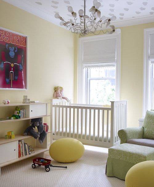
Photo by William Waldron
In her own work, Loew has deftly deployed Primrose Yellow to add a pop of color to a children’s room on the Upper East Side (above) and to a contemporary living room in Gramercy Park (top of the page), both in the form of egg-shaped Tato stools.
Loew’s Primrose Yellow Picks
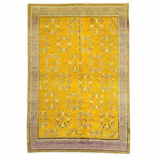
Loew is a fan of this antique Khotan carpet from East Turkestan. She finds the piece, which dates from the early 20th century, “bright and acidic but dimensional enough to have some gravitas as well.” With its punchy yellow hue and traditional motifs, it would work in a variety of settings.
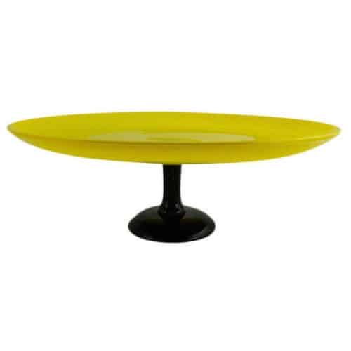
“I think Art Deco and eighties design make wonderfully strange bedfellows,” Loew says of this Schneider Glass centerpiece from the 1930s, which would add a cheerful jolt to any staid dining table.
Maddux Creative
“Yellow is such a wonderful color to use, especially in London, because it’s so contrasting with the skies,” says Scott Maddux, one half of the Southeast London–based interiors firm Maddux Creative. “We had a pink moment last year, and falling off of that moment, yellow seems to make sense. It’s a nice counterbalance to [Rose Quartz], and it maintains the freshness without being too contrasting.”
Though he finds Primrose Yellow to be somewhat old fashioned, he’s intrigued by how it can become modernized. “Using it with black really gives it more of a graphic outline,” he says, and it’s ideal for mixing with aqua and pink to shock an otherwise dusty palette. In terms of fabric prints, Maddux says Primrose Yellow “works incredibly well in silk if you find the right tone.”
How They’ve Used It
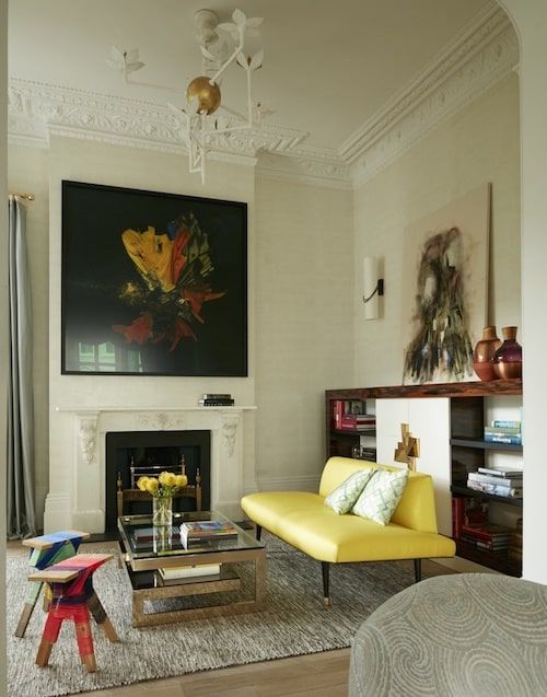
Photo by Ricardo Labougle
For an eclectic family home in London’s Notting Hill neighborhood, the duo added a dash of Primrose Yellow with a stunning settee upholstered in silk. “It just made the room,” Maddux says, “and in the same house, we brought the same colors over on some cushions to tie the room together under a series of paintings by a Norwegian artist.”
Maddux Creative’s Primrose Yellow Picks
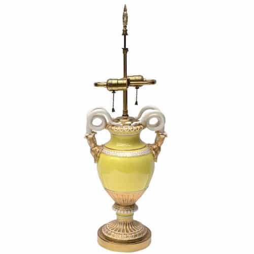
“A lot of Meissen Porcelain from Germany uses Primrose Yellow well in its painting,” says Maddux, who chose a snake-handled vase table lamp from the 19th century. “It’s nice how it pops everything out.”
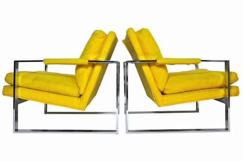
Like Loew, Maddux appreciates the bold contrast of pairing Primrose Yellow with high-sheen chrome, as seen above in these Milo Baughman lounge chairs from the 1970s.
Woodson & Rummerfield’s House of Design
“That type of yellow is a classic yellow for us, being here in Hollywood,” says Jaime Rummerfield, co-owner of glamorous interiors firm Woodson & Rummerfield’s House of Design, which is known for its work in Southern California. “It’s not a juvenile color. It’s actually a very sophisticated hue.”
In private residences, Rummerfield likes to use Primrose Yellow in textiles, upholstery, art and wall coverings — “more as an accent than the primary driver for the space,” she says. “It’s a pretty strong color, so I think it’s better in doses.”
How They’ve Used It
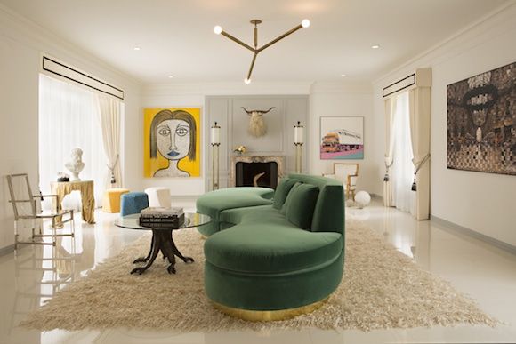
Photo by Karyn Millet
“Where there are pops of yellow, it adds so much interest,” says Rummerfield, who added a Primrose Yellow stool and artwork to a contemporary living room in Hancock Park. She recommends pairing the shade with rich blues, emeralds, and jewel tones for an “impactful and bold” look.
Woodson & Rummerfield’s Primrose Yellow Picks
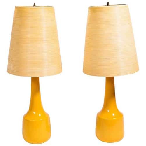
Rummerfield likes these 1960s ceramic Lotte lamps for their ability to work as an accent piece in any setting.
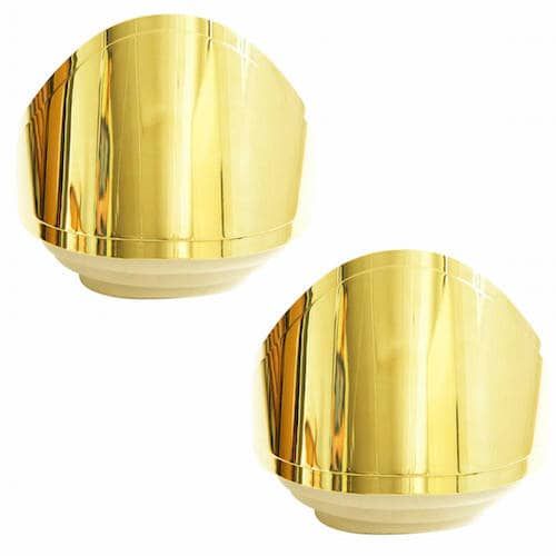
A dramatic pair of Warren Plattner mirrored polished brass sconces, ca. 1981, would also brighten a room.