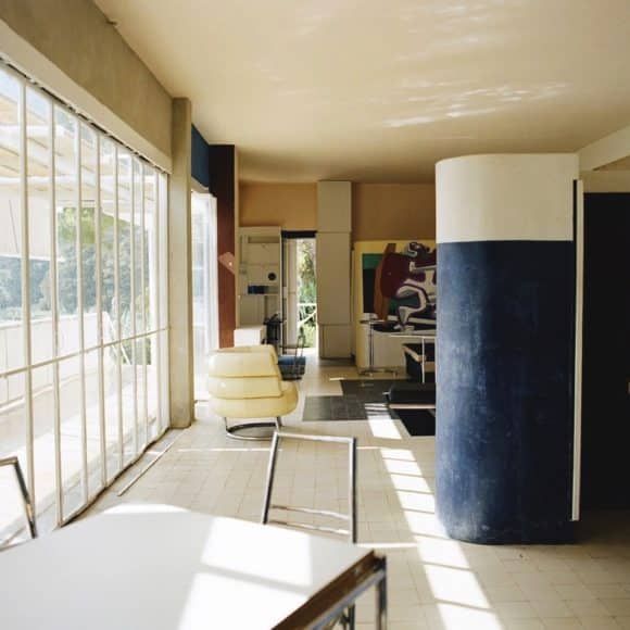
Residence E1027 by Eileen Gray, 1929. All images as credited on www.design.tel
A black and white icon of a Mad Mad-era television set is all that greets you on the landing page of design.tel. But that pared-down graphic is deceptive. Click on it, and you’ll find hundreds of carefully organized images cataloging the best of mid-20th century design, from architecture to electronics to cars to, yes, furniture, each captioned sparsely but deliberately. For design geeks, it’s one of the happiest rabbit holes to fall into.
It’s also one of the most democratic. Works by Ray and Charles Eames and Frank Lloyd Wright are given equal billing to game consoles by Sega and tripod speakers by Elipson. Yet there is a through line in all of these objects, says Benjamin Jay Shand, a 25-year-old University of Sydney architecture and design graduate, who created the site. Though some of these relics belong in the past, together they present a “consistency of language”. No matter the medium or designer, mid-century design — Shand uses the term chronologically, to refer to the period from the late 1930s to mid 1970s, and distinct of “mid-century modern” — always delivers the same message of form, functionality and, often, fun.
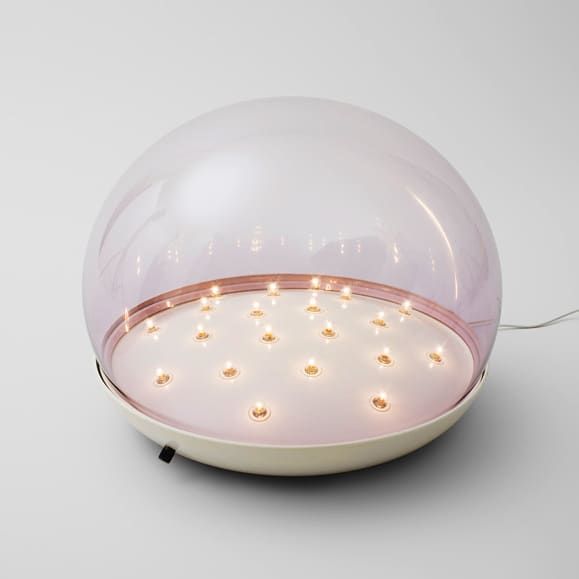
Lamp no. 604 by Gino Sarfatti.
Intrigued by Shand and his eye for design, we asked him to speak about the site, which he founded in January 2015. Here, he discusses driving around in Palm Springs, McDonald’s golden arches and the role that luck plays in timeless design. Read on for more.
How did the idea for Designtel come about?
At the start of last year, I was driving around the West Coast, and I drove up with my brother into Palm Springs from San Diego. I’d actually just missed Modernism Week, and we went to all these houses that I’ve read about. None of them are really Case Study homes; a lot of these are prefabrications for houses that were supposed to be built everywhere but more or less stayed in Palm Springs. But I could see how comprehensive it is. They were simple houses, with really clean lines and strong steel frames. A lot of them were designed in terms of a single theory: they’re mid-century houses with the functional ideals that came decades before. And there’s something about Palm Springs that when you see this mountainous terrain, and then you see these big concrete shells of buildings — it’s just an incredible thing to see. They work in any scale. I always loved design, the paintings of Mondrian, all the work of Dieter Rams. But [seeing those houses] planted a seed where I wanted a way of getting it all together and seeing what it meant then as much as what it means now.
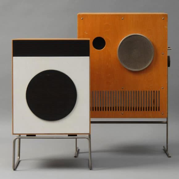
At left, a Braun L2 speaker by Dieter Rams, 1958. At right, a Braun VS 1-32 speaker by Karl Clauss Dietel and Lutz Rudolph, 1965.
Where do you turn to for sources? Do you scan pictures from books, find them online or something else?
It varies. The most wholesome source is scanned promotional and marketing material either from the designer or the manufacturer. Product catalogues — either of the age or retrospective — are equally useful. These tend to compose the product in ideal fashion and/or function and bind it to its time of production. I think all manufacturers, especially those of audio equipment in the ’70s and ’80s, did quite a good job of producing imagery for their products; they tended to be quite kitsch. What they did really well was acutely attach an emotion to what they hoped their products would give. Today everything is really shock in terms of imagery. It’s overexposed, over-defined, and you sort of get an idea of the product’s capability. But back then it was all about the vignette, what it would sell you in terms of a scene. Bang and Olufsen did just that. Whenever they released a product line, they would show all of the items lined up together, so that you’d have the speakers next to the sideboard, which fits the TV, which sits right next to the Danish man and woman. And that’s their brochure from 1978. I found ton of those, which are amazingly useful. I also have hundreds of old Vogue magazines.
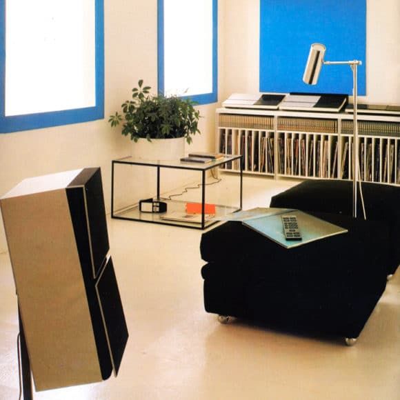
A Bang & Olufsen catalogue image from 1983.
How has Designtel evolved over time?
Originally, it was set up for me and a bunch of designers and architects. I tried to find the finer grains of it, and then it kind of developed, hundreds of posts later, into something that was more expansive in terms of the works. It goes into cameras, vehicles, furniture design. It all says the same thing, and that’s the heart of it. It draws lines between things that perhaps aren’t so clearly aligned.
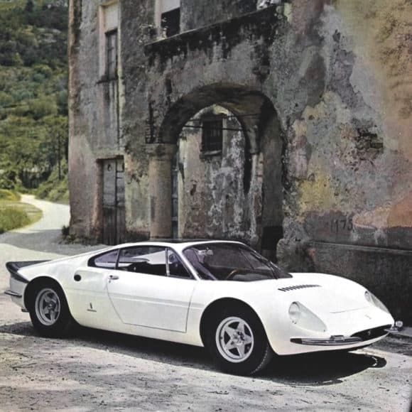
A 1966 Ferrari 365 P Berlinetta Speciale.
Have those parallels taught you something about mid-century design that you weren’t aware of before?
A lot of mid-century design work, it taps into a deep-seated nostalgia within people; the simplicity of it reminds you of another time, even if that time wasn’t your own. There are certain cues within the form that make you think of another time or place or space. That can easily descend into kitsch, but more often than that, I find it creates a warmer feeling with often very simple design.
You’ve also mentioned it’s one of the most distinctive styles out there. Why is “consistency of language” so important?
I think there’s a real argument for a thoroughness in design, which doesn’t limit itself to medium — you can effectively jump around — that’s kind of what the site’s about. The point is that the objects or the architecture are read the same next to each other. The fact that they are in a different class or form is less relevant.
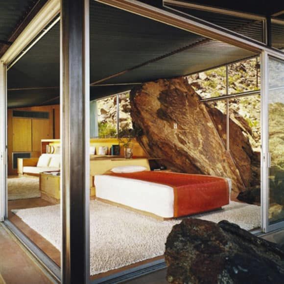
The Frey House II by Albert Frey, 1963.
What has managing Designtel taught you about design in general?
The products that look the most ridiculous are often still produced, and by same manufacturer. All Corbusier furniture could very much have sat on the decade that it was produced in, but something bound it to the time and kind of thrust it forward. Cassina is still manufacturing Corbusier’s LC2 sofa and armchair. Even if it is the most ridiculous idea, there is an element of real luck to the lasting value of design at the end of the day. The more that I study, there is certainly good design and bad design, but there’s also luck to design.
Could you give an example?
The Space Age movement is a good one. It really brought the design to the diner, cinema, bank, street lamp; it was brought into high-class homes. But it was more prevalent in McDonald’s. A diagram was taken to the owners, and ended up turning into the iconic arches of the M in the symbol, even though the M wasn’t actually integral to the branding at that stage. The M was integrated into the architecture of the restaurants, which lent itself to becoming an icon of fast-food burger chains — customers entered through that icon of the place and sat outside it. Everything that happened in the ‘50s and ‘60s in terms of this kind of design was very much that kind of dramatic optimism.
Alan Hess, an authority on Space Age–design, once said: “The Space Age movement established the technological image of Modernism in the lives of the mass public. It completed the revolution of Walter Gropius, Frank Lloyd Wright, Mies van der Rohe and Le Corbusier, the Futurists and the Constructivists, the Expressionists and the Bauhaus” — that is, it brought mass optimism to the everyman.
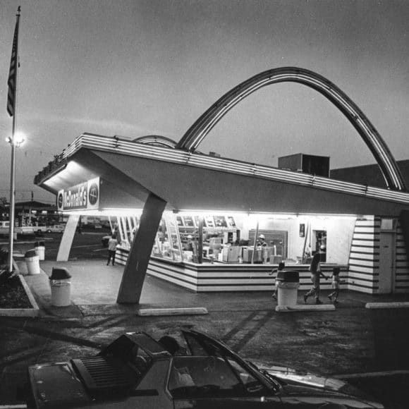
McDonald’s in Downey, California by Stanley Clark Meston, 1953.
Given your own artistic background, I’m interested in hearing how the site has influenced your own work.
It’s undoubtedly made me more aware of stylistic cues within designs and the intent of their makers, which has allowed for more clarity within my own work. It’s intriguing chronicling styles of another time as it illuminates how evident they are in today’s sphere, making for a very transparent depiction of the cyclical nature of design trends. Production of the archive has certainly heightened my consciousness. And with that there’s been no stifling of ambition with respect to current projects and those to come.
Visit Designtel or follow them on Instagram to see even more fascinating, radical and evocative design. This week, we asked Shand to guest curate 1stdibs’ own Instagram feed — see his picks here.