
Moon elevated this breakfast room from dreary and dated to bright and elegant. Photo on the right by William Waldron
Where his design career is concerned, the 40-year-old, Atlanta-born Wesley Moon has led a considerably charmed life. Opportunity regularly arose along his path to establishing his own business: from landing his first New York job at architectural behemoth Skidmore, Owings & Merrill, to developing designs for Martha Stewart–branded residential communities around the United States, to getting his first big client via a friend’s serendipitous conversation with another woman at a Manhattan bus stop. So one might be tempted to attribute his success to dumb luck.
However, as these before-and-after photographs illustrate, Moon’s swift rise in this industry is more attributable to a deft sense of balance and proportion, touches of glamour and the pairing of innovative palettes with richly textured materials. Here, Moon tells us the stories behind his remarkable renovations.
Foyer Before and After


Bottom photo by William Waldron
“When my clients purchased this prewar Park Avenue apartment, it hadn’t been touched in probably 40 years. The color scheme was not only dated — I actually can’t imagine how this was ever acceptable — but it was also dark and dingy. I suppose the stone flooring and faux-marble trim were attempts at grandeur, but it wasn’t at all the direction my clients hoped to go in with their new home. Our goal was accessible elegance. We wanted to bring out the prewar charm of this 1927 building in a fresh and livable, yet sophisticated, way.
We replaced the stone floor with oak in a herringbone pattern to match the rest of the apartment. Then we removed the wainscot and covered walls in a platinum-colored silk wallcovering from de Gournay, which adds texture and beautifully reflects light. We also lacquered the ceiling in high-gloss deep gray, accentuating the generous height. An antique Gustavian settee, custom limestone console, 17th-century gilded Italian mirror and a pair of Dunbar benches complement one another nicely and let you know up front that this is a collector’s home. The photograph over the table, 1841 Book of Proverbs for the Blind, by Abelardo Morell, heralds the clients’ love of photography.”
Living Room Corner Before and After


Bottom photo by Peter Murdock
“Another Upper East Side apartment that hadn’t been touched since the building was completed in 1958, this one had a great layout and generous rooms going for it. But like many a postwar apartment, the ceilings were low and the rooms lacked definition. There were also no architectural elements to speak of. This corner of the living room flowed into a sort of no-man’s-land interim space with low double doors leading into the dining room.
To bring the apartment up to snuff, I defined the individual spaces by creating a separate living room and gallery using a large cased opening that’s over seven feet tall. I mirrored the opening on the opposite side of the gallery, bringing the dining room into one large entertaining space that’s still three distinct rooms. The effect actually makes the whole apartment feel larger, and the vertical lines of the doorways, accentuated by casings in dark oak, lift the ceilings visually. A plaster fan detail on the gallery ceiling also adds height and helps to define that area.
New wide-plank wood flooring, a hefty custom baseboard and a new limestone fireplace add much-needed architectural significance. A customized Vladimir Kagan sofa anchors the corner of the living room and creates an intimate sitting area that’s also part of the larger furniture arrangement. Ceramic wall sculptures from Cocobolo Gallery add interest, while custom painted rope sconces from Bone Simple illuminate this corner vignette.”
Kitchen Before and After
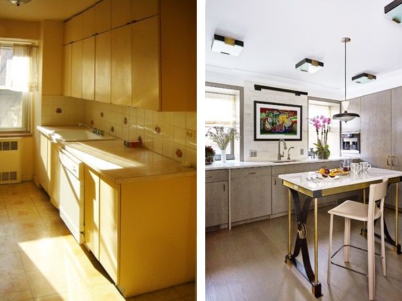
Photo on the right by Peter Murdock, courtesy of Identical Exposure
“This kitchen is from the same postwar Upper East Side apartment as the living room in the previous photos. As you can see, the narrow galley kitchen, which was adjacent to a maid’s room, was built for a bygone era. Instead, my clients wanted a large open kitchen where family and friends could gather. And they also wanted it to be sleek and contemporary, yet warm and inviting.
We tore down the wall separating the maid’s room to create a larger square space. I designed the cabinets in cerused oak and we managed to fit in nearly every appliance imaginable, including a 36-inch Sub-Zero refrigerator and a separate freezer, full-height wine fridge, Wolf range and wall oven, drawer microwave, beverage fridge, dishwasher, icemaker and built-in coffee machine. I designed the wrought-iron and brass island, which seats four comfortably. It’s based on a Gilbert Poillerat table I saw in Paris. To keep the space light, we hung artwork over the sink, as opposed to upper cabinets.”
Bedroom Before and After


Bottom photo by Marco Ricca
“This is a bedroom I did for Holiday House Hamptons, which is a designer showhouse that raises money for Breast Cancer Research. I was given a large room with a beautiful corner window, but there was nowhere to put a king-size bed. I decided to create a canopy bed that would go all the way to the ceiling and center it on the wall. This meant blocking part of the window, but it still left plenty of light and view, allowing me to properly furnish the room.
Each designer in the showhouse picked a holiday theme for his or her room. After seeing this amazing Mauritius wallpaper and matching fabric, generously donated by Pierre Frey, I chose Palm Sunday. The Ruffled Window made the canopy and drapery, and the bed itself was custom-fabricated for me by Savoir Beds using Foglizzo leather. The drapery fabric is from Quadrille, the rug from FJ Hakimian and the nightstands from John Salibello. The lamps are by Kimille Taylor, and Massimo Vitali’s photograph of a beach in Sicily inspired the color scheme.”
Terrace Before and After

Photo on the right by William Waldron
“For clients who purchased this penthouse on the Upper West Side of Manhattan, the terrace was just as important as the interior. To transform this dreary roof into a dreamy oasis, I enlisted the help of Aaron McIntire from Gunn Landscape Design. Aaron devised a brilliant willow wall behind the sitting area to provide privacy in a soft and interesting way. I mixed teak and wrought-iron furniture from Restoration Hardware and recovered all the cushions to give the feeling of an intimate indoor room. The blue-painted coffee table is from Casamidy and the rechargeable outdoor floor lamp is by Linda Allen.”
Studio Before and After


Bottom photo by Tom McWilliam
“Long-term clients who are also friends purchased this studio as their New York pied-à-terre. It was once a one-bedroom apartment, before the previous owners gutted the space to use as a walk-in closet and dressing room. We decided to keep the space open, but we defined a living room and dining area by creating a floating cabinet that holds the TV on one side and functions as a server on the other. To further define the dining area, I connected the cabinet to the back wall with a dropped soffit covered in wallpaper from Porter Teleo.
A pullman kitchen and Murphy bed are discreetly hidden within oak paneling on the side wall that spans the entire space. The result is a multifunctional space that may be small but is also easy to live in and good for entertaining. To furnish the room, we recovered chairs that the client inherited from her parents and combined them with a vintage kilim from Double Knot and an iron coffee table from Dessin Fournir. The ceramic sculpture over the TV and the bronze sculptures on the coffee table are from Cocobolo Gallery.”