Photo by Nicole Cohen/Patrick Cline
With a background in art history, an eye for whimsical interiors and the city’s infinite inspiration coursing through her veins, New York–based Sasha Bikoff says that her interior design philosophy is to make rooms that are like “a breath of fresh air.” She counts as major sources of influence Studio 54, a Salvador Dalí–filled 1930s Left Bank apartment, nature and the Russian Rococo Palladian aesthetic. Her interiors are definitely “a mash-up of inspiration,” as she puts it, the result of which are spaces that feel as sophisticated as they do playful.
If there’s one cotton candy–colored thread that binds many of her interiors together, it’s the color pink. While the shade has most often been relegated to little girls’ bedrooms and stuffy teashops, it’s made a recent refined resurgence in both fashion and design. This simultaneous style trend is no accident, Bikoff says, as the colors and shapes of 1980s and ’90s are enjoying a moment in the fashion world that’s been “trickling down into interiors.”

Photo by Patrick Cline
How are you seeing this rose-colored look back to the ’80s and ’90s getting reinterpreted in a contemporary way?
Some of my favorite Chanel and Gianni Versace pieces from the ’80s and ’90s are pink! Before, when people thought of pink, they pictured chintz and grandma florals. Now, we are seeing pink mohairs and matte velvets. With design, my philosophy is to be fearless and always revert to past inspirations in order to give a fresh new approach to the future by creating a mash-up of design styles and making them relevant to what is going on now.
Why do you love using pink in your interiors? Do you use it to create a specific mood or feeling?
Color sets the tone for the room and for a mood. And I think pink sets the ideal tone. It’s feminine, so women love it and men feel warm in it. Pink can also be happy, sensual and calming. Pinks that have more purple to them tend to be more electric and fun, while pinks that have more yellow in them tend to be more chic and elegant.

Photo by Nicole Cohen
Light pink seems particularly au courant in design — from living room walls to kitschy metal cabinets. What’s your favorite way to use the femme shade?
Using a light-pink shade is more sophisticated, since it’s not the typical baby pink or fuchsia pink you would see in a little girl’s room. It’s the pink you’d find at Versailles or the hermitage. A light pink is great in a large space like a living room or bedroom — I would even paint the ceilings the same color to give off a jewel box effect. Light pink has shades of nude and earth tones in so it is really subtle. Pinks that may have more purple tones in them are better for a pop of color and tying a room altogether.

Photo by Nicole Cohen
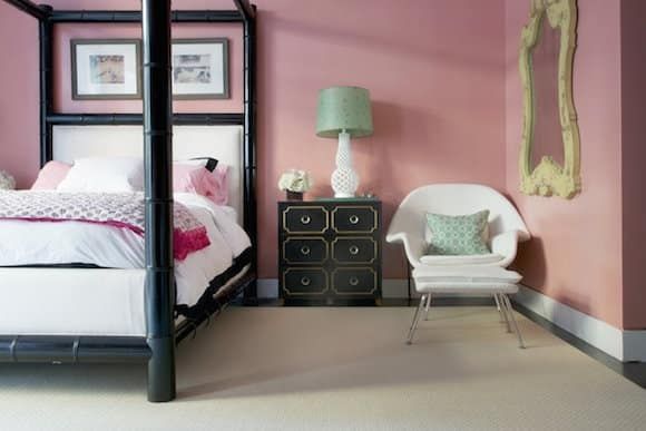
How did your Georgian Colonial pink-hued design plan come together?
This was the home that my client lived in as a little girl, and she wanted to revamp her mother’s design. Those pink walls were original, and we kept them because we both loved them. Originally, the room was all floral and chintz and very 80s, so she wanted a modern update but still romantic and somewhat neutral. The pink is very soft and easy to work with. That is a great example of pink working as a neutral.

Photo by Patrick Cline
Your Soho I project is a tour de force in fuchsia. What was the inspiration behind this bold interior design?
For this Soho apartment, my client said, “If I could, I would live in Barbie’s Dream House.” So I used hints of light pink in the Milo Baughman bookshelf and Maitland Smith stone credenza to play into the bright pink silk curtains and custom hot pink dyed rug for the living room.
More inspiring pink interiors

Photo by Evan Sklar
Bikoff says that “my favorite color combination is pink and green” and this preppy Kentucky kitchen from Kemble Interiors embodies that playful juxtaposition with a retro mint-green refrigerator and pink floor-to-ceiling tile work.

Photo by Laura Resen
A Hudson Valley cottage from Sheila Bridges Design gets a sophisticated stroke of pink in its seating upholstery — the wood paneling and dark carpeting keep the light pinks from feeling too precious.

Photo by Eric Piasecki
The color of the hour brings the drama in this bar and Katie Ridder–designed games room in a West Village apartment. An effortless show of the “more is more” design philosophy.
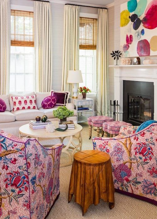
Photo by Zach DeSart
Bikoff says she loves “using florals in my designs to tie in color schemes like bright pink, whether that is in the upholstery, wallpaper or antiques.” Fellow New York designer Sara Gilbane obviously feels the same, as she opted for bold floral upholstery, graphic textiles and an abstract painting to seamlessly integrate bright pink into this Upper East Side family room.

Photo by Alexander James
“Pink is my all time favorite color to decorate with,” says Tiffany Duggan, founder of Studio Duggan, who designed this nursery with various shades of pink. “I don’t discriminate — from deep, dusky pinks, and salmons to bright lacquered magenta, no color is more warm or more flattering. In this nursery, we have layered different pinks to create a more refined feel, using dark accents to toughen the look up.” The nursery, which is painted in Rose Mallow by Fired Earth, features a print of Andy Warhol‘s Ice Cream Dessert (1959) and a star pendant by Hector Finch Lighting.