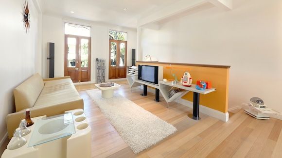
Benjamin Jay Shand’s entertainment lounge features (left to right) an Artemide Bacco bar designed by Sergio Mazza, Craft Associates sofa by Adrian Pearsall, Timatic sunburst teak clock, Bang & Olufsen BeoLab Penta loudspeaker by Lone and Gideon Lindinger-Loewy, Hille coffee table by Robin Day, Bang & Olufsen A2 CD storage tower, Bang & Olufsen Attyca 1 and 2 modules by Jacob Jensen, Bang & Olufsen BeoSystem 6500, also by Jensen, and Bang & Olufsen LX 6000 television set by David Lewis.
The airy Sydney loft that Benjamin Jay Shand calls home has a history that could rival its contents (it was originally built for Victorian-era boat makers). But it’s the rare mid-century and postmodern collectibles, like Panasonic radios and an Elami Jr. robot, that Shand loves so much. A 25-year-old University of Sydney architecture and design graduate known for his thoughtfully curated blog and Instagram account, Designtel, Shand is as passionate about Bang & Olufsen CD storage towers as he is about Boffi fluorescent bar lights, one of which he installed in his kitchen.
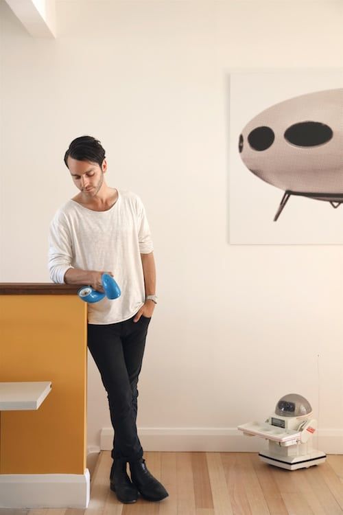
Shand is accompanied by an Omnibot 5402, produced by the Tomy Corporation in the 1980s. The polyester print on the wall is Futuro! by Daniel Soma.
“The aim for the place,” he says of his newly renovated home in the hip inner-city neighborhood of Darlinghurst, “was to create something that was equal parts Italian, German and Danish in its decor and resembled something of an old American toy store in its entirety. I didn’t want it to be totally designed, but it needed to hit certain things.” The result is a real-life embodiment of Designtel — very much of the past with an eye toward the future. Here, Shand explains how the space came together, George Nelson swag-leg desk and all.
All photos by Simon Bernhardt
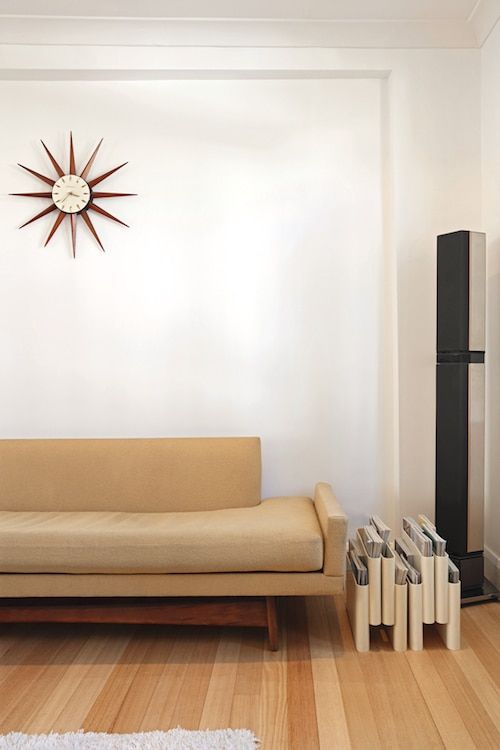
This vignette shows the Pearsall sofa, Timatic clock and Bang & Olufsen BeoLab Penta loudspeaker as well as a Kartell Portariviste magazine holder by Giotto Stoppino
What were your design goals for the loft?
I needed it to have Danish and Italian items — and to a lesser extent, German items. I needed it to be livable. I needed all the objects to reference each other, which is easier said than done because there’s about two decades’ worth of objects, and they actually do span different sub-groups of design within mid-century modern. The Hans Wegner couch is a prototypical Danish piece of that era, then the room goes full throttle into the Space Age. I needed to think in terms of shapes or forms, or by the color — lots of off-whites, yellows and reds. Decisions had to be made with care.
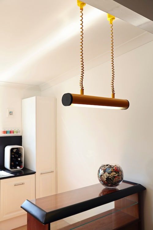
In the kitchen, a Boffi retractable bar light hangs above a Burgess bar cabinet.
Why did you specifically focus on Italian, German and Danish mid-century pieces?
It came from a true affection for the designers and the design within those nations at the time. As to Italian, I am very into the Brionvega electronics from that era. It was that fusion of design and art with technology that extended through their range. Also, in the sitting room, you can see that very-Memphis Bang & Olufsen sideboard with that beautiful telephone by Ettore Sottsass. It operated on a variety of scales within a domestic environment.
With Germany, it’s similar but without so much fun — more rigor and formalism to get those beautiful desks. You get that giant retractable bar light. Danish is easiest because it’s the best of both worlds. It’s elegantly simple. You see these pieces, and you almost instantly see a sketch for them. You see a simple combination of lines, angles, forms. You can instantly see how it went from paper to prototype to my living room.
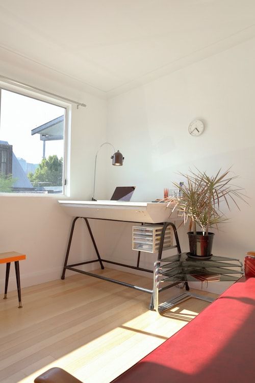
In this nook is an Arc chrome adjustable desk lamp on a repurposed cartography table, smoked-glass and chrome cascading side tables and a Braun ABK 20 wall clock designed by Dietrich Lubs.
Given your requirements, how did you bring these designs together and make them cohesive?
There were certainly tricks to make it look more cohesive than it is. I like to think of all these designs, when they were made, as being quite conscious of what followed. Joe Colombo was well aware of what would come after his pieces. The space needed my narrative to work. The kitchen felt empty until that module that’s against the wall came in. The module was found by my brother — it’s a ’70s-era L’Oreal Cosmetics display module mounted to the wall. Within that setup, it kind of tells the whole narrative of the place at scale. It gave a smaller scale to the place, more warmth and personality.
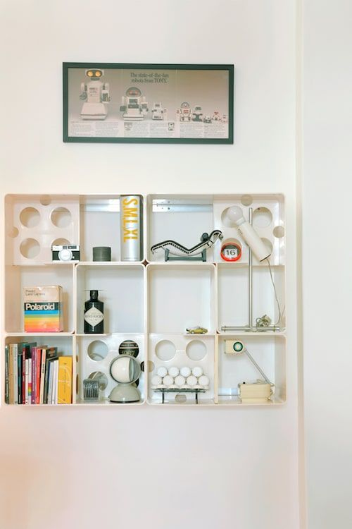
Occupying a vintage L’Oréal Paris display module are Polaroid packaging by Paul Giambarba, an Artemide Eclisse lamp by Vico Magistretti, a telescopic lamp by Pierre Cardin and models of iconic mid-century furniture. On the wall is the “We don’t make ’em like they used to” advertisement for the Tomy Corporation.
Yet nothing in the space feels kitschy, not even the “We don’t make ’em like we used to” poster ad for Tomy robots.
I don’t see it as kitsch, I see it all as wonderful. These things are exemplars of widespread optimism. Like the little robots: They’re the oddest examples of design and technology collided. They’re exemplars of wildly optimistic times, when it was assumed that domestic setups would be paired with an automated assistant, and that assistant would probably thrust the homeowner into the new millennium. That was their mission statement, and this is from the mid-to-late ’70s into the mid ’80s, when they were gearing toward the new decade. It’s a really nice example of a company trying to predict what was next for us.
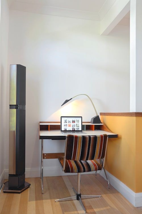
This workstation has a Herman Miller Nelson swag-leg desk by George Nelson and Stilnovo Nastro desk lamp by Alberto Fraser next to a Bang & Olufsen BeoLab Penta loudspeaker.
How do you ensure that any new acquisitions tie into the look of the space?
We’re no longer in the golden age of mid-century design, when there was attention to detail on every hinge and Bakelite on every appliance. But it just so happens that a lot of these products, like a Westinghouse fridge, look like the old ones. There needs to be a middle ground. Smeg is stunning to look at, but make no mistake, it’s not a particularly good fridge. It’s a beautifully skinned average fridge. And yet the Smeg is one of the oldest-seeming items here — it’s a ’50s design throwback.
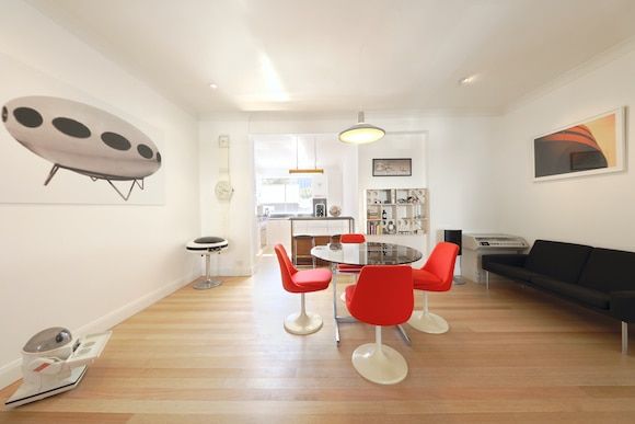
Left to right: an Omnibot 5402, Soma’s Futuro! print, GEC Weltron 2007 stereo system, Swatch Vasily Maxi wall clock, Lusch Erzeugnis dining chairs by Joe Colombo, extension table attributed to Pierre Cardin, Louis Poulsen Model 18564 pendant light, Sanyo Sysmatic stereo console, A.P. Stolen AP34/2 lounge by Hans Wegner and the photographic print Untitled Thirty-Four by Shand himself.
I bet some of these items have interesting backstories. Can you tell us about the oversized Swatch watch?
What Swatch did in the mid-to-late ’80s was produce Maxi watches. I thought they were originally for promotion, but they actually sold them as wall clocks commercially. There’s a Kandinsky design on the watch. It’s got that beautiful Russian abstraction to it. It’s my favorite Swatch design ever. I bought it off one of the main canals in Milan. It was a very Italian store: open for one-and-a-half days a week, on Saturday, Sunday and Wednesday, inexplicably. The Italian storeowner, who was lovely, said he could come in maybe one other day, make me a coffee and discuss the purchase, so without making any transport arrangements I was walking down this canal with the watch upon my shoulder as if it was a wrestling belt. I must have been asked for the time in eight different languages. Everyone was taking photos.