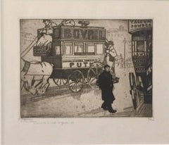
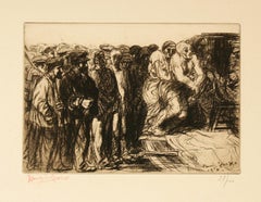
1910s Art

to
330
1,097
388
390
172
161
Overall Width
to
Overall Height
to
7,454
20,115
155,842
236,985
1,787
2,260
4,723
6,163
5,847
15,065
20,269
24,124
17,034
13,629
5,272
424
292
140
131
47
18
16
6
5
1
1,269
842
32
1,478
746
594
425
408
392
223
149
144
140
138
136
127
101
100
89
87
83
66
60
799
567
453
445
358
101
47
34
24
22
773
359
1,223
931
Period: 1910s
Original Watercolour by Delovincourt Orange Dress
Located in Pasadena, CA
Delovincourt: biography Delovincourt, is a poster artist. Delovincourt was an art nouveau artist. He was mainly active during the modern period. Delovincourt: his main works Delovinc...
Category

Art Nouveau 1910s Art

Materials

Archival Paper

France early 20th century View of the Grosbois castle and head study, watercolor
Located in Paris, FR
French school early 20th century  View of the Grosbois castle and a portrait study. Black ink, black ink wash and watercolor on paper Signed lower right (indistinct, see photo) 27 x ...
Category

Academic 1910s Art

Materials

Ink, Watercolor, Carbon Pencil

Quincaillerie by Ludovic-Rodo Pissarro - Wood engraving
Located in London, GB
Quincaillerie by Ludovic-Rodo Pissarro (1878 - 1952) Wood engraving 10.4 x 12.6 cm (4 ¹/₈ x 5 inches) Initialled in the plate, signed lower right, Ludovi...
Category

Post-Impressionist 1910s Art

Materials

Woodcut

Have you a reason for not enlisting? World War One British Recruitment Poster
Located in London, GB
To see our other original vintage propaganda posters, scroll down to "More from this Seller" and below it click on "See all from this seller" - or send us a message if you cannot find the poster you want. Parliamentary Recruiting Committee Which? Have you a Reason for not Enlisting - Or only an Excuse for not Enlisting. Now! Original lithographic poster c. 1914 75 x 50cm Published by the Parliamentary Recruiting Committee, London Printed by the Abbey Press 32 & 34 Great Peter St Westminster SW Before conscription was introduced at the beginning of 1916, recruitment into the British Army was all by way of volunteering. Lord Kitchener...
Category

Modern 1910s Art

Materials

Lithograph

Woman with an umbrella - Pencil on Paper Unique Drawing Post Impressionism, 1910
Located in New York, NY
Henri Edmond Cross Woman with an umbrella, ca. 1910 Pencil on paper 5 1/10 × 3 9/10 in l 13 × 10 cm Frame included - 9 x 7 in l 23 x 18 cm Stamped 'HEC' lower left Condition: Excell...
Category

Post-Impressionist 1910s Art

Materials

Pencil

"Portrait of Swiss Political Attachee, Carlin" Copper Plate Heliogravure
Located in Chicago, IL
2018 marks the centenary anniversary of Ferdinand Hodler’s death. In that 100 years time, the art world’s esteem of this important artist has proved fickle. It has shifted from extolling his artistic merits during his lifetime to showing something of a feigned disdain- more reflective of the world political order than a true change of heart for Hodler’s work. After years of Hodler being all but a footnote in the annals of art history and generally ignored, finally, the pendulum has righted itself once again. Recent retrospective exhibitions in Europe and the United States have indicated not only a joyful rediscovery of Hodler’s art but a firm conviction that his work and world view hold particular relevance today. DAS WERK FERDINAND HODLERS is not only a collection of printed work reflecting the best of all of his painted work created up to 1914 just before the outbreak of World War I, the portfolio itself is an encapsulation of Hodler’s ethos, Parallelisme. Hodler developed his philosophy of Parallelisme as a unifying approach to art which strips away detail in search of harmony. By means of abstraction, symmetry and repetition, Hodler sought ways to depict Nature’s essence and her fundamental, universal order. He believed these universal laws governing the natural, observable world extend to the spiritual realm. Symbolist in nature with Romantic undertones, his works are equally portraits of these universal concepts and feelings governing all life as they are a visual portrait in the formal sense. Whether his subject is a solitary tree, a moment in battle, mortal fear, despair, the awe inspired by a vast mountain range, a tender moment or even the collective conviction in a belief, Hodler unveils this guiding principle of Parallelisme. Several aspects of Hodler’s portfolio reinforce his tenets of Parallelisme. The Table of Contents clearly preferences a harmonious design over detail. The two columns, consisting of twenty lines each, list the images by order of appearance using their German titles. The abbreviated titles are somewhat cryptic in that they obscure the identities of the sitters. Like the image Hodler presents, they are distillations of the sitter without any extraneous details. This shortening was also done in an effort to maintain a harmonious symmetry of the Table of Contents, themselves, and keep titles to a one-line limit. The twenty-fourth title: “Bildnis des Schweizerischen Gesandten C.” was so long, even with abbreviation, that it required two lines; so, for the sake of maintaining symmetry, the fortieth title: “Bauernmadchen” was omitted from the list. This explains why the images are not numbered. Hodler’s reasoning is not purely esoteric. Symmetry and pattern reach beyond mere formal design principles. Finding sameness and imposing it over disorder goes to the root of Hodler’s identity and his art. A Swiss native, Hodler was bi-lingual and spoke German and French. Each printed image, even number forty, have titles in both of Hodler’s languages. Certainly, there was a market for Hodler’s work among francophones and this inclusion may have been a polite gesture to that end; however, this is the only place in the portfolio which includes French. With German titles at the lower left of each image, Hodler’s name at bottom center and corresponding French titles at the lower right of each image, there is a harmony and symmetry woven into all aspects of the portfolio. This holds true for the page design, as it applies to each printed image and as it describes the Swiss artist himself. Seen in this light, Hodler’s portfolio of printed work is the epitome of Hodler’s Parallelisme. DAS WERK FERDINAND HODLERS is also one of the most significant documents to best tell the story of how Hodler, from Switzerland, became caught between political cross-hairs and how the changing tides of nations directly impacted the artist during his lifetime as well as the accessibility of his art for generations to come. The Munich-based publisher of the portfolio, R. Piper & Co., Verlag, plays a crucial role in this story. Publishing on a wide range of subjects from philosophy and world religion to music, literature and the visual arts; the publisher’s breadth of inquiry within any one genre was equal in scope. Their marketing strategy to publish multiple works on Hodler offers great insight as to what a hot commodity Hodler was at that time. R.Piper & Co.’s Almanach, which they published in 1914 in commemoration of their first ten years in business, clearly illustrates the rapid succession- strategically calculated for achieving the deepest and broadest impact - in which they released three works on Hodler to hit the market by the close of 1914. DAS WERK FERDINAND HODLERS was their premier publication. It preceded C.A. Loosli’s Die Zeichnungen Ferdinand Hodlers, a print portfolio after 50 drawings by Hodler which was released in Autumn of 1914 at the mid-level price-point of 75-150 Marks; and a third less expensive collection of prints after original works by Hodler, which had not been included in either of the first two portfolios, was released at the end of that year entitled Ferdinand Hodler by Dr. Ewald Bender. The title and timing of DAS WERK FERDINAND HODLERS' debut leaves little doubt as to the connection it has with another avant-garde portfolio of art...
Category

Symbolist 1910s Art

Materials

Paper

untitled (Young Woman Washing)
Located in Fairlawn, OH
untitled (Young Woman Washing) Lithograph, c. 1910 Signed in pencil lower right; signed in the plate lower right (see photo) Image size: 11 x 5-1/8" Sheet size: 18 7/8 x 12 5/8 inches Condition: Very good Aging to the tan paper it is printed on Provenance: Estate of the Artist Borghi & Company, NYC Rudolph Bauer 1889-1953 Rudolf Bauer was born in Lindenwald near Bromberg, Silesia, in 1889 but his family moved only a few years later to Berlin. In 1905 Bauer began his studies at the Berlin Academy of Art but left the Academy only a few months later to educate himself. The upshot was paintings, caricatures and comical drawings which were published in 'Berliner Tageblatt', 'Ulk' and 'Le Figaro'. From 1912 Bauer contributed to the magazine and Gallery 'Der Sturm' founded by Herwarth Walden and pivotal to German Expressionism and the international avant-garde. In 1915 Rudolf Bauer participated for the first time in a group show at Walden's gallery. There he met Hilla von Rebay, with whom he began a relationship of many years that was crucial to Bauer's later work. By 1922 Bauer had shown work at about eight exhibitions mounted by 'Der Sturm'. From 1918 he also taught at the 'Der Sturm' art school, where Georg Muche was the director. After the war ended, Bauer was a founding member of the 'November Group' although he did not collaborate closely with the group. In 1919 Bauer joined forces with the painter and architect Otto Nebel and with Hilla von Rebay to found the artists' association 'Die Krater'. Impressionist at the outset, Bauer's early work reveals Cubist and Expressionist influences. By 1915/16 Bauer had switched to an abstract pictorial idiom, which is markedly influenced by Kandinsky. In the early 1920s Bauer was also preoccupied with Russian Constructivism as well as the Dutch de Stijl group. Bauer's decided preference for non-representational painting culminated in 1929 with the foundation of a private museum, 'Das Geistreich', which he directed as a salon for abstract art. Political developments in Germany forced Bauer to sell some of his work in America from 1932. His agent in America was Hilla von Rebay, who was by now director of the Guggenheim Collection. In 1936 she organized a touring exhibition of non-representational European art that included sixty Rudolf Bauer oil...
Category

Jugendstil 1910s Art

Materials

Lithograph

Original 1914 Ski Poster Zug Berg-u-Strassenbahn, Austria: Walther Koch - Skiing
By Walter Koch
Located in London, GB
Walther Koch (1875-1915) Zug Berg und Strassenbahn Original lithographic poster (1914) 40x30" Printed in Zurich by Anstalt Gebr Fretz
Category

Modern 1910s Art

Materials

Lithograph

New York Skyline
Located in Boston, MA
Canvas measures 23.5 x 26.5 inches. Brooklyn Bridge is seen in the foreground. Lower Manhattan skyline in distance. Fred Wagner, a Philadelphia, PA painter and teacher was born in Valley Forge, PA on 20 December 1864 and died on 14 January 1940. He studied with Thomas Eakins at the Pennsylvania Academy of Fine Arts...
Category

American Impressionist 1910s Art

Materials

Canvas, Oil, Paper

"Love" Copper Plate Heliogravure
Located in Chicago, IL
2018 marks the centenary anniversary of Ferdinand Hodler’s death. In that 100 years time, the art world’s esteem of this important artist has proved fickle. It has shifted from extolling his artistic merits during his lifetime to showing something of a feigned disdain- more reflective of the world political order than a true change of heart for Hodler’s work. After years of Hodler being all but a footnote in the annals of art history and generally ignored, finally, the pendulum has righted itself once again. Recent retrospective exhibitions in Europe and the United States have indicated not only a joyful rediscovery of Hodler’s art but a firm conviction that his work and world view hold particular relevance today. DAS WERK FERDINAND HODLERS is not only a collection of printed work reflecting the best of all of his painted work created up to 1914 just before the outbreak of World War I, the portfolio itself is an encapsulation of Hodler’s ethos, Parallelisme. Hodler developed his philosophy of Parallelisme as a unifying approach to art which strips away detail in search of harmony. By means of abstraction, symmetry and repetition, Hodler sought ways to depict Nature’s essence and her fundamental, universal order. He believed these universal laws governing the natural, observable world extend to the spiritual realm. Symbolist in nature with Romantic undertones, his works are equally portraits of these universal concepts and feelings governing all life as they are a visual portrait in the formal sense. Whether his subject is a solitary tree, a moment in battle, mortal fear, despair, the awe inspired by a vast mountain range, a tender moment or even the collective conviction in a belief, Hodler unveils this guiding principle of Parallelisme. Several aspects of Hodler’s portfolio reinforce his tenets of Parallelisme. The Table of Contents clearly preferences a harmonious design over detail. The two columns, consisting of twenty lines each, list the images by order of appearance using their German titles. The abbreviated titles are somewhat cryptic in that they obscure the identities of the sitters. Like the image Hodler presents, they are distillations of the sitter without any extraneous details. This shortening was also done in an effort to maintain a harmonious symmetry of the Table of Contents, themselves, and keep titles to a one-line limit. The twenty-fourth title: “Bildnis des Schweizerischen Gesandten C.” was so long, even with abbreviation, that it required two lines; so, for the sake of maintaining symmetry, the fortieth title: “Bauernmadchen” was omitted from the list. This explains why the images are not numbered. Hodler’s reasoning is not purely esoteric. Symmetry and pattern reach beyond mere formal design principles. Finding sameness and imposing it over disorder goes to the root of Hodler’s identity and his art. A Swiss native, Hodler was bi-lingual and spoke German and French. Each printed image, even number forty, have titles in both of Hodler’s languages. Certainly, there was a market for Hodler’s work among francophones and this inclusion may have been a polite gesture to that end; however, this is the only place in the portfolio which includes French. With German titles at the lower left of each image, Hodler’s name at bottom center and corresponding French titles at the lower right of each image, there is a harmony and symmetry woven into all aspects of the portfolio. This holds true for the page design, as it applies to each printed image and as it describes the Swiss artist himself. Seen in this light, Hodler’s portfolio of printed work is the epitome of Hodler’s Parallelisme. DAS WERK FERDINAND HODLERS is also one of the most significant documents to best tell the story of how Hodler, from Switzerland, became caught between political cross-hairs and how the changing tides of nations directly impacted the artist during his lifetime as well as the accessibility of his art for generations to come. The Munich-based publisher of the portfolio, R. Piper & Co., Verlag, plays a crucial role in this story. Publishing on a wide range of subjects from philosophy and world religion to music, literature and the visual arts; the publisher’s breadth of inquiry within any one genre was equal in scope. Their marketing strategy to publish multiple works on Hodler offers great insight as to what a hot commodity Hodler was at that time. R.Piper & Co.’s Almanach, which they published in 1914 in commemoration of their first ten years in business, clearly illustrates the rapid succession- strategically calculated for achieving the deepest and broadest impact - in which they released three works on Hodler to hit the market by the close of 1914. DAS WERK FERDINAND HODLERS was their premier publication. It preceded C.A. Loosli’s Die Zeichnungen Ferdinand Hodlers, a print portfolio after 50 drawings by Hodler which was released in Autumn of 1914 at the mid-level price-point of 75-150 Marks; and a third less expensive collection of prints after original works by Hodler, which had not been included in either of the first two portfolios, was released at the end of that year entitled Ferdinand Hodler by Dr. Ewald Bender. The title and timing of DAS WERK FERDINAND HODLERS' debut leaves little doubt as to the connection it has with another avant-garde portfolio of art prints, Das Werk Gustav Klimts, released in 5 installments from 1908 -1914 by Galerie Miethke in Vienna. Hodler, himself, was involved in Klimt’s ground-breaking project. As the owner of Klimt’s 1901 painting, “Judith with the Head of Holifernes” which appears as the ninth collotype print in the second installment of Das Werk Gustav Klimts, Hodler was obliged to grant access of the painting to the art printers in Vienna for them to create the collotype sometime before 1908. Hodler had been previously invited in 1904 to take part in what would be the last exhibition of the Vienna Secession before Klimt and others associated with Galerie Miethke broke away. In an interview that same year, Hodler indicated that he respected and was impressed by Klimt. Hodler’s esteem for Klimt went beyond the art itself; he emulated Klimt’s method aimed at increasing his market reach and appeal to a wider audience by creating a print portfolio of his painted work. By 1914, Hodler and his publisher had the benefit of hindsight to learn from Klimt’s Das Werk publication. Responding to the sluggish sales of Klimt’s expensive endeavor, Hodler’s publisher devised the same diversified 1-2-3 strategy for selling Hodler’s Das Werk portfolio as they did with regards to all three works on Hodler they published that year. For their premium tier of DAS WERKS FERDINAND HODLERS, R. Piper & Co. issued an exclusive Museum quality edition of 15 examples on which Hodler signed each page. At a cost of 600 Marks, this was generally on par with Klimt’s asking price of 600 Kronen for his Das Werk portfolio. A middle-tiered Preferred edition of 30, costing somewhat less and with Hodler’s signature only on the Title Page, was also available. The General edition, targeting the largest audience with its much more affordable price of 150 Marks, is distinguishable by its smaller size. Rather than use the subscription format Miethke had chosen for Klimt’s portfolios which proved to have had its challenges, R. Piper & Co. employed a different strategy. In addition to instantly gratifying the buyer with all 40 of the prints comprising DAS WERK FERDINAND HODLERS and the choice among three price points, they advertised in German journals a fourth possibility of ordering single prints from them directly. These printed images are easily discernible from the three complete folio editions. The paper size of the single purchased images is of the larger format like the Museum and Preferred editions, measuring 65 h x 50 w cm; however, the paper itself is the same copper print paper used in the General edition and then mounted on poster board. The publishing house positioned itself to be a direct retailer of Hodler’s art. They astutely recognized the potential for profitability and the importance, therefore, of having proprietary control over his graphic works. R. Piper & Co. owned the exclusive printing rights to Hodler’s best work found in their three publications dating from 1914. That same year, a competing publication out of Weimar entitled Ferdinand Hodler: Ein Deutungsversuch von Hans...
Category

Symbolist 1910s Art

Materials

Paper

"Dutch Scene with Windmills" - Framed Early 20th Century Watercolor Landscape
Located in New Orleans, LA
A beautiful antique original watercolor of the Dutch landscape. I apologize for the reflections on the glass - this piece comes already framed and behind glass, in an antique wood fr...
Category

Impressionist 1910s Art

Materials

Watercolor

Cycles Motos Alcyon.
Located in London, GB
GAMY and MONTAUT, Ernest. Cycles Motos Alcyon. [Paris: Mabileau & Co., c. 1914]. Hand-coloured pochoir print. Framed and glazed, overall size: 93.6cm x 49.2cm. The Gamy-Montaut ...
Category

Art Deco 1910s Art

Materials

Screen, Stencil

Intimite.
By Boris Grigoriev
Located in New York, NY
GRIGORIEW, Boris. Intimite. 88 pp. Illustrated with mounted colour frontispiece and numerous full-page and in text illustrations. Small folio, 295 x 230 mm, bound in contemporary p...
Category

1910s Art

Materials

Paper

Lower East Side Crowd
Located in Fairlawn, OH
Lower East Side Crowd Ink and ink wash on paper, c. 1910 Signed in ink lower center edge (see photo) Signed with the initials lower right corner (see p...
Category

American Modern 1910s Art

Materials

Ink

"The Reformation, Hannover" Copper Plate Heliogravure
Located in Chicago, IL
2018 marks the centenary anniversary of Ferdinand Hodler’s death. In that 100 years time, the art world’s esteem of this important artist has proved fickle. It has shifted from extol...
Category

Symbolist 1910s Art

Materials

Paper

Anshutz on Anatomy
Located in New York, NY
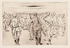
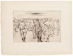
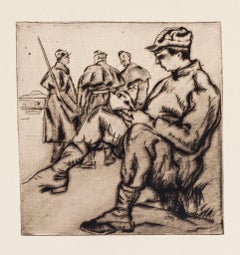
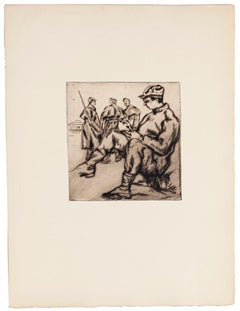
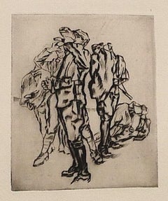
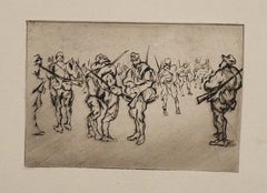
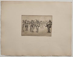
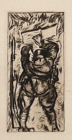
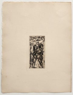
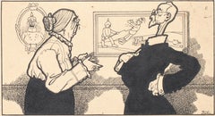
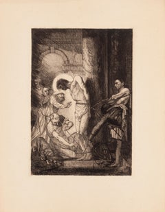
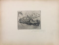
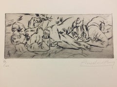
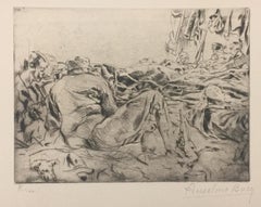
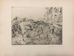
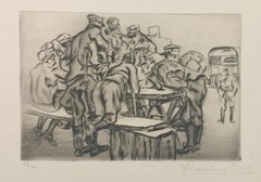
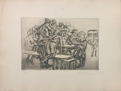
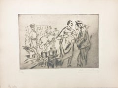
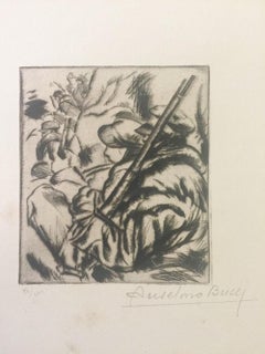
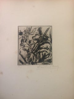
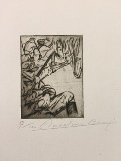
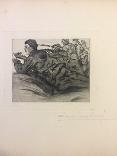
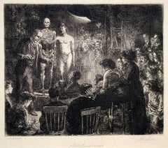
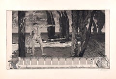
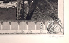
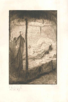
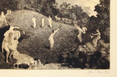
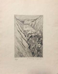
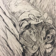
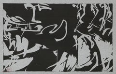
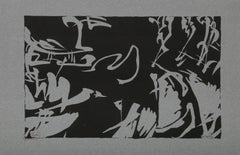
John Sloan (1871-1951), Anshutz on Anatomy, etching, 1912, signed titled and inscribed “100 proofs” by the artist, and also signed “Ernest Roth imp” by the printer. Reference: Morse 155, eighth state (of 8), from the edition of 80. In very good condition, the full sheet, printed in dark brown ink on a brown/tan wove paper, 7 1/2 x 9, the sheet 11 1/8 x 12 3/4 inches. A fine impression. Sloan wrote of this print: “Tom Anshutz, our old teacher at the Pennsylvania Academy, gave anatomical demonstrations of great value to art students. Modelling the muscles in clay, he would then fix them in place on the skeleton. Those present in this etched record of a talk in Henri’s New York class include: Robert and Linda Henri, George Bellows, Walter Pach...
Category

American Realist 1910s Art

Materials

Etching

1911 original poster for La Bicyclette - Le Globe - early 20th-century cycling
Located in PARIS, FR
The 1911 original poster for La Bicyclette - Le Globe is a remarkable testament to the early 20th-century cycling culture and the rise of competitive sports marketing. Created to promote the Le Globe bicycle brand, this poster emphasizes its association with significant cycling achievements, including victories in prestigious races like the Tour de France 1910 and 1911 and the grueling Paris-Brest-Paris 1911. Cycling was rapidly gaining popularity in Europe during this era, not only as a mode of transportation but as a competitive sport that captured the imagination of the public. The poster highlights Le Globe bicycles’ durability and superior design, attributing their performance to technological advancements such as the Eadie freewheel, Hans Renold chain, and Bowden brakes. These innovations are prominently mentioned as key factors behind the brand's success in overcoming the rigors of demanding races. Victories by riders using Le Globe bicycles are proudly celebrated in the poster, with detailed references to stage wins in the Tour de France and the extraordinary records set during the Paris-Brest-Paris race. The detailed text serves as both a chronicle of accomplishments and an endorsement of the brand’s reliability and superiority. The typographic design, typical of early 20th-century posters, conveys authority and credibility while catering to an audience eager for both sporting news and technical innovation. This promotional piece stands as an enduring relic of an era when cycling was not just a sport but a symbol of progress and industrial ingenuity. Today, the La Bicyclette - Le Globe poster...
Category

1910s Art

Materials

Linen, Paper, Lithograph

Antique Illustration of a Golfer by Listed Illustrator for Vanity Fair
Located in Buffalo, NY
Antique illustration of a golfer getting out of a sand trap by well listed illustrator Leslie Saalburg whose work appeared in Vanity Fair and Esquire.
Category

Realist 1910s Art

Materials

Gouache, Illustration Board

Jean POUGNY born Iwan Albertovich PUNI (1890–1956), "The Ace of Clubs"
Located in Paris, FR
Iwan Albertovich Puni (also known as Jean Pougny) was a Russian avant-garde artist (Suprematism, Cubo-Futurism) who later became French. He evolved towards Lyric Primitivism, influen...
Category

Abstract Geometric 1910s Art

Materials

Oil, Cardboard

Tartessians
Located in New York, NY
Arthur B. Davies (1862-1928), Tartessians, soft ground etching with aquatint, 1919-20, signed in pencil lower right. Reference: Czestochowski 96, second state (of 2), total printing ...
Category

American Impressionist 1910s Art

Materials

Etching, Aquatint

19th C. American Impressionist Gouache of Colorado Mountains in Spring
Located in Denver, CO
This original circa 1910s plein air field study by renowned Colorado landscape artist Charles Partridge Adams captures the serene beauty of the Rocky Mountains in a masterful display...
Category

American Impressionist 1910s Art

Materials

Gouache

Trafalgar Square, London
By Alvin Langdon Coburn
Located in London, GB
Signed on mount Inscribed 'Christmas Greetings to members of the Academy of Osiris from Bro. Alvin & Sr. Edith, 1956' Photogravure, mounted on card 10 1/4 x 7 3/4 inches
Category

1910s Art

Materials

Photogravure

Iris Kaempferi: No. 58 SHU-FU-RAKU
Located in London, GB
Iris Kaempferi: No. 58 SHU-FU-RAKU Tokyo, Yoshinoen-Garden, circa 1910. Hand-coloured woodblock print on handmade rice paper, numbered and captioned at top, outlined in ink. Framed...
Category

Naturalistic 1910s Art

Materials

Wood, Watercolor, Rice Paper

Claude Shepperson - Petrushka - Watercolour scene from the Ballets Russes
By Claude Allin Shepperson
Located in London, GB
CLAUDE ALLIN SHEPPERSON, ARA, ARWS (1867-1921) Petrushka – Scene from the Ballets Russes Signed l.l.: Shepperson Watercolour over traces of pencil Framed 30.5 by 45.5 cm., 12 by 18 in. (frame size 52.5 by 66 cm., 20 ¾ by 26 in.) Provenance: Richard C Davis...
Category

Realist 1910s Art

Materials

Watercolor

Lucien Victor Guirand de Scevola (1871-1950), Les Marionnettes 1910, drawing
Located in Paris, FR
Lucien Victor Guirand de Scevola (1871-1950) Portrait of Marie-Thérèse Piérat in Les Marionnettes, 1910 Pencil on paper, signed, dated and annotated lower ...
Category

Art Nouveau 1910s Art

Materials

Carbon Pencil

Peggy /// Antique Victorian Etching Portrait Figurative British Children Child
Located in Saint Augustine, FL
Artist: Sidney Tushingham (English, 1884-1968) Title: "Peggy" *Signed by Tushingham in pencil lower right. It is also monogram signed in the plate (printed signature) lower right Cir...
Category

Impressionist 1910s Art

Materials

Drypoint, Etching, Laid Paper, Intaglio

Bayros-Mappe III - Héliogravure by Fraz von Bayros - 1913
Located in Roma, IT
Héliogravure on japanese paper realized by Fraz von Bayros in 1913 for Ex Libris Verlag K. Th. Senger, Munich. Mounted on passepartout. Edition of 260, hand signed in pencil by the ...
Category

Symbolist 1910s Art

Materials

Photogravure

Bayros-Mappe III - Héliogravu by Fraz von Bayros - 1913
Located in Roma, IT
Héliogravure on japanese paper realized by Fraz von Bayros in 1913 for Ex Libris Verlag K. Th. Senger, Munich. Mounted on passepartout. Edition of 260, hand signed in pencil by the ...
Category

Symbolist 1910s Art

Materials

Photogravure

"Le Petit Cirque Prinder, " Original Etching signd by Auguste Brouet
Located in Milwaukee, WI
"Le Petit Cirque Prinder" is an original etching by Auguste Brouet. This piece depicts a variety of circus performers surrounded by small children. The artist signed the piece in the...
Category

Academic 1910s Art

Materials

Pencil, Etching

"Portrait of Herrn Willy Russ-Young" Copper Plate Heliogravure
Located in Chicago, IL
2018 marks the centenary anniversary of Ferdinand Hodler’s death. In that 100 years time, the art world’s esteem of this important artist has proved fickle. It has shifted from extolling his artistic merits during his lifetime to showing something of a feigned disdain- more reflective of the world political order than a true change of heart for Hodler’s work. After years of Hodler being all but a footnote in the annals of art history and generally ignored, finally, the pendulum has righted itself once again. Recent retrospective exhibitions in Europe and the United States have indicated not only a joyful rediscovery of Hodler’s art but a firm conviction that his work and world view hold particular relevance today. DAS WERK FERDINAND HODLERS is not only a collection of printed work reflecting the best of all of his painted work created up to 1914 just before the outbreak of World War I, the portfolio itself is an encapsulation of Hodler’s ethos, Parallelisme. Hodler developed his philosophy of Parallelisme as a unifying approach to art which strips away detail in search of harmony. By means of abstraction, symmetry and repetition, Hodler sought ways to depict Nature’s essence and her fundamental, universal order. He believed these universal laws governing the natural, observable world extend to the spiritual realm. Symbolist in nature with Romantic undertones, his works are equally portraits of these universal concepts and feelings governing all life as they are a visual portrait in the formal sense. Whether his subject is a solitary tree, a moment in battle, mortal fear, despair, the awe inspired by a vast mountain range, a tender moment or even the collective conviction in a belief, Hodler unveils this guiding principle of Parallelisme. Several aspects of Hodler’s portfolio reinforce his tenets of Parallelisme. The Table of Contents clearly preferences a harmonious design over detail. The two columns, consisting of twenty lines each, list the images by order of appearance using their German titles. The abbreviated titles are somewhat cryptic in that they obscure the identities of the sitters. Like the image Hodler presents, they are distillations of the sitter without any extraneous details. This shortening was also done in an effort to maintain a harmonious symmetry of the Table of Contents, themselves, and keep titles to a one-line limit. The twenty-fourth title: “Bildnis des Schweizerischen Gesandten C.” was so long, even with abbreviation, that it required two lines; so, for the sake of maintaining symmetry, the fortieth title: “Bauernmadchen” was omitted from the list. This explains why the images are not numbered. Hodler’s reasoning is not purely esoteric. Symmetry and pattern reach beyond mere formal design principles. Finding sameness and imposing it over disorder goes to the root of Hodler’s identity and his art. A Swiss native, Hodler was bi-lingual and spoke German and French. Each printed image, even number forty, have titles in both of Hodler’s languages. Certainly, there was a market for Hodler’s work among francophones and this inclusion may have been a polite gesture to that end; however, this is the only place in the portfolio which includes French. With German titles at the lower left of each image, Hodler’s name at bottom center and corresponding French titles at the lower right of each image, there is a harmony and symmetry woven into all aspects of the portfolio. This holds true for the page design, as it applies to each printed image and as it describes the Swiss artist himself. Seen in this light, Hodler’s portfolio of printed work is the epitome of Hodler’s Parallelisme. DAS WERK FERDINAND HODLERS is also one of the most significant documents to best tell the story of how Hodler, from Switzerland, became caught between political cross-hairs and how the changing tides of nations directly impacted the artist during his lifetime as well as the accessibility of his art for generations to come. The Munich-based publisher of the portfolio, R. Piper & Co., Verlag, plays a crucial role in this story. Publishing on a wide range of subjects from philosophy and world religion to music, literature and the visual arts; the publisher’s breadth of inquiry within any one genre was equal in scope. Their marketing strategy to publish multiple works on Hodler offers great insight as to what a hot commodity Hodler was at that time. R.Piper & Co.’s Almanach, which they published in 1914 in commemoration of their first ten years in business, clearly illustrates the rapid succession- strategically calculated for achieving the deepest and broadest impact - in which they released three works on Hodler to hit the market by the close of 1914. DAS WERK FERDINAND HODLERS was their premier publication. It preceded C.A. Loosli’s Die Zeichnungen Ferdinand Hodlers, a print portfolio after 50 drawings by Hodler which was released in Autumn of 1914 at the mid-level price-point of 75-150 Marks; and a third less expensive collection of prints after original works by Hodler, which had not been included in either of the first two portfolios, was released at the end of that year entitled Ferdinand Hodler by Dr. Ewald Bender. The title and timing of DAS WERK FERDINAND HODLERS' debut leaves little doubt as to the connection it has with another avant-garde portfolio of art prints, Das Werk Gustav Klimts, released in 5 installments from 1908 -1914 by Galerie Miethke in Vienna. Hodler, himself, was involved in Klimt’s ground-breaking project. As the owner of Klimt’s 1901 painting, “Judith with the Head of Holifernes” which appears as the ninth collotype print in the second installment of Das Werk Gustav Klimts, Hodler was obliged to grant access of the painting to the art printers in Vienna for them to create the collotype sometime before 1908. Hodler had been previously invited in 1904 to take part in what would be the last exhibition of the Vienna Secession before Klimt and others associated with Galerie Miethke broke away. In an interview that same year, Hodler indicated that he respected and was impressed by Klimt. Hodler’s esteem for Klimt went beyond the art itself; he emulated Klimt’s method aimed at increasing his market reach and appeal to a wider audience by creating a print portfolio of his painted work. By 1914, Hodler and his publisher had the benefit of hindsight to learn from Klimt’s Das Werk publication. Responding to the sluggish sales of Klimt’s expensive endeavor, Hodler’s publisher devised the same diversified 1-2-3 strategy for selling Hodler’s Das Werk portfolio as they did with regards to all three works on Hodler they published that year. For their premium tier of DAS WERKS FERDINAND HODLERS, R. Piper & Co. issued an exclusive Museum quality edition of 15 examples on which Hodler signed each page. At a cost of 600 Marks, this was generally on par with Klimt’s asking price of 600 Kronen for his Das Werk portfolio. A middle-tiered Preferred edition of 30, costing somewhat less and with Hodler’s signature only on the Title Page, was also available. The General edition, targeting the largest audience with its much more affordable price of 150 Marks, is distinguishable by its smaller size. Rather than use the subscription format Miethke had chosen for Klimt’s portfolios which proved to have had its challenges, R. Piper & Co. employed a different strategy. In addition to instantly gratifying the buyer with all 40 of the prints comprising DAS WERK FERDINAND HODLERS and the choice among three price points, they advertised in German journals a fourth possibility of ordering single prints from them directly. These printed images are easily discernible from the three complete folio editions. The paper size of the single purchased images is of the larger format like the Museum and Preferred editions, measuring 65 h x 50 w cm; however, the paper itself is the same copper print paper used in the General edition and then mounted on poster board. The publishing house positioned itself to be a direct retailer of Hodler’s art. They astutely recognized the potential for profitability and the importance, therefore, of having proprietary control over his graphic works. R. Piper & Co. owned the exclusive printing rights to Hodler’s best work found in their three publications dating from 1914. That same year, a competing publication out of Weimar entitled Ferdinand Hodler: Ein Deutungsversuch von Hans Muhlestein appeared. Its author, a young scholar, expressed his frustration with the limited availability of printable work by Hodler. In his Author’s Note on page 19, dated Easter, 1914, Muhlestein confirms that the publisher of Hodler’s three works from that same year owned the exclusive reproductive rights to Hodler’s printed original work. He goes further to explain that even after offering to pay to use certain of those images in his book, the publisher refused. Clearly, a lot of jockeying for position in what was perceived as a hot market was occurring in 1914. Instead, their timing couldn’t have been more ill-fated, and what began with such high hopes suddenly found a much different market amid a hostile climate. The onset of WWI directly impacted sales. Many, including Ferdinand Hodler, publicly protested the September invasion by Germany of France in which the Reims Cathedral, re-built in the 13th century, was shelled, destroying priceless stained glass and statuary and burning off the iron roof and badly damaging its wooden interior. Thomas Gaehtgens, Director of the Getty Research Institute describes how the bombing of Reims Cathedral triggered blindingly powerful and deeply-felt ultra-nationalistic responses: “The event profoundly shocked French intellectuals, who for the most part had an intense admiration for German literature, music and art. By relying on press accounts and abstracting from the visual propagandistic content, they were unable to interpret the siege of Reims without turning away from German culture in disgust. Similarly, the German intelligentsia and bourgeoisie were also shocked to find themselves described as vandals and barbarians. Ninety-three writers, scientists, university professors, and artists signed a protest, directed against the French insults, that defended the actions of the German army.” In similar fashion, a flurry of open letters published in German newspapers and journals as well as telegrams and postcards sent directly to Hodler following his outcry in support of Reims reflected the collectively critical reaction to Hodler’s position. Loosli documents that among the list of telegrams Hodler received was one from none other than his publisher in Germany, R.Piper & Co. Allegiances were questioned. The market for Hodler in Germany immediately softened. Matters worsened for the publisher beyond the German backlash to Hodler and his loss of appeal in the home market; with the war in full swing until 1918, there was little chance a German publisher would have much interest coming from outside of Germany and Austria. Following the war and Hodler’s death in 1918, the economy in Germany continued to spiral out and just 5 years later, hyper-inflation had rendered its currency worthless vis-a-vis its value in the pre-war years. Like the economy, Hodler’s reputation was slow to find currency in these difficult times. Even many French art fans had turned sour on Hodler as they considered his long-standing relationship in German and Austrian art circles. Thus, the portfolio’s rarity in Hodler’s lifetime and, consequently, the availability of these printed images from DAS WERK FERDINAND HODLERS since his death has been scarce. In many ways, Hodler and his portfolios were casualties of war. Thwarted from their intended purpose of reaching a wide audience and show-casing Parallelisme, Hodler’s unique approach to art, this important, undated work has been both elusive and shrouded in mystery. Perhaps DAS WERK FERDINAND HODLERS was left undated as a means of affirming the timelessness of Hodler’s art. Digging back into the past, Hodler’s contemporaries, like R. Piper, C.A. Loosli and Hans Muhlestein, indeed provide the keys to unequivocally clarify what has largely been mired in obscurity. Just after Hodler’s death, the May, 1918 issue of the Burlington Review ran a small column which opined hope for better access to R.Piper & Co.’s DAS WERK FERDINAND HODLERS; 100 years later, it is finally possible. Hodler’s voice rings out through these printed works. Once more, his modern approach to depicting portraits, landscapes and grand scale scenes of Swiss history speak to us of what is universal. Engaging with any one of these images is the chance to connect to Hodler’s vision and his world view- weltanschauung in German, vision du monde in French- however one expresses these concepts through language, its message embedded in his work is the same: “We differ from one another, but we are like each other even more. What unifies us is greater and more powerful than what divides us.” Today, Hodler’s art couldn’t be more timely. FERDINAND HODLER (SWISS, 1853-1918) explored Parallelisme through figurative poses evocative of music, dance and ritual. His images of sex, night, desertion and death as well as his many landscapes exploring the universal longing for harmony with Nature are unique and important works embodying a Symbolist paradigm. Truly a Modern Master, Hodler’s influence can be felt in the work of Gustav Klimt and Kolomon Moser and subsequent Expressionist artists such as Egon Schiele. He was born into an impoverished family in Bern, Switzerland in 1853. His entire family succumbed to tuberculosis, and he was orphaned by the age of 13, the only surviving child among his 13 siblings. In the absence of family, the influence and guidance which his art instructors provided Hodler was foundational and profound. Hodler began formal studies in 1872 at the Geneva School of Design. Under Barthelemy Menn, Hodler was drawn to the ordered beauty of Euclidian geometry and Durer’s fundamentals of human proportion that proved to be guiding principles informing his art throughout his life. By the 1880s, Hodler began to enjoy some recognition for his work which put him on a new path towards stability. Remaining in Geneva, he became assistant to the well-known muralist, Edouard Castres. Following his first solo show in 1885, Hodler’s work took on a Symbolist quality. He frequently associated with a group of Swiss Symbolist...
Category

Symbolist 1910s Art

Materials

Paper

Iris Kaempferi: No.36 YEDO-JIMAN
Located in London, GB
Iris Kaempferi: No. 36 YEDO-JIMAN Tokyo, Yoshinoen-Garden, circa 1910. Hand-coloured woodblock print on handmade rice paper, numbered and captioned at top, outlined in ink. Framed ...
Category

Naturalistic 1910s Art

Materials

Wood, Watercolor, Rice Paper

H.O. Miethke Das Werk folio "Portrait of Hermine Gallia" collotype print
Located in Chicago, IL
DAS WERK GUSTAV KLIMTS, a portfolio of 50 prints, ten of which are multicolor collotypes on chine colle paper laid down on hand-made heavy cream wove paper with deckled edges; under ...
Category

Vienna Secession 1910s Art

Materials

Paper

"In Foreign Parts" Eugene Higgins, Southwestern Pueblo, Modern Figurative
By Eugene Higgins
Located in New York, NY
Eugene Higgins In Foreign Parts, circa 1913 Signed lower right Watercolor on paper Sight 17 x 13 inches Born William Victor Higgins in 1884 to a Shelbyville, Indiana farm family where the only art Victor was aware of as a child was his father's love of flowers. "He loved their forms and their colors, and he tended his garden as a painter might work a canvas." At the age of nine, Victor met a young artist who traveled the Indiana countryside painting advertisements on the sides of barns. He purchased paints and brushes so the young Higgins could practice his own artwork on the inside of his father's barn. He also taught Victor about art museums and especially about the new Chicago Art Institute. This information never left the young artist, and he saved his allowance until his father allowed him at the age of fifteen to attend Chicago Art Institute. He worked a variety of jobs to finance his studies both there and at the Academy of Fine Arts. Victor Higgins traveled to New York in 1908, where he met Robert Henri, who became a significant influence by depicting every-day scenes and stressing the importance of the spirit and sense of place as important factors in painting. Higgins was also greatly affected by the New York Armory Modernism Show of Marsden Hartley in 1913. While Victor Higgins was in Chicago he met former mayor and avid collector Carter H. Harrison who was to prove instrumental in the growth of Higgins career for several years. Harrison agreed to support Higgins for four years to go to Paris and Munich and paint and study in the great museums in Europe. While at the Academie de la Grande Chaumier in Paris (1910-1914) he met Walter Ufer, who was another Chicago artist being sponsored by Carter Harrison. This meeting was not only a life-long friendship, but the beginning of a great change in the way Higgins looked at "American" art. He decided that America needed it's own authentic style rather than the 19th Century classic style he was taught in Europe. Very soon after returning to Chicago in 1914, Harrison sent him and Walter Ufer on a painting trip to Taos, New Mexico for a year in exchange for paintings. Higgins made other similar agreements and was able to support himself with his painting. This trip was a life-changing experience and introduced Higgins to the authentic America he had been looking for. In 1914 Taos was an isolated village about twelve hours from Santa Fe on an impossible dirt road. But the colorful life of the pueblo people and the natural beauty drew a collection of artists who became the Taos art colony, from which the Taos Society of Artists was founded in 1915. Victor Higgins became a permanent resident within a year of his arrival and a member of the society in 1917, exhibiting with Jane Peterson in 1925 and with Wayman Adams and Janet Scudder in 1927. The members would travel around the country introducing the Southwest scenes with great success. He remained a member until the Society's dissolution in 1927. Higgins was the youngest member of the group of seven. Other members were Joseph Henry Sharp, Bert Phillips...
Category

American Modern 1910s Art

Materials

Paper, Watercolor

Portrait Etching of English Victorian Poet Elizabeth Barrett Browning
Located in Houston, TX
Etching of a woman dressed in turn of the century attire looking out at the viewer. The work is signed in pencil by the artist. The etching is not framed. Artist Biography: William...
Category

Naturalistic 1910s Art

Materials

Etching

Car Racing in France, 1911 - Silver Gelatin Black and White Photography
Located in Atlanta, GA
A unique original silver gelatin black and white photograph by Agence Meurisse, Paris. Car racing in Boulogne-sur-Mer, France, circa 1911. Features: Original silver gelatin print pho...
Category

Art Deco 1910s Art

Materials

Silver Gelatin

Answering the Door Early 20th Century w/c Fauvism Social Realism American Scene
Located in New York, NY
Answering the Door Early 20th Century w/c Fauvism Social Realism American Scene Note: We have three similar in style works from 1911 available now on 1stDibs. All are framed identi...
Category

American Realist 1910s Art

Materials

Paper, Watercolor

"Long Live The King" by Hulton Archive
Located in London, GB
"Long Live The King" by Hulton Archive 21st June 1911: Workmen putting up decorations at the Royal Exchange to celebrate the Coronation of King George ...
Category

Modern 1910s Art

Materials

Black and White

"Portrait of Mrs. Gertrude Miller" Copper Plate Heliogravure
Located in Chicago, IL
2018 marks the centenary anniversary of Ferdinand Hodler’s death. In that 100 years time, the art world’s esteem of this important artist has proved fickle. It has shifted from extolling his artistic merits during his lifetime to showing something of a feigned disdain- more reflective of the world political order than a true change of heart for Hodler’s work. After years of Hodler being all but a footnote in the annals of art history and generally ignored, finally, the pendulum has righted itself once again. Recent retrospective exhibitions in Europe and the United States have indicated not only a joyful rediscovery of Hodler’s art but a firm conviction that his work and world view hold particular relevance today. DAS WERK FERDINAND HODLERS is not only a collection of printed work reflecting the best of all of his painted work created up to 1914 just before the outbreak of World War I, the portfolio itself is an encapsulation of Hodler’s ethos, Parallelisme. Hodler developed his philosophy of Parallelisme as a unifying approach to art which strips away detail in search of harmony. By means of abstraction, symmetry and repetition, Hodler sought ways to depict Nature’s essence and her fundamental, universal order. He believed these universal laws governing the natural, observable world extend to the spiritual realm. Symbolist in nature with Romantic undertones, his works are equally portraits of these universal concepts and feelings governing all life as they are a visual portrait in the formal sense. Whether his subject is a solitary tree, a moment in battle, mortal fear, despair, the awe inspired by a vast mountain range, a tender moment or even the collective conviction in a belief, Hodler unveils this guiding principle of Parallelisme. Several aspects of Hodler’s portfolio reinforce his tenets of Parallelisme. The Table of Contents clearly preferences a harmonious design over detail. The two columns, consisting of twenty lines each, list the images by order of appearance using their German titles. The abbreviated titles are somewhat cryptic in that they obscure the identities of the sitters. Like the image Hodler presents, they are distillations of the sitter without any extraneous details. This shortening was also done in an effort to maintain a harmonious symmetry of the Table of Contents, themselves, and keep titles to a one-line limit. The twenty-fourth title: “Bildnis des Schweizerischen Gesandten C.” was so long, even with abbreviation, that it required two lines; so, for the sake of maintaining symmetry, the fortieth title: “Bauernmadchen” was omitted from the list. This explains why the images are not numbered. Hodler’s reasoning is not purely esoteric. Symmetry and pattern reach beyond mere formal design principles. Finding sameness and imposing it over disorder goes to the root of Hodler’s identity and his art. A Swiss native, Hodler was bi-lingual and spoke German and French. Each printed image, even number forty, have titles in both of Hodler’s languages. Certainly, there was a market for Hodler’s work among francophones and this inclusion may have been a polite gesture to that end; however, this is the only place in the portfolio which includes French. With German titles at the lower left of each image, Hodler’s name at bottom center and corresponding French titles at the lower right of each image, there is a harmony and symmetry woven into all aspects of the portfolio. This holds true for the page design, as it applies to each printed image and as it describes the Swiss artist himself. Seen in this light, Hodler’s portfolio of printed work is the epitome of Hodler’s Parallelisme. DAS WERK FERDINAND HODLERS is also one of the most significant documents to best tell the story of how Hodler, from Switzerland, became caught between political cross-hairs and how the changing tides of nations directly impacted the artist during his lifetime as well as the accessibility of his art for generations to come. The Munich-based publisher of the portfolio, R. Piper & Co., Verlag, plays a crucial role in this story. Publishing on a wide range of subjects from philosophy and world religion to music, literature and the visual arts; the publisher’s breadth of inquiry within any one genre was equal in scope. Their marketing strategy to publish multiple works on Hodler offers great insight as to what a hot commodity Hodler was at that time. R.Piper & Co.’s Almanach, which they published in 1914 in commemoration of their first ten years in business, clearly illustrates the rapid succession- strategically calculated for achieving the deepest and broadest impact - in which they released three works on Hodler to hit the market by the close of 1914. DAS WERK FERDINAND HODLERS was their premier publication. It preceded C.A. Loosli’s Die Zeichnungen Ferdinand Hodlers, a print portfolio after 50 drawings by Hodler which was released in Autumn of 1914 at the mid-level price-point of 75-150 Marks; and a third less expensive collection of prints after original works by Hodler, which had not been included in either of the first two portfolios, was released at the end of that year entitled Ferdinand Hodler by Dr. Ewald Bender. The title and timing of DAS WERK FERDINAND HODLERS' debut leaves little doubt as to the connection it has with another avant-garde portfolio of art prints, Das Werk Gustav Klimts, released in 5 installments from 1908 -1914 by Galerie Miethke in Vienna. Hodler, himself, was involved in Klimt’s ground-breaking project. As the owner of Klimt’s 1901 painting, “Judith with the Head of Holifernes” which appears as the ninth collotype print in the second installment of Das Werk Gustav Klimts, Hodler was obliged to grant access of the painting to the art printers in Vienna for them to create the collotype sometime before 1908. Hodler had been previously invited in 1904 to take part in what would be the last exhibition of the Vienna Secession before Klimt and others associated with Galerie Miethke broke away. In an interview that same year, Hodler indicated that he respected and was impressed by Klimt. Hodler’s esteem for Klimt went beyond the art itself; he emulated Klimt’s method aimed at increasing his market reach and appeal to a wider audience by creating a print portfolio of his painted work. By 1914, Hodler and his publisher had the benefit of hindsight to learn from Klimt’s Das Werk publication. Responding to the sluggish sales of Klimt’s expensive endeavor, Hodler’s publisher devised the same diversified 1-2-3 strategy for selling Hodler’s Das Werk portfolio as they did with regards to all three works on Hodler they published that year. For their premium tier of DAS WERKS FERDINAND HODLERS, R. Piper & Co. issued an exclusive Museum quality edition of 15 examples on which Hodler signed each page. At a cost of 600 Marks, this was generally on par with Klimt’s asking price of 600 Kronen for his Das Werk portfolio. A middle-tiered Preferred edition of 30, costing somewhat less and with Hodler’s signature only on the Title Page, was also available. The General edition, targeting the largest audience with its much more affordable price of 150 Marks, is distinguishable by its smaller size. Rather than use the subscription format Miethke had chosen for Klimt’s portfolios which proved to have had its challenges, R. Piper & Co. employed a different strategy. In addition to instantly gratifying the buyer with all 40 of the prints comprising DAS WERK FERDINAND HODLERS and the choice among three price points, they advertised in German journals a fourth possibility of ordering single prints from them directly. These printed images are easily discernible from the three complete folio editions. The paper size of the single purchased images is of the larger format like the Museum and Preferred editions, measuring 65 h x 50 w cm; however, the paper itself is the same copper print paper used in the General edition and then mounted on poster board. The publishing house positioned itself to be a direct retailer of Hodler’s art. They astutely recognized the potential for profitability and the importance, therefore, of having proprietary control over his graphic works. R. Piper & Co. owned the exclusive printing rights to Hodler’s best work found in their three publications dating from 1914. That same year, a competing publication out of Weimar entitled Ferdinand Hodler: Ein Deutungsversuch von Hans Muhlestein appeared. Its author, a young scholar, expressed his frustration with the limited availability of printable work by Hodler. In his Author’s Note on page 19, dated Easter, 1914, Muhlestein confirms that the publisher of Hodler’s three works from that same year owned the exclusive reproductive rights to Hodler’s printed original work. He goes further to explain that even after offering to pay to use certain of those images in his book, the publisher refused. Clearly, a lot of jockeying for position in what was perceived as a hot market was occurring in 1914. Instead, their timing couldn’t have been more ill-fated, and what began with such high hopes suddenly found a much different market amid a hostile climate. The onset of WWI directly impacted sales. Many, including Ferdinand Hodler, publicly protested the September invasion by Germany of France in which the Reims Cathedral, re-built in the 13th century, was shelled, destroying priceless stained glass and statuary and burning off the iron roof and badly damaging its wooden interior. Thomas Gaehtgens, Director of the Getty Research Institute describes how the bombing of Reims Cathedral triggered blindingly powerful and deeply-felt ultra-nationalistic responses: “The event profoundly shocked French intellectuals, who for the most part had an intense admiration for German literature, music and art. By relying on press accounts and abstracting from the visual propagandistic content, they were unable to interpret the siege of Reims without turning away from German culture in disgust. Similarly, the German intelligentsia and bourgeoisie were also shocked to find themselves described as vandals and barbarians. Ninety-three writers, scientists, university professors, and artists signed a protest, directed against the French insults, that defended the actions of the German army.” In similar fashion, a flurry of open letters published in German newspapers and journals as well as telegrams and postcards sent directly to Hodler following his outcry in support of Reims reflected the collectively critical reaction to Hodler’s position. Loosli documents that among the list of telegrams Hodler received was one from none other than his publisher in Germany, R.Piper & Co. Allegiances were questioned. The market for Hodler in Germany immediately softened. Matters worsened for the publisher beyond the German backlash to Hodler and his loss of appeal in the home market; with the war in full swing until 1918, there was little chance a German publisher would have much interest coming from outside of Germany and Austria. Following the war and Hodler’s death in 1918, the economy in Germany continued to spiral out and just 5 years later, hyper-inflation had rendered its currency worthless vis-a-vis its value in the pre-war years. Like the economy, Hodler’s reputation was slow to find currency in these difficult times. Even many French art fans had turned sour on Hodler as they considered his long-standing relationship in German and Austrian art circles. Thus, the portfolio’s rarity in Hodler’s lifetime and, consequently, the availability of these printed images from DAS WERK FERDINAND HODLERS since his death has been scarce. In many ways, Hodler and his portfolios were casualties of war. Thwarted from their intended purpose of reaching a wide audience and show-casing Parallelisme, Hodler’s unique approach to art, this important, undated work has been both elusive and shrouded in mystery. Perhaps DAS WERK FERDINAND HODLERS was left undated as a means of affirming the timelessness of Hodler’s art. Digging back into the past, Hodler’s contemporaries, like R. Piper, C.A. Loosli and Hans Muhlestein, indeed provide the keys to unequivocally clarify what has largely been mired in obscurity. Just after Hodler’s death, the May, 1918 issue of the Burlington Review ran a small column which opined hope for better access to R.Piper & Co.’s DAS WERK FERDINAND HODLERS; 100 years later, it is finally possible. Hodler’s voice rings out through these printed works. Once more, his modern approach to depicting portraits, landscapes and grand scale scenes of Swiss history speak to us of what is universal. Engaging with any one of these images is the chance to connect to Hodler’s vision and his world view- weltanschauung in German, vision du monde in French- however one expresses these concepts through language, its message embedded in his work is the same: “We differ from one another, but we are like each other even more. What unifies us is greater and more powerful than what divides us.” Today, Hodler’s art couldn’t be more timely. FERDINAND HODLER (SWISS, 1853-1918) explored Parallelisme through figurative poses evocative of music, dance and ritual. His images of sex, night, desertion and death as well as his many landscapes exploring the universal longing for harmony with Nature are unique and important works embodying a Symbolist paradigm. Truly a Modern Master, Hodler’s influence can be felt in the work of Gustav Klimt and Kolomon Moser...
Category

Symbolist 1910s Art

Materials

Paper

Paris, Porte de Bercy
Located in Houston, TX
Stunning watercolor of the flood at the Porte de Bercy in Paris by French artist E. Fournier, 1910. Signed lower right. Original artwork on paper displayed on a white mat with a g...
Category

1910s Art

Materials

Watercolor

"Exuberant Woman" Copper Plate Heliogravure
Located in Chicago, IL
2018 marks the centenary anniversary of Ferdinand Hodler’s death. In that 100 years time, the art world’s esteem of this important artist has proved fickle. It has shifted from extolling his artistic merits during his lifetime to showing something of a feigned disdain- more reflective of the world political order than a true change of heart for Hodler’s work. After years of Hodler being all but a footnote in the annals of art history and generally ignored, finally, the pendulum has righted itself once again. Recent retrospective exhibitions in Europe and the United States have indicated not only a joyful rediscovery of Hodler’s art but a firm conviction that his work and world view hold particular relevance today. DAS WERK FERDINAND HODLERS is not only a collection of printed work reflecting the best of all of his painted work created up to 1914 just before the outbreak of World War I, the portfolio itself is an encapsulation of Hodler’s ethos, Parallelisme. Hodler developed his philosophy of Parallelisme as a unifying approach to art which strips away detail in search of harmony. By means of abstraction, symmetry and repetition, Hodler sought ways to depict Nature’s essence and her fundamental, universal order. He believed these universal laws governing the natural, observable world extend to the spiritual realm. Symbolist in nature with Romantic undertones, his works are equally portraits of these universal concepts and feelings governing all life as they are a visual portrait in the formal sense. Whether his subject is a solitary tree, a moment in battle, mortal fear, despair, the awe inspired by a vast mountain range, a tender moment or even the collective conviction in a belief, Hodler unveils this guiding principle of Parallelisme. Several aspects of Hodler’s portfolio reinforce his tenets of Parallelisme. The Table of Contents clearly preferences a harmonious design over detail. The two columns, consisting of twenty lines each, list the images by order of appearance using their German titles. The abbreviated titles are somewhat cryptic in that they obscure the identities of the sitters. Like the image Hodler presents, they are distillations of the sitter without any extraneous details. This shortening was also done in an effort to maintain a harmonious symmetry of the Table of Contents, themselves, and keep titles to a one-line limit. The twenty-fourth title: “Bildnis des Schweizerischen Gesandten C.” was so long, even with abbreviation, that it required two lines; so, for the sake of maintaining symmetry, the fortieth title: “Bauernmadchen” was omitted from the list. This explains why the images are not numbered. Hodler’s reasoning is not purely esoteric. Symmetry and pattern reach beyond mere formal design principles. Finding sameness and imposing it over disorder goes to the root of Hodler’s identity and his art. A Swiss native, Hodler was bi-lingual and spoke German and French. Each printed image, even number forty, have titles in both of Hodler’s languages. Certainly, there was a market for Hodler’s work among francophones and this inclusion may have been a polite gesture to that end; however, this is the only place in the portfolio which includes French. With German titles at the lower left of each image, Hodler’s name at bottom center and corresponding French titles at the lower right of each image, there is a harmony and symmetry woven into all aspects of the portfolio. This holds true for the page design, as it applies to each printed image and as it describes the Swiss artist himself. Seen in this light, Hodler’s portfolio of printed work is the epitome of Hodler’s Parallelisme. DAS WERK FERDINAND HODLERS is also one of the most significant documents to best tell the story of how Hodler, from Switzerland, became caught between political cross-hairs and how the changing tides of nations directly impacted the artist during his lifetime as well as the accessibility of his art for generations to come. The Munich-based publisher of the portfolio, R. Piper & Co., Verlag, plays a crucial role in this story. Publishing on a wide range of subjects from philosophy and world religion to music, literature and the visual arts; the publisher’s breadth of inquiry within any one genre was equal in scope. Their marketing strategy to publish multiple works on Hodler offers great insight as to what a hot commodity Hodler was at that time. R.Piper & Co.’s Almanach, which they published in 1914 in commemoration of their first ten years in business, clearly illustrates the rapid succession- strategically calculated for achieving the deepest and broadest impact - in which they released three works on Hodler to hit the market by the close of 1914. DAS WERK FERDINAND HODLERS was their premier publication. It preceded C.A. Loosli’s Die Zeichnungen Ferdinand Hodlers, a print portfolio after 50 drawings by Hodler which was released in Autumn of 1914 at the mid-level price-point of 75-150 Marks; and a third less expensive collection of prints after original works by Hodler, which had not been included in either of the first two portfolios, was released at the end of that year entitled Ferdinand Hodler by Dr. Ewald Bender. The title and timing of DAS WERK FERDINAND HODLERS' debut leaves little doubt as to the connection it has with another avant-garde portfolio of art prints, Das Werk Gustav Klimts, released in 5 installments from 1908 -1914 by Galerie Miethke in Vienna. Hodler, himself, was involved in Klimt’s ground-breaking project. As the owner of Klimt’s 1901 painting, “Judith with the Head of Holifernes” which appears as the ninth collotype print in the second installment of Das Werk Gustav Klimts, Hodler was obliged to grant access of the painting to the art printers in Vienna for them to create the collotype sometime before 1908. Hodler had been previously invited in 1904 to take part in what would be the last exhibition of the Vienna Secession before Klimt and others associated with Galerie Miethke broke away. In an interview that same year, Hodler indicated that he respected and was impressed by Klimt. Hodler’s esteem for Klimt went beyond the art itself; he emulated Klimt’s method aimed at increasing his market reach and appeal to a wider audience by creating a print portfolio of his painted work. By 1914, Hodler and his publisher had the benefit of hindsight to learn from Klimt’s Das Werk publication. Responding to the sluggish sales of Klimt’s expensive endeavor, Hodler’s publisher devised the same diversified 1-2-3 strategy for selling Hodler’s Das Werk portfolio as they did with regards to all three works on Hodler they published that year. For their premium tier of DAS WERKS FERDINAND HODLERS, R. Piper & Co. issued an exclusive Museum quality edition of 15 examples on which Hodler signed each page. At a cost of 600 Marks, this was generally on par with Klimt’s asking price of 600 Kronen for his Das Werk portfolio. A middle-tiered Preferred edition of 30, costing somewhat less and with Hodler’s signature only on the Title Page, was also available. The General edition, targeting the largest audience with its much more affordable price of 150 Marks, is distinguishable by its smaller size. Rather than use the subscription format Miethke had chosen for Klimt’s portfolios which proved to have had its challenges, R. Piper & Co. employed a different strategy. In addition to instantly gratifying the buyer with all 40 of the prints comprising DAS WERK FERDINAND HODLERS and the choice among three price points, they advertised in German journals a fourth possibility of ordering single prints from them directly. These printed images are easily discernible from the three complete folio editions. The paper size of the single purchased images is of the larger format like the Museum and Preferred editions, measuring 65 h x 50 w cm; however, the paper itself is the same copper print paper used in the General edition and then mounted on poster board. The publishing house positioned itself to be a direct retailer of Hodler’s art. They astutely recognized the potential for profitability and the importance, therefore, of having proprietary control over his graphic works. R. Piper & Co. owned the exclusive printing rights to Hodler’s best work found in their three publications dating from 1914. That same year, a competing publication out of Weimar entitled Ferdinand Hodler: Ein Deutungsversuch von Hans...
Category

Symbolist 1910s Art

Materials

Paper

"Cherry Tree in Bloom" Copper Plate Heliogravure
Located in Chicago, IL
2018 marks the centenary anniversary of Ferdinand Hodler’s death. In that 100 years time, the art world’s esteem of this important artist has proved fickle. It has shifted from extolling his artistic merits during his lifetime to showing something of a feigned disdain- more reflective of the world political order than a true change of heart for Hodler’s work. After years of Hodler being all but a footnote in the annals of art history and generally ignored, finally, the pendulum has righted itself once again. Recent retrospective exhibitions in Europe and the United States have indicated not only a joyful rediscovery of Hodler’s art but a firm conviction that his work and world view hold particular relevance today. DAS WERK FERDINAND HODLERS is not only a collection of printed work reflecting the best of all of his painted work created up to 1914 just before the outbreak of World War I, the portfolio itself is an encapsulation of Hodler’s ethos, Parallelisme. Hodler developed his philosophy of Parallelisme as a unifying approach to art which strips away detail in search of harmony. By means of abstraction, symmetry and repetition, Hodler sought ways to depict Nature’s essence and her fundamental, universal order. He believed these universal laws governing the natural, observable world extend to the spiritual realm. Symbolist in nature with Romantic undertones, his works are equally portraits of these universal concepts and feelings governing all life as they are a visual portrait in the formal sense. Whether his subject is a solitary tree, a moment in battle, mortal fear, despair, the awe inspired by a vast mountain range, a tender moment or even the collective conviction in a belief, Hodler unveils this guiding principle of Parallelisme. Several aspects of Hodler’s portfolio reinforce his tenets of Parallelisme. The Table of Contents clearly preferences a harmonious design over detail. The two columns, consisting of twenty lines each, list the images by order of appearance using their German titles. The abbreviated titles are somewhat cryptic in that they obscure the identities of the sitters. Like the image Hodler presents, they are distillations of the sitter without any extraneous details. This shortening was also done in an effort to maintain a harmonious symmetry of the Table of Contents, themselves, and keep titles to a one-line limit. The twenty-fourth title: “Bildnis des Schweizerischen Gesandten C.” was so long, even with abbreviation, that it required two lines; so, for the sake of maintaining symmetry, the fortieth title: “Bauernmadchen” was omitted from the list. This explains why the images are not numbered. Hodler’s reasoning is not purely esoteric. Symmetry and pattern reach beyond mere formal design principles. Finding sameness and imposing it over disorder goes to the root of Hodler’s identity and his art. A Swiss native, Hodler was bi-lingual and spoke German and French. Each printed image, even number forty, have titles in both of Hodler’s languages. Certainly, there was a market for Hodler’s work among francophones and this inclusion may have been a polite gesture to that end; however, this is the only place in the portfolio which includes French. With German titles at the lower left of each image, Hodler’s name at bottom center and corresponding French titles at the lower right of each image, there is a harmony and symmetry woven into all aspects of the portfolio. This holds true for the page design, as it applies to each printed image and as it describes the Swiss artist himself. Seen in this light, Hodler’s portfolio of printed work is the epitome of Hodler’s Parallelisme. DAS WERK FERDINAND HODLERS is also one of the most significant documents to best tell the story of how Hodler, from Switzerland, became caught between political cross-hairs and how the changing tides of nations directly impacted the artist during his lifetime as well as the accessibility of his art for generations to come. The Munich-based publisher of the portfolio, R. Piper & Co., Verlag, plays a crucial role in this story. Publishing on a wide range of subjects from philosophy and world religion to music, literature and the visual arts; the publisher’s breadth of inquiry within any one genre was equal in scope. Their marketing strategy to publish multiple works on Hodler offers great insight as to what a hot commodity Hodler was at that time. R.Piper & Co.’s Almanach, which they published in 1914 in commemoration of their first ten years in business, clearly illustrates the rapid succession- strategically calculated for achieving the deepest and broadest impact - in which they released three works on Hodler to hit the market by the close of 1914. DAS WERK FERDINAND HODLERS was their premier publication. It preceded C.A. Loosli’s Die Zeichnungen Ferdinand Hodlers, a print portfolio after 50 drawings by Hodler which was released in Autumn of 1914 at the mid-level price-point of 75-150 Marks; and a third less expensive collection of prints after original works by Hodler, which had not been included in either of the first two portfolios, was released at the end of that year entitled Ferdinand Hodler by Dr. Ewald Bender. The title and timing of DAS WERK FERDINAND HODLERS' debut leaves little doubt as to the connection it has with another avant-garde portfolio of art prints, Das Werk Gustav Klimts, released in 5 installments from 1908 -1914 by Galerie Miethke in Vienna. Hodler, himself, was involved in Klimt’s ground-breaking project. As the owner of Klimt’s 1901 painting, “Judith with the Head of Holifernes” which appears as the ninth collotype print in the second installment of Das Werk Gustav Klimts, Hodler was obliged to grant access of the painting to the art printers in Vienna for them to create the collotype sometime before 1908. Hodler had been previously invited in 1904 to take part in what would be the last exhibition of the Vienna Secession before Klimt and others associated with Galerie Miethke broke away. In an interview that same year, Hodler indicated that he respected and was impressed by Klimt. Hodler’s esteem for Klimt went beyond the art itself; he emulated Klimt’s method aimed at increasing his market reach and appeal to a wider audience by creating a print portfolio of his painted work. By 1914, Hodler and his publisher had the benefit of hindsight to learn from Klimt’s Das Werk publication. Responding to the sluggish sales of Klimt’s expensive endeavor, Hodler’s publisher devised the same diversified 1-2-3 strategy for selling Hodler’s Das Werk portfolio as they did with regards to all three works on Hodler they published that year. For their premium tier of DAS WERKS FERDINAND HODLERS, R. Piper & Co. issued an exclusive Museum quality edition of 15 examples on which Hodler signed each page. At a cost of 600 Marks, this was generally on par with Klimt’s asking price of 600 Kronen for his Das Werk portfolio. A middle-tiered Preferred edition of 30, costing somewhat less and with Hodler’s signature only on the Title Page, was also available. The General edition, targeting the largest audience with its much more affordable price of 150 Marks, is distinguishable by its smaller size. Rather than use the subscription format Miethke had chosen for Klimt’s portfolios which proved to have had its challenges, R. Piper & Co. employed a different strategy. In addition to instantly gratifying the buyer with all 40 of the prints comprising DAS WERK FERDINAND HODLERS and the choice among three price points, they advertised in German journals a fourth possibility of ordering single prints from them directly. These printed images are easily discernible from the three complete folio editions. The paper size of the single purchased images is of the larger format like the Museum and Preferred editions, measuring 65 h x 50 w cm; however, the paper itself is the same copper print paper used in the General edition and then mounted on poster board. The publishing house positioned itself to be a direct retailer of Hodler’s art. They astutely recognized the potential for profitability and the importance, therefore, of having proprietary control over his graphic works. R. Piper & Co. owned the exclusive printing rights to Hodler’s best work found in their three publications dating from 1914. That same year, a competing publication out of Weimar entitled Ferdinand Hodler: Ein Deutungsversuch von Hans...
Category

Symbolist 1910s Art

Materials

Paper

Visit to the Bazaar - 1916 British watercolour on silk by Sheringham
Located in London, GB
GEORGE SHERINGHAM (1884-1937) Visit to the Bazaar Signed; inscribed with title on a label on the backboard Watercolour and gold paint on silk 15 by 38 cm., 6 by 15 in. (frame size 34 by 56 cm., 13 ½ by 22 in.) Exhibited: London, Leicester Galleries, Exhibition of Works by George Sheringham, 1916, no.17. Sheringham was born in London and studied at the Slade under Henry Tonks and later in Venice, Brussels, Berlin and Paris where he held his first one-man exhibition in 1905. On his return to London he initially supported himself with poster designs and teaching. His first exhibition of fan designs was held at the Ryder Gallery in 1909 followed by another in the following year. With enthusiastic reviews in Studio he had launched his career as a decorative designer, theatrical designer and illustrator. He illustrated books by Max Beerbohm and Cyrus MacMillan. In 1921 he collaborated with his brother Hugh on a book about fishing, The Book of the Fly Rod. He wrote Drawing in Pen and Pencil (1922), with James Laver, Design in the Theatre (1927) and with Rupert Mason and R Boyd Morrison he edited Robes of Thespis, Costume Designs by Modern Artists (1928). As a decorator, Sheringham designed the music room at 40 Devonshire House...
Category

Realist 1910s Art

Materials

Watercolor

Torment
Located in New York, NY
Arthur B. Davies (1862-1928), Torment, soft ground etching with aquatint and roulette, 1919-20, signed with the estate stamp lower right, and signed by the printer Frank A. Nankivell...
Category

American Impressionist 1910s Art

Materials

Etching, Aquatint

"Dying Woman" Copper Plate Heliogravure
Located in Chicago, IL
2018 marks the centenary anniversary of Ferdinand Hodler’s death. In that 100 years time, the art world’s esteem of this important artist has proved fickle. It has shifted from extol...
Category

Symbolist 1910s Art

Materials

Paper

"Harvest (Sugar Beets), " Aquatint Etching by Manuel Robbe, circa 1910
Located in Long Island City, NY
This etching with aquatint was created by French printmaker Manuel Robbe. Robbe’s innovative techniques, along with his sense of color harmony and his choice of subjects: stylish wom...
Category

Impressionist 1910s Art

Materials

Etching, Aquatint

"Praying Warrior" Copper Plate Heliogravure
Located in Chicago, IL
2018 marks the centenary anniversary of Ferdinand Hodler’s death. In that 100 years time, the art world’s esteem of this important artist has proved fickle. It has shifted from extolling his artistic merits during his lifetime to showing something of a feigned disdain- more reflective of the world political order than a true change of heart for Hodler’s work. After years of Hodler being all but a footnote in the annals of art history and generally ignored, finally, the pendulum has righted itself once again. Recent retrospective exhibitions in Europe and the United States have indicated not only a joyful rediscovery of Hodler’s art but a firm conviction that his work and world view hold particular relevance today. DAS WERK FERDINAND HODLERS is not only a collection of printed work reflecting the best of all of his painted work created up to 1914 just before the outbreak of World War I, the portfolio itself is an encapsulation of Hodler’s ethos, Parallelisme. Hodler developed his philosophy of Parallelisme as a unifying approach to art which strips away detail in search of harmony. By means of abstraction, symmetry and repetition, Hodler sought ways to depict Nature’s essence and her fundamental, universal order. He believed these universal laws governing the natural, observable world extend to the spiritual realm. Symbolist in nature with Romantic undertones, his works are equally portraits of these universal concepts and feelings governing all life as they are a visual portrait in the formal sense. Whether his subject is a solitary tree, a moment in battle, mortal fear, despair, the awe inspired by a vast mountain range, a tender moment or even the collective conviction in a belief, Hodler unveils this guiding principle of Parallelisme. Several aspects of Hodler’s portfolio reinforce his tenets of Parallelisme. The Table of Contents clearly preferences a harmonious design over detail. The two columns, consisting of twenty lines each, list the images by order of appearance using their German titles. The abbreviated titles are somewhat cryptic in that they obscure the identities of the sitters. Like the image Hodler presents, they are distillations of the sitter without any extraneous details. This shortening was also done in an effort to maintain a harmonious symmetry of the Table of Contents, themselves, and keep titles to a one-line limit. The twenty-fourth title: “Bildnis des Schweizerischen Gesandten C.” was so long, even with abbreviation, that it required two lines; so, for the sake of maintaining symmetry, the fortieth title: “Bauernmadchen” was omitted from the list. This explains why the images are not numbered. Hodler’s reasoning is not purely esoteric. Symmetry and pattern reach beyond mere formal design principles. Finding sameness and imposing it over disorder goes to the root of Hodler’s identity and his art. A Swiss native, Hodler was bi-lingual and spoke German and French. Each printed image, even number forty, have titles in both of Hodler’s languages. Certainly, there was a market for Hodler’s work among francophones and this inclusion may have been a polite gesture to that end; however, this is the only place in the portfolio which includes French. With German titles at the lower left of each image, Hodler’s name at bottom center and corresponding French titles at the lower right of each image, there is a harmony and symmetry woven into all aspects of the portfolio. This holds true for the page design, as it applies to each printed image and as it describes the Swiss artist himself. Seen in this light, Hodler’s portfolio of printed work is the epitome of Hodler’s Parallelisme. DAS WERK FERDINAND HODLERS is also one of the most significant documents to best tell the story of how Hodler, from Switzerland, became caught between political cross-hairs and how the changing tides of nations directly impacted the artist during his lifetime as well as the accessibility of his art for generations to come. The Munich-based publisher of the portfolio, R. Piper & Co., Verlag, plays a crucial role in this story. Publishing on a wide range of subjects from philosophy and world religion to music, literature and the visual arts; the publisher’s breadth of inquiry within any one genre was equal in scope. Their marketing strategy to publish multiple works on Hodler offers great insight as to what a hot commodity Hodler was at that time. R.Piper & Co.’s Almanach, which they published in 1914 in commemoration of their first ten years in business, clearly illustrates the rapid succession- strategically calculated for achieving the deepest and broadest impact - in which they released three works on Hodler to hit the market by the close of 1914. DAS WERK FERDINAND HODLERS was their premier publication. It preceded C.A. Loosli’s Die Zeichnungen Ferdinand Hodlers, a print portfolio after 50 drawings by Hodler which was released in Autumn of 1914 at the mid-level price-point of 75-150 Marks; and a third less expensive collection of prints after original works by Hodler, which had not been included in either of the first two portfolios, was released at the end of that year entitled Ferdinand Hodler by Dr. Ewald Bender. The title and timing of DAS WERK FERDINAND HODLERS' debut leaves little doubt as to the connection it has with another avant-garde portfolio of art...
Category

Symbolist 1910s Art

Materials

Paper

Portrait of a notable with a mustache
Located in Genève, GE
Work on canvas
Category

1910s Art

Materials

Oil

Hell Hole
Located in New York, NY
John Sloan (1871-1951), Hell Hole, 1917, etching and aquatint, signed bottom right, titled bottom center, and inscribed “100 proofs”. Reference: Morse 186, second state (of 2). From ...
Category

American Realist 1910s Art

Materials

Etching, Aquatint

"Woman Turning Around" Copper Plate Heliogravure
Located in Chicago, IL
2018 marks the centenary anniversary of Ferdinand Hodler’s death. In that 100 years time, the art world’s esteem of this important artist has proved fickle. It has shifted from extolling his artistic merits during his lifetime to showing something of a feigned disdain- more reflective of the world political order than a true change of heart for Hodler’s work. After years of Hodler being all but a footnote in the annals of art history and generally ignored, finally, the pendulum has righted itself once again. Recent retrospective exhibitions in Europe and the United States have indicated not only a joyful rediscovery of Hodler’s art but a firm conviction that his work and world view hold particular relevance today. DAS WERK FERDINAND HODLERS is not only a collection of printed work reflecting the best of all of his painted work created up to 1914 just before the outbreak of World War I, the portfolio itself is an encapsulation of Hodler’s ethos, Parallelisme. Hodler developed his philosophy of Parallelisme as a unifying approach to art which strips away detail in search of harmony. By means of abstraction, symmetry and repetition, Hodler sought ways to depict Nature’s essence and her fundamental, universal order. He believed these universal laws governing the natural, observable world extend to the spiritual realm. Symbolist in nature with Romantic undertones, his works are equally portraits of these universal concepts and feelings governing all life as they are a visual portrait in the formal sense. Whether his subject is a solitary tree, a moment in battle, mortal fear, despair, the awe inspired by a vast mountain range, a tender moment or even the collective conviction in a belief, Hodler unveils this guiding principle of Parallelisme. Several aspects of Hodler’s portfolio reinforce his tenets of Parallelisme. The Table of Contents clearly preferences a harmonious design over detail. The two columns, consisting of twenty lines each, list the images by order of appearance using their German titles. The abbreviated titles are somewhat cryptic in that they obscure the identities of the sitters. Like the image Hodler presents, they are distillations of the sitter without any extraneous details. This shortening was also done in an effort to maintain a harmonious symmetry of the Table of Contents, themselves, and keep titles to a one-line limit. The twenty-fourth title: “Bildnis des Schweizerischen Gesandten C.” was so long, even with abbreviation, that it required two lines; so, for the sake of maintaining symmetry, the fortieth title: “Bauernmadchen” was omitted from the list. This explains why the images are not numbered. Hodler’s reasoning is not purely esoteric. Symmetry and pattern reach beyond mere formal design principles. Finding sameness and imposing it over disorder goes to the root of Hodler’s identity and his art. A Swiss native, Hodler was bi-lingual and spoke German and French. Each printed image, even number forty, have titles in both of Hodler’s languages. Certainly, there was a market for Hodler’s work among francophones and this inclusion may have been a polite gesture to that end; however, this is the only place in the portfolio which includes French. With German titles at the lower left of each image, Hodler’s name at bottom center and corresponding French titles at the lower right of each image, there is a harmony and symmetry woven into all aspects of the portfolio. This holds true for the page design, as it applies to each printed image and as it describes the Swiss artist himself. Seen in this light, Hodler’s portfolio of printed work is the epitome of Hodler’s Parallelisme. DAS WERK FERDINAND HODLERS is also one of the most significant documents to best tell the story of how Hodler, from Switzerland, became caught between political cross-hairs and how the changing tides of nations directly impacted the artist during his lifetime as well as the accessibility of his art for generations to come. The Munich-based publisher of the portfolio, R. Piper & Co., Verlag, plays a crucial role in this story. Publishing on a wide range of subjects from philosophy and world religion to music, literature and the visual arts; the publisher’s breadth of inquiry within any one genre was equal in scope. Their marketing strategy to publish multiple works on Hodler offers great insight as to what a hot commodity Hodler was at that time. R.Piper & Co.’s Almanach, which they published in 1914 in commemoration of their first ten years in business, clearly illustrates the rapid succession- strategically calculated for achieving the deepest and broadest impact - in which they released three works on Hodler to hit the market by the close of 1914. DAS WERK FERDINAND HODLERS was their premier publication. It preceded C.A. Loosli’s Die Zeichnungen Ferdinand Hodlers, a print portfolio after 50 drawings by Hodler which was released in Autumn of 1914 at the mid-level price-point of 75-150 Marks; and a third less expensive collection of prints after original works by Hodler, which had not been included in either of the first two portfolios, was released at the end of that year entitled Ferdinand Hodler by Dr. Ewald Bender. The title and timing of DAS WERK FERDINAND HODLERS' debut leaves little doubt as to the connection it has with another avant-garde portfolio of art prints, Das Werk Gustav Klimts, released in 5 installments from 1908 -1914 by Galerie Miethke in Vienna. Hodler, himself, was involved in Klimt’s ground-breaking project. As the owner of Klimt’s 1901 painting, “Judith with the Head of Holifernes” which appears as the ninth collotype print in the second installment of Das Werk Gustav Klimts, Hodler was obliged to grant access of the painting to the art printers in Vienna for them to create the collotype sometime before 1908. Hodler had been previously invited in 1904 to take part in what would be the last exhibition of the Vienna Secession before Klimt and others associated with Galerie Miethke broke away. In an interview that same year, Hodler indicated that he respected and was impressed by Klimt. Hodler’s esteem for Klimt went beyond the art itself; he emulated Klimt’s method aimed at increasing his market reach and appeal to a wider audience by creating a print portfolio of his painted work. By 1914, Hodler and his publisher had the benefit of hindsight to learn from Klimt’s Das Werk publication. Responding to the sluggish sales of Klimt’s expensive endeavor, Hodler’s publisher devised the same diversified 1-2-3 strategy for selling Hodler’s Das Werk portfolio as they did with regards to all three works on Hodler they published that year. For their premium tier of DAS WERKS FERDINAND HODLERS, R. Piper & Co. issued an exclusive Museum quality edition of 15 examples on which Hodler signed each page. At a cost of 600 Marks, this was generally on par with Klimt’s asking price of 600 Kronen for his Das Werk portfolio. A middle-tiered Preferred edition of 30, costing somewhat less and with Hodler’s signature only on the Title Page, was also available. The General edition, targeting the largest audience with its much more affordable price of 150 Marks, is distinguishable by its smaller size. Rather than use the subscription format Miethke had chosen for Klimt’s portfolios which proved to have had its challenges, R. Piper & Co. employed a different strategy. In addition to instantly gratifying the buyer with all 40 of the prints comprising DAS WERK FERDINAND HODLERS and the choice among three price points, they advertised in German journals a fourth possibility of ordering single prints from them directly. These printed images are easily discernible from the three complete folio editions. The paper size of the single purchased images is of the larger format like the Museum and Preferred editions, measuring 65 h x 50 w cm; however, the paper itself is the same copper print paper used in the General edition and then mounted on poster board. The publishing house positioned itself to be a direct retailer of Hodler’s art. They astutely recognized the potential for profitability and the importance, therefore, of having proprietary control over his graphic works. R. Piper & Co. owned the exclusive printing rights to Hodler’s best work found in their three publications dating from 1914. That same year, a competing publication out of Weimar entitled Ferdinand Hodler: Ein Deutungsversuch von Hans Muhlestein appeared. Its author, a young scholar, expressed his frustration with the limited availability of printable work by Hodler. In his Author’s Note on page 19, dated Easter, 1914, Muhlestein confirms that the publisher of Hodler’s three works from that same year owned the exclusive reproductive rights to Hodler’s printed original work. He goes further to explain that even after offering to pay to use certain of those images in his book, the publisher refused. Clearly, a lot of jockeying for position in what was perceived as a hot market was occurring in 1914. Instead, their timing couldn’t have been more ill-fated, and what began with such high hopes suddenly found a much different market amid a hostile climate. The onset of WWI directly impacted sales. Many, including Ferdinand Hodler, publicly protested the September invasion by Germany of France in which the Reims Cathedral, re-built in the 13th century, was shelled, destroying priceless stained glass and statuary and burning off the iron roof and badly damaging its wooden interior. Thomas Gaehtgens, Director of the Getty Research Institute describes how the bombing of Reims Cathedral triggered blindingly powerful and deeply-felt ultra-nationalistic responses: “The event profoundly shocked French intellectuals, who for the most part had an intense admiration for German literature, music and art. By relying on press accounts and abstracting from the visual propagandistic content, they were unable to interpret the siege of Reims without turning away from German culture in disgust. Similarly, the German intelligentsia and bourgeoisie were also shocked to find themselves described as vandals and barbarians. Ninety-three writers, scientists, university professors, and artists signed a protest, directed against the French insults, that defended the actions of the German army.” In similar fashion, a flurry of open letters published in German newspapers and journals as well as telegrams and postcards sent directly to Hodler following his outcry in support of Reims reflected the collectively critical reaction to Hodler’s position. Loosli documents that among the list of telegrams Hodler received was one from none other than his publisher in Germany, R.Piper & Co. Allegiances were questioned. The market for Hodler in Germany immediately softened. Matters worsened for the publisher beyond the German backlash to Hodler and his loss of appeal in the home market; with the war in full swing until 1918, there was little chance a German publisher would have much interest coming from outside of Germany and Austria. Following the war and Hodler’s death in 1918, the economy in Germany continued to spiral out and just 5 years later, hyper-inflation had rendered its currency worthless vis-a-vis its value in the pre-war years. Like the economy, Hodler’s reputation was slow to find currency in these difficult times. Even many French art fans had turned sour on Hodler as they considered his long-standing relationship in German and Austrian art circles. Thus, the portfolio’s rarity in Hodler’s lifetime and, consequently, the availability of these printed images from DAS WERK FERDINAND HODLERS since his death has been scarce. In many ways, Hodler and his portfolios were casualties of war. Thwarted from their intended purpose of reaching a wide audience and show-casing Parallelisme, Hodler’s unique approach to art, this important, undated work has been both elusive and shrouded in mystery. Perhaps DAS WERK FERDINAND HODLERS was left undated as a means of affirming the timelessness of Hodler’s art. Digging back into the past, Hodler’s contemporaries, like R. Piper, C.A. Loosli and Hans Muhlestein, indeed provide the keys to unequivocally clarify what has largely been mired in obscurity. Just after Hodler’s death, the May, 1918 issue of the Burlington Review ran a small column which opined hope for better access to R.Piper & Co.’s DAS WERK FERDINAND HODLERS; 100 years later, it is finally possible. Hodler’s voice rings out through these printed works. Once more, his modern approach to depicting portraits, landscapes and grand scale scenes of Swiss history speak to us of what is universal. Engaging with any one of these images is the chance to connect to Hodler’s vision and his world view- weltanschauung in German, vision du monde in French- however one expresses these concepts through language, its message embedded in his work is the same: “We differ from one another, but we are like each other even more. What unifies us is greater and more powerful than what divides us.” Today, Hodler’s art couldn’t be more timely. FERDINAND HODLER (SWISS, 1853-1918) explored Parallelisme through figurative poses evocative of music, dance and ritual. His images of sex, night, desertion and death as well as his many landscapes exploring the universal longing for harmony with Nature are unique and important works embodying a Symbolist paradigm. Truly a Modern Master, Hodler’s influence can be felt in the work of Gustav Klimt and Kolomon Moser and subsequent Expressionist artists such as Egon Schiele. He was born into an impoverished family in Bern, Switzerland in 1853. His entire family succumbed to tuberculosis, and he was orphaned by the age of 13, the only surviving child among his 13 siblings. In the absence of family, the influence and guidance which his art instructors provided Hodler was foundational and profound. Hodler began formal studies in 1872 at the Geneva School of Design. Under Barthelemy Menn, Hodler was drawn to the ordered beauty of Euclidian geometry and Durer’s fundamentals of human proportion that proved to be guiding principles informing his art throughout his life. By the 1880s, Hodler began to enjoy some recognition for his work which put him on a new path towards stability. Remaining in Geneva, he became assistant to the well-known muralist, Edouard Castres. Following his first solo show in 1885, Hodler’s work took on a Symbolist quality. He frequently associated with a group of Swiss Symbolist...
Category

Symbolist 1910s Art

Woolworth Building, No. 2
Located in New York, NY
A superb, richly-inked impression of this extremely scarce etching and drypoint. Second state (of 2). Edition of approximately only 10. Signed in pencil by Marin. Published by Alfred...
Category

Modern 1910s Art

Materials

Drypoint, Etching

"Mossi Head dress Mas ceremonies Rep Upper Volta, " Wood created c. 1910
Located in Milwaukee, WI
"Mossi Head dress Mas ceremonies Rep Upper Volta" is a wood sculpture that includes various other materials such as fabric, and fibers. An abstracted animal with a hump and a bird on it's back make up the top of the headdress. 27" x 6" x 1" The Mossi states were created about 1500 A.D., when bands of horsemen rode north from what is now northern Ghana into the basin of the Volta River and conquered several less powerful peoples, including Dogon, Lela, Nuna, and Kurumba. These were integrated into a new society call Mossi, with the invaders as chiefs and the conquered as commoners. The Mossi make both political art and spiritual art. Figures are used by the ruling class to validate political power, and masks are used by the conquered peoples to control the forces of nature. The several mask styles reflect the diversity of the population before the 15th century invasion. Long tall masks...
Category

Tribal 1910s Art

Materials

Fabric, Wood

"Chestnut Tree" Copper Plate Heliogravure
Located in Chicago, IL
2018 marks the centenary anniversary of Ferdinand Hodler’s death. In that 100 years time, the art world’s esteem of this important artist has proved fickle. It has shifted from extolling his artistic merits during his lifetime to showing something of a feigned disdain- more reflective of the world political order than a true change of heart for Hodler’s work. After years of Hodler being all but a footnote in the annals of art history and generally ignored, finally, the pendulum has righted itself once again. Recent retrospective exhibitions in Europe and the United States have indicated not only a joyful rediscovery of Hodler’s art but a firm conviction that his work and world view hold particular relevance today. DAS WERK FERDINAND HODLERS is not only a collection of printed work reflecting the best of all of his painted work created up to 1914 just before the outbreak of World War I, the portfolio itself is an encapsulation of Hodler’s ethos, Parallelisme. Hodler developed his philosophy of Parallelisme as a unifying approach to art which strips away detail in search of harmony. By means of abstraction, symmetry and repetition, Hodler sought ways to depict Nature’s essence and her fundamental, universal order. He believed these universal laws governing the natural, observable world extend to the spiritual realm. Symbolist in nature with Romantic undertones, his works are equally portraits of these universal concepts and feelings governing all life as they are a visual portrait in the formal sense. Whether his subject is a solitary tree, a moment in battle, mortal fear, despair, the awe inspired by a vast mountain range, a tender moment or even the collective conviction in a belief, Hodler unveils this guiding principle of Parallelisme. Several aspects of Hodler’s portfolio reinforce his tenets of Parallelisme. The Table of Contents clearly preferences a harmonious design over detail. The two columns, consisting of twenty lines each, list the images by order of appearance using their German titles. The abbreviated titles are somewhat cryptic in that they obscure the identities of the sitters. Like the image Hodler presents, they are distillations of the sitter without any extraneous details. This shortening was also done in an effort to maintain a harmonious symmetry of the Table of Contents, themselves, and keep titles to a one-line limit. The twenty-fourth title: “Bildnis des Schweizerischen Gesandten C.” was so long, even with abbreviation, that it required two lines; so, for the sake of maintaining symmetry, the fortieth title: “Bauernmadchen” was omitted from the list. This explains why the images are not numbered. Hodler’s reasoning is not purely esoteric. Symmetry and pattern reach beyond mere formal design principles. Finding sameness and imposing it over disorder goes to the root of Hodler’s identity and his art. A Swiss native, Hodler was bi-lingual and spoke German and French. Each printed image, even number forty, have titles in both of Hodler’s languages. Certainly, there was a market for Hodler’s work among francophones and this inclusion may have been a polite gesture to that end; however, this is the only place in the portfolio which includes French. With German titles at the lower left of each image, Hodler’s name at bottom center and corresponding French titles at the lower right of each image, there is a harmony and symmetry woven into all aspects of the portfolio. This holds true for the page design, as it applies to each printed image and as it describes the Swiss artist himself. Seen in this light, Hodler’s portfolio of printed work is the epitome of Hodler’s Parallelisme. DAS WERK FERDINAND HODLERS is also one of the most significant documents to best tell the story of how Hodler, from Switzerland, became caught between political cross-hairs and how the changing tides of nations directly impacted the artist during his lifetime as well as the accessibility of his art for generations to come. The Munich-based publisher of the portfolio, R. Piper & Co., Verlag, plays a crucial role in this story. Publishing on a wide range of subjects from philosophy and world religion to music, literature and the visual arts; the publisher’s breadth of inquiry within any one genre was equal in scope. Their marketing strategy to publish multiple works on Hodler offers great insight as to what a hot commodity Hodler was at that time. R.Piper & Co.’s Almanach, which they published in 1914 in commemoration of their first ten years in business, clearly illustrates the rapid succession- strategically calculated for achieving the deepest and broadest impact - in which they released three works on Hodler to hit the market by the close of 1914. DAS WERK FERDINAND HODLERS was their premier publication. It preceded C.A. Loosli’s Die Zeichnungen Ferdinand Hodlers, a print portfolio after 50 drawings by Hodler which was released in Autumn of 1914 at the mid-level price-point of 75-150 Marks; and a third less expensive collection of prints after original works by Hodler, which had not been included in either of the first two portfolios, was released at the end of that year entitled Ferdinand Hodler by Dr. Ewald Bender. The title and timing of DAS WERK FERDINAND HODLERS' debut leaves little doubt as to the connection it has with another avant-garde portfolio of art prints, Das Werk Gustav Klimts, released in 5 installments from 1908 -1914 by Galerie Miethke in Vienna. Hodler, himself, was involved in Klimt’s ground-breaking project. As the owner of Klimt’s 1901 painting, “Judith with the Head of Holifernes” which appears as the ninth collotype print in the second installment of Das Werk Gustav Klimts, Hodler was obliged to grant access of the painting to the art printers in Vienna for them to create the collotype sometime before 1908. Hodler had been previously invited in 1904 to take part in what would be the last exhibition of the Vienna Secession before Klimt and others associated with Galerie Miethke broke away. In an interview that same year, Hodler indicated that he respected and was impressed by Klimt. Hodler’s esteem for Klimt went beyond the art itself; he emulated Klimt’s method aimed at increasing his market reach and appeal to a wider audience by creating a print portfolio of his painted work. By 1914, Hodler and his publisher had the benefit of hindsight to learn from Klimt’s Das Werk publication. Responding to the sluggish sales of Klimt’s expensive endeavor, Hodler’s publisher devised the same diversified 1-2-3 strategy for selling Hodler’s Das Werk portfolio as they did with regards to all three works on Hodler they published that year. For their premium tier of DAS WERKS FERDINAND HODLERS, R. Piper & Co. issued an exclusive Museum quality edition of 15 examples on which Hodler signed each page. At a cost of 600 Marks, this was generally on par with Klimt’s asking price of 600 Kronen for his Das Werk portfolio. A middle-tiered Preferred edition of 30, costing somewhat less and with Hodler’s signature only on the Title Page, was also available. The General edition, targeting the largest audience with its much more affordable price of 150 Marks, is distinguishable by its smaller size. Rather than use the subscription format Miethke had chosen for Klimt’s portfolios which proved to have had its challenges, R. Piper & Co. employed a different strategy. In addition to instantly gratifying the buyer with all 40 of the prints comprising DAS WERK FERDINAND HODLERS and the choice among three price points, they advertised in German journals a fourth possibility of ordering single prints from them directly. These printed images are easily discernible from the three complete folio editions. The paper size of the single purchased images is of the larger format like the Museum and Preferred editions, measuring 65 h x 50 w cm; however, the paper itself is the same copper print paper used in the General edition and then mounted on poster board. The publishing house positioned itself to be a direct retailer of Hodler’s art. They astutely recognized the potential for profitability and the importance, therefore, of having proprietary control over his graphic works. R. Piper & Co. owned the exclusive printing rights to Hodler’s best work found in their three publications dating from 1914. That same year, a competing publication out of Weimar entitled Ferdinand Hodler: Ein Deutungsversuch von Hans...
Category

Symbolist 1910s Art

Materials

Paper

"William Tell" Copper Plate Heliogravure
Located in Chicago, IL
2018 marks the centenary anniversary of Ferdinand Hodler’s death. In that 100 years time, the art world’s esteem of this important artist has proved fickle. It has shifted from extol...
Category

Symbolist 1910s Art

Materials

Paper

Summer
Located in Storrs, CT
Summer. 1914. Drypoint. Appleby 46. 6 7/8 x 4 7/8 (sheet 11 5/8 x 9 3/16). Edition 77. A fine impression printed on cream wove paper on the full sheet with deckle edges. Signed in pe...
Category

Modern 1910s Art

Materials

Drypoint

Still Life Flowers, Wallflowers, By Owen Bowen, Watercolour
Located in York, GB
watercolour of a vase of wallflowers , still life flowers by Owen Bowen. Dated and signed lower left 1911. Size of image 48 cm by 38 cm whilst overall the s...
Category

English School 1910s Art

Materials

Watercolor

"Stockhorn Mountain Range at Thuner Lake" Copper Plate Heliogravure
Located in Chicago, IL
2018 marks the centenary anniversary of Ferdinand Hodler’s death. In that 100 years time, the art world’s esteem of this important artist has proved fickle. It has shifted from extol...
Category

Symbolist 1910s Art

Materials

Paper

Morning on the East Side
Located in New York, NY
Jerome Myers (1867-1940), Morning on the East Side, c. 1910, colored etching, signed in pencil lower right and annotated “imp.”; numbered and titled (twice) lower left. In very good ...
Category

1910s Art

Materials

Color, Etching

"Three Mountaintops Emerging From Fog" Copper Plate Heliogravure
Located in Chicago, IL
2018 marks the centenary anniversary of Ferdinand Hodler’s death. In that 100 years time, the art world’s esteem of this important artist has proved fickle. It has shifted from extolling his artistic merits during his lifetime to showing something of a feigned disdain- more reflective of the world political order than a true change of heart for Hodler’s work. After years of Hodler being all but a footnote in the annals of art history and generally ignored, finally, the pendulum has righted itself once again. Recent retrospective exhibitions in Europe and the United States have indicated not only a joyful rediscovery of Hodler’s art but a firm conviction that his work and world view hold particular relevance today. DAS WERK FERDINAND HODLERS is not only a collection of printed work reflecting the best of all of his painted work created up to 1914 just before the outbreak of World War I, the portfolio itself is an encapsulation of Hodler’s ethos, Parallelisme. Hodler developed his philosophy of Parallelisme as a unifying approach to art which strips away detail in search of harmony. By means of abstraction, symmetry and repetition, Hodler sought ways to depict Nature’s essence and her fundamental, universal order. He believed these universal laws governing the natural, observable world extend to the spiritual realm. Symbolist in nature with Romantic undertones, his works are equally portraits of these universal concepts and feelings governing all life as they are a visual portrait in the formal sense. Whether his subject is a solitary tree, a moment in battle, mortal fear, despair, the awe inspired by a vast mountain range, a tender moment or even the collective conviction in a belief, Hodler unveils this guiding principle of Parallelisme. Several aspects of Hodler’s portfolio reinforce his tenets of Parallelisme. The Table of Contents clearly preferences a harmonious design over detail. The two columns, consisting of twenty lines each, list the images by order of appearance using their German titles. The abbreviated titles are somewhat cryptic in that they obscure the identities of the sitters. Like the image Hodler presents, they are distillations of the sitter without any extraneous details. This shortening was also done in an effort to maintain a harmonious symmetry of the Table of Contents, themselves, and keep titles to a one-line limit. The twenty-fourth title: “Bildnis des Schweizerischen Gesandten C.” was so long, even with abbreviation, that it required two lines; so, for the sake of maintaining symmetry, the fortieth title: “Bauernmadchen” was omitted from the list. This explains why the images are not numbered. Hodler’s reasoning is not purely esoteric. Symmetry and pattern reach beyond mere formal design principles. Finding sameness and imposing it over disorder goes to the root of Hodler’s identity and his art. A Swiss native, Hodler was bi-lingual and spoke German and French. Each printed image, even number forty, have titles in both of Hodler’s languages. Certainly, there was a market for Hodler’s work among francophones and this inclusion may have been a polite gesture to that end; however, this is the only place in the portfolio which includes French. With German titles at the lower left of each image, Hodler’s name at bottom center and corresponding French titles at the lower right of each image, there is a harmony and symmetry woven into all aspects of the portfolio. This holds true for the page design, as it applies to each printed image and as it describes the Swiss artist himself. Seen in this light, Hodler’s portfolio of printed work is the epitome of Hodler’s Parallelisme. DAS WERK FERDINAND HODLERS is also one of the most significant documents to best tell the story of how Hodler, from Switzerland, became caught between political cross-hairs and how the changing tides of nations directly impacted the artist during his lifetime as well as the accessibility of his art for generations to come. The Munich-based publisher of the portfolio, R. Piper & Co., Verlag, plays a crucial role in this story. Publishing on a wide range of subjects from philosophy and world religion to music, literature and the visual arts; the publisher’s breadth of inquiry within any one genre was equal in scope. Their marketing strategy to publish multiple works on Hodler offers great insight as to what a hot commodity Hodler was at that time. R.Piper & Co.’s Almanach, which they published in 1914 in commemoration of their first ten years in business, clearly illustrates the rapid succession- strategically calculated for achieving the deepest and broadest impact - in which they released three works on Hodler to hit the market by the close of 1914. DAS WERK FERDINAND HODLERS was their premier publication. It preceded C.A. Loosli’s Die Zeichnungen Ferdinand Hodlers, a print portfolio after 50 drawings by Hodler which was released in Autumn of 1914 at the mid-level price-point of 75-150 Marks; and a third less expensive collection of prints after original works by Hodler, which had not been included in either of the first two portfolios, was released at the end of that year entitled Ferdinand Hodler by Dr. Ewald Bender. The title and timing of DAS WERK FERDINAND HODLERS' debut leaves little doubt as to the connection it has with another avant-garde portfolio of art prints, Das Werk Gustav Klimts, released in 5 installments from 1908 -1914 by Galerie Miethke in Vienna. Hodler, himself, was involved in Klimt’s ground-breaking project. As the owner of Klimt’s 1901 painting, “Judith with the Head of Holifernes” which appears as the ninth collotype print in the second installment of Das Werk Gustav Klimts, Hodler was obliged to grant access of the painting to the art printers in Vienna for them to create the collotype sometime before 1908. Hodler had been previously invited in 1904 to take part in what would be the last exhibition of the Vienna Secession before Klimt and others associated with Galerie Miethke broke away. In an interview that same year, Hodler indicated that he respected and was impressed by Klimt. Hodler’s esteem for Klimt went beyond the art itself; he emulated Klimt’s method aimed at increasing his market reach and appeal to a wider audience by creating a print portfolio of his painted work. By 1914, Hodler and his publisher had the benefit of hindsight to learn from Klimt’s Das Werk publication. Responding to the sluggish sales of Klimt’s expensive endeavor, Hodler’s publisher devised the same diversified 1-2-3 strategy for selling Hodler’s Das Werk portfolio as they did with regards to all three works on Hodler they published that year. For their premium tier of DAS WERKS FERDINAND HODLERS, R. Piper & Co. issued an exclusive Museum quality edition of 15 examples on which Hodler signed each page. At a cost of 600 Marks, this was generally on par with Klimt’s asking price of 600 Kronen for his Das Werk portfolio. A middle-tiered Preferred edition of 30, costing somewhat less and with Hodler’s signature only on the Title Page, was also available. The General edition, targeting the largest audience with its much more affordable price of 150 Marks, is distinguishable by its smaller size. Rather than use the subscription format Miethke had chosen for Klimt’s portfolios which proved to have had its challenges, R. Piper & Co. employed a different strategy. In addition to instantly gratifying the buyer with all 40 of the prints comprising DAS WERK FERDINAND HODLERS and the choice among three price points, they advertised in German journals a fourth possibility of ordering single prints from them directly. These printed images are easily discernible from the three complete folio editions. The paper size of the single purchased images is of the larger format like the Museum and Preferred editions, measuring 65 h x 50 w cm; however, the paper itself is the same copper print paper used in the General edition and then mounted on poster board. The publishing house positioned itself to be a direct retailer of Hodler’s art. They astutely recognized the potential for profitability and the importance, therefore, of having proprietary control over his graphic works. R. Piper & Co. owned the exclusive printing rights to Hodler’s best work found in their three publications dating from 1914. That same year, a competing publication out of Weimar entitled Ferdinand Hodler: Ein Deutungsversuch von Hans...
Category

Symbolist 1910s Art

Materials

Paper

Recently Viewed

View All